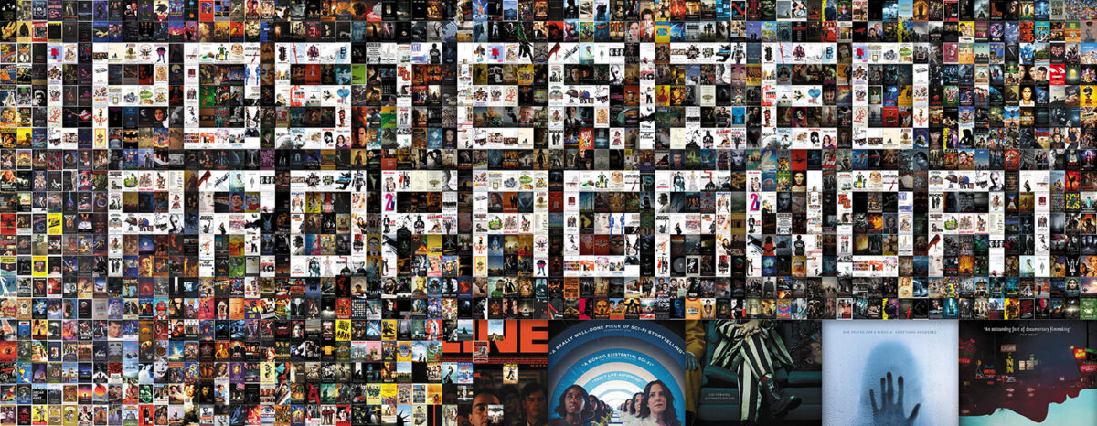
Just because everyone is talking about Venice, Telluride, TIFF, and NYFF right now doesn’t mean theaters have suddenly stopped opening new movies near you. Some of them are even the same films playing at those festivals too.
There are a ton of titles dropping this September despite only having four Fridays. Then you add the streaming titles. And the VOD titles. The play for your attention is real. Sadly, I don’t think a glowing T-square is the way to go towards that pursuit … although I am intrigued to discover the purpose behind the choice.
So, if you want to judge a book by its cover to help whittle down your selection, here are a few good ones to help the cause.
Unique views


I know nothing about Sheldon Wilson’s Believer (limited, September 13), but the poster has me wanting to learn more. Not only is it aesthetically interesting in its 180-degree rotation causing the ground to be the sky and the sky to be the ground, but the tagline about not being able to trust yourself conjures notions of duality that are generally shown by giving shape to two sides of the same coin.
Where then does the mistrust lie here? Sanity? Is this person who’s falling upwards towards a railroad junction (that almost looks like a mirrored image along the page’s y-axis before a closer look proves otherwise) dreaming? Will the eventual reverse gravity splat wake them up? Or turn out the light?
It’s a simple piece devoid of frills. The bold tag, the distressed all-caps title, and an impossible image giving us more to guess than know. It’s the perfect tease.
So too is the one-sheet for Lisandrio Alonso’s latest collaboration with Viggo Mortensen entitled Eureka (limited, September 20). Rather than flipping its vantage point, the composition places us into the eyes of a clandestine voyeur. Not only are we therefore trying to discern what’s going on in the scene between the trees below us, but also whether this position is aligning us with the bird in the foreground or an unseen character for whom we’re currently embodying.
Again: simple and devoid of frills. It’s a captivating image that conjures drama via framing. A seemingly mundane scene for which we must buy a ticket to learn more. And the text, while legible, is just innocuous enough to fade into the background as we lean closer to see what it is everyone has turned to see.
Red Rooms (limited, September 6) is different. The viewpoint itself isn’t even real. It’s just an image of Juliette Gariépy on a gray background. Without a sense of place or story, the designers needed to create their window into this world via overlay.
The “place” doesn’t therefore need to be real to exist. With some great glitch and noise work, what was a straightforward publicity portrait is now a video screen. Not only are we looking at her, but she now has the potential to be looking back at us.
It’s a smart way to turn a boring baseline into a memorable visual that holds your gaze with an uncertainty as to whether you’ve become part of the scene itself. They could have just thrown a CRT filter or repetitive pattern over the top, but they took the time to put it on the fritz in an authentic and random way. Add the cool vertically stretched font and stacked text resembling a cross (maybe like the one Gariépy’s character wears around her neck) and it’s as formally pristine as it is superficially broken.
Bloodied


While the paint streaks coming down from the gorgeous typography of the title make absolutely zero sense (even if Dinklage and Lewis were two-dimensional standees, you can’t logically have those lines sometimes be behind them and sometimes in front), I still really enjoy BOND’s poster for The Thicket (limited, September 6). I like the period garb, the white and red palette, and that little horse at the bottom. The vibe is sophisticated grunge.
That title, though. I can’t stop looking at it. It’s not just graffiti, but the result of a thick brush laying on that paint with enough weight to catch the many coverage incongruities with each letter. The red splat of a dotted “i” is obviously computer generated, but it doesn’t detract from the whole’s authenticity. It merely enhances the overall effect.
MOCEAN’s Azrael (limited, September 27) avoids the white in its palette, making its text barely bright enough to be read. It’s a necessary choice considering how dark the whole proves with its painted image’s chiaroscuro aesthetic. Anything brighter and Samara Weaving’s fear would get drowned out by the shadow. This way we can pay attention to the words or avoid them altogether without losing the impact of this horrific crucifix of distress.
What an idea to turn the image around rather than the cross too. So often we get nightmare fuel marketing that leans into the upside-down symbol to denote evil and here we have the page flipped so that symbol remains right-side up. Is it a sign that a force of light exists in this darkness? Or is it a ruse to make us believe Weaving is the victim only to reveal her as the perpetrator instead? Up is down. Down is up.
Blood or not, there’s nothing evil about the advert for The Featherweight (limited, September 20). No, this one is pure vintage nostalgia. Until I clocked Stephen Lang, I had half a mind to scroll right past it thinking it was a restoration rather than a bona fide fresh 2024 release. That’s how good the homage is.
The off-white coloring. The quotes around the title. The collage work that looks like someone meticulously cut each figure out from their own picture because Photoshop hasn’t been invented. I wouldn’t call you a liar if you said the designer made this thing with a lightbox and glue to know what it felt like to be a graphic designer in the 1970s.
Who said they don’t make ‘em like they used to?
Faces on faces


Fun line drawings aside, it’s the typography on Matt and Mara (limited, September 13) that does it for me. Those giant “Ms” creating a massive tower block with the lower case “and” and the way the rest of the two names just kind of trail off to the side. It makes it look as though there are two cats lying down, one on top of the other, staring straight at us.
And even though the title is the focal point with its color and heft, it still gets pushed backwards by those delicate drawings for no other reason than the lines being black. It helps too that they connect to span the length of the “Ms” like its wrapping around them as string. The director’s name can’t help itself from being both an extension of the illustration and a crucial counterbalance to the names threatening to fall.
It’s fun, attractive, and minimalistic. It feels nostalgic like that Featherweights poster, but also modern. More an evolutionary step forward than an intentional homage.
Booger (limited & VOD, September 13) is wholly contemporary in its faux print repetition. While it feels computer generated due to the haloing along the edges of each face, its artificial halftone harkens back to more analog methods. It’s a best of both worlds scenario where it neither hides its strings nor its influences.
I also just like the layout that Vodka Creative and director Mary Dauterman utilize. You get the sense of Grace Glowicki and the cat oscillating together if not altogether merging as one, but the coloring also gives us this great ladder into the page to climb up and see what’s next. From cat’s eye to title to eye to laurel. We’re jumping from one to the next, flickering identities from human to animal with no end in sight.
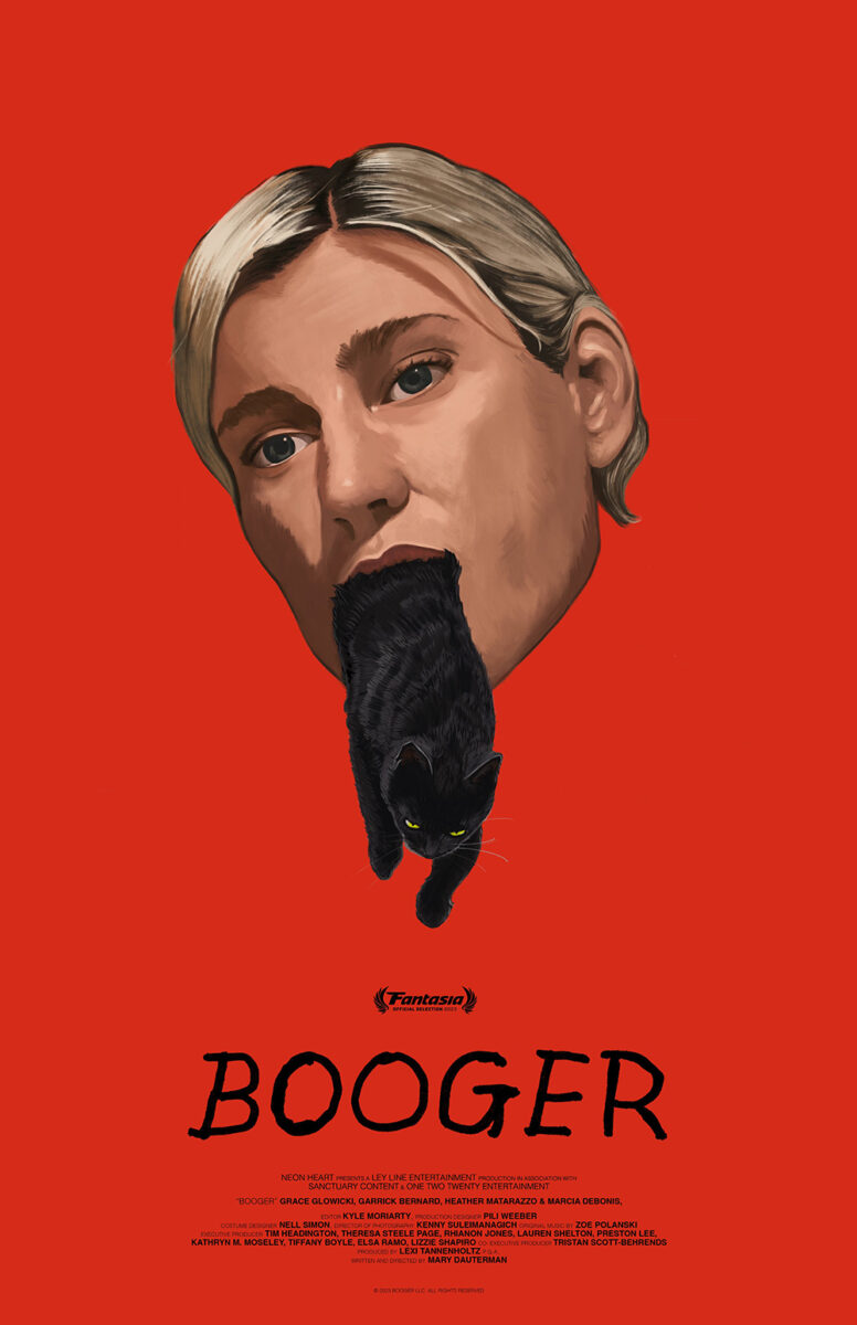
It’s not as surreal as Inna Kofman’s festival sheet with the cat exiting Glowicki’s mouth, but it is just as trippy in the sense that these two beings are inextricably linked. What a wild pair of artistic standouts letting viewers know they aren’t in for the same old thing.
They did it with the neon artificiality of uniformly bright fields and digital cropping. Hannah Christ and Derek Gabryszak conversely do it with paper tears and grainy textures on their collaboration for The Universal Theory (limited, September 27).
What a stunning piece for a “quantum mechanical thriller in black and white” as the description reads. It’s the perfect illustrative representation of that line too because I can’t stop thinking about the glossy chaos of Ant-Man as Paul Rudd falls into the Quantum Realm and how much better this practical jumble of faces breaking apart and coming together is.
It provides multiple angles, emotions, and identities puzzled together to create a head with eight eyes that’s magnetically pulled towards a stark white vertical line that should break the frame in half yet strangely bonds it instead. Not that it doesn’t still allow for the compartmentalizing of the text to offset nicely with two colors diagonally flipped.
I see a merry-go-round pole bouncing up and down with its mass of expressions serving as the seat. I see a foreboding face like the great and powerful Oz staring in a trance rather than readying to scream demands. I see the fracturing of reality fighting to find its equilibrium again. Its image explains nothing while saying everything we need to know.