As we work into the second week of the New York Film Festival, the theatrical shift towards awards-season fare officially begins at your local multiplexes, a bunch of the highly touted titles from acclaimed directors that critics raved about all September making their way to the public. And with only Black Adam (October 21) readying to siphon off the mainstream populace, there’s potential for a lot of turnover to ensure everything gets its shot.
Carefully check out those posters on the wall to see what’s playing and what’s coming so as not to miss a potential nominee squeaking in last second for a week-long engagement. There are a few stunners below to distract you from the rest too. So don’t forget to stop staring at them in-person and eventually scan the rest.
Alone


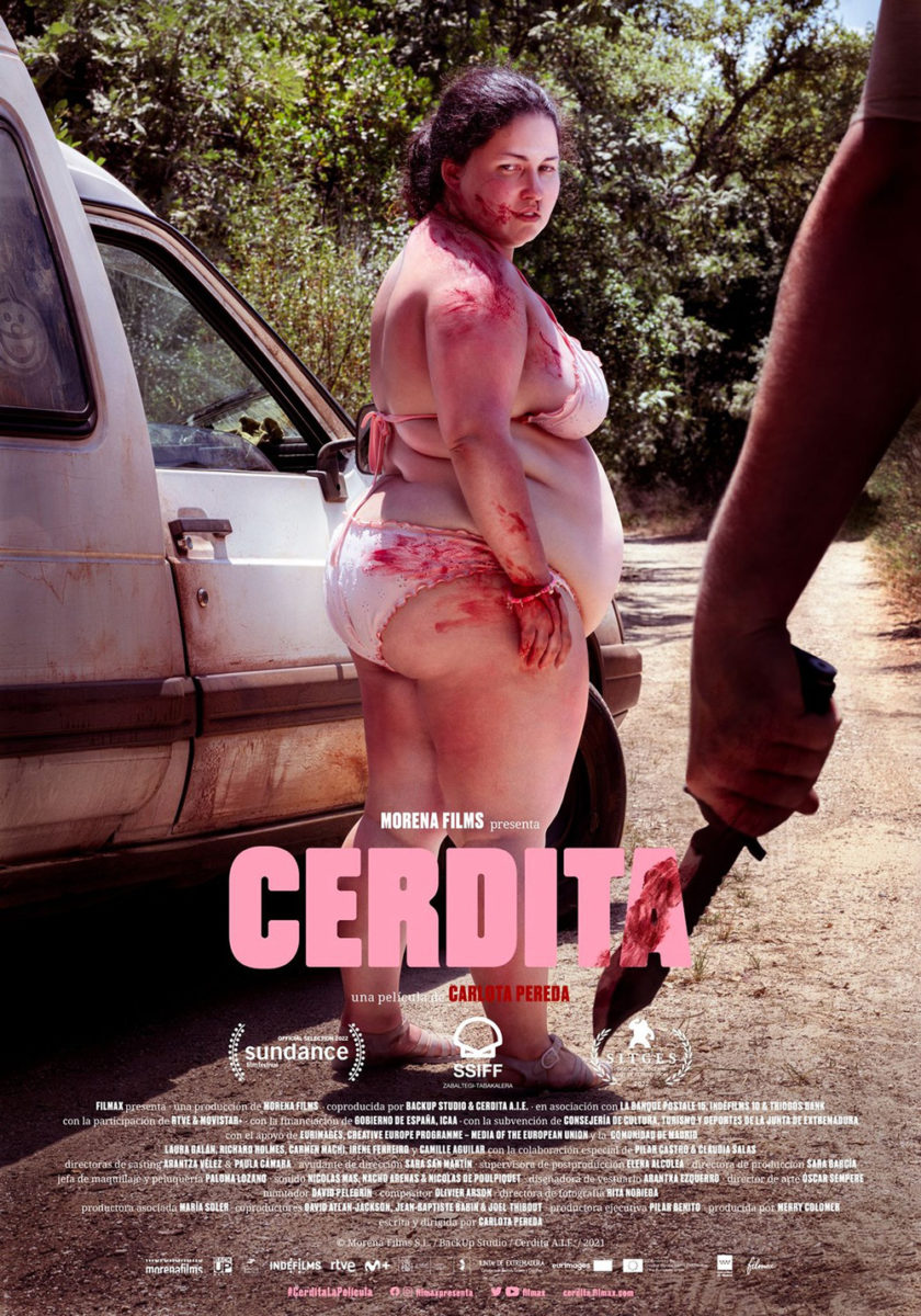
I’m not going to lie: the poster for Piggy (limited, October 7) is a bit misleading. This image of Laura Galán covered in blood has us believing we’re about to see her go on a rampage for 90 minutes, only to discover the whole is conversely a quiet film dealing with bullying, peer pressure, and the human instinct to feel desirable. Things don’t get wild until the last 20-or-so minutes.
How do you depict that, though? You can’t. So you sell the wildness instead. And why not? This is an objectively captivating image that conjures so many hypotheses about what we’re about to experience upon sitting down. Is she the monster? Is she the final girl? Is Carlota Pereda doing something completely different with those tropes to create something new?

These questions are why I believe this US sheet is superior to the original Spanish one. By showing Galán opposite a man’s hand holding a knife, the numerous options piquing our curiosity evaporate. And while they do both work together as a sort of before and after diptych, seeing this one by itself paints her solely as the victim. It teases in one dimension whereas the other teases in three.
The sheet for To Leslie (limited, October 7) is an interesting one—it seems to want to split the difference between a modern poster and that from the era mentioned in the first critic quote: the 1970s. I can see the graphic capabilities of that diminishing field of bars at the bottom of the page if utilized by someone like Saul Bass to build tension and motion, even as the polished exactness here loses his sense of urgency. It’s playing with that style to deliver something else—equally idiosyncratic if less immediate.
Not that we even need those bars at all considering how gorgeous that shot of Andrea Riseborough is with hair blown-out as though she’s touching an electrostatic orb. It’s a great scene of chaos mixed with serenity since her face seems calm and still rather than engaged in active movement. I love the monochrome nature of the whole too with the text sometimes proving illegible depending on how dark the field is below. Everything is simultaneously absorbed and expelled from the page itself—the tactility of the print medium’s additive ink is on full display.
If there’s one isolated portrait that stands out from the rest this month, however, it must be AV Print’s Tár (limited, October 7). What a spectacular use of composition and chiaroscuro to make it so we cannot know whether Cate Blanchett is leaning back or if we’re somehow gazing up from below. All that matters is that her wingspan stays in the frame to illustrate her command of the space. This is her domain. Neither the audience nor the orchestra matters—the spotlight is solely on her.
Thus you can’t fit the text anywhere above or below her arms without distracting from that imposing form. So you simply bump down the opacity and put it smack dab in the middle and atop her torso. If we want to read it, we can. If we want to look through it at her, we can do that too. Our mind can lift the transparent sheet affixed with text up to bask in the drama of what lies beneath.
Pairs


The best description for Empire Design’s Till (limited, October 14) is “simple yet effective.” Everyone should already know the story of Emmett Till. As such, the film—and the poster—doesn’t need to simply focus on the lynching itself. It instead seeks to depict the quest Mamie Till Mobley took to seek justice for what occurred. Rather than just the hate and violence of the crime, this is a film about a mother’s love.
So we get an embrace. We get to see that emotional bond front and center before everything goes sideways. It’s simultaneously a goodbye and a promise to never let go. Put the title in bold at the top and we know exactly who these two people are—what’s going to ultimately tear their bodies apart despite their souls remaining forever entwined.
The Banshees of Inisherin (limited, October 21) gives us the opposite. Its characters are spaced far away from each other—not necessarily at odds, but also not quite together. One looks out into the water. The other gazes at him. One’s mind is set. The other hopes to change it.
You get the whole gist of the movie in this one glance. The uphill battle to repair what was broken opposite the steely resolve to keep things as they currently are. That it arrives in a beautiful package with a faux-textured page glimpsed beneath the muted inks that prevent the whole from falling prey to glossy overkill is a bonus. So, too, is the delicately measured title alternating between a smooth script and distressed all-caps serif—the text above and below it perfectly aligned to augment the invisible wall that ensures the actors remain separate.
And then comes Nicolás Ortega’s Decision to Leave (limited, October 14). Its two characters are also together, but not by choice. How do we know? Because the “O” in “Decision” circles the handcuffs that tether them thanks to a deftly composed scene. He is the policeman investigating a murder. She is the widow of the deceased. The chalk outline at their feet is the absence that binds them.
It too prints with a muted palette to lean into the painterly aesthetic marked by an expertly rendered craquelure. The coloring lends a mysterious air to the whole—a dark foreboding that has as much potential to reveal secrets in the past as well as the present. Where will his search for answers take him? What is her place within it? Because I’ve heard a lot of people talk about Park Chan-wook’s latest as a romance. Project that onto the image and you must wonder what is really being highlighted by that “O”: the cuffs or the almost-touching hands.


Add in a couple other posters for the film and you find a sense of adventure and camaraderie instead of animosity or suspicion. Whether the circular diorama akin to paper art or the rolling hills and water recalling woodcut prints, there remains a gently elegant craftsmanship to each. I can’t wait to experience the full journey for myself.
Titles


Take out that collage of fangs in the background and this poster for Project Wolf Hunting (limited, October 7) still works thanks to a fun, creepy bit of typography. A good blackletter font goes a long way for horror and horror-adjacent designs, but there’s more than meets the eye this time. Some of the letters are cut in half and stapled together—but not with the part that was cut off. Instead the bottom halves are completely different. Some are sans serif. Some italicized. Some serif. It’s a mismatch of styles where even the tops are sometimes the ones that don’t fit.
It’s a wonderful tease for a supernatural hybridization of species, monsters, or whatever writer-director Kim Hong-sun has in store for audiences. Because while those wolf mouths are seamlessly sewn together via photo manipulation, merging the letters crudely by comparison cannot be without intent. The juxtaposition demands we ready for anything as carefully laid plans always run the risk of falling apart before hatchet jobs unceremoniously take their place.
While the imagery used for My Policeman (limited, October 21; Prime, November 4) by LA is similarly nothing to write home about—a solid if unimpressive photo of Harry Styles takes up the frame knowing his name and face will sell tickets all by themselves—Tori Huynh’s title design surely is.
The typeface is elegantly idiosyncratic, half serifs going backwards and forwards (sometimes on the same letter) to make it seem as if both “Ms” have been mirrored. It’s an ingenious hack that allows the kerning to squeeze without any overlap. The often-uncontrollable gap between an “A” and an “N” is thus negated while still providing each character room to breathe. Putting the “My” inside the “O” becomes almost quaint by contrast and yet it’s no less crucial to the whole. It’s a typographic masterpiece.
Leave it to Danni Riddertoft (design) and Studio Kargah (typography) to finally give us a memorable sheet that melds unforgettable image and text via Holy Spider (limited, October 28). Rather than let the crisp green Arabic pop above a regular photograph, Riddertoft creates a red-heavy Persian rug with plush portraiture instead. It’s a mesmerizing effect that should have you wanting to reach out and touch the stitching that simply is not there. And being what we assume to be a woven prayer rug, it also perfectly embodies the title with metaphorical wink.

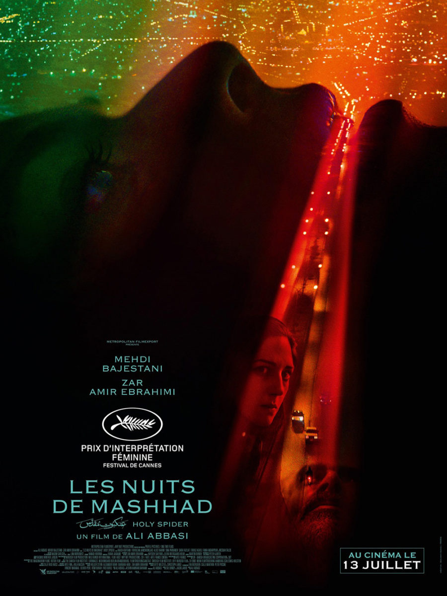
It’s not the only stunner for this film: the French sheet delivers a dramatic photo manipulation of its own wherein the open mouth of a woman becomes both the conduit of a night-time road (also colored in green and red) and the start of a projection of faces we can assume are the journalist investigating a spate of murders and the serial killer responsible. It’s thus more literal than the rug in its representation of the players, but no less captivating in construction—depending on just how much the studio wishes to leave to our imagination.
