Another month, another exciting selection of foreign and indie titles to combat the Hollywood machine (although it is nice to see the latter’s big three coming from three different studios—Doctor Strange in the Multiverse of Madness from Disney on May 6, Downton Abbey: A New Era from NBC on May 18, and Top Gun: Maverick from Paramount on May 27—a rarity since all the mergers). And with that exciting selection comes some exciting imagery to hopefully turn heads in the lobby and remind patrons what else is coming.
The fact that all nine titles below are theatrical releases (with a couple going streaming and/or VOD same day) shows the studios (big and small) have officially reverted to pre-COVID status quo whether audiences are ready to comply or not. While there are many positives and negatives born from that unavoidable development, one of the former is unquestionably being able to see these beauties printed and hung on a wall.
Front and center


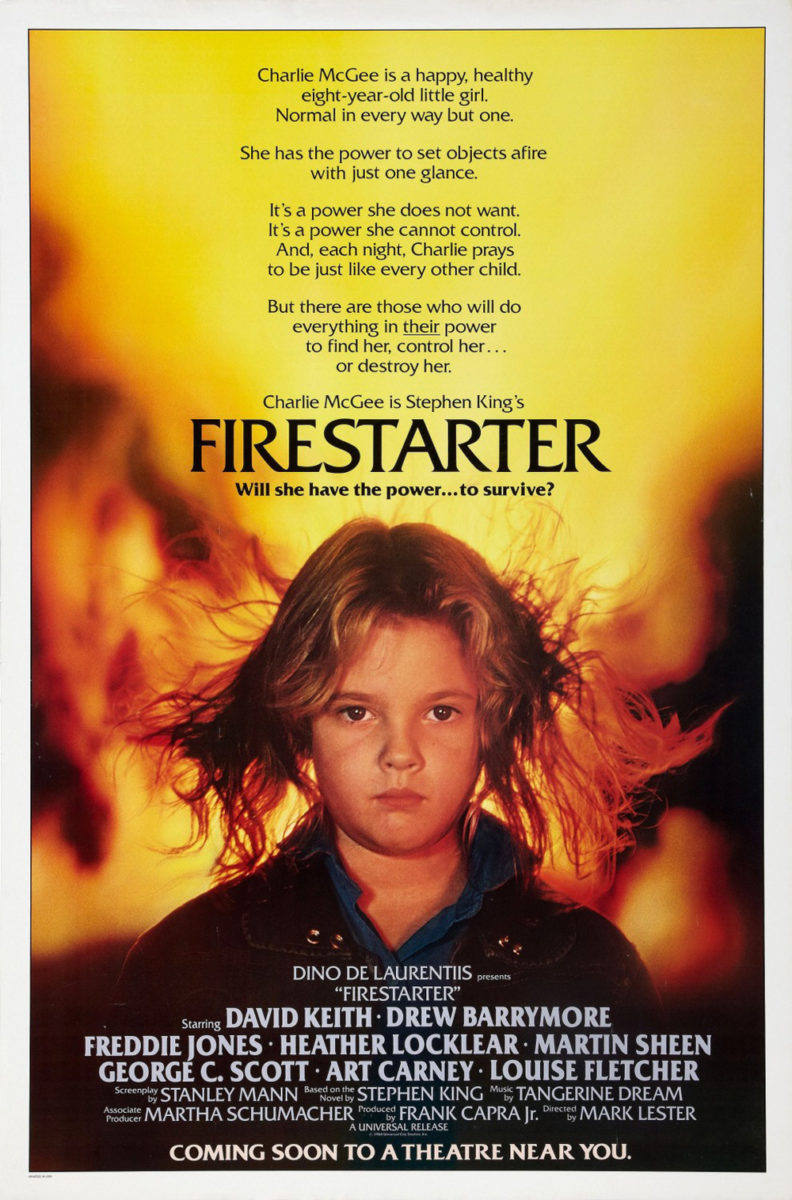
LA adheres to the “if it isn’t broken, don’t fix it” rule to wonderful effect with their sheet for Firestarter (wide and Peacock, May 13). Even if you’re unaware of the Stephen King source material, seeing Drew Barrymore and Ryan Kiera Armstrong staring us down while flames burn in the background tell us almost everything we need to know. The other aspect is of course the flowing hair. If the actors had looks of fear, we would think it’s being affected by the blast. Because they gaze with steely determination, we know it’s a product of their telekinetic powers.
Kudos too for the updated typeface adding a bit of paperback flourish to contrast its very wordy predecessor. Those cut-ins on each horizontal bar aren’t necessarily meant to be blown up that big (you can see them in full effect on the smaller text above the title, creating swoops rather than indentations), but the uniqueness of the effect and increased bubbled thickness really help it pop.
The star of the Digger (limited, May 20) poster might not be engaging with us so purposefully, but the impact is no less engrossing considering how surreal it proves. While my mind first thought of the Progressive “Motaur” commercials upon seeing this motocross rider’s bike transforming into a horse, it quickly turned to the likes of Greek designer Vasilis Marmatakis after seeing the director’s name. I wouldn’t be surprised if Yorgos Lanthimos’ frequent collaborator designed this one too.
It’s a cool image that’s only enhanced by its muddy yellow sheen. The figure is as easily flying through the air as he is suspended in amber—our vantage point filtered by sand and dust or a window of hardened resin. The bold title comes in as an incongruous mystery unless “digger” is an extreme sports term of which I’m not familiar. It’s half modern western, half high-concept absurdity. And I’m fully on-board as far as finding out what it’s all about.
From muddy to brilliant (and back to fire) we move to the stunning, colorful poster for Gaspar Noé’s short Lux Æterna (limited, May 6). It’s bold, provocative, and psychedelic in its scene of sexy crucifixion with Charlotte Gainsbourg seemingly enjoying her being at the center of a pyre engulfed by flames. Add the geometrically broken-down orb of light at her back and the allusion to stain glass windows is unavoidable. I’m surprised the black triangle holding the rainbow-gradient title isn’t shaped into a church itself—not that such literalism is needed.
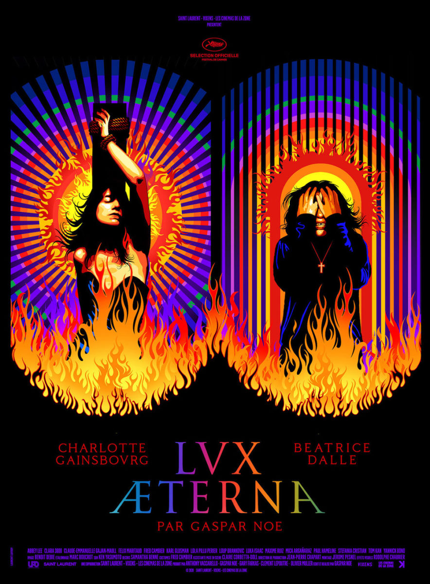
The effect only gets wilder on the alternate sheet with Beatrice Dalle screaming, hands over face, besides Gainsbourg. For her part the orb is segmented vertically rather than radially, the lines creating a doorway instead of a sun. That shift makes the whole somewhat tough to absorb as it destroys the otherwise symmetrical composition from two eyes to an “o” and “n”. A message perhaps? Guess you’ll need to watch to know for sure.
Peering out


The dark clouds of LA’s Montana Story (limited, May 13) advert lend it a somberness that fits with the stoic looks of Haley Lu Richardson and Owen Teague below. A subdued color palette adds to that atmosphere with her jacket providing the only real splash of brightness despite still being a muddy earth tone in its own right. Richardson becomes our focal point as a result even though Teague is bigger in the foreground, his shadows merging with those of the horse to help frame her against the sky.
Both are gazing in opposite directions off-screen, more with notions of introspection than purpose in the real world. What are they thinking about? What are their regrets and worries? These siblings have returned home to confront truths they had hoped to run away from. We can sense that “ticking time bomb” described in Indiewire’s critic’s quote. We anticipate the heavy weight of burden.
The cast of The Tsugua Diaries (limited, May 27) are also peering out, but this time it’s at us. Rather than thousand-yard stares, these tractor riders are smiling and waving at the camera in a joyous state of energy and excitement. They’re bringing us into the scene—into the fun—as if to say, “hop aboard” or, at least, “follow behind” once they pass. We want to see what’s put them in such a good mood.
Add the watercolor scribbles of foliage and this gleefulness is only enhanced as though the whole is a photograph pasted and drawn over in a scrapbook to project emotion atop its visual recording. And the artist wants us to bask in that aesthetic, enlarging and separating the title in a way that forces our eyes to travel horizontally across the page before shooting down vertically. It forms a squared spiral, leading us through a rudimentary maze to find our guides in the middle.
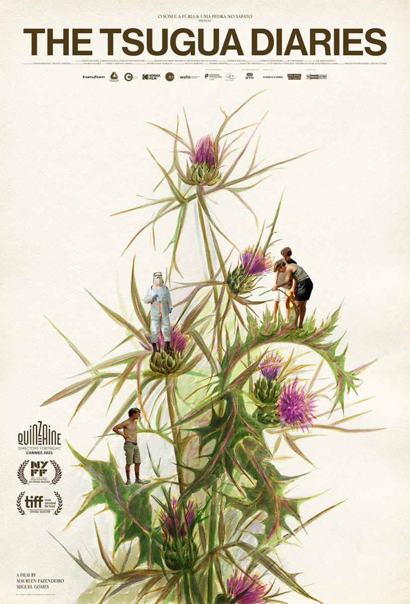
Midnight Marauder takes that idea and runs with it for the American release poster. They turn the whole into an illustration of plant life surely found within the garden where those characters work to build a greenhouse. The men and women are now segmented on leaves and buds to fulfill their disparate jobs, moving from the scrapbook diary of the title to a metaphoric representation of the work itself.
For a bit of both worlds, Brian Hung’s latest Hong Sangsoo composition for In Front of Your Face (limited, May 6) supplies dramatic weight and playfulness with his glimpse at Lee Hyeyoung looking beyond the frame. Unlike Montana Story, there seems to be a sense of contentment in her face despite the synopsis talking about a secret. It’s not one that she seems to be running from.
Story assumptions aside, however, the real appeal here is the typography. Hung takes the title literally by blowing it up to stretch across the entire page so he can segment the words with the physical presence of her face. The left side is in front. The right side is behind. But we’re never confused as far as how to read the whole. This isn’t a “Don’t Dead Open Inside” scenario. Bleeding the letters off the edge helps train us to go left to right without pause, each line (nicely pushed with indentations) its own new object to read in sequence.
Y-axis


Symmetry abounds with the next three drawing a straight line down the middle vertically so we can fold each in half. That sort of balance isn’t for everyone, but it’s always appealed to me.
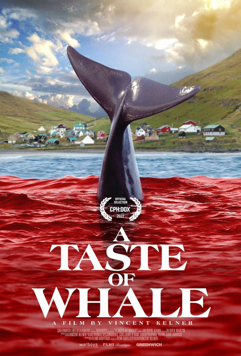
Sometimes it’s as simple as A Taste of Whale (limited, May 27) and its illustration of the mammal diving through a translucent field of red. The heavy title counteracts its descent with the director credit perfectly spaced on either side of the whale’s tail to keep the symmetry alive. It’s a gorgeously minimal design suited for mass-produced screen-printing—one black plate and one red plate chugging along so installers can paste fliers on light posts around town.
Frost Foundry takes that idea and brings it into the real world with an equally stunning sheet of a tail escaping its crimson prison of bloodied water. Here we don’t see the rest of the whale, its fin becoming a last gasp attempt to get our attention like a hand bursting through the dirt of a horror movie’s cemetery. It’s still perfectly balanced, though, this time with its heavy title on the bottom—hopefully pointing skywards rather than tragically pushing down.
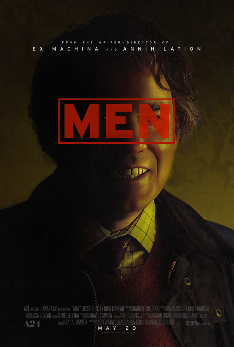
MOCEAN’s Men (limited, May 20) takes the “folding in half” aspect to extremes by turning its view out from a tunnel into a Rorschach painting of reflections and shadows manifesting a skull out of thin air. It’s a creepy image with darkened grass creating eyes and Jessie Buckley’s mirroring a nose, the teeth forming all on their own. Anyone who’s seen the trailer should find reason in the comparison as every man shown is played by Rory Kinnear in a psychological mind game born from Buckley’s psyche. What do the drawings look like? Well, they all look the same.
The answer is just as creepy too. That smile on Kinnear’s face in the second sheet is straight out of a wooden teethed nightmare, the translucent title simultaneously labeling him and censoring him in a way that only renders him more frightening. I’m excited to see what Alex Garland has in store.
Of all this month’s release, though, Intermission Film’s The Innocents (limited & VOD, May 13) has stuck with me most. This is a scene of a young girl on a swing set—it should be joyful and fun regardless of the doom and gloom rolling in skyward. All that changes by flipping the whole upside down. Suddenly she’s not mid-swing in a bid to pull off a 360-degree spin. She’s just dead weight. Waiting. Watching. Ready to pounce.


It’s quite unsettling and nicely darkened to allow the bright white of the title to pop with its tightly kerned block of ominous letters. There’s purpose to its design and placement much like on the character sheets with eyes centered beneath. We’re being told a fact that can’t help but appear to be a lie by way of its vehicle. Are these children innocent? Their fear may suggest yes. The reflections of others’ menacing stares suggest otherwise.