There are a lot fewer ampersands this month as more theaters open and smaller studios decide to go back to their theatrical only rollouts with VOD arriving at a later date rather than simultaneously. I’m sure there will be even fewer next month and fewer still the one after that as Hollywood pushes itself back towards a status quo it desires. The big boys will obviously continue to toe the line as they build up their streaming service subscription numbers while also attempting to reap box office returns.
Advertising through posters and creative identities becomes even more important as a result with so many venues competing for consumer attention. Some people will be attending theaters and thus necessitate those giant cardboard displays. Some will be staying home and thus necessitate an attractive digital alternative while scrolling through online catalogs.
And if you’re Zack Snyder, Netflix will simply create a full-scale character sheet campaign for Army of the Dead (Netflix, May 21) because they can. Whether the handful of theaters willing to show it will actually utilize that stable of tent-pole poster excess remains to be seen.
A frame within a frame


It took three years, but Monster (Netflix, May 7) is finally getting released this month with an interesting if not wholly successful poster to get the word out. When you’re obligated to include that many names despite not bothering with a credit block, it’s difficult to do much better.
The good: texture. For a streaming film that probably won’t see many (if any) posters printed for theatrical display, this thing looks like a piece of paper on my computer screen. The soft grain, cardboard framing device, and muted colors lend a tactility that glossy photography can’t. I’m imagining ten of these glued to a big city corner wall.
The bad: that gradient blur. I get the idea considering we’re supposed to question who Kelvin Harrison, Jr.’s character is amidst the accusation leveled against him, but the crisp border down the middle incongruously negates the choice of a blur that exists for gradual transformation. I’m not seeing Harrison change. I’m questioning whether my left eye has failed.
Is the blurred half therefore good or bad? Does this aesthetic choice add anything that an actual split-screen between two different portraits couldn’t? The more I look at it, the more the image fades away completely to leave the first part of the tagline as a spacecraft with cast and crew names as wings trying to shoot down the second half of the tagline like in Space Invaders.
Brandon Schaefer’s The Killing of Two Lovers (limited & VOD, May 14) is a similar structural concept without all the superfluity. Its blurring is a function of its field of depth—creating a barrier between the “two lovers” as though some invisible force has put them at odds. And its image isn’t fated to be covered by text, text, and more text. We’re instead given a clean line of focus from top to bottom as title feeds into image with the rest left to the viewer to peer closer or walk away.
I like the off-kilter logotype formed in a way that allows the title’s length to dictate its inherent imbalance while somehow keeping it balanced through composition. “Killing” and “Lovers” become our focal points in size, shifted to remain centered even as crooks are formed to house the “of” and “two” as connective tissue binding both lines to the same horizon. The “the” then acts as a fastener, its positioning mimicking the laurels, critic’s quote, and bottom text so that it all feels symmetrical even though it’s not.
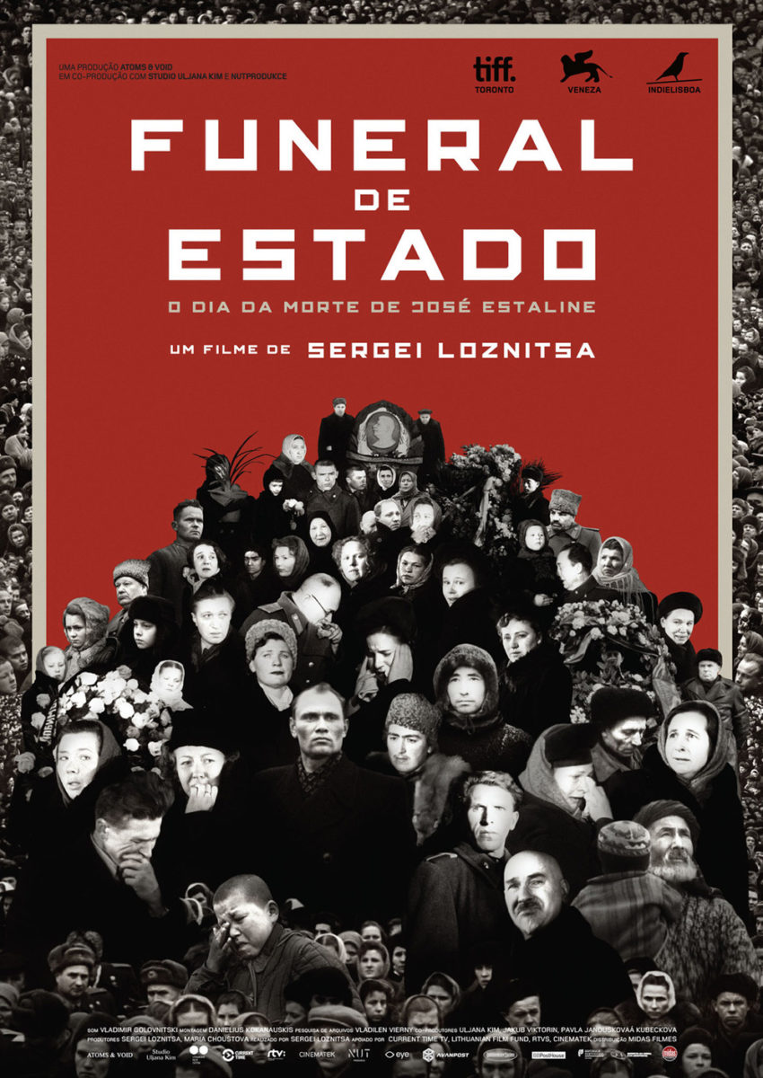
State Funeral (limited, May 7; MUBI, May 21) doesn’t need visual trickery in its typography since its two-word title lets everything just stack without problems. The designer banks on that consistency to play with the imagery beneath it in order to create an optical illusion of depth. The frames of color therefore become a wall separating two different fields of collaged faces: the flat outside border and the sprawling mountain of bodies leading backwards to a vanishing point marked by Joseph Stalin’s profile.
There’s an obvious constructivist feel to the collage and colors, but the whole uses those motifs in a modern way that marries past to present. It’s a wonderful stylistic choice that expands upon the Spanish sheet’s starkly bright Xeroxed contrast. The white on that version is blindingly loud to the point where we have to look away. The simple act of muting it and muddying the photographs turns the whole from an assault on our senses into an invitation to explore.
Logotype & image


There’s rarely a more effective way to market a film than with an expertly cropped image and uniquely rendered title. This is why teasers generally provide the best designs: the number of constraints dictating their mission haven’t become unmanageable. Distill things down to a captivating juxtaposition with those two elements and you have your viewer eating from the palm of your hand. Less truly is often more.
Just look at Blast Beat (limited & VOD, May 21). While the studio obviously demanded a slew of other things from tagline to cast and more in-between, the designers ensured that they kept the importance of image and title free from chaos. All the text is at the top or bottom to keep ninety percent of the page grounded in the visual representation of mood, emotion, and atmosphere.
Those words fade away when compared to the Arias brothers’ faces of fatigue breathing heavily against a police cruiser. We see the sweat and exhaustion. We see the grunge and grime of metal and anarchy. And there are zero distractions.
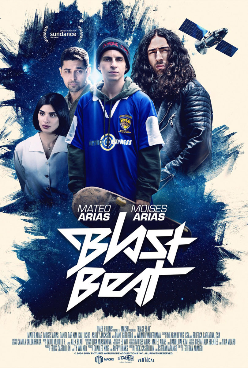
This is key since the photo is compelling and complex all on its own with a shallow focus highlighting Mateo even as Moises’ tilted head steals our attention by nodding towards the title. The story it tells is therefore only one piece to the puzzle as our eyes are guided by that static motion. And what a title it is: an homage to the hard rock monikers teens drew on their desks in the 1980s and 1990s with forty-five-degree angles creating sharp edges at every corner.
Now compare that to Kustom Creative’s final sheet. Glossy lens flares replace the dirty dive bar sheen. Generic poses in collage replace the dramatic close-up caught surreptitiously. And the decision to put a satellite in the top right corner pushes everything off-center in a way that makes it appear like a mistake. The excitement has been usurped by contractual obligation.
It happens with New Order (limited, May 21) too—only in the opposite direction. This time the boring grids comprised of multiple scenes and multiple characters has been scrapped in lieu of the kinetic brutality this film offers in unforgettable ways. To look at the Spanish posters at right after seeing the film is to scratch your head at how such a magnetically captivating work could be rendered so inert by boxed-in faces.


Now turn your head towards the US sheet above and breathe in the carnage. The image is turned ninety-degrees to both disorient with crisscrossing sightlines and utilize as much area as possible. Only now can we see the guns and the baseball bat as bodies are pushed upwards off the page—one didn’t have to be sacrificed for the other in a vertical crop. Add the Jackson Pollock paint splatters like the blood and smoke marking the scene over a neatly centered title (bold and contradictory itself with backwards “Es”) that becomes another victim of the insanity and you can begin to understand how overwhelmed you’re about to feel while watching.
If you really want to see the difference a good crop and font can make from one poster to the next, though, it doesn’t get more pronounced than with Spring Blossom (NYC & LA, May 21).
Suzanne Lindon is practically lost amongst the sea of faces on the festival sheet. Yes, she’s the only one not in profile, but that’s not quite enough to make her and her malaise the sole focus—especially not when the still being used is forced to compete with a giant title and edge to edge text refusing to give our eyes a break. This is a magazine ad. Informative and bland.


So what does Midnight Marauder do? Zoom into Lindon’s face. Don’t just make her the focus, make her the entire poster. Suddenly that expression is less about boredom amongst other girls her age and more about personal longing. The once pristine image is now set with grain to soften its impact and externalize her thoughts similar to LA’s porcelain skin via mother!. And that text that was screaming in our face is now tucked beneath an eye—unassuming and yet still unmissable with its singular, handwritten scrawl.
Embrace the surreal


BOND is over here showing us that posters for a big studio movie are still allowed to have mystery after all. The foggy atmosphere of their Spiral (wide, May 14) teaser is as ominous as it is beautiful: the sea of bright lights against a dark sky with nothing but a red curl of a traffic light cutting through to steal our attention. Seeing Chris Rock’s name at the top is enough to let his image be a simple silhouette battling the haze.
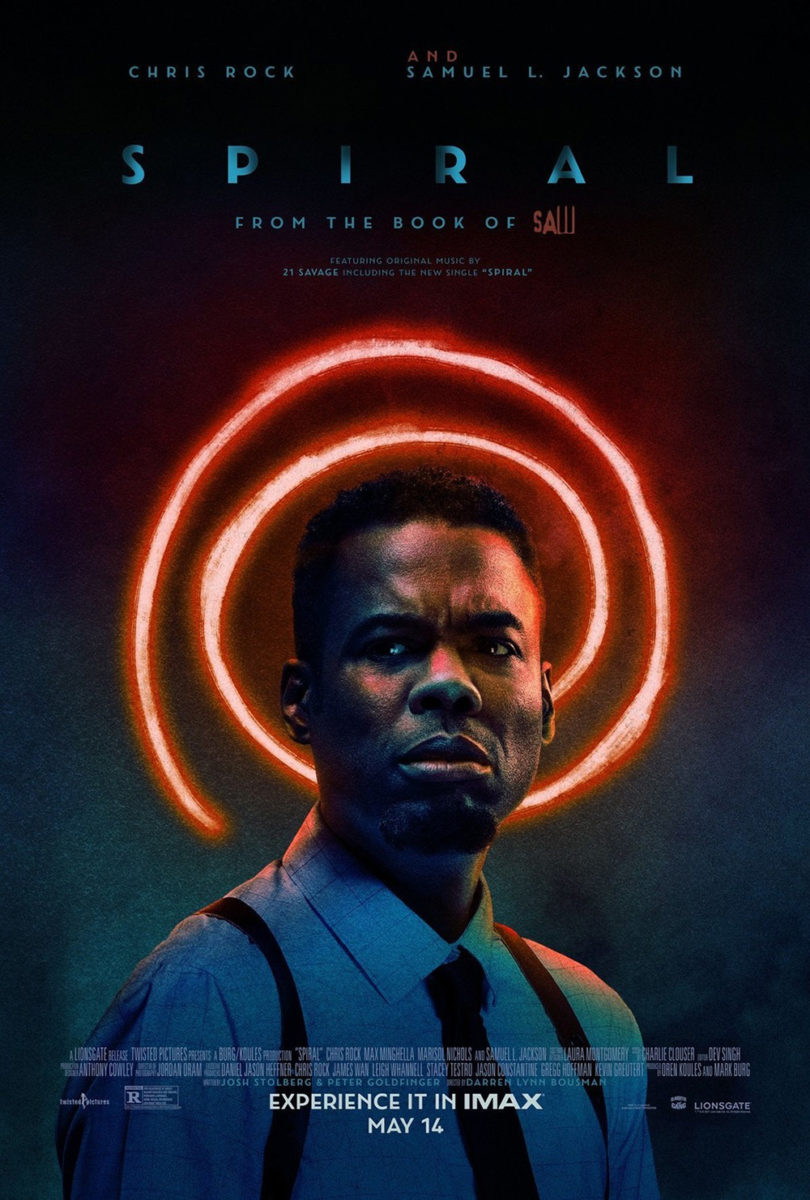
I even like the title treatment’s weird gradient for one simple reason: it feeds into the background. The firm knows that the effect only works if it’s in concert with the field of color it’s placed upon and the proof lies in the fact that it succeeds on their second sheet too. I do have to laugh, though, since the effect is surely meant to signify a spinning motion (the light source shifting on the letters’ surface to create those shadows) that recalls original production company’s Twisted Pictures’ emblem.
And while the second poster doesn’t manufacture the same nightmarish, dream-like environment of the first, it is still successful at creating a mood desperate to set it apart from the Saw series’ usual griminess. It’s amazing what a little color can do when our minds had been conditioned to think gray concrete and dead fingers for the previous seven films. That the glowing spiral doubles as a halo is an interesting touch too. Is Rock our savior? Or does the shape’s history as a symbol for confusion mean he only believes he is?
It’s probably a stretch to call the poster for Swimming Out Till the Sea Turns Blue (limited, May 28) surreal, but its use of a flat, cut-out illustration technique does create an otherworldly scene at least. This attractive sheet utilizes texture as a welcome contrast to photo gloss, its hand-crafted aesthetic a breath of fresh air transporting us back to the age of Georges Méliès. And I love the fountain pen as lighthouse.
If I had one complaint, however, it’s the font choice. Something about the bold, block serifs usually ascribed to westerns feels incongruous against the water—especially the delicate nature of water formed by layers of paper. The thin typefaces on the other two sheets below feel more at home.


As for those sheets themselves: Brian Hung’s with geometric mountains seems to be trying to capture the magic of the above entry unsuccessfully while the one with photography might outdo them both. This last one is pretty cool in that it seems to be using multiple photos to create a scene that doesn’t actually exist. Some of it looks upside down. Some of it looks like ice formations. Some use trees as waves. It’s a mesmerizing strobe of positive and negative, land and sea, taking us somewhere we’ve never been.
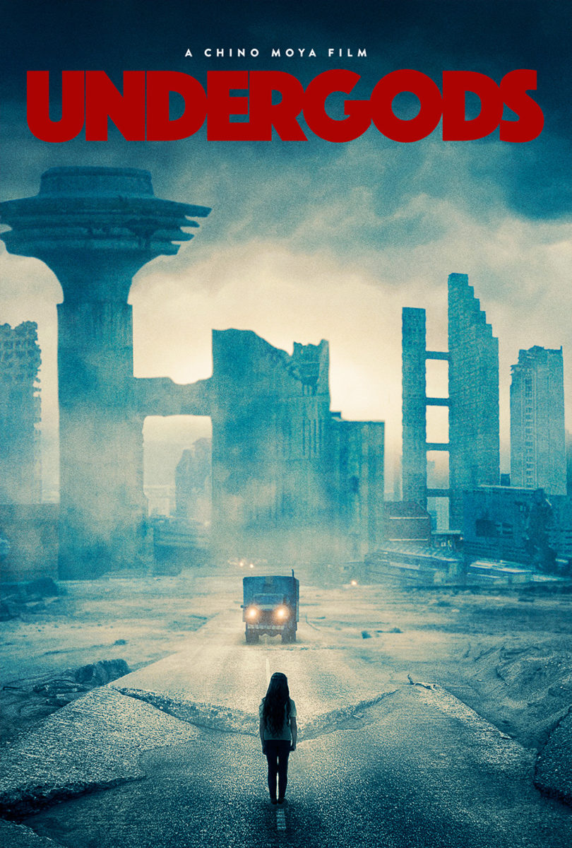
For actual surrealism, go to Max Loeffler. His Undergods (limited & VOD, May 7) may seem more aligned with album artwork than multiplex displays, but that’s kind of the point. This medium is meant to catch eyes and excite. So create a desolate wasteland, peel some faceless monuments to identity as though they are stickers, and keep on driving. Once you watch the film, you’ll know that he got the essence of the film down pat.
It’s disappointing then that the final sheet leaves it all behind for a rather boring scene of the actual wasteland that only ends up touching on one aspect of the whole because it refuses to go further than literal representation. Thankfully they didn’t mess with the logotype, though. Its use of kerning to combine some letters while letting a sliver of space exist between others is superb.
What is your favorite May release poster? What could have used a rework?