
“Don’t Judge a Book by Its Cover” is a proverb whose simple existence proves the fact impressionable souls will do so without fail. This monthly column focuses on the film industry’s willingness to capitalize on this truth, releasing one-sheets to serve as not representations of what audiences are to expect, but as propaganda to fill seats. Oftentimes they fail miserably.
Month #2 of full quarantine is here and we’re left with much of the same as the first. Theaters remain closed, indies have forgone their theatrical releases for digital-only (and the Oscars have officially allowed certain titles to be eligible this year despite it), and the odd straight-to-VOD premium title is dropping to make AMC Theatres mad.
So posters are once more relegated to digital-only exposure. It might not be their natural multiplex wall habitat, but at least they’re here to get the word out anyway. And if nothing else, they prove an attractive way to sort through the new release section at your preferred online venue.
FYI: Deerskin, a film whose poster I spoke about in March, is getting its digital release on May 1.
Well, isn’t that familiar


When it comes to the topic of copycat designs, something like BOND’s Arkansas (VOD May 5) proves an exception. Does it look like a ton of other posters before it (I use Greg Bunbury’s The Battery as comparison)? Yes. But it’s less about cribbing elements and more about evoking a sense of time and place. These are both examples of homage to old school posters wherein a boxed image and unique logotype were all anyone could hope to utilize. Their similarities are a result of their intentions, not a lack of originality.
I’m not sure the same can be said about Inheritance (VOD May 22), though. Did BLT Communications, LLC have a monopoly on black posters with white type extending beneath the surface of a skyline to illustrate the setting as being underground via 10 Cloverfield Lane? No. But come on. Are we really going to say the former was created in a vacuum wherein the latter wasn’t at the forefront of the designer’s mind? I don’t mean to imply it was malicious—just that the shadow of remembrance surely played a huge role in conceptualizing the final product.
Unless it was malicious and Vertical Entertainment said, “Make it like that Cloverfield sequel.” Then boo on them. Do better.
Pairing BLT’s The Lovebirds (Netflix May 22) and Palaceworks’ First Love shows how a specific stylistic tendency can burn through subconscious (and conscious) minds extremely quickly. Not only do they both wield a brightly colored aesthetic bordering on otherworldly neon, but they lean hard into the yellow text to pop with cohesion where white would only blind us. That they both have “love” in the title and use a heart for the “o” only speaks to our pop cultural affinity for emoji communication. The grunge/graffiti nature of paint/blood becomes a way to show us how “this isn’t your mom and dad’s rom-com.”
As for The Refinery Creative’s How to Build a Girl (VOD May 8), it shouldn’t be surprising to find a visual connection to Crew Creative Advertising’s The 40 Year-Old Virgin. Feldstein family aside (not that Jonah Hill had a huge role in the latter), this implicit desire to mimic the Judd Apatow brand can’t be a coincidence. You have a charismatic star front and center trying to traverse a world he/she is unsure about where to start. There’s a youthful naiveté to both (regardless of the age discrepancy) and the threat of making too hard of a 180-degree turn to the dark side.
The high school photo template is therefore the perfect embodiment of that transition between childhood and adulthood or immaturity and maturity because it provides a frozen moment depicting the joy and promise that too often is thrown away before year’s end. There’s so much optimism in their smiles and so much blissful ignorance against the inevitable mistakes about to be made.
You have a good face


Like so much kids fare these days, WORKS ADV went with a full frame of faces for their Spanish-language tease of Scoob! (VOD May 15). It’s a simple way of making sure every child’s favorite character is visible when passing posters down the hall of a theater and it’s an easy endeavor for a designer since perspective and scale is thrown out the window.


I’m honestly surprised the English poster didn’t follow suit because this is what we’ve been getting for a decade (see The Muppets). The firm went with a line-up here instead—the same characters yet now their attention is off-screen instead of invested in their audience (minus Scooby’s fourth wall breaker, of course). It loses so much excitement in this way because we can’t interact with them. We’re forced to remember that they aren’t here. They aren’t playing with us.
That’s why cold open’s tease is the way to go. While the characters still aren’t acknowledging our presence, they’re at least in motion with trademarked expressions. The metallic title is able to scream like it wants to with that exclamation point and we can imagine which scary villain is on their tail.
Blood & Chocolate’s poster for Valley Girl (VOD May 8) takes the best parts of those first two Scoob! sheets and merges them together. It’s an obvious pose with bodies turned sideways, but their faces and eyes are focused on us. They’re making certain that we see how “awesome” they are before they break into song (this is a musical adaptation of the 1980s Nic Cage film).
The coloring gets that decade’s vibe down nicely with that simple line motif in the background wanting me to call this Miami Vice Nights or something else to that effect. The glow of the title along with its elongated art deco font begs to be flickering as a jukebox in our minds puts down a record only we can hear.
On a Magical Night‘s (exclusive engagement in Film at Lincoln Center’s Virtual Cinema on May 8) poster might be busy with all of its text, but just imagine if the title was alone up there. A better Photoshop job would be necessary to make up for the fact that the vertical molding just stops midway now, but the whole would breath so much easier.
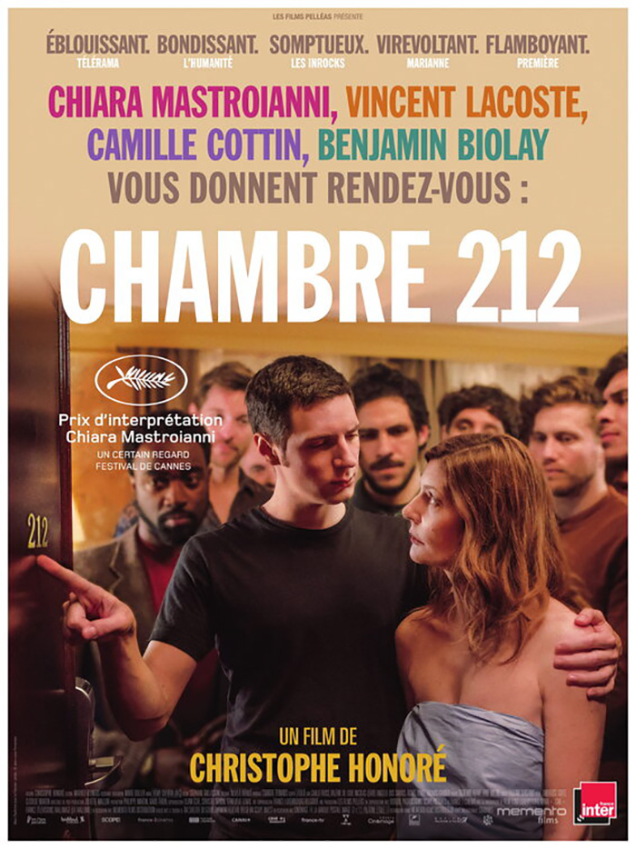
Then we could focus on Chiara Mastroianni and the way the shadows of wrought iron spirals are cast upon her body. We can read more into her expression as she looks away from the blurred man behind her on the bed. We’d be able to live in the scene rather than being shaken out of it by words in multiple sizes and colors vying for our attention.
It beats the French sheet either way—a design that’s even busier with bigger text and more colors. The scene it portrays is interesting in its own right, though, with so many men watching as a wrapped-in-sheet Mastroianni is shown the number on the door. This one is more comical as a result and more intrusive. Leave it to Americans to balk at the absurdity of sex (I assume from context clues being that I haven’t watched the film) by leaning into the more intimate drama instead.
The great thing about Midnight Marauder’s The Vast of Night (Amazon May 29) is that we can barely register the faces in its frame at all. They often work with a crudely grainy, Xerox look in their posters, but this is possibly the most roughed up image I’ve seen by them in quite some time. That doesn’t mean it isn’t meticulously planned, however. The composition and contrast is intentionally measured for the tiny scene at bottom right to come together with photo-ready quality—the mysterious frequency of the film’s plot dissolving reality before our eyes.
I have to applaud the boldness of just how tiny the text is too. That Amazon didn’t care about cast and crew names being all but illegible so the design could stand on its own two feet is a positive sign on the road of letting posters be their own art above mere advertisement.
Going all-in


The poster for Spaceship Earth (VOD May 8) is quite pedestrian on its surface. There’s a group of people lined up in a row, the actual setting in which they reside, and a title. Everything is more or less positioned symmetrically on a vertical axis to force its appeal to be taken at face value. And yet I really like it a lot.
From the coloring to the science fiction look of the Biosphere 2’s architecture, you really get a sense of the documentary’s time and place (if you remove the obvious connection to Disney’s Epcot ride). What puts it over the top for me, however, is that gorgeous logotype. It uses a tough font to handle due to the extreme slant of the “As” and yet the words seem so perfectly suited to render that issue moot. Whether it’s the first tucking under the loop of the “P” or the second going beyond its border to sneak under the middle bar of the second “E,” they feel at home. And what a brilliant maneuver it was to have the first “E” mimic the “C” next to it rather than retain its own boxy shape. The designers truly went above and beyond.
It’s that same complex simplicity that resides in the one-sheet for Crystal Swan (MUBI May 23) too. Rather than just use an image, they’ve ostensibly run it through a copy machine one hundred times to rough it up a bit. Not only that, they specifically used a copier fully depleted of cyan with cartridges of yellow, magenta, and black soon to join it. Throw in a shoddy drum unit and you begin to see the textured banding that provides the whole an authentic lo-fi tactility new technology can’t really deliver anymore.
You can bet it took a lot of effort to make it look this way—countless layers and filters to ensure the yellow hits exactly where it’s needed to augment Alina Nasibullina’s face without distracting from everything else. This is key since the black is faded to the same saturation as the other colors and thus unable to pop out above the rest. We see it only because of the white boxed housing it. Like the image, it’s a rectangle of content that’s isolated to work with a unique glory all its own while also proving an integral part of a tandem that’s stronger united.
A similar effect can be had just by the way you compose the frame too. While the poster for Take Me Somewhere Nice (MUBI May 21) is nothing more than a still and text, we can’t help but get drawn in by its skewed and upside down perspective. You can get vertigo looking at this thing once your brain decides to want the woman at its center to fall as the world around her is tipped over. She defies gravity instead and thus transports us into her sky from where we stand. We become the sun shining down upon her.
The sheet is formally sound too as a “Z” is created from the “film by” credit, down the diagonal of dress, woman, towel, and back over through the title. Our eyes travel to each entity one a time in a single fluid motion. The festival laurels get their own frame in a towel and the cast list is punctuated by the tiled pattern of the whole—a staccato of bulleted names.
Expert design, however, can’t overcome the sheer audacity of a singular work such as Brian Hung’s Liberté (exclusive engagement in Film at Lincoln Center’s Virtual Cinema on May 1). How can you look at this poster and not want to discover what’s happening via the film? Whose hand is that? What part of the body is the flesh it squeezes from? We can surely assume thanks to buzzwords like “Radical,” “Shocking,” and “Provocative” above the title, but experiencing it will be so much sweeter.


That it conjures one of the great Polish posters of all-time (Wiesław Wałkuski’s Danton) only makes its hold on my mind stronger. The Spanish-language sheet is thus rendered boring by comparison—something no one probably would have said when it was released before the above English version even existed. Once again, however, less is most assuredly more.
What is your favorite May release poster? What could have used a rework?