
“Don’t Judge a Book by Its Cover” is a proverb whose simple existence proves the fact impressionable souls will do so without fail. This monthly column focuses on the film industry’s willingness to capitalize on this truth, releasing one-sheets to serve as not representations of what audiences are to expect, but as propaganda to fill seats. Oftentimes they fail miserably.
It’s no surprise a month like June doesn’t possess the best posters for blockbuster releases. No one readying to visit a theater for summer popcorn carnage cares if the advertisement in the lobby has artistic merit. Does it have Tom Cruise? Mark Wahlberg? A computer generated robot/monster/supernatural/alien with a gun/cannon/missile? Yes? Take my money.
Nobody’s going to nitpick about 22 Jump Street‘s (June 13) oddly composed poster. Maybe it’s just me but the sunglasses, t-shirt text, and actors’ faces all look like they were slapped on with little focus on authenticity. At least the characters from Think Like a Man Too (June 20) appear real. Sure a couple guys at bottom look like bobbleheads and Meagan Good seems to be floating into the background … ok, it’s not good either.
Big studios aren’t the only ones dropping the ball, though, as Paul Haggis‘ new film Third Person (limited June 20) fails to fully intrigue. What’s with the faded Liam Neeson and very awkwardly fonted “Watch Me”? Why did Cardinal Communications USA isolate Neeson’s name top center so it looks distractingly off-center by not lining up with James Franco‘s beneath it? What a waste of the pretty cool dress disintegrating into pieces of paper effect. I guess indie studios like Sony Pictures Classics like a little star power in the summer too.
Variability
 |
 |
 |
 |
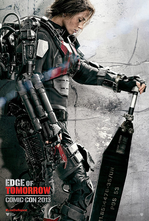
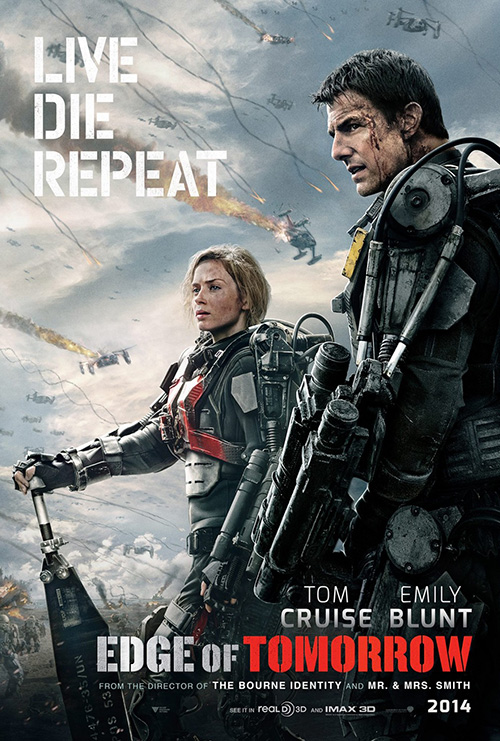
The new Doug Liman film Edge of Tomorrow (June 6) is getting some good buzz of late. I’m not exactly sure if Warner Bros. anticipated it, however, when you take into consideration the fact they’ve released posters from three different design firms—the first of which bowed at 2013’s Comic-Con. While it’s a genre flick that should play perfectly with those who attend such conventions, that’s a lot of money thrown around so far in advance. Tom Cruise or not.
I definitely don’t oppose the strategy if you have the budget to do so. In all honesty, those sheets by P+A are my favorite. There’s an abstract art quality to the background creating a duality of vision that could pass as concrete wall scuffed to hell or gray smoke filled with debris of a battlefield. Emily Blunt is in silence repose, her tech in all its glory, and a gorgeous line of lens flare shooting across her chest. The logo is a bit clunky yet relevant in its metallic stencil and thankfully easy to forget in lieu of the unblemished full profile above.
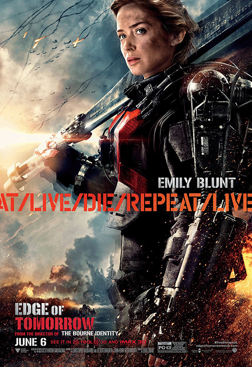
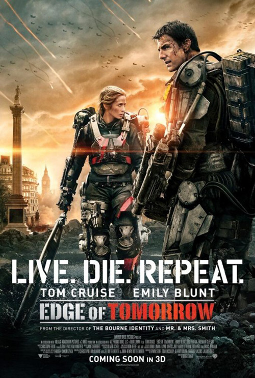
I have a feeling Concept Arts thought the same (or at least Warner Bros. did to request a similar style) as their character ad tries to do the same with added action. There’s a sun glare this time, we get to see Emily’s eyes, and her armor is rendered a bit more realistically. But what I love is the cropped band of next repeating at the middle “Live / Die / Repeat”. It has me designing teaser sheets in my head where that cycle covers the entire page, sparking the creative juices to figure out a way to make the photography mimic an identical sense of infinity loop.
 |
 |
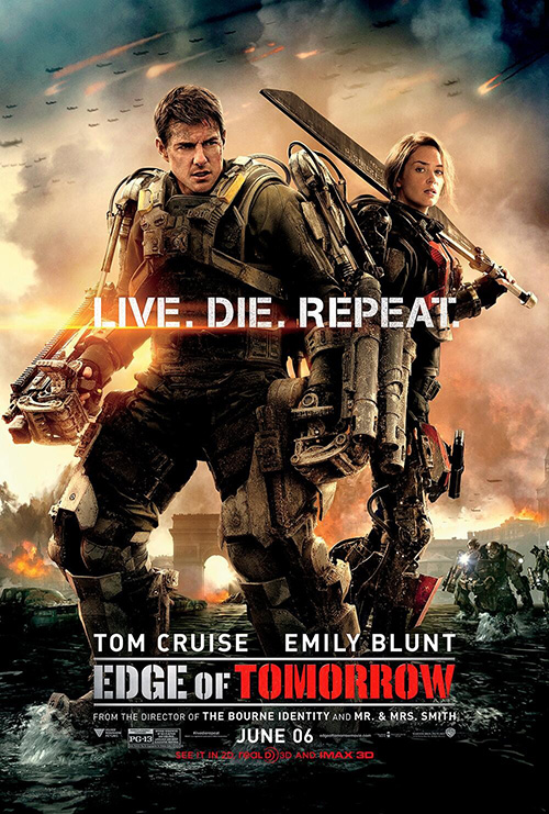 |
It’s a rarity but these character sheets are light years better than the main ones pitting Blunt and Cruise together in frame. The two from Concept Arts want to create the same composition yet fail with the increased areas of focus. Buildings are added, the actors never quite appear to be populating the same plane, and the tagline line minus the visual repeat loses its impact. Better than WORKS ADV‘s desire to turn its heroes into Gods by fooling with perspective to make them victorious giants rather than humble soldiers, they just aren’t as appealing as the ones above.
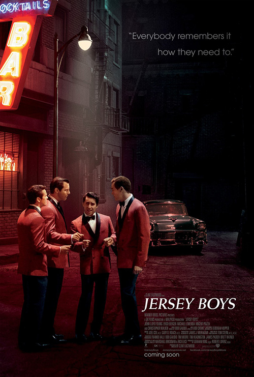
cold open may not have as many variations for Jersey Boys (June 20) since they are just one company, but it’s interesting to witness theirs and the studio’s thought process for change considering how similar both iterations are.
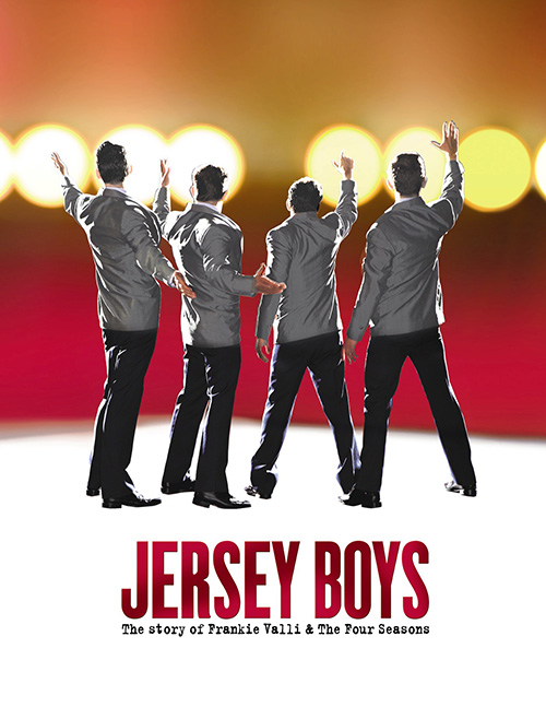 |
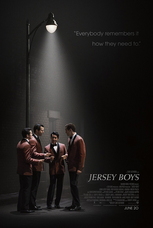
To start, I like the way they dealt with the problem inherent to quickly copying the playbill imagery. What makes the Broadway cover so fantastic is how it depicts one of the musical’s best moments where the back of the stage becomes the crowd to which The Four Seasons perform. The whole thing becomes a faux concert where we watch them sing to a nonexistent audience, thrusting us onto the stage to absorb the chaos of success. Being a movie—not to say Clint Eastwood didn’t find a way to match this exhilaration—makes such a first-hand experience irrelevant.
How then do you solve the issue? By going back to the beginning—on the streets and under a lamp. This first design creates an atmosphere of introduction as we can almost hear the notes coming out of their mouths to the snap of their fingers as the darkness save that carefully position light allows the piece to bridge the gap between stage theatricality and cinema.
The second may not look very different, but its effectiveness surely is. By putting that building behind them with the bright neon glowing sign and the old fashioned car, the designers erase any remnants of the theater origin. We’ve officially exited artifice into a photograph with a specific location. No longer attentively watching as music is made where the light forces our eyes, we’re simply viewing a static advertisement with little to hold our gaze longer than a quick second.
Dots per inch
 |
 |
 |
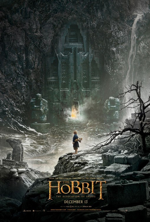 |
I know it’s nowhere near as effective as Ignition‘s sumptuous environment for The Hobbit: The Desolation of Smaug, but there’s a similar quality to BLT Communications, LLC‘s Transformers: Age of Extinction (June 27). The awkward 4/Optimus Prime logo is small and at the bottom, our characters are depicted small and in the foreground, and everything behind is allowed to exist as a monumental point of focus. A weird metal behemoth is less than interesting in comparison to the gates of Dol Guldur, but you get the point. At least they tried.
There’s motion, depth of field, and a sense of danger—three things absent in the firm’s other entries. BLT attempts to find success again with their shot of that same aircraft behind a walking Transformer and bellows of smoke, but the lack of humans and its boring symmetry do nothing for the sake of excitement. I do prefer the full title as opposed to that icon, though. Kudos for that switch.
As far as the rest … snooze. Optimus on a Dino-bot is cool initially, but what else does this poster bring? Nothing. It’s a simple attention grab for fanboys who know what that robotic dinosaur is and trust me: they’ve already witnessed it in full effect during the trailer. The fourth design is even worse and as stagnant as a collage of characters can be. Everyone’s Photoshoped in with masking applied to pretend there’s depth, but Optimus can’t help looking like a cartoon in the juxtaposition. Summer tent-pole star power wins again.
Where Transformers finds itself utilizing computer artwork composed of pixels in a fine enough resolution to trick us into believing it’s real, three other movies are being sold with an aesthetic that pushes the pixels of photography beyond their limits.
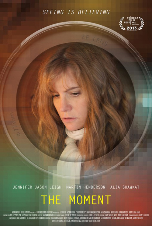
First up is The Moment (limited June 6) and its visual representation of the tag “Seeing is believing”. It’s not a great poster. The fonts are drab, the ghosted camera lens floats without purpose, and Jennifer Jason Leigh‘s photo is from a scene that doesn’t quite fit the design. With everything outside the lens boxed and blurry, I have to believe the artist is trying to create a window for us to look through, but nothing is set up to make such a feat realistic. We can read the text on the lens meaning it’s facing us and Leigh appears to be checking out something on a table exactly where we’re standing since the out-of-focus part of her scarf is the same ratio as the in-focus (no zooming).
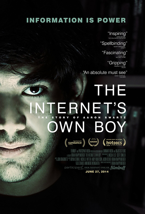 |
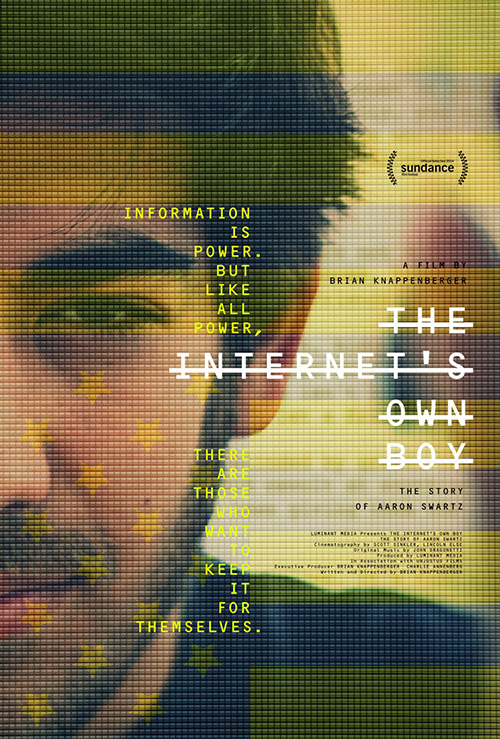
Next is The Internet’s Own Boy: The Story of Aaron Swartz (limited June 27) by The Boland Design Company. I really like this one. It’s very similar to a more straightforward iteration from The Refinery, but they take the idea of seeing their subject through a computer screen so much further. The pixel boxes are in-your-face, the crossed-out text a nice play on redaction, and the upside-down American flag motif a pretty powerful statement. Swartz was a “Hacktivist” after all—one many probably never heard of unless you know the origins of Reddit. Boland understands that they have to introduce him to audiences in some respects and their stylistic choices do just that.
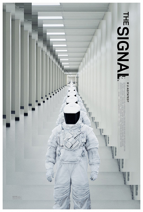 |
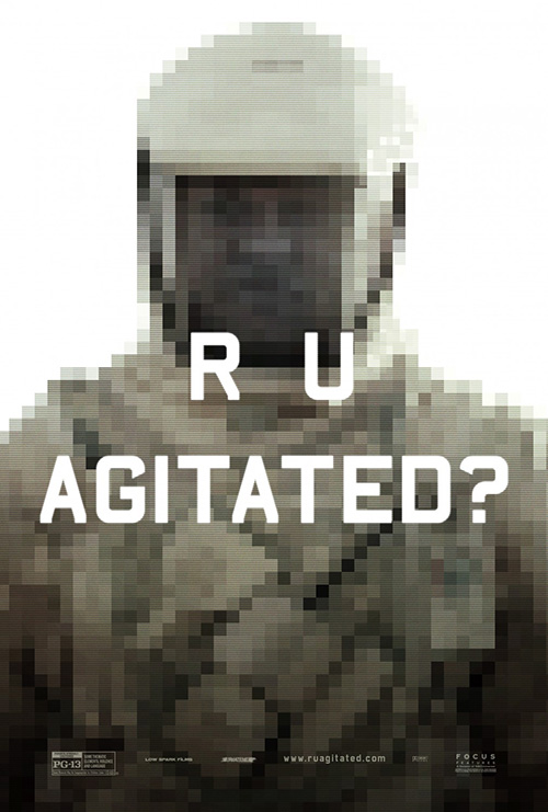
The third is an interesting bit of psychological manipulation by Gravillis Inc. for The Signal (limited June 13). There is no apparent reason for the image of Lawrence Fishburne to be pixelated until you read the text “R U Agitated?” You find yourself answering silently with a “Yes” because you want to know what’s going on. Is he falling apart on a computer screen? Is our vision leaving us? Is the titular signal causing it? There’s a palpable sense of discomfort that the firm ratchets up even further with their second advertisement.
It’s this version where we don’t even get to see who’s in the suit that makes you sick if you look at it too long. Is it a practical shot from the film with a room of mirrors set-up specifically to cause this echo? Or did Gravillis simply have some fun blowing the two-dimensionality out into an accordion of flat depth back to its vanishing point? I don’t know and I don’t actually care because the feeling it’s meant to manufacture is made.
Fierce eyes
 |
 |
 |
 |
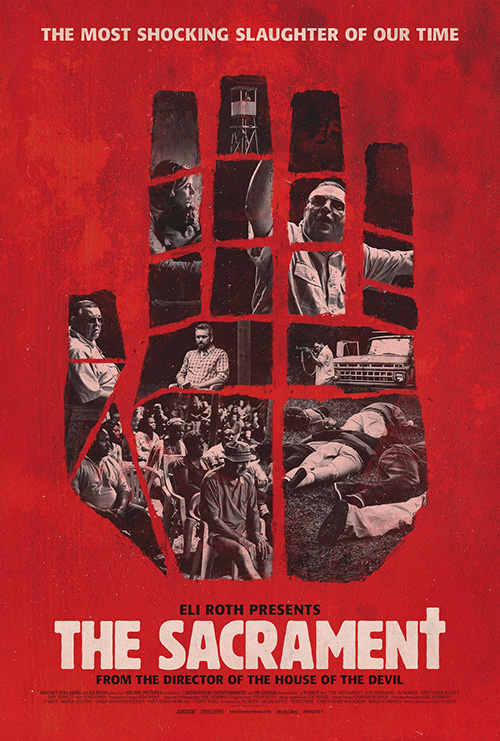 |
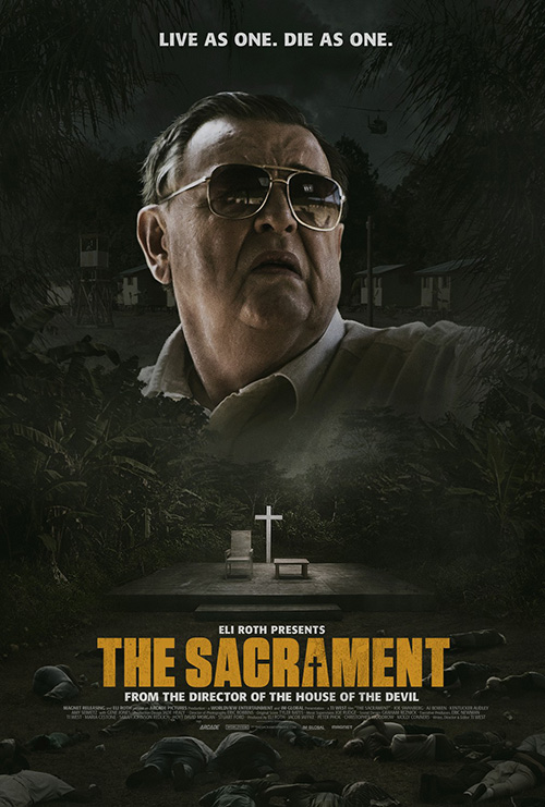
There’s something eerily creepy about Gravillis Inc.’s poster for The Sacrament (limited June 6) and it’s not just my eyes trying to tell my brain that the giant floating head is John Goodman when it’s not. No, it’s the sense of darkness in every corner from the still, dead bodies at bottom to the solitary helicopter coming too late through the trees. And the glow of the cross at the center can’t help but juxtapose salvation against hubris—a stage set for a mass murderer to lead his flock to their destruction.
The logotype is subtle and effective with its rough, grunge texture and the cross counter in the second “A”. Its color pops it from the heaviness beneath and the tiny white supporting text to move our eyes up towards its monster in full control. The imagery is so much better than their cutout hand creating windows of film stills against a blotchy red. I rarely applaud a floating head over graphic artwork, but here we are.
 |
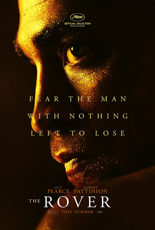 |
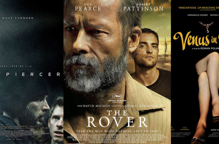
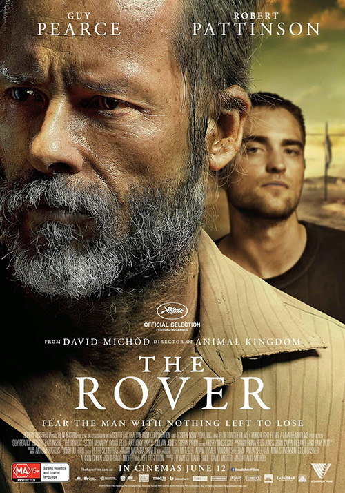
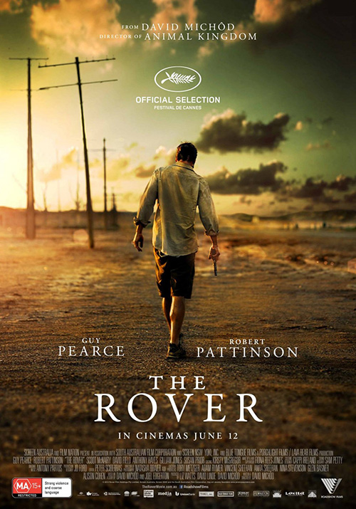
For The Rover (limited June 20) I choose the sheet with Guy Pearce‘s sadness in a motionless, mid-quiver above Robert Pattinson staring directly at us as the winner of its campaign. The title is positioned and sized nicely to balance the “The” above the “V”, Pearce’s beard and pores are in extreme focus to the point where we could count each, and there appears to be a crucifix in the distance with a man affixed—possibly a clothesline or electric pole but definitely an intentional addition.
The sense of drama is extreme and almost matched by Jeremy Saunders‘ shot of Pattinson stumbling away from us with gun in hand. The lighting is perfect, the contrast beautiful in its yellowish tint. I want to know where he’s going as much as where he’s been, wondering who it was he’s killed as well as who he seeks. It creates a separate air of mystery without Pearce—one of greater danger yet almost as much compassion from the slumped shoulders alone. As menacing as Ignition’s shadowy character sheets, these first two also include a touch more humanity to ground things in the helplessness of a man with nothing to lose as much as hardened unpredictability.
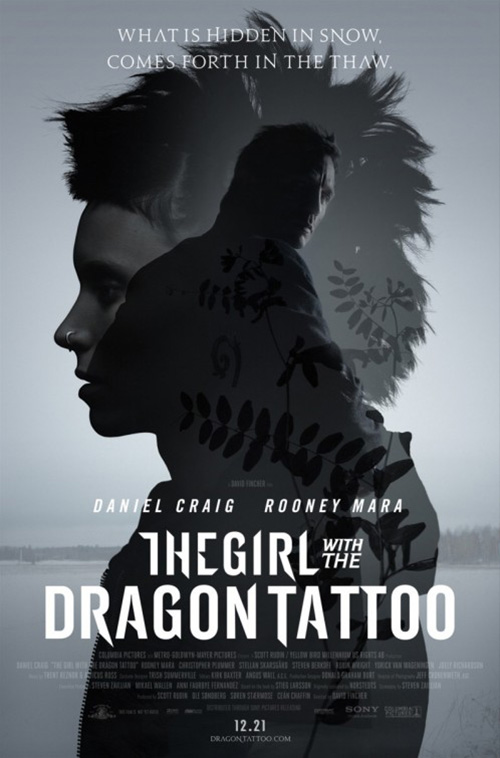 |
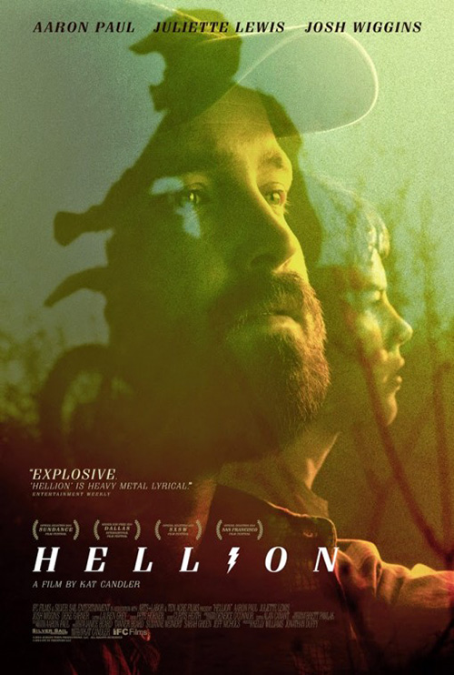
It’s that same heavy sadness that P+A instills with Aaron Paul on their double exposed artwork for Hellion (limited June 13). Similar to The Girl with the Dragon Tattoo coupling of one character in profile and the other in three-quarter, we look into both souls through the transparency and their eyes. The coloring is almost a combination of warm and cold, keeping us unsure of the emotionality while also pointing us to the right direction by its silent elegy of small town folk and dirt bike appeal.
I didn’t like the title font at first, but it has grown on me a lot after subsequent views. There is something electric about it—and no, not because the “I” is a lightning bolt. The angled slab serifs are simultaneously blunt and sharp; the kerning between letters wide and purposeful as the italics moves us through. It makes us look at its two halves: the word meaning a child who behaves badly turning into “hell” and “lion” with the dark abyss of the distant stares above foreshadowing a horror you can’t begin to anticipate.
 |
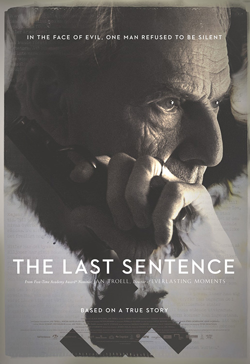
The Boland Design Company does a similar thing with The Last Sentence (NYC June 20). Here the hazy fog of contemplation creates clouds of ink as though suspended in water with a face melting into swastika and what is probably an example of the Hitler and the Nazi criticism he printed as editor of a Swedish newspaper.
It’s so much more mesmerizing than the original international poster that utilizes the same photograph. We get to see the full gun now, embrace the complexity of the era in which this character lived, and really understand the struggle he’s experiencing as more than mere portrait. In all honesty, the Swedish one could be showing a man on the phone as easily as one ready to fight.
Dramatics
 |
 |
 |
 |
 |
 |
 |
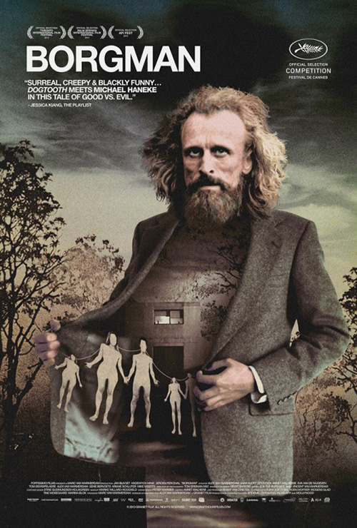
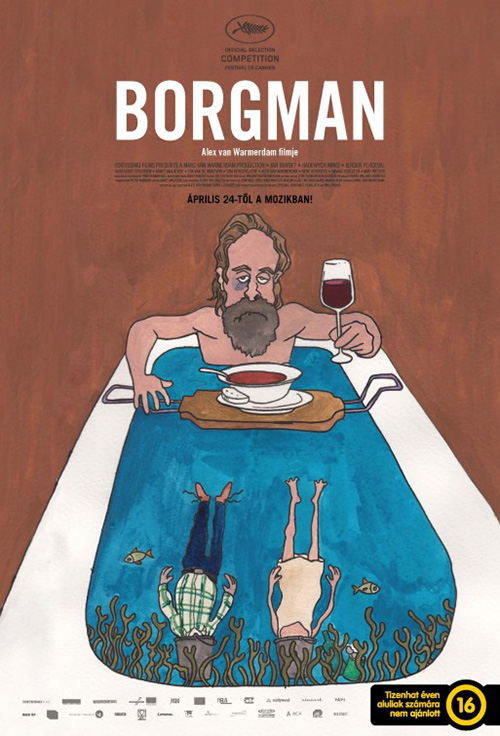
I don’t think I’ve heard people talk about a film more than they have Borgman (limited June 6) this past year. Generally revolving around adjectives that intrigue enough to the point I truly don’t want to know anything about it before sitting down, checking out these posters has been my first exposure to the film itself. Let’s just say this new English-language sheet is in accord with the reactions I’ve read.
How could this imagery not whet your appetite and get your thoughts swimming? A crazed Jan Bijvoet alone is enough to arrest your gaze let alone the treasures hidden inside his jacket. It’s a surreal portrait wherein his under shirt disappears to reveal the Xerox-copy of a landscape at his back as overly-detailed paper dolls exit to depict a warped sense of nuclear family outside a cement block house that seems more prison than home. Is he letting them out or inviting us in?
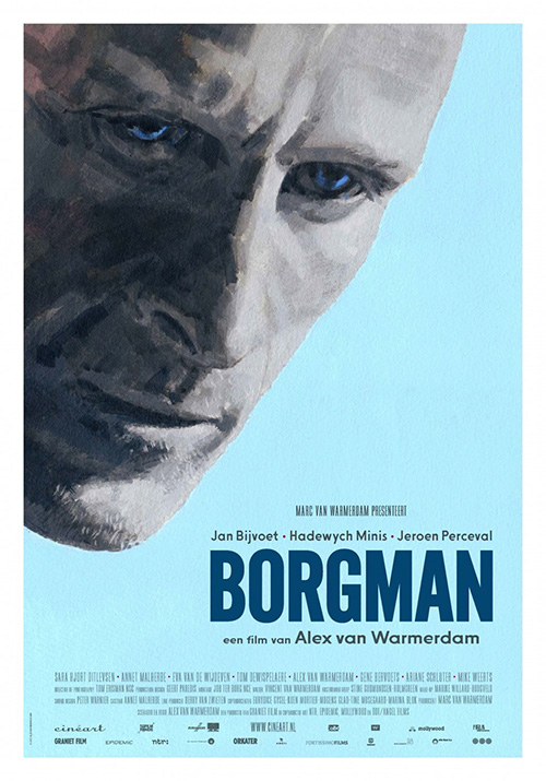
It captures a mood that the foreign posters simply do not. I’m not sure what is going on with the cartoon tub—two people dead in buckets while he dejectedly eats soup? It’s goofy, weird, and playful—three things that for all I know may better describe the film than the photographic manipulation of horror. They just don’t do it for me. And neither does Alex van Warmerdam‘s painting. All it does is make me think of Hunger.
 |
 |
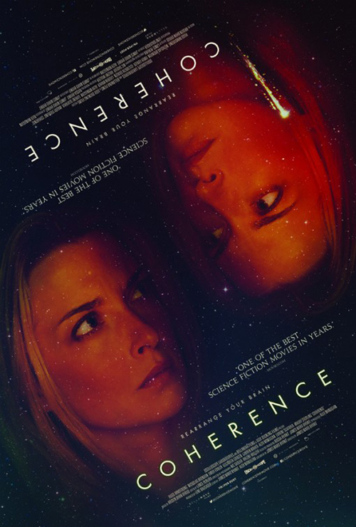
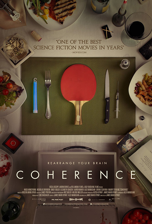
Coherence (limited June 20), on-the-other-hand, finds a way to captivate with photo imagery and abstract comedy. I really enjoy Juan Luis Garcia‘s flippable entry. It’s unsettling in its mirrored axis, copying itself everywhere except the comet flying at top right. Or is it? The way Emily Baldoni‘s faces fade into the starry black sky creates a shadow that appears darker on the bottom head in comparison to the top. I know it’s probably just a trick of the mind, but I can’t help thinking the left one is angry while the right scared.
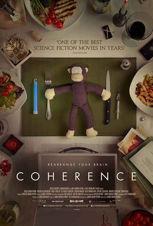
Willing to go in a different direction, Juan Luis Garcia also gives two very similar sheets of a dining room table. One has a photo of Baldoni and the other Nicholas Brendon, one a Ping-Pong paddle and the other a stuffed monkey. There are more inconsistencies to spy upon from the number on the di, tomatoes on a plate of grilled chicken, as well as the type of wine. A puzzle so subtle you truly need both to be hanging from your indie theater’s wall to notice everything, of course I want to watch the film and discover even more.
 |
 |
 |
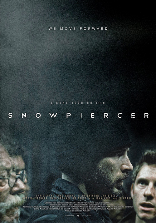
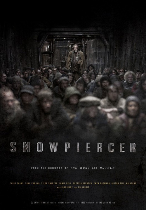
Moving from mystery to mood, this advert for Snowpiercer (limited June 27) is gorgeous. A glorified film still that manages to get John Hurt, Chris Evans, and Jamie Bell all in frame despite three-quarters of the whole being a grainy mist of night, it instills a feeling of claustrophobia that I’m sure aligns with the film being set on a train. The title is permeated by the darkness just around the letters’ edges as though being taken over and we’re left wondering what’s hiding in the nothingness or perhaps even fearful it may reach out and grab us too.
The second sheet is also good besides its weirdly filtered title looking like a bad emboss. Hurt is seen rising above the faceless hoard coming towards us as a beacon of hope amongst the dire straits he transcends as the walls enclose us in their metallic prison like sardines in a can and we almost find the need to turn around so as not to be engulf by the mass of humanity coming our way.
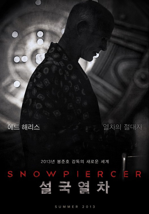
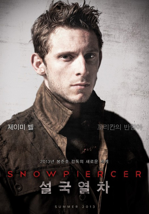
Sadly the original Korean posters never quite equaled this success with a string of character sheets portraying squalor and one innocuously darkened silhouette wearing a jacket covered by symbols. There’s no scale or stakes—two things the stateside examples have in spades.
 |
 |
 |
 |
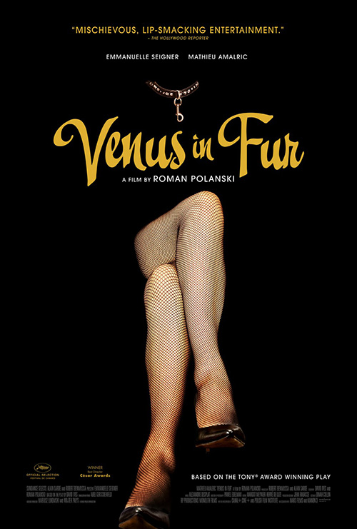
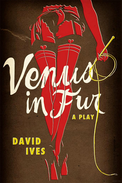
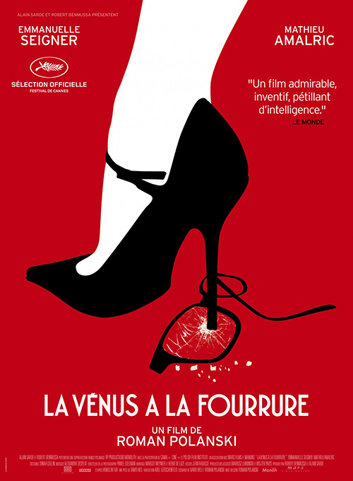
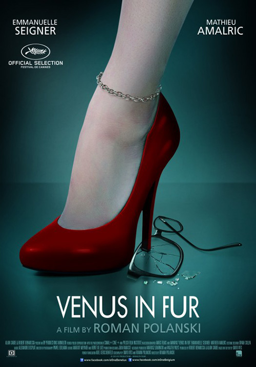
The same can be said about Venus in Fur (limited June 20). Where Le Cercle Noir‘s international iteration looks to update the imagery used on the cover of David Ives‘ play, Gravillis Inc. goes all-out with their insanely dramatic American release. Rather than simply turn the French design from illustration to photo—possibly because someone already did to horrible effect—Gravillis increases the sexuality and suspense by forcing us face-to-face with a disembodied pair of legs.
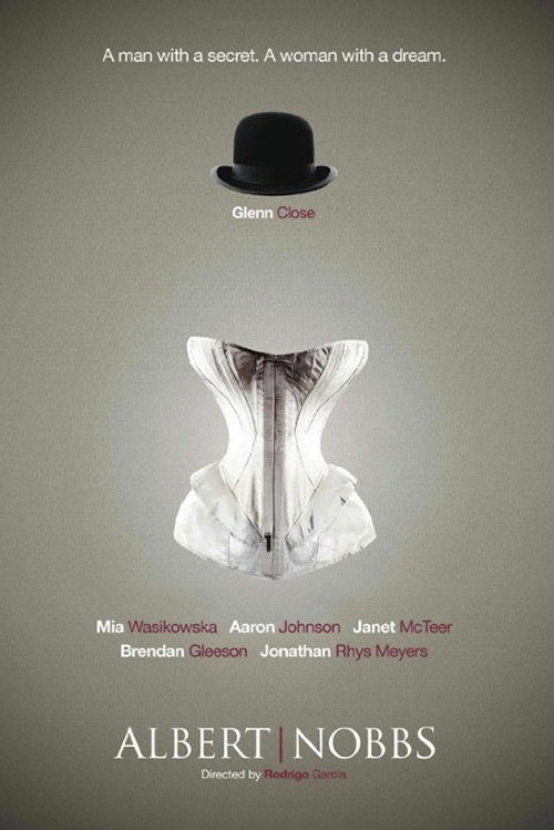
The font goes back to mimic the original play cover and provide intrigue above sans serif coldness, adding a playful flourish to the fishnet contours and pitch-black space. It’s a perfect evolutionary step from Creative Partnership‘s Albert Nobbs, deconstructing the female form in a way that makes the subject generic while allowing the substance to remain uniquely specific. It’s another striking piece of art by Gravillis, who are fast becoming the benchmark for movie poster craft.
What is your favorite June release poster? What could have used a rework?