It’s The Batman time (wide, March 4). As such, there aren’t many studio pictures hitting theaters to combat the cowl this month. So, with Turning Red (Disney+, March 11) going to streaming, the time for counter programming through indie and foreign titles is here. Hopefully your local theaters comply. If not, there are a few below hitting VOD too. You can go to Gotham and still return home for something more low-key.
And there’s always Oscars catch-up with the last few nominees finding their way to digital and/or streaming this month. That also means the alternative poster game has begun to increase in the lead-up to March 27’s ceremony. Here are some of my faves from Needle Design, Eileen Steinbach, Haley Turnbull, and Scott Saslow:


A familial pose


There are so many sightlines in P+A’s poster for After Yang (limited & Showtime, March 4) that it’s impossible not to find your way through the entirety of the page. Jodie Turner-Smith is trying to catch her husband’s eye as she looks left. He (Colin Farrell) is avoiding her gaze to ultimately look past his daughter towards the bottom right corner. She’s (Malea Emma Tjandrawidjaja) pointing her worried expression at her malfunctioning android companion. And it (Justin H. Min) is staring at nothing with a blank slate of lifelessness. The gorgeous horizontal flare of light singles him out as “other” to the humans, separating adults from child to show the family’s fracturing dynamic.
My only issue with the whole is how jammed the text feels at the top. The critic quotes are tiny and yet still distracting since they fill the whole area in a way that makes the title feel like a crammed in afterthought. It’s too bad because the image is rendered with such a welcomingly light touch with its haze and soft texture.
The designer of Jane by Charlotte (limited, March 18) avoids this problem by not being asked to find places for extra text. Without a need for excerpts, they can use the symmetricity of the image—daughter and mother / director and subject, back-to-back—as a solid vertical axis for our eyes to move from top to bottom. Laurels to photo to title to credits. It’s simple yet attractive, giving us everything we need with clarity and boldness.
Because even though we’re practically looking at silhouettes, we know exactly whose faces are being highlighted with that sliver of light. Those bright orbs in the sky also nicely punctuate our descent like flashing bulbs moving us from left to right and down to the only other stark white piece of the whole: a uniquely rendered scrawl of cursive putting the sort of personal touch this family-fueled biography seems to embrace with full force.
From simplicity to complexity comes Keith Maitland’s documentary about the hippie who vowed to give away his $25 million inheritance in 1970 to help fuel world peace entitled Dear Mr. Brody (limited & VOD, March 4; discovery+, April 28). Frost Foundry’s extravagant linework on its one-sheet takes the centered theme of money and runs with it to create a new framed portrait of American royalty complete with flower power, marijuana leaves, and cupids to go along with gorgeously hatched drop shadows, hallucinogenic waves, and ornate banners.
Everything is working in tandem from festival logos to critic blurb to title—this monetary facsimile firing on all cylinders for what’s easily the most striking poster of the month. How could you avoid this detailed assault of visual splendor when surrounded by otherwise glossy photos? It’s more akin to the elaborately illustrative world of screen-printed show posters than Hollywood advertisements, its artistic merit far outshining any homogenously commercial tropes.
Center frame
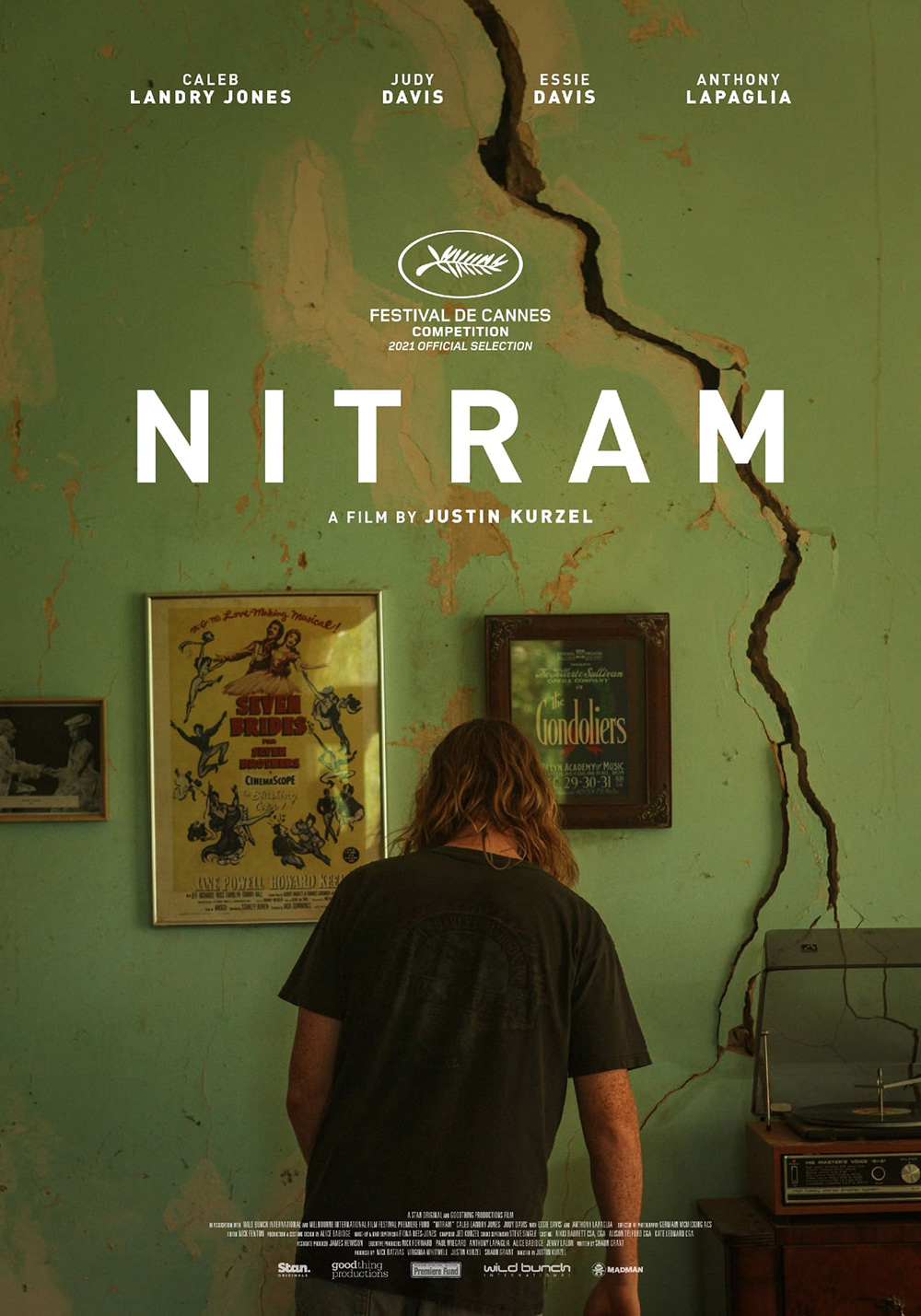


I haven’t seen Nitram (limited & VOD, March 30) yet, but I’m going to guess that the image used on the poster is taken directly from the film. If so, it proves to be one of those perfect moments that fully encapsulates the whole and kudos to the artist for singling it out. Because this is a story about a man in the lead-up to tragedy (namely the 1996 Port Arthur mass shooting in Tasmania). What better way to show the fracturing of self and perhaps sanity than placing the perpetrator (in this case Caleb Landry Jones) at the center of a house in disrepair with a massive crack in the wall?
To have a visual like that is only half the battle, though. You still must fit in everything else that’s contractually obligated for inclusion in a way that works. I therefore wonder if some manipulation was involved because the composition is impeccable. The spacing between cast list names just kisses the edge of the drywall opening. The Cannes laurels fit nicely in the space formed by that crack and the title. And the latter’s “M” sees its downward diagonal covering the hole like a puzzle piece. Everything is measured to balance above this troubled soul, his back turned to let the scene speak for his mental state alone.
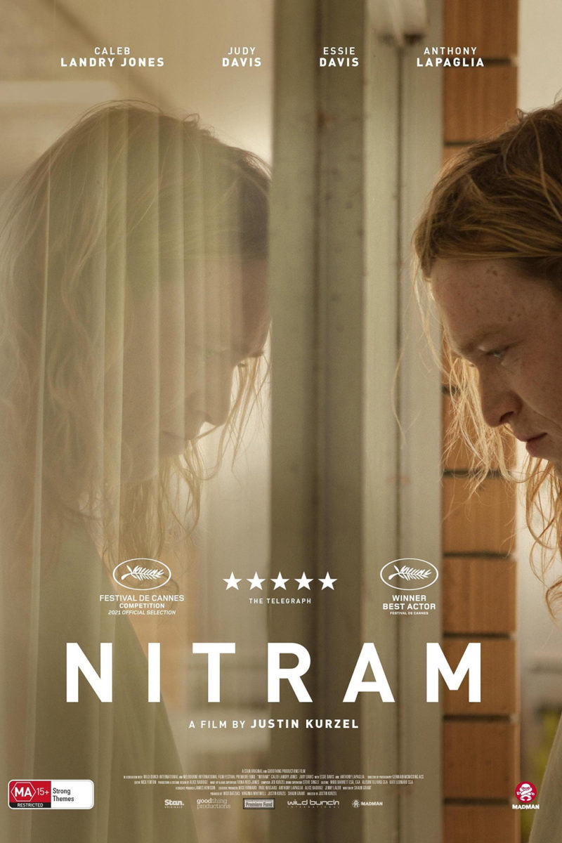
The Australian sheet isn’t too bad itself, using the exact same pieces in different ways. Here the text gets out of the way of the image completely, though, floating to the top and anchoring the bottom so Jones can take control of the middle. Using the reflection to create duplicity seeks to create a similar divide between man and monster, but the wall’s metaphor is just too powerful by comparison. Sometimes good isn’t enough when placed besides greatness.
P+A centers their sheet for Windfall (Netflix, March 18), but they do so in a way that rejects any play for symmetry. Rather than build around Lily Collins, they build atop her. Jesse Plemons and Jason Segel bleed off the page, each a head taller than our focal point to ensure they become shrouded beneath the title spanning the width above her. From there the cast list moves off-center, its left justification creating an edge that complements the right justification of the credit box beneath. It’s a frame crafted in three-dimensions to box Collins’ face as she gazes through the gap afforded within the chaos.
The choice to go illustration rather than photography is interesting yet crucial so that the coloring can be matched with artistic intent rather than utility. It also lends a sort of story book noir vibe, the shadows of a tree we assume sits out of frame working with the title’s blinds-like kerning to conjure an air of mystery. The typeface loses legibility as it gets smaller (and the kerning tighter), but those elongated characters add to the vertigo effect of uncertainty. Something’s not quite right and we’re dying to find out what.
A similar sense of intrigue hits us with MOCEAN’s X (limited, March 18), but this time its towards the subject rather than the unknown. We want to know what Collins and company are looking at and guessing with Windfall. Here we want to discover what the character already knows. Because that’s not the pose of a woman trying to get away from whatever occurred to put blood on her ankle. No, that’s a pose of comfort rather than fear. She’s readying to go back for more and we hope she takes us along.
This one chooses an illustration too, although it probably could have been recreated with photography much easier than the above. Its shadows are less about mystery than utility (helping the text at bottom pop above the grass) and its subject less about identity than wit. I’m guessing the firm worked up a copy without the big “X” too considering the legs create an even bigger one, but I’m also guessing the studio thought it too risky to trust the audience to make that connection. Having both isn’t bad, but I do think the legs are enough.
Skewed views


I love the Israeli poster for Ahed’s Knee (limited, March 18). Flipping the image ninety-degrees so Avshalom Pollak is parallel to the ground allows those vertical characters of the title to rise like pillars from in front of and behind him. They almost become stairs as a result, each dropping down further as they move right to left until the last one hits him in the heart. The complementary coloring is bright and vibrant, the mood severe (his expression) and yet also fun. There’s way too much text otherwise, but that giant title dwarves it all to the point of disappearing into the background.
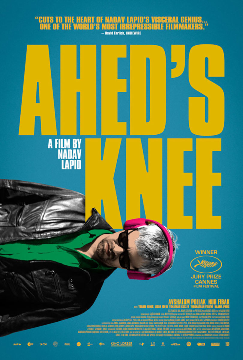
You can’t therefore blame Kino Lorber’s decision to use it as a jumpstart for their own US counterpart. But where it improves on the use of space insofar as the superfluous text is concerned (switching away from white does wonders), you can’t help but feel letdown by those English letters simply existing. It’s really clean and expertly laid out and yet the movement is lost. The kinetic energy of the original is literally lost in translation.
We move from positive space to negative with AV Print’s wildly creative and minimal design for Everything Everywhere All at Once (limited, March 25). Depending on how you look at it, there is no text at all. It’s just googly eye upon googly eye, big and small alike, stuck everywhere all at once. And yet the words are so clearly defined anyway. With only black and white at their disposal, they’ve made it so that the title pops off the page in a way that tricks our minds into believing it’s the positive space.
Ingenuity aside, however, the real success is how creepy the whole proves. You wouldn’t think it possible, not with the comedy inherent to the only object in frame. Despite those eyes being funny after they’re slapped onto faces or used to create them, the sheer number on display here flips a psychological switch. Beyond even trypophobia, though, the thing I can’t stop seeing is how every single one of them is looking off to the left. It’s one thing to be static and fall to the bottom middle. It’s another to be synchronized towards a fixed point. I shudder to think what’s waiting in the wings.
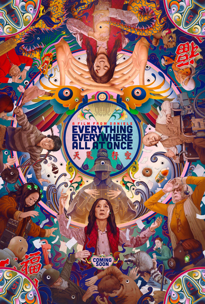
To look at James Jean’s elaborate illustration tempers some of the teaser’s horrors with surreal, metaphysical anomalies instead of monsters. Its revolving circle of chaotic figures trapped in the real world (bottom) and the spiritual world (top) adds layers upon layers of dimensional breaches merging work with fantasy and more. It’s a gorgeous display that surely holds numerous Easter eggs for anyone who’s already seen the film—whetting appetites and satisfying converts alike.
Even so, no sheet this month compares in sheer WTF-ness to Vasilis Marmatakis’ Great Freedom (limited, March 4; MUBI, May 6). I’ve been gazing at this wonder since last fall’s festival season and it hasn’t lost any of its allure in the months since.
A man readies to look out the window on the metal door of his prison cell. That same man pushes through another window from the other side. The latter is smaller and centered, rendering the former a two-dimensional image rather than a three-dimensional scene itself. It’s an optical illusion made weirder by the disembodied hand of another lighting Franz Rogowski’s cigarette—its positioning making it so that the window is about waist-high rather than head-high like the bigger image. In and out we go, wrapping our heads around the logistics until we realize the loop is the point. Inside or out, this man has nowhere to go.
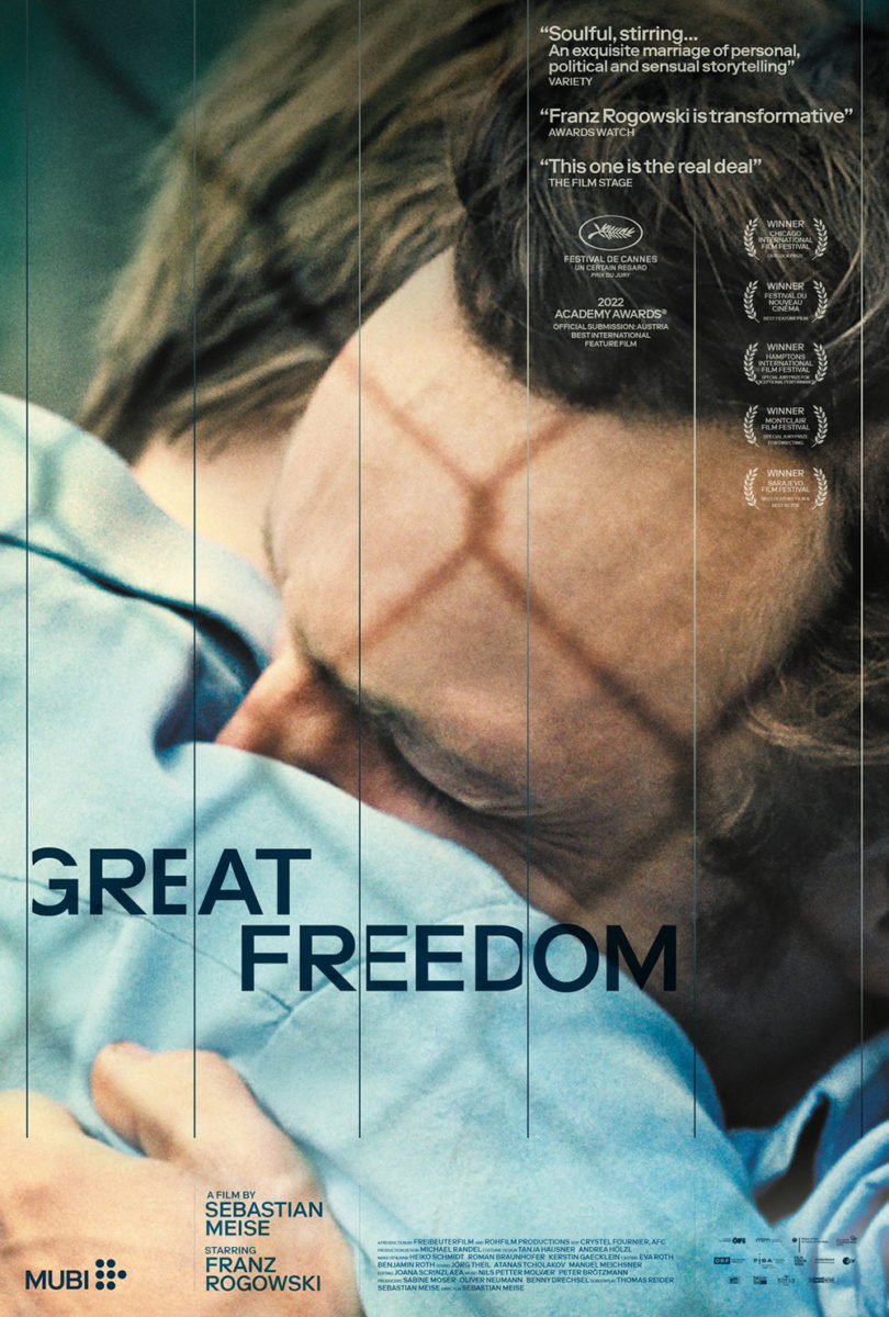
It’s an absurdist nightmare. An existential crisis by way of flattening time and space. How can you not get drawn into the drama?
Not that the latest version isn’t equally dramatic in a more straightforward way via emotional release. It might not be as unique, but it remains powerful in its simplicity with a tearful embrace trapped behind its own bars. Those lines are subtle yet binding—forcing the letters of the title to consume themselves before daring to get too close.