Sure, July is bringing back the Fantastic Four (July 25), Superman (July 11), and Jurassic Park (July 2), but they aren’t the reboot that caught my eye. No, that distinction belongs to Rihanna is Smurfette (July 18).
Not only is it wild that this franchise still believes itself to be relevant, but the number of times it’s been resuscitated this century has me wondering if the world would somehow end the second Gargamel eradicated his tiny blue nemeses. Paramount might literally be keeping us alive. Or prisoner. I’m not certain which.
Because there’s obviously enough of a brand recognition problem to feel comfortable intentionally burying the actual title of Smurfs on the page (if it’s included at all) so Rihanna’s credit can earn our focus. She’s their main selling point, so you can’t blame them for leaning in.
Everything old is new again––if a global phenomenon is hocking sales.
Thankfully, we have some new stuff coming to theaters too.
Faces


Although I’m putting the poster for Saint Clare (limited & VOD, July 18) under the heading of “Faces” because of Bella Thorne’s mug filling up the entire page, my favorite part of the whole is the title treatment.
Sure, the textured grain, muddy coloring, and bright crucifix in her eye make it captivating with the bright-yellow information superimposed on top, but I love the font and removal of the horizontal bars from within its As. Something about the space created from their absence renders it strangely off-putting. I can’t stop looking, as though there’s something to find or a hidden meaning to decipher. It’s purely aesthetic, but just unexpected enough to question my own sanity.
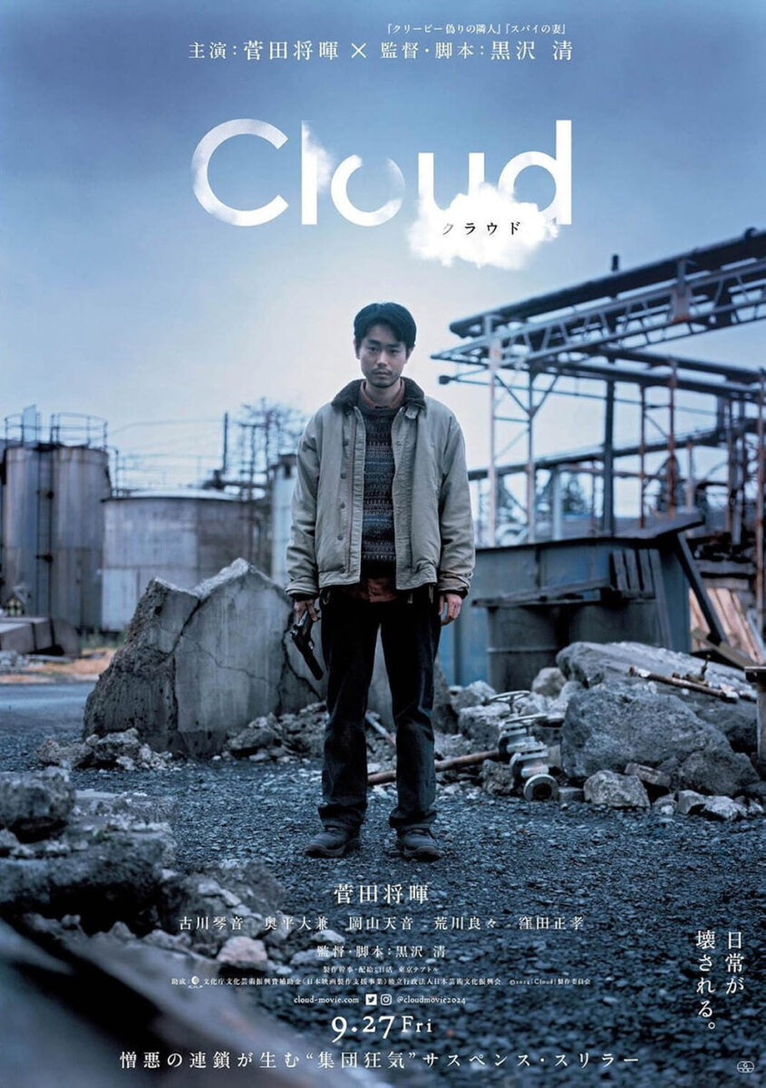
Similarly, while Masaki Suda’s face is a central piece of the poster for Cloud (limited, July 18), everything else demands I look away instead.
There’s the gorgeous, disappearing title fading into the background, as if a mist at the beginning and merging to create a new shape of condensed water vapor at the end. There’s also the shallow depth of field blurring the gun we know is in his hand and pointing our direction. His face is crisp and clear to recognize his state of mind, but the rest conjures atmosphere, suspense, and intrigue.
It’s a marked improvement over the Japanese sheet’s more straightforward approach of showcasing Suda, gun-in-hand, at the middle of a wide shot. He almost fades into the background since his clothes have the same coloring as the construction scene behind. I like this effect because it mimics the title flickering between solid and gas––here and there––but you do lose the drama that targeted focus provides.
That truth changes if you excise pieces from their scene to construct a more graphic, collage-type feel à la Fable’s Kill the Jockey (limited, July 2). Yes, everything is in-focus, but it’s cut-and-paste rather than a backdrop pose. It’s about placing a ton of elements onto a canvas and reorienting them to craft a memorable concert of visual motifs to tell a story.
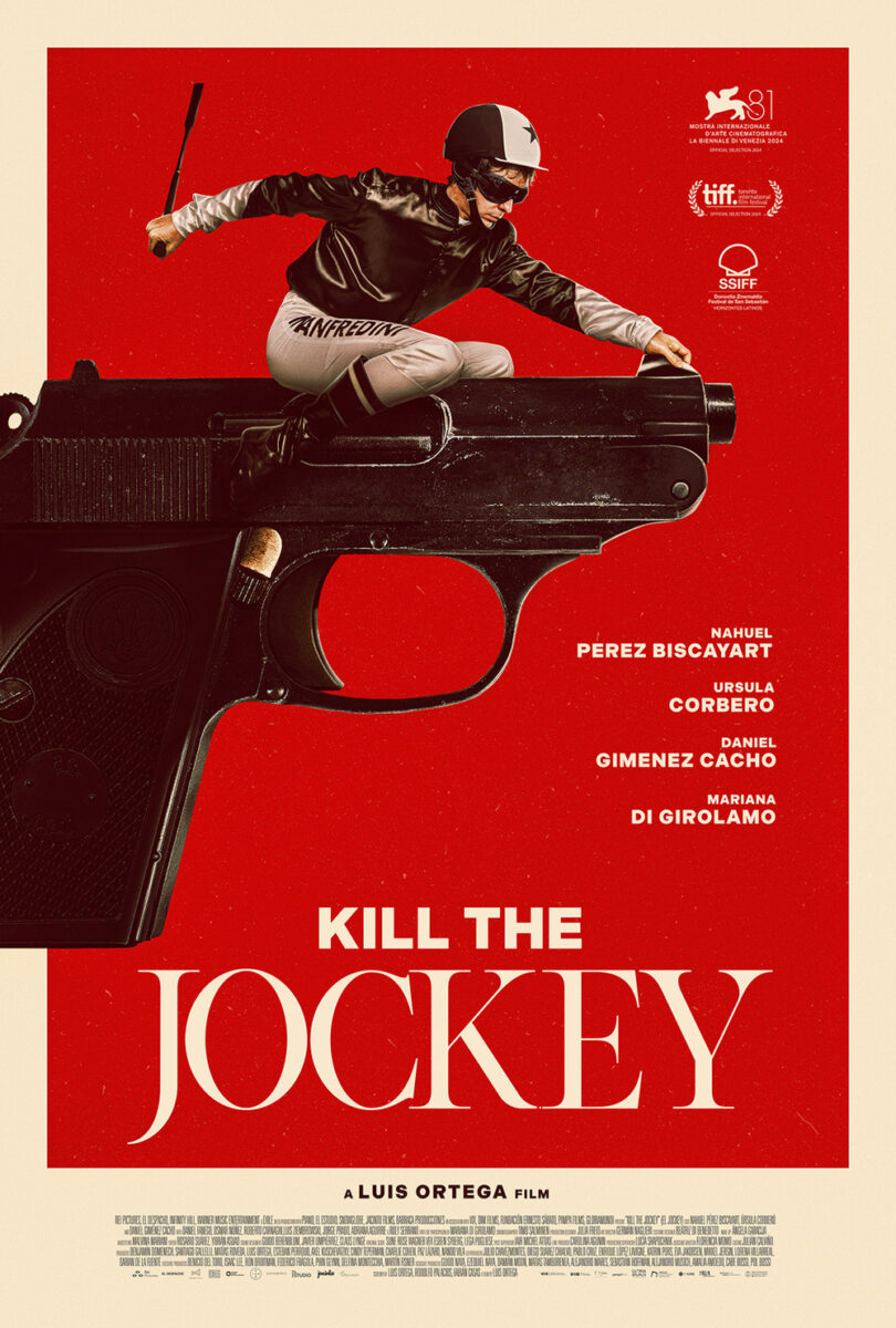
A gun points towards the jockey, but he is positioned upside-down through the top of the frame. Maybe it signifies that he’s crazy. Or maybe it means the act of murdering him won’t be as easy as the shooter assumes. It’s as much a tease of content as it is tone by setting up the players (with two people reflected right-side-up in his googles presumably being responsible for the hit) and deed in jest.
This becomes truer in the second sheet: the jockey is now riding the gun as if it was a horse. The absurdity is the point. The confusion as to whether he’s the target or the shooter allows us to bask in the fun without getting bogged down by any story. It’s also much cleaner in composition by balancing text against image, whereas the other sought to fit blocks of information wherever it could. This one breathes with motion, shooting our gaze left to right and straight towards our seats.
Pairs


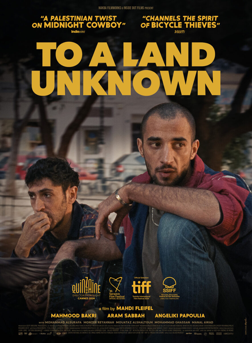
Two cousins desperate for escape. That’s the drama we see depicted in the one-sheet for To a Land Unknown (limited, July 11). It’s in the eyes of their translucent portraits and the dark quiet of the nighttime backdrop beneath. Two men stuck. They can’t go home to Palestine and can’t leave Athens without money, so they hatch a plan and sit in determined silence awaiting the moment to put it in motion.
It’s a simple composition that provides environment as well as character, one atop the other. The title treatment follows suit with one line of solid white and the other in outline. There and not. Existing and surviving. Ready and uncertain.
You get a bit of that in the original festival sheet of the same two men sitting and looking offscreen, but Watermelon Pictures’ version definitely ups the ante for emotion. By stripping the vibrance away and removing the yellow for cool blues and grays, it takes us from a window into the film’s world to one that looks into its soul.
Bianca Moran Parkes and Bangers & Mash’s teaser for Together (limited, July 30) is conversely looking into itself. Literally. Two eyeballs approaching each other, zero wiggle room as the lashes and lids surrounding them begin to merge and pull. It’s a discomfiting image that will surely make some squirm and second-guess whether to buy a ticket; it’ll confirm for others that they must. Add the title mirroring this effect with tightened kerning conjoining each letter and there can be no mistaking the word’s meaning.


I enjoyed Neon’s marketing campaign’s slow evolution forward without losing the plot. From eyes to lips to arms, the camera zooms out to reveal the two leads’ identities while still maintaining the body horror potential of their union, all the while introducing the shift from intimacy to terror once the reality of their situation comes into clearer focus.
For me, though, it’s MOCEAN’s poster for Abraham’s Boys (limited, July 11) that truly gets under my skin. The previous film’s materials all have a sheen of computer effect that keeps viewers at arm’s length; this one maintains authenticity in its more practical make-up work of two puncture wounds and the trails of blood flowing out.
It’s very stylish in its crop and captivating in its seeming indifference to the nightmare it depicts. This woman isn’t afraid. She’s instead presenting her wounds as something to be witnessed and, perhaps, desired. The text and holes are perfectly centered along the y-axis with the title placed on the hinge of her neck so our eyes can travel down the rivers of red to finally rest on the crucifix around her neck. It’s a scene of contradiction and intrigue. How could you not want to find out more?
Peaks


If U2 could do it, why not us? Those are the sentiments surrounding GrandSon’s teaser for Eddington (July 18), considering this edit of David Wojnarowicz’s Untitled (1988–89)––itself an intentionally photographed crop of a diorama at the National Museum of American History in Washington, D.C.––isn’t the first instance of its use in pop culture. U2 used an edit back in 1992 for their release of “One” as a single.


As Min Chen expertly dissects at Artnet, the decision to do so is thematically sound. Wojnarowicz’s original piece was using the imagery of buffaloes being forced off a cliff to comment on the AIDS epidemic and America’s government doing the same to those infected with the virus. U2 used the artwork and subsequently donated all royalties to AIDS research. And now Grandson uses it to connect Ari Aster’s COVID-era western to its tragic canon.
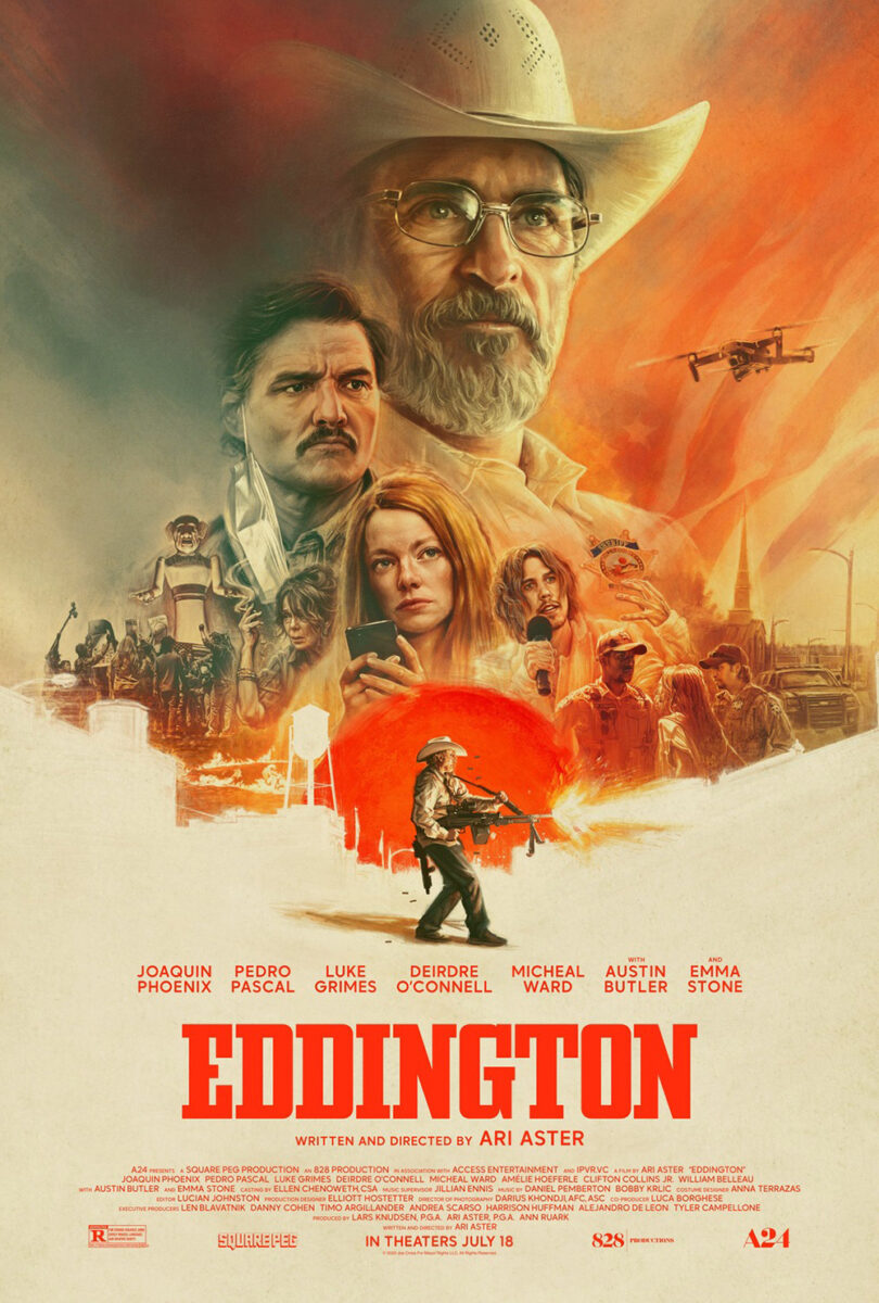
It remains a stunning metaphor, and the shift from landscape to portrait loses none of its visual impact. Credit the designers, too, for keeping the text small and white to remain legible without ever stealing our attention from the scene itself. Only the bright-red title dares to grab our focus, its hue causing a shimmer effect against the brownish gray. It’s tough to read on that background, so we’re forced to go full blinders mode with our senses to ensure we’re processing nothing else.
Jack C. Gregory’s illustration on the final sheet is a nice contrast, but you can’t help feeling let down by the loss of that initial mystique. Grandson ensures everything is highly legible and literal here. Cast collage, text block, dark info on light fields. I wonder if A24 initiated a quid pro quo: yes, we’ll use your artsy teaser, but only if you also produce a mainstream Hollywood counterpart that nobody will get confused about.
From photographed mountain peak to illustrated ant hill, we move to Pablo Bronstein’s wonderfully painted Collective Monologue (limited, July 17). The dirt mound rests in the center of the page so an anteater can hoist itself onto one side and twirl its long tongue into a cursive rendition of the title in Spanish down the other.
That alone would be a memorable-enough image, so it’s a bonus to also receive the floral frame delivering the director’s name via vines and daisy wreaths. This thing has real “illuminated manuscript” energy, but with a delicate, fun tone that creates both a scene (that tongue has a destination for us to follow) and billboard signage. There’s no way it doesn’t stand out on a wall full of glossy photo montages.
My favorite of the month, however, is the festival sheet for Drowning Dry (limited, July 18). Its peak comes from a superimposed triangle of color leading us down a dock to the jumping trajectory of kids diving into the expanse of white beyond. The geometric shape is a way to frame the children while leading us up the page, but it could also be a wedge of time moving us clockwise from the right edge of the pier.
Why? Because this is a very important scene from the movie. One that places everything afterwards in a sort of purgatory. And since we will eventually return to it onscreen, one can read that triangle both ways, depending on the direction. Clockwise going forward. Counterclockwise going back.
The typography is a huge part of the poster’s success, too. Small and centered––it becomes an end point for our eyes as we rise through the jumping boys’ bodies. The asterisk becomes a marker for us to rest on and consider a complement to the two children who also exist “outside” (it from the title, them from the orange field). The empty space provides us breathing room to move freely throughout.

The American release seeks to update the look, but in so doing loses a lot of what worked. The color change from white to dark-gray is, conversely, very oppressive. The enlargement of the orange triangle to fully encompass the dock breaks its timer wedge potential. And the giant title as a 90-degree angle (doubling one “D” for both words) puts a finite border to the whole that feels less dramatic than it does threatening.
One is a welcoming scene we don’t anticipate will turn tragic. The other screams at us to watch out because there’s danger ahead.