Theaters are back! Or that’s what the studios would like you to believe from the huge box-office takes of Top Gun: Maverick and Minions: The Rise of Gru. What’s “back,” really, is the trend of studio monopolies over screens. I don’t know how things look in the big cities, but my hometown barely opens two new films a week (not counting the Bollywood and Tollywood titles) despite there being ten different theaters. So: regardless of people buying tickets, letting these blockbusters set new records without an asterisk seems a bit disingenuous (#gentleminions notwithstanding).
As for the rare indie / foreign title squeaking through, finding them is probably easier than ever. When the same five titles take up three-quarters of the board, the outliers stick out. Even so, their logotypes and posters need to pop just to remind viewers they’re there. Odds are they aren’t getting more than a week each. No one wants to be left lamenting a missed opportunity to see what might prove to be their movie of the year on the big screen. Turn their heads with unforgettable art to ensure they won’t.
Love in the air


It only gets harder when you have the big boys like Marvel enlisting LA to create stunning, retro-chic teasers like the duo for Thor: Love and Thunder (July 8). Disney doesn’t have to push the envelope, yet they do anyway. From the color palette to the ’80s metal font to the fantastic juxtaposition between old (Chris Hemsworth) and new (Natalie Portman), you’re getting exactly what you need to let the excitement flow.
What a shame they must also deliver a final sheet with the usual laundry list of contractually obligated likenesses and names. That’s not to say these collages are always bad. LA’s version is still colorful, but also static and confused. By utilizing images steeped in the reality of their surroundings, creating a scene rather than a still life often becomes impossible. You need to conversely inject something extra into it. You need to create the energy that their more-is-less constraints cannot.


BOND does well with their Screen X iteration. They lean into the “fun” of Taika Waititi’s style and turn that band aesthetic into a Lisa Frank Trapper Keeper with repeated line work and heart / lightning motifs. It becomes an assault on our eyes instead of a lullaby. Will it turn a lot of people off as a result? Sure. But they’ll remember it anyway.
From excitement to awe, we shift to Fire of Love (limited, July 6). What an amazing image of Katia and Maurice Krafft in their silver heat suits standing against a wall of lava fire. Simply breathtaking. Pair its grainy stock with the quirky ’60s font curves and popped out “o”—you really get transported back in time, peering through a window and gazing upon sights you’ll probably never see firsthand yourself. Such is the power of cinema.
It doesn’t therefore matter that the whole is familiar in its simplicity of image, title, and quote. Why complicate things when such a matter-of-fact presentation can sear itself onto your eyeballs all on its own? I look at it and find myself trying to pull the lever of a viewfinder so I can move to the next image. I want to know why they’re there, who they are, and where they go. Who wouldn’t?
Studio Allioli’s festival sheet for A Love Song (limited, July 29) is similarly constructed with windowed image and large title first, everything else second. Where the previous film had its own built-in masterpiece of dramatic visuals, this one commissioned one instead. The artist is Max Strong and his collage work is akin to a mosaic. Torn colors are overlapped and fit together to create texture and shapes—mountains on skies and roads on valleys.
It’s both austere in its depiction of nature’s majesty and personal in its construction and scale. Because more than the backdrop set into the frame, this piece is about the pick-up truck and RV in the foreground. That’s our evidence of humanity whether the “love” stated beneath it is about man and nature, Dale Dickey and Wes Studi, or a bit of both. It’s a promise of purpose and story to accompany the beauty of America’s West. It’s about mankind’s hope set against an infinite expanse that cannot dwarf the power of our dreams.
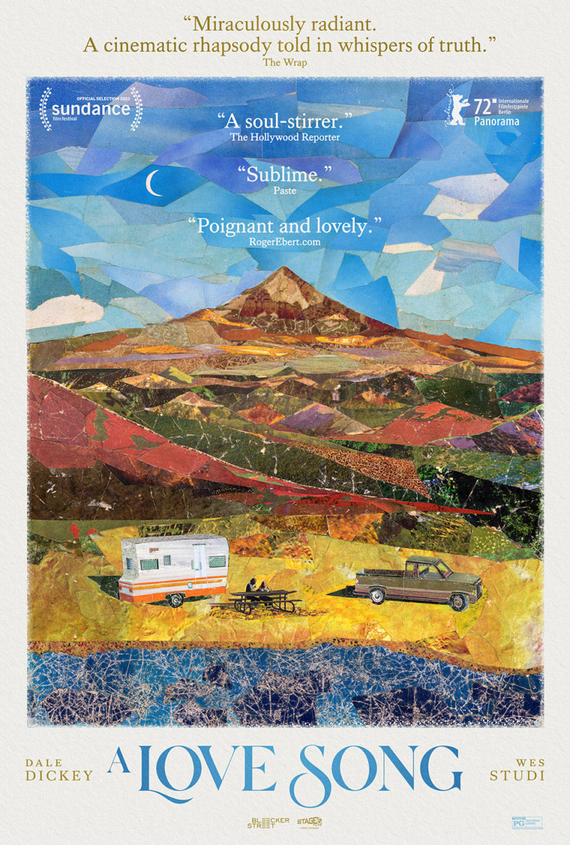
There’s a reason Bleecker Street decided to stick with the same general look and feel for their official poster. Strong’s collage remains intact (though much brighter) with a nice softening of edges. I love the new title font’s more delicate approach (along with an elegant serif for the cast names) and don’t mind a more literal approach by putting Dickey and Studi at a park bench between the vehicles; but slapping quotes and moving the laurels onto the sky ultimately cheapens the atmosphere of this scene. Do you really need four blurbs? The Wrap‘s says everything you need. The others are redundant.
Obscured portraits


Too often a poster attempts to provide a portrait in lieu of context, narrative, or intrigue. If not necessarily grounds for dismissal, many do find themselves lacking the sort of substantive artistic edge that warrants audiences to take a second look.
That’s not the case with Andrew Bannister’s My Old School (limited, July 22). Part of the reason stems from a choice to use the documentary’s tools to its advantage; part of it is what those tools are. Because not only does director Jono McLeod utilize animation to depict the memories of those who attended class with “Brandon Lee”—he also enlists Alan Cumming to portray said subject by acting out “his” words. So, like the work itself, the poster delivers its portrait two steps removed.
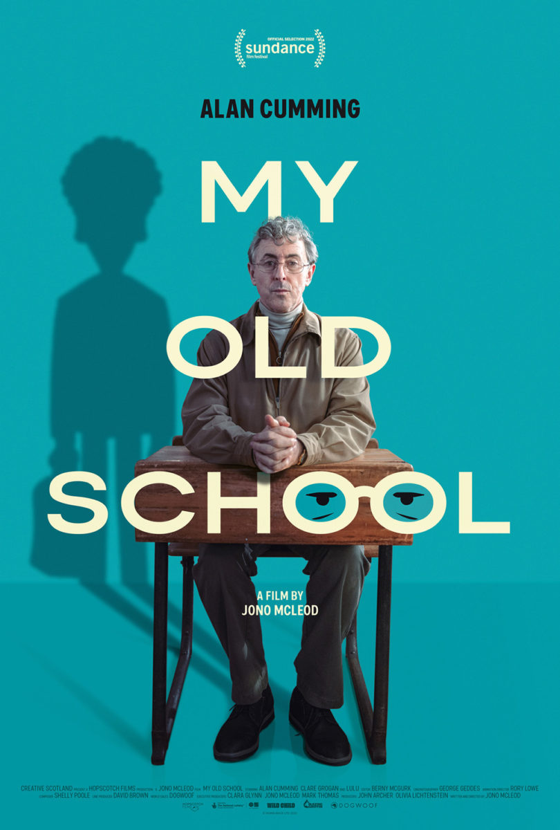
Even without the concept, however, Bannister’s composition is still worthy of note. From the symmetry (having two girls mirror themselves behind Cumming’s single desk helps keep the balance) to the bright yellow sans serif augmented by a hand-scrawled “My,” it’s simple, effective, and clean. It piques our interest while setting the stage for what’s to come.
This second sheet at right is by contrast too sparse. Using the glasses as “Os” is a cute touch, but its white-on-turquoise palette is bland by comparison. Why is the shadow a cartoon? Why is there so much white space to the right, making the whole so off-balance that it seems ready to topple over? Less isn’t always more.
The opposite is true with Sharp Stick (NY & LA, July 29; expanding, August 5; VOD, August 16). Brandon Schaefer and Jump Cut’s teaser is a wonderful bit of intrigue by way of squared image, eccentric font, and expertly scaled ancillary text that almost fades into the background. It’s fun and mysterious. Dramatic yet spare. Who is this person? What is she waiting for? Is she picking paint off the stairs or readying to draw upon them?
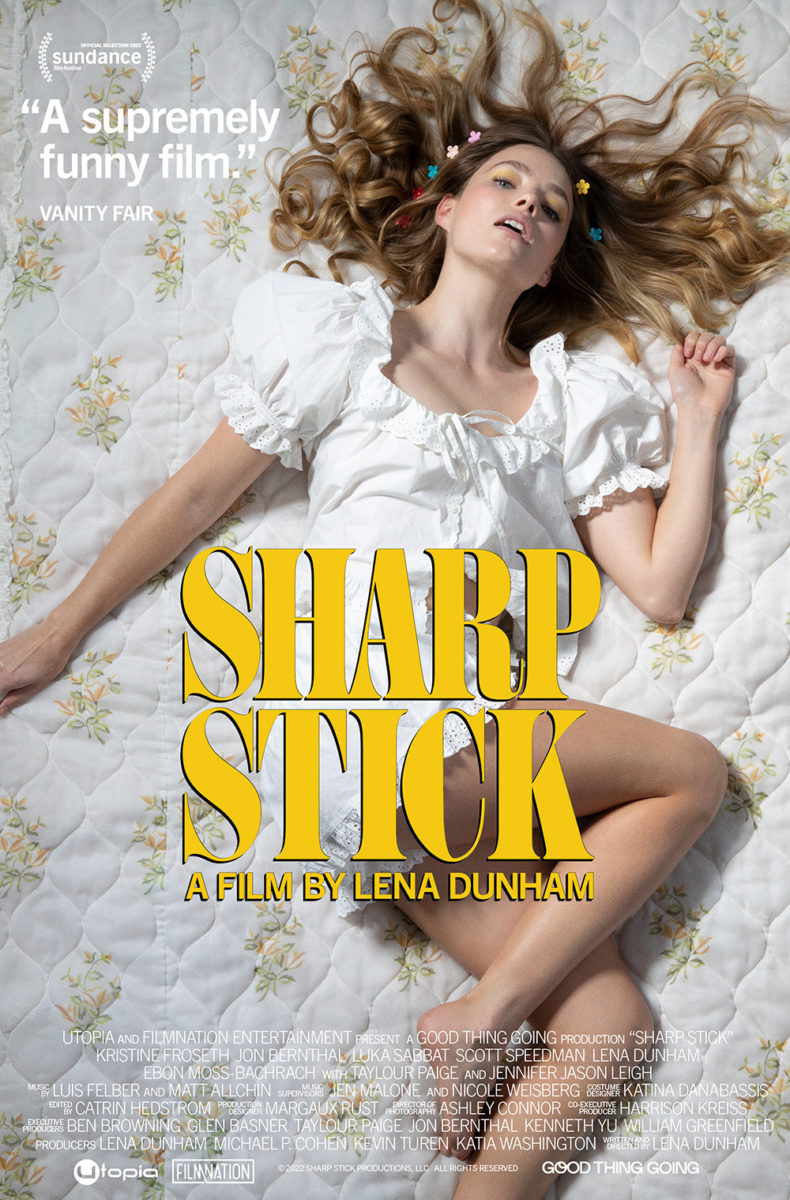
Now shift to the full sheet of Kristine Froseth lying on a bed as the title screams in a bold, headline serif. It’s not bad, but it is a lot. Suddenly the text is increased exponentially to fit into a much more complex puzzle. Example: the quote. It looks like an afterthought now, its bold sans squeezed into the top corner so it seems as though it was enlarged until it had nowhere else to go. What should be a provocative pose becomes weighed down to the point of farce.
And that leads us to the memorably singular Murina (NY, July 8; LA, July 15). Its portraiture goes beyond both deflection and obscuration to focus on the lead character by way of a cut rather than face. Which is a gutsy move, shifting our perception away from reaction to evidence. Without seeing Gracija Filipovic’s face we have nothing but the result of whatever occurred to impact our thoughts. That we’re being shown an injury at all tells us it wasn’t an accident to be dismissed, but an important event that will surely impact what we’re about to witness.


Les Aliens’ European poster and the latest American iteration lack that sense of danger in the unknown. Filipovic’s serious expression alludes to tone, but not quite as heavily. They provide us a before picture rather than an after, letting our imaginations jump to innocuous conclusions that retain a sense of the paradise locale of sun and water instead of the potential violence of a scenario yet unseen. That’s what the blood and bruises supplies—a reality hidden beneath an otherwise idyllic façade.
Edge to edge


I love the scale of this poster for Moon, 66 Questions (limited, July 15). It really gets at the isolation of this character who has returned home to try getting to know her father as failing health consumes him. Whether she is going up or down those stairs, she’s portrayed as being caught in the middle. Continue living estranged or turn around and give it one more shot.
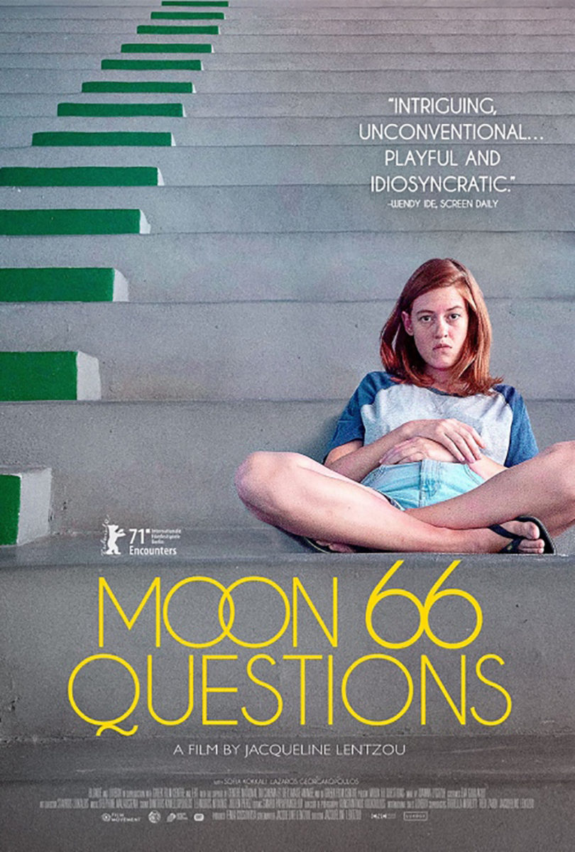
Now look what happens when someone decides that much empty space and uncertainty is too great for an audience to bear. Once you push forward, cropping the image onto Sofia Kokkali as portraiture, you lose all context of her journey. Those stairs are no longer a pathway connecting past and present; they’re merely a location for a photograph. It’s just a woman, stagnant and starring, stuck in place with nowhere to go as the camera creates a wall to block her escape.
Kudos to that new title treatment, though. The “66” sandwich of the previous poster is awkward, each word being a different size and the “Moon” precariously balancing atop the points of the numbers. Not only does the new font and color choice help it pop here, but the overlapping “Os” and kissing “6s” keep things smooth and seamless.
Scale is also a big part of Anonymous Club (limited, July 15). This time the focal point (Courtney Barnett) is placed at the bottom so the expanse of possibilities can rise above. Unlike that second Moon poster, however, this placement doesn’t prove a constraint when she’s facing towards the unknown rather than us. So, in some respects, she’s still caught in the middle between past (where we sit) and future (where the sky leads).
And the room with which she can operate is infinitely enlarged by the choice to let that “M” and “O” bleed off the page. The title is still readable, thus mostly in frame, but it’s pushing those boundaries. Each unit of letters floats into space, disconnecting themselves to bring their message to the world. That they are simultaneously clouds and concert poster chic cutouts copied on a Xerox (you can still see the lines around some of them to mark where each squared letter was cut and pasted together) astutely merges its artistic metaphor with its subject’s rock ‘n’ roll aesthetic.
The design that has really stuck with me this month, however, is P+A’s lo-fi and grainy Resurrection (limited, July 29). While the main image of Rebecca Hall is framed within its own rectangle, the crop still retains an edge-to-edge sensibility. It’s as though she’s pushing her way through that window, smushing her face as close to its opening as possible to menace us with a steely gaze. And even as the designers try containing her behind a wall of red lines, her eye pierces through.
This design shines in the optical illusion created by those lines. For one, they are part of the photo even as they seek to cover it. Look at the top portion, where they push past the border of the frame, and notice that Hall’s forehead and hair continues within them. Which is foreground and which background? Can they truly be separated?
Second is the visual disruption caused by lines so close together. Despite all text being level, its positioning above the red field tricks our eyes into imagining that each block is rising. Making “Hall” larger than “Rebecca” enhances the effect. It and “surrection” begin to float as though on a conveyor belt, Halls’ eye becoming a black hole sucking those letters (and presumably us) in. We thus need that frame around her face to grab ahold of and stop our forward progress, leaving us hanging over the edge of oblivion.