The pandemic weirdness continues as we hit February and see … Oscar contenders? I’m not going to be talking about the posters for The Father (limited, February 26), but it (and others) are debuting to audiences now rather than last December because of the extended nominations period. Add titles Judas and the Black Messiah (limited & HBO Max, February 12)—which just got a new sheet from Gravillis and Minister of Culture for the Black Panther Party, Emory Douglas—and we’re well past reveling in the usual dump month fare. Hollywood is going to keep us on our toes throughout 2021 with bookending award seasons.
So while some studios look to double their theatrical one-sheets as “For Your Consideration” advertisements chock full of critics’ quotes, you might do well to go a bit further. Seek out the artwork from independent features willing to embrace iconic imagery that complements mood and energy above award aspirations instead. A few are listed below.
Text and image


It’s probably an acting longshot, but Viggo Mortensen’s Falling (limited & VOD/Digital HD, February 5) is one of the aforementioned holdovers hoping a release closer to the nomination period will bolster its chances. You shouldn’t be surprised then to find it a sort of hybrid: simple, highlights the actors embroiled in a tense scene, and includes three critic quotes. Shift some things around to make some extra space for more text and you have a readymade FYC ad for the trades. Keep them as is and you have a straightforward, clean poster for theater walls.
While it won’t “wow” anyone, it is an effective composition. It sticks to its central vertical axis (the title’s intriguing typography even remains balanced symmetrically to the whole despite being anything but on its own) and delivers all the usual trappings without bombarding us with any superfluous overlap.
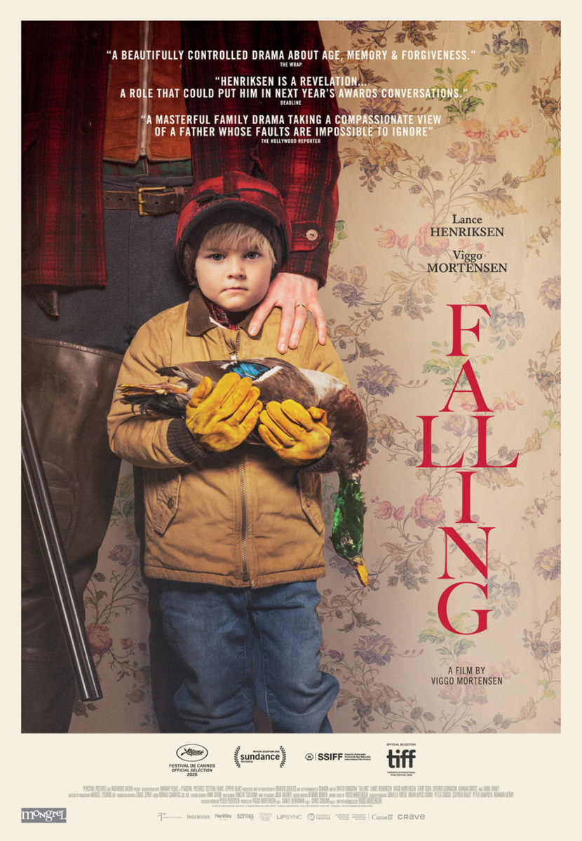
It’s why the festival sheet fails a bit by comparison. The image works, but the decision to use it as the background distracts from the text placed above. And if I couldn’t read the title anyway (single letters spaced top to bottom is a design no-no with the double “l” doing no favors as an aesthetic outlier), I’d be scratching my head at the red coloring losing any clarity it might possess. The hue is completely lost on the wallpaper even with that slight, white glow meant to pop it out. The newer version might not be too memorable, but legibility goes a long way.
French Exit (limited, February 12) takes things even further by filling every last inch with blurbs. By the time this sheet came out, the film was supposed to be heading to a release shortly after its festival run. So I have to assume this was created for voting purposes as much as it was marquee potential. Put some big-time publication accolades at the top to pique interest and then throw Michelle Pfeiffer and Lucas Hedges at the bottom as though afterthoughts.
The shame of it all is that we lose the character of the film in the process. Rather than create a sense of the smug, out-of-touch demeanor these two driving should manifest, the frame looks like two people angry after a fight who refuse to look at one another. It should be a family portrait (cat included, of course), not melodramatic huff that seems to be selling a movie it’s not. Sony Pictures Classics is putting all their eggs in the “repeat Pfeiffer’s name” basket.
And it’s not like you couldn’t still create something that captivates despite the text. Just look at the final one-sheet for The Wanting Mare (limited & VOD, February 5). You can’t truly compare a boutique studio leveraging star power for box office receipts to a purely independent feature where its director Nicholas Ashe Bateman wears numerous hats (going so far as to design this poster himself), but it’s nice to know excitement is possible without the corporate oversight.
How does he do it? By crafting a singular image (the portrait with city light-filled horizon cutting things off at the eyes is beautifully alluring) and playing with the text. He goes crazy with the kerning to spread the quotes edge to edge and in effect makes them even thinner and more unobtrusive than the font selection already ensures. They become stars in the sky rather than distractions—part of the whole rather than selfishly stealing our attention.
Add the eroding title with every letter but the “H” dissolving into the blue and we become privy to a sense of kinetic energy. It’s as though those words are shimmering in the night and thus our brains pretend the lights above are too. The new world Bateman creates on-screen is given life on the page through this unknown woman’s gaze. Where the festival sheet brings characters into its landscape, this one sees her as its creator.
Title and image, vol. 1


Remove all that text while still retaining a void of star power and you can really do whatever you need to drum up interest: something streamers have been doing a lot of the past couple years with documentaries. cold open’s Fake Famous (HBO Max, February 2) doesn’t even include the director’s name. Title, image, studio, and date. That’s it.
And it works. You’re not going to see these at your local theater anyway, so there’s no reason to add more than teaser details. They’ll be slapped onto a street corner wall in big cities or coded to populate the sidebar of a website. Title, image, studio, and date.
Even so, the firm doesn’t just phone this one in (no pun intended). They take care in choosing a font that works well with their “like” icon and continue that motif in the shadows behind “influencers” posting to their socials. We see the divide between real and digital alongside how the obvious blurring of that line distracts these three people from the world around them. In this moment everything besides their screens becomes obsolete.
The Refinery doesn’t quite have the same luxury with Bleecker Street’s The World to Come (limited, February 12). They need to get their actors up there and sell their product in a more conventional way, yet they’ve found an avenue that allows the result to still work like a teaser. It’s all about the typography.
This usual method for something like this is keeping images separate and putting the text in the gaps. We would then go from top to bottom in sections, absorbing one at a time in isolation. And it’s not as though the designers don’t understand that one image works better (see Falling above). Sometimes they have no choice but to make room for all the actors who have poster appearances in their contract.
What’s interesting this time is the distinct lack of that separation. Each image butts up to the next with a common, deep coloring that helps them almost melt into each other. The dark hues allow the white text to be easily read above them while the image choice (Casey Affleck shifted left, Katherine Waterston and Vanessa Kirby centered, and Christopher Abbott shifted right) provides us the diagonal to travel along.
We’re still therefore going from top to bottom, but now we do it fluidly. Rather than jump, we float down from one word to the next as the extreme leading between them expands the title to stretch the frame’s entire height. Even that distance, however, is precisely calculated. The “To” intentionally creates a triangle of focus with the women’s mouths and “World” all but masks the edge between top and middle quadrants by stealing its focus, effortlessly shifting our eyes from one to the next as though we’re falling straight through.
And from linear pathways to circular ones, we move to MOCEAN’s striking Little Fish (limited & VOD, February 5). The piece should make narrative sense to anyone who’s seen the film considering memory serves as a cyclical character in and of itself thanks to Olivia Cooke remembering their romance just as Jack O’Connell is forgetting it. But the composition works beyond that truth on a purely formal level too because of how the paint swirls spin the piece around the central point created by their touching foreheads.
The bright circle becomes as much a sun in the darkness as it is a signifier that her mind burns bright while his extinguishes. She therefore tries to become a conduit for their memories—willing them to move from her mind to his. The fact his face is a complete silhouette by comparison, however, proves it won’t be so easy.
Image notwithstanding, the lowercase and italicized title is just as important to the whole too. That slant augments our brain’s desire to twist the whole clockwise to see where things land. And it’s also expertly placed so that the top serif of the “l” kisses O’Connell’s forehead en route to becoming the electric visions sparking in her head … if only they can break through the seemingly impenetrable wall of his.
Title and image, vol. 2


From small title to big, we move to InSync Plus and Dan Forkin’s The Vigil (limited & VOD, February 26). Rather than overpower us with it, however, the designers use its size in order to let it fade into the background so as not to distract from the obvious centerpiece: a melting candle made out of Dave Davis’ face.
It therefore uses that creepy, unforgettable imagery as the whole’s light source—illuminating the bottom half of the giant letters before the top dissipates back into the black void beneath. We see both simultaneously as a result since the former can’t exist without the latter. Everything else is thus rendered optional. The laurels, tag, and credit box are there, but only for those seeking the additional information.
Leroy and Rose’s great teaser for Barb & Star Go to Vista Del Mar (VOD, February 12) operates under the assumption that we don’t need any of that additional text at all. It can get away with it too because it’s hitting theater walls so early (there’s no date besides Summer 2020 listed) that a subsequent entry should arrive in a couple months to replace it. So as long as it piques your interest, it proves a success.
And how could this one not? Its compositional use of space is wonderful with clouds at bottom and people at top (kitty corner to the title for balance). The titular duo is thus flying so high that there’s nothing tethering them to the atmosphere let alone the ground. But it’s not scary. We’re not fearful for their fall. We instead find ourselves as exhilarated as they must be. These are two women having the time of their lives with drinks and hors d’oeuvres in-hand and smiles on faces—assumedly so since their heads are cutoff. That too is a brilliant move, though, since it gets our minds racing about who they are with mention of Bridesmaids as our only clue.


The firm’s second sheet (facing us) along with P+A’s alternate (backsides) are thus opening this world up without leaving the mystique of its colorful absurdity behind. They’re sitting in a clam shell as though posing for a “Darling Darlings” show and riding a shrimp after all. Everything happily remains about mood and fun. We can worry about plot once the film begins.
And that leads us to Mark McGillivray and Empire Design’s gorgeous I Care A Lot (Netflix, February 19). Who needs context when a hyper saturated duotone Rosamund Pike popping off a complementary color background is enough to turn heads? There’s a very Andy Warhol meets Barbara Kruger quality to the piece that really aligns with the tone of the film.
The way the text is laid out, however, is the linchpin. Unlike Falling‘s festival sheet going up and down, we’re still going left to right here—just in chunks. So where our eyes are strained there by reading each letter separately to then form the word afterwards, we’re processing each word within its sentence’s whole. And by keeping the font consistent straight through credits and quote, we’re never once distracted away from their bold showcase. That kind of homogeneity is unique in these days of excess (it of course helps when Netflix rarely has to move beyond teaser poster sensibilities like theatrical studios). It’s simple yet stunning.
What is your favorite February release poster? What could have used a rework?