The tough decisions were made and those few big releases holding onto their Christmas date are still moving forward—some for the few theaters that will remain open and some to hopefully drive holiday subscriptions to their respective studios’ streaming services. Does it signify a brave new distribution world? Probably not. Odds are that things go back to “normal” this time next year as long as another new virus doesn’t strike … and as long as our favorite theaters can survive what might be another lengthy hibernation.
It’s nevertheless weird to enter the month and know that the majority of awards contenders have been held to arrive in January and February (the so-called “dump months”) due to the extended Oscar schedule, but that doesn’t mean we’re without some important pieces to the puzzle. Thankfully the poster game knows it and excelled accordingly.
Minimal distractions


Why not lean into the pomp and circumstance of a big budget Broadway musical with big budget name-brand stars when you’re afforded the chance? LA gets to play with some fonts, go ham on faux neon filters, and deliver a rather elegant teaser for The Prom (Netflix, December 11) despite all the loudness we know we should expect from a Ryan Murphy film. It’s a bona fide winner because it refuses to do as much as we assume it would.
So it comes as no surprise that another sheet would eventually surface with garishly Photoshopped actors replacing names for ample spotlight. They’re put between small town USA and Broadway marquees on a rainy street with so many glare spots that your eyes will cross. Suddenly the plot is distilled in a superficially confusing way with a plastic sheen and low budget worry. And it’s completely unnecessary unless face-time was a contractual obligation on behalf of the cast. Were the cringes it conjures worth it when the tease delivered hope?
Luckily for Mayor (virtual cinemas, December 2), there are no A-list actors to steal attention from aesthetic. Illustrator Tony Stella can work his magic on a small scale by wonderfully juxtaposing an opaque man against a landscape all but faded and invisible in the distance. It’s the perfect metaphor for a politician leading a city that some might say doesn’t exist in the way it would need to for him to lead it. So he’s literally trapped in emptiness, forced to create the boundaries with which to use to do his job.
More than the illustration, however, Stella and Midnight Marauder (together as Alphaville) supply the whole a clean, symmetrical composition that allows our eyes to hop from one line of focus to the next. Laurels are a block. Quotes are a block. Image (I like the idea that it can be a symbol of growth like a tree blossoming up from the figure or destruction like an atomic bomb cloud), tagline, and title follow. My favorite bit, though? The stains at the left edge. Are they food? Blood? Aging blemishes? They give it a sense of lived-in experience either way—as if it was pulled off a wall in Ramallah.
Speaking of places in the abstract … few posters possess the beauty, efficacy, and sheer Swiss Army knife versatility of the gorgeously designed Nomadland (limited, December 14). It’s fantastic on its own with a stark white background, minimal text (star, director, tentative release date), and stunningly rendered imagery that embodies the ethos of the film. The title is an idea after all: a setting more in the mindset of those who live within it than a physical geographical region. So we get Nevada, California, South Dakota, Nebraska, and Arizona’s license plates to form an approximate amalgam complete with wear, tear, rust, and dirt.


Where it becomes ingenious is the decision to create a series for the film’s own travels on the festival circuit. There’s a Telluride/Los Angeles hybrid. There’s the New York Film Festival. Toronto. And even Venice. That the design firm takes the verisimilitude to the nth degree by shortening the title to six letters sans vowels (the full nine only works when you have more than two plates at your disposal) is the icing on the cake.
Hollywood presence


Whether a choice on behalf of BOND or the byproduct of how good Pixar’s animation style has become, the posters for Soul (Disney+, December 25) have an appealing real-world texture to them that the usual glossy, computer-animated fare lacks. From the softness of the clothing to the blurred edges refusing to provide any thick outlines to the title feeling more like paper than superimposed font, this thing has true character.
And the way it plays with depth on a two-dimensional field is superb—one white border presenting foreground (Joe Gardner) and background (the cat) with an expert use of composition to put the title in a place that integrates reality and The Great Before through the “O’s” portal of the heart.
The differences are minimal, but Legion Creative Group’s international sheet both improves upon (the white border isn’t squared, but slanted just a bit) and exposes how good its predecessor was (the title is crisper and thus “faker” while the composition shift renders the whole boring in its generic portraiture). It’s good, but why change what was already great?
I never would have thought I be saying similarly complimentary things about realism and atmosphere for a videogame adaptation like Monster Hunter (limited, December 25), but cold open has earned some genuine plaudits for their work here. Whereas the Resident Evil series Milla Jovovich and her husband Paul W.S. Anderson stewarded never escaped its plastic gloss in marketing materials, this film seems desperate to change the narrative by making us believe what we’re seeing is possible.

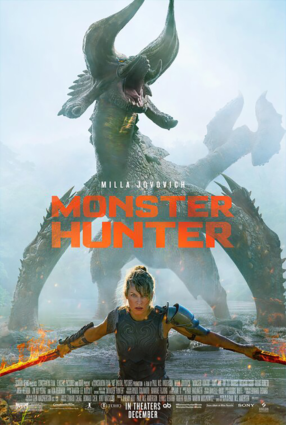

That goes for the darkened sky, foggy textures, and potentially real props like the jawbone sword and tusk bow that Jovovich and Tony Jaa hold respectively. It also goes for the layout itself and the large area of negative space above the cornered actors and its ability to lend a sense of foreboding due to the nature of what giant beasts might be approaching before long. (Ton of credit too for the title design’s restraint in making its monster eye “O” graphic rather than photographic.)
BOND’s final sheet unfortunately loses a lot of that authenticity. It’s not because the monster is shown, though. They could have done that with the same gritty filters as the teasers if they chose. Utilizing the usual blockbuster gloss instead is thus a conscious choice—it’s not as egregious as Resident Evil, but it’s still a disappointment.
You won’t hear me saying that about any of the sheets for Wonder Woman 1984 (limited and HBO Max, December 25). Just because you can take chances when you have a sequel with slam-dunk IP doesn’t mean many studios will actually do it. Kudos to eclipse for doing the work and Warner Brothers for signing off because this thing is glorious.
I love the bright colors, the 1980s TV shadow trails, the graphic line work, and the way in which a winged Diana effectively mirrors the two “Ws” above her while also helping the gap between them form an arrowhead driving the whole up, up, and away (yes, I know that’s Superman). It’s kinetic, vintage, and modern all at once with a bold bleed that demands it be plastered like wallpaper on every outdoor surface possible.


What WORKS ADV (straight-backed and facing us) and BOND (three-quarters, leg bent) did isn’t bad either with their kaleidoscopic colors evoking the era and the wings. They got people talking during the summer (when a theatrical-only release was still planned) and showed that tent-poles could succeed with advertising materials that think outside the box. We don’t need action and explosions because we know they will be present. Give us intrigue and personality. Provide a showcase for good art that sticks since campaigns for films this big are about brand exposure, not ticket sales.
Prosopagnosia


One of the best works this month comes from Brandon Schaefer and Minor Premise (limited, virtual cinema, VOD, and Digital HD, December 4). Reminiscent of jock’s Daniel Isn’t Real, the image provides a cool visual representation of the mental fracturing that occurs on-screen. Sathya Sridharan is in effect playing ten different characters in the film once his psyche is pulled apart into isolated emotional and psychological pieces (intelligence, anger, libido, etc.) forcing him to deftly traverse each in order to make himself whole again. The longer he remains separated, the quicker his body shuts down.


So here we have a third of the control obstructed by at least four other versions of himself taking over with motion blurs that conjures the idea of flames—his mind burning from the inside out. It’s provocative, illustrative, and effective with no desire to sacrifice the image by making the title obnoxiously big.
Schaefer’s second installment is quite good too with just one of Sridharan’s faces melting away to nothingness as his identity collapses under the weight of what’s happening. And since nothing else changes (quote, title, director, laurels, and credit box appear identical), you have to wonder if these were simply two comps that the studio couldn’t choose between before deciding to go with both. There are few better testaments to the work than that.
The same goes for when a single image transfers over into multiple versions of a campaign because it’s too good to ignore. That’s what happens with the main piece from Survival Skills (VOD/Digital HD, December 4) of a VHS tracked Vayu O’Donnell. Here’s a film that comments on domestic abuse and police response through the fourth wall breaking aesthetic of old training videos. You can’t depict that medium better than with a white “Play” command and analog artifacting—at least not for those of us who grew up with a keen familiarity to them.
This was the isolated image used during its festival run and now its been augmented for the final sheet complete with after school special title font and VHS logo. And when you watch the film for yourself, you’ll discover just how perfect it is beyond its retro nostalgia since O’Donnell’s character exists on two planes simultaneously. He’s both a “real” cop and a training video “actor.” He’s blurring the line between fact and fiction, good-hearted humor and harsh drama. So by hiding his eyes, we only see what the narrator wants: those grinning pearly whites. Behind the mask, however, are sorrow, regret, and uncertainty.
But there’s one poster that can still turn heads even after viewing the great stuff above: Art Machine’s Promising Young Woman (limited, December 25). This is an all-timer and definite inclusion for Top Ten of the year. It’s simple, attractive, and menacing—especially if you know what the film is about. Carey Mulligan is neither gazing into this mirror to look back at herself nor to find us in the distance. She’s merely drawing a message. She’s leaving her mark. It’s a challenge meticulously crafted with lipstick still in-hand for one final look in case she missed something.
I know a lot of people love the firm’s initial offering with its illustrated mouth as couch, but I find the follow-up delivers many of the same emotions with a more palatable and universal appeal. Where that one seems cluttered with overlapped text and words butted right up against imagery, the mirror supplies levels of depth so that everything can be separated even when it’s not. It turns the frame into an object for us to interact with rather than a sign to read before moving on.
What is your favorite December release poster? What could have used a rework?