“Don’t Judge a Book by Its Cover” is a proverb whose simple existence proves the fact impressionable souls will do so without fail. This monthly column focuses on the film industry’s willingness to capitalize on this truth, releasing one-sheets to serve as not representations of what audiences are to expect, but as propaganda to fill seats. Oftentimes they fail miserably.
Five Fridays, fifteen wide releases, a slew of limited engagements, and the activation of Wednesdays for additional real estate: it must be August.
We’ve got sharks, Pooh, canines galore (in multiple forms), and Muppets gone bad to sprinkle a little fun, terror, and plenty of popcorn-throwing eye-rolls into your summer’s swan song before another school year begins. Which to choose from now that MoviePass is no longer running at full speed to catch them all? No other month is as crucial to marketing reach that cuts through the noise than this one and yet no other month is hampered by a dearth of creativity either (except maybe January).
But while big budget character sheets will assault you everywhere you turn in the lobby, a few should stop you from running with eyes closed to your seat. Audiences know what they want to see during the summer and will go regardless of advertising. It’s therefore the perfect moment for the independents to sway them back for something different too.
A tale of two posters


I laugh now whenever the latest trailer for Alpha (August 17) starts playing with its inspirational soundtrack and optimistic voiceover about “man’s best friend.” I laugh because it wasn’t too long ago when I sat in that same theater and watched a very different tease depicting a boy left stranded in the wild who must tame a wolf to prove his might as a warrior. Oh what a five-month postponement and complete marketing overhaul can do to transform a niche thriller into a family friendly blockbuster event.
Luckily we have the evidence of what was, though. We can look back at the first poster and see the dual faces of intimidation thanks to WORKS ADV and Frank Ockenfels’ photography. Here’s a boy covered in mud and ready to kill, flames licking at his chin. These two figures seek blood and are willing to do whatever is necessary to survive. Rage fuels their flight.
Fast-forward to eclipse’s wholesome tagline with its aspirational view of a family of elephants in the distance and a docile pooch following its master on an adventure that will only bring them closer together in the fore. We’re talking night and day when it comes to tone. What makes it even weirder is that I haven’t heard anything about the film getting extensive reshoots or anything. (How it could since its first release date was September 2017?) It’s as though test screenings showed children liked it more than adults and the studio decided a shift in focus onto them was their best chance for success.
Luckily most movie-going audiences have short memories and will probably forget the original poster and trailer’s wildly different intent.
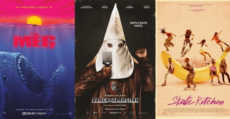
Skate Kitchen (limited August 10) doesn’t suffer from the same schizophrenia, but it is interesting to compare the down and dirty aesthetic of its festival one-sheet to the polished photography of its studio advert.
There’s a grunginess to the first that lends itself to the subject of skateboarding—especially since the stars of the film are a real life collective known for their skills on wheels as opposed to acting. This is the type of Xerox on colored paper effect you’d see in a flier handout taped to a telephone pole. It has crude drawings of banana peels and a hot pink scrawl of a title giving it character. It’s about an in-the-moment adrenaline rush of unbridled speed.
The second loses that sense of ephemera. Here the banana is real and enlarged into a half-pipe populated by the boarders in glamour shot poses. The action is manufactured, the artifice of this fictional narrative on display rather than pushed to the background so the realism could remain intact. Skate culture has literally been replaced by Hollywood convention rather than injected into it. Where the yellow, in-your-face loudness jolted me out of my multiplex malaise, the soft peach pallor of the other lulled me back to sleep.
Big budget variety


The best films for expansive campaigns are those utilizing multiple genres. When you have more than one tone and aesthetic to capitalize on, you can go for broke without risking audience alienation. Throw some comedy at viewers to remind them their actioner isn’t just about explosions. Add some drama to show thrills hide behind the camp.
It’s in this vein that The Meg (August 10) is able to keep churning out new posters on a regular basis. Canyon Design Group can focus on the scale of this prehistoric shark by leaning into the horror aspect of what its hunt could deliver while Statement Advertising can infuse their depiction of scale with a clever “Opening Wide” pun. We therefore both fear what might happen to the characters putting their lives on the line to stop this beast and revel in their inevitably hilarious, hubristic demises.


But there’s also a lineage to uphold via Concept Arts’ food chain progression from man to shark to megalodon. And from that nesting doll depiction we can move towards the appeal of bright colors and throwback artistry wherein the orange-red sky behind a doggie-paddling canine could feasibly connect this film to the MonsterVerse courtesy of Kong: Skull Island similarities.
Scale aside, however, these four all retain a sense of drama that overshadows any potential humor. If anything they are dark enough to earn strange looks from those who hear you laughing after taking a gander. So it’s nice that we do get one poster refusing to divide its intent. This illustration is hilarious in that the numerous inflatable tubes flying through the air thanks to the creature’s aggressive surfacing maneuver look like donuts. Rather than appear as a scene that little boy in the foreground should fear, it comes across as a dance party with colorful confetti and flailing attendees enjoying their ride through the sky.
The only real quandary with this series is the title itself and the weird separation happening with the “G.” Is that supposed to be the megalodon’s dorsal fin coming up for air? It looks more like a periscope to me. Neither good nor bad, I simply wonder what the designer was thinking. Maybe he/she just thought it looked cool.


It shouldn’t surprise anyone that the second example of variety comes from another action/comedy in The Spy Who Dumped Me (August 3). Instead of having a monster to combat, however, the studio focuses upon its leads’ personalities. LA (with photography from Cullin Tobin) puts its stars front and center with Mila Kunis’ serious expression opposite Kate McKinnon’s humorous embellishment. The former is thrust into a situation spiraling out of her control while the latter goes along for the ride with excitement that may or may not prove incongruous to the peril.
What’s great about this campaign is that we don’t simply receive these photographic depictions with different coloring. The studio instead enlists outside artists to commission their interpretations of the property with unique styles all their own. So we get June Bhongjan’s gorgeous paintings with hand-lettered text; Monica Ahanonu’s minimalist constructions resembling fashion designer sketches collaged with texture; and Amanda Lynn’s idiosyncratic illustration so disinterested in likeness that it feels like a wonderfully creative foreign bootleg DVD cover.


There are a ton of these things from the seemingly vectorized work of Allison Reimold’s detailed, three-dimensionally rendered playing card to Adrianne Walker’s flatly simply portraiture above a smoky exhaust fume title. They each arrive with varying levels of success (my faves are the above by Bhongjan and Ahanonu because of their polished yet uninhibited rough draft feel). Put the lot of them together and you see a mammoth marketing budget. Beyond that bankroll, though, is a true desire for artistic ingenuity above tired rehashes.
Less wins again


These next four speak for themselves as beautifully rendered portraits that hold composition and drama paramount.
First is Nico, 1988 (limited August 1) and its close crop of Trine Dyrholm moving on stage with spotlight. The image itself is captivating with its grainy film stock and shallow focus as well as this effect where the orb of light seemingly emanates from her chest. It’s as though her head is tilted back to let loose the power of rock and roll, the music possessing her with a genius unlike any other.
And then there’s the typography straight off of a Woodstock event poster: bold, curvy, lowercase, and undeniably of its era. This is as much a loving recreation of the past as I’m sure the filmmakers hope their movie will prove. It transports us if only for a second to a feeling where nothing mattered but the electricity of a live show.
LA’s teaser for Kin (August 31) is similar in its illuminated silhouette, but very different in both its sense of mood and time. This science fiction piece renders its glowing orb out of laser light patterns, its title composed of neon lines with infinite possibilities frozen into their respective letters. You read the tag and believe the orb is a portal for him to find his escape. But something prevents him from taking it just yet.


The second tease is even better as it delivers a scene still shrouded in that same mystery. Here Myles Truitt is in possession of the weapon that will make him a wanted man—its tessellations of light mimicking the title font’s presentation to make sure we know it’s not of this world. And the tagline is different to align with this new imagery. Escape is now off the table. Our intrigue is on that “thing” he found.
I love how these two draw us into their sense of the unknown. That doesn’t mean I dislike the final sheet, only that it loses its appeal in deciphering a puzzle while knowing so much remains missing. As far as totem collages go, however, this isn’t bad. The shape descends as though a beam from a UFO—everyone looking down while Truitt singularly gazes up. It makes us recall its inspiration whether the billed connection to Stranger Things or its Tron meets Terminator feel. It puts us in the correct headspace.
For Slender Man (August 10), P+A turns mystery into its lead character. We look upon this image and quickly see the monster of its title: a tall figure of malice lurking in wait. But it also plays with the duality of nightmare and myth by blocking our view with a pane of glass covered in foggy condensate. So maybe it is just a man. Maybe it’s even someone we know. Our fear is therefore what turns those water droplet lines into arms. It’s our frightened anticipation that clouds our judgment so we believe it could be something unexplained. Successful horror films keep their evil off-screen and so do their posters.
Similar to the grain with Nico, John McEnroe: In the Realm of Perfection (limited August 22) wants to provide us tactility through texture and time through place. What’s interesting is that we have no clue what this film is about. The easy assumption is John McEnroe. What we can’t know is that it’s specifically about this tennis legend in 1984 at the French Open against Ivan Lendl. But all that is inconsequential to the image at-hand. Perfection has to do with his talent. That this is the moment the filmmakers argue showed him at his height is secondary.
The choices made here by the designer are fantastic from the decision to force a vertical image (cropping out the tennis ball in the air) into a landscape orientation to the gridded off text as reminiscent to a tennis court as a sports score-sheet. And the red clay is all-consuming, its appearance bumpy and impure as though one giant moiré pattern. We don’t want the photograph to be smoothed out, though. We want it to evoke the time it was taken with all its visual impurities. It’s an imperfect memorial of perfection.
Cream of the crop


B O N D goes where mother! didn’t dare with their poster for The Little Stranger (limited 8/31). Rather than just allude to the chipping porcelain of Jennifer Lawrence’s Virgin Mary statue of Mother Earth as a degradation of earthly things, they rip Domhnall Gleeson’s face right off with the tag “These delusions are contagious.” It’s the perfect juxtaposition because you see it as a disease rapidly spreading over his body: rashes and flakes tearing pieces off in swaths. You can’t help but stare at the artistry involved too to make it seem real. Nor can you avoid feeling off-balance by the cursive scrawl of a title as distressed as the stone above yet intentionally so—not because of decay.


Creative Partnership’s final poster loses this mystique. It tries to retain a connection by switching from sculpture to canvas, but the cracks of paint on the wall carry a much different importance than a human’s face. Here we simply see what might be a window towards another world or time (the “real” girl conversing with the “fake” boy at bottom left). We question what’s happening, but only in a cursory way. Rather than be enveloped by provocation, we realize the draw here is the cast. Do you like those three at right? Then that’s all you need to know.
For a film that takes place on screens displaying the internet, I’m really surprised the only Searching (limited August 24, wide August 31) poster mimics this effect is Russian. P+A is the firm of note and they do a wonderful job filling the frame as if it was a cracked smart phone. It looks good too. These types of modern trompe l’oeil often can’t help looking fake whether from too much glass spidering or too crisp text unbelievably positioned beneath it. Yet this one feels tactile and personal. If the image resembled a newsfeed media photo rather than live aftermath of a voyeur, it’d be perfect. By comparison with its English-language siblings, however, it already is.


What’s even going on with Art Machine’s teaser? Why are the letters spaced like that? None are on their actual “key” so the placement seems arbitrary at best. I guess it could be relevant to the film somehow, but all I know now is that it’s difficult to parse and definitely not worth the effort.
Then you have P+A delivering the blandest sheet I can think of for the subject matter. John Cho looks like anyone on his/her phone: intensely contemplative. I don’t see any worry despite the multiple signs of potential tragedy superimposed behind him that we assume to be moving across his screen. And then you just put the title in a common sans serif? With all the electronic noise and lines you don’t try and make it tech savvy like the Russian with its strip of yellow interference jogging off-center? I can only imagine the studio hands were all over this one since we know the firm is capable of much better.
Gravillis Inc. has no problem delivering exactly what its film is supplying when it comes to Spike Lee’s BlackkKlansman (limited August 10). This true story is about a black cop who poses on the phone as a white supremacist to infiltrate the Ku Klux Klan—a wild juxtaposition that’s presented on the page for all to see thanks to John David Washington donning the hood. And if his skin color against that wardrobe wasn’t enough to captivate, they have him holding an afro pick in one hand and a clenched fist as the other. How you could ever walk by without doing a double take on your first pass is beyond me.


The firm also provides us a sheet with Washington unencumbered by his KKK disguise. It’s pretty boring with a black and white American flag tripling its stripes as windows to his image and … prison bars? I’m not entirely sure what the inconsistent layering of photo and graphic is meant to conjure, but it’s definitely not as memorable as their other. And if you’re going to keep two lines of text inside their stripes, why throw everything else off by enlarging the others to two different sizes so as not to adhere to theirs? It looks like a draft of an idea that they couldn’t quite pull off. But the studio green-lit it anyway.
It is still a step up from the third iteration of waxy figures cropped off the edges with a distressed white triangle between them. If you’re going to distill the KKK motif to a geometric symbol, why are the actors so weirdly hyper-real? This clash is simply distracting and more confirmation that the first truly is truly great. When something is that iconic, anything else merely half-heartedly fills out a quota with the knowledge it will never be beat.
And that leaves us with the poster that’s far and away the best of the month: The Boland Design Company’s We the Animals (limited August 17). What a beautiful piece it is.
In an era of superior technology and polished graphics, this advert goes old school to draw right on top of its image. First they had to expertly crop the scene to give the little boy in the foreground the space for his scream to be given shape while his two brothers run away in the distance. Second they had to scribble in crayon the fire spewed out in a deafening roar. Third is the title filling out the frame without any need to fit nicely in what has become a ready-made quotation bubble.
They could have easily picked a font to adequately approach the look they’ve cultivated and yet they did it by hand anyway. Look at the “invisible” lines showing how each “E” was constructed in haste and the imperfect “As” proving every letter to be of-the-moment and off-the-cuff. Add the director and author’s names at the bottom right in the same handwriting and the whole becomes its own art project seemingly untouched by computers. It’s a one-of-a-kind original animated by our imaginations, presuming the artist covered every square of negative with these flames of youth. It crackles in constant flux, increasing in size until deflating back to nothing as the boy closes his mouth and begins his pursuit.
What is your favorite August release poster? What could have used a rework?