The first five Friday month of 2022 has arrived and studios are bringing their heavy hitters like Morbius (wide, April 1), Sonic the Hedgehog 2 (wide, April 8), Fantastic Beasts: The Secrets of Dumbledore (wide, April 15), and The Bad Guys (wide, April 22) to utilize that extra time. That kind of even spacing hopefully means there should still be plenty of screens to house the littler fare as well.
So, keep the creative imagery coming as full-scale competition for eyeballs is seemingly back for good. The “Theatrical Only” text has become a permanent fixture on marketing materials to manufacture an air of “quality” for Hollywood blockbusters while other independent shingles have refused to bat an eye when going day and date with digital too. More forums mean more opportunity. More opportunity means more titles. It’s never been more crucial to stand out from the pack.
Just in frame


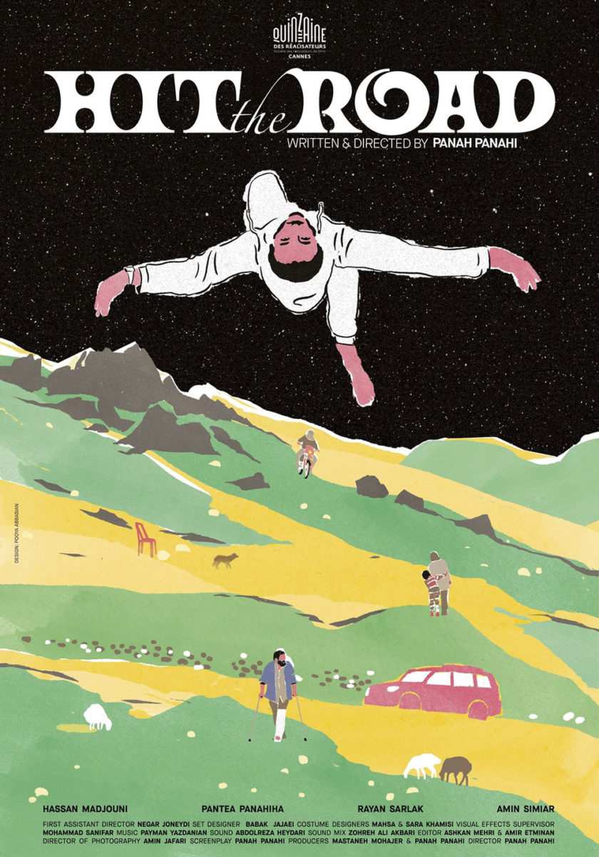
I love the excitement bursting from the one-sheet for Hit the Road (limited, April 22). The designers use the unbridled scream of their subject as the backbone, tilting the title to match with a rough marker font to add to the personality and volume. That diagonal almost puts those words into his mouth as a declaration, the horizontal quotes and laurels framing the kinetic energy in a way that ensures our eyes stick to the focal point like a reverberating echo of pure joy.
It’s a complete 180-degree turn from the original festival sheet too. While still “fun” in its illustrative nature, the color palette and style are more reminiscent of a 1970s concert poster than that glossy emotion. The typeface is unique (with a Zapfino “the” thrown in the middle), the artistry bold with its fields of colors mostly devoid of lines, and the mood a bit surreal in its trippiness of floating characters and adventure.
Much like with the boy of that first poster, Intermission Film angles its frame upward with Cow (limited & VOD, April 8) so that the titular animal can ground the whole beneath its expanse of sky-filled promise. Theirs is obviously staider (no Mister Ed-type revisions to open the cow’s mouth in a scream), but also more aesthetically pleasing in its typography (an elegant serif complementing the smaller, sans serif text) and composition.

This one’s diagonal is more of a straight-line conversation than an aural sound wave, our eyes moving from title to subject and back again as the top right and bottom left triangles remain empty to both frame that journey and ensure the whole doesn’t feel claustrophobic. That might be its best attribute and why it’s such an improvement over the original quad sheet with its depiction of captivity and squalor. It’s no less impactful, but something about the outside and its sense of majesty draws you in whereas this glimpse through a narrow corridor pushes us out.
Gagarine (limited, April 1) provides a nice balance to the above titles as its actors are both excitedly bursting into the frame (like Hit the Road) and beautifully contrasted with a more polished text block (like Cow) perfectly situated between them and a sky that, this time, holds its own focus.
Because while the film is about these kids and their loss of childhood through the impending destruction of an apartment complex, it’s also about a yet unwritten future devoid of the constraints that same childhood had enforced. Every end is a new beginning and the smiles of this trio prove they’re traveling towards something rather than away.
Duos


For such a simple poster, the festival sheet for The Girl and the Spider (limited, April 8) is not without its share of intrigue. From the focus being on two women rather than one (with a tiny spider crawling upon a hand) to the naked woman with motorcycle helmet, clues as to narrative are surely missing. Instead, we receive a fascinating graphic piece of art to pique interest and provide mood over plot.
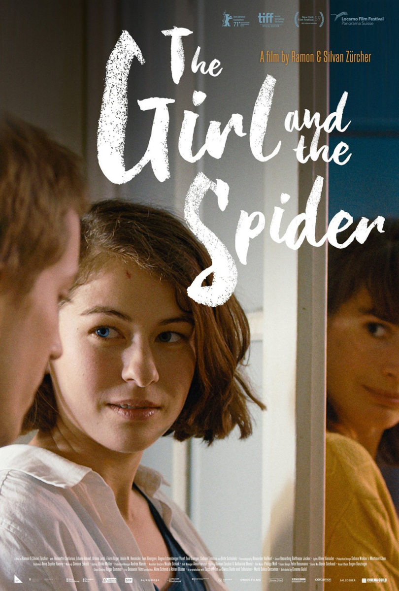
The ripped orange field pops above the otherwise muted and grainy photography, its dynamic with the green title causing my eyes to cross as they attempt to quiet the optical illusion created. It’s like a window looking in unlike the second poster utilizing a door for separation. Where that one keeps its two women apart, this one separates them from the rest of the design to delineate image from text. It’s much more dramatic as a result—the texture adding to its austerity—while the colorful photography of the other lends a comedic flavor punctuated by the actors’ expressions and playful font.
There’s a similar sense of warmth and play present with Petite maman (limited, April 22). The above isn’t the French sheet, but it does use the same wonderful “heart” portrait of Joséphine and Gabrielle Sanz rising above a watercolor depiction of their country home (complete with fort). The subtle smiles as they gaze into each other’s eyes really captures the sense of wonder and excitement at the core of their brief yet indelible adventure together. Friends. Sisters. Mother and daughter alike.


I found it surprising when MUBI moved away from that collage for a heartfelt embrace instead since its similarity to Playground supplied a much sadder outlook. While this is a bittersweet film to be sure, that shift almost loses too much of the former’s life in lieu of tragedy. It’s about the “goodbye” rather than the “hello.”
I’m still not sure what’s going on with the text as far as making Céline Scianna’s name as big as the title and Portrait of a Lady on Fire almost as big as both, though. It’s so confusing and really hampers the casual viewer’s ability to know what this film is without having to expend energy that good design is supposed to shield you from losing.


Thankfully Time Tomorrow and Empire Design dial things back for the American sheet, singling out the filmmaker amongst falling leaves so that we know her importance without distracting from the bolder, bigger title beneath. And while I like this starker rendition, I think the addition of quotes as a backdrop wall helps things pop. Because while you’re supposed to read the accolades, you don’t really have to for them to serve a purpose to the whole. They help solidify the frame and create depth so that the fort and girls push into the foreground.
The pair that stuck with me most this month, however, is the one at the center of Vortex (limited, April 29). This could have easily just been a low-fi black and white image of Dario Argento and Françoise Lebrun multiplied over a neon red or yellow. To therefore divide the image, use both colors, and boldly repeat text as though pages being lost in the gutter of a book only augments the sense of uncertainty that comes with its embrace.
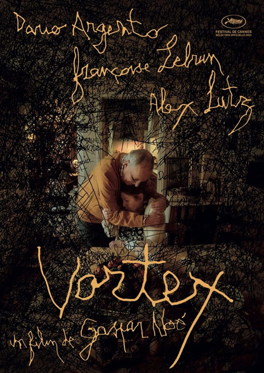
These characters are suffering from dementia so it’s no surprise one would seem to be smiling while the other appears sad. They’re at once remembering and forgetting—a constant struggle between red stops and yellow slows with no green upon the horizon. The pages of their lives bleed into each other as past disappears and future gets erased. All they have is the present’s spread with no way to turn back or more forward.
It’s loud in its orchestration but just as beautiful in its metaphor as the Cannes sheet’s rough scrawls closing in to snuff them out. What a wonderful case study in how stark precision and imperfect crudeness can be wielded to conjure the same emotional feeling. These deliver an identical message in such different ways. It all becomes a matter of taste.
Offbeat eccentrics


Speaking of lo-fi, check out what did Caspar Newbolt and (version_industries) did with We’re All Going to the World’s Fair (limited, April 15; Digital HD/VOD, April 22). The film is about a young woman immersing herself in an online role-playing game and the poster leans into the scenario with digital grain, a pixelized typeface, and a ghost-like specter of a hand a la old school point-and-clicks. What better way to stand out from the crowd than doing everything in the aesthetic opposite direction?
Despite image quality, however, this is still a very well-thought-out composition and design. By rendering the page as a screen, it becomes tactile to the point of our wanting to reach out and click the underlined text link in order to see where we go next. And the vantage point—having the character looking at us as though we’re inside the screen—riffs on the idea that reality is fractured within this mirror of technological separation. Are we engaging with her? Or is she engaging with us? (There’s also a motion poster version at the designer’s website.)
GrandSon takes things back to more polished photography with Hatching (limited, April 29; Digital HD/VOD, May 7), but with a twist. Rather than simply give us a glimpse of the actor and her egg, the firm turns them both into a gorgeous silhouette that cuts into the blurry floral pattern of background wallpaper. It’s a heavy contrast that gives it an almost storybook feel with the red glow from the egg stripping things further towards a two-dimensional flatness that tricks the mind into believing a light is flashing behind its darkened curtain.
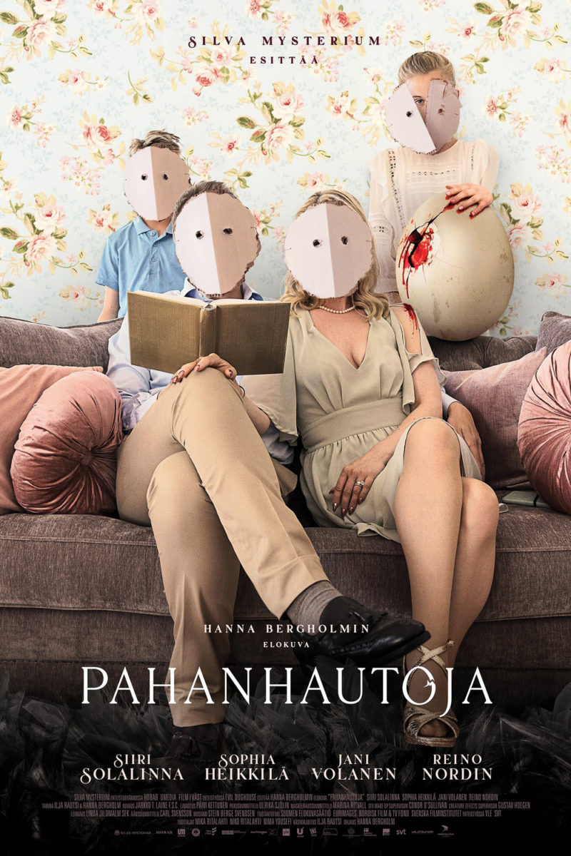
It’s a mesmerizing image made stronger by its crisp line work and softened blacks, its reverence making us fear what might happen next in a different way than the absurdity of the original sheet. Because where the former removes us from the proceedings as a voyeur taking in its atmosphere, the latter confronts us by placing its masked family in judgmental posturing. That pose is unnerving since it feels like they’re waiting for us to respond to a question we’ve never heard. Add the cracked and bloodied egg and we can’t help but worry what’s going to happen to us rather than them. The egg is no longer our focus. It’s our surrogate.
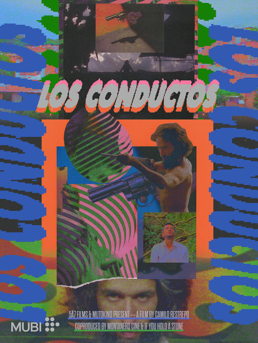
The work that has stuck with me most this month, however, is that of Los Conductos (limited, April 29). It’s a poster that was released in 2019 ahead of the film’s Berlin premiere (and has subsequently been used as part of a collage by Chris Burnett and commissioned by MUBI) that captivates in its effective layering of black and white photography, repetitive line patterns, and color fields attractively bleeding over into the beige background at the right edge as though evidence of plate separations. Positive and negative space flicker with two men represented by one and the other before being interlocked as one.
Does it tell us anything about the movie itself? No. But it grabs our attention and worms its way into our minds to remain visibly important upon passing by its name on a marquee or the image itself when scrolling through selections on a streaming site. That’s the goal: recognition. Give us something to vibe with and be rewarded by the implicit hold its success manifests.