“Don’t Judge a Book by Its Cover” is a proverb whose simple existence proves the fact impressionable souls will do so without fail. This monthly column focuses on the film industry’s willingness to capitalize on this truth, releasing one-sheets to serve as not representations of what audiences are to expect, but as propaganda to fill seats. Oftentimes they fail miserably.
Daylight Savings coming to an end alongside that brisk autumn chill means awards season is finally here. So get your brand new MoviePass ready and your route to your local indie theater cleared. For those more into superheroes than critical darlings, however, don’t despair. Both Marvel and DC have you covered too. Add Pixar’s latest Coco (opens November 22) and I actually wouldn’t be surprised to see November earning a bigger box office take than any summer month this year as a result.
Super characters


While it first looked as though DC would do things differently than Marvel as far as meet-ups versus standalones, their trajectory proved pretty similar if accelerated. We got our Superman movie, Batman (kind of) movie, and Wonder Woman movie all before their paths cross with newcomers Flash, Cyborg, and Aquaman (Avengers had six established opposite two newcomers). And while Iron Man and company “assembled,” Batman and friends are “uniting.”

With five years between their competitor’s gamble and this month’s Justice League (opens November 17) bow (Joss Whedon ultimately and inexplicably ushering both into theaters), the risk is less about the viability of the genre and more about that of the DC tone. It’s therefore unsurprising that Warner Bros have skewed close to their predecessor while also trying to mine the current zeitgeist.
So WORKS ADV’s teaser logo recalls BLT Communications, LLC’s Avengers with some added drama. The original sheet housing all five heroes stays rather tame with big text and little context. These are conservative approaches, but they occur during a period where the goal was simply name recognition and stock poses (see row two).
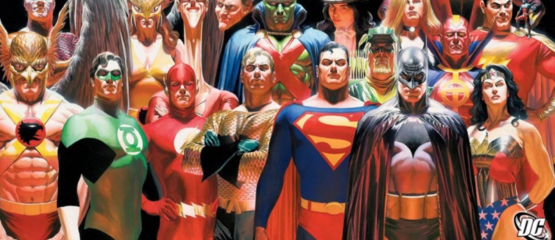
That leads us to B O N D and their appropriation of Alex Ross’ seminal Kingdom Come artwork with fantastic, shadowy portraiture of Ben Affleck and company. If only they didn’t decide to turn each hero’s symbol into a letter to then incorporate into the tagline, this thing would be worthy of hanging on the wall. That logo gimmick is laughably bad, though. It cheapens the austere drama of the rest.
Concept Arts does a much better job with those icons on their character sheets (see row three). They decided to let the symbols enhance their design rather than overpower it, each one interlocking with the Justice League emblem for continuity. This allows their appropriation of Mike Mitchell’s Marvel-heavy profile paintings—more egregiously than B O N D with Ross—shine on its own. But while it’s one thing to mimic lighting effects, it’s another to literally steal an aesthetic. I hope Mitchell was compensated.


From here B O N D moves to cartoon illustration while retaining the clunky tagline. And Concept Arts moves to an intriguing split-screen look for their new portraits (see row four). The latter shows again how they have a better handle on using the icons as enhancement rather than distraction. They blow each up to be a window of sorts wherein the image outside is a black and white depiction of the character’s “human” disguise and the image inside is a colorful glimpse of each in full uniform. Again, however, it can’t help but recall another artist’s work: Martin Ansin’s Spider-Man: Homecoming.


LA went with the kitchen sink aesthetic on Thor: Ragnarok (opens November 3). Whether it’s their circled worlds showing just how many places the titular hero goes this time around, computer chip diamonds keeping their collage interesting despite it still being a collage, or the Photoshop illustrative filter slicing Thor into segments inhabited by his co-stars, these designers threw everything in. And why not when the logotype they’re working with looks like it was lifted straight off an Atari cartridge? Amp up the colors and assault eyes to ensure they remember Asgard is back.
Even Tracie Ching goes full color crazy with her metallic looking lightning Thor storm above right. It’s not as much psychedelic as it is collectible trading card with foil emboss. And while that sounds snarky, I don’t mean it as such. It’s a style unlike anything else on the multiplex’s walls and frankly that’s the goal. You’re trying to distract someone and this one is shiny enough to do so unironically.
This is why B O N D’s heavily saturated chalk clouded character sheets are simultaneously boring and unforgettable. The poses are stiff, but the color is electric. I’m not sure if there’s relevance to the texture besides it looking cool and tactile as opposed to blurry explosions, but it definitely turned my head. Sometimes it’s just about finding a solution to a problem. How can we complement these characters with color that’s attractive and “real?” Throw dust at them.


LA had their work cut out for them with Wonder (opens November 17) since you don’t want the marketing material to hinge on prosthetics. Mask avoided the same issue back in 1985 by always having Eric Stoltz’s character seen in silhouette or from behind because the point of these films is message-based. You don’t want to scare shallow people away with an “ugly” face. You want to bring them in with promises of uplifting empowerment.

That doesn’t mean LA shies away completely. In fact they do a nice little maneuver wherein Jacob Tremblay’s Auggie is “revealed” after an initial tease with the actor in a space helmet. The concept draws viewers in with mystery while also dealing with the imagery in a delicate manner that’s neither exploitative nor cowardly. Put him on a bright pastel blue background with bold white text devoid of counters and you ensure our focus is on this “kind” boy we “can’t wait to meet.”
But when it was time to do something more substantial, the firm went back to anonymity with the helmet and illustration. The painting is cute with the dog and “alien” feeling, but perhaps too precious and avoidant. The animated series is therefore the film’s best because it puts Auggie on equal footing alongside his costars without making passersby uncomfortable. “Choose Kind” arrives with a playful lilt and faces become black and white abstractions of hair and flesh with only an eyeball adorned by the title to add personality. It’s simple, effective, and unobtrusive without being misleading.
Modern portraiture


It’s nice when a film doesn’t have a well-known subject and the marketing team have the room to make something that’s attractive with or without the person’s face being visible. A Gray State (limited November 3) is just such an example as the poster deals with context rather than content. The documentary is about an Iraq veteran found dead before he could finish the alt-right dystopian movie he hoped to create. David Crowley is centered on as both a tragic figure and a man peering at the world through viewfinders. It’s about discovering who he was and what happened.
So the concept of showing him pointing a camera at us is perfect. He’s seeing us through a filter that ultimately proves filled with paranoia; we’re seeing him as he hides his true self. This monochrome image is fading into its gray background, his life gradually unraveling until there would be nothing left. The poster says a lot without much detail, our intrigue about this mystery man’s identity enough to pique interest and learn more.
The Robot Eye’s Princess Cyd (limited November 3) does the opposite as far as making certain we see its subject in full. But that doesn’t mean she’s any less interesting due to coloring, subdued aesthetic, and ornate text. It’s almost as though the firm saw the press quote “A lush film” and ran with that visual potential. They soften things until they possess an ethereal glow, this character caught in a sort of fairy tale environment masked by rosy-eyed hope and wonder.
Her face, hair, and shirt are lent a pinkish hue to almost melt into the background of blurred and faded trees. She’s not “popping” out of the frame or begging to be seen—she’s merely there. She just is. The title’s dark red script is therefore a major contrast, yet its subtle tinting by the lens flare in the top left ensures it only “pops” enough to be noticed without overwhelming. Everything here is dialed back to let us absorb its sense of feeling.
On the Beach at Night Alone (limited November 17) takes things further by confusing text and image in a way that forces its audience to choose what to see. Because of the color selection, font, and crop, it’s almost impossible to feasibly read the title and focus on Kim Minhee simultaneously. You either pick up on her darkened figure against the bright water and sky or you decipher the purple handwritten scrawl superimposed above her—text that requires your attention to comprehend. And yet neither feels out-of-place. Neither is stronger than the other. The choice is yours to make.


It’s similar to director Sang-soo Hong’s last film Right Now, Wrong Then albeit less mesmerizingly intense. The marriage between image and text remains while the bold, formal composition takes a more conservative turn. Even so, the sheet is much better than its alternate design that pushes Minhee to the bottom of the frame so the text can rest above her head. Now the white coloring makes it so we see nothing but the title, its thicker stroke heavy-handed as nuance is usurped by legibility.
The easiest way to avoid the latter? Empire Design has the answer with their wonderful teaser for The Darkest Hour (limited November 22). If you don’t want competition, remove that which would compete. We all know what Winston Churchill looks like, so the simple inclusion of “Gary Oldman as Winston Churchill” provides the answer to who the man holding up two fingers in “peace” is. This knowledge lets the off-kilter crop and starkly contrasted lights and darks create an attractive dynamic that’s only broken by the bold title in color. And it keeps the distraction—either positive or negative of Oldman as Churchill—at bay.


Luckily for the film and the ad campaign, the make-up has this actor looking very much like the historical figure he plays. That doesn’t mean you should eventually put him front and center, though. A little patience can go a long way still by simply alluding to the figure under dramatic lighting and atmosphere. This is what Empire does with their second teaser cropping his face from the nose up and ARSONAL with their black and red poster covered in smoke. There’s a sense of weight with both as far as who Churchill was and what he did.
Sadly that’s not the case with ARSONAL’s teaser. It shows too much Oldman in profile tinted a ghastly reddish hue with translucent serif text taking over the whole frame, hurting your eyes in the process. The sheer artistry of the previous three make this look amateurish at best.
Take a look at my cast list


It says a lot about an industry when advertisements for art can find themselves selling the pieces within rather than the whole. But that’s Hollywood and a collaborative art form comprised of multiple artists all working together for the same goal. You’ll have people buying tickets to a movie because their favorite actor is in it. Others will blind buy because of the director or the writer or the costume designer. And if your film has Oscar winners in it? Slap that on the poster too in case you might cajole a stranger into thinking this one will be just as prestigious as the last despite the only similarity being a paycheck.
Unfortunately, while this mode of thinking is crucial to the artwork’s success, it’s often devastating to the artwork selling it. Case in point: P+A’s I Love You, Daddy (limited November 17). Rather than let this low-fi black and white design breathe, the firm is forced to do the best it can with way too much information. Actor names as big or bigger than the title always spells trouble.
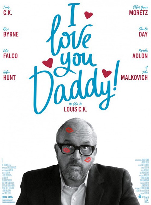
To look at this piece is to be frustrated. Sure we recognize some of these people, but what’s the purpose of their positioning? Why is Chloë Grace Moretz large and grainy while the others are crisp and dark? What’s with the drop shadows on people that are very intentionally depicted as two-dimensional? The only thing I really like is the title treatment—something that seems out of place with the rest, fun and bold instead of flat and uninteresting.
The international poster isn’t great, but it is better. For one it doesn’t clutter the frame with redundancies. (Do we need tiny figures we can barely discern when their names are legible?) Finally the title is given importance, the tone less serious overall with tiny hearts and pop art kisses adorning writer/director Louis C.K.’s face. Let’s face it: he’s the one-man band draw (or detractor). Those other eight names aren’t selling haters on giving this a chance.
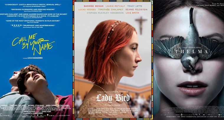
BLT Communications, LLC doesn’t have the problem of a divisive creator with Lady Bird (limited November 3). They don’t need to hide Greta Gerwig’s involvement by focusing on the cast; the cast is the focus. But rather than clutter things, they’ve distilled the environment of the film down to font and aesthetic. They’ve embodied this teen’s existence within (and ultimately rebellious against) a Catholic School with stained glass borders, cross iconography, and Old English text.
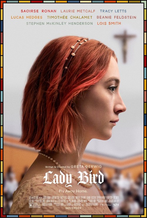
And even though there are also eight names here, they are presented in a way that progresses our gaze down to the title. They aren’t a distraction; they’re a journey. “Oh she’s in it? Her too? And those two? Whoa, Greta Gerwig wrote and directed? What’s it called? Lady Bird!” It may seem so basic, but this is intuitive design at its finest.
It would have been very easy to derail all that works here with their full sheet of Saoirse Ronan, but they again rise to the occasion. They mimic the composition with her head being the cast list block and a real crucifix punctuating where a geometric cross once resided. The names are then rendered to complement the colored border, what they say becoming secondary to how they enhance the visual look. Our eyes can’t help but eventually settle on the bright white of the name below.
These next two are evidence of a creative hive mind. Like when two Truman Capote movies or two Jungle Book reboots are put into production at the same time, B O N D and Art Machine have crafted the exact same poster for Three Billboards Outside Ebbing, Missouri (limited November 10) and Murder on the Orient Express (opens November 10) respectively. Both are broodingly dark wide shots of dramatic sets depicting their titular stages. Both contrast it with a brighter color for text that almost radiates with a flicker, a center justified cast-list one above the next until reaching the title.
Both would also be greatly helped by removing that cast-list so the mood and “logos” impacted us without distraction. Provide those captivating vistas of foreboding danger with no text other than a title to infiltrate our memories and never let go. These prove why graphic design is forever a craft with a foot in two worlds: art and commerce.
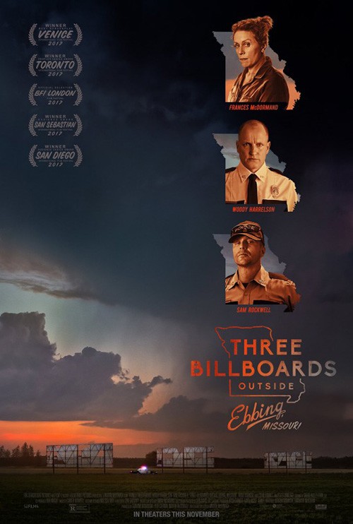
While I like the style of Three Billboards‘ “logo,” it is a mess. A lot of this has to do with it being way too long, but the decision to split the first three words from the last two makes it seem like two separate entities. The different fonts enhance this shortcoming by ensuring there’s absolutely no cohesion whatsoever.
And while it’s a cute decision to use that outline of Missouri for a window on the actors in costume in the next iteration, the result is even more distracting than the text-based cast-list. The look is brightened to draw attention towards these players rather than the drama below. I’m hard-pressed to even look at the billboards at all because they are such an afterthought now by comparison.
The title treatment for Murder is therefore more effective in its simplicity despite having a long name itself. The coloring pops it off the red smoke of the train and the glow provides a neon aesthetic more akin to urban-set film noir detective tales than period-specific Agatha Christie-era bottle episodes. This anachronism isn’t an isolated incident, though. If you’ve seen the trailer with Imagine Dragons playing, you’ll know the studio is desperately seeking an avenue to hit millennials that would turn their nose to Christie otherwise.


The full sheet relegates names to the top so waxy figures of the cast can be seen in full below, but it still works in large part to the colors. The neon lends it a hard-boiled look that screams “Mystery!” And the gorgeous layout of the title as a box that doesn’t play fast and loose with its kerning keeps things solid and calm despite the chaos we know is occurring within every person’s head.
To me the biggest misstep of this campaign is the character series. The text isn’t neon anymore—it’s interior-shadowed letters warped and enlarged to give vertigo rather than clarity. Who cares if she’s “the widow” or he’s “the doctor?” Talk about taking something that works and running it into the ground by augmenting subtleties into focal points.
Lingering images


This poster for Most Beautiful Island (limited November 3) may say nothing about the film itself, but you can’t tell me you wouldn’t stop and take a second look if you saw it on the theater wall. Just because the red and black duotone is more than likely a “stamp” filter from Photoshop—one perfectly calibrated to give us just enough nostrils to form the face beneath those white eyes to this character’s soul—doesn’t mean it doesn’t work.
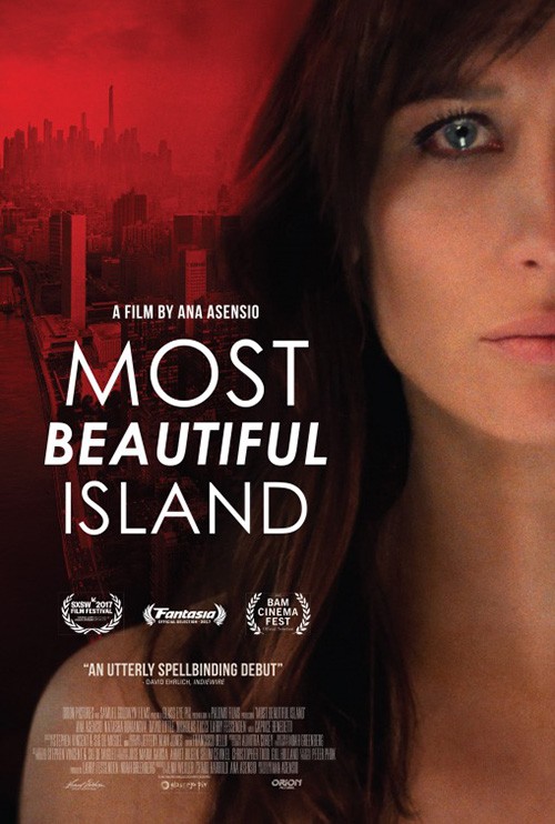
And the title is a master class of typography in as far as using a wonky font without letting its issues distract from its beauty. The designer used the diphthong in “Beautiful” to counteract the empty space between an “E” and an “A” and then cut off the bottom of the letters in “Island” to avoid that worse gap between an “L” and an “A”. These maneuvers don’t hamper readability as a compromise for style; they enhance the style that was already present.
Compare this sheet to the final and you see how much intrigue is lost when settling on photography and generic fonts. Nothing here begs for attention. It actually asks you to simply move along to the next.
Call Me By Your Name (limited November 24) could do no wrong with the image they chose. It’s a perfectly composed repose between Timothèe Chalamet and Armie Hammer that infers upon their relationship and creates a triangle pointing up to the title—along with the former’s gaze. The only thing that could make it better would be removing the critic blurbs and moving the title up to give some distance between it and Chalamet.
Even with all this white text that’s interestingly enough easier to read than the compressed actor names at bottom, the design succeeds. One could say it actually balances out the bottom-heavy layout to make an hourglass tapering towards the title at center. As for that yellow bit of loosely scrawled letters, the font’s breeziness really aligns with the photo’s lazy Sunday vibe. This is daydream incarnate.
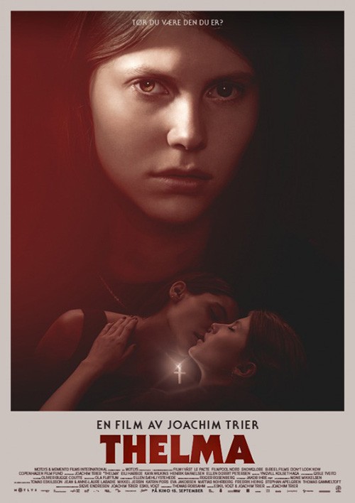
That leads us into nightmare because there have been few if any posters this year as unsettling as P+A’s Thelma (limited November 10). I don’t say that just because of the dead bird on its actor’s face or the content either. That in itself is creepy—Eili Harboe’s open mouth presuming she too is dead—but for me it’s the eccentric choice of using right justified text that has my head spinning. It feels as though there’s a magnet off the right side of the page pulling the words its way. And while this shouldn’t be any different than left justified, America reading left to right renders it so.
It’s not often I champion a glossy domestic sheet over its atmospheric international counterpart, but that’s definitely the case here. Akiko Stehrenberger’s version isn’t bad. In fact it’s quite good. But focusing on horror tropes with cloudy veils of smoke, a glinting cross, and a direct stare by the star doesn’t quite cause the same unease as the surrealism of the first. Just because something is “polished” doesn’t mean its fake, clichéd, or a failure. It just goes to show that concept can still trump aesthetic trends.
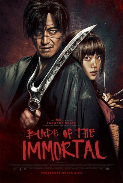
But I do like a good contemporary style regardless of trend popularity and Blade of the Immortal (limited November 3) has one. Just look at this thing with its grunge print in black ink on tan paper stamped with blood splatters and a red title seal of barbed rope. It’s gorgeous with its landscape imagery offset set by portrait text. You can almost feel it spinning, the disorienting swipe of those blades following the circle’s trajectory coming with rage. This design is attacking its audience with impunity and we’re excited to let it.
The graphic quality and skewed composition makes Gravillis Inc.’s poster utterly disposable. It’s through no fault of the firm, though, as they’ve done their job with a menacing if staged pose and aggressive font style. The other entry is simply too good, its kinetic energy earning a visceral reaction this one’s static concept cannot match. You don’t want to judge one thing by comparing it to another rather than on its own merits, but sometimes that level of objectivity is impossible.
What is your favorite November release poster? What could have used a rework?