“Don’t Judge a Book by Its Cover” is a proverb whose simple existence proves the fact impressionable souls will do so without fail. This monthly column focuses on the film industry’s willingness to capitalize on this truth, releasing one-sheets to serve as not representations of what audiences are to expect, but as propaganda to fill seats. Oftentimes they fail miserably.
You can thank Avengers: Infinity War spill over and May’s most anticipated blockbuster Solo (open May 25) for leaving the four week month rather spare where it concerns studio pictures despite being the start of summer. I’d steer clear of the month if I were an executive too—heck, three of the posters highlighted below aren’t even “true” theatrical releases (two hit Netflix with the third making its bow on HBO).
As any cinephile knows, however, there are always a few strong pictures banking on the oft-discussed counter-programming position. So we check out the posters and get excited regardless of needing to navigate through a sea of Disney-backed character sheets assaulting us everywhere we go.
Look familiar?


What May does possess is a healthy number of posters that can’t help but evoke another from the annals of film marketing. While some do so with admitted purpose, most prove to be complete headscratchers. I’ll give these firms credit and three of these for fall in the former category.
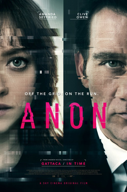
First up is Anon (Netflix, May 4). Let’s be honest: if you have Amanda Seyfried in your movie, you’re putting her on your poster. Apparently, if you’ve used her in one of your past films you call her up for another too. Like In Time, Andrew Niccol is the director of this science fiction starring Seyfried’s bangs. I’m not sure what’s going on with the super-imposed boxes, but I’m sure it’s important.
You can’t blame the designers for recalling Niccol’s past work, especially since this is a Netflix film—a platform that may also have In Time available for streaming by the 4th (a page exists, but it’s blank). That type of brand recognition for the artist is significant. The service doesn’t need posters per se, so creating one must provide purpose even if the result isn’t quite as dynamic as its competitor’s attempts (see the sheet for Sky Cinema at right).
For Life of the Party (open May 11), cold open opts to focus on genre as much as celebrity. They could have just put Melissa McCarthy up there with her graduation cap, but the addition of the tassel as obstacle to vision turns a static, content-driven image into one that’s animated and tone-driven. Crew Creative Advertising did the same with Get Smart a decade ago for identical reasons. This effect of subverting self-serious promotion with visual gag conjures a smile and hopefully helps your brain remember the title. It doesn’t do much on its own artistically, but it does its job.
The poster for Dark Crimes (limited May 11) does neither. I’m not certain as to the motivations of anything on this one besides the decision to fill the frame with star Jim Carrey. Is that slice going three-quarters of the way through the page supposed to signify the “light” and “dark” sides of his mind? If so, why isn’t it separating two distinct expressions? Or maybe his face is good and his head (brain) is bad? At least the “R” is backwards to really show where this film dares to go …
This thing is so innocuous that I just see LA’s Aftermath instead. Aging and grey-bearded actor looking down in profile? Check. Diagonal white line cutting across? Check. But at least this one feels dramatic. It exudes a melancholic sadness by shielding Arnold Schwarzenegger’s eyes and presents context with the “line” being a collision course of two airplanes. We learn something here. All Dark Crimes gives us is confirmation that Carrey does still supplement his painting by acting every once in a while.
And that leaves us with The Cleanse (limited May 4) by Phantom City Creative (when it was still titled The Master Cleanse). It’s a neat image with a little demon dude rising up as a shadow from Johnny Galecki—perhaps the “thing” he must purge from his body. I love the softness of the sheet from its off-white coloring to its almost blurred yet sharply cut font. But I loved this all even more when the firm did the exact same thing with The Void.
I can easily forgive this one, though. Phantom City Creative isn’t some corporate entity slapping photos and text together. It’s a niche, two-person, independent studio that has done a lot of alternative sheets for Mondo over the years and their unique style will of course permeate through the entirety of their work. Is it disappointing that I can’t look at this one without seeing another? Yes. But it succeeds and proves to be distinctly theirs. That’s ultimately what paying customers seek when approaching them for work.
Looking good


There’s a lot to like about Mary Shelley‘s (limited May 25) poster. The crop, the monochrome coloring offset by the brightness of Elle Fanning’s eye, and the blank expression recalling the subject’s most famous creation: Frankenstein’s monster.
But there’s just as much to question. Why fill the title with what appears to be a woodcut illustration from her book? Why split the tagline into three distinct parts despite none of them making sense without the others considering it is a single sentence? Why not use the line “The life that inspired Frankenstein” as the tag (to supply a message) instead of positioning it as a subtitle (to demean observers who do actually know who Shelley was)? This is a good first draft that needed more honing.
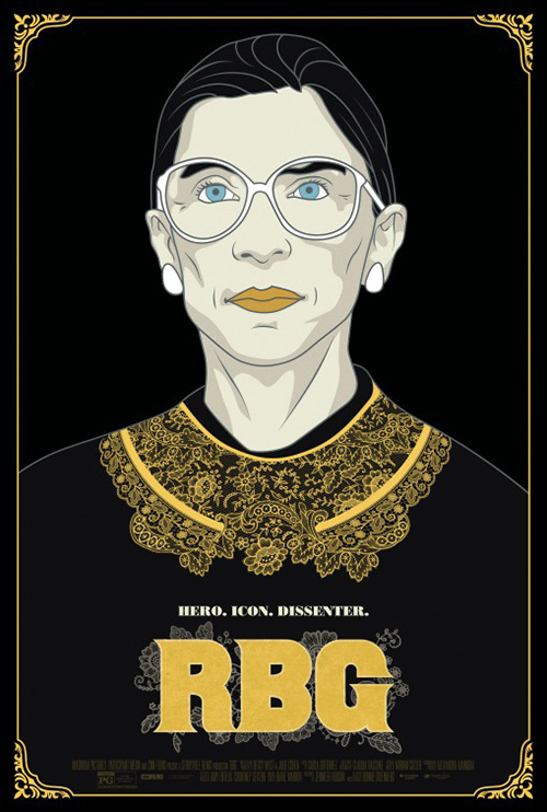
The same goes for Gravillis Inc.’s RBG (limited May 4). I like the concept: make a graphic image that embodies its subject without showing the subject. What better way to do this for Ruth Bader Ginsburg than using her trademarked lace collar? There isn’t. But the way it is oriented doesn’t lend itself nicely to what’s around it. The stacked title overpowers in its boldness and the choice to curve the tagline proves misguided in its awkward construction.
The firm’s second design is much better as the lace is allowed contextual shape, the tag is straightened, and the title is adjusted for color, detail, and cohesion. Why is Ginsburg a cartoon, though? I’m not saying we need a photo here, just a more photo-realistic illustration. Here’s all this ornate line work ruined by a simplistic vector portrait sticking out like a sore thumb. It feels like they spent too much time on the bottom and needed to rush to finish the top before deadline.
Cartoon is obviously more relevant when it comes to an anime such as Lu Over the Wall (limited May 11). This simplistic line-drawing aesthetic is the same that the film utilizes—the playful bubble glares a charming inclusion rather than distraction. Boy is it busy, though. I understand wanting to throw in as much as you can, but I’m not sure what it is I’m looking at thanks to too many redundancies.
We don’t need big Lu and tiny silhouette Lu in the title when the title is positioned within her hair(?). That’s a cool stylistic addition when you’re just using the title as a tease or have the title far enough from the image itself to tie them together. I like the upside-down boy at top as a visual contrast and artistic complement, but the dogs are too much. It might be their size, but it feels as though they are drawn in a different style than the humans. And why are there so many umbrellas? I’d rather be given an idea of place than be beaten over the head with a motif that’s meaningless before seeing the film.
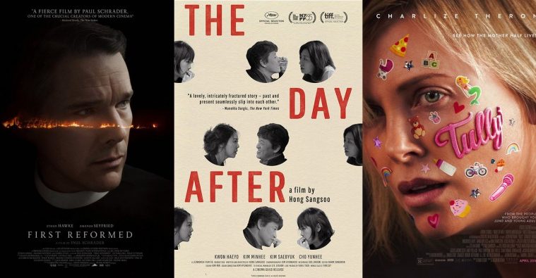
The Day After‘s (limited May 11) sheet is for the most part great. It stands apart with its color, staggered title, and unorthodox use of photography. But it’s also somewhat confusing in its visual language by alternating between word and image with laurels, critic quote, and cast/crew seemingly filling in the blanks. With all that excess it can be difficult parsing the main compositional idea of placing a title word in the gap between Kwon Haeyo and whichever woman is left watching him with another. It actually makes it so that we don’t look long enough to even acknowledge this choice.
That’s a shame because I think it really says something about what the film might be. You get the sense of cheating, of Haeyo’s character engaging with three different women at three separate times while another is left alone. Letting his photos change while keeping the women the same is yet another interesting narrative contrast positioning him as the focal point and them the planets orbiting around. I simply wish there was a way to free this dialogue from the business-side so forcefully pushing its way in.
Two-handers in two dimensions


There’s something wonderfully disorienting about InSync Plus’ poster for Beast (limited May 11). It’s not rare to use a shallow depth of field that highlights one of two characters in a single frame, but it is when you do it in a way that blurs the figure taking up a majority of the space. Here’s this giant image of Johnny Flynn and yet our eyes can barely look at him without seeing Jessie Buckley’s glare in the distance. It seems faked and I wouldn’t be surprised to learn the designer blurred him intentionally despite the photograph being in focus, but it works. It creates an unnerving aesthetic that directs our vision to what’s important. Add a distressed Old English title in white and you realize from the ping-pong back and forth that it describes her.


On the surface it looks less substantial than AllCity’s character sheets with their more subdued color scheme and darker visual atmosphere. But are they really darker? Do they equal the menace that radiates from the one above? No. Sometimes memorable artistry is no match for an expert handling of design that renders a simple photo unforgettable.
On Chesil Beach (limited May 18) by The Refinery is telling a different story with its two leads. Animosity doesn’t separate these two, insecurities, shame, and selfishness do. This is expressed not by making one clearer than the other, but by putting them back-to-back. The silence between them is deafening as a result, their unspoken frustrations driving a wedge that turns a distance of inches into miles. We see his anger-tinged sorrow and her confident pride making it so they may never look upon the other again.
It’s an effective image that also helps to frame the page’s expanse of sky. The credit block and critic quote are right justified to let their staggered lines wrap around the curves of the actors’ heads. I don’t love the multi-colored text on the quote, but I get that it was done to ensure it’s not lost in the blue like the cast/crew. It unfortunately just risks distracting our focus from the gorgeous hand-drawn title font as much chalk-like as skywriting. The delicateness of its orchestration is the perfect contrast to their faces—a hopeful lilt rendered incapable of sustaining itself against the drama to come.
That type of drama isn’t necessarily the first thing you think when the name John Woo comes up—despite his best work proving great examples of the genre. No, it’s action. So its not surprising this sheet for Manhunt (Netflix, May 4) would go full Non-Stop in its motion blur, bottom-heavy diagonal free-fall. These two men are about to leave the frame while the background whooshes forward at the speed of the bullets being fired.


I’ll be honest: this poster isn’t anything special. It merely shows what you can do with two characters in-sync with each other unlike the previous two films. I much prefer the Mandarin entry with its handcuffed arms forming Woo’s trademarked flying dove. You receive the sense of camaraderie of the first without the noise (albeit also with much less intrigue). What I really like is the title’s loose calligraphy coupled with an English translation that’s individualistic in its internal non-conformity.
Midnight Marauder’s The Tale (HBO, May 26) is the least dynamic of this section and yet you couldn’t say it is any less effective. Yes, it’s just a film still. And yes, it’s just a simple sans serif title in white. But when you don’t need anything more than that, why ruin it by going too far?
This is the film’s Sundance advertisement and if it got picked up by a studio rather than HBO it probably would have been given a makeover with a Laura Dern close-up hoping to capitalize on her stunning run of hits these past couple years. But doing so would have squandered the precision sense of emotion provided here. I haven’t seen the film so I don’t know if the young girl is Dern’s character’s daughter, but I’d like to think she is her past self instead. Here’s the girl that tragedy befell looking up at the woman she’d become for strength and answers—both of which won’t necessarily be easy to give.
Winner winner, chicken dinner


When an image is captivating enough on its own, it takes a confident designer to realize as much. Too often posters reveal themselves as try-hard with 3D-beveled fonts and unnecessarily gaudy photo filters that ruin what created enough drama all on its own. Just think of all the things that could have been done to turn this sheet for Sollers Point (limited May 11) into another glossy piece of consumer culture. Think of all the things the designer refused to do so the image could shine.
Not only is this scene of a man dipping his legs into water off his submerged car a head-turner, but the setting beneath the concrete stanchions of a bridge add a dystopian allure to complement his dejected disposition. And none of it is obstructed. The title is gigantic and yet it doesn’t hide the oppressive beauty of those gray behemoths rising into the sky. The text frames the man so we read title, experience his trouble, and learn the details. Sometimes the best thing an artist can do to leave his/her mark is to remove him/herself from the equation.
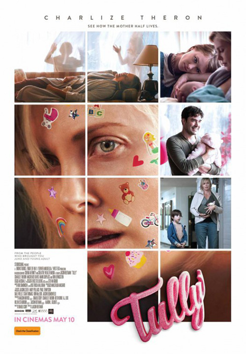
In many ways ARSONAL’s Tully (open May 4) does the same. It may not seem it since so much is happening that might not be part of the original photo, but it all makes sense. Charlize Theron’s expression may have been enough to depict the harried exhaustion of parenthood, but the addition of those stickers only amplifies it. I love that some are firmly affixed and others lifting at the edges either by sweat or longevity. And the artistry on the title to make it look like a fuzzy sticker is superb.
I’m not sure why you’d want to break this up into a grid with boring stills that force you to remove the title from her face. That “sticker” only works when it is adhering to the curve of her check. It being a sticker is the only reason to make it puffy and fuzzy. Without that context it’s becomes style without substance.
P+A knock the poster for First Reformed (limited May 18) out of the park. They refuse to sacrifice the readability of their main image (Ethan Hawke) by segmenting the space, instead superimposing the scene of a church and its adjacent land on fire atop his face. It becomes a meter of sorts—for his rising emotion rather than heartbeat. Here’s an incident that drives him to the darkness we can only assume will consume him. It’s on his eye-line, in focus, and threatening to spread.
Beyond the imagery is the subtly effective use of typography. If you notice there’s a shift in opacity depending on appeal. The title is brightest, the actors a step below. The critic quote at top is equal to the actors or a little lighter with director Paul Schrader’s named fading into the background with the credit box below. Everything is meticulously spaced to go text, fire, and text with equal vertical distance between. Look hard enough and you can make a cross in Hawke’s face too: mid-brow shadow down to mouth and eyes across.
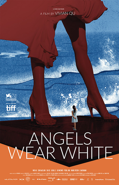
No matter how good that one is, though, few could come close to matching the gorgeous textures of something as beautifully abstract as Angels Wear White (NYC May 4, LA May 18). It’s like a collage with seemingly disparate pieces slapped atop the next similar to a wall of old paper notices, striations of time exposed. The blue and white water looks like a mixture of Hokusai and Pollock, the giant Marilyn Monroe statue a warm red against that cool palette losing enough clarity to render it Pop Art in style. And there in the middle of it all is a young girl, photo real and gazing towards this iconography of a life far removed from the one she’s led.
It’s an artistic representation of a scene straight from the movie that delves into the lead’s mind to mine her psychology and emotion. The colors are vibrant and audacious, the text pushed to the side to allow the visuals our full attention. I’m glad its English counterpart retained its art even if the text can’t help but minimize its power.
What is your favorite May release poster? What could have used a rework?