“Don’t Judge a Book by Its Cover” is a proverb whose simple existence proves the fact impressionable souls will do so without fail. This monthly column focuses on the film industry’s willingness to capitalize on this truth, releasing one-sheets to serve as not representations of what audiences are to expect, but as propaganda to fill seats. Oftentimes they fail miserably.
In a five Friday month, March 2018 doesn’t disappoint with way too many releases to even begin to touch upon the artwork of all. The fact that every wide release from Death Wish (March 2) to Gringo (March 9), Pacific Rim: Uprising (March 23), Sherlock Gnomes (March 23) and Ready Player One (March 29) has multiple, uninspired character sheets doesn’t help. (Sorry, this means I won’t be bringing up the poor perspective-induced stilt leg on the latter—link.)
I can thankfully afford to ignore them all because the indie and foreign slate is both expansive and (mostly) attractive in print. What’s truly surprising among them, however, is my ability to make three distinct groups based around a single aesthetic/aspect within. The design hive mind is in full effect with certain poster tropes proving effective in the past and therefore highly mimicked for better or worse.
The Outliers


This is not one of those sections as these four have very little in common.
The first for The Leisure Seeker (limited March 9) isn’t even a poster I particularly like. Its image is nice with a dynamic crop of actors in character, but what’s with the lined frame as route for the tiny RV? Why was it deemed more important than keeping the leading between “The” and “Leisure” manageable as two parts of a three-part whole? I don’t even want to hear the reasoning.


I’ve included it hear as a placeholder for the weirdly captivating illustrative posters from the Pacific. Why this film about an aging (and tragically ailing) couple traveling the United States caught the attention of Spin Destiny to release these two pairs of colorful artwork is beyond me, but here we are.
I’m a fan of the first coupling with their imperfect portraiture that look nothing like Donald Sutherland and Helen Mirren while also looking exactly like them. A bit of soft focus collage enters to give some insight on their roles with pills, booze, books, and ice cream and the result is nothing if not worth a turn of the head.
The second is more Photoshop filter chic with ornate framing than true illustration, but they still have style. I guess 72 and 82 are the new 22 and 32 out west. I’d definitely rather see character sheets of these two with actual history on their faces than the airbrushed smoothness of those A-listers who are just beginning.
This next one proves I didn’t ignore all the behemoth releases this month. I just couldn’t leave this spirograph collage for A Wrinkle in Time (March 9) off the docket. BLT Communications, LLC could have just done the usual heads upon heads or that popular irregular grid of boxed heads, but they instead came up with this colorfully layered work at the convergence of art and commerce.


The line that cuts the page in half diagonally doesn’t seem to break-up the content in any meaningful way (I haven’t seen the film or read the book) because the designers decided on a visually radial transition rather than linear. Our eyes go to the center title and spiral out through the warm oranges to cool blue-greens. I like that Reese Witherspoon’s hair becomes part of the palette and how color itself is stripped away as we move closer to the edges (save Michael Peña’s glowing eye). There’s a lot happening here formally than you would initially assume.
InSync Plus’ curtain teaser is another effective part of the film’s campaign and if I’m being honest the other collage sheet is too (it uses prism fracturing to isolate different heads instead of the aforementioned irregular boxes). And you have to like the character sheets in close-up with magic and glitter. LA doesn’t feel pressured to put names on them because they know the images speak for themselves. That isn’t Reese, Oprah, and Mindy. It’s Mrs. Whatsit, Which, and Who.
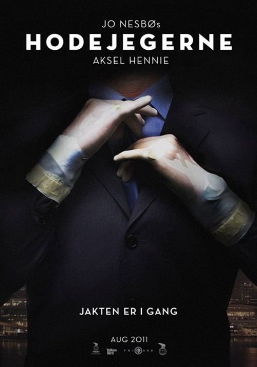
For The China Hustle (limited March 30), faces aren’t even necessary. P+A takes a page out of Headhunters‘ book with a suited man adjusting his tie. Rather than rubber gloves sparking interest, however, this one is all about the pins: an American flag on the lapel and a Chinese flag on the cuff. It smells like corruption to me, the visual helped along by a tagline about “No good guys in this story” and mention of the Enron documentary.
The whole is a nice piece with symmetry broken by those parts that tell its story. The title is simple sans augmented by color and “$,” the text almost too small to read everywhere else. Those pins really are the draw. And let’s face it: anything with those two countries together under the umbrella of “hustle” will raise eyebrows.
I finish this mishmash of styles with Claire’s Camera (limited March 9). This is a poster that should by all accounts make me look away real quick, but something about it works. The color is bold, the circles arbitrary, the cutout dog staring at us as though hit wrote the pull quote is beyond quirky, and that cursive font above the circular window of actors makes me think of a diner sign. Yet here I am thinking, “Yeah, but it’s kind of cool.” C’est la vie.
Double Vision


There are many ways to do the double exposure trick in design. They don’t all work.
I Can Only Imagine (March 16) goes the safe route with a close-up and long shot. The former is to provide a focal point: the star of the film. The latter is the give us an established setting: in this case the relationship between the star and another. There’s nothing exciting about what’s going on here, though. If anything its staid aesthetic walks into what appears to be a spiritual direction as the actor looks towards God while the two of them walk towards a light of hope in faith. It’s therefore very generic and yet probably extremely successful in beckoning its target demographic closer.
Outside In (limited March 30) goes the bad route. I really don’t think any explanation can make this poster better. It takes its two leads and gives them equal weight with medium shots from their torsos up. It then plays with translucency until they have no choice but to compete for our attention. Where this could be a good thing where our gaze moves back and forth, the act of placing them on top of each other only means frustration. We are forced look at both simultaneously and neither in the confusion.
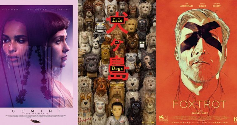
Gemini (limited March 30) shows us the “good way.” Its actors are on even footing, but merged in a way that allows them to be seen together and separately. Their dark hair becomes a convergence point, the two forming what might be a mirror, depiction of multiple personalities, or just two friends. The third image of trees adds another layer of reflection, it being upside alluding to a car window passing by. There is friction in their looking away, mystery in the dramatic purple, and intrigue in the tiny gun easily forgotten at bottom.
Ismael’s Ghosts (limited March 23) proves a beautiful hybrid of everything that works in the previous three. It deals in a close-up and medium shot with one solid and the over almost transparent. Marion Cotillard becomes a complement to Charlotte Gainsbourg rather than competition or even equal. Their imagery works in tandem to build a relationship between hemispheres and color—both of which become intentionally divided by the designer. Cotillard is the same subdued color as the critics’ quotes, fading into the background. Gainsbourg is the same high contrast white as the title and cast list, popping them above the darker wall below. The sheet provides two disparate halves deftly made into one cohesive whole.
Bottom-heavy


The poster for Isle of Dogs (limited March 23) began as a bottom-heavy design (focal point/content underneath an expansive field of negative space). But now its Japanese characters and extensive cast list has dwarfed the scene. I wouldn’t be surprised to hear some say they didn’t even know dogs were included because their sight could never escape the oppressive red of the title. For a tease (of sorts), however, that’s not a bad thing.


Even so, it is nice to see a bit of content for BLT’s next. They’ve put a different scene at bottom and brought the dogs and boy to the forefront within the title itself. It’s still text heavy, but the eccentric stop-motion figures go a long way towards making those names fade into the background. It’s therefore even better then when they’re all removed for your children’s film cliché of putting every character involved inside the frame at once. The red Japanese still pops, but it does so with a milder nudge rather than the previous scream.
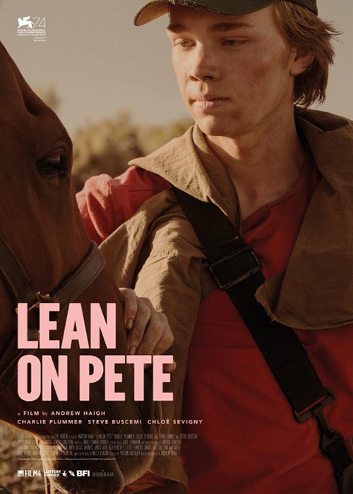
InSync Plus’ Lean on Pete (limited March 30) is a more conventional depiction of the design maneuver—so much so that it almost leaves the top two-thirds bare. The text at top and the tag just below it is so thin that it disappears into the night sky as though more stars twinkling. The title is just as narrow, its size giving it the attention it deserves without hijacking our ability to see the rest.
There’s drama here in the somber silhouette of boy and horse under the yellow glow of a light bulb. The whole conjures feelings of hope and potential with “sky’s the limit” sensibilities and a love like that between Atreyu and Artax in The NeverEnding Story. We have an idea of an impending adventure together, something the previous festival sheet lacks. While we can see Charlie Plummer’s face now, it doesn’t add anything to the message. I wouldn’t even be sure that’s his horse through this scene. He could be a vagrant walking up to give it a pet.
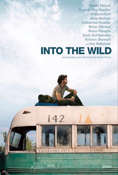
InSync Plus is also responsible for The Vanishing of Sidney Hall (limited March 2). It would be lazy to say they’re ripping themselves off by wielding the same stylistic choice again (remember that studios probably say, “We want what you did on Film X” often), so I’ll talk about its similarities to Into the Wild instead. They both show their lead in isolated repose atop a derelict transportation vehicle. They both depict a sense of worry alongside promise—their stories as believably tragic as they might be optimistic.
There’s one thing I really don’t like about it: the title block. I love the font choice with its boldness, tight kerning, and playful serifs leaning left and right as though dancing. But what’s going on with the justification? The top line is right justified, the second and third left. Couple this oddity with the huge disparity in size between them and it would be easier to have just named the film Sidney Hall. Maybe they’re trying to embody the act of “vanishing,” but the boy is the one performing this verb. So shouldn’t his name be what’s fading away? It’s one thing if it fit nicely above the “NEY,” but it doesn’t. It just floats above the “D” as though someone forgot and had to quickly squeeze it in.
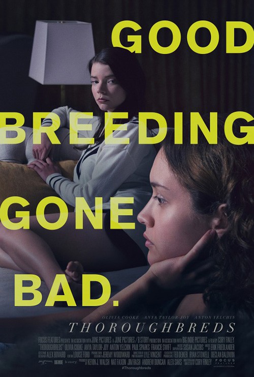
And this brings us to ARSONAL’s Thoroughbreds (limited March 9). Here’s a design taking pains to not let any single piece distract from another. It puts its ample negative space in the middle, separating the text from the imagery. The result is a balanced scale between dark title and sofa-sitting cast because the physical is grounded at bottom while the abstract levitates above without true weight to drag it down.
The pregnant silence that exists on the couch between Olivia Cooke and Anya Taylor-Joy is augmented by the bare wall extending towards infinity above them. It’s sterile and pristine, their angelic façades hiding a darkness alluded to via the blood spot “O” of the title. The tension here rivals that of a second sheet depicting the same scene from a different angle. I’d argue the first is better because it has both girls giving side eye as opposed to one while the other watches TV. The large yellow tagline counteracts the uninterrupted silent judgment that existed too by filling that space. And why isn’t “BAD” touching the edge of the page like every other line above it? I cannot look anywhere else.
An eye for an eye


There’s a very good possibility that the poster for They Remain (limited March 2) perfectly describes its film to the smallest detail, but you’d never know without having seen it. With all that’s going on—the scared, wide eye at the center; the ouroboros hidden in leaves; and the different bugs littering the scene—it’s tough to get a handle on whether the story takes place in reality or some fantastical nightmare. We assume the latter thanks to an ominous tagline, but who knows? I guess you have to watch it to find out.
In that regard this sheet is a winner. I cannot stand how big and yet compressed the credit box is or the “fakeness” of the title (it looks like a free font wherein the designer took an existing free font and put a bad grunge filter over it), but the imagery is undeniably effective. It’s like a rabbit-hole to Wonderland for us to whirl around as we descend further into madness.
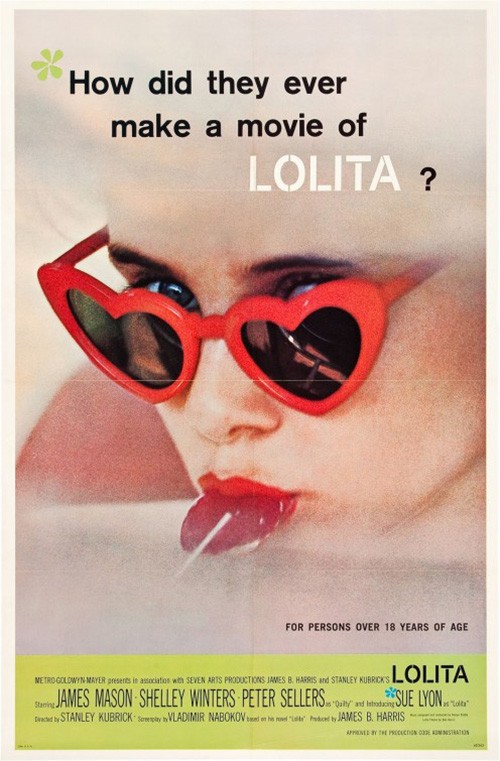
Ignition’s Josie (limited March 16) might not look straight at us like the previous work, but it interacts with us just the same. Whereas that disembodied eye feared what it saw (the viewer), this one gives us form thanks to the reflection of Dylan McDermott. But there’s something more at play here than mere seduction. It uses the imagery of a Lolita to imbue that notion, but it flips it upside down with the heat of a bright neon palette of reds and yellows. She isn’t waiting for us to approach. She’s looming large, showing her dominance from start to finish.
It’s a cool concept that doesn’t quite fire on all cylinders. I don’t think McDermott is necessary or that his presence in both eyes of Sophie Turner’s glasses is realistically drawn. I do like the crop, color scheme, and playfully threatening title font, though. It simply feels like a first draft to what could ultimately become a masterpiece.
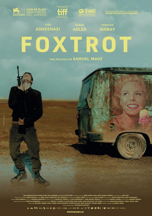
I’m a big fan of Foxtrot (limited March 2)—a piece that appears to have gone through many iterations to become the minimalist illustration we now see. I’ve tried to keep myself in the dark as to what this film delivers (my love of the director’s Lebanon enough to place it high on my most anticipated list), so I can’t talk about the actual meaning behind the imagery outside of its provocativeness.
Here’s this man’s face in portraiture covered by a thick black X. Is he not allowed to see what’s coming or does he hope to stop himself from seeing it? I would lean towards the latter simply because of the black-tinted tear running down his check. This isn’t a blindfold denoting execution. He isn’t crying about his own life. No, this is a very methodical disruption of the inevitable. This is a person closing his eyes and covering his ears to pretend he can prevent himself from learning a tragic truth he already knows.
It’s impossible to look at without finding yourself enraptured by its complexities. The mystery of it is its greatest asset because the mood is familiar in a way that makes us squirm in our seats. You can’t say the same about the other advert formed by a film still. It may be interesting with its soldier hugging a gun next to a van with a painted woman underneath dirt and grime. But it’s a surface interest. It’s something that earns a wryly quizzical smile while the other begs us to discover what its subject refuses to see.
If I were to crown a winner this month, however, that victor is definitely Gravillis Inc.’s Flower (limited March 16). I remember seeing this one online when it came out only to discover I never forgot it. Here I was months later looking at the title and knowing the poster without needing to see it again. That’s power.
It’s so simple too. I assume the image of Zoey Deutch is from the film, but it’s staged perfectly for the purposes of this poster regardless. She’s staring at us with a look of comfort, confrontation, and perhaps invitation as well. We don’t need to know what the flower on her tongue is (drug, embroidered patch, sticker, etc.) because it is of less consequence than the act itself existing within a duality of harmlessness and sexuality.
Transforming that yellow circle into the “O” of the title becomes a genius move because it ensures that we see it. Her eyes are locked with ours and yet we’re drawn to her mouth instead. Place her a bit to the left so the title is centered and the effect loses its unsettling importance. The fact it’s off-center is huge insofar as it stops us from being stuck along the x- or y-axis. We are given freedom by this slight misplacement to roam where we will. So when we inevitably land on her tongue, it feels like we got there without help. With the strings of manipulation removed, we find that guilt and embarrassment replace it.
What is your favorite March release poster? What could have used a rework?