“Don’t Judge a Book by Its Cover” is a proverb whose simple existence proves the fact impressionable souls will do so without fail. This monthly column focuses on the film industry’s willingness to capitalize on this truth, releasing one-sheets to serve as not representations of what audiences are to expect, but as propaganda to fill seats. Oftentimes they fail miserably.
Get ready for remakes, sequels, and festival holdovers because it’s … a month of the year. Sometimes I miss the days of my childhood when there’d only be one new film a week, an era when no one thought remaking an animated film shot-for-shot with real actors would make money. But it’s invigorating nonetheless to see all those tinier films constantly stepping up to go against these behemoths and earn acclaim and cash while proving creativity does still exist.
For a month with five Fridays, however, March doesn’t necessarily have that much going for it poster-wise. There are some intriguing releases like The Belko Experiment (opens March 17) with lackluster artwork or The Blackcoat’s Daughter (limited March 31) with pretty if unoriginal design. Sure they get the job done, but they don’t get me more excited for the films. The same goes for the 90s-chic Song to Song (limited March 17) poster and carbon copy T2: Trainspotting (limited March 17) sheets portraying how much we’ve all aged in twenty years.
Thankfully there are a few works highlighted below that will excite you for what their films may deliver rather than serving as mere placeholders to share title and release date, nothing more.
Beauties, beasts & Power Rangers


But let’s talk about that shot-for-shot remake first. While I say this facetiously since The Jungle Book proved Disney wasn’t interested in remaking their classic films as much as improving them (which it did by a mile), it’s tough to watch the Beauty and the Beast (opens March 17) trailer and not think, “Why shouldn’t I just stay home and watch the cartoon?” I’m not sure there’s a good answer. Time will tell.


What we do know is that BLT Communications, LLC decided to double-down on the nostalgia by all-but copying its 1991 Oscar-winning predecessor. Just look at the teasers with darkly diffused atmosphere turning its pair engaged in dance to silhouette. The pose is different, but the intent is identical. Besides a bit more color and its stylized title font, the image triggers something dormant in our memories.
The same can be said about the full sheet with its not quite cartoonish menagerie of inanimate objects looking upon the titular duo. What’s different here is that the shift from cutesy to “realism” is disturbing, the live-action feel making things darker than the cartoon ever could. The shadowy mood lends a sinister aesthetic that may overpower the idea of romance we’re supposed to experience. Or maybe it’s intentionally underling the Stockholm syndrome aspects of the script.
As far as the character sheets go, it’s telling that the American versions are obligated to show the actors behind the animation while France retains a sense of mystery like the film (hopefully) will. And what’s with keeping the Beast in his cursed form despite this choice? Is it just because Dan Stevens isn’t well known here? (Although Legion is changing that if Downton Abbey didn’t already do so.)
Disney wants their cast to be seen and seen they are. Sadly it only renders the whole to look more Tim Burton’s Alice in Wonderland than the “most beautiful love story ever told.”


Power Rangers (opens March 24) has sought to set itself apart from its source material by relinquishing the “Mighty Morphin” except in tagline. Much like the trailer, however, they’ve adapted a similar bent to Chronicle instead. LA goes for silhouettes of kids readying to become what we know they will, much like the aforementioned “regular kids get superpowers” film (albeit MIDNIGHT OIL placed them in full flight). The grittiness is intact, the infinite possibilities as represented by a wide expanse of sky too. Those boys refused to come together while these boys and girls are told they must to “be more.”


This tease paired with the foggy action shot of mechanical beasts looking very Transformers-like is pretty cool. There’s atmosphere, mystery, and a distinct lack of polished faces (considering all are practical no-names thus far in their careers anyway). I also enjoy the simple “Go Go” with lightning bolt in lieu of the title. It still surprises me that this franchise is ubiquitous enough to get away with that, but here we are in 2017 with Saban spending big yet again.
From there we get the requisite character series with Lionsgate going full Hunger Games on the sheer number of variations. We get the portraits in shadow, the poses on Zords, and the “high-speed” static shots with blurred lines. There’s drama, scale, and action: although the main goal is to simply saturate the market and our eyeballs. Frankly, these all do a better job than the final, generic totem collage of costumes. At least Elizabeth Banks adds some excitement in that one to counteract the staid heroes.
Grab bag


Because there are so many Fridays and therefore releases this month, I had to just make a category for random designs that aren’t necessarily similar to each other besides being worthy of mention. Here they are.
First up is My Scientology Movie (limited March 10). In all honesty, the poster isn’t anything special as far as content goes with title, subject, and environment. If this were based around a photograph we’d dismiss it as soon as we looked at it. But it isn’t a photograph. It’s a new work commissioned from Ralph Steadman and it’s glorious as a result.
The designer is Mister.S and all the credit to him for getting the Fear and Loathing in Las Veags illustrator to come onboard. There’s something about his controlled sloppiness that lends itself to the cultish insanity of Scientology. That level of being watched, recruited, and trapped is on full display with eyeballs popping out of camera lenses, windows, and even the title. The way it represented Hunter S. Thompson’s crazed drug-fueled gonzo adventures also depicts this world of thetans and E-meters.
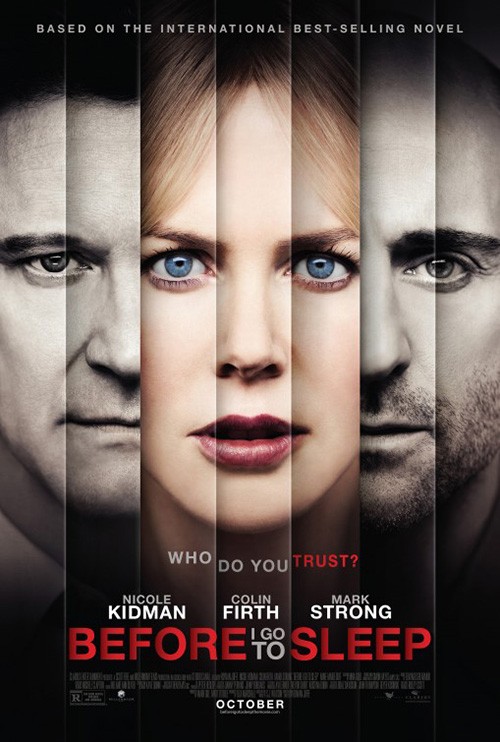
Next is Ignition’s Before I Fall (opens March 3). You may say that it is eerily similar to Blood & Chocolate’s Before I Go to Sleep and you wouldn’t be wrong. But while the latter uses its vertical blinds as aesthetic, the former brings in a sense of psychological struggle. The segmentation is for Zoey Deutch alone, not three actors. These are different emotional states of one person shown simultaneously.
What I really love about the sheet is how it handles the title. The letters are compressed and expanded, the alignment between slats shifted depending on higher or lower positioning. There’s even some nice shadow work to confirm its illusion of depth. I’m a bit disappointed this stylistic flourish isn’t consistently used at top too (where the letters differ in brightness but not position), but maybe doing it there proved too distracting.
It won’t turn too many heads on its own, but there’s some good stuff involved if you are willing to take a longer look—especially with the curtains lending an idea of repetition and façade to illustrate the tagline. Either this day never ends for the rest of her life (each partition a new iteration of the same 24-hours) or she’ll be dead once it does (nothing left behind the curtain).
The Catfight (limited March 3) poster is much more literal and as a result perfect for representing the film. This thing is a satirical romp with major political and social undertones that deals with two rival opposites of the same coin who engage in no-holds barred rumbles. The whole “Black and Blue” comedy isn’t merely being cute. Those bruise-inducing beat-downs are the thread that adheres this film together.
So what more do you need than Anne Heche and Sandra Oh growling in a headlock? Nothing. Give it an off-kilter crop job, assault us with a playfully bold font in bright red, and leave us wanting to see this scene unfold at full speed. You won’t be disappointed when it does.
Last up is MIDNIGHT OIL’s Table 19 (limited March 3). I actually really, really like this one-sheet. It’s very similar to the one created by GNAH Studios for Amityville: The Awakening (which you’ll probably see written about here next month) in that it seeks to transfer the social media zeitgeist into print form. The poster is ostensibly a cell-phone application interface screen a la Instagram where someone took a photo of the titular table, tagged the actors included, and let each character comment upon it.


It’s an intriguing maneuver mostly because the busy-ness of an online screen like this is vastly different from what the print medium (and especially posters) strive to achieve. Half of this page is text that isn’t relevant to providing viewers information. This text works as image. And if you aren’t familiar with the mechanics of social media on your phone, it may be difficult to even find the title amongst the filler.
But that risk is what makes this a brilliant concept. It’s targeting a specific demographic through familiarity and making those outside that demographic stop and stare to try and decipher what’s happening. We get an impressive visual inside joke and they get an alternate sheet with a more conservative, literal approach (the middle finger tine alienating in its own right for the older sect). I’m sold.
Artistry over actor


The headline here may be a tad misleading in regards to Ghost in the Shell (opens March 31), but I stand by its inclusion because none of LA’s posters depict a generic glossy portrait of Scarlett Johansson removed from the film’s context. We instead receive action-shot, mask, illustration, and glitch.
The first is the least “artistic” in that it merely provides a film still. Here’s Major bursting through a window, guns drawn. It’s not quite exciting due to the profile vantage point, though. I wonder how much more effective it’d be had she been launching towards us or away from us. The latter gets my mind racing most as I think about the chaos below of targets about to die. As is we see her suit, nothing more.
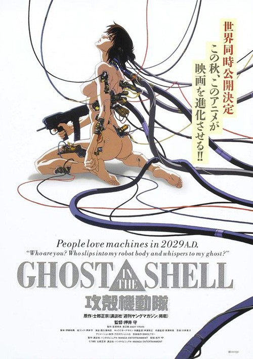
This is why the mask teaser is so memorable. It’s a portrait, but it’s not Johansson. Is there a head beneath? A robot? Something else? This sheet is all about the unknown and yet it’s attractive on the surface too. The hard plastic texture is tactile, the detailed edges of its pieces carefully marked. It frights us in its stoicism and excites in our wanting it to unleash the rage we imagine hides underneath.
I like the Mondo-lite illustrative work too, but it isn’t necessarily unique except for the fact that it will be in multiplexes and not just on fanboys’ walls. It’s nice to have it in the mix if only because it harkens back to the anime origins of the property. But despite that it pales in comparison to the glitchy computer screen merging flesh with electronics. It might have been better if Johansson’s face wasn’t so pristine in comparison to the rest, but the studio has to take advantage of her inclusion since they’ve already alienated audience members by casting her. Something about that messed up triangle has me staring much longer than I should in hopes I can decipher a secret within.


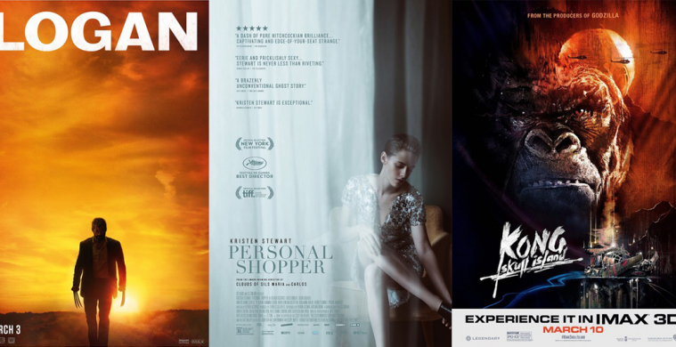
Kong: Skull Island (open March 10), on-the-other-hand, is all about the art. It wears its inspirations on its sleeves, but that’s okay when it allows for a unique marketing angle. The subdued warm color palette alone is enough to turn heads, its hues a stark contrast against the usual dark black fur of previous King Kong films. There’s a sense of tropical place here to set it apart from the usual New York City skyscrapers.
This first entry from Concept Arts is both reminiscent of Bob Peak and Tom Jung’s Apocalypse Now‘s red and orange sun and the flat, two-dimensional geometry of something like Sam Smith’s Kumiko, The Treasure Hunter. It’s almost cartoony and yet still dramatic with a mean streak yet to be unleashed. The hope for a contemporary Kong is alive and well.


The same goes with B O N D’s smoky tease where the darks of Kong are tinted blue so the green smoke can pop and hold our attention. This is mood above spectacle, emotion above optics. The firm’s riff on Concept Arts’ sheet is right in line with this too, the colors building a haze of life rather than death despite our approach towards a monster.
I could personally do without Little Giant Studios’ IMAX poster if for no reason than its blatant copying of another Apocalypse Now advertisement. Where the first utilized Peak and Jung’s style, this doesn’t even try to hide its homage. The imagery is intensely appealing, but it cannot exist without your mind traveling back to Francis Ford Coppola’s classic. That type of comparison so early in the process is never good—especially if this new film can’t live up to those expectations.
Also, is it bad that my favorite of the bunch might be the international Godzilla-inspired circus of color, violence, and embellishment? I assume the finished piece will be quiet like the others assume, but the inclusion of John C. Reilly makes me wonder if it may go zany enough to do this wild artwork justice too.
Provocateurs


Okay, this Logan (open March 3) teaser by Gravillis Inc. doesn’t look provocative on the surface. It’s just a silhouetted Wolverine against a sunset sky of orange, the title in bold, textured white above. But that’s exactly why it’s so impressively fresh—a superhero movie sold as quiet, contemplative drama. This is a real movie that just happens to have mutants as characters. It’s not some extravagant meet-up of twenty icons ready to rip each other’s throats so special effects can excite. This poster explains that Logan won’t be the same old thing Marvel has supplied time and time again. It will instead prove to be an emotional western positioning itself to end a chapter once that sun goes down.


So of course they will move from this to a scarred, rage-fueled (but obviously defeated) Logan in close-up. Of course they’ll give us a melancholy image of clawed hand held by human child. This film is a goodbye to an entire franchise if you read into the time period when it takes place. It’s the passing of a torch from old to new; a hopeful glimmer positing that those who take over can succeed where those who failed couldn’t. It’s about internalization rather than external physicality.
And it was the correct style to utilize regardless of them being photo-based. There’s still feeling in both, metaphor and a careful eye for cropping and content. These are things a painted collage cannot truly mirror. I’m not saying the IMAX poster is bad—it’s just not as poignant as these others. I applaud its embrace of the western aesthetic and the somber expressions, but it’s really just another grindhouse throwback to sell. The sense of pathos is missing.
For 13 Minutes (limited March 17) we receive a striking image of identity and autonomy—something that’s becoming very relevant today. We have a grid of Nazis, identical in every way as sheep to Hitler’s reign with one exception. That glaring difference that doesn’t belong is Georg Elser, the orchestrator of a failed assassination plot on the Fuhrer. To simply put him on a poster with a swastika as seen at right in a foreign sheet doesn’t possess the same impact.


Obviously the American distributor agreed since they decided to retain the same artwork for their transition stateside. It’s hard to blame them because even if the eye doesn’t see Elser right away, it will want to investigate the homogenous pattern to discover what’s happening. It’s a similar effect to Being John Malkovich only without the humor of the faces being obviously false. This time it’s a metaphor for compliance and cowardice as we are made to find the exception rather than understand the horror we know too well.
If you really want to turn heads, though, you do what InSync Plus did with Personal Shopper (limited March 10). You realize here that it’s not about Kristen Stewart as much as the voyeuristic view of her. To put her in the center of the poster unobstructed is to simply give us a woman. Here’s the actress, no more no less. The simple addition of this veil of a curtain to bisect the frame adds mystery, a story, and us to the scene. Are we watching her or is someone (something) else?
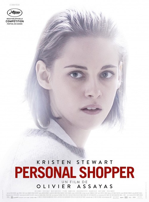
It’s a captivating pose made more fascinating by the layers put over it. The glare of her silver dress enhances the grayish tone of the rest, its light popping off the page rather than any specific color. The only true hue besides subtle shade differences comes from her chair, its warmth framing her within the coolness of the whole. And the way in which the curtain’s translucency both creates the idea of “ghost” and the “other” is inspired.
Le Cercle Noir’s French sheet from Cannes just can’t approach this sense of evoking discovery. A washed out portrait without context? Really? Is she the ghost or did someone go too heavy in Photoshop? Maybe this is a scene from the film, the glow a marker for an unknown presence—I don’t know. But sight unseen, this image isn’t earning my attention.
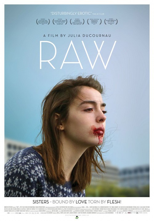
But for my money the month’s true standout is P+A’s Raw (limited March 10). I love this poster. From the coarse grain texture to the monochrome hue to the drop of blood your eye can’t help but focus upon right above the boldly ornate thin to thick serif font contrasting the roughness with precision, it’s unforgettable.
There’s a pulpy feel here that the Australian version loses in its classy, modern upgrade. Now we have full-color, glossy perfection, and art deco sans serif. The blue of the sky shines a completely different tone than the pinkish reds too, a sense of exposed unease replaced by calm reality. There’s no otherworld feel in the second to stop us from trying to justify her bloody lips. We attempt to put her into our surroundings whereas the first poster forces us to create a brand new fantasyland of unchecked aggression. One shows the character contented and full, the other captures her preparing to uncoil and pounce onto whatever is in her sights.
What is your favorite March release poster? What could have used a rework?