“Don’t Judge a Book by Its Cover” is a proverb whose simple existence proves the fact impressionable souls will do so without fail. This monthly column focuses on the film industry’s willingness to capitalize on this truth, releasing one-sheets to serve as not representations of what audiences are to expect, but as propaganda to fill seats. Oftentimes they fail miserably.
DC, Marvel, and Transformers? It must be … December. The studios are going big this Christmas on the counterprogramming for Oscar-bait titles and you can’t really blame them. While your cinephile family member brings the tissues, you can bring the fun.
It’s kind of nice too because that means more films to skip as you catch-up on end-of-year list must-sees. The comic book and toy franchises will still be out come January, so you can take your time and give your money to the independents this holiday season instead. They deserve it.
Contractually obligated collage


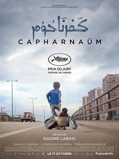
The poster for Capernaum (limited December 14) isn’t the kind of collage you’d expect—nor is it like the three I’ll be talking about next. Rather than position heads of differing sizes in the center of the page, Sony Pictures Classics goes heavy on critic quotes. And it’s not just brief buzz phrases either since a Pete Hammond centerpiece spans thirty-eight words and four lines. Add the slew of accolades at the bottom and its obvious the studio is banking on praise to sell tickets before unsuspecting theatergoers have a moment to realize there will be subtitles.
It’s too bad because the festival sheet with the same imagery (although clearer, more colorful, and attractive) is stunning by comparison. The painted Arabic is a welcome touch and the single laurel for a Cannes Jury Prize says all you need.


Next is Aquaman (December 21) and its Comic-Con sheet of kitchen sink aesthetic. Jason Momoa might be in the foreground, but Patrick Wilson and Black Mantha take center stage with giant heads stealing our gaze from the chaotic mess below. You can’t necessarily blame Little Giant Studios, though, considering this work is more about exposing paying fans to an early character tease than anything else. This isn’t selling the movie as much as fueling blind excitement from sycophants frothing at the mouth.
And let’s face it: this result succeeds in that goal where B O N D and photographer Michael Muller’s Finding Arthur Curry does not. Is this thing exemplifying his marine biology skills? His shark whispering skills? The designer’s Photoshop skills? All I know is that it’s difficult not to laugh at the grid-like collection of animals with a tagline that says “Home Is Calling” as though they’ve been invited to dinner.
The duo’s gold-plated serious face isn’t any better, but at least it’s positioning this hero as someone who commands respect while still offering some levity thanks to the juxtaposition of “He’s not around here.” You don’t say? The trident tease by Concept Arts is probably my favorite of the bunch, though, since it leaves things to the imagination.


BLT Communications, LLC doesn’t fare much better with their floating heads on Bumblebee (December 21). I will give them credit for letting the Transformer have top billing size-wise, however. Because let’s face it. This property has run its course and the only reason anyone is interested in continuing the ride is the titular character’s penchant for humor. Sorry Hailee and John, but your airbrushed faces framed by a videogame-esque neon logo ain’t the draw.
I’m merely disappointed the studio went in this direction when the kid-friendly, Iron Giant retread imagery was executed with skill. You should lean into the whole kid befriending robot angle because that type of fantasy dynamic will get younger attendees excited. If Paramount were smart they would have gone full PG too with Laika boss Travis Knight at the helm. Transformers are toys after all. The nostalgia my generation had when the first film bowed is gone now. Target the product’s actual demographic.
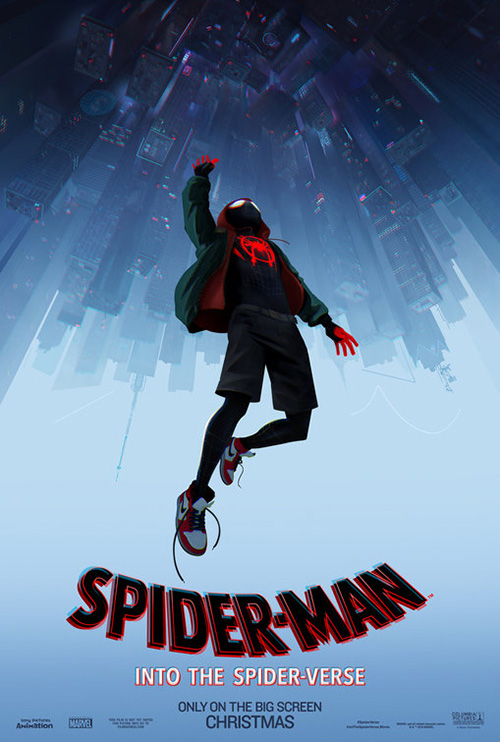
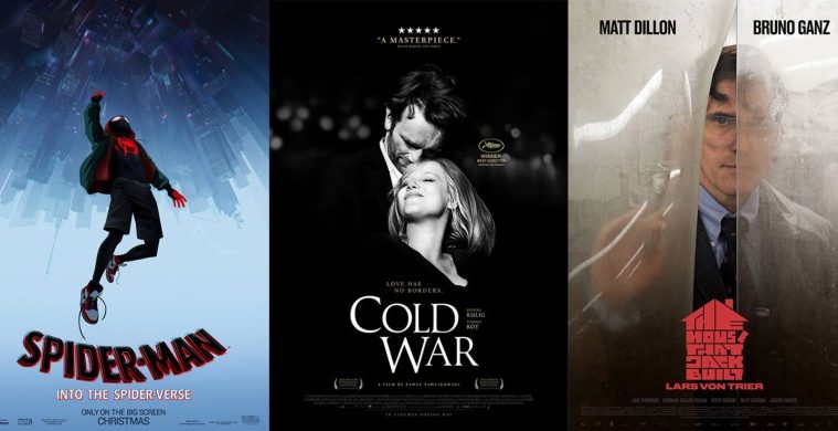
At least BLT was allowed to do exactly that on Spider-Man: Into the Spider-Verse (December 14). It helps when the medium is animation, though, since it brings a built-in preconception of fun. And when the whole point of the film is to showcase a crazy amount of different web-slingers from alternate dimensions, go crazy. Put Miles Morales, Peter Parker, Gwen Stacy, and those other two in frame with a sense of kinetic motion. Create a faux idea of three-dimensionality so the children walking by can stare mouth agape in awe.
And if you want to go a bit more serious, shift the color palette. I’d argue the cooler blues and greens of the teaser complement Spidey’s darker suit with bright red best. The 180-degree spin to have his falling down appear as though he’s flying up adds an invigorating sensation of vertigo too. You can feel the rush of adrenaline watching this thing in 3D will most certainly provide.
Dynamic duos


A film I was intrigued by until watching the trailer, Holmes and Watson (December 21) gets a teaser from WORKS ADV as funny as it is tragic. “Holmies?” “H” and “W” hand gestures as gang signs? It’s cultural appropriation at its worst with humor ten-plus years stale. Just give us Step Brothers 2 already.


Thankfully Creative Partnership knows how to do a good two-hander with Mary Queen of Scots (limited December 7). Here we have authentic gazes that can pierce through your soul with an eye for the beauty and drama of period aesthetic rather than its potential for laughs. I love the hand-scrawled title font and the dark coloring to let those two pale faces in chiaroscuro pop and look our way with determination.
B O N D it equal to the task with their gold text on gold wardrobe on gold background piece of art, pulling the camera out to get a look at the full regalia. But it’s the character sheets that outshine them all. These two look like paintings on canvas made all the more stunning with their deep blue on blue and red on red of actors bleeding into backdrop. Stick a gaudy frame on these and ready for war.

Welcome to Marwen (December 21) goes the opposite direction with bright light, plastic surfaces, and odd couple juxtaposition courtesy of Steve Carell and sixth-scale action figure Steve Carell. I’m very leery of the direction this film’s marketing has taken considering the heavy subject matter it’s based upon, but I’d like to give director Robert Zemeckis the benefit of the doubt. Making the intentional choice to pick Forrest Gump out of his filmography, however, doesn’t bode well as far as handling things with a deft touch.
At least LA’s tease gives Carell’s doll a stoic expression as soulful as it is resilient. This is the face Mark Hogancamp’s story deserves and hopefully will be provided. The rest is just clean sans serif text atop more of the same, each letter blending into the next so the artistry and emotion of the portrait shines through.

Kudos then to Empire Design for delivering the month’s best-designed duo with Stan & Ollie (limited December 28). They knew that the most iconic visual motif this comedy partnership has is its hats and they create a funny scene to prove it. Rather than lose that simplicity upon deciding to remove the newspaper, the firm keeps things light and jovial with the white space above the actors reserved for Laurel’s cap in flight.
And don’t discount the font thickness increasing from thin Stan to heavy Ollie. It’s subtle enough to not be a “fat joke” and effective enough to supply a visual metaphor without sacrificing legibility.
A loving embrace


I’m still confused about this whole concept and whether or not it will feasibly make enough money to render the stunt successful, but the artwork by BLT for Once Upon a Deadpool (December 12) is inspired. There was a now-settled rumor about how Ryan Reynolds may have stolen the Princess Bride conceit from someone on Twitter (see @MVBramley), but it works. And having Fred Savage kidnapped and surly makes things even funnier.
So why not let Savage take the reins of this festive reindeer? Why not depict Deadpool as the damsel in distress sitting sidesaddle and clutching tight (besides its inherent anti-feminine connotations)? Add some ornate framework and a Bob Ross landscape of mountains majesty and you have a novelty to smirk at and ignore as the DVD extra it probably should have been.


Ben is Back (limited December 7) sees InSync Plus going serious with a distraught and desperate child clinging to a mother showing tough love and difficult restraint. The emotion on display in this image is immense whether you know the plot to the film or not. And I like that it goes the opposite direction of Beautiful Boy (with similar subject matter) from earlier this year. Rather than show joy and understanding, this poster explains the tragic reality that some parents must stop letting their kids drag them down.
That’s why this sheet is so much better than the German iteration of smiles. Having Ben be back isn’t some great thing in the context of the film because of what else he brings with him. Julia Roberts’ face in the first portrays this truth like no amount of additional text or images could.
Follow that with romance in This Time Tomorrow’s Cold War (limited December 21). In stark black and white much like the film itself, we receive the main pair engaged in a dance of pure joy. It’s a gorgeous image with adjusted levels to let tuxedo and dress bleed into the background, blurred lights added to give a sense of scene behind. The rest is then built upon the vertical axis from a five-star review to a carefully constructed title box as bright white as the faces above.
It’s this text that really sells the piece for me. The words “Cold” and “War” are staggered to mimic the actors’ positioning, the tagline broken to do the same. Those words are also magnetized together with “old” aligned to the bottom of the “C” and the “ar” to the top of the “W”. It’s naturally compressed yet not oppressively so in order to allow the actors’ names to be nustled in as well. The same delicate visuals in photography and typography are married together into a cohesively beautiful whole.
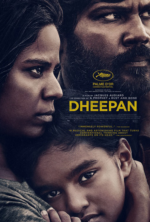
On the other end of the spectrum is the claustrophobic drama of The Refinery’s Bird Box (Netflix on December 21). Similar to Gravillis Inc.’s Dheepan, this in-close crop of Sandra Bullock and children forces us to confront the familial connection they share and the assumed danger they face. The blindfolds add mystery to the equation because we’re unsure whether they have put them on for protection or been made to do so by external forces.
It’s a captivating image that the firm does its best to overwhelm with text. Bullock’s name might be too large, but at least it’s over a dead space of hair. And since the studio doesn’t have to worry about credits for its digital releases, we don’t sacrifice the boy’s face below. I would like to see what happens when the title is shrunk a little, though, since it leaving the fabric at left does distract. If fully contained within, I think we could separate the two and read both text and blindfold better.
A shrouded face


This month we’ve got bruised-up, made-up, and covered-up faces cropped off the side of their frame. It’s interesting that these three posters would go the exact same route as far as showcasing their lead’s right side even if the composition itself isn’t necessarily unique. The reason stems from their ability deliver such different attitudes depending on their film’s content.
First is ARSONAL’s Destroyer (limited December 25) with an unrecognizable (but not really) Nicole Kidman daring us to stare back her. The image is what grabs our attention because of its pain and anger, but I’m not certain it’s enough to make its mark. It doesn’t help that the critic quotes at top are so long and small once you get to their bottom lines or that the text at middle is solid black. There’s nothing but size to differentiate Kidman’s name from the title and on quick glance it’s just a black box covering her cheek. So I see that eye and become unnerved enough to look away before processing anything else.
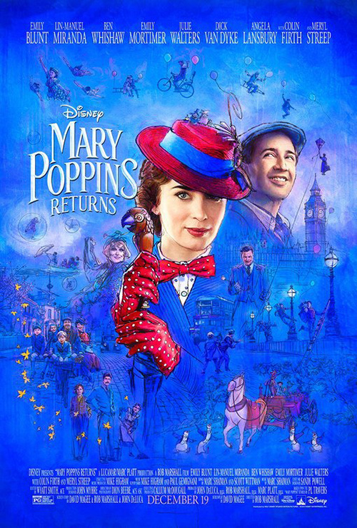
Second is BLT’s Mary Poppins Returns (December 19) and its immaculately airbrushed Emily Blunt delivering a knowing smile as she looks past us towards her next wards. It’s this lack of eye contact that makes it hard to really engage with the sheet. There’s no reason to hold my gaze and thus I move to the title, shrug, and push forward.
Its very blue illustrative counterpart doesn’t have that issue. Not only is Blunt now interacting with us, but there’s also a ton of content to soak in from supporting cast to flying children to falling leaves. The aesthetic lends the whole a concept sketch feel too with loose line work that’s only filled in by detail when a face demands it. Here’s what the costumes should look like. Here’s how the chimney sweep dance will go. And if you thought the original’s penguins would be absent—think again.
Third is LA’s Mortal Engines (December 14) and its want for mystery. This one is less about the face than the environment forcing it to be covered. The long dark hair and blood red mask conjure feelings of dystopia as well as elaborate on the tagline to predict scars hidden beneath. They also work as a framing device to ensure our sight lingers upon the brighter top right corner and confront the character present beyond her setting. That’s a determined eye similar to Kidman’s, but darker and projecting uncertainty rather than clear-focused malice. Where the former shows killer instinct, this one supplies judgment.
And that leaves Matt Dillon in The Einstein Couple’s The House That Jack Built (limited December 14). Like the previous three women, his face is also shrouded to reveal his right side. Rather than have the rest cropped, however, his portrait is at a middle distance so the butcher freezer plastic can do the work instead. This is therefore more than simply a look at a character. It’s not about what the actor is projecting as much as how we react to the situation he presents. Where you can look away from the others as disembodied heads, Dillon’s hand creates a point of interaction. He’s coming for us and our only escape is to run.
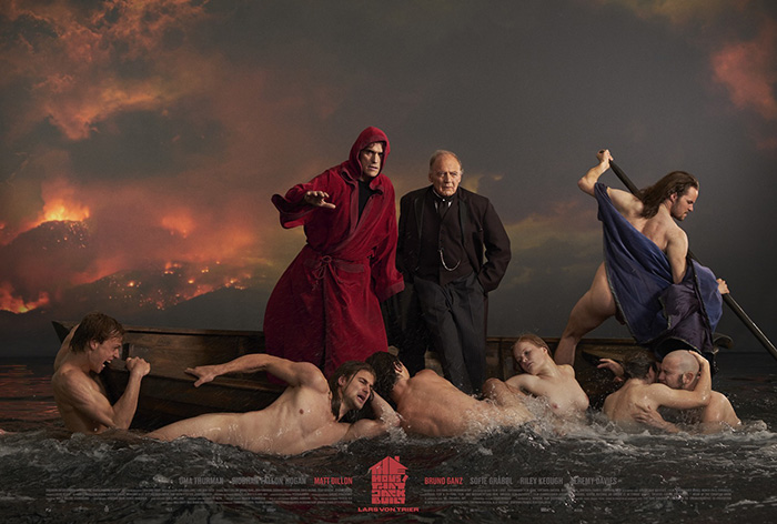
This is a pretty great sheet for that reason alone, but the title iconography is pretty cool too. Leave it to Lars Von Trier to have an elaborate, vertical logo created that he will then use in his horizontally orientated movie. And for something that doesn’t concern itself with consistency of letters, it retains legibility. So what that the “E” in “The” is the same size as the “TH” combined? This house was drawn and the letters fit in. It’s a design exercise given life outside the classroom.
As for the painterly scene of ferried men to Hell, I’d be remiss to ignore it when talking about this movie. Sadly, there’s little to say. It’s quite literally a lifted frame from the film that lacks the same sense of provocation it possesses in context. I will applaud the typography, though. I love that the title house is at center so stars Dillon and Bruno Ganz can be topped billed on either side via color saturation rather than order. The designers found a way to highlight what it needed to without compromising the image’s symmetry.
What is your favorite December release poster? What could have used a rework?