
“Don’t Judge a Book by Its Cover” is a proverb whose simple existence proves the fact impressionable souls will do so without fail. This monthly column focuses on the film industry’s willingness to capitalize on this truth, releasing one-sheets to serve as not representations of what audiences are to expect, but as propaganda to fill seats. Oftentimes they fail miserably.
I admittedly expect more out of September than the requisite Adam Sandler brood (Hotel Transylvania 2 opens September 25 – poster), sloppy attempts at merging photography with thematic iconography (Pawn Sacrifice opens limited September 16 – poster), Martin Short impersonators (Mississippi Grind opens limited September 25 – poster), and boobs (The Perfect Guy opens September 11 – poster)—yes, I’m disappointed in the selection fall has thus far brought. This is the start of festival season. We should be getting iconic designs advertising the critical darlings we’ve waited twelve months to see in our hometowns. Not the same old mediocrity summer thrives on.
There are thankfully a handful of winners, don’t get me wrong. Sadly, even they don’t truly standout as meriting much attention past fleeting admiration. Hopefully October delivers its A-game to make up the difference.
Doppelgängers
 |
 |
 |
2013’s Toronto International Film Festival brought with it at least two doppelgänger movies in Enemy and The Double around now. Marketing agencies appear to have taken their lead by supplying us a healthy dose of homage, rip-off, or perhaps coincidence? The worst part is that I wouldn’t be surprised in the studio requested, “Something similar, well, exactly like that other poster I really loved five years ago.”
 |
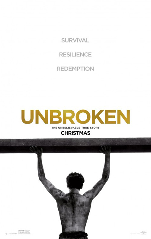 |
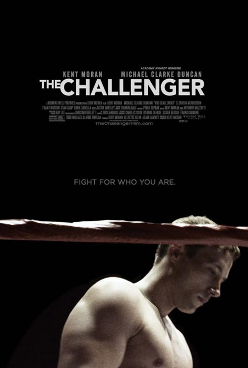
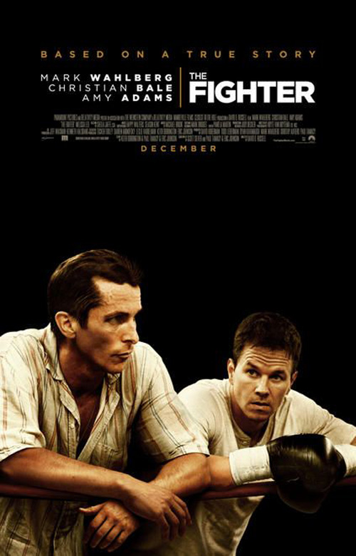
This brings us to The Challenger (limited September 11). What say you? The Fighter meets Unbroken? I thought as much.
The rub is that I actually think it’s a pretty good poster. I hate the title smashing “The” into “Challenger”—it’s beyond awkward. Other than that, though, the piece provides the same impactful simplicity of those it mimics. I like the boxing ring rope placed between the fighter and us. I like the dramatic feeling of melancholy on his face. Add a succinct tag in the center that isn’t overpowering in size and you have a solid advert.
I’m just into condoning my remembering a film because it reminds me of something else—especially an Oscar nominee like The Fighter.
 |
 |
The Transporter Refueled (September 4) is never going to be mistaken for an Academy Award-caliber film. So no worries there. It may conjure thoughts of the thin but highly entertaining trilogy that made Jason Statham a household name, though. Actually, going that route might have been the way to go. Why isn’t this new guy firing two guns whilst jumping through the air?
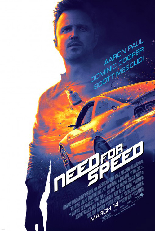
Instead, Art Machine, A Trailer Park Company decides to utilize a tried and true trope of unoriginality like we’ve seen with Easy Money, Need for Speed, and countless other fare. Stick the lead on a solid background, put a scene inside his silhouette, and reap the rewards only laziness can procure.
Breaking up the title into The Trans Porter Refueled is just one more detail to confuse audiences. And that’s saying something when you’re the fourth installment in a popular box office franchise.
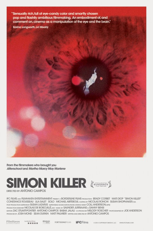 |
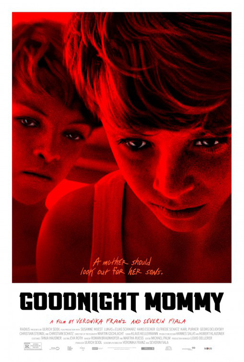
Gravillis Inc. is the next culprit with their poster for Goodnight Mommy (limited September 11). Does its deep red-filtered image, boxed in a frame of white with added space at the bottom for title and credits ring a bell? How about after looking at Simon Killer‘s memorable one-sheet from a few years back?
It’s an on the nose aesthetic for the subject matter, but the execution pales in comparison to its predecessor. The photography is way too over-saturated to the point of these boys looking like they’ve been printed on heavy translucent latex or Jello. The hue is oppressive, the result almost cartoonish rather than scary. I do enjoy the font selection, though—the smooth scrawl, not the weirdly angular knife points sticking out of every descender in the title.
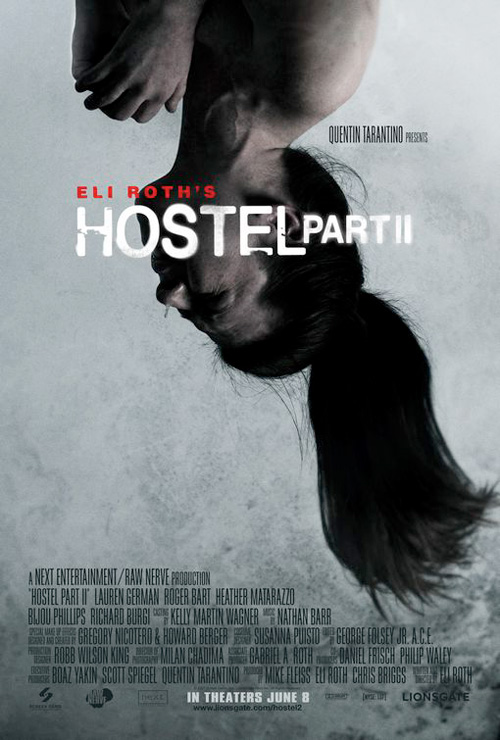 |
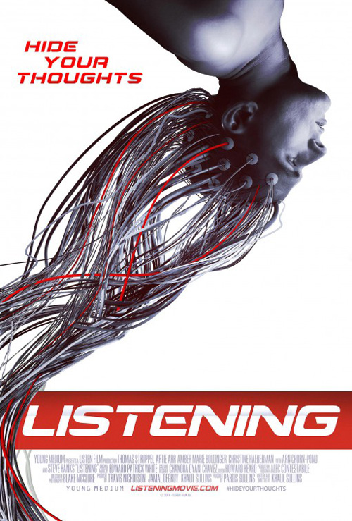
My last example of repetition is with Listening (limited September 11). This one is a stretch considering there not being any direct correlation the artist could have made. But the first thing I thought of when peering upon it was Hostel 2. The tone is drastically different, but sometimes imagery becomes so ubiquitous that you need to know if steering clear from similarities behooves you in the long run.
The imagery is arresting with its wires as hair running off the page and into our space. I’ll give them that. Unfortunately the font selection is poor—a boring choice made worse by an odd drop shadow in the middle of the letters. Why is that there?
The four Bs
 |
 |
 |
 |
This section is brought to you by the letter “B” as well as memorable artistry. Let’s just say that after seeing these after only reaching the second of twenty-six letters, I had certain optimism for what would follow. That’s where the disappointment spoken about in the introduction was born.
 |
 |
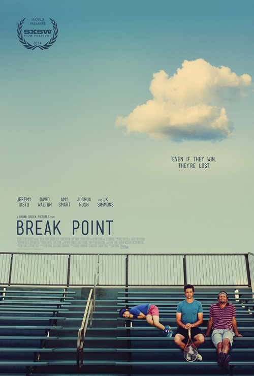
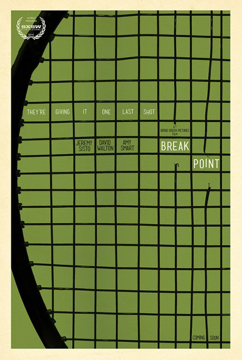
It’s not necessarily fresh with one or two posters a month delivering an excess of white space to take hold of our eyes and guide them through their work, but InSync + BemisBalkind‘s Break Point (limited September 4) is effective nonetheless.
The photo is goofy with its two leads posing for the camera as the child at their side is flopped on a bleacher in what looks like a very uncomfortable position. Its environment allows for sky to take up the top two-thirds and yet the designers refuse to just populate it with large and obnoxious text. Instead the title sits small and in its place—bolder despite its thin width to pop above everything else.
And the placement of the cloud is fantastic. Not only does it counter the title block compositionally, but it also gives the two men a sort of foreboding sense of bad luck like in a cartoon when a storm follows one character to infer upon his/her emotional state.
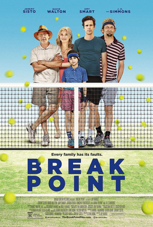
The firm’s graphic entry of a racket as line drawing works too, but it’s possibly too sparse to really make an impact. As for cold open‘s attempt—let’s try and forget it exists. Not only is it forgettable with its Photoshopped family and large, perfect sans serif letters, it’s also frightening. The faces don’t belong on their necks, Jeremy Sisto looks like Mark Pellegrino, and Amy Smart looks like the work of a middle schooler who hasn’t mastered mouths or drawing in general.
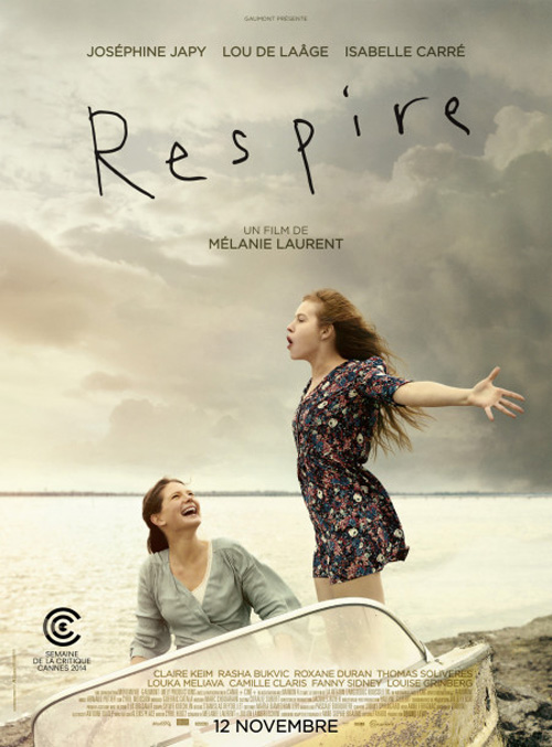 |
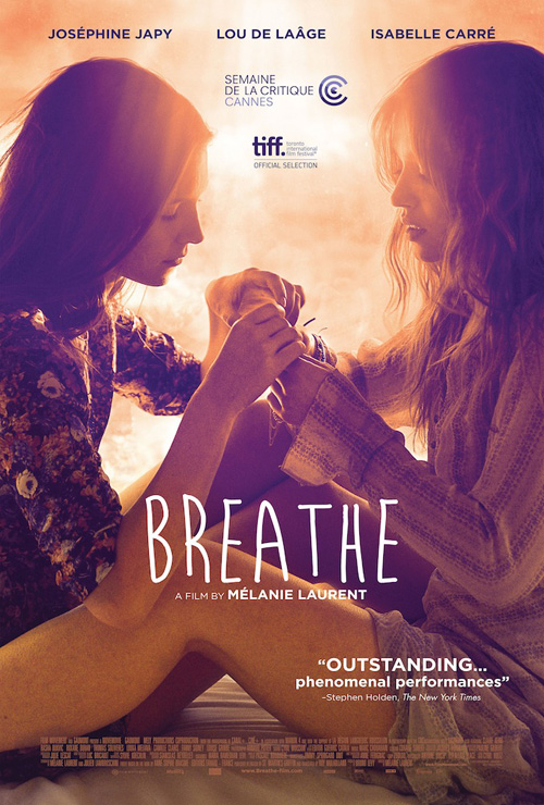
Mélanie Laurent‘s Breathe (limited September 11) earns a rather attractive bit of portraiture in comparison. Carefully cropped to be both interesting and content-driven, the frame houses its actresses in a display of natural symmetry. The washed out light at top gives it realism studio photography never could and the orange tint a fiery base shining through to the surface. Make the playful title font rougher and more distressed (like its French-language counterpart) to match the aesthetic and this becomes a pristine piece.
The French one is beautiful in its own right with the darkening sky of white space and the kinetic action of the two women frozen in time, but it doesn’t quite have the staying power as the domestic. I’ll take the latter’s emotional connection above the former’s promise of adventure any day.
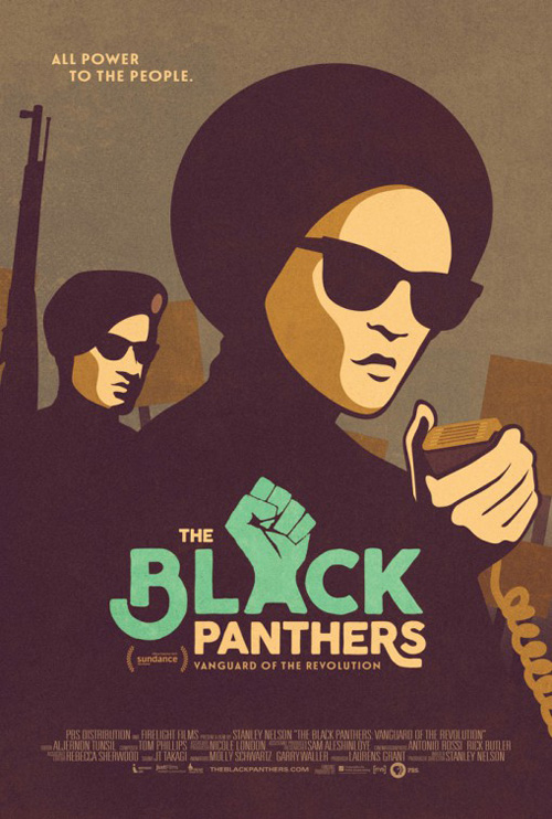
With The Black Panthers: Vanguard of the Revolution (limited September 2), there’s a lot to like. The illustration style’s geometry, textured colors, fading clarity, animated title—it all adds up to something unlike anything the rest the month delivers. You could say that it gives a serious subject the wrong tone, but I’m okay with softening severity to make something more palatable to the audience while not failing the underlying message.
This toes that line with ease, turning truth into propaganda painted in an era-specific aesthetic. Whereas the 60s and 70s needed to show real people with real guns to drive home their party’s goals, getting people to buy tickets asks for a bit more approachability. The graphic illustration also carries with it a sense of austerity and honor rather than journalistic exposé meant to frighten and exploit.
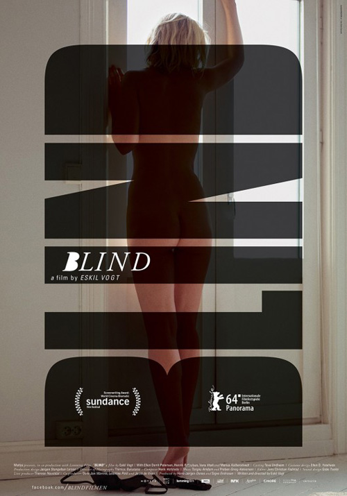
The “B” I find to be the best, though, is HANDVERK‘s Blind (limited September 4). Its photo of a naked woman from behind is alluring and mysterious; the censoring title in solid block letters simultaneously forcing us to spy on her as they cover her up.
Using the festival laurels as counters of the “B” is less than appealing, but it doesn’t distract too much from the otherwise formal success. Even the eccentricity of the smaller title is pleasing in its ugliness. The kerning is off so that there is more space between each letter as they progress, the “B” has no counters while the “D” does (contradicting the larger example), and the serif is a stark contrast to everything else. But it fits in its off-putting nature.
Props to props
 |
 |
 |
 |
Props are sometimes gimmicks. Gimmicks sometimes work. I’m not sure this is true with each one of the next four posters, but they are intriguingly captivating regardless of that success.
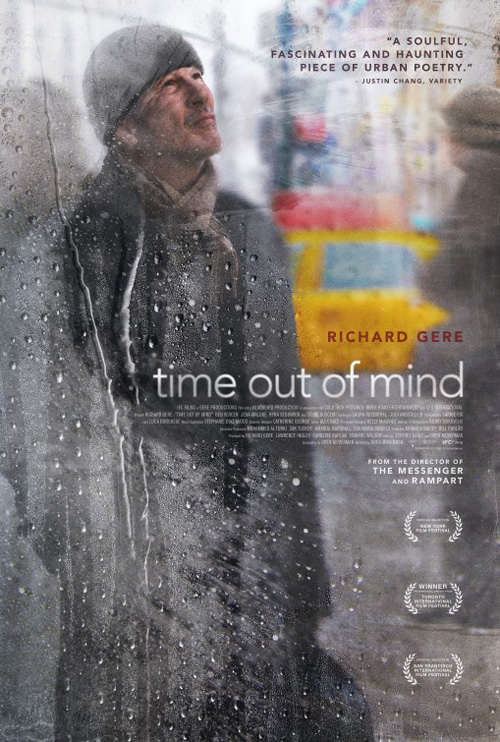
Take Gravillis Inc.’s Time Out of Mind (limited September 11) for example. The design hinges on the idea that a piece of glass is separating us from the scene of Richard Gere on the street. This glass is fogged and wet with condensation, dripping clear and wiped away to better see him behind it.
The image is unique as a result, if not completely arbitrary in a way. I see the concept of the unknown, complemented by Gere’s face of perplexed thought. Is that enough for it to be relevant as more than a pretty poster, though? Maybe. Does it matter? Not really. Sometimes attractiveness is enough to remember a film’s name and keep it in the back of your mind for when it releases.
 |
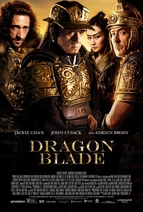 |
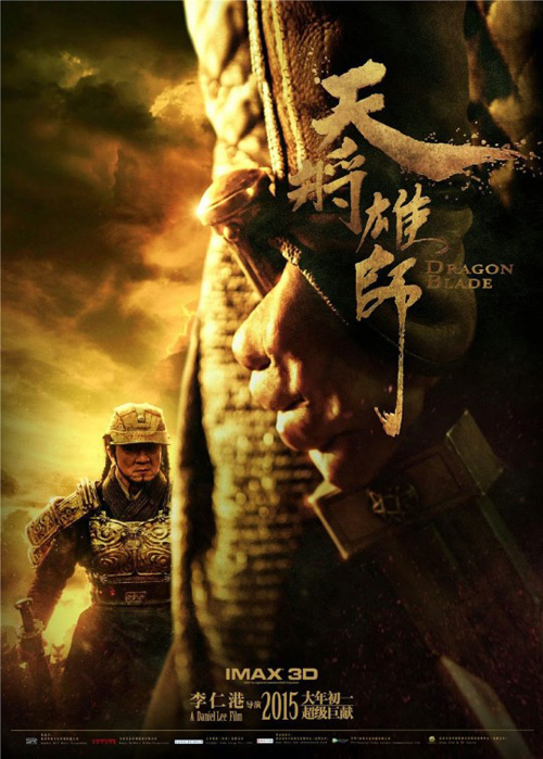
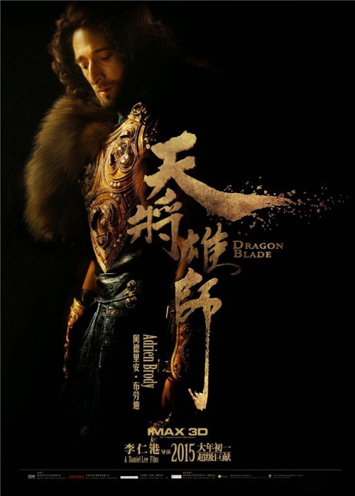
Other films sell themselves simply by their WTF casting like Dragon Blade (limited September 4) and its samurai epic starring Jackie Chan, John Cusack, and Adrien Brody.
The character sheets are beautiful in their chiaroscuro shading and highlights juxtaposed against the physical embodiment of the movie’s title in its native language’s calligraphy. I’m not sure if this style could have followed through to its main sheet without finding clutter in the need for multiple actors, but I’d like to see what the firm tried. Anything would be better than the unrealistic melding of four actors with varying expressions of constipation.
I think the tease comes close to finding the marriage of visual beauty and content by giving us Chan and the decorative title in a brooding scene of extreme lights and darks. The sense of scale is breathtaking with the titular blade in hand being our central focus, huge and in the foreground, despite the Chinese legend being the clear face our eyes are drawn towards. This thing is firing on all cylinders.
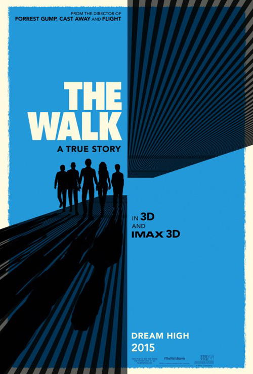 |
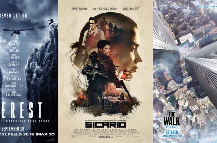
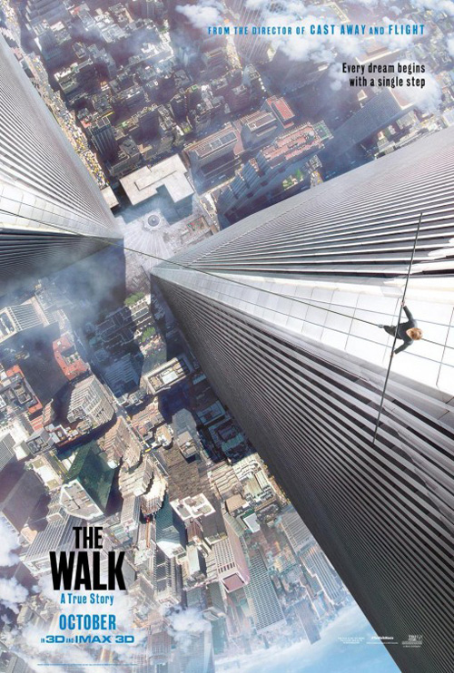
The same can be said for Vox and Associates‘ The Walk (September 30). How can you not be mesmerized by its vertigo-inducing vantage point putting us into the moment as Philippe Petit journeys between the World Trade Center towers on a wire? The cable cutting straight across the page is just different enough from the not quite parallel building facades creating a hitch that helps us fall through the sky and down to the city streets. It’s invigorating.
It’s a shame the designers couldn’t solve the problem of how to get the text to pop without placing obtrusively appalling outer glows of white beneath it. I get that they are trying to put them above “clouds,” but they’ve failed. Make the day more overcast, really give those cumulus cotton balls some volume so it doesn’t look like they are only there to support the words. Like its graphical brother of silhouettes and heavy lines appearing to be a cheap Mondo knock-off, it’s just not quite right.
 |
 |
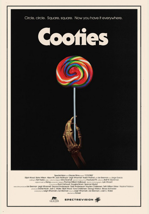
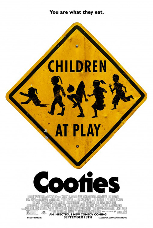
Cooties (limited September 18), on the other hand, is all kinds of right. I adore this poster and almost had it on my Best of list from 2014. The nostalgic feeling its off-white coloring and old-fashioned font warms my heart as the sugary sweet lollipop meets skeletal hand delivers its genre-hybrid sensibilities without a single word. Before even looking at the cast list, this poster had me wanting to see the film.
LA‘s second tease with the funny “Children at Play” sign is effective for other reasons. Definitely more playful and as a result less precise in epitomizing exactly what it’s selling, it begs us to see what’s going on. I would have liked the rendering to be more realistic like the candy, though. Why not manufacture this thing on metal and take a photograph? The fake-ness of it lends a childish nature that loses its target audience.
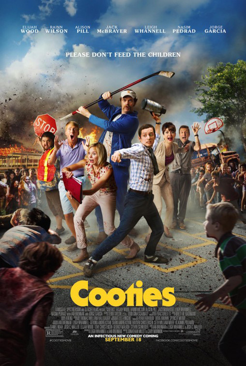
I won’t begrudge the studio wanting one with the actors in full view, but I won’t pretend to like it either. The collection in the center isn’t believable spatially and their child pursuers are blurred and added in to look like cardboard stand-ups rather than actors. It’s all very glossy and mainstream—a far cry from how the campaign began so many months ago.
Live from LA
 |
 |
 |
 |
 |
 |
 |
 |
You may have noticed I did not single out big firms like Ignition or BLT Communications, LLC this month. Where they used to dominate the movie poster scene, today finds a new contender taking control in LA. They’ve been around for a few months handling some massive campaigns in Minions, Insurgent, and The Age of Adaline and it seems they are here to stay.
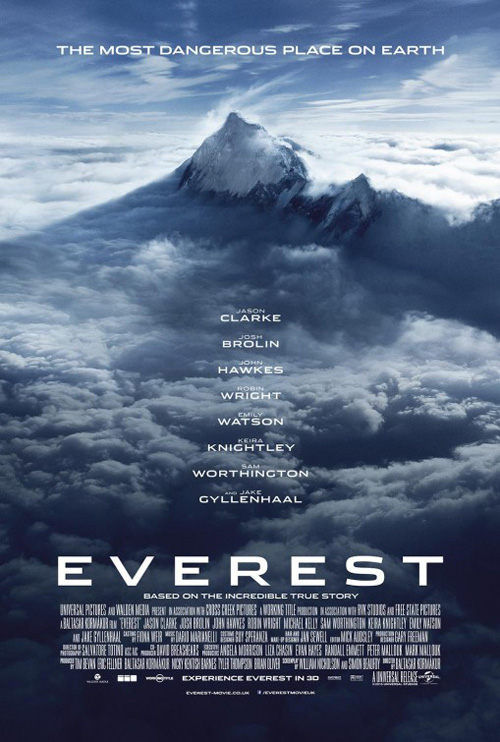
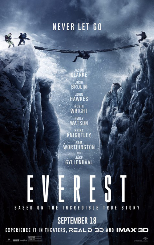
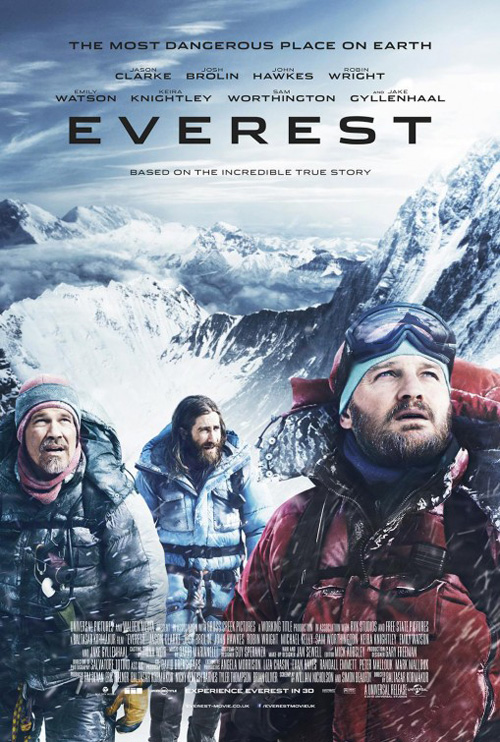
Prolific isn’t always perfect, though. It’s not like Everest (IMAX September 18; wide September 25) is a bad poster per se, it’s just not very memorable. Mountaintop, clouds, and list of actors’ names—it has the Roland Emmerich vibe down pat without his name to sell it beyond the stars.
I guess it looks dangerous to match the tagline, but it also conjures thoughts of Mt. Olympus. Are the Gods coming down for a little clashing or wrath? At least the firm’s second selection gives some suspense with climbers hanging onto an almost fallen comrade over a canyon, but it’s still mainstream pandering. Hate to say it but Empire Design‘s sheet with actual celebrity faces may be best if only because the names aren’t taking up half the frame.
 |
 |
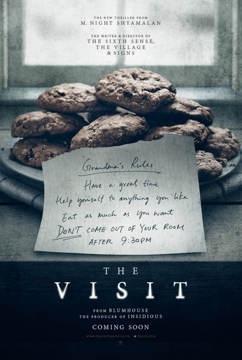 |
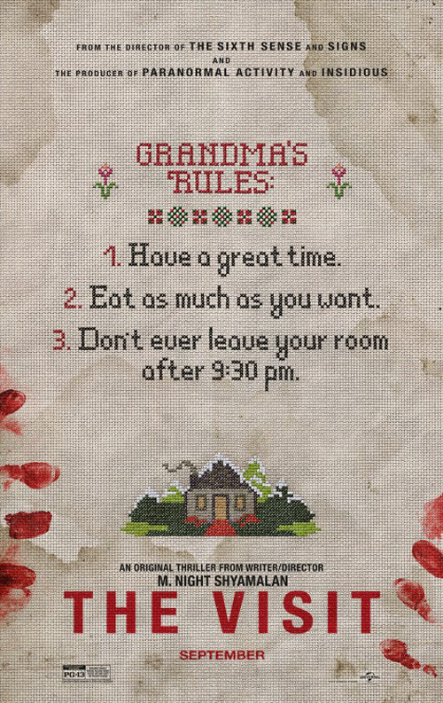
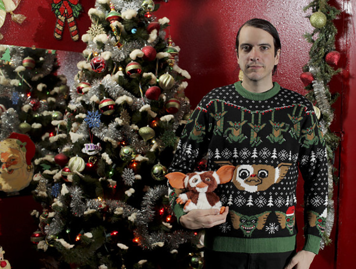
LA hits their stride with The Visit (September 11). It’s very much a variation on a theme already popularized by Sightseers and Mondo’s Gremlins sweater, but it also works contextually with M. Night Shyamalan‘s foray into low budget found footage. Of course grandma would knit the kids their rule sheet—that’s what grandmas do besides bake cookies, isn’t it? Just look at the alternate poster …
I like that the firm doubles down on the aesthetic by not just using the textured canvas background or only giving certain text the effect. The house illustration and checkered motifs are a nice touch while the bloody fingerprints perfectly tease the horror at its center. The tone is right with a mix of terror and whimsy.
 |
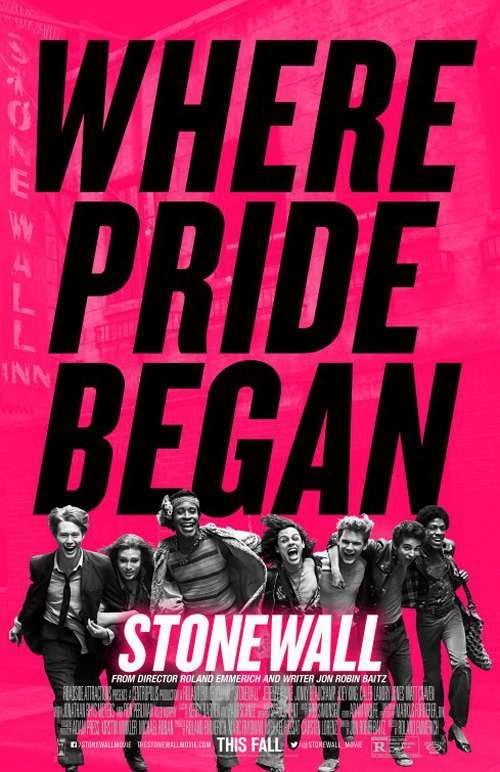 |
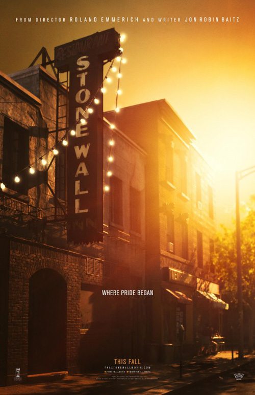
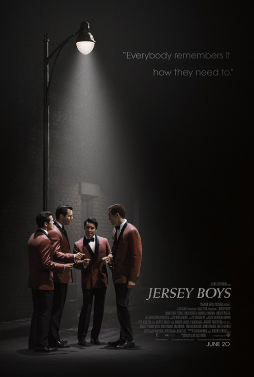
Speaking of Roland Emmerich, LA got their chance to work with the destruction maestro on his much smaller production of Stonewall (limited September 25). This thing is gorgeous. It reminds me of what cold open did on Jersey Boys, but with an exponential increase in authenticity. This one doesn’t look like a studio set.
I love the title becoming a part of the image, the sun over-exposing the sky while also illuminating the foreground with a warm yellow, and the careful placement of the tag as the boldest white to steal our attention every time.
It’s more austere than full sheet in pink with monochrome actors running towards us, but also more effective. Who’d think the tiny white tag on the first would be more pronounced than the massive black lettering of the second? And that title’s outer glow makes it look like an action flick. That decision was a poor choice.
 |
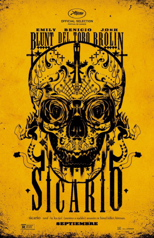 |
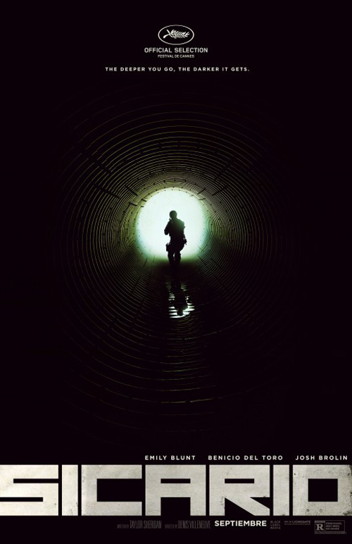
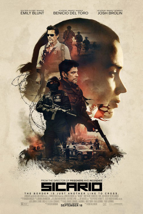
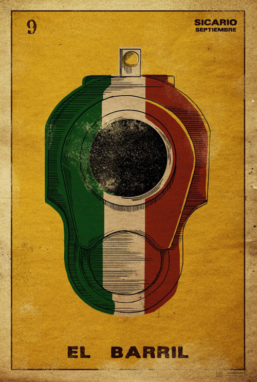
Where LA shines brightest, though, is with the tease for Sicario (limited September 18; wide September 25). This thing is spooky, gorgeous, and unforgettable. There’s an optical illusion happening with the circles of the sewer line the silhouette at back is approaching, the waves of their false convergence creating motion as though we’re zooming in or the figure is zooming out. And that logotype is great too. The thick sans blocks spanning the width demand our attention and carry a weight the fine details of the rest command in the exact opposite way.
 |
 |
 |
Their totem college of actors is pretty good too considering its clichéd design. The painterly quality always makes it more attractive than photo splicing ever can because it becomes artistic rather than fake. The dirty blemishes adhere to the tone of the film and a real sense of drama comes through.
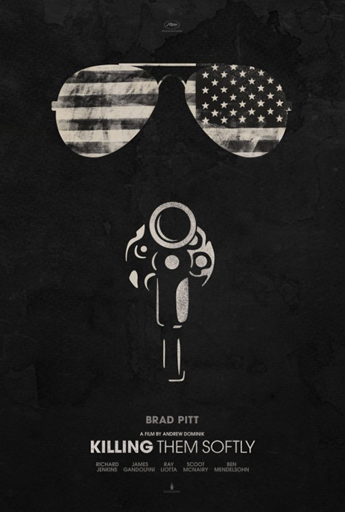
The rest of the series is reminiscent of Gravillis Inc.’s own out-of-the-box work on Killing Them Softly. Their clip art style is intriguing and the faded ink on canvas look gives it age and a tactile touch, but I think the objects might be too obscure in their minimalism. And the bright tattoo design is just that: familiar and appropriate, but not for everyone.
What is your favorite September release poster? What could have used a rework?