“Don’t Judge a Book by Its Cover” is a proverb whose simple existence proves the fact impressionable souls will do so without fail. This monthly column focuses on the film industry’s willingness to capitalize on this truth, releasing one-sheets to serve as not representations of what audiences are to expect, but as propaganda to fill seats. Oftentimes they fail miserably.
—
This month may be one of the least creative in terms of movie posters ever. Between the laziness, litany of character sheets, and over-used technique, I think I only actually like two entries out of the bunch.
The small number of releases doesn’t help matters as far as diversifying—especially with so few independents to temper the summer season’s blockbuster onslaught—but you still hope to catch a couple gems from the big studios. May will be a moneymaker either way, so perhaps no one wanted to waste time and energy creating great work when people would flock to theatres anyway.
Who needs effective marketing?
 |
 |
 |
 |
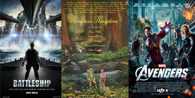
Two films that fit this bill perfectly are The Avengers (open May 4th) and Battleship (open May 18th). Audiences have known whether they’ll buy a ticket for months and no amount of laughable premises or character overkill will change any minds.
 |
|
 |
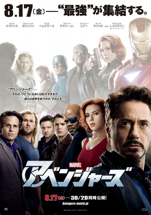 |
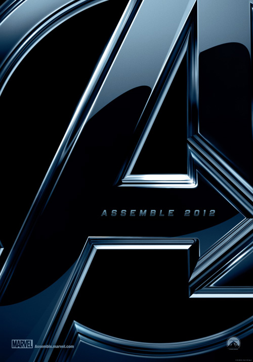
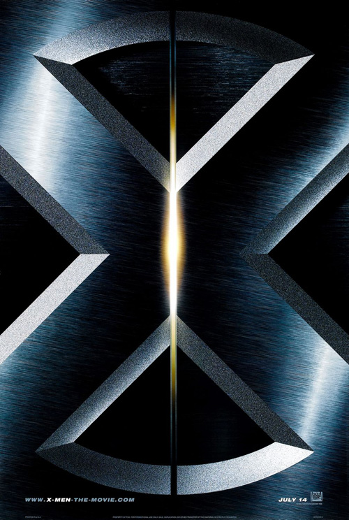
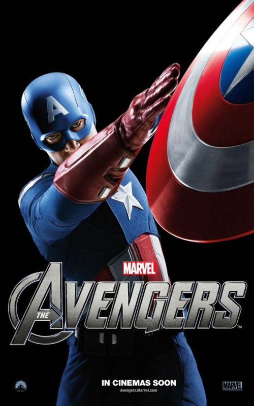
It’s therefore unsurprising to see BLT COMMUNICATIONS, LLC (formerly BLT & Associates) take a trip to the well and tease the world Marvel-style. Much like their iconic ‘X’ one-sheet for the original X-Men, The Avengers find themselves represented by a stylistic ‘A’ with defiant arrow propelling our minds to the infinite possibilities such an assembly of superheroes can conjure up.
Simple, effective, and completely boring—I’m not sure when such unparalleled excitement began at the unveiling of logo treatments for comic book adaptations, but boy do people get jazzed. It’s a giant ‘A’. We already know it’s coming, show us the all-star cast in costume. Now that’s exciting, right?
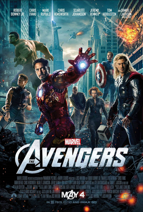
Well, it is on paper at least. Gazing upon the Photoshopped collage only ends up expressing the kind of disappointment I’m anticipating to discover after watching the film despite the universal love I’ve been reading. There are just too many carefully placed amidst explosive chaos with clear sightlines for fanboys to gawk at. And, in all honesty, we’ve already seen them in costume on the big screen before. Hulk is the only new iteration—the third in nine years mind you—and all I can muster is a resounding, “meh”.
The character sheets only make matters worse with plastic sheens and figurine poses in way-too-bright colors against a black back. At least the Asian piece refuses to hide the fact it is poorly manufactured drivel as its alter egos superimpose above ‘human’ forms without environment superfluity. Thor should probably be flipped since his ‘regular Joe’ is the actual costume, but that’s just me being a jerk.
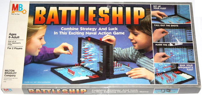 |
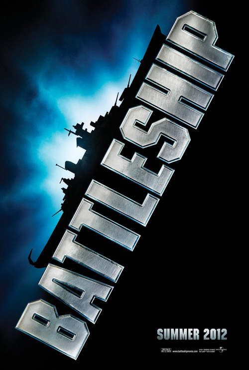
Battleship, on-the-other-hand, has no idea what it wants to be. The tease shows the titular ship with a font treatment identical to the 1984 edition of the board game with a few contemporary, military-esque updates. We think it’ll just be some nautical adventure with sonar bleeps and missile destructions while Liam Neeson barks orders, making us wonder why the Milton Bradley game needed optioning in the first place.
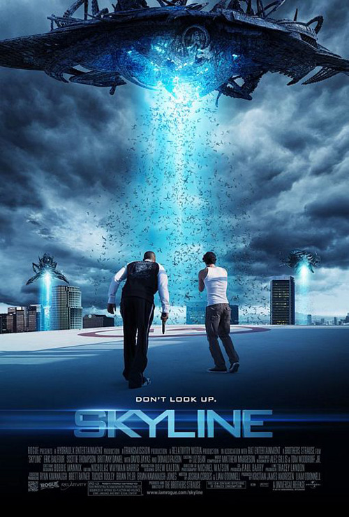 |
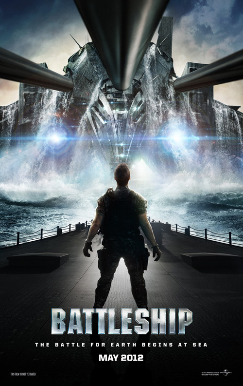
But wait! They aren’t finished because Battleship is in fact—and you’ve seen the trailer so this is not a spoiler—an alien invasion! What?! How … cool?
BLT then steals The Refinery‘s design for Skyline and places Taylor Kitsch in the foreground peering at the monstrosity rising from the deep. I’ve seen Transformers, though, so I can tell Riggins those three cannon barrels at the top are going to prove pretty much worthless.
The whole cast was supposed to show?
 |
 |
 |
 |
Like The Avengers, the Summer movie season continues on with poorly conceived posters designed in post production without any kind of inventive staging. Why waste the actors’ time and make them leave their trailer for a shoot when you can take touched-up images and force them together? I often wonder whether it truly is cheaper to spend the man-hours needed to airbrush and mask instead of just having everyone on set take a few promotional shots.
 |
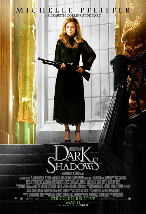 |
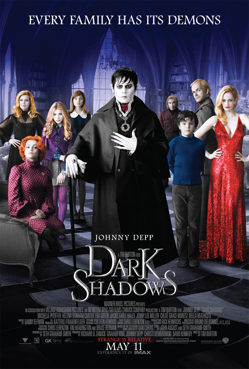
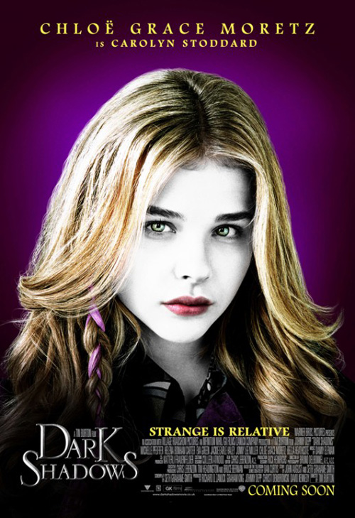
The reality of the situation is that I actually don’t mind Ignition Print‘s sheet for Dark Shadows (open May 11th). Its family portrait aesthetic works in context with the film and the characters shown are eccentric enough to pique interest. And with vibrant colors counteracting any preconceptions I may have had remembering those dour, black and white VHS cases of the original I passed by many years ago at Blockbuster, the very heightened world created in the trailers comes through.
But why do we need character posters, let alone two distinct series? The head shot entries are intriguing in a Pop Art type of way, but all they do is show each actor’s face in costume—an utterly worthlessness exercise. At least the second round puts the Collins clan in environments that may or may not infer on who they are. Like most of this ilk, however, you can see the Michelle Pfeiffers are identical in hair and body with only changed facial expressions and right arm to make appear different.
 |
 |
 |
 |
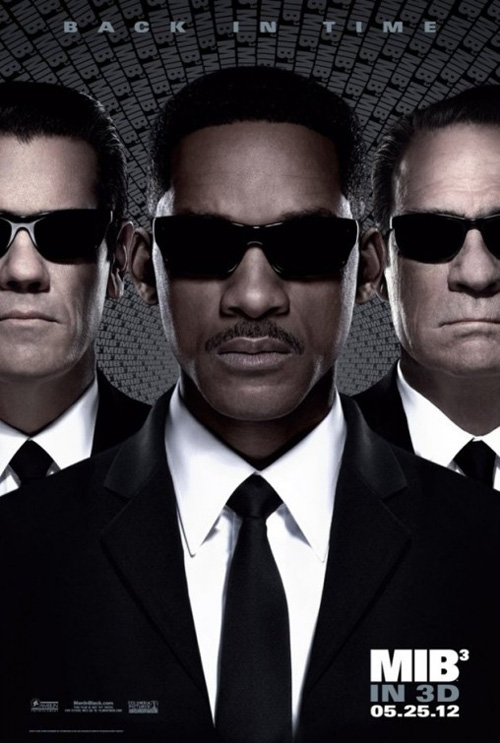
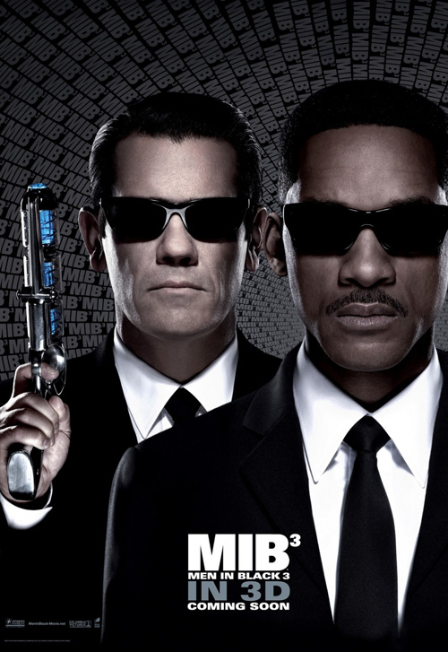
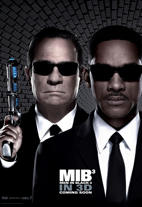
If you want really bad, though, look no further than Men in Black 3 (open May 25th). Again, I don’t mind the main poster—Will Smith at center with the two incarnations of Agent K (Josh Brolin and Tommy Lee Jones) at his side. The stern expressions fit canon and, while I hate the stream of logos in the background, I do enjoy the grayish pattern created behind them. As far as making the ‘3’ into an exponent goes, I’m not quite sure what they’re justification is besides trying to look cool.
The trouble occurs when BLT splits the image into two separate sheets. If you toggle between both you’ll notice that the body used for K is identical. In fact, the painted on head of Jones even uses part of Brolin’s left ear. I simply can’t help but believe the designers could have had much more success with actual photographs depicting the three together. To me natural always trumps artifice.
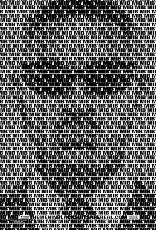
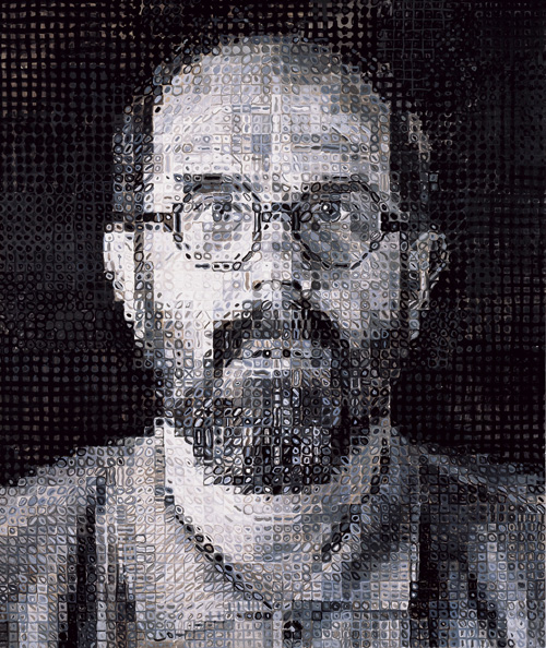
Even the Chuck Close–like segmented teases—despite being difficult to process visually—have more going for them than these faux compositions. I just wish they could have created the effect without bolding certain logos unrecognizably for the deepest blacks.
 |
 |
 |
 |
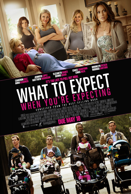
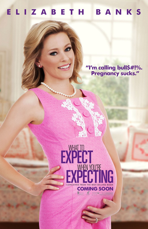
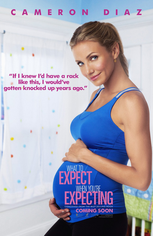
What to Expect When You’re Expecting (open May 18th) doesn’t even try to use its fit together pieces as more than a half page on their main advert. Possessing a plethora of famous faces, Ignition forgoes the badly Photoshopped pregnant women by separating each so the title treatment can grace they protruding bellies separately. I’m not sure it’s very effective but at least one at a time is better than all at once.
I actually feel for the designers here because the title is way too long. They try to separate the font with light and bold styles, but only cause confusion on the character posters. ‘Expect’ and ‘Expecting’ are fat and pink, sticking out like sore thumbs while the rest remain white and innocuous. The main sheet at least separates the words at a logical midway point, allowing the title to flow much smoother.
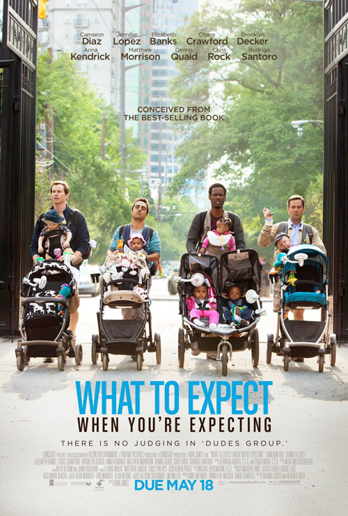
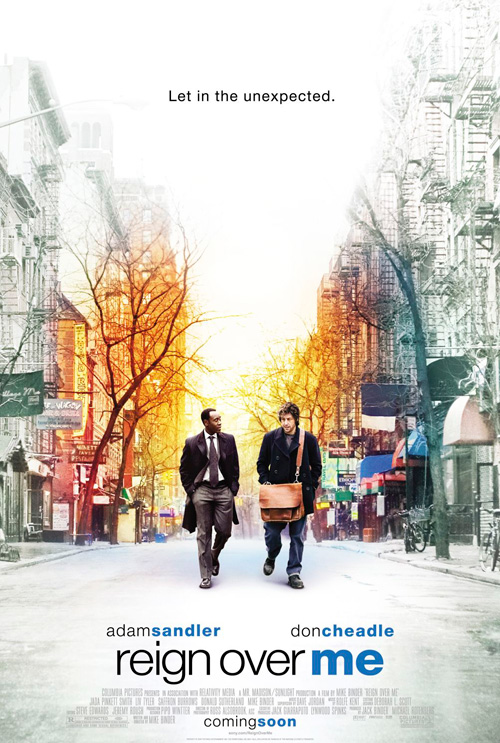
If I were Ignition, however, I’d simply stick to the piece showing a gang of husbands toting strollers. This imagery is the best part of the trailer and the subversion of stereotypes to make ‘stay at home Dad’ appear faux hip is a hoot. Besides an eerie resemblance to the firm’s own design for Reign Over Me, the joke here works so much better than celebrities wearing prosthetic stomachs and corny taglines.
 |
 |
 |
 |
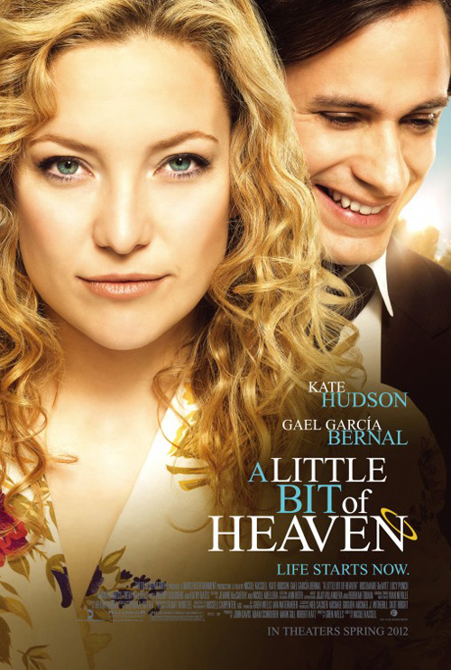
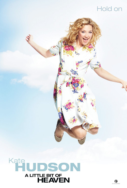
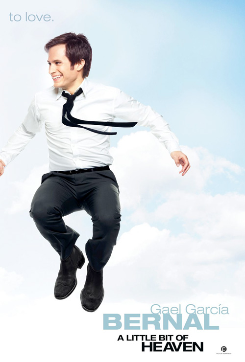
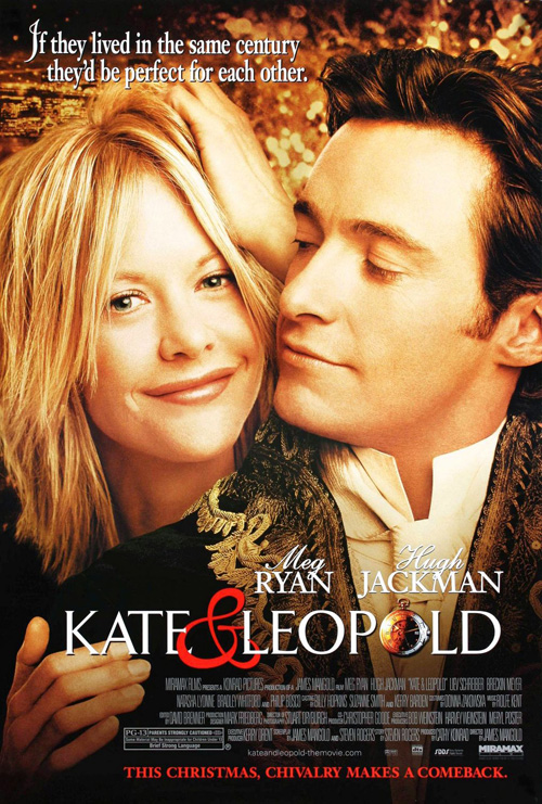
And then comes the horribly tired romantic imagery of a giant face with smaller lover behind of A Little Bit of Heaven (open May 4th). The Cimarron Group does what studios have been doing for decades by putting the sultry, confident face of Kate Hudson large and in charge with a giddily laughing Gael García Bernal in the background. Much more contrived and over-used than the recent spate of cropped close kissing seen last month with The Lucky One—see Kate & Leopold—this poster does nothing but make me think Bernal is deceased and a guardian angel looking down. It’s that damn halo’s fault on the title.
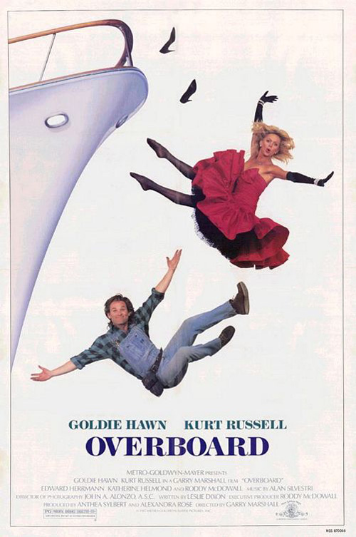
If anything, I actually kind of like the alternate diptych from bpg showing both actors jumping in the air because it gives a lighter feel and may actually be a real photo for once—besides the scale of the sky of course. The expressions on their faces are pretty campy, but I can’t help smiling at the assumed unintentional parallel to Hudson’s mother Goldie Hawn‘s Overboard.
The fine line of “artistic”
 |
 |
 |
 |
 |
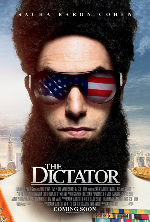 |
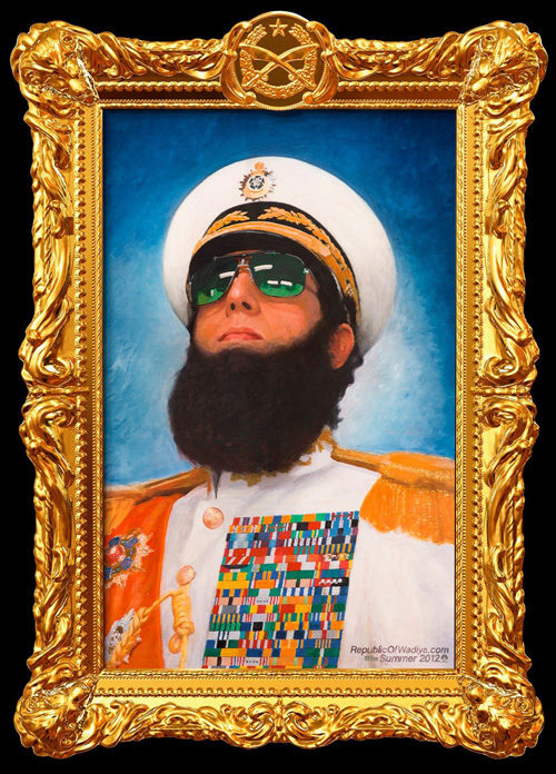
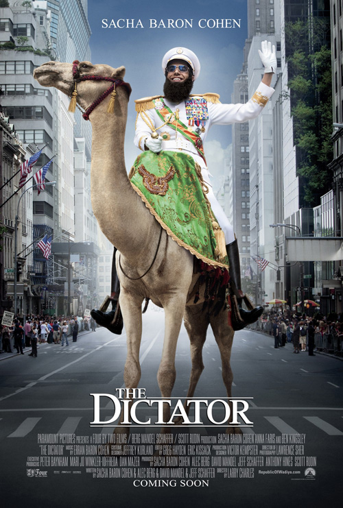
What surprised me the most this month would have to be the fact one of the best posters comes from Sacha Baron Cohen‘s newest foray into method acting with The Dictator (open May 16th). A teaser of the best sort, BLT treats us with the iconic visage of General Aladeen in painterly strokes and gilded frame courtesy of E. Fehlberg and J. Laverdiere.
No name is necessary since Cohen rarely stars in films that don’t deal with him embodying an offensive caricature and the website listed bottom right is the perfect use of new technology to discover what film it depicts. The internet is so easily accessible now that it’s a wonder more studios don’t utilize it. A truly successful tease will ingrain itself and force the viewer into light research to find out more. Sadly, since most agencies still put QR codes on advertisements that go to a non-mobile friendly website, I can’t yet say the world is yet internet savvy.
Once it comes time to expose the title, though, BLT follows the status quo with floating heads or badly touched up imagery with pseudo humor. Putting the American Flag in Cohen’s glasses on the one is uninspired and the camel in the city is completely preposterous in scale alone. Kudos for the simple serif font treatment, though, the designers could have easily gone overboard there.
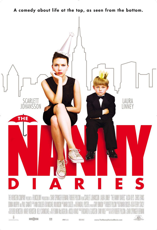 |
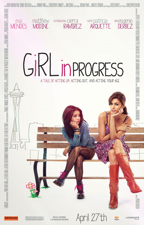
REV CREATIVE—unlike BLT—decided to keep their handmade artistry in their main sheet for Girl in Progress (open May 11th). Isolating the stars on a park bench, the drawn lines of Seattle skyscrapers become quaintly noticeable in the background. It’s a cutesy technique we’ve seen before—check out Tarhan Creative‘s The Nanny Diaries—of juxtaposing the striking starkness of lines on white with full color photo that really only comes off drab and trite here.
The conceit of the film appears to follow suit as mother Eva Mendes shows herself to be more child than daughter Cierra Ramirez. With a plot like that I guess maybe the marketing strategy was to go ironic with its fluid likes and crude drawings signifying a loss of innocence perhaps? I don’t know, to me it clashes with the premise and seems lazy more than anything else. Not that cutting Mendes and Ramirez out of their background is lazy; unless the shot was taken against white in a studio. Then it most definitely is.
 |
 |
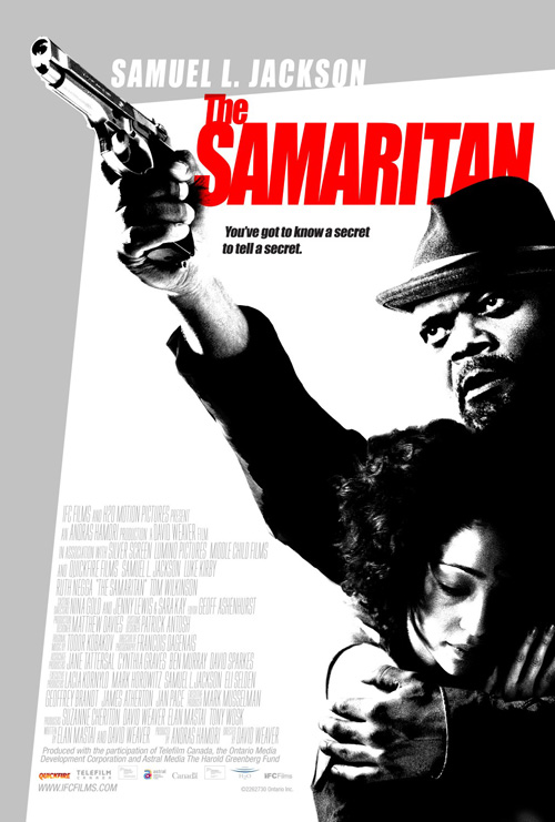
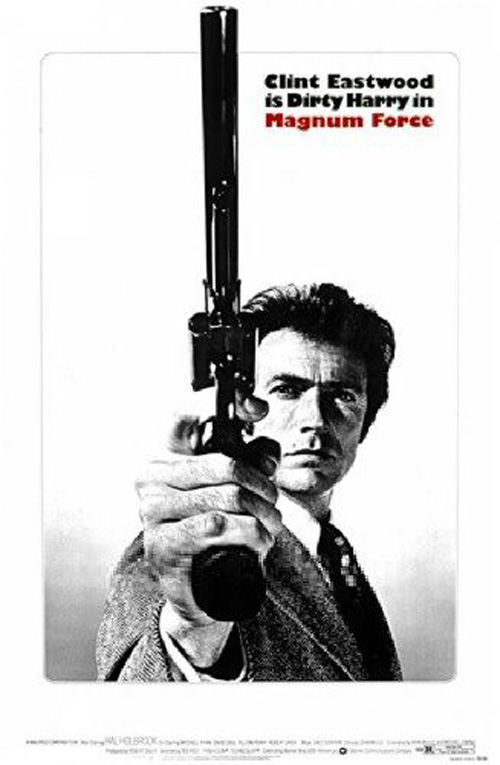
Another misstep on the path of creativity comes from Art Machine, A Trailer Park Company‘s poster for The Samaritan (limited May 18th). Trying to be edgy with pitch-black copy paper-like photo filters, red text, and abstract boxes, the imagery fails to be so because of the clichéd attempt. This could be something special a la Magnum Force‘s minimalism, but a need to be cute ruins it.
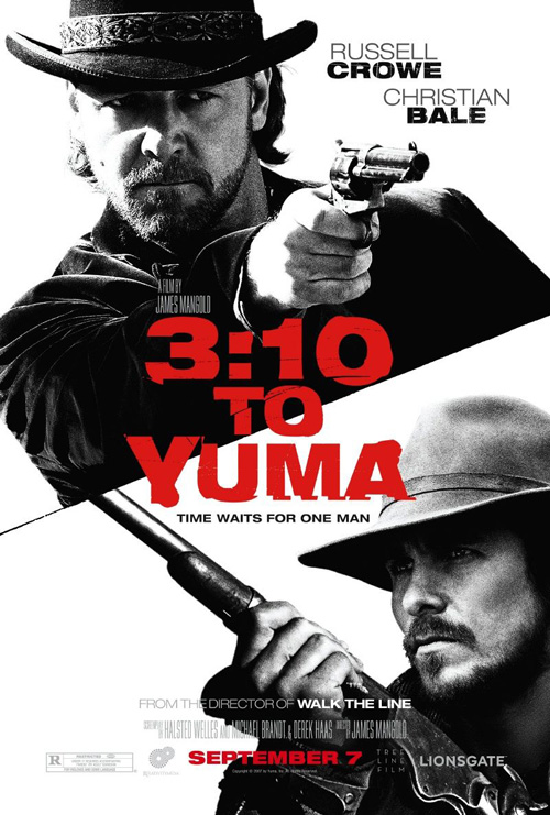
The contrast is too deep, the ‘multiply’ filter on Sam Jackson‘s hand allows the red of the title to bleed through, and the idea itself does nothing to explain the film besides showing its popular star. Even Ignition’s rather boring display for 3:10 to Yuma does a better job at red over black/white despite being as conventional as can be. I guess Art Machine just tried too hard.
 |
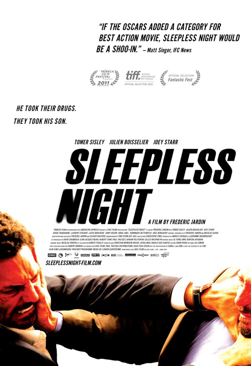
Luckily, the foreign film Sleepless Night (limited May 11th) comes to rescue us with a stunning image-based design from The Boland Design Company. It’s not often I praise a domestic poster above an international one, but looking at the original’s floating head pyramid will explain how easy it was to blow out of the water.
Rather than merely beat it, however, Boland goes for gold with its black text on white for three-quarters before hitting the violent exchange of actors below it. Cropped off the page for added drama, the fierce expressions make the words speaking of action flick glory above look to be speaking the truth.
Finally May sees a poster that isn’t trying to sell us a star. Being a French import surely helped due to the naivety of viewers not knowing anyone it in anyway.
Redundant Redundancies
 |
 |
 |
 |
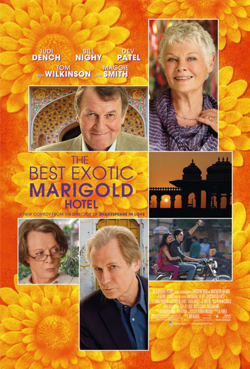
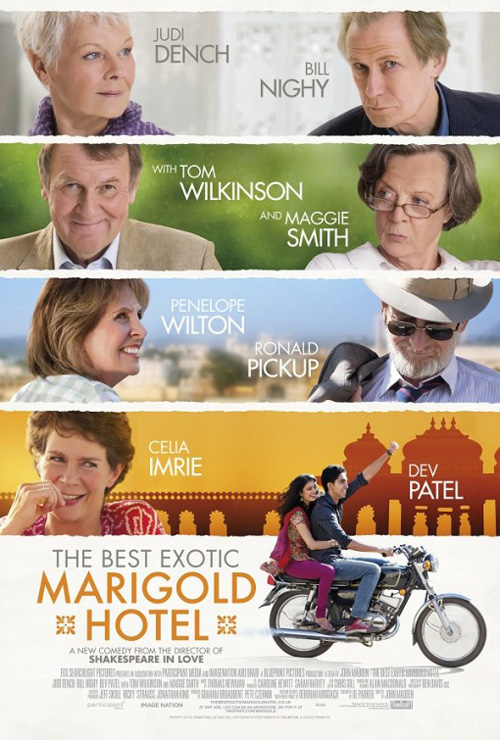
My favorite film of the year thus far—as we close in on the halfway point of 2012—comes with a trio of posters that exude varying degrees of indifference. The Best Exotic Marigold Hotel (limited May 4th) the film is colorful, cultural, emotive, and brilliantly acted while the posters are flat, almost monotone, and reliant on happy faces from powerful British actors without a shred of craft.
 |
 |
If I were made to pick a favorite, I’d probably have to go with the orange-tinted photo box entry. Similar to last month’s domestic print for Headhunters, the boxes butt up with one another and show a still from the film or posed cast shot. It’s clean—for the most part since text is hard to read above the marigolds—and at least gives a tiny taste of the warm colors to be seen.
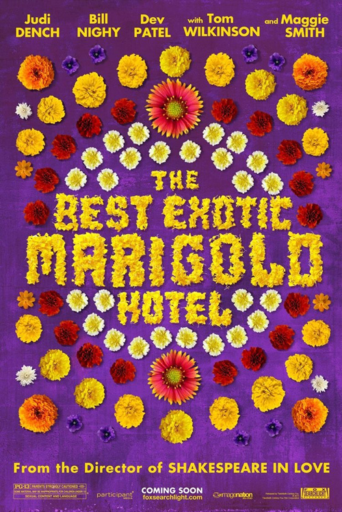
I’m completely flabbergasted by BLT’s Sgt. Pepper-inspired floral design. Really, though, what were they thinking? Show the pink wall of Jaipur, the exotic landscapes, architecturally beautiful mosques, or even the tuk-tuks the film’s leads travel in throughout. Give us India, not Woodstock—especially since America has nothing to do with the work.
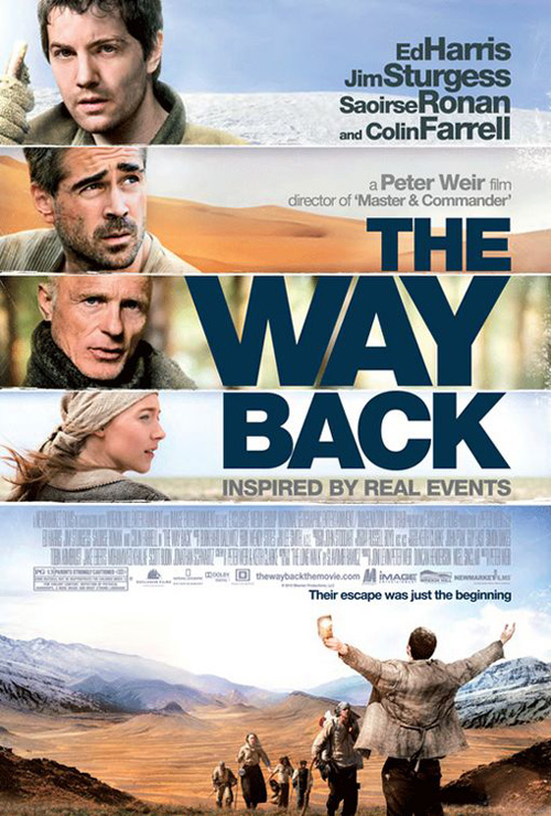
I won’t even waste breath on the third design. I seriously wouldn’t be surprised to learn the artists took the sheet for The Way Back and placed new images in the blocks. Even the white, distressed border between strips is almost identical.
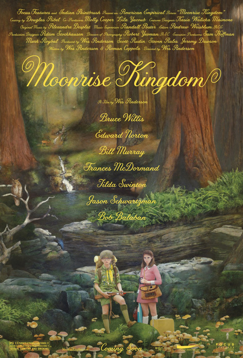
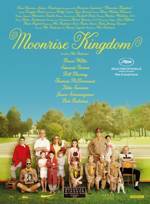
While these are redundant in motif, however, Wes Anderson‘s Moonrise Kingdom (open May 25th) is in style. Fitting snugly with the posters for the auteur’s last few films, Mojo and Michael Gaskell get the sterile, staged aesthetic down perfectly.
 |
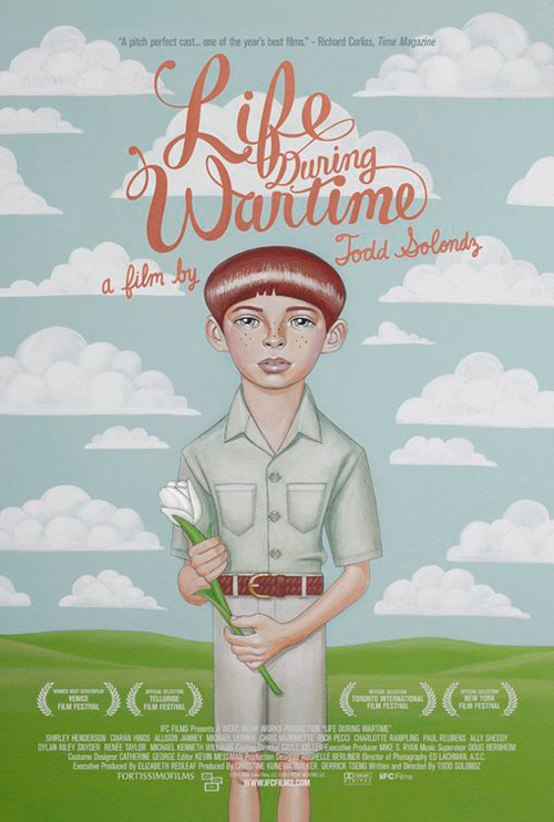 |
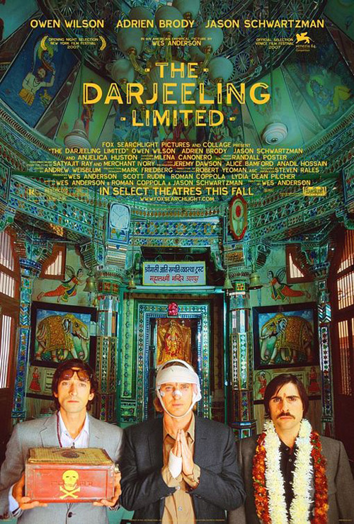
Like BLT’s Darjeeling Limited before it, the hyper-real, almost fabricated colors of its image become covered by a hipster font unlike any normal Helvetica or Century Gothic you’ll see throughout the rest of the work I’ve culled together above. It’s a flowing swirled serif in yellow that really complements the handmade art direction below it like Mojo’s own Life During Wartime did a couple years back.
You look at both posters and see Wes Anderson. There’s no question about who directed the film depicted. Sumptuous and detailed, you could surely lose yourself in the woodland feel, Bruce Willis looking hysterically normal, and the A-list cast supporting him. My favorite flourish, however, is the realization that the backdrops are just that. You can see the shadows behind Bill Murray, Ed Norton, and the others, proving the true artifice at work and the reason it appears as staged as it does. It’s a nice creative touch that outshines everything else May has brought.
What is your favorite May release poster? What could have used a rework?