“Don’t Judge a Book by Its Cover” is a proverb whose simple existence proves the fact impressionable souls will do so without fail. This monthly column focuses on the film industry’s willingness to capitalize on this truth, releasing one-sheets to serve as not representations of what audiences are to expect, but as propaganda to fill seats. Oftentimes they fail miserably.
—
Summer is here and the marketing materials look as vapid as the films. Not to say there aren’t a couple gems coming to multiplexes with blockbuster budgets; there simply aren’t any surprises. A lack of limited releases definitely doesn’t help that cause, but even those included come across with lackluster appeal.
A month without any superhero flicks, perhaps June sits as a precursor to July’s more noteworthy entries. We can hope agencies saved their best work for them because the following do nothing to inspire any confidence in the industry finding new ways to catch our eyes.
I spy with my little eye …
 |
 |
 |
 |
… something that’s been done before.
There are many one-sheets fitting this bill in June, but none more than the four I’ve singled out in this first stanza. Copycats don’t always have to be forgettable or unoriginal, though. They just somehow always seem to be.
 |
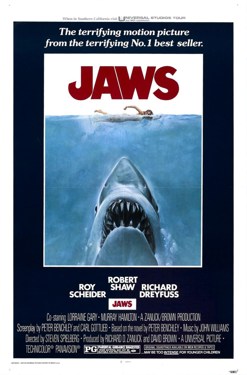 |
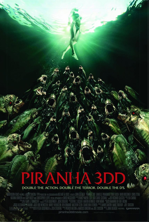
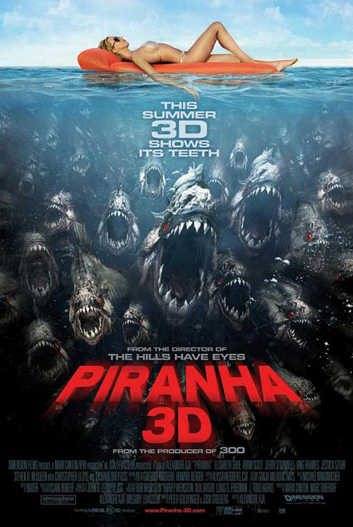
Give Art Machine, A Trailer Park Company a pat on the back for attempting to overcome its inspiration on the initial sheet for Piranha 3DD (open June 1). Utilizing a new angle to put a different spin on its predecessor Piranha 3D‘s—also by Art Machine—facsimile of Roger Kastel‘s Jaws, they’ve crafted a captivating design. Seeing the curvy soon-to-be victim treading water from below is much more alluring a position than the simple profile on back and the mass of fish readying for a bite infinitely more menacing than coming towards us while she floats above.
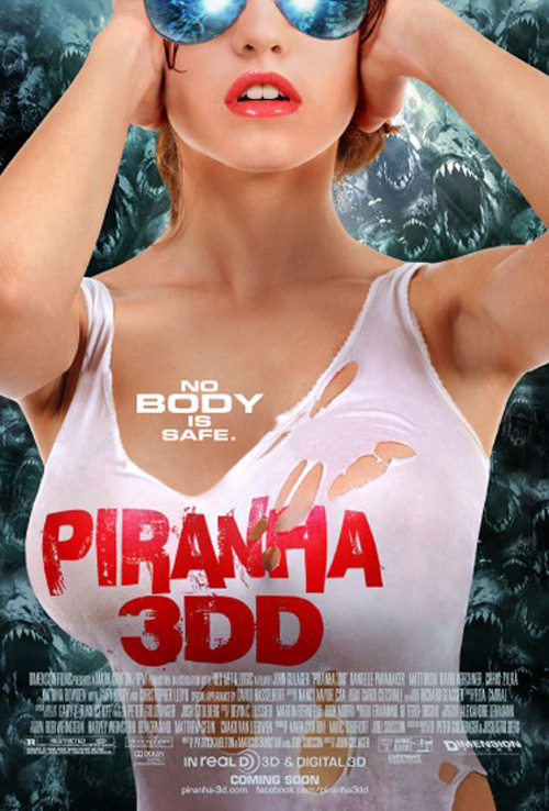 |
The red font is much sleeker than the bold perspective from the first film and the green tint gives an otherworldly glow that begs conjuring thoughts of radioactivity or mutation thanks to the Hulk. Sadly, however, the Weinsteins must have thought a thinly veiled title reference to large breasts wasn’t enough to grab college-aged males’ attention. So, enlisting Blood & Chocolate and AV Squad, we’re given the highly sexualized second entry with a woman who looks uncannily like Ali Larter—an actress not in the film.
With sexy lips, aviator sunglasses, and a ripped top threatening to show cleavage, all sense of dread at its horror aspect is pushed aside in lieu of lust. The piranhas are now a complete afterthought in the background and the font becomes a badly distressed sans serif placed without regard for perspective or realism. This is a perfect example of how subtlety is often sexier after all.
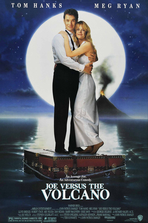 |
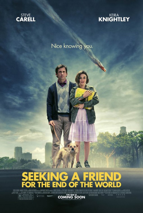
Moving from busty bosoms to an overabundance of clothing, our next example is Ignition Print‘s Seeking a Friend for the End of the World (limited June 22). By placing Steve Carell and Keira Knightley at center while a foreboding sky mirrors the ominous title, I couldn’t get Joe Dante‘s Joe Versus the Volcano (designed by John Alvin) from my mind.
With facial expressions that don’t quite match each duo’s environment, the two posters show their films’ destructive forces small while the actors become focal points. A falling meteor matches a fiery volcano and the title treatments are dwarfed by the stars standing above. Neither grabs much interest besides their out-of-place wardrobes—seeing Knightley look like a twelve year old while Carell frumps around with his dog definitely piques interest as far as the comedy is concerned. Other than that, however, the concepts are rather pandering to our nation’s want for celebrity above story.
And that leaves us with thinly bold sans serifs like Century Gothic or Futura. I used to cherish those typefaces as their perfectly circled ‘Os’ make them more stunning considering my love for symmetry than the ellipses most other fonts contain. But when did putting them in all caps and white over imagery become fashionable? Was it Crazy, Stupid, Love.? The Social Network? Even earlier?
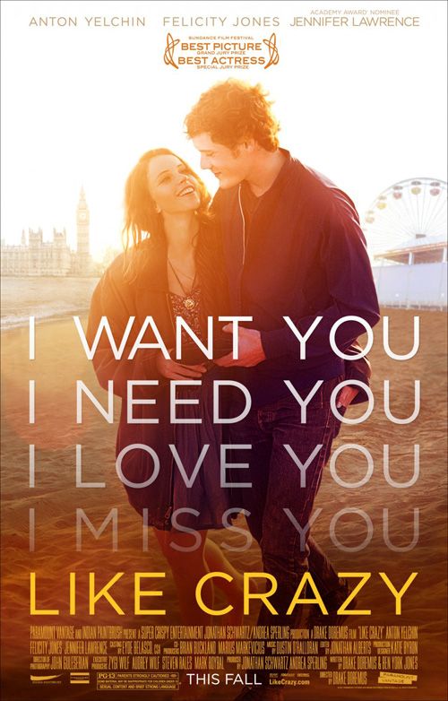 |
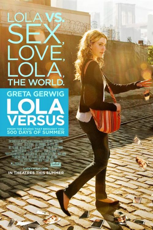
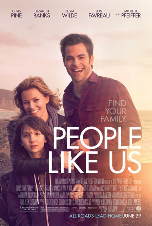
While not quite those two fonts—you can tell by the rigidly straight ‘M’—Like Crazy ushered in the juxtaposition their white text atop an over-exposed image. mOcean and Blood & Chocolate took notice and decided to continue the trend with Lola Versus (limited June 8) and People Like Us (open June 29) respectively.
Both using a rather innocuous photo that does little besides showcase the actors, the washed out aesthetic and sharp edged letters become our only point of interest. I should enjoy the simplicity in orchestration and clean design with carefree use of overlap, but I just can’t. I’ve seen it before and I’m pretty sure I’ll see it again and again. The look has had its time and should be retired whether studios request it or not. Everything becomes trendy at some point and annoying shortly thereafter.
Less is more
 |
 |
 |
 |
I guess familiarity is only seen as helpful for teasers. Whet fans’ appetites at the start and then throw something new and bland their way to gather more prospective seat fillers than the already fervent devotees of its source material.
 |
 |
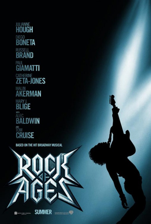
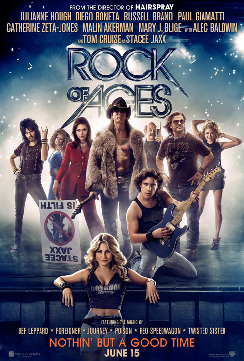
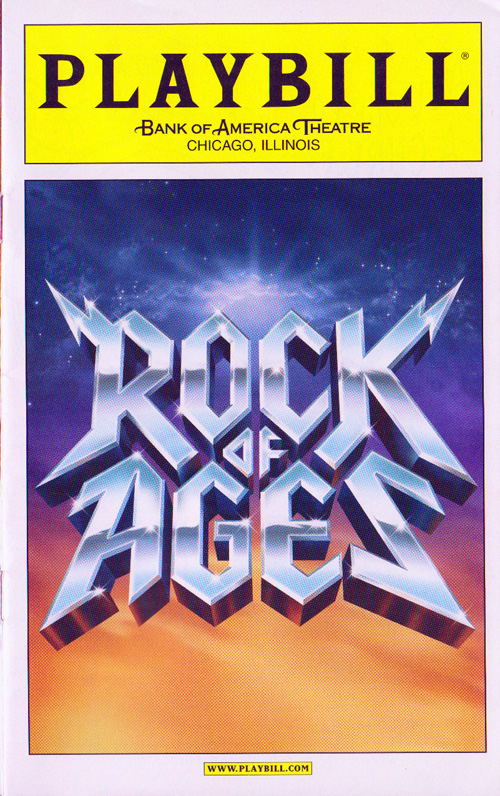
Warner Brothers follows such a formula in how they handled Rock of Ages (open June 15). Hiring BLT Communications, LLC for the tease breathes life into an updated version of the theatrical playbill’s logo with a silhouetted rockstar against a metallic color palette of light. It’s a striking image that allows the A-list cast to use their names’ clout and get lovers of the musical to start guessing who each plays.
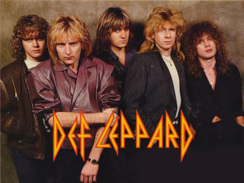
But this wasn’t enough as WORKS ADV was brought on to punch things up with a painterly portrait of the faces attached to those names. The ‘band’ is all together like an 80s poster of Def Leppard complete with ducky lips, confident swagger, and wind swept hair. Change the logo to look like a Fox reality TV talent show, add some smoke, and voila! We have us a glimpse at the cast in costume. Yay?
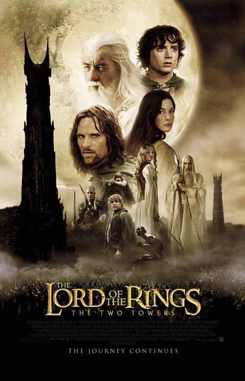 |
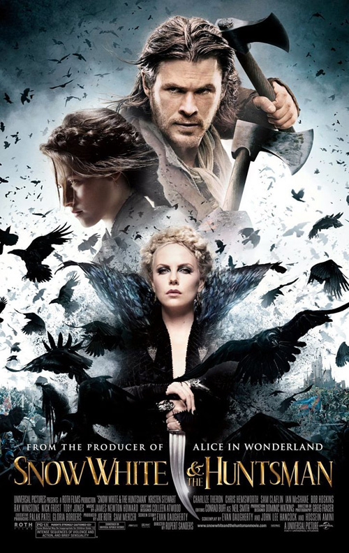
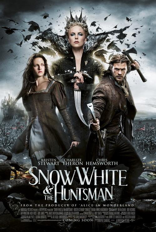
Along the same lines comes Snow White and the Huntsman (open June 1). Bemis Balkind does their best to spice up the floating head template of say The Two Towers, but an army of ravens doesn’t excuse the fact characters are fading out of each other to create a totem of cheesy, faux seriousness. I’m still not sure if it’s better or worse than Creative Partnership‘s sibling of full figures, but it is interesting to see two agencies use the same imagery in almost the exact same way.
 |
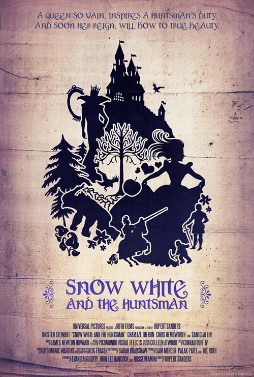 |
While an admittedly blatant rip-off of artist Wieslaw Rosocha, I’ll concede that Bemis Belkind’s second entry here is at least trying something different. Yes, the second eye in the raven’s head is discomforting and the design itself a bit too on the nose as far as what Charlize Theron‘s Ravenetta is capable of, but you have to like the contrast of black and white.
Go a little further, though, and you can get behind deviantART artist Dwayne Labuschagne‘s entry in Universal’s Facebook competition. A gorgeous minimalist design in the vein of old, first edition Hemmingway covers by “Cleon”, his poster gives a wonderful storybook feel as it retains the film’s darkness. The font is a bit much at the top, but in the end this fan art is my winner of the lot.
If it ain’t broke …
 |
 |
 |
 |
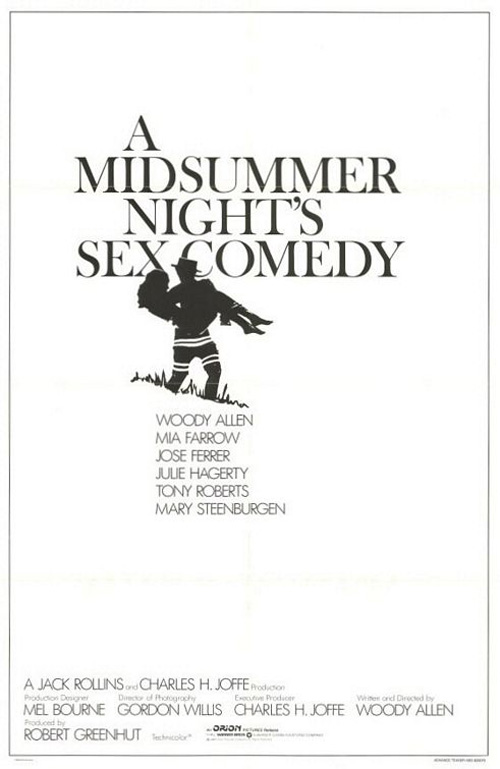 |
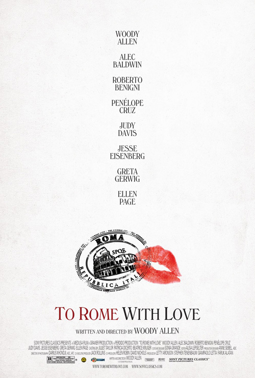
Like the uniform opening credits from Woody Allen‘s prolific career, one can’t help but acknowledge how many of his films used text and the director’s name to sell tickets in advertising too. It’s Woody Allen, after all—what more do you need?
As such, you could look at Manhattan Murder Mystery or Zelig as cousins to Cardinal Communications USA‘s sheet for To Rome with Love (limited June 22) and not be too far off track. But it’s A Midsummer’s Night Sex Comedy that really shows a kindred spirit with its graphic imagery cutting through the cast list. A little color helps break up the monotony of the black and white of old, but the style is pretty much identical. We’ve come to expect a brand from the auteur and his marketing campaigns often follow suit.
 |
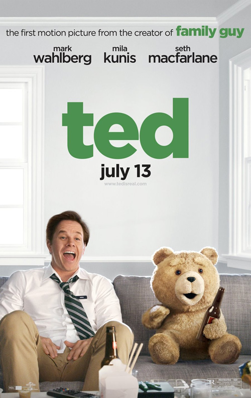
Going against a want for class and sophistication, however, brings us Ignition Print’s run for Ted (open June 29). A crass comedy from Seth MacFarlane, the posters instill the film’s rather absurd concept of a talking teddy bear and his not quite grown-up best friend Mark Wahlberg.
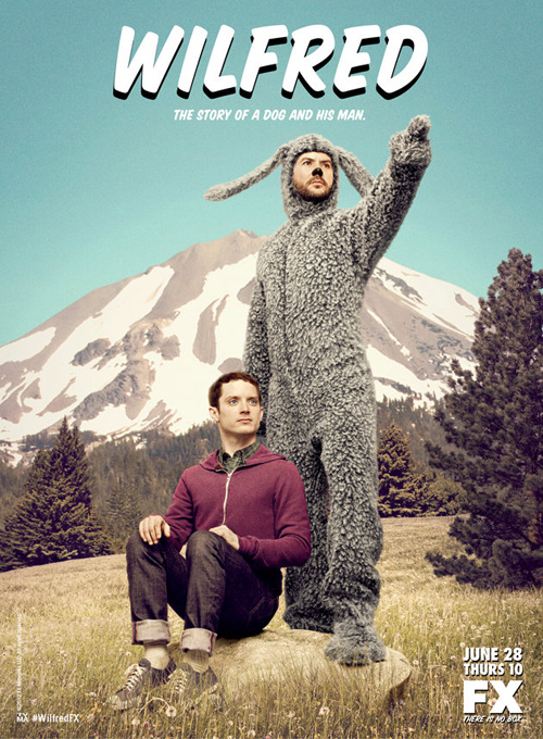
The series isn’t horrible as it pits the two characters together with beer and a bold, lowercased title, but the similarity to “Wilfred” is hard to ignore. In fact, the movie looks pretty close conceptually so the design firm shouldn’t be held responsible for similar looking ads. I do find it interesting, though, that they decided MacFarlane was better suited to be listed as an actor rather than writer/director. I guess “Family Guy” is a bit more ubiquitous than the man behind it.
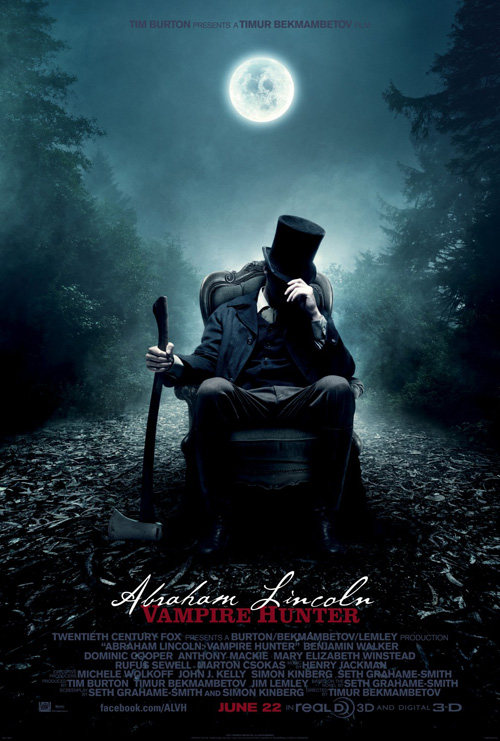
Where Abraham Lincoln: Vampire Hunter (open June 22) is concerned, the idolized president possesses a built-in image. Everyone knows the seated statue at the Lincoln Memorial and using it as a design element is a no-brainer. But it’s interesting to see how two different agencies deal with such an iconic pose.
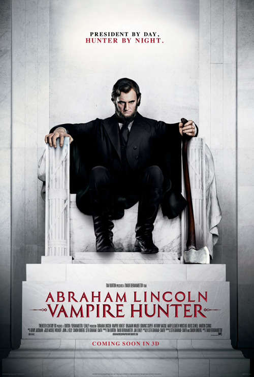 |
Ignition takes the smart path of mimicking the statue without blatantly showing it. By putting Lincoln in a chair in the forest, we conjure memories of Washington DC tours while also acknowledging the fact this poster is its own beast. The dark sky and full moon allude to the supernatural aspects at play and the ax infers this stoic giant has a little more punch than his pen.
But for some reason The Refinery was brought on to throw their hat in the ring devoid of subtlety. They place Benjamin Walker on the actual marble seat with a scowl of malice. So obvious, it even goes full on into a sharply pointed font to give thoughts of stakes and fanged creatures of a Victorian Age. Give me the beautiful impurity of Ignition’s flowing script atop sans serif over that any day.
 |
 |
 |
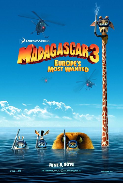
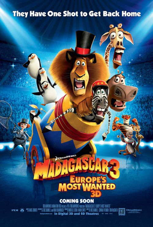
For Madagascar 3 (open June 8), you almost hope they get past what has been done for its two previous movies. Yes, our favorite zoo animals are lost again, but who says we always need to see them in differing stages of fright on the posters?
BLT Communications, LLC does go the easy route by giving one with such facial expressions—maybe Alex the lion can only look scared with mouth agape—but they also bring freshness in with a splendid teaser playing on the unavoidable joke of the characters’ species. Hiding in the water, you can see Alex and Gloria’s glares barely above the surface while Melman’s ill-fitted physique for secrecy puts him a couple stories higher into the sky. The logotype remains consistent throughout the series and kids are given little time between films to forget their friends.
Textual prowess
 |
 |
 |
 |
Who needs a crisp image of a character to sell movie tickets? Not these four films.
Three come from the independent forum while the fourth is by a director that’s no stranger to such budgetary constraints. It’s not surprising then to see agencies going a bit less conventional with their designs. In fact, I’m actually kind of excited at how far on the unorthodox spectrum they went.
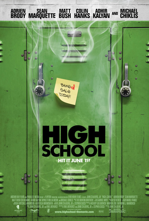 |
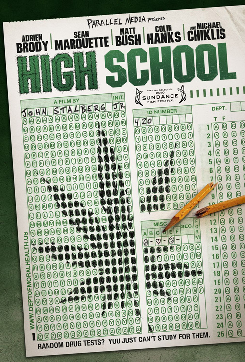
A film that’s a couple years in the can, I love The Robot Eye‘s work for High School (limited June 1). Epitomizing the titular establishment—who didn’t take Scantron tests—the ingenuity on display is great. With website and tagline placed carefully in the margins, a chewed up pencil snapped in half on the page, and a scrawled marijuana leaf in the bubbles, it portrays exactly what sort of comedy is expected.
The Arterie‘s less inventive locker piece gets the same point across, yet I believe the overabundant smoke ruins the tone. A ‘handwritten’ font is used to display a lame tag on a Post-it and the title is shown in simple block letters with little of the fun from the previous sheet. Something about the penciled letters in that not being uniform—the two ‘Rs’ in director John Stalberg, Jr. aren’t the same—and the doodled scribble around ‘HIGH’ give it an authenticity the green lockers cannot.
 |
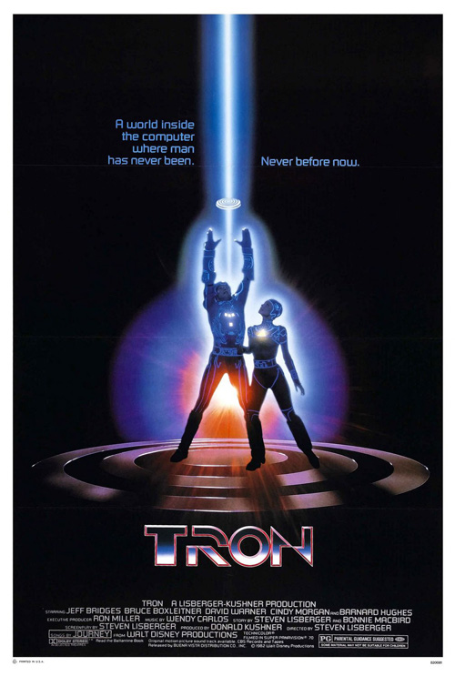 |
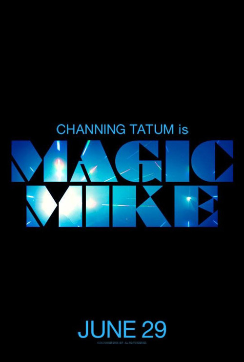
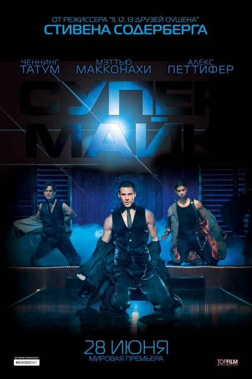
Also devoid of photos, what I like about the teaser for Steven Soderbergh‘s Magic Mike (open June 29) is how little it shares. The director’s name is nowhere, actors are unnecessary, and the colors are coolly dark. Its eccentric font’s almost puzzle-like construction recalls Tron through a Studio 54 filter and the spotlight within the letters only helps you remember the film is based on star Channing Tatum‘s past as a stripper.
Unlike the foreign entry’s Chippendales look, however, the tease knows women around the United States have heard Tatum is playing a male ‘dancer’ in his newest flick and they’ll use their imaginations to fill the black void with daydreams of the heartthrob. Still a month away from release, a more orthodox design could still be in the works. Honestly, I don’t think it’s necessary.
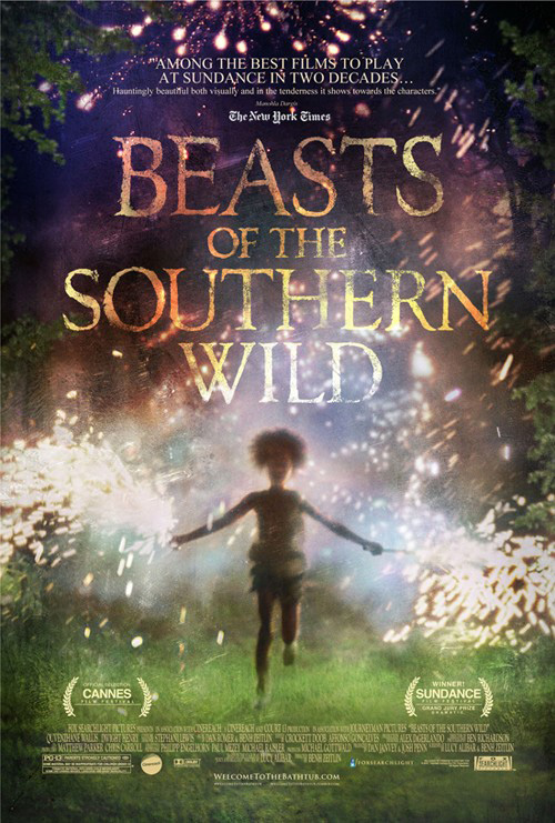
Similar to its use of typography, the marketing campaign for Beasts of the Southern Wild (limited June 27) isn’t afraid to try something different. Decomposing and transparent in sections, the text used mimics the blurred motion of colorful sparklers beneath. It’s a sumptuous film still utilized to the best of its visual power and its mystery asks you to check out the whole. You can’t ask for a better result than that.
 |
 |
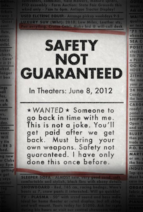
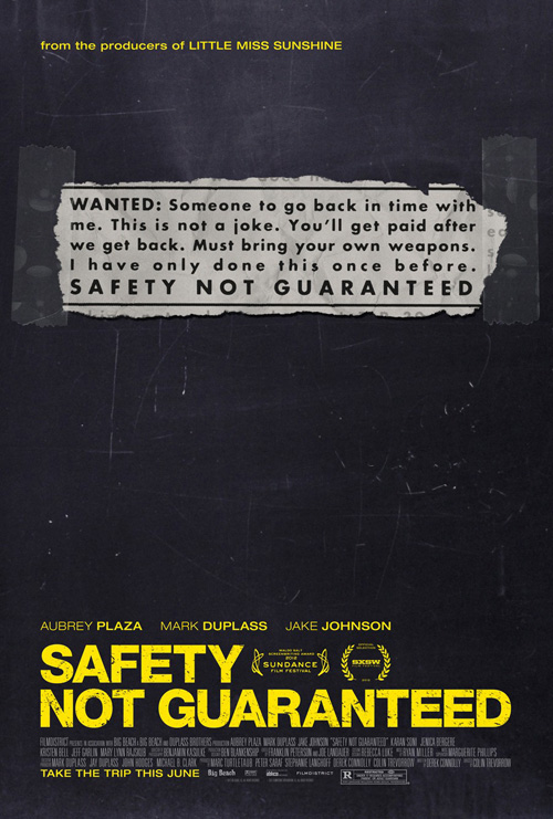
For me, though, it doesn’t get better in June than Safety Not Guaranteed (limited June 8). A tease nothing but the title and release date, the faux classified ad is a wonderful device to catch attention. Boxed in red like by an unemployed layabout, the implausibility of its request for a time traveling companion can only inspire you to find out more.
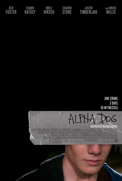
Gravillis Inc. tries to do the same with their piece, but it ultimately fails in comparison. I like the odd positioning of its ripped newspaper ad to create white space—although not quite as jarring as Crew Creative Advertising‘s Alpha Dog—but the scratched yellow font removes all sense of realism. This is a poster and can be nothing else. At least with the tease we can suspend disbelief and think it to be a blown up ad from the day’s paper. Kudos to whomever did the work because instilling a design with the feel of another product is never easy.
Adequately hiding their potential
 |
 |
 |
 |
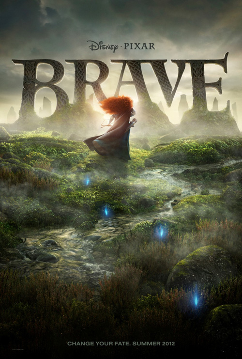
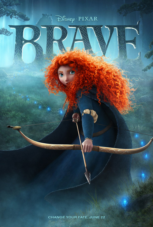
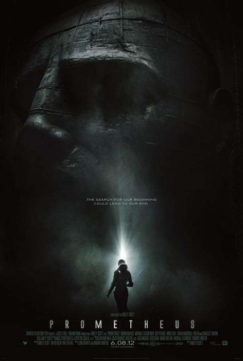
I generally save my last words for those works I deem best, but this month I decided to touch upon the two films I can’t wait to see. Both Brave (open June 22) and Prometheus (open June 8) look fantastic and I’ll be buying a ticket either way. It is still intriguing to see what their marketing people came up with, though. How would they get the few oblivious people that live under rocks to understand the spectacle each will hopefully bring?
 |
 |
 |
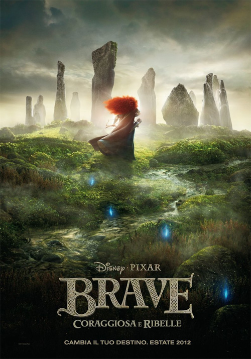
BLT Communications, LLC earned the account for Pixar’s newest and I have to admit being torn in my feelings. Better than its foreign counterpart by superimposing the title over what looks to be a Stonehenge-esque monument, the glowing blues and misty atmosphere really do instill an air of mystery. But could they have done more? Could they have played with elements like Merida’s hair or gone away from the actual CGI animation in lieu of a striking two-dimensional image?
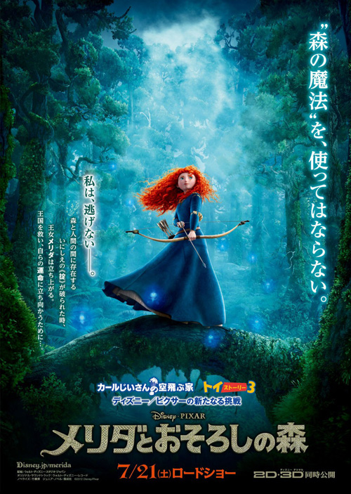
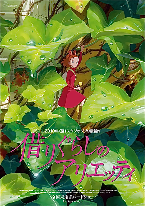
I don’t know the answer to this, but I can’t say I’m completely disappointed. It’s better than the one depicting an armed Merida readying her bow because it holds back from such blatant character plopping at the center. However, FIVE33‘s Asian design offers more of her surrounding environment and puts us into the action much like Arrietty earlier this year. Like them or not though, I’m a huge fan of the Celtic logotype. That thing is kind of epic while still remaining charmingly appropriate.
 |
 |
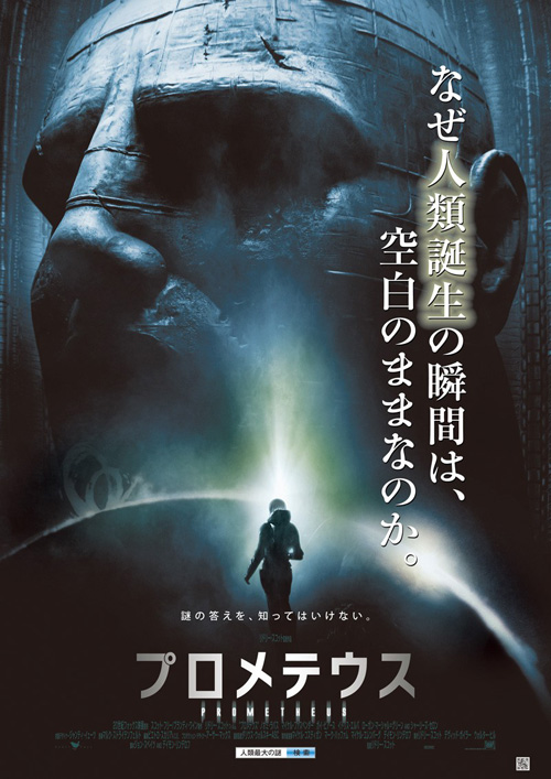 |
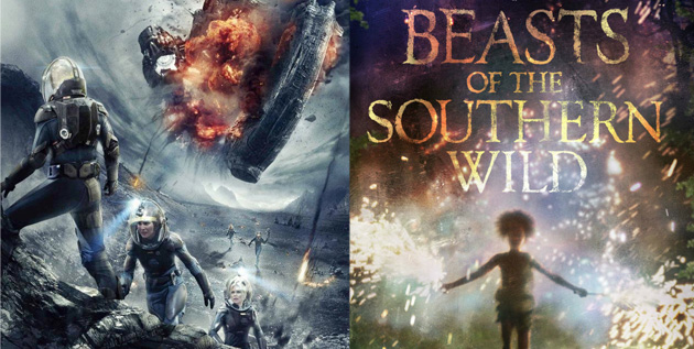
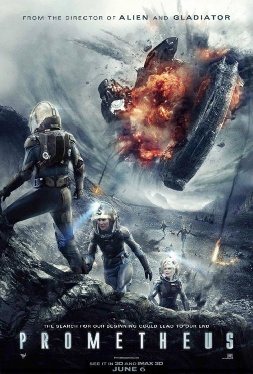
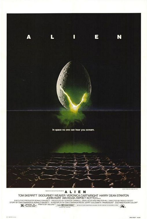
As for Prometheus—one has to think about Ridley Scott‘s Alien when the science fiction thriller comes up. BLT won this account as well and it appears they couldn’t remove it from their heads either. Shrouded in darkness, the mammoth statuary at back is illuminated solely by the light behind Noomi Rapace. Much like the glow of Alien‘s egg, you’re crippled by fear about what may lurk beneath the black.
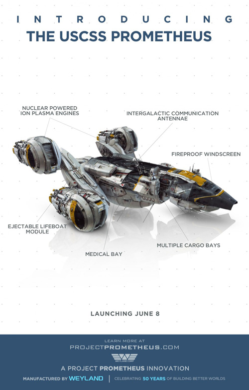
Art Machine also received a shot at creating a later, more action-infused sheet and it does work as a result of its extreme perspective and slanted composition. By far less mysterious, there is something to be said about catching a glimpse of the actors in their world. I’d rather experience the suits and the machinery in use rather than the lackluster ‘character’ posters of the technology. Why do we care about Weyland’s transportation units? I love the viral video campaign running concurrently, but these stark white diagrams leave much to be desired.
It is, however, fun to see the foreign advert use the same giant head as BLT but without the darkness. Do Americans really like being frightened and kept away from answers that much? I know I do. Give me the unknown any day and I’ll find out what’s hiding when I sit down at the theatre.
What is your favorite June release poster? What could have used a rework?