“Don’t Judge a Book by Its Cover” is a proverb whose simple existence proves the fact impressionable souls will do so without fail. This monthly column focuses on the film industry’s willingness to capitalize on this truth, releasing one-sheets to serve as not representations of what audiences are to expect, but as propaganda to fill seats. Oftentimes they fail miserably.
What’s up with so few movies opening in theaters this February? I’m not complaining since it means a lot less posters to go through as well as perhaps a sign that less crap is being made. Remember when there was an event type atmosphere surrounding every new release because so much money and creativity went into it? Oh the days when there was more good cinema popping up on the marquee than clunkers.
This month sadly doesn’t look to go back to that trend. Along with some highly anticipated fare come a few January dump holdovers too. I guess we’ll just chalk the light schedule up to a lack of new independent releases and a desire on behalf of theaters to keep those Oscar contenders chugging along before the awards show bows on the 28th.
Gods, superheroes, and idiots—oh my!
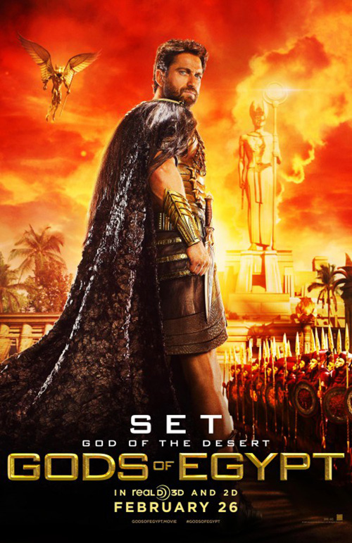
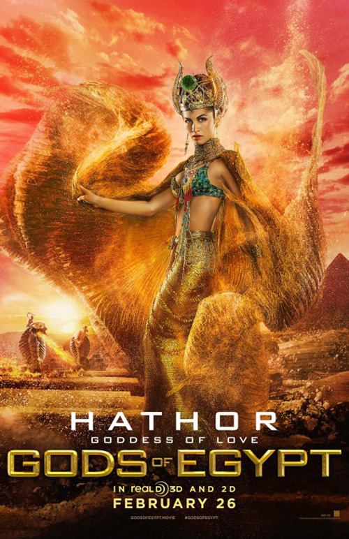
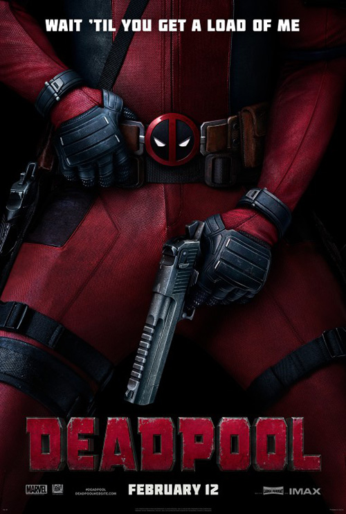
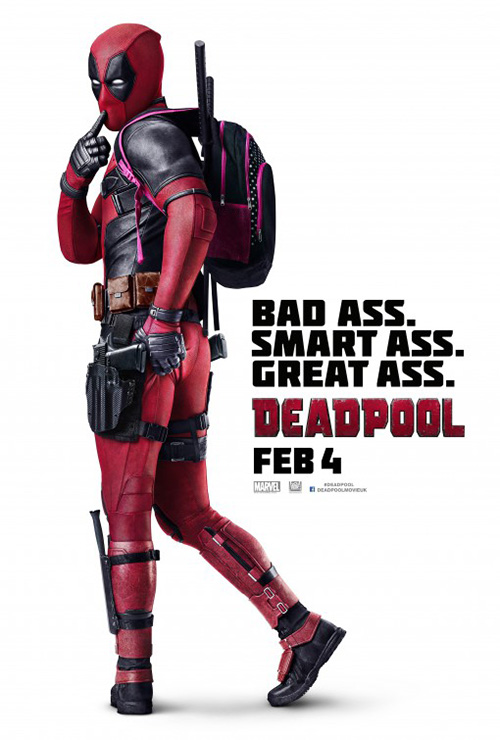
February has so many characters hitting the big screen that the studios wanted to ensure we knew each one personally. If that means introducing us to cartoonish Gods Horus, Set, and Hathor; superheroes Colossus and Negasonic Teenage Warhead; or idiots Derek and Hansel, well, we will meet them in all their various forms of glory.
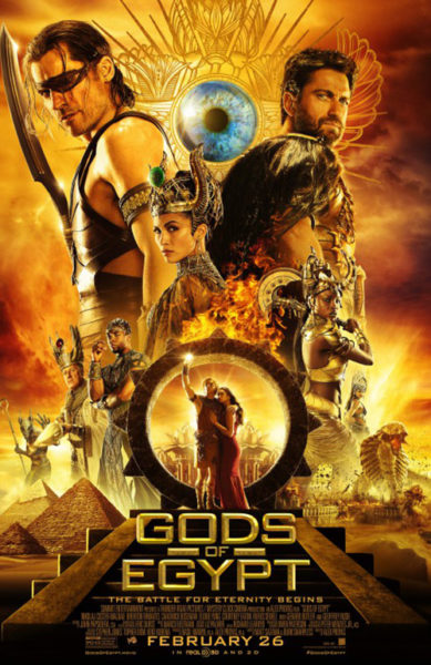
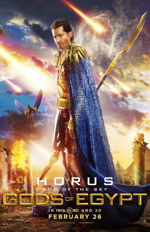
While the Gods from Gods of Egypt (opens February 26) and idiots from Zoolander 2 (opens February 12) seem to fold out as a way to detract from their films’ shortcomings, the superheroes know what’s up. The first positive for them is that the aforementioned two supes are merely tiny pieces of just one poster in Deadpool‘s (opens February 12) campaign. The second positive is how perfectly suited to the content Ten30 Studios has made their extensive library of advertising.
LA’s work for Gods isn’t all obnoxious color, fire, and brood, though. While those are the ones we’ll probably be seeing at our local multiplex, the teases are much more effective. I love the gold and silver sheets with their computer-generated Gods in armor floating above a blocked title. They still looks cartoonish—a fact that worries me despite Alex Proyas’ talent at the helm—but the metallic sheen adds something the brightness of the characters doesn’t.


I’m also a fan of the weird liquid metal splashes these two beasts in flight create with the third tease. I mean, I don’t love it on its own, but by comparison it delivers intrigue. There’s action and menace involved rather than pretty people posing for the camera with serious faces pretending their film isn’t going to be campy as hell.
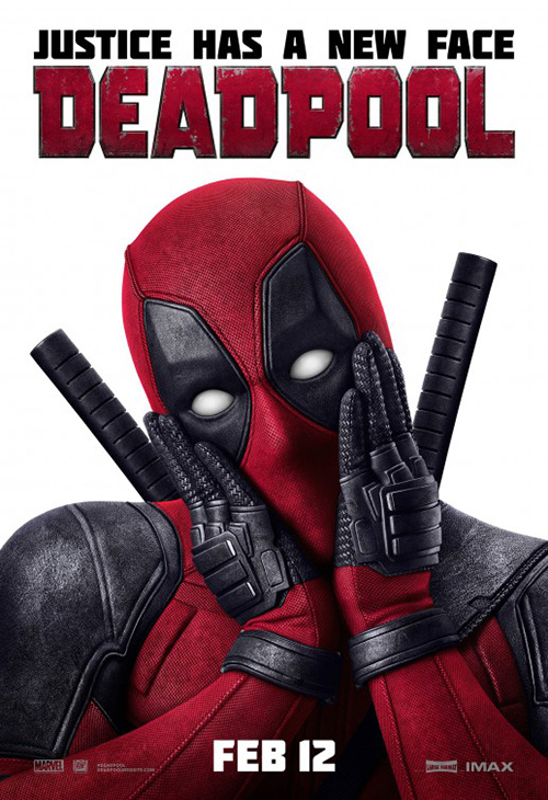
Ryan Reynolds and Fox know and embrace their camp. That’s why you get sex jokes, parodies, and juvenile humor coming out Deadpool’s white eyeballs. The “Wait ‘Til You Get a Load of Me” sheet speaks for itself with its position of the gun; the “Ass” sheet recalls a steady stream of over the shoulder coy pin-up gaffs (the most recent to my mind being Baby Brent from Cloudy with a Chance of Meatballs); and “Face” pretty much has animated eyelash bats with that pose.


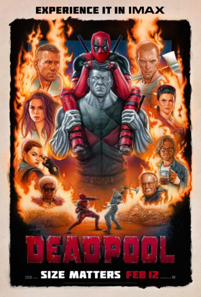
The IMAX entry may embrace its comic aesthetic, but it’s probably the weakest of the bunch as its mocking of Drew Struzan-esque illustrations has it becoming one itself. The rest sprawl out and attempt to hit whatever funny bones the others didn’t. We get a heart for its Valentine’s weekend release and high school sweater for 40-Year Old Virgin fans. And if you want even more just do a Google search to find rom-com banners and testicular cancer PSAs. Move over Star Wars, Deadpool is literally everywhere right now.
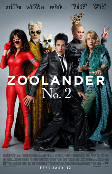
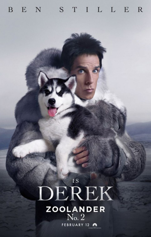
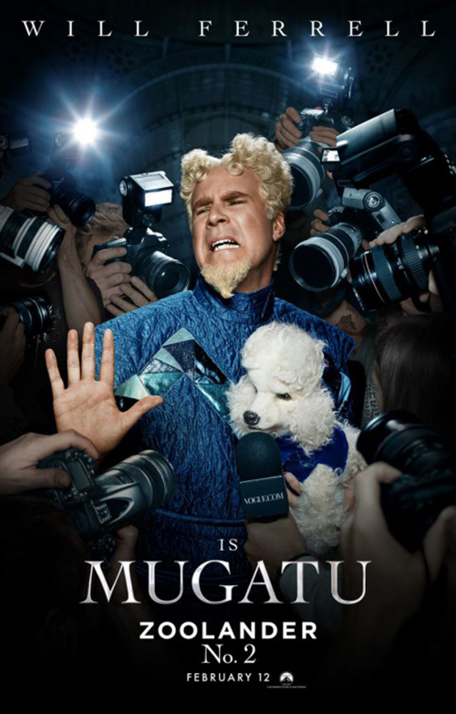
As for Zoolander 2, let’s give credit to BLT Communications, LLC for doing character sheets right. They aren’t just taking the same portraits from the full one-sheet and isolating them against the exact same background (or barely changed) like the next section will show. Instead they give these weirdoes a venue to be as weird as possible. Let Owen Wilson wear his clueless stare with a naked lady. Give Ben Stiller a fur coat and Huskie so his empty face can portray his complete lack of irony in the juxtaposition. And definitely let Will Ferrell grimace in disgust like he is wont to do.


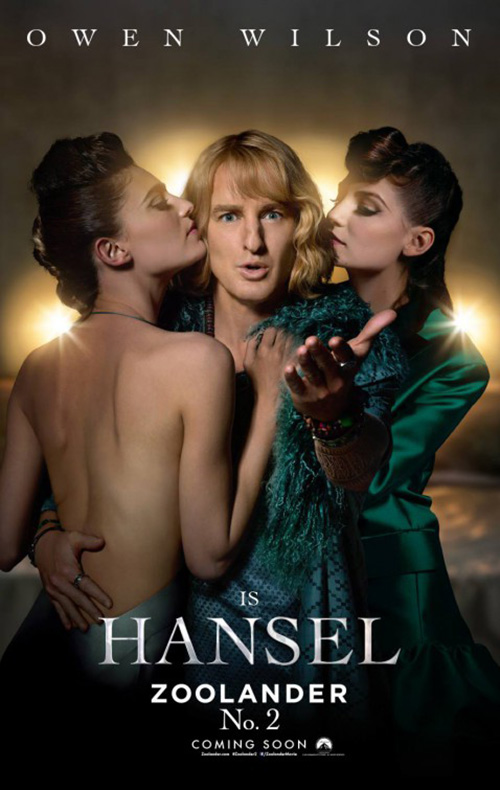
These things are hilarious—Kristen Wiig’s collagen-filled lips channeling the Real Housewives of the fashion world can’t be ignored either. Even more, BLT also delivers a few one-offs with more humor than that initial static group shot above. Using the “No. 2” perfume gimmick is pure genius and it’s in full effect with Derek’s black and white pursed lips. The cell phone selfie duo is boring by comparison, but the moped garners a giggle. Penélope Cruz looks stiffer than a mannequin and it’s great.
Romans, single ladies, zombies, and thieves—OH MY!
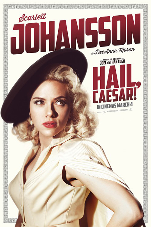
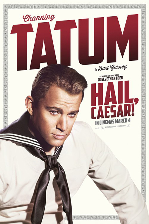
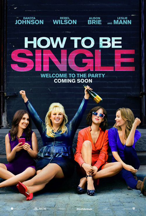
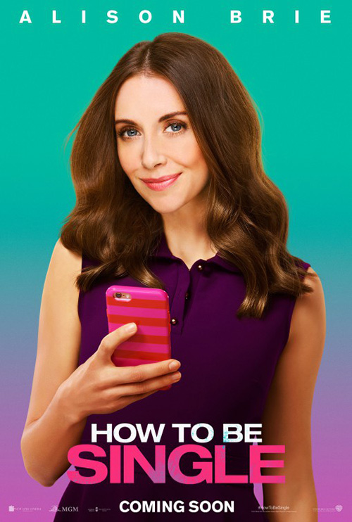

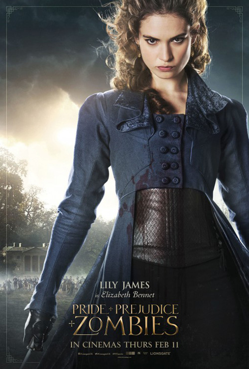
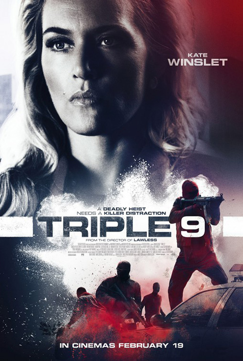
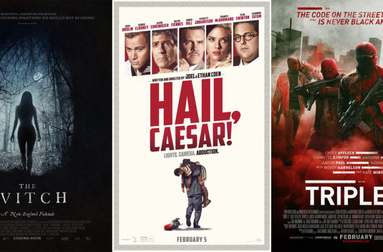
What was I saying about character sheets done wrong? Oh, these ones. All four of the following—Hail, Caesar! (opens February 5), How to Be Single (opens February 12), Pride and Prejudice and Zombies (opens February 5), and Triple 9 (opens February 26)—are atrociously lazy: isolated actors copied into identical template frames.
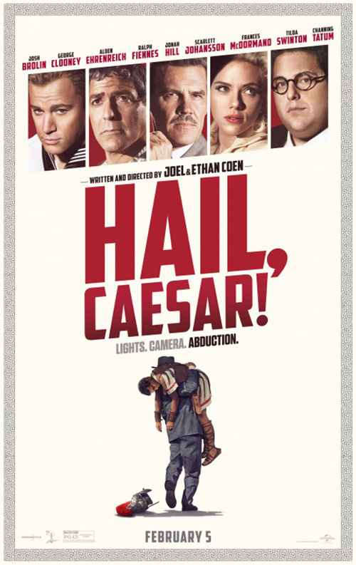
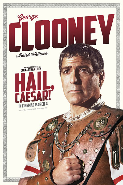
It’s too bad about The Posterhouse’s Hail, Caesar! because I do like the main sheet. It’s nothing special with its boxes of celebrities, but I like the border motif and eccentric title block. The font is somewhat different with its angled vertical edges and even though the comma is floating outside the main letters, it works. To just double down and use the same format with larger portraits is completely uninspired.
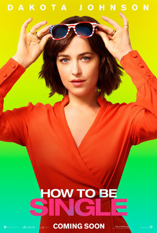
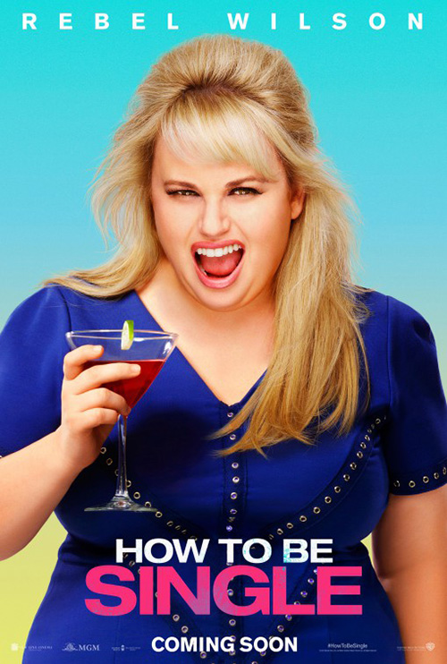
Not as uninspired as WORKS ADV’s characters from How to Be Single, though. You’re just putting airbrushed actresses against bright gradients of color? Yawn. I can’t even give cold open credit for the final sheet either since it’s as boring. Not only that, but the firm pretty much recycled the same layout they used on Drinking Buddies. Add the fact that Dakota Johnson already acted in a film that also ripped this design off (Date and Switch) and the whole endeavor is badly cannibalistic.


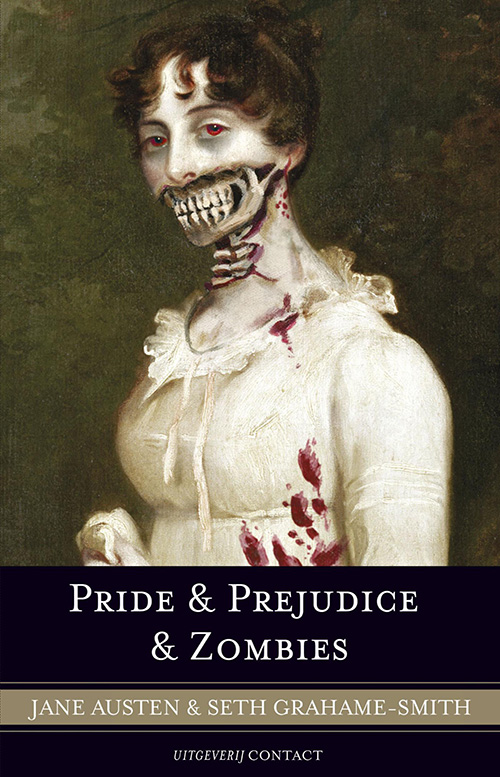
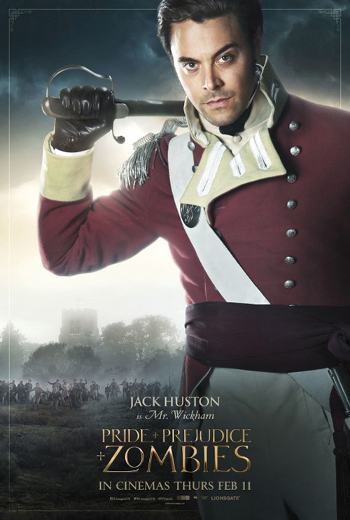
While Posterhouse redeems itself with their exacting send-up of Zombies‘ book cover (I guess we should applaud the designer of it rather than them), they fall back into lame practices of ho-hum templates with their characters. The backgrounds change marginally as far as what building sits behind their respective hoard of flesh-eating monsters, but the sky is the same. I do like the off-center positioning of the actors, though. Not all is lost.
It’s Ignition who does the material justice with their melted painting and atmospheric mound of dead bodies. That second one recalls Mark W. Carroll’s Far From the Madding Crowd, but warped by its own horror elements.


On the whole, though, I dislike the title block in all as it makes me think about Harry Potter. There’s a strangely off-putting humorous lilt to it that doesn’t quite mesh with the subject matter. And the red silhouette collage? It just doesn’t do it for me much like Macbeth didn’t last year.
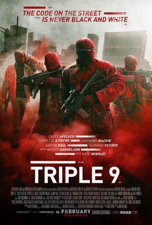
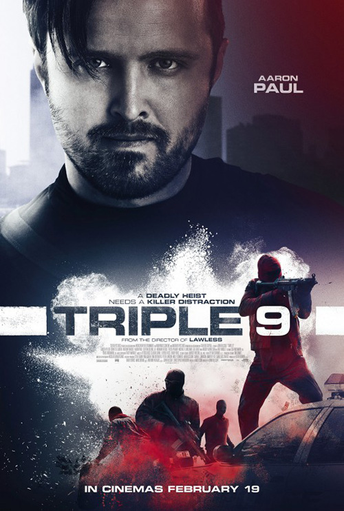
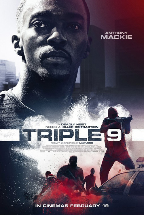
Unfortunately it’s AllCity’s Triple 9 that loses me most. Talk about the kitchen sink: these character sheets are overflowing with visual stimuli. We’ve got the high contrast portrait, the inverted title against grungy paint spray, and faceless criminals with automatic weapons that we have no idea whether the person highlighted above is for or against.
They’re like two posters in one. The studio liked the mood from Art Machine, A Trailer Park Company’s main design so much that they wanted it retained. So AllCity is forced to bisect the page in a way that makes the actor an afterthought. Why do them at all?
I will say this: Art Machine’s sheet does prove effective. The red tint is a nice touch to complement the smoke and the redacted lines are intriguing despite being nothing more than stylistic flourish. They don’t actually cover anything, instead serving as elongated bullet points. I dig it.
Fascinating faces


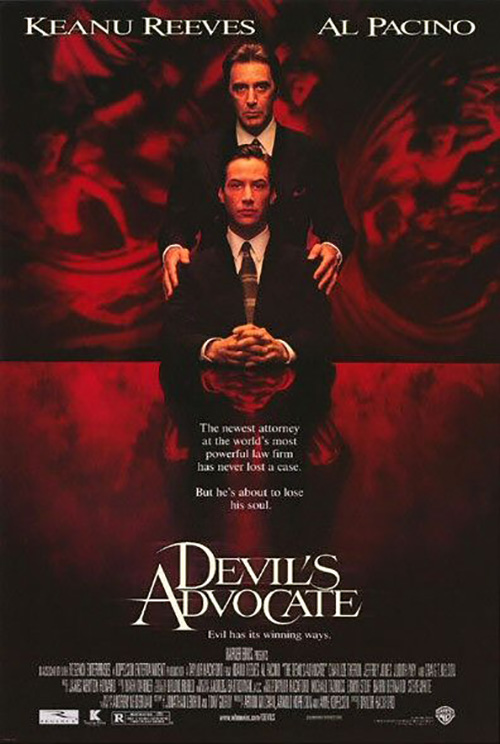
In all honesty, nothing about Kustom Creative’s poster for Misconduct (opens February 5) is fascinating. I included it here because I wanted to compare it with BLT’s Devil’s Advocate. They are spitting images of each other besides Anthony Hopkins throwing the numbers out of whack.
Ambition surely is deadly when you have Al Pacino as a mentor/boss—that’s what I’ve learned from both. I’m just waiting for the twist where we find out Josh Duhamel is Divergent. That’s why the title is coming apart diagonally, right?
And now the fascinating fare:
First up is Regression (limited February 5). Designed by User T38, I’m a fan of the close-ups of Emma Watson and Ethan Hawke. They are super high resolution to the point of seeing the liquid in their eyes and both crops assist in the sense of mystery and dread of the horror. The text is minimized to top and bottom and the title doesn’t overpower us. Instead it fades at the edges like a passing thought so our attention can get back to the faces above.


They aren’t the only good ones in the campaign, though. (Some are actually pretty lame if you check them all out online.) The Spanish tease is quite effective too with its upside cross of red in the rundown barn’s façade. Coupled with the gray foreboding of its coloring—as well as the interesting vantage point putting us in the scene looking through a window—and it one-ups similar poster for Devil in 2010.
Next is P+A’s Race (opens February 19). There’s a lot to like here—some of it stuff I feel like I shouldn’t. Just look at that title icon with the runner cut into the word. The kerning is extra tight and the position of the silhouette is manipulated to fit in the leg of the “A,” but I don’t actually mind any of it.
This could be because it’s a nice graphic counterpart to the photography of the rest. The same goes for the actor names at top. They’re super dark black and bold despite being thinner than they could be to still pop everything above the hazy, vintage, period aesthetic. And that’s perfectly depicted itself as though a newspaper clipping from the 1940s. You can’t say anything bad about the cool pose either, hand hiding half of Stephan James’ face as he readies to dart our direction.
Last but definitely not least is the stunning international poster for Remember (limited February 12). It’s like Gravillis Inc.’s Time Out of Mind from last year, but even better because Christopher Plummer is interacting with the watery/glassy field blocking him from sight.


The coloring gives it a pastel/oil paint quality almost like the thing is a finger painted masterpiece of expressionistic bliss. The darkness is just enough to pop the simple, white title out and the emotion is overpowering. You can feel his hand grasping out at a memory only to have his mind stop it just short.
It’s light years ahead of bpg’s work on their faux cut-in-half diptych with bottom at top and top at bottom (they don’t line up) as well as their minimalistic to the point of amateurish black silhouette. At least the former contains some nice intent with the monochrome, grainy photography. The latter is merely a hastily made image as though done overnight to make a deadline.
More than their actors


Including Leroy and Rose’s Eddie the Eagle (opens February 26) in this section may be misleading since actors are very much in view, but they aren’t the whole concept. Both Taron Egerton and Hugh Jackman are small and in profile so the act of what’s happening proves more important. This is a key distinction and one most posters ignore by putting a face front and center as though it supercedes the story. It doesn’t.
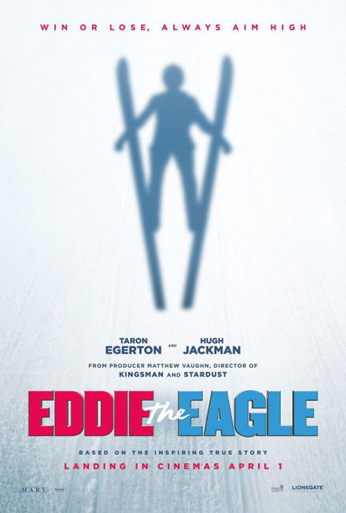
It’s a cool composition with the van cropped off the bottom edge and Egerton gaining some velocity by coming into frame from the right. The giant title is interesting too besides the extra line to put “From the Producers of Kingsman“. I don’t think anyone who went to see Kingsman is automatically going to be interested in a true-life story about a kid who became an Olympian despite no one believing he could. It also convolutes the title into being “Eddie the from producers of Kingsman: The Secret Service Eagle”. That is confusing visually.
The second sheet pales in comparison. It’s supposed to be as though from Eddie’s vantage watching his shadow on the snow below, but the effect doesn’t quite work. Instead it feels like a spectral figure is standing up to face us. I do appreciate the old school 80s vibe with the title, though.
Gravillis Inc.’s Southbound (limited February 5) is different because it gives no sense of what you’re about to see besides mood. There are no characters or realistic events depicted. It’s completely conceptual: bold and succinct in telling a tale of evil’s hold and its refusal to let go.
There’s not much else to say except for kudos to the illustrator for a captivating hybrid image of road trip and devilish interference. I like the font too—sharp and flowing like a demon tale slinking about to cut you when you least expect it.
For Rolling Papers (limited/VOD February 19), the full image is less impressive than the effect used to deliver it. The whole melding full newspaper mastheads into the joint is too awkward and unrealistic considering the rest of the piece is so minimal. I’m not sure how they could put those text blurbs in otherwise, but the way it is now is distracting.
The rest, though, is pretty great. I love the double exposure mimicking a printing press’ registration being just off. Doing so gives it a blurring effect despite everything actually being crisp when split apart. The smoke even shimmers a bit as a result. And no one can ignore that yellow on a theater wall. No one.
But while each of those above has merit, the true standout this month is Gravillis Inc.’s work on A24’s The Witch (opens February 19). Talk about not needing actors: why can’t a crow, rabbit, and ram be used instead?
The best part of this series is how evil they look while retaining a sense of biological verisimilitude. These things could have easily fallen into cartoon caricature, but they exude malice instead—something the poster with a human does not. That one portrays what seems to be the mystery of adventure like in a fantasy such as The Lion, the Witch, and the Wardrobe. If she weren’t naked I’d wonder if it may be a film targeted at a younger audience that it actually is.


What all four have in common that cannot be dismissed is their great use of typography. That italicized, period-specific font is inspired and I love the break between both halves of the “W”. The print is crudely edged as though done with inferior equipment to give it even more of a sense of place in 1630 New England. And it also injects an increased creepy factor too. I can’t wait to see this one.
What is your favorite February release poster? What could have used a rework?