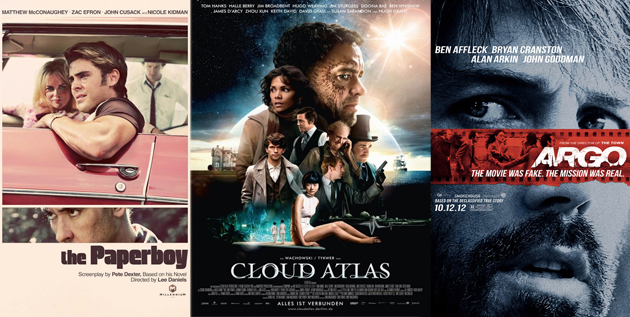
“Don’t Judge a Book by Its Cover” is a proverb whose simple existence proves the fact impressionable souls will do so without fail. This monthly column focuses on the film industry’s willingness to capitalize on this truth, releasing one-sheets to serve as not representations of what audiences are to expect, but as propaganda to fill seats. Oftentimes they fail miserably.
—
Summer is over and the studios still have a few genre flicks to unload before the arthouse, festival favorites begin rolling out. Oh, and Halloween is here too.
The sad thing is that horror films should have the capacity for infinite inventiveness. If your gorefest is going to be ‘new’ and ‘unforgettable’ then the artwork should as well. Unfortunately, the firms in control of these campaigns appear to have been uninspired by the material. This doesn’t bode well for quality, but they’re critic-proof and inevitable box office winners anyway.
Thankfully the TIFF and Sundance holdovers going wide salvage the month artistically.
If it ain’t broke … fix it?
 |
 |
 |
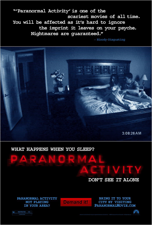 |
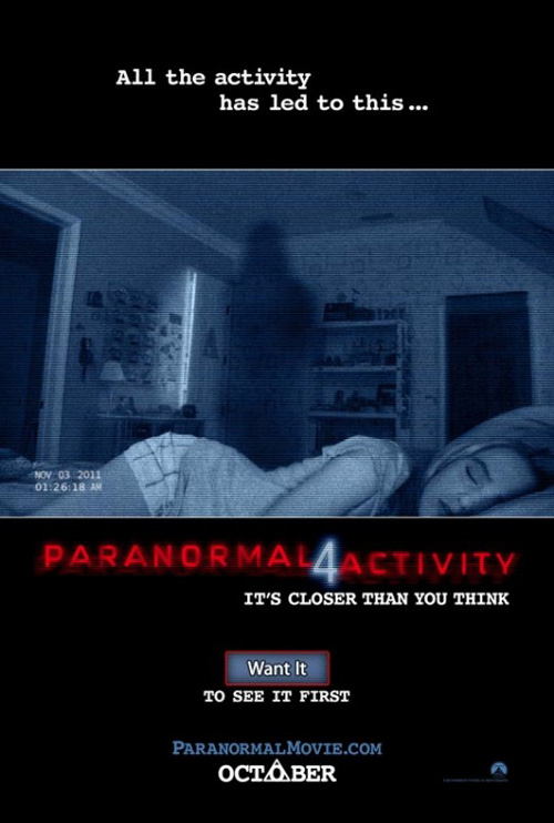
Much like the films—sorry, I thought the first Paranormal Activity was dreadfully boring—BLT Communications, LLC‘s posters follow a cookie cutter format that simply rehashes what we’ve already seen.
Back into the bedroom with a shadowy figure looming in a night vision blue tint, Paranormal Activity 4 (open October 19th) is a perfect example of too much despite so little. The amount of text has been cut extensively from five years ago, but there is still too much delineation. Without allowing the image to fill the page, our eyes are compartmentalized into the top, middle, and bottom separately.
And when the campaigning to get people’s votes for wider release becomes more important than the film’s name itself, I think it’s time to go direct to DVD. At least the Saw franchise didn’t have to worry about whether an audience would come.
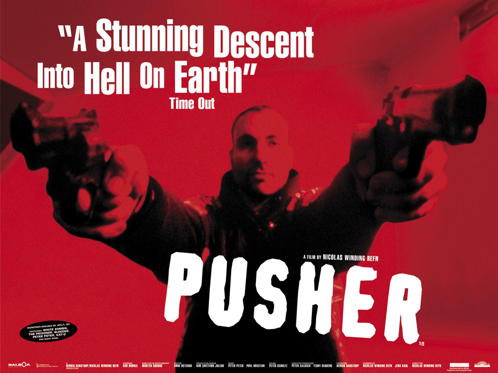 |
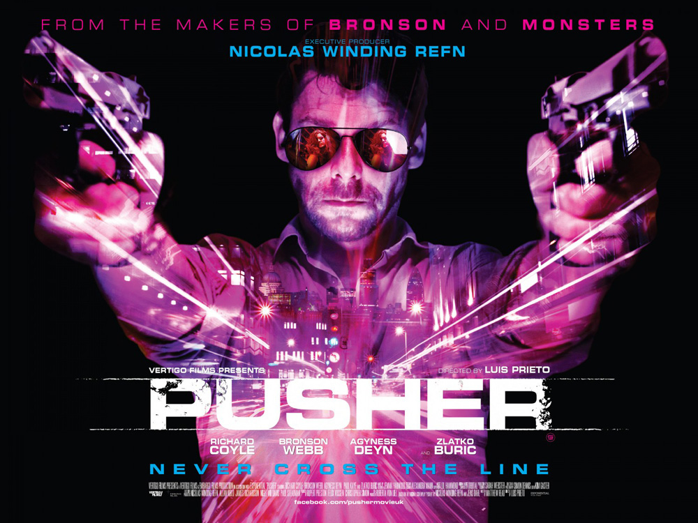
On the flip side, the new American remake of Nicolas Winding Refn‘s Pusher (limited October 26th) actually breathes new life into its old design.
Utilizing the same concept of showing its star engaged in a standoff with a gun in each hand, Empire Design‘s low budget two-color 1996 sheet has gotten a complete makeover from Hoo-Ha. Richard Coyle finds the mean streets flying past at light speed through his chest while the whole resembles a firework exploding from the center. The maroon and blue colors pop brilliantly from the deep black and the lines of light create a ton of motion.
The only glaring issue I have would be the unnecessary Photoshoping of a woman in his sunglasses. So is he about to shoot her? I mean, if she’s in front of him she must be the victim, right? I haven’t seen the film, but this seems highly unlikely. Sometimes a sexy woman can hurt your poster after all.
 |
 |
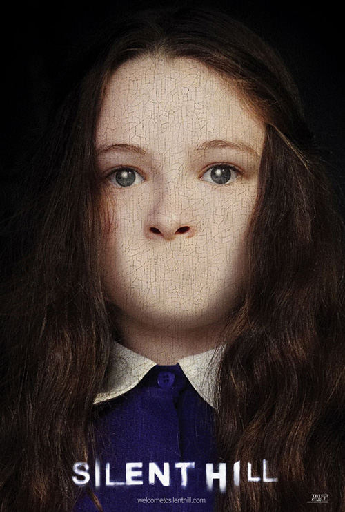 |
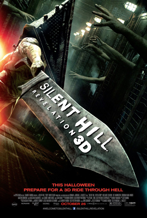
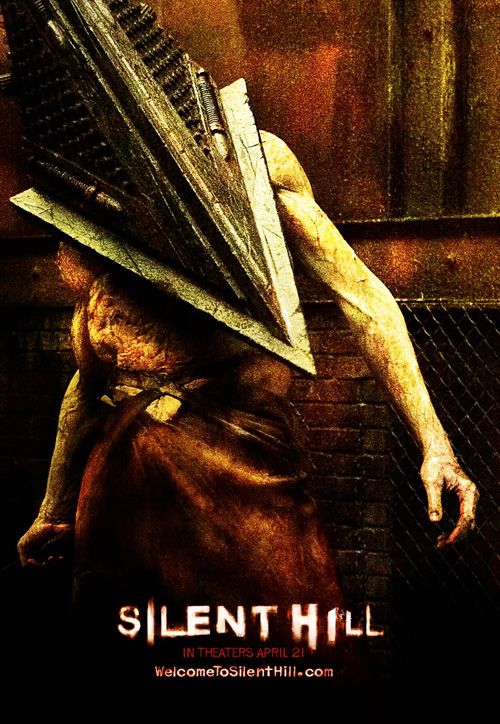
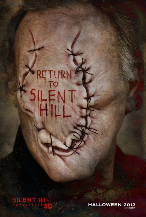
At least she isn’t über clear graphics work so superimposed and computerized that the poster looks like it was a college-level final project, though. Because this is exactly what REV CREATIVE has done with the amazingly gritty design ideas of the first film for Silent Hill: Revelation (open October 26th).
Whether the cracked painting of Jodelle Ferland or the yellowed, metallic grunge of Pyramidhead, Shoolery Design‘s Silent Hill‘s aesthetic was perfectly transferred to its print material. Looking at the plastic muscles of this formidable monster’s current iteration coupled with the faux texting only makes me assume the film itself will be as shoddily done. And I LOVED the first.
They couldn’t have embossed the text into the sword? They couldn’t have made the text on that stitched face scars or something equally gross and plausible? These two are a travesty.
Been there, doing it again
 |
 |
 |
 |
 |
 |
 |
 |
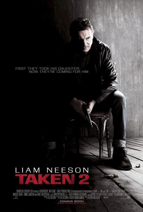
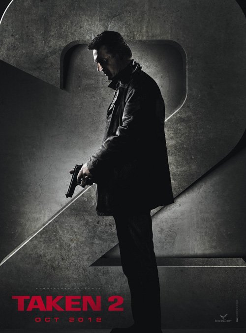
So is Liam Neeson now the bringer of light, too? Is that what cold open‘s high contrast design of a defeated actor sadly seated on a chair is doing? Or is he just biding time in sorrow before cracking heads?
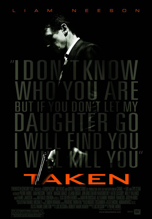
In their defense Neeson does have the same expression in Petrol‘s sheet for Taken, but this is Taken 2 (open October 5th). We know what he’s capable of doing and we know he doesn’t ever worry he will fail. There should instead be a grimace of anger as he readies to pounce on that wolf … oops, wait. Wrong film.
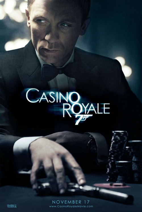
The least they could have done was give him a calculating look like Daniel Craig in Casino Royale, processing the details and hatching plans. Something needs to make us believe he will find his ex and daughter because this appears as though he’s already failed.
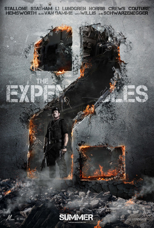
It is better than RYSK‘s teaser hybrid of Taken and Expendables 2, though. So there’s that.
 |
 |
 |
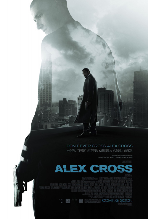
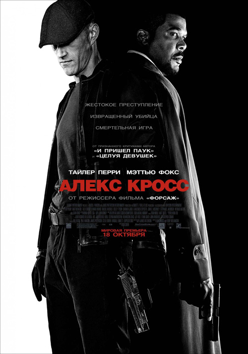
Going to another ‘sequel’, Alex Cross‘s (open October 19th) hero may have the same name but a very different face. The titular character now looks a lot like Madea instead of previous actor Morgan Freeman. Honestly, I don’t blame Ignition Print for doing what they could to not showcase Tyler Perry. It’s probably the only shot they had at keeping the film from appearing like a joke.
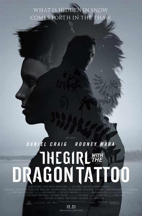
Using the new fad in design with ghostly imagery overlapped by solid a la The Girl with the Dragon Tattoo, Matthew Fox is a giant of evil compared to the trench coat-wearing Perry. Wait, who is the good guy here? They both have the exact same stance with a gun so if I were to guess I’d say the bigger one even though I know that’s wrong. It’s just a mistaken subversion of focal point.
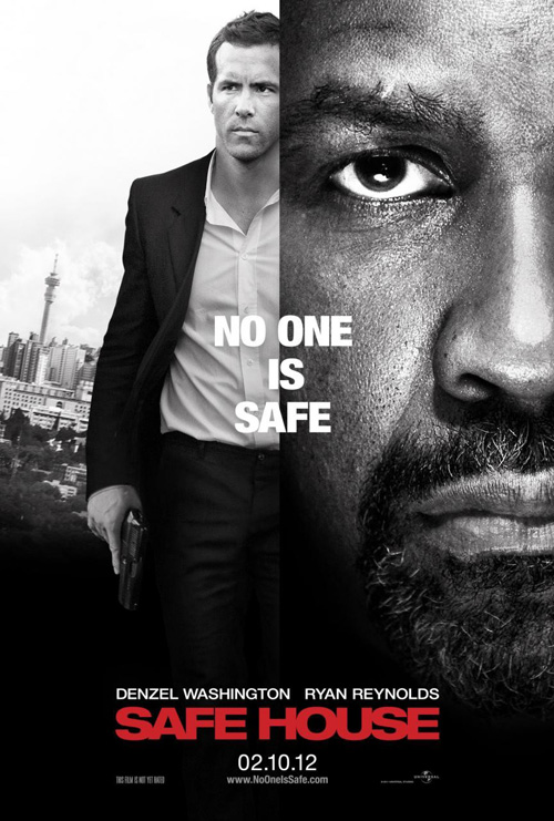
Even their Russian sheet seems wrong with its Safe House black and white. Why is the villain seen first? Why do they both have guns to confuse us? Maybe Perry ends up being the bad guy after all. Now that would be a film I’d see.
If you think those Alex Cross poster comparisons may be a stretch, these next two aren’t.
 |
 |
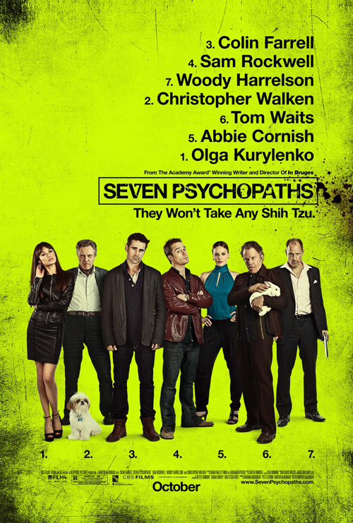
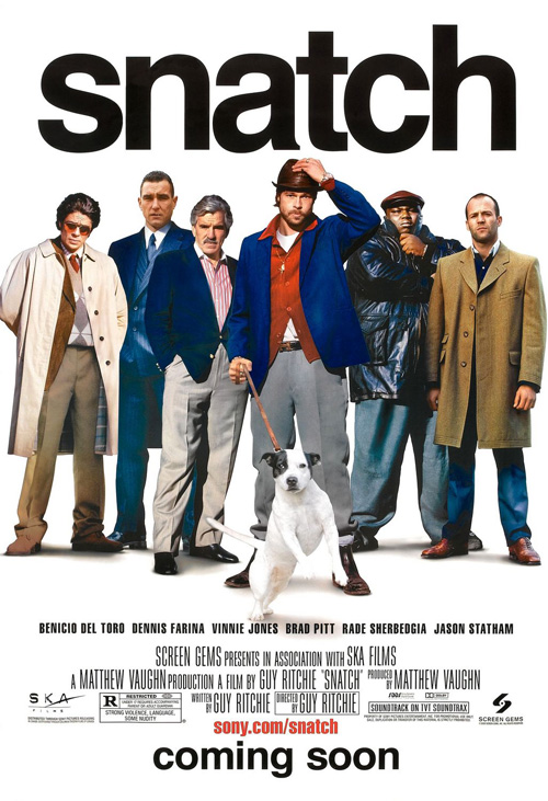
Who didn’t see the trailer for Seven Psychopaths (open October 12th) and think Guy Ritchie? More specifically Snatch? This is a motley crew of miscreants crossing paths and causing destruction so it’s no surprise Ignition takes a page from Indika Entertainment Advertising.
Right down to the faux angry faces and fluffy dog, the line-up motif is only made better due to more impressive Photoshop capabilities—Snatch‘s is pretty horrid. The dirty edges are obvious and the icon-heavy title lame, but we really only need the actors on display to grab our attention in the end. They sell the film along with director Martin McDonagh‘s pedigree, so it’s no surprise the campaign goes that route.
A more inspired character series would have been welcome, though. Cutting the actors out of the main sheet and putting a number window above them does not an interesting design make.
 |
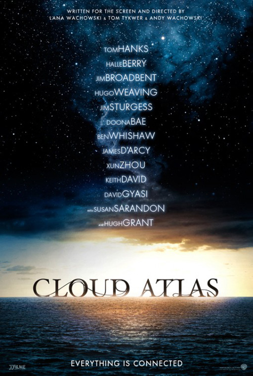 |
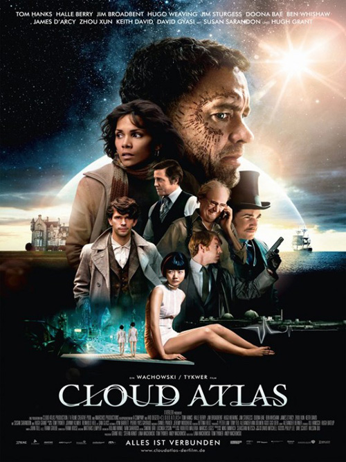
What didn’t need its cast to sell tickets is Cloud Atlas (open October 26th). More than that, WORKS ADV didn’t need to use the head totem collage to showcase them.
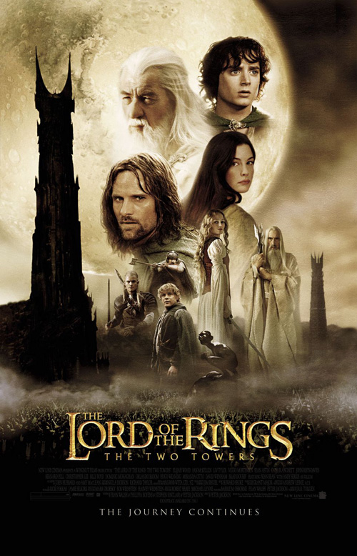
A gorgeous science fiction epic, the simplicity of the teaser’s names and title treatment’s intriguing flow from letter to letter is so much more effective than Tom Hanks‘ gigantic, tattooed head. The Two Towers is my go-to as far as showing this technique’s past use, but at least BLT handled the faces in a hierarchy of importance to the film. Here it’s by actor pedigree despite Hanks and Halle Berry doing very little work the past years.
The potential was huge as these posters could have been amazingly inventive with the film’s cast playing multiple characters. If you wanted faces you could have done a grid of the each actor’s six iterations to really stun with the mystery of how it will all work out. As it is now, none of the magic I witnessed in the finished film has been included.
You only need one that works
 |
 |
 |
 |
 |
 |
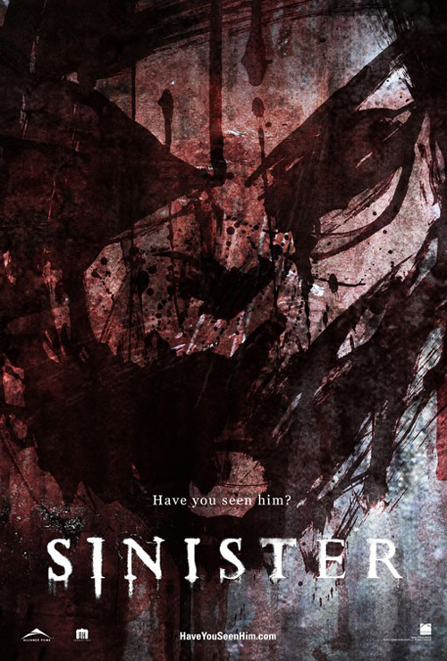 |
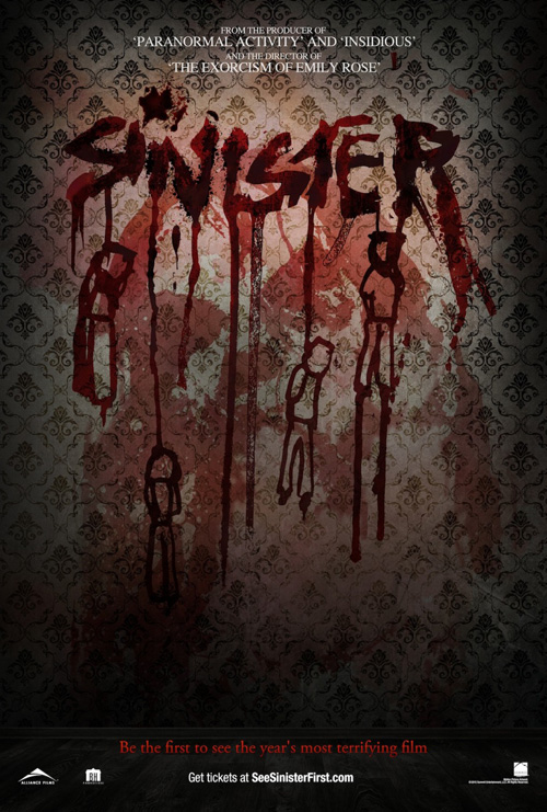
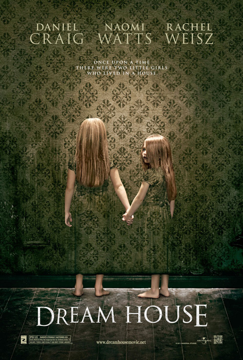
Whoever is responsible for the marketing of the Ethan Hawke starrer Sinister (open October 12th) should be applauded. Here is a horror film cashing in on its ability to be creepy and unique instead of just plopping its leading man on paper with a fearful face. (They could have avoided using the same wallpaper artist as Dream House, though).
Smeared paint and blood with hung cartoon figures limply dripping give the wall a foreboding sense of malice—all atmosphere and dangerous tone. Whether that or the full-blown face darkly splattered to epitomize the film’s title, you know exactly what you’re getting into while still being in the dark to the details.
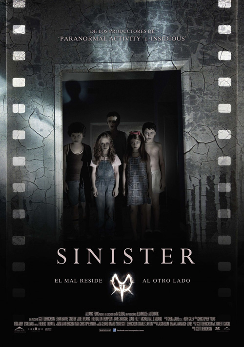
Once you start putting real people into the work like the Spanish sheet, however, all sense of mystery is erased. Creepy kids are harmless these days in an over-saturated market and I don’t even need to mention the unnecessary inclusion of filmstrip sockets giving too many details we don’t want.
 |
 |
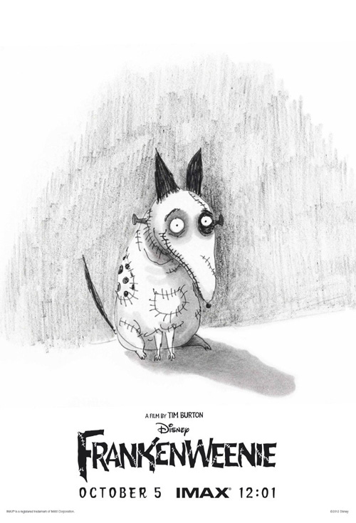
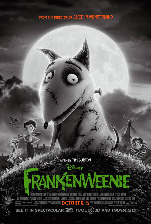
When it comes to Frankenweenie (open October 5th), why not move away from the literal representation of the movie? The claymation artistry is a selling point, yes, but let it speak for itself at the theatre.
Paranorman had the right idea teaming up with Mondo to give us differing stylistic choices in a series of posters completely devoid of the actual medium at play (see August’s entry). In that vein, the handdrawn pencil on white rendering of the titular dog is so refreshing. For those in the know, Frankenweenie is a long-form remake of Tim Burton‘s short film of the same name. An artist who recently had a show traveling to museums, seeing this original scribble is a personal take at the long process this creature has gone through.
An IMAX only entry, it thankfully gives something of substance to go against the manufactured polish of the official posters. There is one design trying to mimic old school B-movie dreck too, but it just doesn’t cut it with an unfiltered circular window at bottom and imagery that isn’t rough enough. The typography is perfect, though, so all is not wasted.
 |
 |
 |
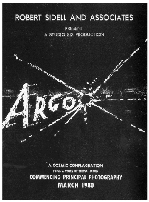 |
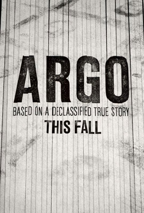
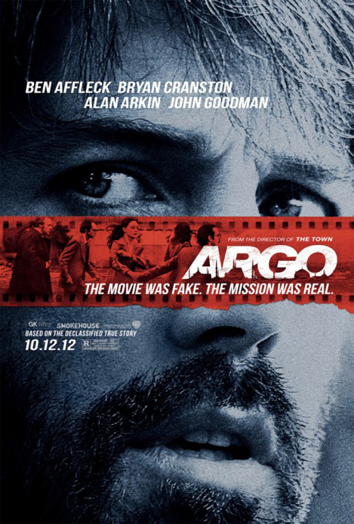
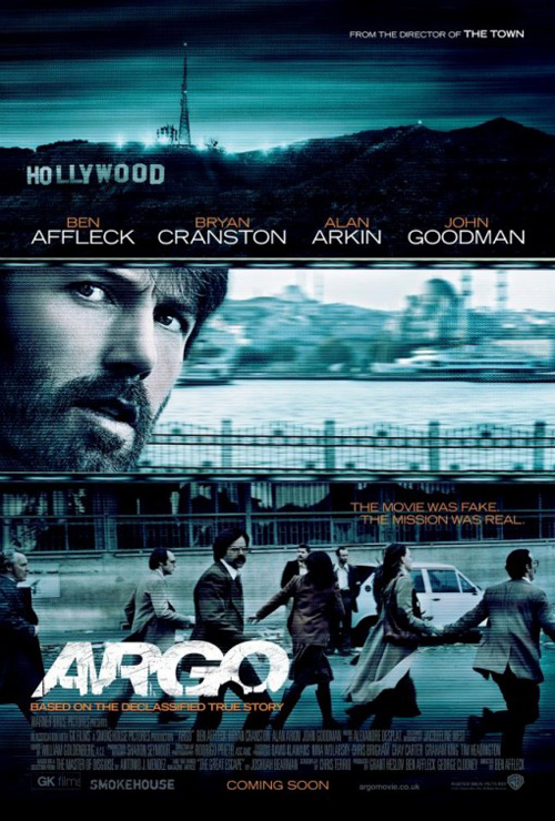
Instead of receiving it’s best a week before release, Argo (open October 12th) had theirs first. A brilliant teaser that embodies the subject matter with minimal effort, the reattached shredded paper scraps are both appropriate and beautifully simple.
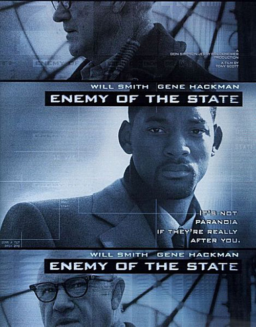
From there Canyon Design Group decides to slap Ben Affleck‘s face on a sheet with its own easy filmstrip motif as well as create an Enemy of the State copy bathed in blue. They’re too mainstream and obvious considering a plot depicting a fake science fiction film, only getting the title treatment right with some cool silhouetted mosques cutting into the letters.
But how great would it have been if they used an update of the faux Argo sheet from 1979? That would have been awesome. Unfortunately Hollywood probably wouldn’t have had the guts to do it without Affleck’s mug.
 |
 |
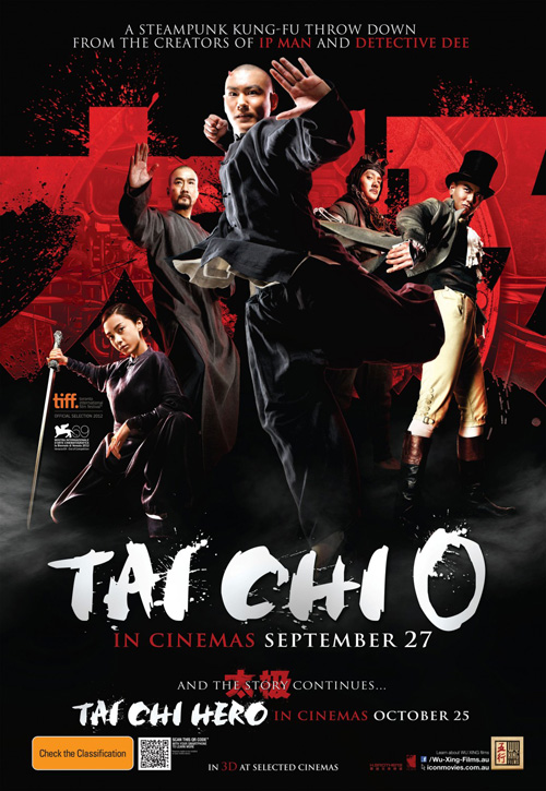
Just as lamely mainstream as those, the English-language sheet from Dominic Smith for Tai Chi 0 (limited October 19th) isn’t exactly horrible. There are some nice action poses with a little of the steampunk aesthetic alluded to in the text, but it’s still no more than a photo collage.
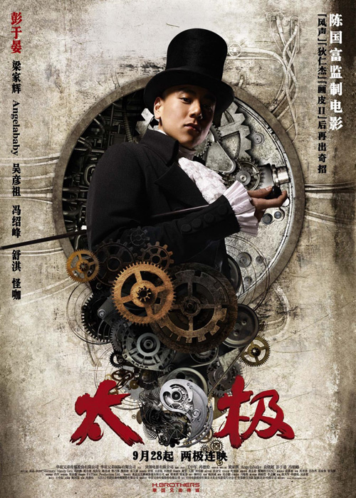
What’s uniquely amazing is Ignition Print’s Chinese series of character posters. Fully taking the steampunk to heart, we’ve got gears and tech exploding forth with wiring and grungy texturing in the background. How much do these really depict the film without showing any martial arts at all? I don’t know. But when the artwork is this cool, I really don’t care.
Design can be redundant AND fresh
 |
 |
 |
 |
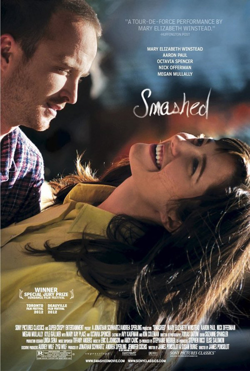 |
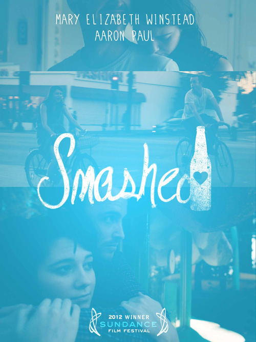
I really like this washed out blue sheet for Smashed (limited October 12th). The color saturation helps kill the sharp delineations of its three images and allows the white scripted title to standout naturally. Looking more like a fingerprint on glass or a dry-erase marker on a white board, something about this personal touch is captivating.
Cardinal Communications USA adds a more generic image of the two leads to the fray and isn’t too shabby either. Mary Elizabeth Winstead‘s dip is positioned perfectly in the frame for the text at top to center without getting too close to the page’s edge. And they removed the somewhat lame bottle from the ‘d’ in Smashed to make the scrawl even better. It’s just a gorgeous flourish in an otherwise familiar work.
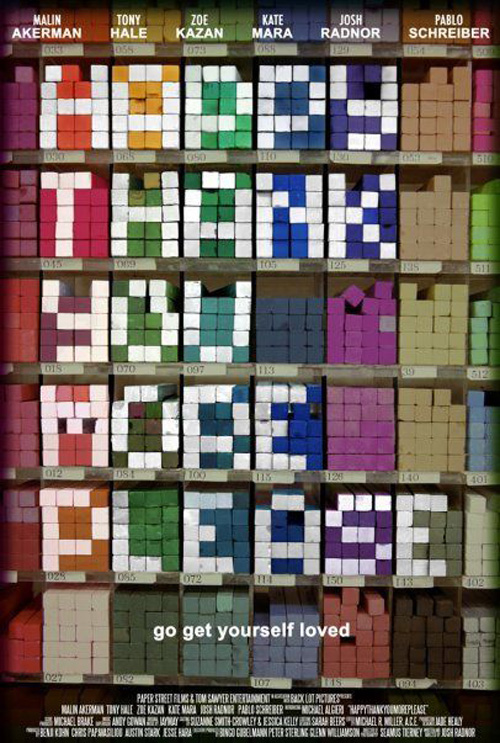 |
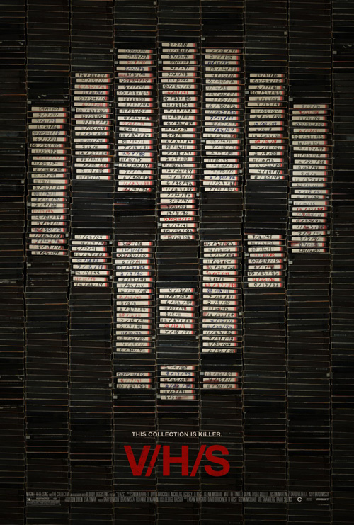
A bit fresher despite utilizing a design technique I too put into effect in this feature’s header image, the poster for V/H/S (limited October 5th) works as wonderfully as Argo‘s tease above and Happythankyoumoreplease‘s does. Going right to the source of the title’s meaning, its giant columns of videotapes blacken the frame in order to allow the white labels to get its point across.
Yes, the skull isn’t anything to write home about as far as creating a sense of chills, but the handwritten dates are a nice touch … except for the fact they repeat. Hmmm. I’d be interested to discover from anyone lucky enough to have seen it already whether this revelation is pertinent to the film. The date 7/18/91 is everywhere and the rest multiply too—some even changing colors. Is it an intentional stylistic choice or just the work of a lazy designer copying and pasting?
 |
As anyone who has been reading these posts from the start will know, I’m a sucker for typography interacting with the images it describes. cold open’s The House I Live In (limited October 5th) is no exception.
The chain link fence and barbed wire have been precisely excised from the murky sky so that the yellow sans serif literally appears to be floating behind it. Imprisoning the words as the barrier does its captives, the piece isn’t only visually stunning but also intellectually pertinent.
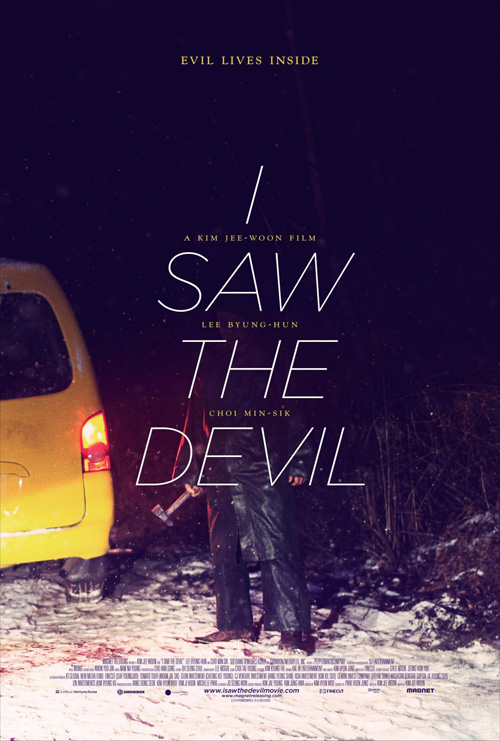
I love work like Gravillis Inc.‘s I Saw the Devil and its use of text to block our view, but something about the words being out of reach here has a stronger hold. I can’t get over the simplicity or the use of color to shine through the gray. There aren’t many out there that possess this level of successful execution.
 |
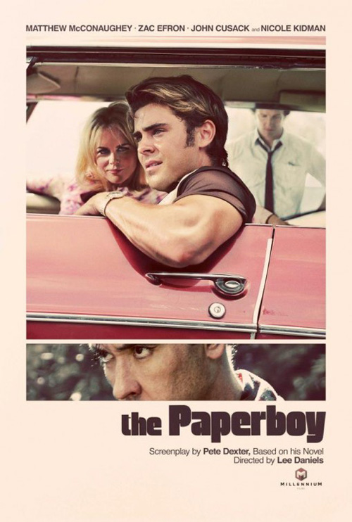
With that said, October finds a second film with a near perfect poster being released. For Lee Daniels‘ follow-up to the nicely advertised Precious, and company has gone retro to great effect on The Paperboy (limited October 5th). I remember seeing this design back when it was released and thinking it had a better than great chance of making my end of the year Top Ten.
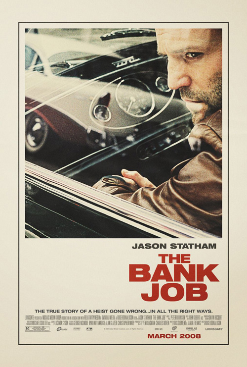
Much like Ignition’s The Bank Job print, the off-white page color subtly shows age while the art direction, make-up, and wardrobe ooze 70s aesthetic. I love the uniquely fat text with ultra-thin counters, the painterly gradients in Zac Efron‘s hairdo and arm, Nicole Kidman‘s sultry gaze, and John Cusack‘s menacing stare. This is a powerful image that would make me buy a ticket to the film after simply glancing upon it off the streets. I really need nothing more.
What is your favorite October release poster? What could have used a rework?

