“Don’t Judge a Book by Its Cover” is a proverb whose simple existence proves the fact impressionable souls will do so without fail. This monthly column focuses on the film industry’s willingness to capitalize on this truth, releasing one-sheets to serve as not representations of what audiences are to expect, but as propaganda to fill seats. Oftentimes they fail miserably.
—
Not even superhero heaven can save this summer from continuing its uninspiring dearth of quality posters. But what do you expect when there are four sequels/reboots in the mix?
A couple hipster designs save July from being a total disappointment as creativity is almost nonexistent while retreads are utilized in order to “keep consistency”. I understand a need to remind audiences about where these films came from, but I think you can dial it down a bit when you’re talking about some of the biggest franchises cinema has seen in the past decade.
I’ve never wanted fall to come so quickly. Well, maybe I have. I love fall.
All of the lights
 |
 |
 |
 |
 |
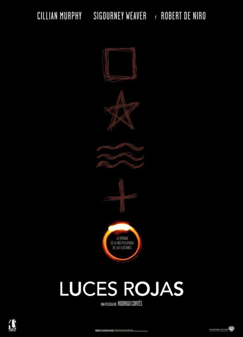 |
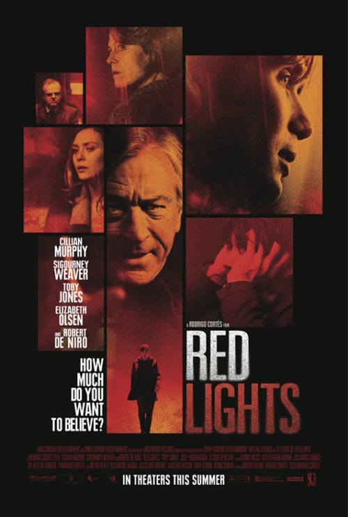
Unfortunately for director Rodrigo Cortés, Ignition Print‘s chiaroscuro-infused light work with Buried is nowhere to be seen with his newest film Red Lights (limited July 13). Unsure whether the entire campaign is from REV CREATIVE—the one poster I know by them uses the same title treatment as displayed above, so maybe—one can’t help but want a bit more than boxed character studies.
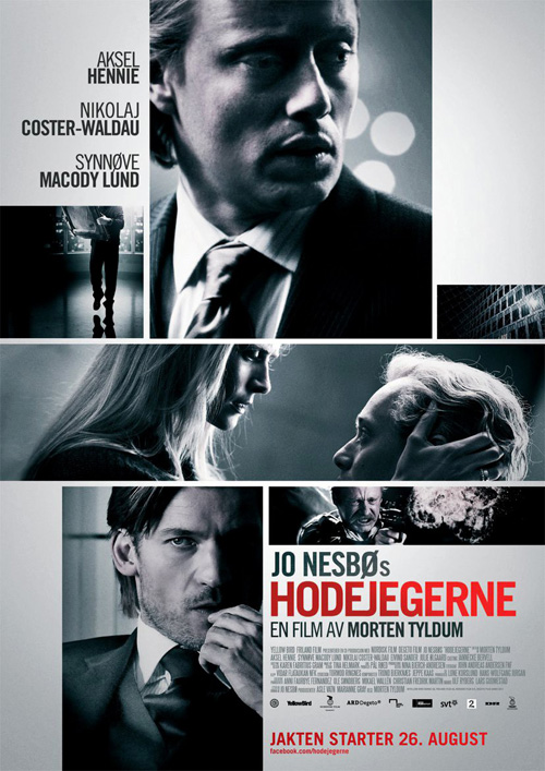
An overused, lazy concept most recently seen with City Rain Design‘s Headhunters, there is no mystery in such an arrangement. Actors look angry, scared, and calculating in a red hue—way to be on the nose—but for what purpose? We know what they look like; we don’t need to see them blandly collaged together. And the question, “How much do you want to believe?” Believe what?
At least the Spanish version tries to play with abstraction—just too much. Scrawled symbols that remind me of Peter Venkman trying to get into a co-ed’s pants subtly etch through the pitch black as though alluding to some religious/spiritual undertones. Sadly, the ‘One Ring’ glowing at the bottom only elicits the asinine response of, “Yes, I believe in hobbits.”
 |
|
 |
 |
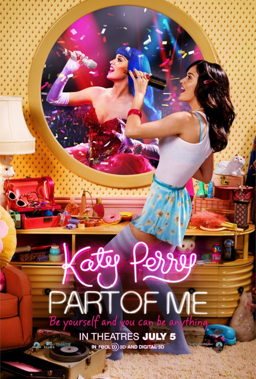
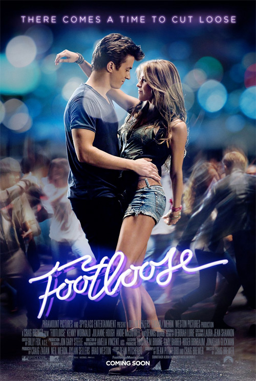
Moving from verbal ‘lights’ to neon ones, BLT Communications, LLC gives us a pretty straightforward sheet for Katy Perry: Part of Me (open July 5). With the singer standing in front of her mirror, singing into a hairbrush a la Elisabeth Shue in Adventures in Babysitting or Cate Blanchett in Bandits, we see the duality of the bombshell between real life and stage persona.
A documentary/concert film about the former Mrs. Russell Brand doesn’t appeal to my sensibilities, but I’ll admit this marketing scheme is a lot more interesting than seeing her on stage via a publicity still. Good on BLT for trying to have fun, despite ripping off their own neon tubing from Footloose. If anything, I can waste some time traversing the clutter and finding a “Simpsons”-esque donut, bunny lamp, and mini gumball machine.
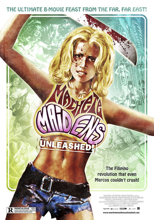
As far as their popcorn explosion variation goes, I can’t get Madman Entertainment‘s Machete Maidens Unleashed out of my head. I’m unsure images depicting Roger Corman blood and gore are what anyone wants to associate with Perry, so I’d stick to putting the bedroom karaoke in public.
 |
 |
 |
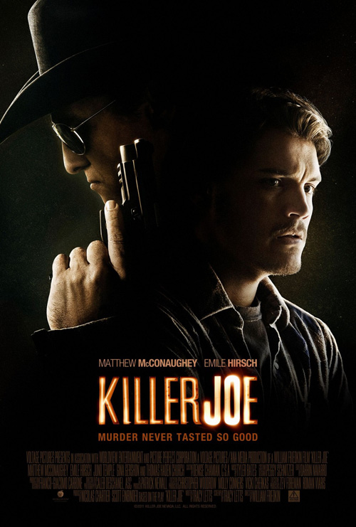
Continuing with the neon lighting trend, I really enjoy the above advert for Killer Joe (limited July 27). I love the glow of what appears to be a flashbulb pushed beyond its capacity as it adds a layer of creepiness the actors’ expressions have started cultivating. The organic shapes of light contained within subvert the tight kerning of the clean sans-serif font, the possibility they could go out at any second filling you with trepidation.
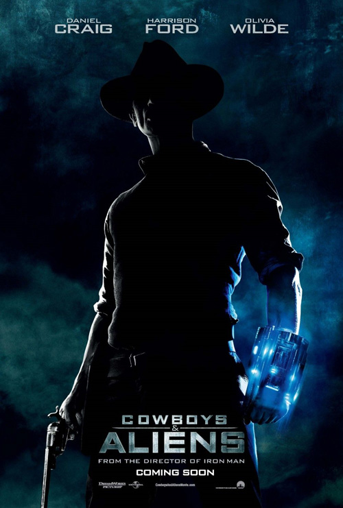
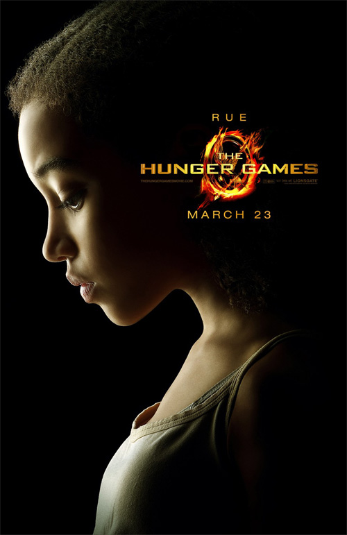
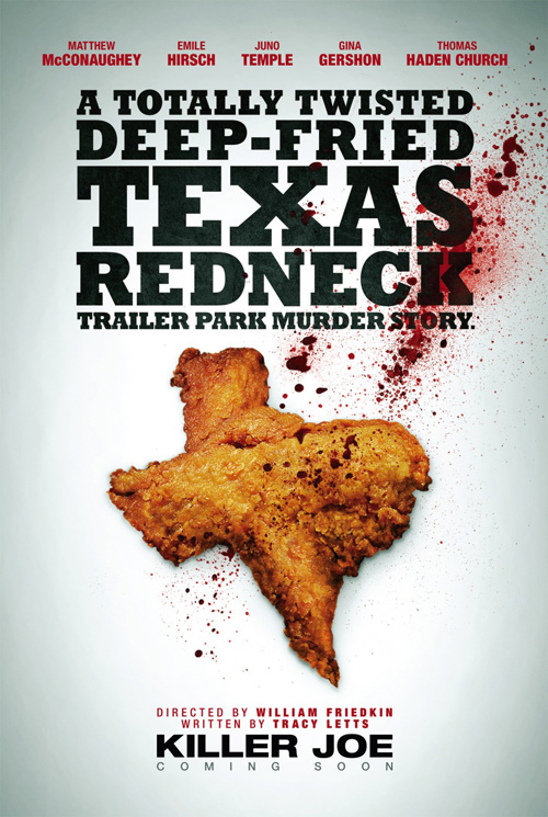
I’ll admit now that in a couple months I’ll probably be over the heavily concentrated contoured glow of faces we’ve seen everywhere from Cowboys & Aliens to The Hunger Games, but I’m all for it at the moment. The only thing that could possibly make this one-sheet better is if Matthew McConaughey‘s stern profile was centered on its own. Either way, though, anything beats a Texas-shaped piece of deep-fried chicken. I’m not really sure what Ignition was thinking there.
 |
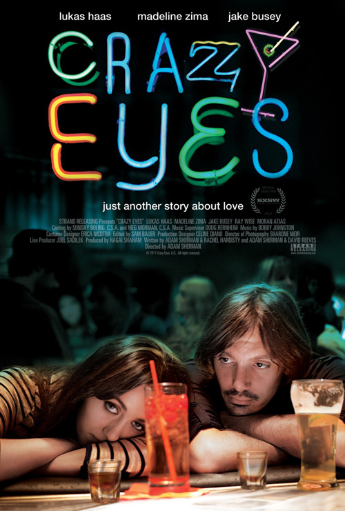
And that leaves us with Crazy Eyes (limited July 6). A cool composition with Madeline Zima and Lukas Haas dejectedly depressed at the bottom while the darkness of their existences floats above, the eccentrically put together array of neon letters at top nicely shines forth.
My issue from loving Kustom Creative‘s work completely is how big the title treatment is in comparison with the rest. It’s as though they feared the negative space rather than embraced it. Overpowering the carefully constructed image below, there is no way to see the poster as a cohesive whole, (putting the credit info in the middle doesn’t help either). It simply becomes a less interesting version of Le Cercle Noir‘s My Blueberry Nights, a design fearless in its originality.
A tracing paper boon
 |
 |
 |
 |
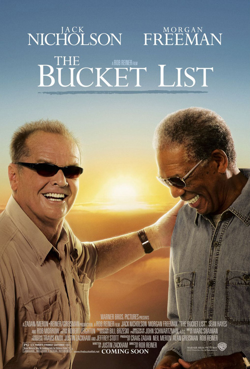 |
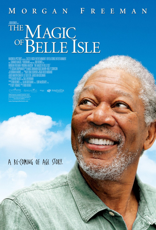
While director Rob Reiner can’t seem to get a wide release anymore—I actually really enjoyed Flipped by the way—he does still manage to hire Morgan Freeman in order to sell his films. The only caveat is that everyone’s favorite narrator/personification for God needs to be comfortable and such comfort exists in his favorite denim shirt.
Seriously, did the image for KO Creative‘s The Magic of Belle Isle (limited July 6) come from Bemis Balkind‘s The Bucket List‘s throwaways? I get that you don’t need more than Freeman’s mug to sell a film—obviously Reiner’s name isn’t what it used to be since it’s as small as humanly possible above the title treatment—but do something with it other than showing how the dude doesn’t really have to act anymore. “Just be your affable self, Morgan. The people eat it up.”
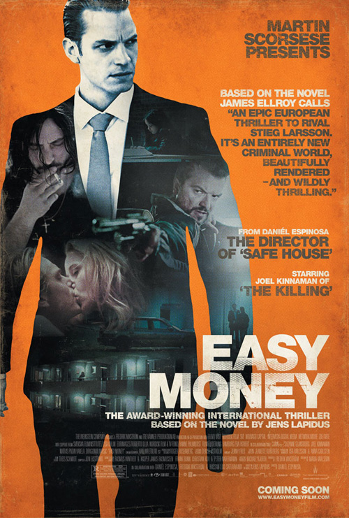
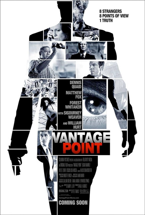
Wardrobe may be one thing, but motifs are another. Maybe it’s the fact both are foreign films, but what’s with using the silhouette/actor’s body to serve as a container for the action? Did the designers think it would be too American to make the poster one dynamic image? Was a collage too boring for an international critical darling?
 |
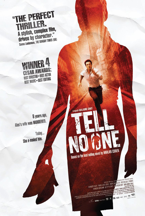 |
This is an interesting phenomenon since we’re also given the drab boxes of Headhunters above to cram as many visuals as possible at once—look at Vantage Point combining the two elements together to even worse result. It’s like some deem these subtitled gems less important to spend time on while others try to spice things up. Not to say the one-sheet for Easy Money (limited July 13) is spicy—unless Joel Kinnaman is what the doctor ordered—it’s just a little more intriguing than tiled rectangles.
The similarity to Tell No One shouldn’t be ignored, though, as I can’t stop thinking the artists felt an aesthetic flourish and tons of text would make people not realize they’d have to also read at the theatre. “Let’s distract them, make a trailer where no actor speaks, and dupe them into buying a ticket before the truth can surface.”
 |
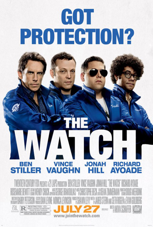 |
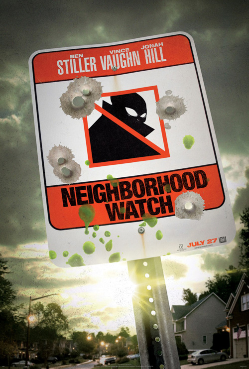
In the case of The Watch (aka Neighborhood Watch) (open July 27), a high-profiled name change actually got ARSONAL to move away from their copycat-ness. With the Trayvon Martin case fresh in the minds of consumers, the studio felt it best to move its alien invasion comedy as far from reality as possible—because an alien invasion was simply too relevant at the time.
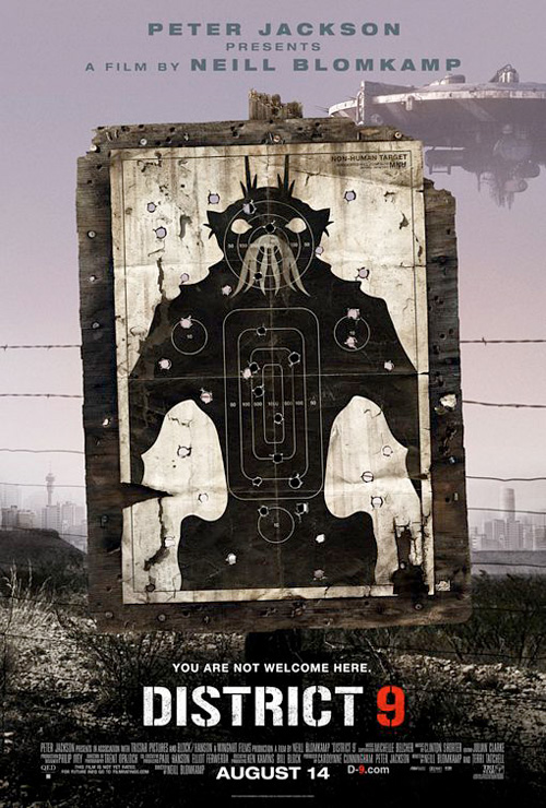
So, along with removing a stone-faced Jonah Hill shooting his fingers like a gun out a car’s window from the trailer, the agency also scrapped the aesthetic of their teaser advert. Looking very similar to Ignition Print’s rather genius campaign for District 9, this should have been a welcome move towards a more creative path. I mean everyone knew the film dealt with aliens now due to their scramble to not shelf the flick altogether out of misplaced fear, why not go crazy and make posters with the boys posing next to an extraterrestrial like the new trailer depicts?
Oh, because that would be smart. We don’t want smart. Instead we’ll badly Photoshop everyone in a straight line on white, crop Richard Ayoade in such a way that it appears a chunk of his body is missing, and add a cheesy tagline dripping with sexual innuendo. Wow, talk about wasting an opportunity to breathe life into something that societal pressure was ruining before anyone even knew it was a film.
 |
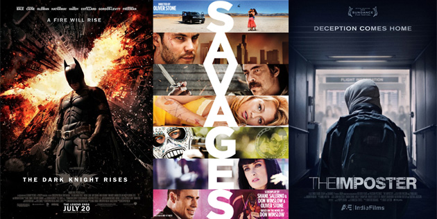
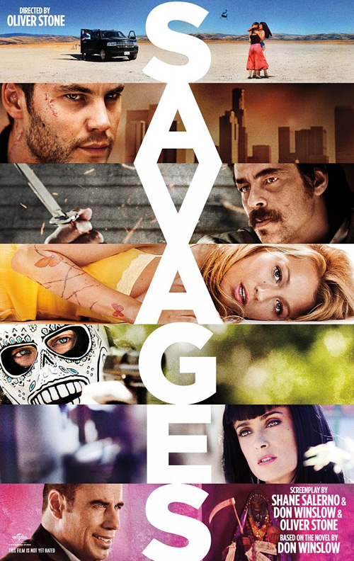
At least we’ve got Oliver Stone to kick us in the teeth and save the day. Right? I have to imagine his Savages (open July 6) contains some iconic, raw imagery to put on display. The masks its main criminals wear should suffice in that regard alone.
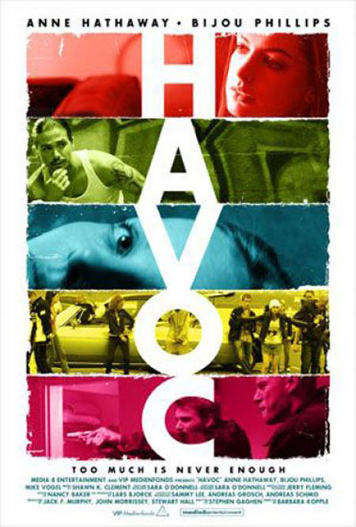
For some reason Concept Arts decided to not only follow a trend I talked about in May with The Best Exotic Marigold Hotel and The Way Back, but also blatantly rip off Creative Domain‘s work for Havoc. And I’m not taking similarities here; this is legit lifting of creative from the font to the design. Maybe the art was imprinted in the back recesses of the designers’ minds and just happened to come out identically without ill intent. Even so, you’d have to believe somebody would have noticed the theft before going into production. It’s not like 2005 was that long ago.
Consistency = unoriginality
 |
 |
 |
 |
 |
 |
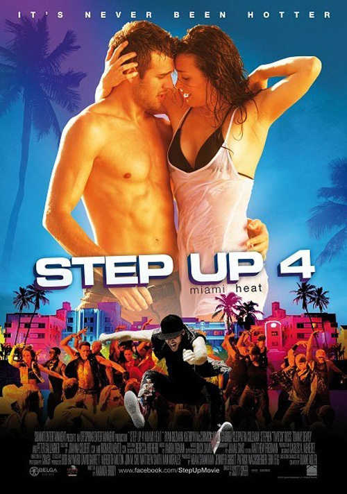 |
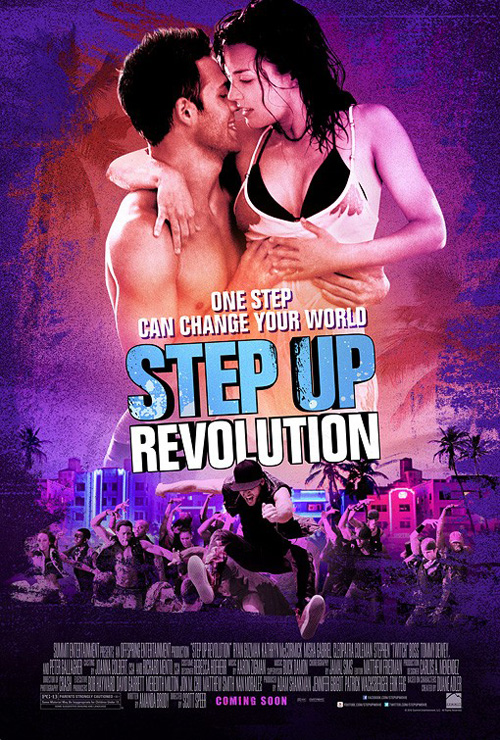
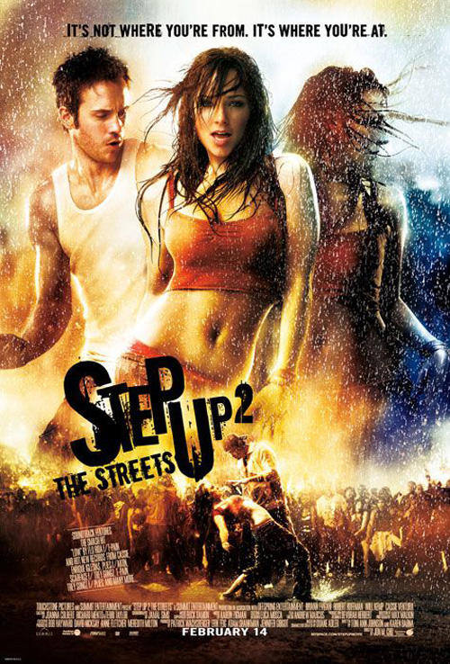
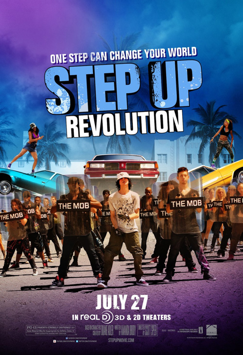
It’s kind of amazing they’re still making these films, but I guess the audience for dance romance is huge. Step Up Revolution (open July 27) rounds out the franchise that made Channing Tatum a star to a quartet of sweat and attitude. And while the poster by The Cimarron Group looks pretty much like a retool of what The Arterie did for Step Up 2: The Streets, I couldn’t help but share the fun little ‘change’ made from an earlier design.
Before it gained the ‘Revolution’ and turned dancers into ‘The Mob’ by giving them riot gear while girls dance on hydraulic-powered cars in the background, Step Up 4 had a different subtitle: Miami Heat. How do you go from that to Revolution? It makes you wonder if current events made them change the entire film’s scope despite no one really going to see plot in the first place. It most surely has never been hotter.
 |
 |
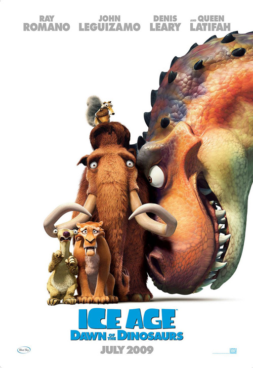 |
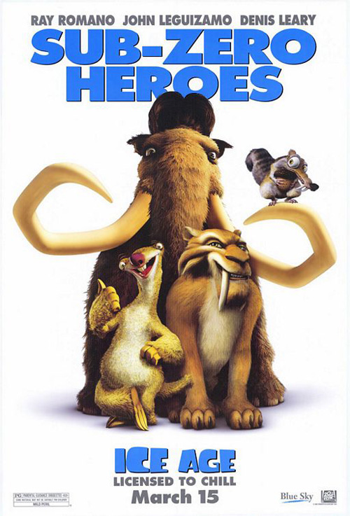
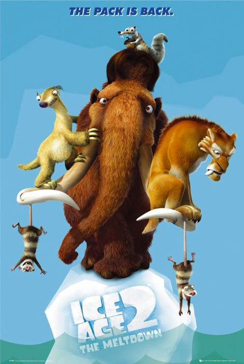
Move on to the cold, however, and we’ll see 20th Century Fox Domestic Theatrical Creative Advertising doing to Ice Age 4: Continental Drift (open July 13) what BLT did for Madagascar 3 last month. Sticking with our favorite woolly mammoth, smilodon, and sloth, the trio crowd together like they have for each of the three previous marketing campaigns.
Much like the inclusion of a T-rex for Dawn of the Dinosaurs, this newest entry adds a few of the pirates that will most likely be causing our heroes a bit of trouble. The logo remains the same, Scrat continues to search for his acorns, and the blue ice refuses to completely melt away. It’s hard to really screw-up an animated children’s film when kids only want to see their old friends again anyway, so 20th Century Fox plays it safe by staying the course.
 |
 |
 |
 |
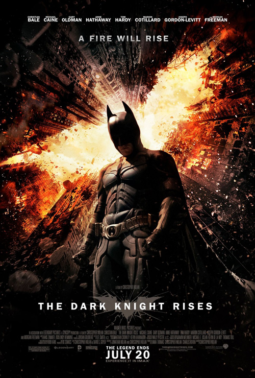
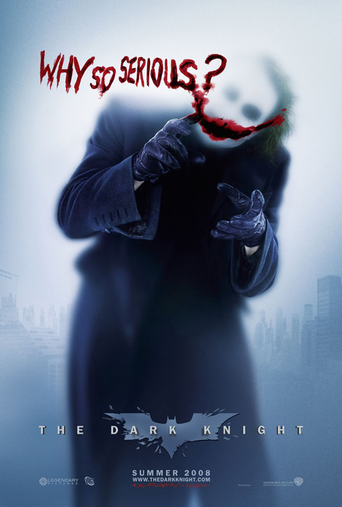
But unlike those two series, I really expected to be wowed by whatever the winning firm came up with for Christopher Nolan‘s Batman swan song, The Dark Knight Rises (open July 20). After all, it’s hard to forget the brilliant work BLT did by subverting our preconceptions with a bunch of Joker-inspired sheets for The Dark Knight. Whether the chillingly famous “Why so serious?” or the graffiti-riddled second versions of Bats against his fiery calling card, the art was inspired.
Unfortunately, Ignition doesn’t follow suit and instead gives us much of what we expect. Batman’s dark suit stands firm against another giant, orange-tinged bat as the buildings surrounding him crumble to the ground. I’ll admit the avalanche of steel is a decent construction as far as iconic imagery goes, but where is the originality? Where is the ingenuity that worked so well a couple years ago?
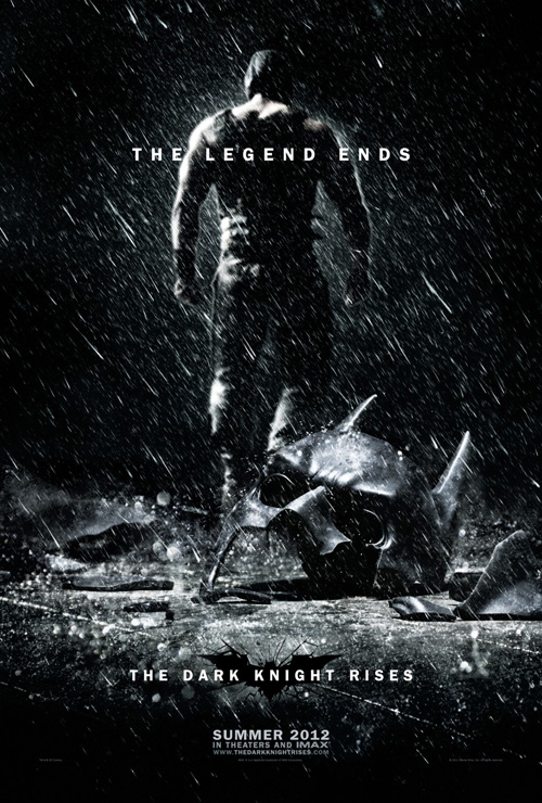
At least one teaser foreshadows the possible death and destruction to come on a more emotional level through Bane walking away while Batman’s mask lay cracked and shattered on the ground. So all was not for naught. I just wanted more.
 |
 |
 |
 |
 |
|
 |
 |
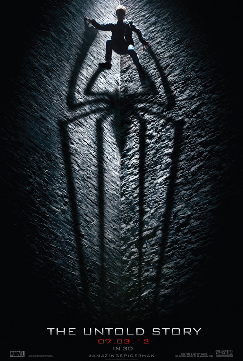
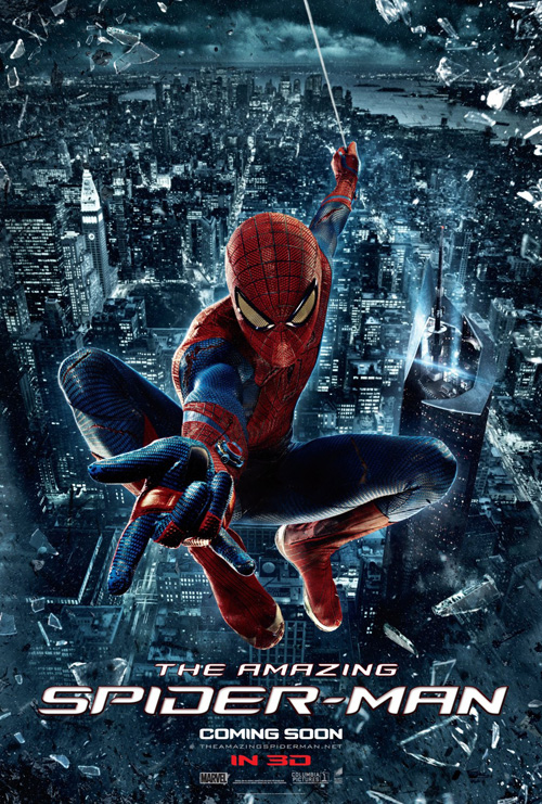
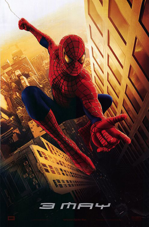
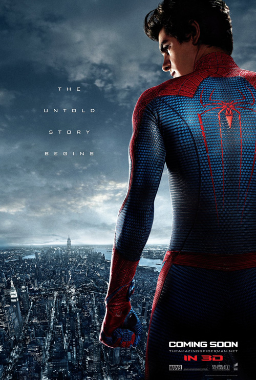
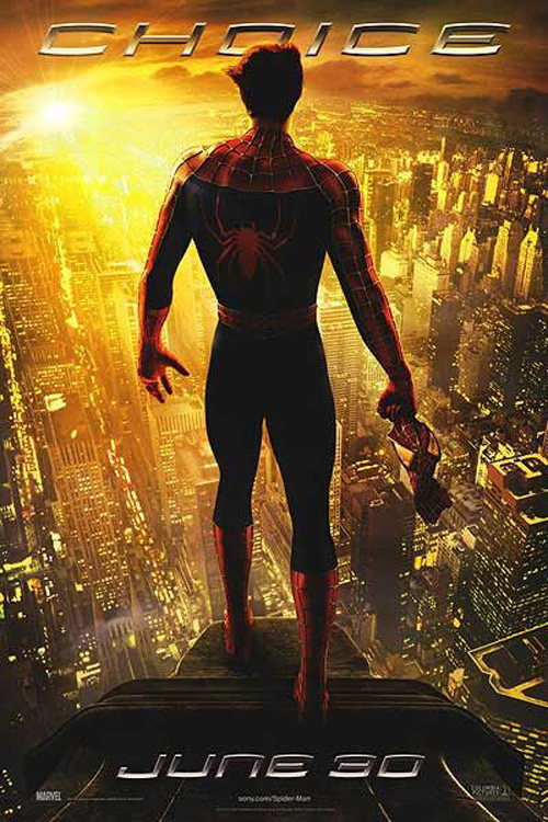
And so, it became The Amazing Spider-Man‘s (open July 3) burden to bear as far as great tent-pole advertising was concerned. They wrestled BLT away from DC long enough to attempt some of the Dark Knight‘s magic, but I’m not sure anything really stands out past the tease that’s worth noting.
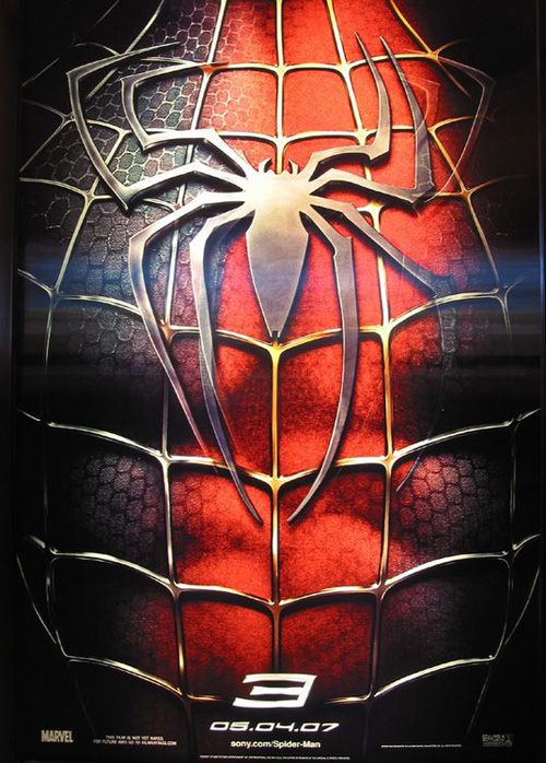
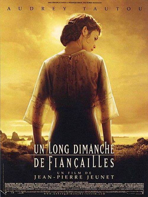
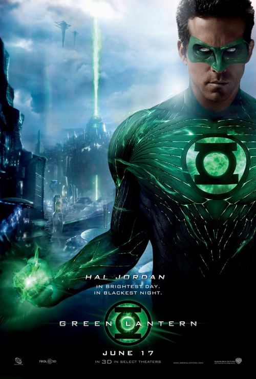
Mirroring Sam Raimi‘s trilogy, we have one poster with a logo (like Spider-Man 3), one with Spidey in flight (like Spider-Man), and one with our hero standing against the city below (like Spider-Man 2). But besides Andrew Garfield copying Audrey Tautou‘s stance from A Very Long Engagement while also channeling Green Lantern, none show true intrigue besides an elongated shadow on a brick wall. That one, however, does really excite. I still remember seeing it when released before any footage had yet leaked from the set—it definitely whet the appetite.
Unfamiliar faces or none at all
 |
 |
 |
 |
With only Killer Joe striking my fancy alongside a couple almost-great entries, we finish July with a quartet using its actors in very different ways. The first is a socialite who would fit right in with the reality television dimwits our nation eats up; the second foreign and therefore a byproduct of the international quirk some lift their noses at while others love to absorb; and the last pair contain shrouded faces enhancing their design instead of hijacking it.
 |
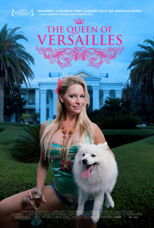
Doing its best to portray the staged pomp and circumstance of works like Jean-Baptiste-Andre Gautier d’Agoty‘s Marie Antoinette, Gravillis Inc. puts Jackie Siegel front and center in their poster for The Queen of Versailles (limited July 20). A documentary about upper class excess, I wouldn’t be surprised if they didn’t call her up to don a frilly gown out of the 18th century before receiving an angry dial tone in response.
The hot pink text juxtaposes nicely with the ornate motif underneath as wealth and poor taste collide. Almost mocking in its majesty, Siegel and her dog are probably not in on the joke since this photo was taken while their goal to create the largest estate in Orlando still seemed an idyllic fantasy. America loves train wrecks and a glorious fall from on high, so the aesthetic only helps build up the image we pray the film eventually tears to shreds.
 |
 |
 |
 |
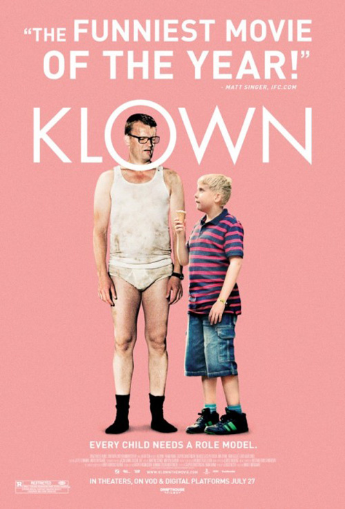
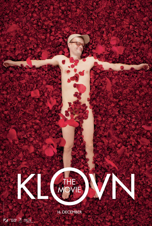
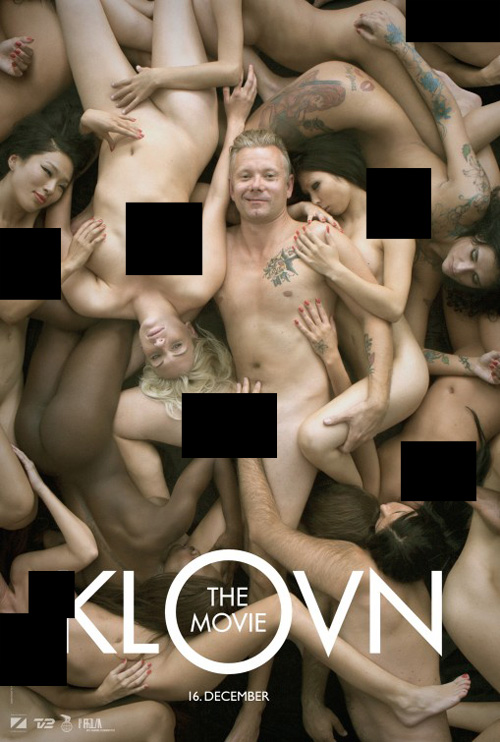
On the flipside, the marketing behind comedy Klown (limited July 27) hits its mark with actors knowing exactly what tone it is they’re trying to accomplish. While an artistically trendy design, I do love the use of the letter ‘O’ as a modifier to showcase exactly what we’re supposed to look at. With a pink background and a rather odd image—a grown man in his underwear looking dumbfounded while a young boy eats an ice cream cone—one won’t be forgetting the advertisement very easily.
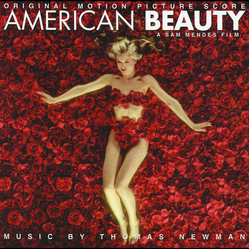
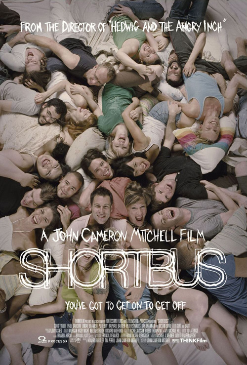
More PG-rated than the Danish posters before it, I’m not sure there’s a better way to market what promises to be a risqué comedy other than this minimalistic, hipster route. And while I generally loathe campaigns mocking other films for laughs, something about these men being thrust into weird situations internationally brings a smile to my face. Whether Frank Hvam looking like Mena Suvari in American Beauty or Casper Christensen doing a completely nude version of Shortbus, I can honestly say Klown has worked its way into the recesses of my mind through its warped sense of humor.
 |
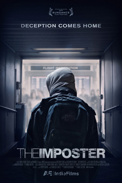
Deciding against showing us the real life subject matter of The Imposter (limited July 13), Gravillis still is able to show much with very little. A documentary concerning a young Frenchman who pretends to be the lost son of a grieving Texan family, the air of mystery and dread here is palpable as the hooded figure walks towards the door.
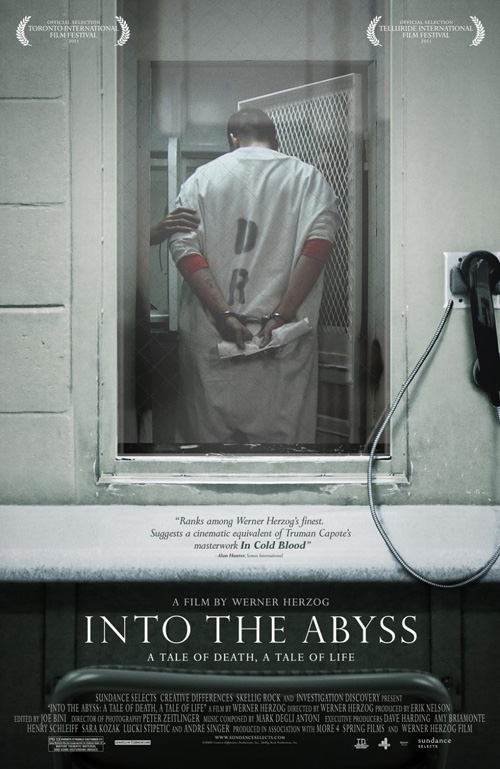
By filtering the typography with an airplane ticket overlay, the details surrounding the tagline’s deception are easily accessible. Reminiscent of P+A & Mojo‘s image-heavy Into the Abyss, there is a sense of melancholy at work that almost tries to let us as viewers empathize with the plight of those photographed. It definitely makes you want to find out what awaits and how far this boy goes on his grossly misguided journey as well as whether we should feel any sympathy for the boy at all.
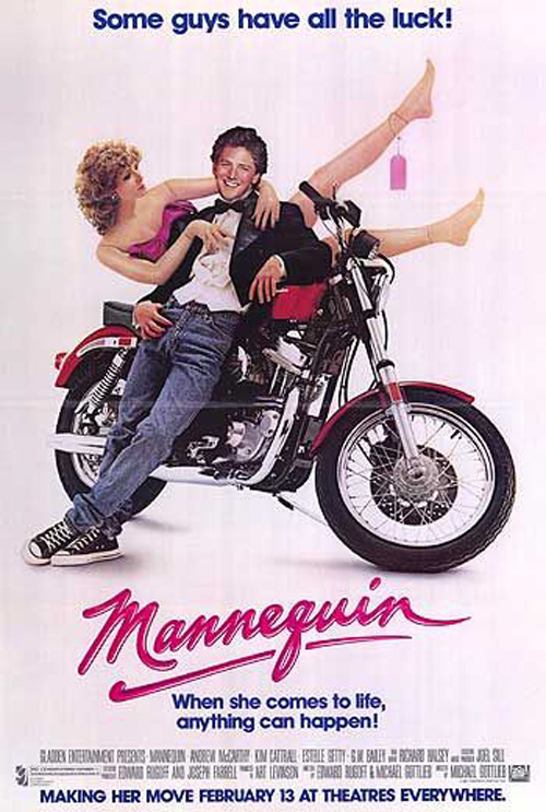 |
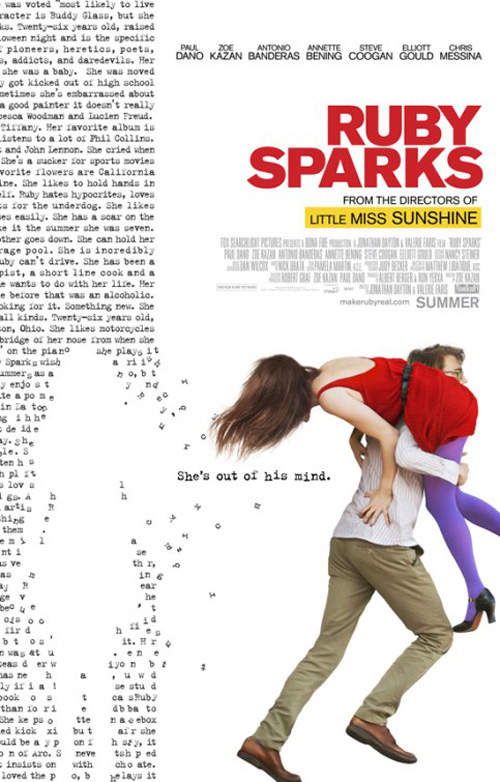
And that leaves us with Ruby Sparks (limited July 25) and Bemis Balkind’s interesting use of text as shape. Like Andrew McCarthy‘s fictional girl in Mannequin, it appears Paul Dano has written a woman into existence via his typewriter and literally pulled her into reality.
The heavy red sans serif title is par for the course as far as indie rom/coms go these days, so what I really enjoy here is the use of Courier at left. Visually representing how he created her, the words form the negative space of where she was before getting slung over his escaping shoulder rather than the girl herself. It’s a cute concept orchestrated well that just goes to show how good ideas can make a better impression than big glossy images too cluttered to project their true message.
What is your favorite July release poster? What could have used a rework?

