“Don’t Judge a Book by Its Cover” is a proverb whose simple existence proves the fact impressionable souls will do so without fail. This monthly column focuses on the film industry’s willingness to capitalize on this truth, releasing one-sheets to serve as not representations of what audiences are to expect, but as propaganda to fill seats. Oftentimes they fail miserably.
—
And we’re back after ignoring a month where the most interesting poster was Liam Neeson‘s face washed out in white. I’m not saying February is any better—because it’s not—but at least we’re distancing ourselves from the start of the year dump of films with marketing campaigns projecting their lower quality. There will be some moneymakers this month, but I doubt many will call them great movies.
Living in a secondary market like mine in Buffalo, NY makes me want to believe I have the Oscar holdovers from 2011 to talk about as they’re released here in our independent theatres. But then I remember posting about them all months ago and resign myself to speaking about kid’s flicks starring The Rock.
Let’s play dolls
 |
 |
 |
 |
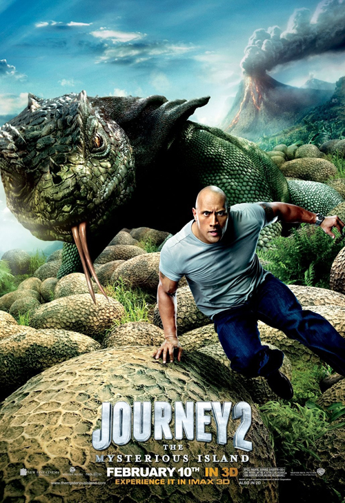
Dwayne still can’t seem to shake the fact he makes boatloads of money bouncing his pectoral muscles with kids in sci-fi fantasies long enough to realize he’s a charismatic action star. It’s a shame because I feel like he’s wasting his prime ass-kicking days performing opposite giant monsters that aren’t there until post-production. He’s a cash cow, though, so the trend won’t be changing anytime soon.
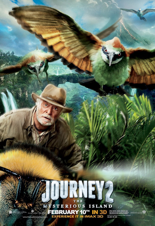 |
Neither it seems will campaigns using cutout actors placed willy-nilly onto a background with computer-animated creatures. This series does hold an interesting tidbit, though, as the full cast one-sheet for Journey 2: the Mysterious Island (open February 10) comes from Ignition Print and yet the same exact image of The Rock is used inside a character poster from WORKS ADV. Maybe they collaborate, maybe Warner Brothers own all imagery, or maybe I really don’t care. It’s a slapdash poster with more Photoshop elements than human representation—yawn.
They should just use the Michael Caine entry and be done. The Brit is riding a bee Honey I Shrunk the Kids-style and I’d wager a bet to say more than sixty percent of the poster is blurred out. I just love the fact Caine admittedly works for the paycheck, so kudos to him for still going strong.
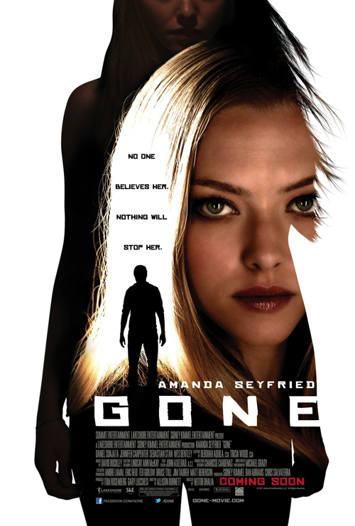
What I hope wouldn’t be so rock steady in the industry is lame thrillers borrowing tropes from classics like Halloween in order to scrape up a story empowering women by making them the victim. All it does is allow the likes of Amanda Seyfried—who should be doing much better fare—to feign fright before a third act reveals shows her assailant is really her insert-clever-never-saw-that-coming-relation! GASP!
 |
 |
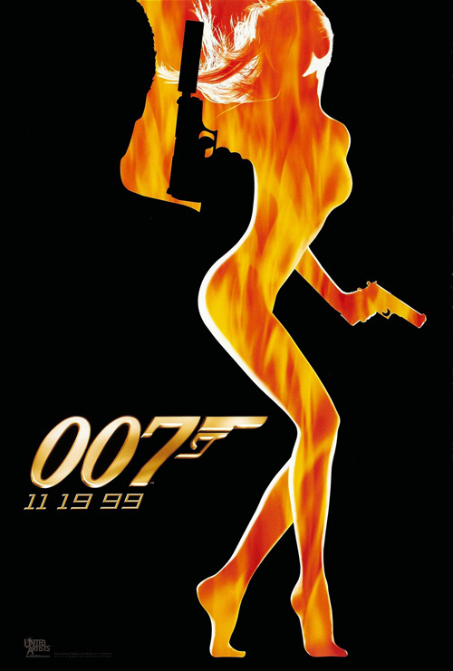
It also allows ad agencies to use dark colors and high contrast with flashes of warm highlights to depict thrills. The Cimarron Group not only does this but also utilizes silhouette windows for added ‘intensity’ in their sheet for Gone (open February 24). It’s a man beside a girl inside another girl in an ill-conceived combination of sharp vector graphics with photography.
Diane Reynolds-Nash‘s The World is Not Enough used the concept to much better effect back in the day and guys like Olly Moss are owning the window silhouette motif in fan-inspired alternate posters that almost always end up better than the theatrical one. Something tells me that Gone won’t get the cult following to find out what he could do with it.
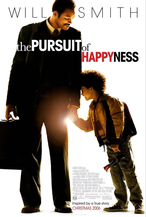 |
But if cutting figures out to place inside or over imagery is too much for you, there’s always the ever-popular idea of putting them on stark white to drive home focus—just in case having that big name on top isn’t enough. Ignition went this route by giving Tyler Perry front and center placement to advertise Good Deeds (open February 24).
I like the clean, tight serif font over his midriff and above that gorgeous briefcase, but not because the color and style offset the imagery—there’s not much here to clamor for attention. I like it because it helps pretend not being a complete facsimile of BLT & Associates‘ Pursuit of Happyness. You see, Will Smith’s briefcase holding salesman has a sans serif over his chest. I’m just glad they found room for the light flare.
(Yes, I realize this may be a spoof sheet like Perry’s last campaign. If so, I hate it even more. No one should rehash a joke that wore thin after maybe Big Happy Family number three. If it even got that far.)
When all else fails, repeat
 |
 |
 |
 |
 |
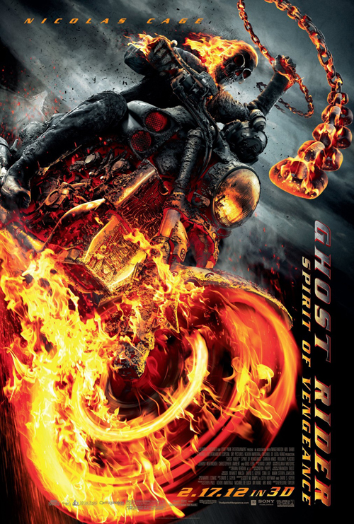
Whereas some copying can be shrugged off as homage/spoof/etc., it appears as though Vox and Associates literally reflected the original Ghost Rider one-sheet on its y-axis, beefed it up with brimstone, and slapped Spirit of Vengeance (open February 17) on the side.
The rendering of the fire is cool and the imagery perfectly depicts the subject matter, but was there really no other ideas thrown about at the brainstorm meeting? I haven’t seen the original film, but what I’ve heard from friends is that the studio probably should have distanced itself as far as possible. I doubt they were thinking it would be a thinly veiled reference to Part 2 being darker and more detailed than its predecessor—the American public doesn’t pay enough attention for that to be a selling point.
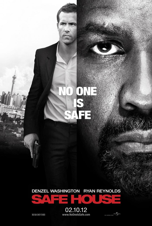 |
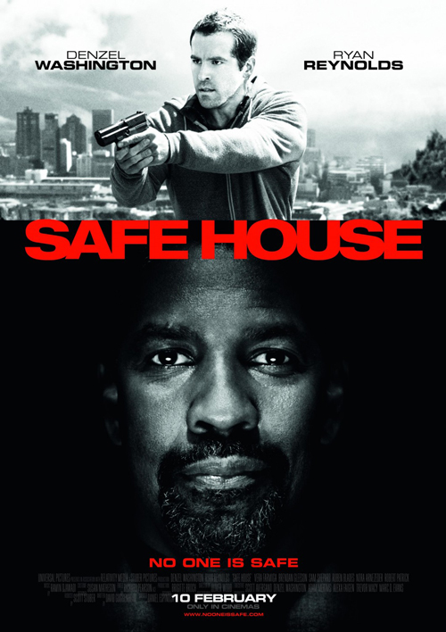
At least they have a few years in between copies, though, since the same can’t be said for Safe House (open February 10). Deciding to create two different posters, they couldn’t think of anything more elaborate than changing the axis of bi-section and the photos inhabiting each half. It’s either Ryan Reynolds above Denzel Washington or to his left.
And if that’s not enough, the designers strip all color to make it a black on white ensemble of contrasting tropes—skin color, ‘hat’ color, etc. The bold, red sans serif name recalls an infinite number of works before it and soon what appears an entertaining little thriller through trailer exudes unoriginality in print. Have fun and put smiling Denzel in the middle of the poster with a border of people bearing down on the edge. Use the imagery its title suggests; don’t simply go back to the well.
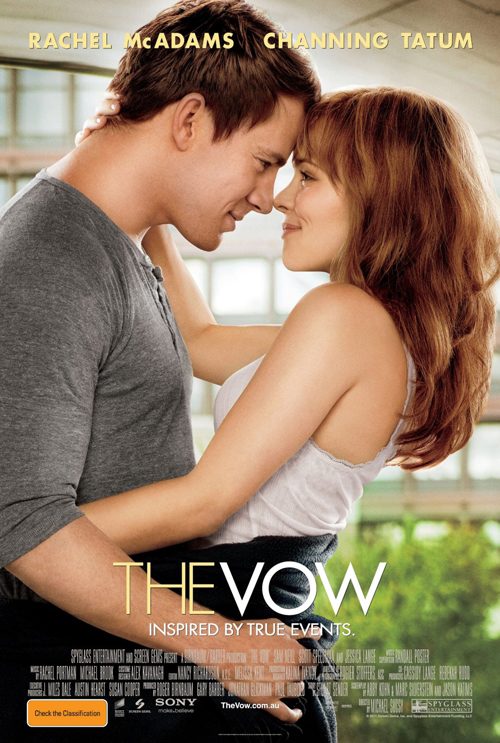 |
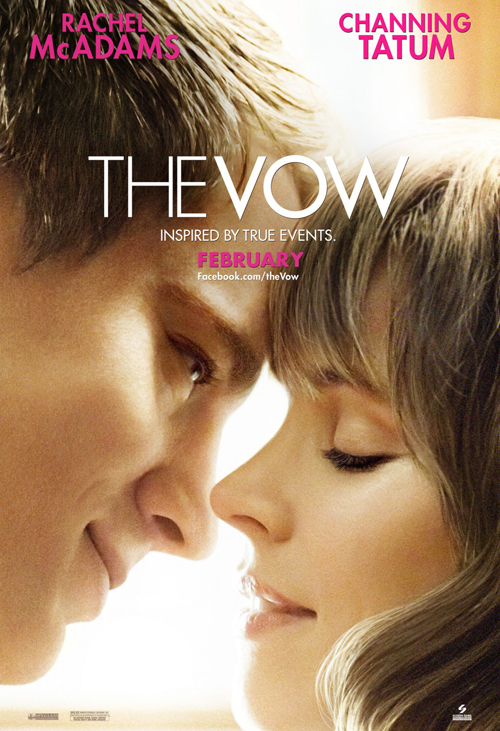
On that note too, while I championed some close up embraces last year—see Breaking Dawn Part 1—I believe the fad is already wearing thin. It’s tough to stay fresh when most close-ups of guy plus girl look strikingly similar. Pulse Advertising tries hard to make their advert for The Vow (open ) work, but the awkward cropping of heads doesn’t do any help. We should be seeing eyes and lips, not giant foreheads taking up the entire top half.
It is much better than their alternate, more full-figured option by ridding our view of useless periphery. I enjoy the title font’s thin to thick weight between words and that they didn’t give into their baser, schmaltzy desire to turn that “o” into a wedding ring. Someone in that design room must have brought the option up. But does it giving something away showing their embrace when we’re still unsure whether they’ll get together at the end?
Yes, Sheldon, that was sarcasm.
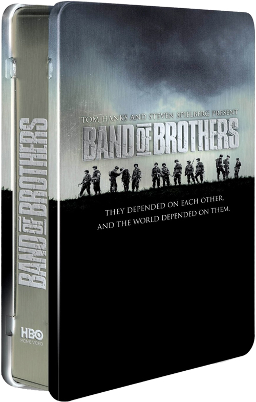 |
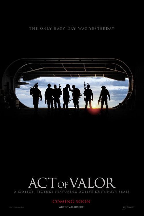
As copies go, though, you could do worse than mimick the iconic DVD cover of “Band of Brothers“. Concept Arts does so for their Act of Valor (open February 24) poster by depicting silhouetted Navy Seals exiting into the sunlight. It’s an interesting move that works for me and yet still doesn’t at the same time. The anonymity leaving these heroes who’ve protected our country equal is fantastic, but isn’t the whole concept of this film to put a face to their actions?
I know there wouldn’t be any A-list celebrities making an appearance since the cast is all ex-Seals, but maybe showing their faces would give us a more personal connection. For all I know the men on the poster are models standing in for the authentic soldiers. Personally, I have no interest in seeing non-actors reenact their past in a controlled environment anyway. I’d rather re-watch a documentary like Restrepo and see it in real time.
Intrigue abounds
 |
 |
 |
 |
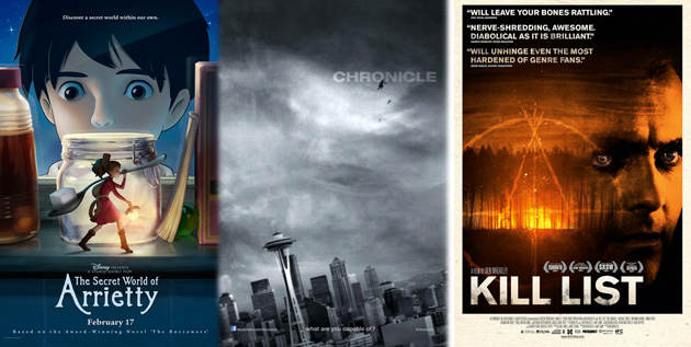
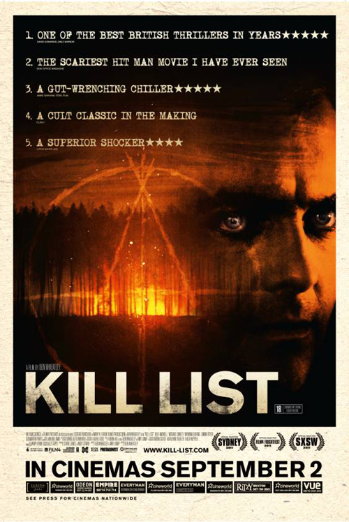
There is something old school about OTMentertain‘s one-sheet for Kill List (limited February 3) that I can’t quite put my finger on—but I like it. I’ve seen the film already and yet I have no clue whose face it is gracing a majority of focus opposite the Blair Witch-like insignia leading up to one of the best finales I saw in 2011. It doesn’t really matter if we know, though, because the idea of fear comes across in his eyes and that’s the real motivating factor of putting him in.
I like the distressed fill of the title treatment, the Courier-esque font used for the accolades at top, and totally buy the painterly feel of the imagery. It’s a slow burn of a film with much more nuance than I expected—and maybe wanted—and this design does a good job of sharing those sentiments. You won’t be bombarded with over-the-top scares and the marketing doesn’t unfairly plant that seed in your head.
 |
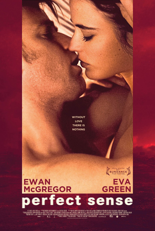
On the other hand, the firm at the helm of Perfect Sense‘s (limited February 10) campaign does want to sow some seeds into your consciousness. With almost an identical image in crop and subject as The Vow—seen earlier—the tone expressed here is completely different. Where the former is saccharine and bright, this depiction of Ewan McGregor and Eva Green is dark and in full sexual thrust to engage our senses.
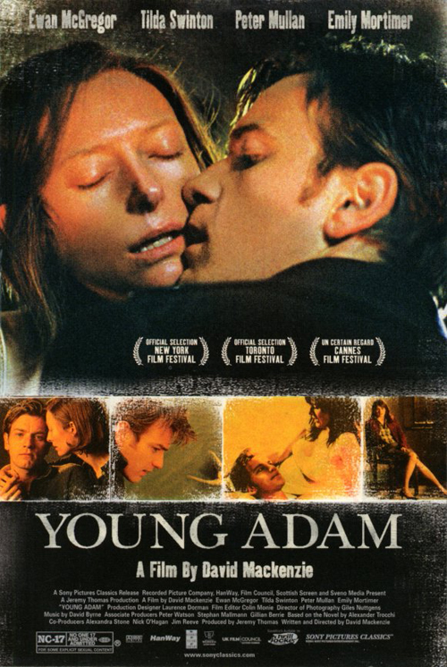
No stranger to erotica, McGregor and director David Mackenzie worked together on a similarly themed poster for their film Young Adam. A lustful love is on display on each and there is no mistaking the import of Perfect Sense‘s tagline and shaky blur of its title to help express just how much their love is working. The question then becomes, what is happening in their relationship outside of the bed to threaten what they have?
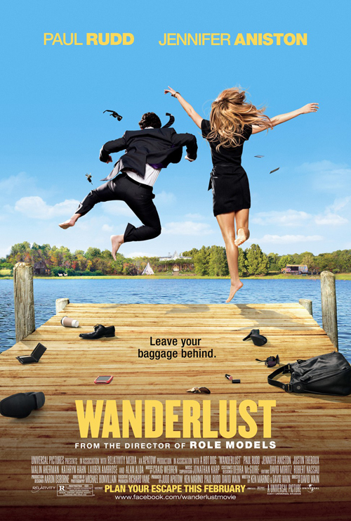
But while they’ve left all their clothes behind, it’s Paul Rudd and Jennifer Aniston flinging themselves into the water in full dress that humors and delights in ARSONAL‘s Wanderlust (open February 24). It’s probably not even them jumping, but that doesn’t make the concept any less appealing to the title’s definition of roving traveler as cell phones and electronics are jettisoned to the dock.
The Helvetica at top is nice—I’m not sure anyone dislikes this font—but the condensed bold treatment of Wanderlust is the sleeker flourish in my eyes. The sans serif helps contrast the frozen motion on display in the photo, but the little curved hitch in the ‘R’ gives it some personality to stand on its own away from the rest of the text.
Less is more in this regard and I enjoy how most work this month doesn’t try to shove as many images in our face as Journey 2. Pick one and enhance it without screaming excess and removing its true focal point. We want intrigue when looking at a static vertical representation of the final piece’s moving landscape. Immerse us in the world and win our interest to find out more.
 |
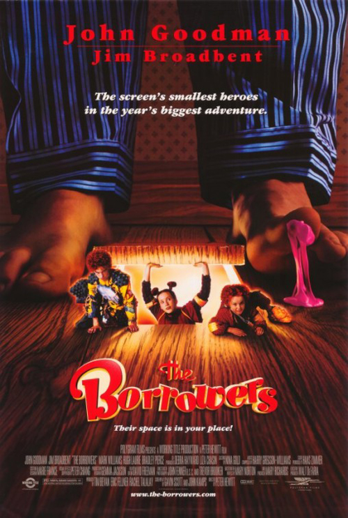 |
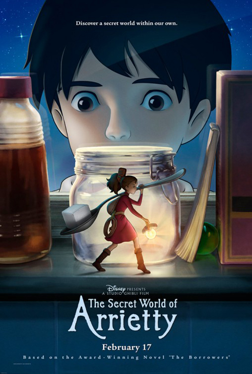
The Secret World of Arrietty‘s (open February 17) international sisters are a perfect example. Whereas the American version does an okay job showing a couple characters while instilling the source material’s subject with the theft of a cube of sugar—it is an adaptation of The Borrowers after all—it fails to be anything but ordinary when compared to the Japanese counterpart. We barely make out Arriety through the leaves but the color puzzle absorbs us to look deeper and cements our want to discover what else is hidden beneath.
It’s all about the atmosphere
 |
 |
 |
 |
If you’re going to get me in the theatre based on a poster—I’ve stopped watching trailers unless they play before a film due to the high propensity of spoilers these days—portraying a palpable atmosphere is your best bet. Bait the hook emotionally and viscerally and I’ll check to see whether you make good on the promise.
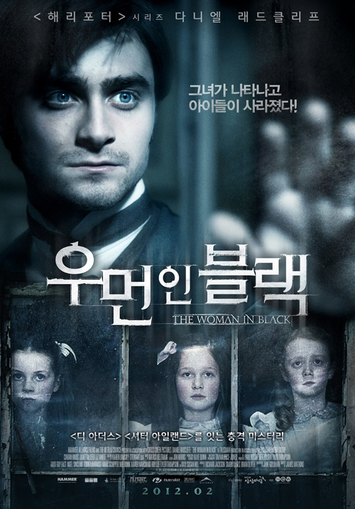 |
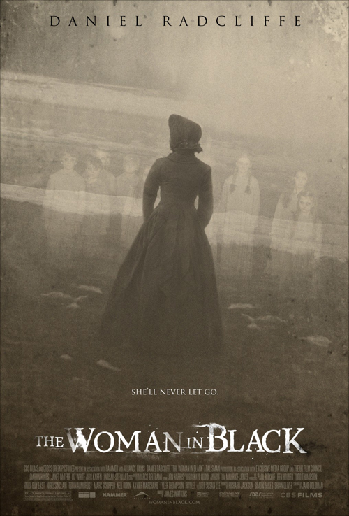
Blood & Chocolate have done this in spades with The Woman in Black (open February 3). Unlike their Asian counterpart, they know people don’t go to a horror film because of the actor at the lead. Harry Potter or not, Daniel Radcliffe isn’t putting butts in seats yet as his reinvention as a versatile performer is still in its infancy. Look at the box office numbers for cheaply made, widely distributed schlock from unknown filmmakers—Saw, Paranormal Activity, etc.—and see how it’s the thrills we want.
From the inky fades of the title font to the thick fog shrouding the whole from view, you get a sense of the ghostly dread expected. Creepy kids are always a surefire way to reel in viewers and the wide, dead eyes only help the cause. Yes, it does nothing to describe the film besides show a ‘woman in black’, but it piques interest and sets mood.
 |
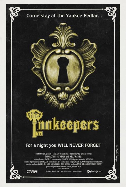 |
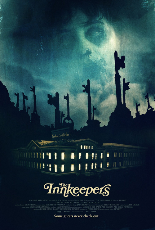
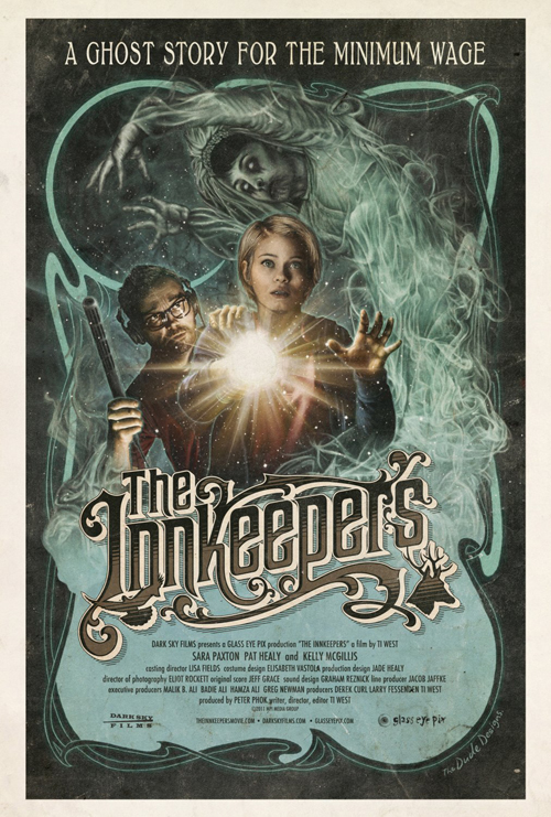
British film The Innkeepers (limited February 3) sees Gravillis, Inc. doing the same. While Tom Hodge‘s alternate takes give a nostalgic horror tone with antique bits of flair, Gravillis’ silhouetted key tombstones rising from the ground towards a ghastly distorted face of a boy in the sky is brilliant.
There is a painterly feel as brushstrokes are noticeably visible and the inn’s vacant windows give a bit of Psycho flavor. The real winning attribute above all, however, comes from its simple yet elegant font choice as ascenders and descenders curve and wrap around adjacent letters. Much cleaner than the more stylistic typography from Hodge—simplicity reigns supreme.
 |
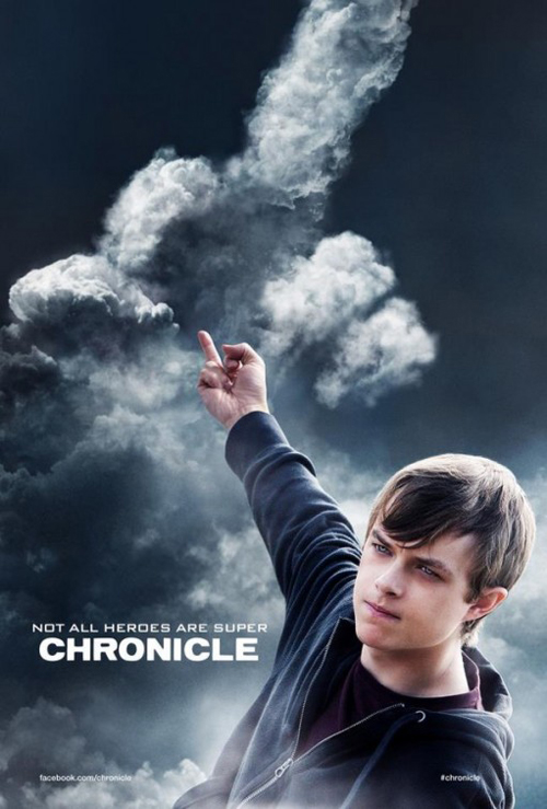 |
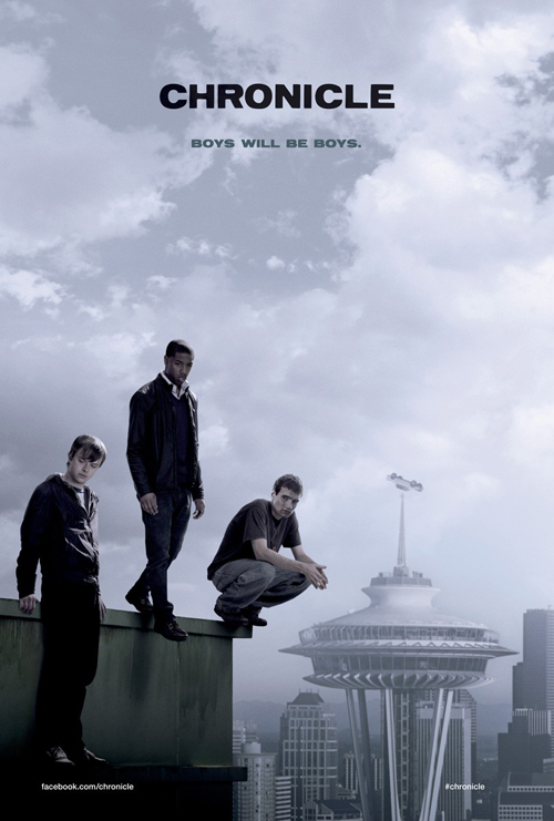
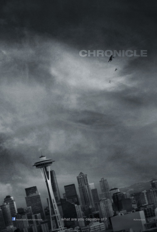
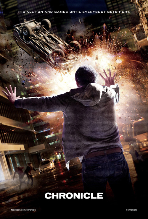
And the same can be said with Chronicle (opens February 3). I love the title’s tight kerning and the cloudy darkness brewing in the skies is lush. Midnight Oil Creative gives a more literal representation with actors in differing states of thin air floating, but the off-kilter composition is as intriguing as Ignition Print’s more tempestuous teaser of a coming storm. The city below is tilted and the subtly placed dark figures flying through the air give a sense of the looming danger of something not quite right.
It’s not all great as Midnight’s other campaign inclusions find atmosphere fading for cheap gimmicks. I don’t mind the TV screen pixelation filter of the first but do find that its actor using his power defeats the mystery. The second poster’s middle finger fails in concept and orchestration as the final product makes me wonder who approves these things for public consumption. Faux documentaries with ‘found footage’ have an allure that should be replicated in print. I can only hope the studio castrated the good ideas and settled on inferior product because I hate blaming the designers when most times it’s out of their control.
What is your favorite February release poster? What could have used a rework?

