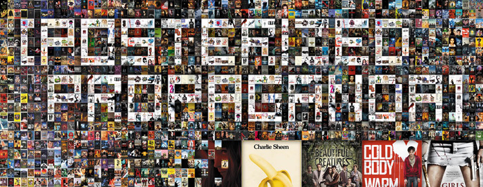
“Don’t Judge a Book by Its Cover” is a proverb whose simple existence proves the fact impressionable souls will do so without fail. This monthly column focuses on the film industry’s willingness to capitalize on this truth, releasing one-sheets to serve as not representations of what audiences are to expect, but as propaganda to fill seats. Oftentimes they fail miserably.
—
February. Just outside of the dump month that is January and yet still devoid of any true must-sees besides the arty ones no one has heard of and the umpteenth sequels of once beloved franchises.
And what’s up with the horror films? I understand the appeal and the shear amount made, but February? At least Jonathan Levine‘s zombie flick has romance in it for Valentine’s Day. I guess the lack of other rom/coms means we expect the rest later …
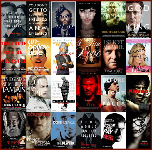
Right out of the poster handbook
 |
 |
 |
 |
Class is now in session.
 |
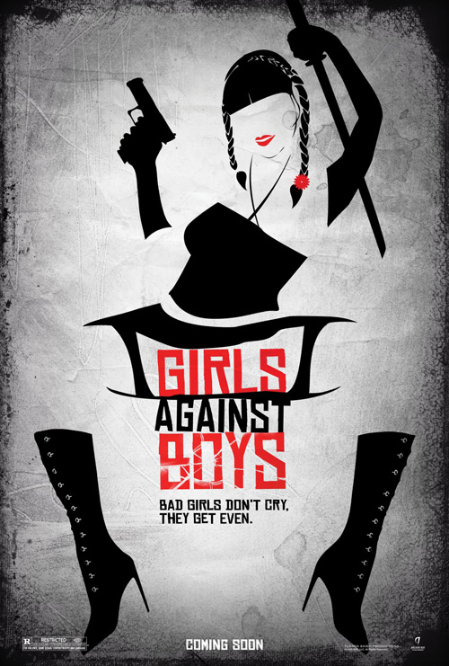 |
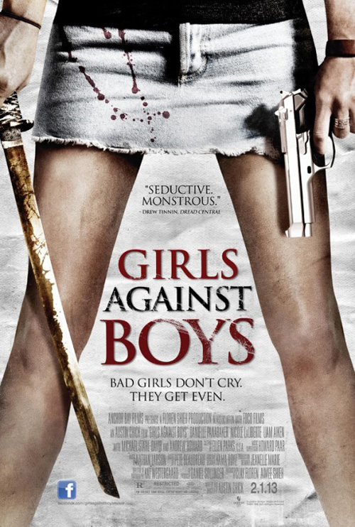
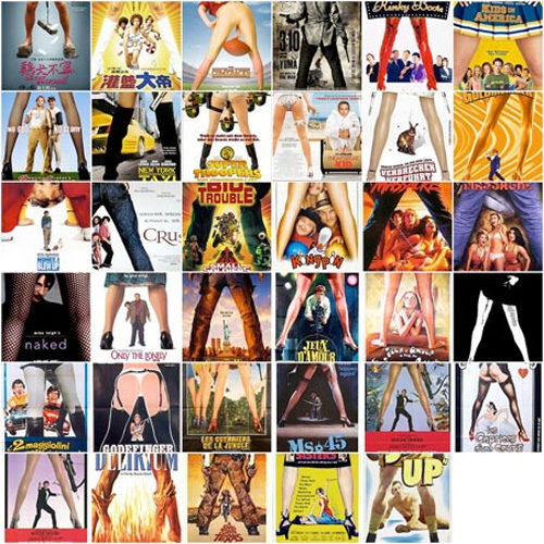
Chapter 1: The between the legs shot.
We’ve all seen the collected collage of this trope and others over the past couple years so it should be no surprise that we see it again in 2013 with Girls Against Boys (limited February 1st). Maybe a couple dismembered male heads or bloody bodies could have helped? The sword looks rusty while the gun is brand new, why? And the bloodstained skirt might not be the best location for such a specific violent motif?
At least Art Machine, A Trailer Park Company tried something different despite failing with their minimalist vector art. I like the red highlights if not the odd positioning of the caricatured woman. I guess the female nether regions play a larger role to the film than I would have assumed considering the blatant depiction of weapons? Maybe teeth are involved …
 |
 |
Chapter 2: Cover those faces with text.
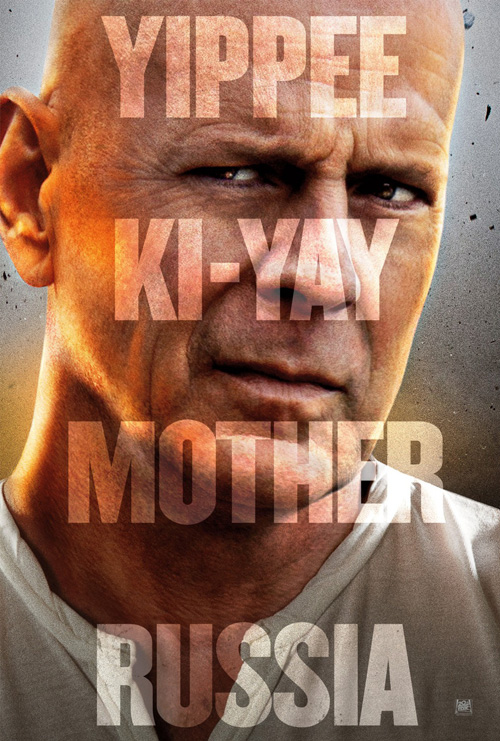
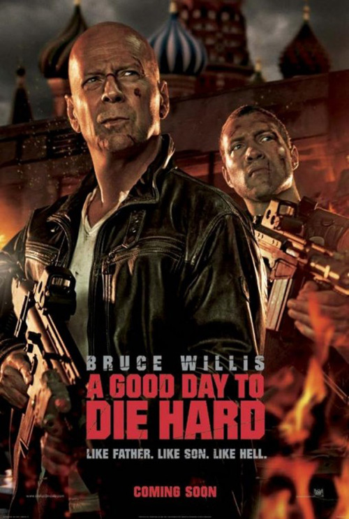
Thanks cold open for giving us another clichéd design this month. The one good thing they have going for them is that A Good Day to Die Hard (open February 14th) practically sells itself by those last two words. Throw in a cheesily updated variation on John McClane’s catchphrase and you have airbrushed wrinkles and a wry smile to remind you that Fox loves money.
I can’t even say ARSONAL does a better job with their mocked up faux film still of Bruce Willis and the bad guy from Jack Reacher Photoshopped together in front of the Kremlin or some other such Russian looking establishment. They do kind of look alike, although it would have been much more badass if the kid wreaking havoc abroad was Mary Elizabeth Winstead.
 |
 |
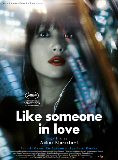
Chapter 3: The cropped frame shrouded in glares.
Okay, so maybe this one is not quite as obvious as the last two, but you can’t deny it happens often. Well, at least where Le Cercle Noir is concerned.
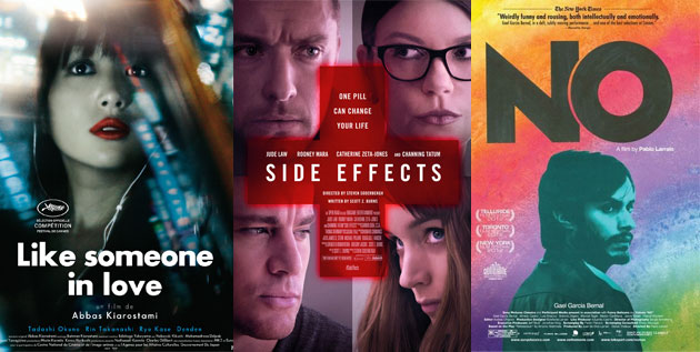
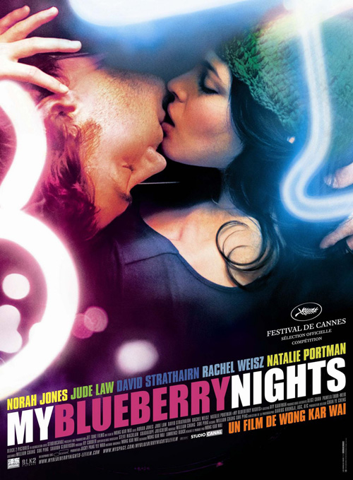
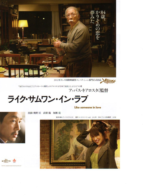
For Like Someone In Love (limited February 15th), the firm decided to practically rip-off the one-sheet they crafted for My Blueberry Nights. Maybe it’s a stretch but I definitely thought of it the moment I laid eyes on Rin Takanashi‘s face. The fact they were made by the same design agency only helped bolster the comparison.
Either way, it’s better than the original Japanese version. Way to pick two shots and a portrait to float in the white space. Talk about three images that do anything but captivate.
 |
 |
 |
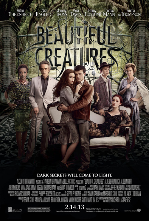
Chapter 4: Just reprint the book cover.
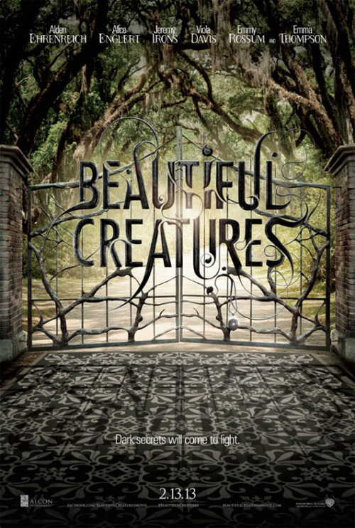
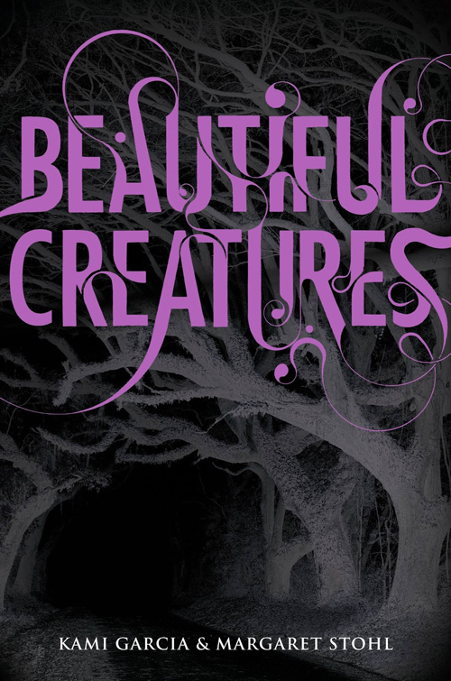
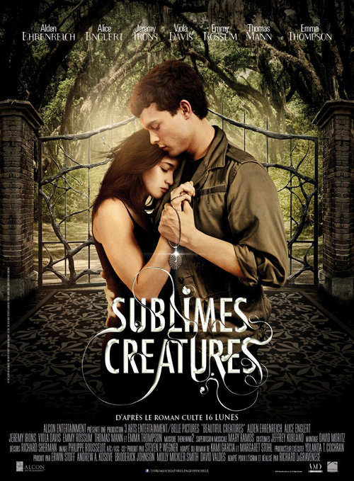
Frankly, I don’t blame the studio for wanting some consistency with the source material that is probably going to put a lot of butts in seats. It also doesn’t hurt that Art Machine had a pretty awesome looking logotype to work from for Beautiful Creatures (open February 14th). The intricate curves and interlocking gaps between letters is so stunning that the foreign sheet lifted the style as well.
While the teaser’s sans everything but gated, wrought iron text stands on its own, I actually don’t mind the inevitable decision to throw in a few actors. Yes, their stances are awkward, the dark shadows at the bottom fudges perspective, and the faces are a bit too polished and smooth. But what can I say? My eyes end up tracing the curves of the title after a few seconds anyway.
Look familiar?
 |
 |
 |
 |
Way to go on the originality guys. I guess the “if it ain’t broke don’t fix it mentality” is just too quick a fix to ignore, especially if movie studios keep buying the same stuff they have before. Hey, it kind of sounds like the product they churn out too …
 |
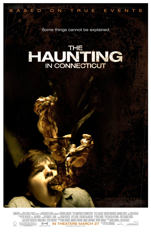 |
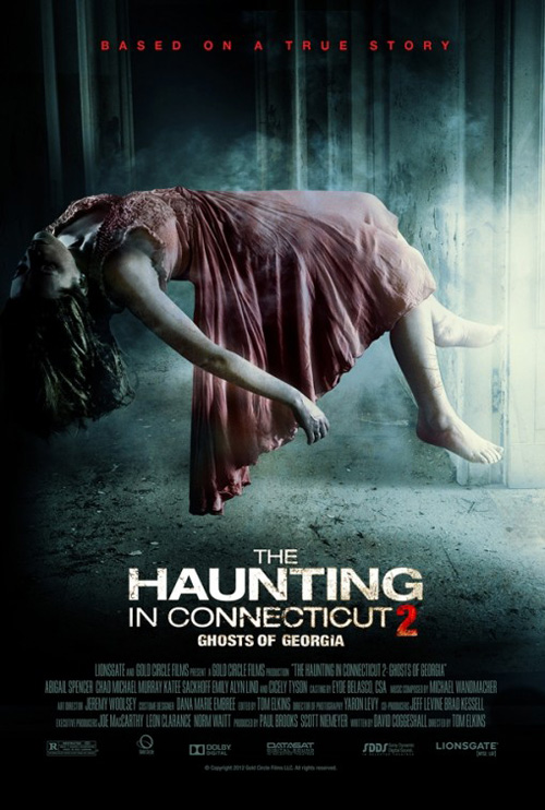
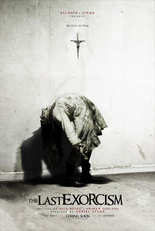
Anyway, first up is the mouthful that is The Haunting in Connecticut 2: Ghosts of Georgia (limited February 1st). Good job on Zuul redux, I didn’t realize Dana Barrett wore anything else but red. Seriously, though, how many times can we look at floating, contorted bodies before we realize we’ve seen the film fifty times before too?
What really gets me angry—as I look at Ignition Print‘s Last Exorcism‘s similar vibe—is their original Haunting in Connecticut broke the pattern. That image is freaky as all get out and a memorable bit of unexplained phenomenon. This is the kind of stuff that sticks in my mind to take a mental note and possibly give it a chance on DVD.
 |
 |
 |
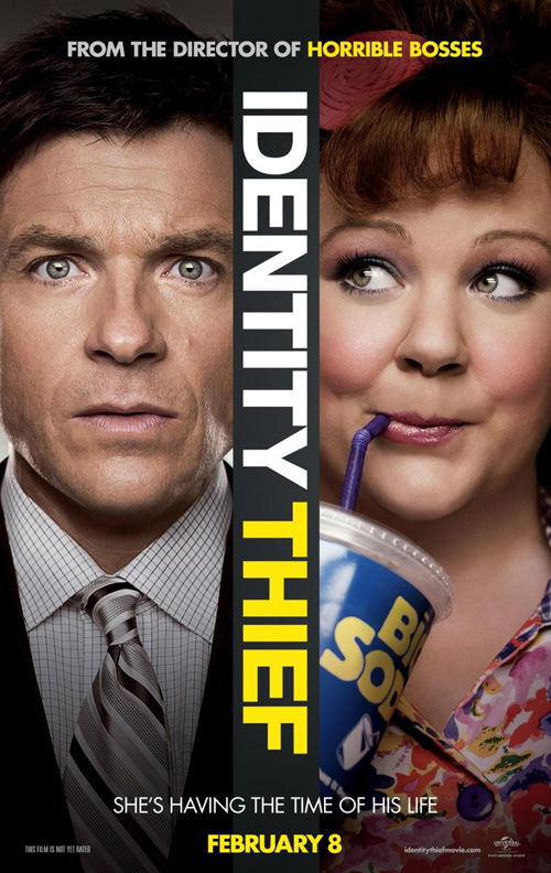
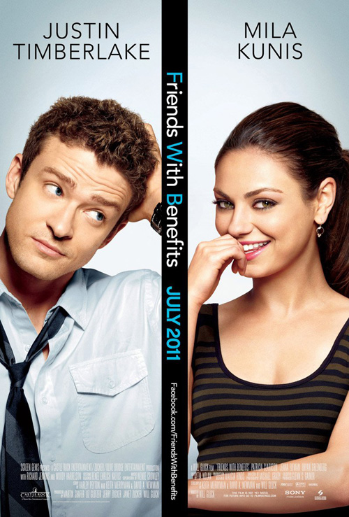
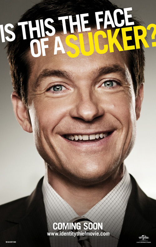
Where Identity Thief (open February 8th) is concerned, I’m probably not the only one who is sick and tired of the double face poster. Between the title, Jason Bateman‘s involvement, and The Cimarron Group‘s design, I thought this was another body swapping flick like The Change-Up until a trailer finally got released.
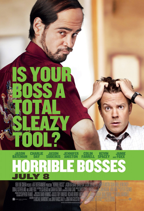
Compare it to ARSONAL’s Friends with Benefits and you have the makings of a new trend for the collage makers above to horn in on. Put Cimarron’s character sheet of Bateman next to BLT Communications, LLC‘s for Horrible Bosses—the director of which helmed both—and lazy doesn’t even begin to describe my angst.
 |
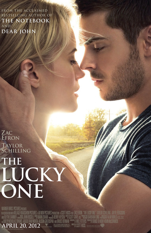 |
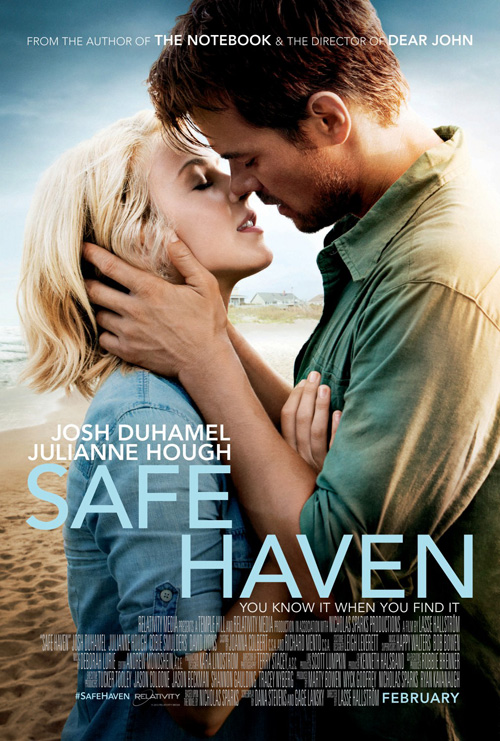
Ugh, and don’t even get me started on the whole Nicholas Sparks motif. Really, WORKS ADV? You’re just going to rip-off The Notebook and The Lucky One for Safe Haven (open February 14th)? Not even going to try something a little different?
I just love that each of these three have the lips oh so close but not touching. Let’s add some suspense and a “will they” or “won’t they” conundrum because Josh Duhamel may yet realize he’s sixteen years older than Julianne Hough. It’s a Nicholas Sparks book for crissakes, they’re going to kiss. If they don’t, however, let me know. I may be interested in checking it out then.
 |
 |
 |
The true tragedy of this section is with Steven Soderbergh‘s latest, Side Effects (open February 8th). I’ll say it right now—I love this sheet. The dark red filter on Rooney Mara‘s image, the checklist doctor’s note aesthetic at the bottom, and the hand scrawled names/signature add a brilliant authenticity to the whole. It’s so much better than Tarhan Creative and White Spark Creative‘s second character quadrants example, but I digress.
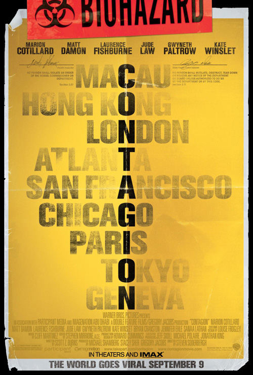
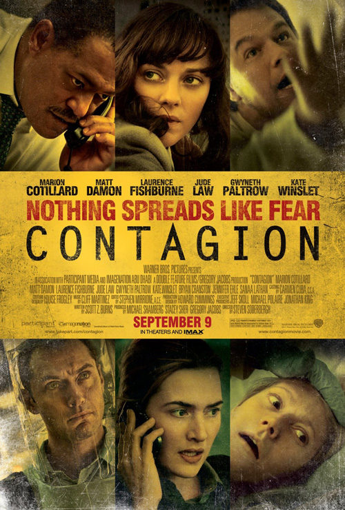
No matter how much I like the teaser, the similarities in campaign to Soderbergh’s other medical field thriller are too much to ignore. It’s not as well done as Side Effects, but Canyon Design Group and Shel Starkman Design Group‘s tease for Contagion also attempts the verisimilitude route with fake signatures and biohazard tape and folded creases, etc. Flip to Ignition Print’s one sheet of character photos with a solid color block of text in the middle and you have a carbon copy marketing scheme at play.
At least Side Effects improved on the formula—I’ll give it that.
An artistic touch
 |
 |
 |
 |
Thankfully a few firms did decide to add some artistry to their works this month whether the end result was great or not. I’d rather have a noble failure than a cheap knock-off any day.
 |
 |
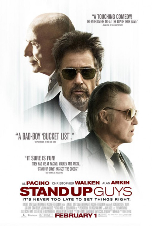 |
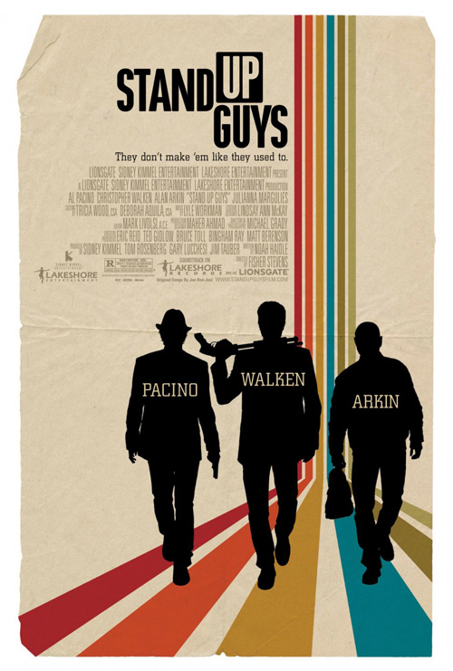
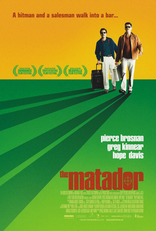
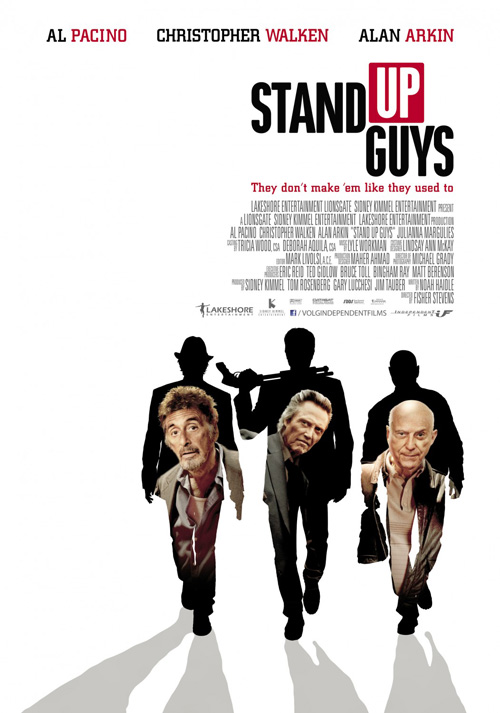
Despite being über hipster, I kind of like WORKS ADV’s sheet for Stand Up Guys (open February 1st). The colored bars coming down and breaking in perspective is nice—albeit a total stock image trope I used myself on a Passion Pit contest entry a couple years back and which The Refinery played upon for The Matador—and the silhouettes are clean and distinct without the unnecessary addition of crazy-eyed faces like the example to the right.
What I really love about it, however, is the title treatment’s use of reverse color text and the gorgeous faux textured paper that is actually smaller than the finished size. It adds character to the piece you don’t get with lame floating heads as well as some much-needed allure. Trust me when I say Al Pacino, Christopher Walken, and Alan Arkin are three guys that can get by on name recognition alone.
 |
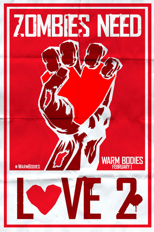
The same goes for this great tease of a propaganda poster for Warm Bodies (open February 1st). “Zombies Need Love 2” is a perfect catchphrase encapsulation of a movie that deals with the undead falling for human hearts instead of brains and the artwork is just the right mix of strong, solid colors and distressed yet bold type. Even the chunks of flesh taken out of the hand helps portray exactly what we’re dealing with here.
The same can’t be said for BLT’s regular posters making Nicholas Hoult and Teresa Palmer the main focus. It’s weird that they are in full color when the rest is not; the high contrast white text superimposed above the image only conjures memories of Zombieland; and the fake creases of the page have no relevancy to the piece. The tease might have been folded—it’s a viral poster you could see hanging in the streets. These full sheets are too polished and commercialized for that aesthetic nuance to be effective.
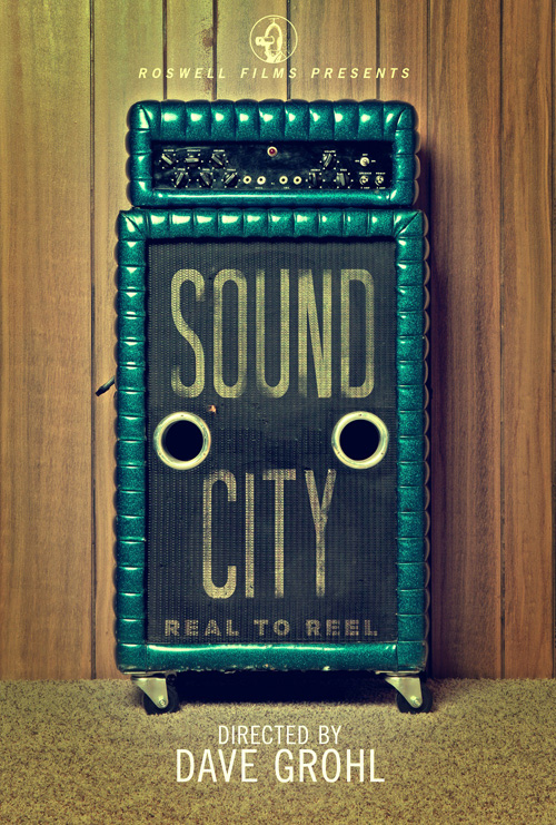
If only more firms could be like the one who crafted the advert for Sound City (limited February 1st), I’d be a happy guy. I’m a sucker for designs that use their subject matter as the vehicle to display their information.
There is a tactile feel to the photo as the body of the rug is known against the speaker wheels depressing into it and the mesh cover pattern is retained below the fading, spray painted text. It’s simple, to the point, and attractive—three things many studios could learn to accept is all that’s necessary.
 |
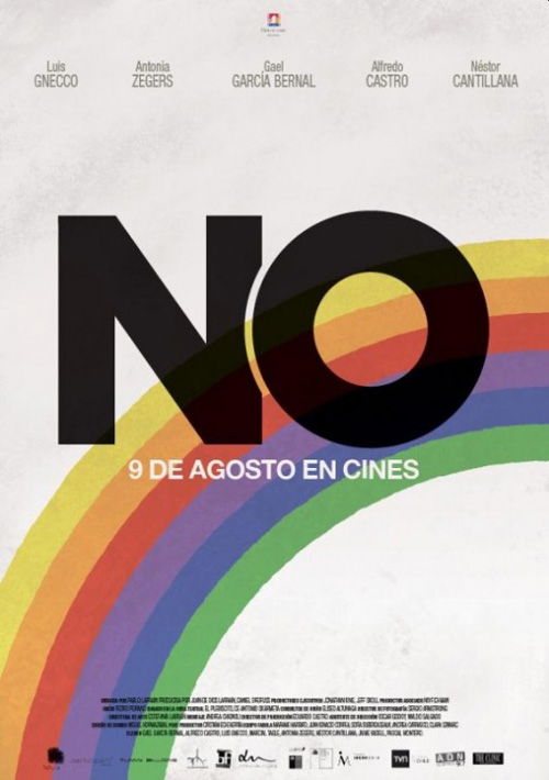
If you want true minimalism, though, look no further than the Oscar nominated No (limited February 15th). When your film is about an actual marketing campaign, why not use the actual materials you will be depicting onscreen? It’s a no-brainer.
This is the brand Gael García Bernal‘s character creates for his party’s plan to overthrow Chile’s dictator through democracy. The rainbow, the formidable “NO”, and the idea that happiness truly is on its way—none of this had to be designed today because it already was back then.
If you’re going to improve on it, improve on it. I love this second sheet for Cannes’ Quinzaine screening that gives the aesthetic a makeover. You can see brushstrokes in the “NO” for a more personal feel and the rainbow is kept but in a more streaky, watercolor bleed of color. Take the washed-out image of Bernal away and you have a true winner melding styles of two eras. Never be afraid to use real-life design when its real-life story is what’s on display.
Dream interpretation
 |
 |
 |
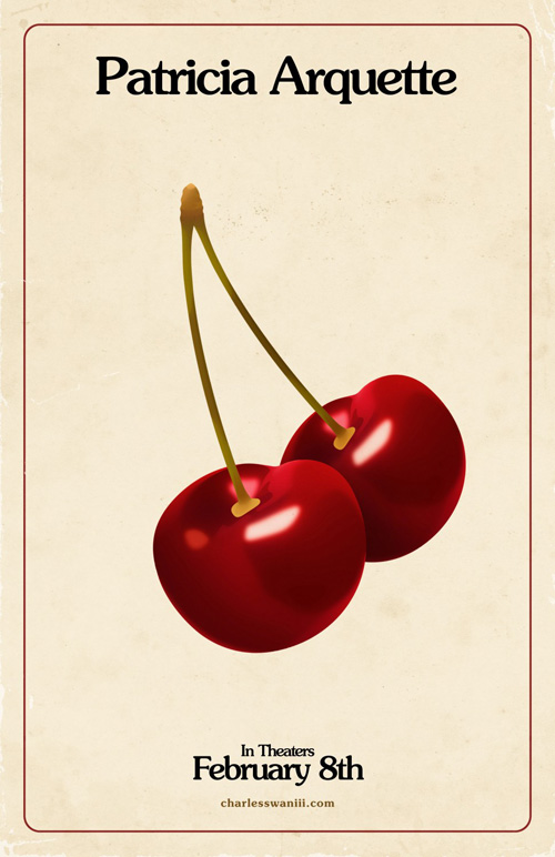 |
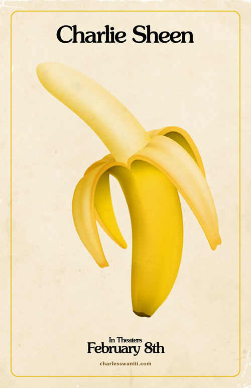
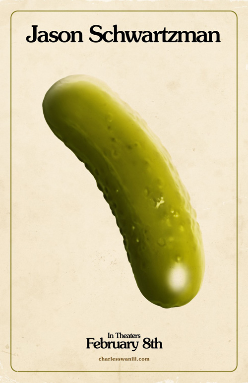
The highlight of the month above all else, however, is P+A‘s work for Roman Coppola‘s long-awaited return to feature length films A Glimpse Inside the Mind of Charles Swan III (limited February 8th). Like the movie itself, these random(?) picture associations used as character posters are just on the correct side of crazy inventiveness and imagination. You can read into them innuendo if you want or you can just accept them as they are.
 |
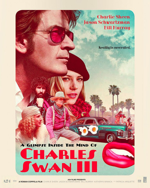 |
It’s a film chock full of detail with a literal kitchen sink thrown in for good measure so while the campaign captivates in its mysterious obscurity, it also perfectly encapsulates the feel Coppola has created. Pair them with P+A’s official one-sheet of Charlie Sheen floating with an arrow pierced through his heart above Hollywood and you’ve just scratched the surface of the off-the-wall antics you’ll be experiencing in the theatre.
The separate 70s homage poster is pretty swanky in its own right too with crisply cutout characters collaged in a soft focus for a clean overlap, but it’s just too static of an image to portray the spirit of the film. There is something about the disembodied objects that allows the brain to quickly associate them with actors and the film itself that cannot be beat. Who said anything had to make sense in order to grab your attention?
What is your favorite February release poster? What could have used a rework?

