Beyond Joker: Folie à Deux (October 4) and Smile 2 (October 18), this month is light on studio power. The indies are surely champing at the bit to fill the gap with a slew of festival darlings getting their limited releases in before Oscar voting. Searchlight, Focus Features, Neon, and A24 are all jockeying for position to earn your wallet’s trust; choose wisely.
While their posters can easily help steer your attention away from the likes of Venom: The Last Dance (October 25) and its glossy CGI, the question is whether they can also do so from each other. Or––and this is ultimately the correct choice––you can simply go and see them all.
Mathematical


There’s nothing more mathematical than a snail’s shell due to the existence of the Fibonacci sequence at its core, so I must start this section off with Memoir of a Snail (limited, October 25). I’m honestly amazed the studio commissioned more posters without the shell––it’s such an iconic graphic with which to draw us in.
What’s great about the above poster isn’t that it uses the spiral to hypnotize us, but that it uses the shell as an anchor with which to build off and surround. That doesn’t also make it our anchor where vision is concerned, though. By mimicking the coloring in its backdrop, the shape gets lost despite its size. What we see instead is its impact both as an object with an opening through which the lead character can pop out his bright head and a physical border with which to influence the curve and movement of the text above.
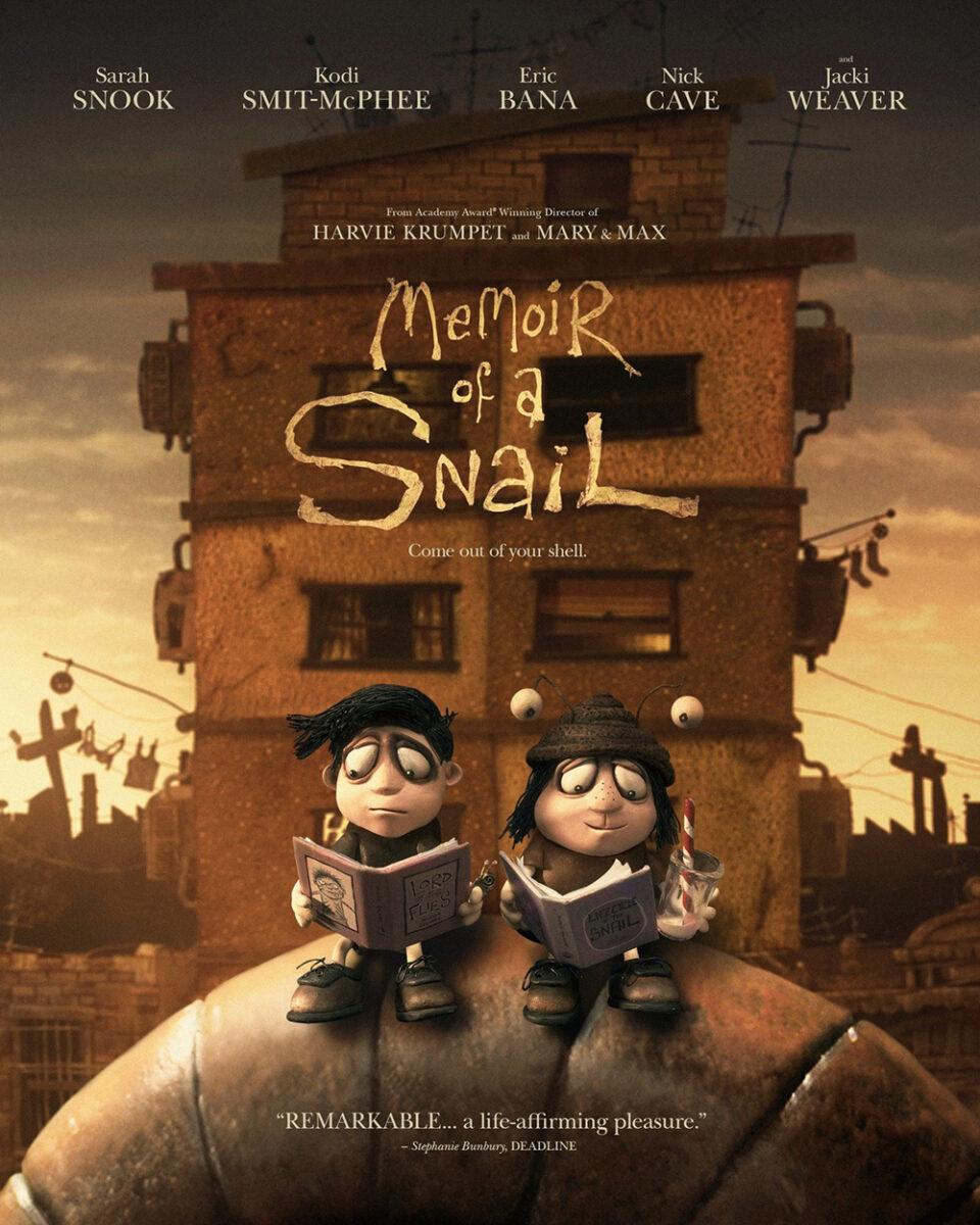
The shell becomes a sort of passive obstacle for the bright whites to compete for our interest. Whether the character or title hits us first, we involuntarily ride that curve up or down to the other.
P+A’s alternative version is effective, but we lose that energy as everything balances symmetrically along with y-axis. We read it like any other page: left to right, top to bottom. Simple. Safe.
Brandon Schaefer and Jump Cut’s Things Will Be Different (limited, October 4) moves from Fibonacci to repetition and perspective. It’s an elegant representation of the film’s sci-fi gimmick of a door that takes its entrants to a place outside of time. The keyhole thus becomes both a metaphor and a passageway––the stark contrast of deep black and bright white giving life to those moments between entrance and exit that the characters share during their travels.
And despite also being a strictly symmetrical design, that use of perspective prevents it from ever growing stagnant. Yes, we still read the page left to right, top to bottom, but we also enter it through that portal. It invites us in to not just see Joseph and Sidney in the distance, but to meet them in the middle.
Perspective is involved in Aleksander Walijewski’s Rumours (limited, October 18) too, but not in an overt way to truly fit the mathematical subhead. It was merely the easiest way to fit this gorgeous illustration into the column.
It’s a wonderful image in the artist’s singular style that allows for the main cast of government leaders to exist with equal billing as far as visual representation goes. Each has his / her head cut open at the forehead so their communal brain can be seen rising out of the columned structure housing their visages. And despite them all coming from different parts of the geographic and political spectrums, their beliefs and demands come from the same chaotic garbage fire.
The whole feels a bit busy with the text squeezed in all around the image, but not enough to ruin the experience. I love the extreme elevation inherent to the title font’s drop shadow that sets it apart from the rest. It’s as though the word is presented as a placard below the cylindrical gun barrel of politicians to warn us not to trust anything any of them say.
Retro


I love a good halftone effect and the photo manipulation on New Wave (limited, October 4) provides an excellent example. This is a moiré pattern at its finest––heavy outlines, double-vision, grainy texture. It’s ripped straight from an ’80s magazine and blown-up well beyond its resolution’s capacity.
And the designers simply let it stand. They shift all the text around it to ensure the glory of printmaking stands out against the blemished red background and purple highlights. Add that awkward yet entrancing double-W as wavelength in the title and the whole thing becomes a time machine of aesthetic we hope translates to the screen as well.
P+A’s Woman of the Hour (Netflix, October 18) goes Xerox-chic for its filter––stripping away detail in its high-contrast shift to provide a captivating duotone highlighted by tinted white flourishes via title and heart. It’s gritty and grungy with an underground zine flavor to plaster on light posts for proto-viral marketing circa a 1978 setting. And going so far on the dial makes it so we recognize Anna Kendrick’s face without having it become our focus. Because it’s really about what she’s looking at as manifested by the reflection in her eye.
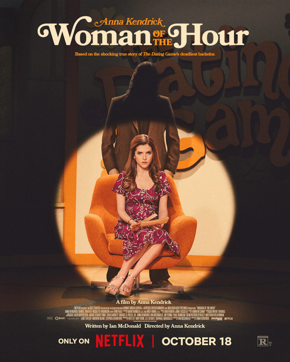
Good on Netflix for sticking with the same firm after purchasing distribution rights––P+A understood the assignment for the above festival sheet and the final at right. Because it’s more than just letting the production design scream ’70s. You must match the lo-fi grain to the flowery fonts too.
It’s a great image as well––a companion piece in its ability to keep Kendrick and the killer onscreen together while still holding them apart. Only this time she is the focal point. She’s the one in the spotlight. And yet it’s still the mystery of him lurking in the shadows that truly catches our attention.
How can you not adore BLT Communications, LLC’s decision to go with a madcap illustration on Saturday Night (October 11) à la Jack Davis’s It’s a Mad, Mad, Mad, Mad World sheet from 1963? Rather than crawling across the globe to snatch that briefcase, this version presents Lorne Michaels as Atlas carrying the weight of a circus of clowns upon his back.
It’s a perfect distillation of the SNL tone with goofy Mad Magazine caricatures that could be used as the commercial-break interstitials the show likes to supply on-air. We don’t need a cast list, either––it’s less about the actors than the actors they are embodying. Let the art speak for itself, considering the alternative is much less inspiring.


Just look at this other design. The photos of the cast look too much like the real actors to channel their characters and the text––while welcomingly vulgar––is simply too much. It’s asking us to project the actions of those words onto these harmless and static portraits when the illustration conversely renders them in the act. They say a picture is worth a thousand words; this pair of posters proves it.
Tied in knots


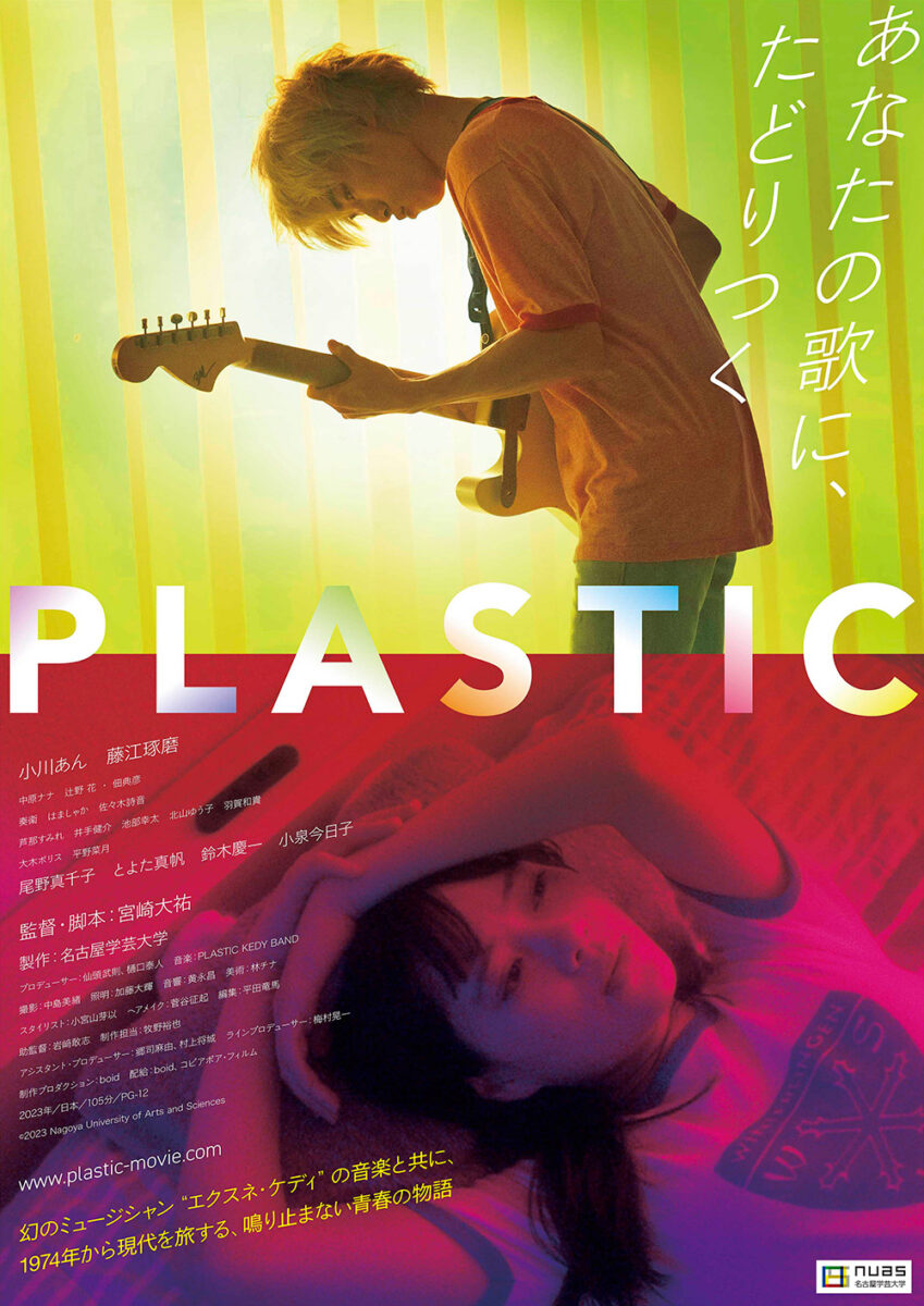
The letters are taking over Ariel Esteban Cayer’s design for Plastic (limited & Metrograph at Home, October 4). They’re like a physical manifestation of the music shooting across the split screen from his guitar to her ears. Some reverb siphons off behind him too, but most of the sound hits its target to get this “psych rock romance” off the ground.
It’s a nice evolution from the original Japanese poster. We still get the split-screen there, but not the added sense of place and direct connection. Sure, we can imagine she’s thinking about the music he’s playing, but the American sheet ensures no assumptions are necessary. And I’m a big fan of the shift from white gradient sans serif letters to fun, translucently rainbow-colored loops. Its stateside invitation lends a more playful sense of spontaneity.
AllCity goes playful with La Cocina (limited, October 25) too. The comparison to Carmy and Sid from The Bear’s first season episode “Review” helps, considering the two actors are combatively standing back-to-back while a never-ending stream of receipts prints and coils around them like a snake, but it also has a light touch on its own with the mixed media of photography and illustration––plus the escaping lobster.
My favorite part, though, is the composition. While the actors are smack dab in the middle to create a point of symmetry, the designers nicely split the rest of the content unevenly between left and right sides. All the text goes to the former. The crustacean goes to the latter. It’s somehow simultaneously unbalanced and balanced. Weighted heavily in one direction, but never enough to go into a full tumble. It teeters and totters, but never falls down.
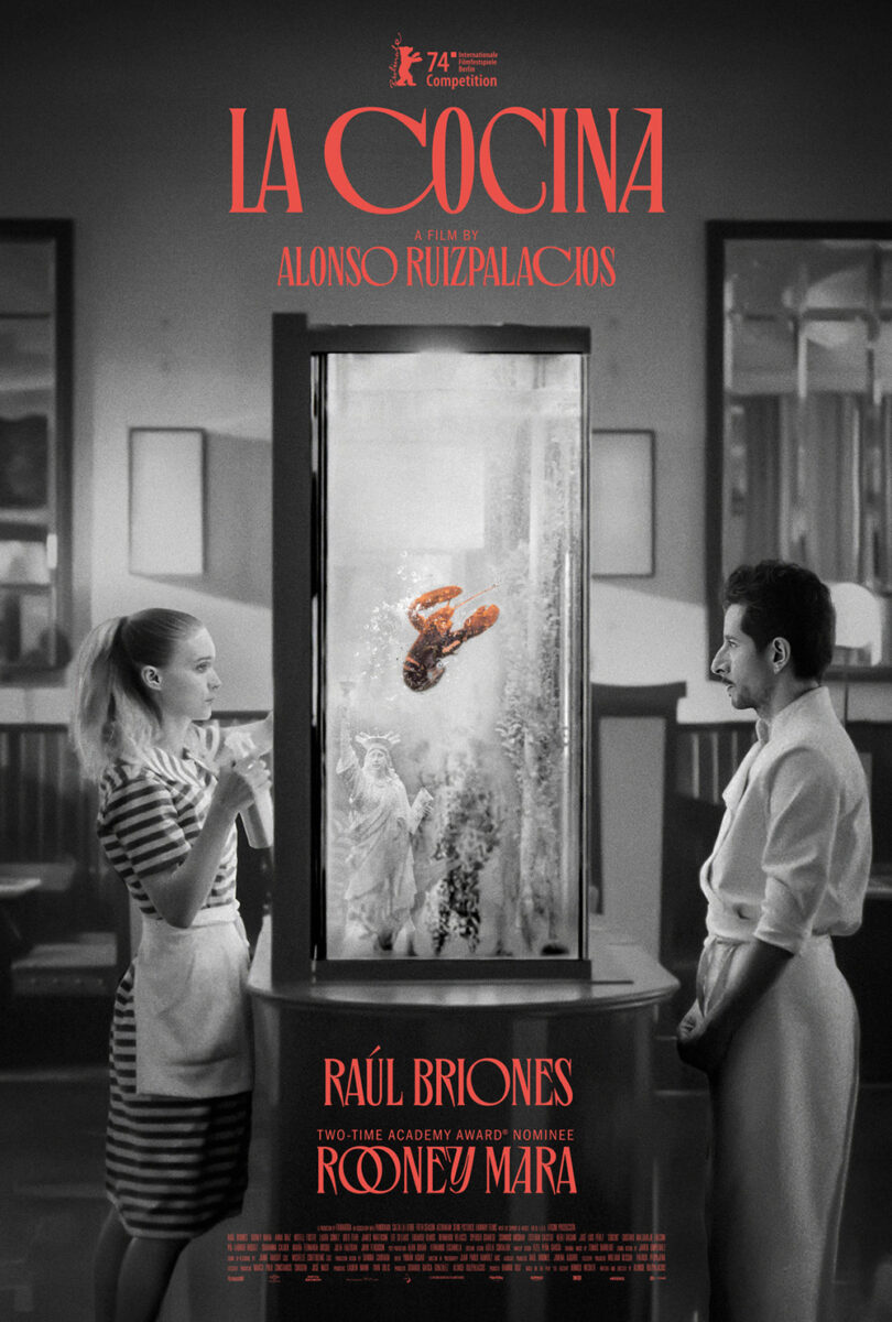
While I prefer this more minimalist version of the concept, I can’t deny the success of its more literal counterpart with Rooney Mara and Raúl Briones separated by a lobster tank. We still get the combative aura. The lobster is still singled out by color rather than positioning. The exquisite typography stays intact (because you should never ruin a good thing). And the whole remains on that symmetrical center y-axis––only this time creating a column of red to cut through the black-and-white photography.
The winner of fun this month, however, goes to Check Morris’s hysterical Daaaaaalí! (limited, October 4). If you’ve seen the film, you’ll know why it works so well. Frankly, if you know anything about Salvador Dalí, you will too.
Not only is this cartoon version of the surrealist twisted in a knot like the six actors who play him throughout Quentin Dupieux’s latest absurdist comedy, but he’s also practically giving the camera he’s holding the “wink and the gun” in a way that makes us know he’s referring to himself in the third person. What more do you need than that? This is Dalí on Dalí. An egomaniacal genius causing as many problems as solutions en route to creating a film about himself that’s as singularly chaotic as his own personality.
Add a brilliantly bold title in cursive to make certain we clock exactly how many “A’s” have been included and the masterpiece is complete.