November has sequels (Wicked for Good on November 21), festival fare (Die My Love on November 7), international Oscar submissions (Sirât, limited on November 14 before going wide in January), animation (Zootopia 2 on November 26), and remakes (Running Man on November 14). It’s about holiday box office, awards buzz, and Oscar qualifiers. Don’t blink or you may miss the one-week window to see your hotly anticipated title.
So, pay attention to the theater walls and the placards placed above or below each poster to tell you if something is “coming soon” or already on screens. Check the artwork next to the titles you’re searching for to discover something new to put on your calendar too. Because the fall movie schedule always seems to disappear in a flash.
Landscapes


Part of the cinematic adventure is to visit new places. Case and point: Piedmont, Italy courtesy of Trifole (limited, November 14). This tale of a woman searching for a truffle to save her ailing grandfather’s home is given the vista treatment of mountains and sky in the background of a vantage point staring down the curve of a hill. We see the natural beauty of the Earth alongside the regimented patterns of man via rows of plants tied to wooden posts.
And in the middle stands our protagonist—at once a blur in motion walking right to left and a static focal point framed perfectly at the center of an hourglass formed by the inverted triangle of the view above and the triangle of grass below. Her dark clothing is balanced by the large, dark letters of the title to break the poster into two halves with the credit block finding its own address outside the image. Our eyes travel one line at a time from top to bottom with a respite in the middle begging us to look through its window onto Europe’s majesty.
The landscape Empire Design uses for Sentimental Value (limited, November 7) is that of the human face. Rather than just give us one, however, the firm plays with the Golden Ratio to lead our eyes from each character to the next through their shrinking boxes. Stellan to Renate to Elle to Inga. We jump between them, creating scenes that don’t exist via the contrasting glances. Stellan looks right and Renate looks left, but our path from him to her occurs so fast that we imagine them peering into the other’s eyes.
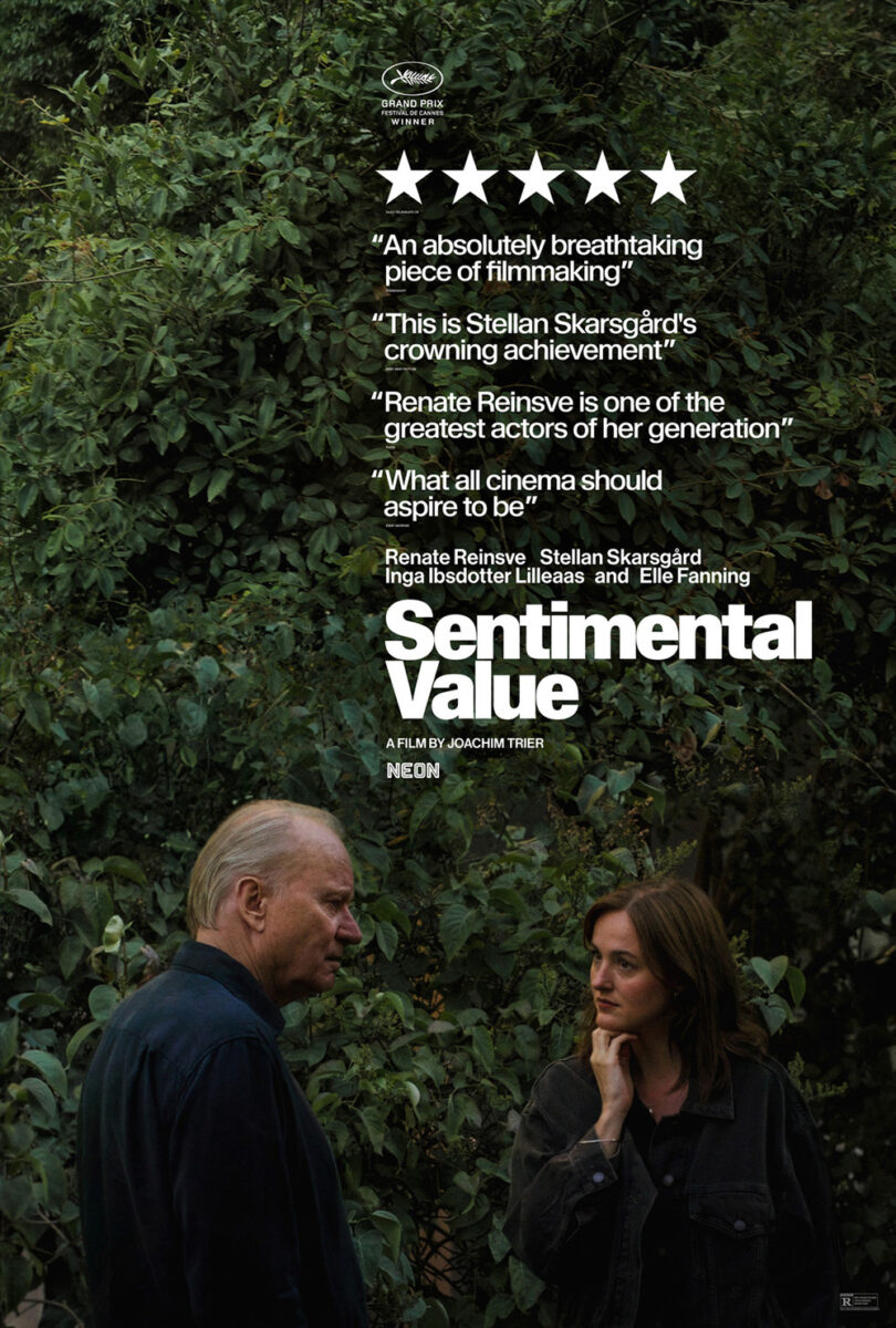
The typography is nicely superimposed atop this collage too, creating its own rectangle at the center of the page for the others to draw us through. And the way it’s placed (the critic quote butted against the top of Renate and Elle’s box and the “t” in Sentimental butting against the right side while the word itself rests on Elle and Inga’s bottom edge) adds to the geometric perfection of the whole.
I like the quote-heavy alternative as well with its more mainstream text on image presentation still creating drama due to the breadth of white space above the two actors to hold the white text. It’s simpler and matter of fact, but still attractive. One might say more attractive due to the chaotic potential of all those boxes on the above sheet, but not more interesting.
And that brings us to the hand-sewn cartography of Rebuilding (limited, November 7). Less a poster than a cover illustration considering it holds no mention of the industry via studio, quotes, or credits beyond cast and director, the gorgeous craftsmanship demands to be seen. The night sky contrasting with the daylit crops (the coloring of the RV at top lending it an inverted quality of evening as opposed to the bright white RVs below). The figures of humans and animals. The colorful fields and juxtaposition of black roads and blue river. It’s a wonderful mood piece setting a stage.
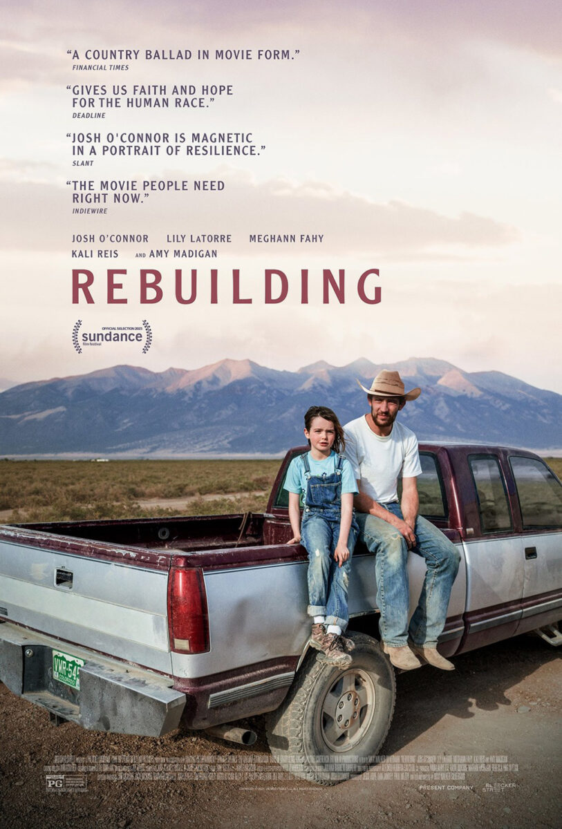
The actual poster therefore delivers a jarring shift with its injection of a lot of text and its pivot to photography with two characters sitting on the edge of a pickup truck’s bed. You still get the mountains and greenery. You still get the juxtaposition of nature and man with the vehicle taking up so much of the frame. But you can see how easy it will be for this one to get lost amongst other photo-based fare whereas the colors and textures of its counterpart would conversely pop. Advertising as an art form demands a delicate balance.
Faces and things


I’ll never stop shaking my head at the whole marketing ploy of suddenly turning Osgood Perkins films into “trips,” but you must applaud the posters themselves for creating a nice sense of dread. GrandSon’s Keeper (November 14) continues that trend with its intriguingly blurred black spot taking the place of its actor’s face.
Yes, it’s just plain unsettling, but I also enjoy the uncertainty of its intent. Are we to believe this is about censorship? That the viewer has a blind spot? Or that the viewer wants to erase this person? Or does it represent the character’s own malice? A sort of manifestation of them sucking the life out of a situation or creepily becoming unrecognizable from their mounting rage?
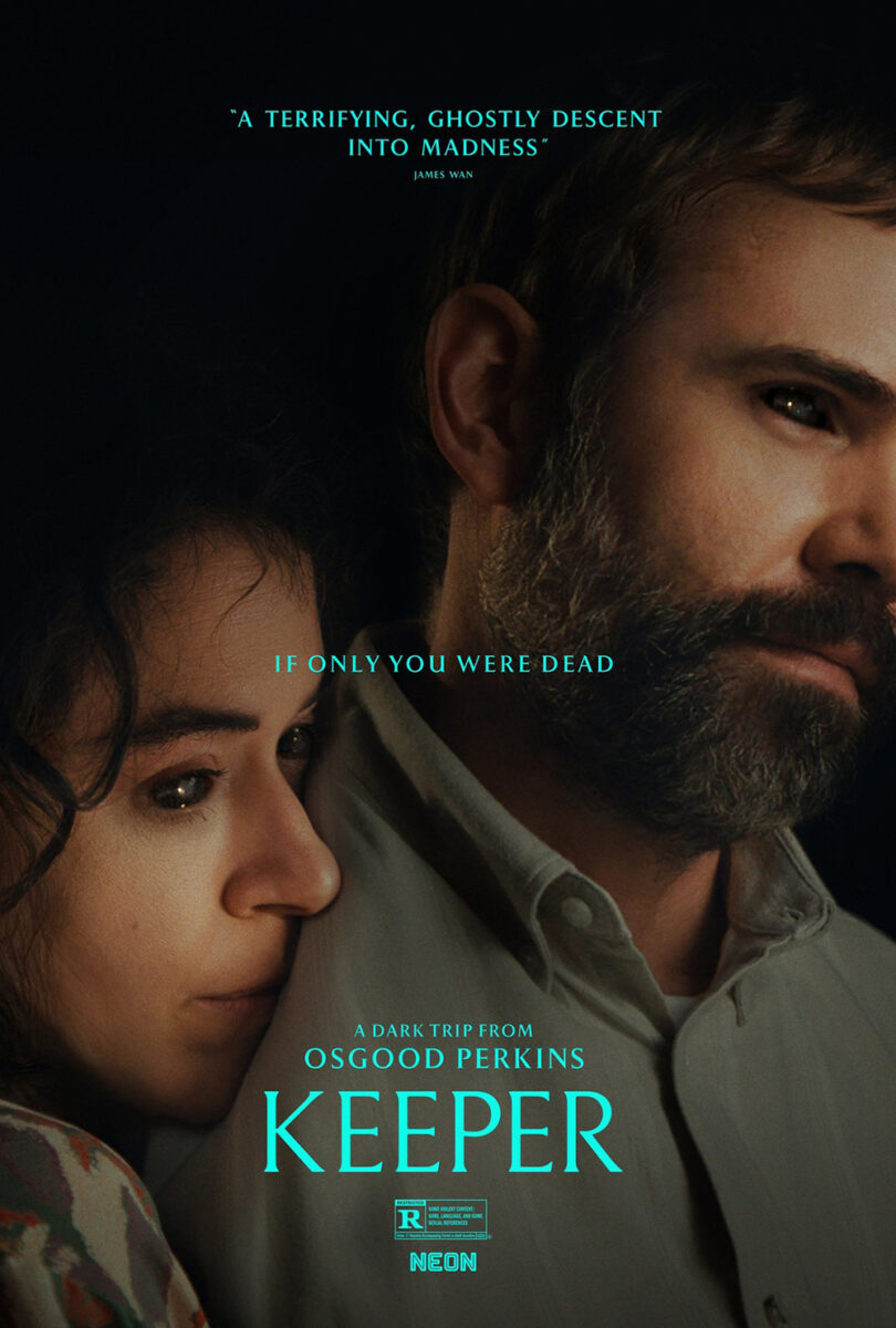
Are they the one who doesn’t like us anymore? Or do we no longer like them?
The final poster doesn’t really add clarity. It provides an extra character and changes the tagline, but, beyond their black eyes mimicking that black hole, the connection is mostly about vibes. And that’s all it needs to be to pique our interest. Because we want to find out what’s going on. We don’t want it to tell us before sitting down.
There’s a similar duality to the poster for The Things You Kill (limited, November 14), design by director Alireza Khatami himself. It uses an image from the film wherein a thin band of light highlights the subject’s eye so the rest of his face can remain in shadow. He is obviously hiding, but for what purpose? To escape the danger that he sees or to bide his time before unleashing a danger that he possesses?
Couple that uncertainty with the title and we assume violent intent exists on one side of the equation. We’re meant to therefore feel a mix of fear and excitement. To push ourselves closer to the edge of our seats before discovering which direction the truth falls. So, it makes sense to use red for the text as a means of augmenting that terror with a promise of blood.
The emotion at the center of the poster for The Thing with Feathers (November 28) is conversely sorrow. This is in part due to the synopsis talking about a grieving father, but also from the white scratches below Benedict Cumberbatch’s eyes forming tears. The whole’s muddy yellow background pushing through the actor’s monochrome photo lends it a cloud of despair as well.
We must question the formation of those tears, though, and its captivating aesthetic treatment. Rather than draw drops or ensure the image contained tears upon his cheek, the artists physically gouged the page. These are violent lines. Impulsive, angry, and uncaring about their impact on the rest of the page. They add an edge to the design that either infers he has more to worry about than his sadness or that his emotions might be clouding his judgement as far as reciprocating with violence himself. It simultaneously reveals the internal and external cost of one’s pain.
Intimate pairs


Embrace #1 comes courtesy of BLT Communications, LLC and their poster for Hamnet (limited, November 27; wide, December 12). In it we see Jessie Buckley and Paul Mescal looking sad, his hand atop her shoulder and their heads touching with hers on his. It’s a delicate and emotive pose—painterly in its composition and the illustrative foliage creeping in from the edges to consume them into the earth.
What really stands out, however, is the confidence to let this gorgeous image speak for itself. The actors’ names are small and in the upper corners (for once actually aligned with the correct person too). The title is perfectly centered with filmmaker and tag small enough to disappear into Buckley’s dress. And the credit block at the bottom in thin fonts fades away as well.
Because this is about the love shared by its two subjects rather than any industry doctrines. Loss countered with compassion. A moment frozen in stasis to be overgrown by nature without relinquishing any of its power to studio names or time itself.
Daughter’s Daughter (limited, November 21) goes full painting with its orange reds turning blankets into bodies as its mother’s embrace proves less about comforting the receiver than it does the giver. Because this is a woman removed from her children by geography, death, and time. A woman struggling to cope with loss via memory and imagination.
One daughter sleeps. The other peers from behind the couch. And the mother smiles in the knowledge of their presence in her heart. It’s an attractive piece with precisely positioned Chinese characters that help to frame the figures rather than distract from them. I’m therefore surprised the final poster didn’t bring this festival aesthetic along for the ride despite portraying a similar scene.
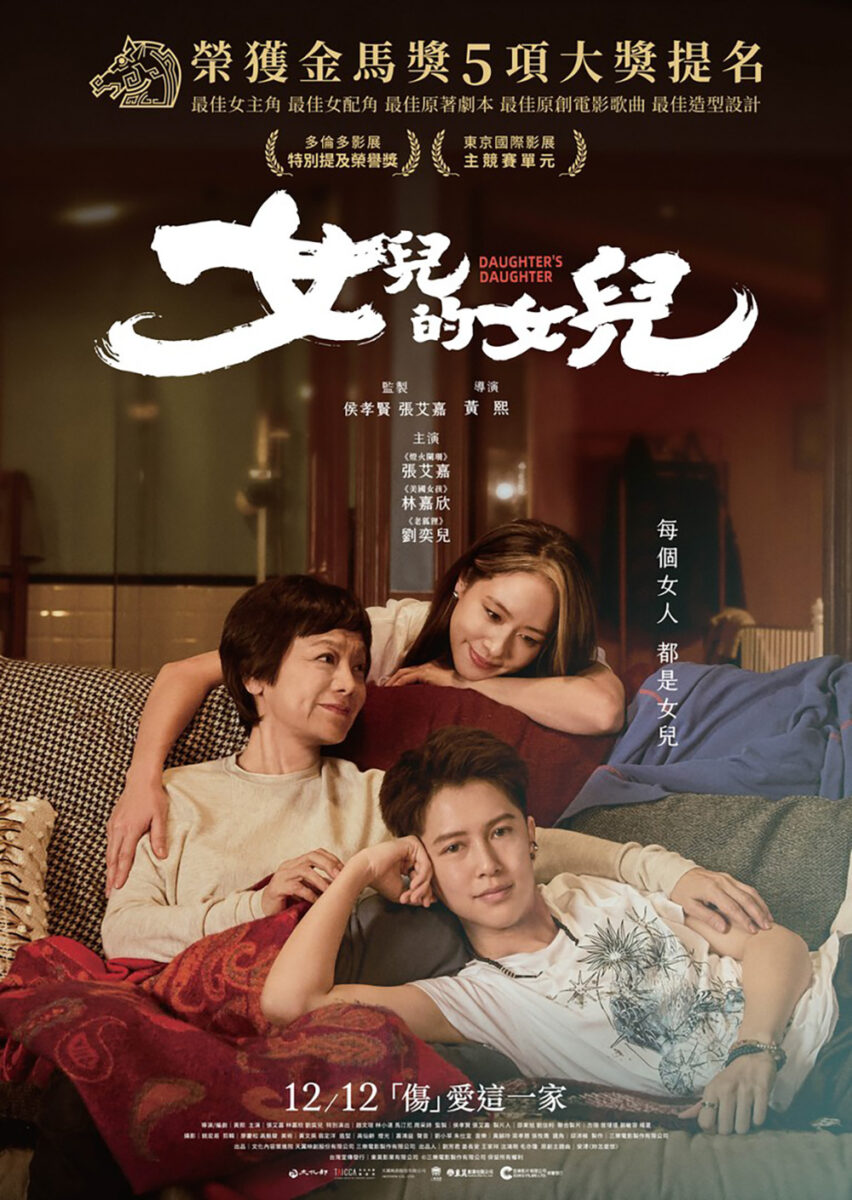
This photographic iteration is obviously a happier one, though. The melancholy is replaced by joy now that all three women are awake and smiling together. It probably sells the film better to audiences as a hopeful family drama, but it also might misrepresent the looming tragedy at its narrative’s back.
But that’s easy for me to say since I’ve already seen the film. Sometimes a great poster like the above speaks louder after the credits roll.
With a similar approach as Hamnet, Peter Hujar’s Day (limited, November 7) possesses a sumptuous texture that provides its grainy photograph its own painterly sheen. Its characters aren’t in an embrace, but the dynamic remains intimate in both the way they look at each other with love and friendship and the fact that a microphone lays between them to capture each other’s vulnerability on tape.
And it again knows its image is too good to be overshadowed or hijacked by the requisite sales information of its medium. So, the designer pushes all text to the bedroom wall in the top right and the shaggy duvet at the foot of the bed, ensuring the crisscrossed bodies between earn our full attention.
Our eyes follow their diagonals in a slow slope downwards with Rebecca Hall’s head angling us to Ben Whishaw so his body can push us further to the title. We float down like a feather from left to right and back again until resting at the bottom. Is it a portrait worthy of Hujar’s own artistic talents? Maybe. Perhaps it is at least something Allen Ginsberg can get excited about after rejecting the word “portrait” outright.