June proves another solid month for posters. Here’s hoping it’s the continuation of a trend that will keep pushing through to the winter and not one last gasp before the summer ushers in the usual avalanche of glossy photo collages.
If the indies keep coming (many below were first seen on the 2023 festival circuit), we should be in good shape. Because despite falling way behind the studios in terms of screens, they will always outnumber Hollywood in terms of titles. That’s simply the state of the industry today. You must sift through the noise to find the prize.
Supernatural


Jordan Scott is back with a new feature 15 years after her debut Cracks with Fable at the helm of the marketing campaign. Their first sheet for A Sacrifice (limited, June 28) presents a seemingly normal landscape rotated ninety-degrees so that the horizon line turns vertical. A forest scene at the edge of a lake, the foreboding atmosphere created by the darkened sky gets us in the mood as the details give us pause as far as what plane of reality is shown.
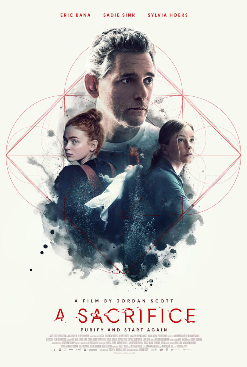
Because at the center of the quasi-hourglass shape formed by the tagline and title is a woman in white. She would always be our focal point due to the brightness of her gown and the parting of the long grass in sync with those words, but she becomes one even more due to the depiction. While we don’t question the rippling of her reflection in the water at left, we must question the rippling of her physical body at right. Is she fading in or out? Is she a promise of hope or despair?
The second sheet isn’t as effective insofar as instilling a mood since the campaign pivots to a more generic collage of actors, but it does captivate. The addition of geometric shapes creating a pattern beneath them alludes to a scientific aspect that perhaps counters the notion of the occult presented in the synopsis and the title takes up the woman’s mantle by shifting and breaking in a ripple of electric interference and/or fluid refraction.
Where Scott’s film supplies a potential for otherworldliness, Humanist Vampire Seeking Consenting Suicidal Person (limited, June 21) gives an overtly supernatural characterization––subtly. Despite Sara Montpetit’s character being a vampire in the film, Midnight Marauder’s poster doesn’t fall prey to the easy desire to make certain we know it via fangs. Instead, there’s just a single drop of blood at her mouth to augment the title and allow our minds to connect the dots.
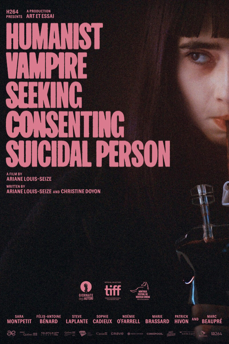
What I really like about that drop, however, is its rendering. This is a composition consisting of a photograph and text––a background and a superimposition. The delineation is made more obvious by a grainy texture to the image that makes it so the crispness of the text pops above the softer focus of Montpetit’s face. Rather than let the blood fade into that backdrop by also putting it under the grain, though, Midnight Marauder places it atop the photo as if it’s on a piece of frosted glass.
The effect puts the blood on the same level as the text, elevating its importance and clarity from merely a feature of the image in a broader sense to a specific point of focus all its own. It proves a fantastic visual flourish to guide our eyes across the page while also adding a little metaphorical context to the narrative considering Montpetit plays a vampire who refuses to kill or feed. Removing the drip from her chin is therefore a commentary on the sort of imposter syndrome going on. One could wipe it away
You don’t get that same depth of story with the original Canadian sheet of Montpetit drinking from a blood bag. It’s still an intriguing image considering we’re culturally used to seeing vampires feed from a victim’s neck, but it lacks the mysterious duality of the US sheet.
The poster for The Vourdalak (limited, June 28) leans into those culturally assumptions, becoming purely about aesthetic in the best way possible through its homage to classic cinema both through typography and imagery. And the former isn’t just the Old English calligraphy of the title either. It’s also via a tagline that conjures the soft projection of intertitles during silent films.
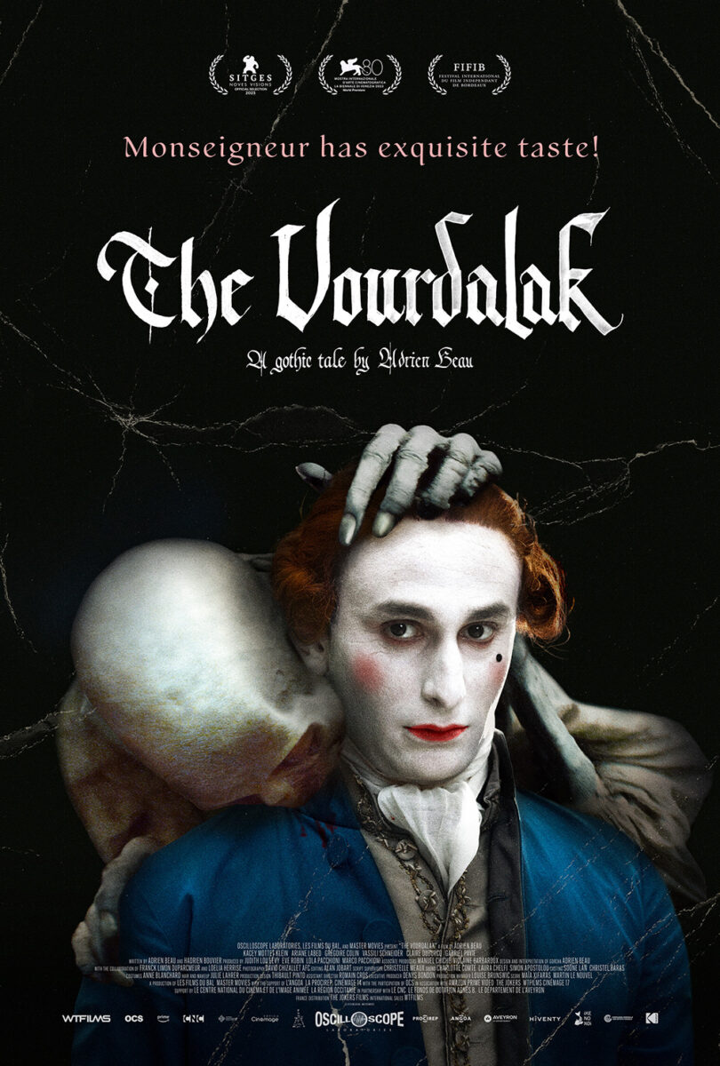
The image is what strikes me most, though. The almost paint-like colored-in-post look, the heavy make-up, and the skeletal being climbing atop this man’s shoulder to do what the previous vampire won’t. It feels like a snapshot from a play as much as a still from a silent classic––the artifice boldly proclaiming its presence rather than sheepishly pretending no one will notice it. This is a meticulously planned presentation meant to sell us on the nightmarish possibilities of the art. It evokes an era of cinema uninterested in CGI or AI. An era of craftsmanship and ingenuity that seeks to bring fantasy to life with a physicality unmatched by computer effects.
It’s no surprise the English-language sheet pretty much just translates the text, maintaining the integrity of the original with the addition of some cracked folds. When you have a winner, don’t reinvent the wheel.
Separated


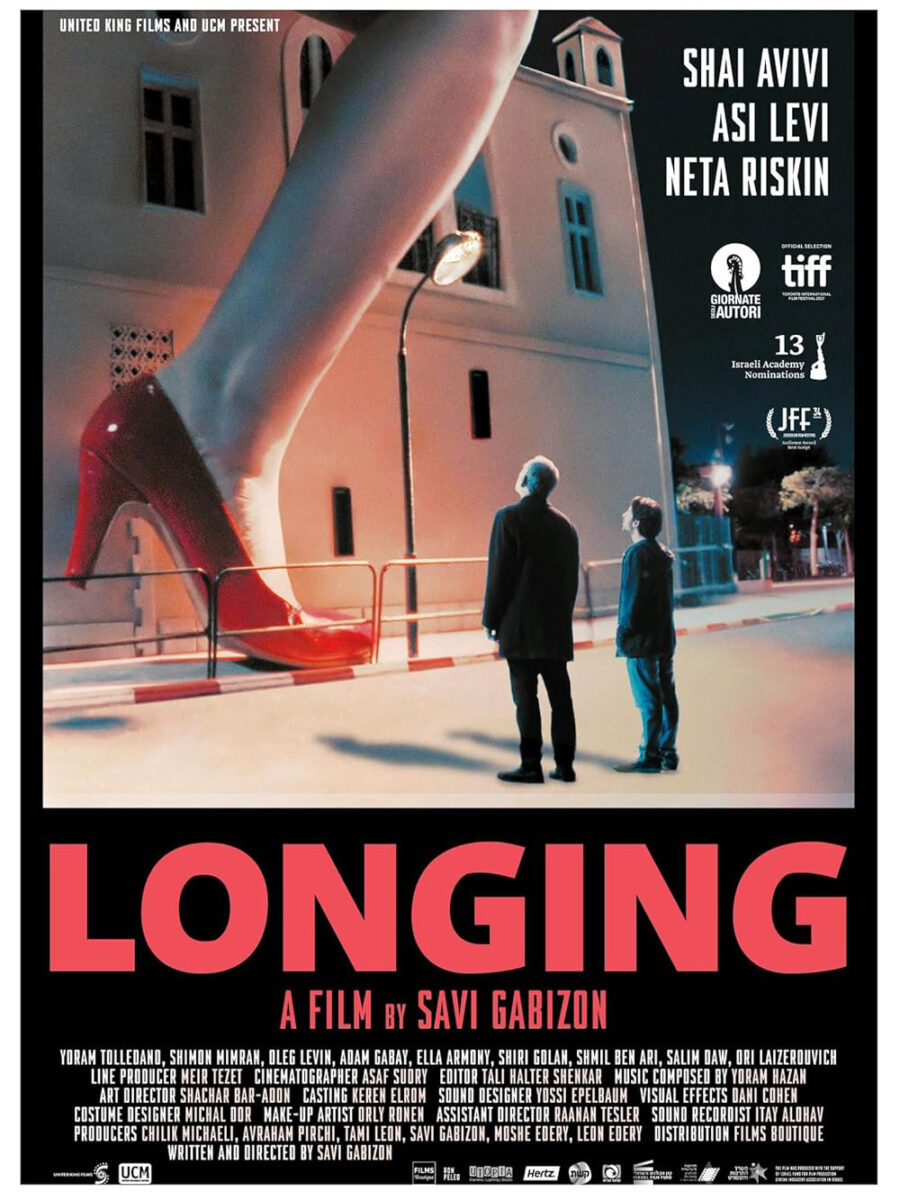
I have no clue what’s going on in Jensen Logue-Lee’s poster for Longing (limited, June 7) and I don’t want to find out since the surreal scene seems best experienced in the moment on-screen. It’s two people standing in the foreground, looking up at a giant foot in a red high-heel shoe presumably attached to a giant woman walking between them and the building in the background. Is it fantasy? Hallucination? A monster movie?
You can’t see this piece on the wall and not want to find out more about Savi Gabizon’s English-language remake of his own Israeli film. And you must imagine the distributor knew this fact considering it had worked before when selling that previous iteration. This one is more photo-real in its juxtaposition, but the concept and blocking are identical.
Where that one uses scale to separate reality from fantasy and/or characters from illusion, P+A’s sheet for Janet Planet (limited, June 21; wide, June 28) uses what appears to be a mirror to separate parent from child. Young Lacy is in all three segments of this triptych––slightly shifted by the differing angles of the reflective surfaces despite each being made to seem flat by a close crop removing perspective. Her mother Janet is only in one, looming large above. Combine that concept with the title and Lacy becomes a satellite orbiting Janet’s celestial form.
The image is an attractive one on its own, the shift to vertical turning a common scene of life into a faux film strip readying to flicker past our eyes. The text placement is therefore paramount so as not to ruin this newfound sense of motion. By putting one word of the title at the top and the other at the bottom, this kinetic illusion is actually augmented by the extra work needed for us to bring them together. Our minds drag them closer, figuratively bringing the edges in like the inside back cover of a Mad magazine, compressing the title to eventually meet in the middle.
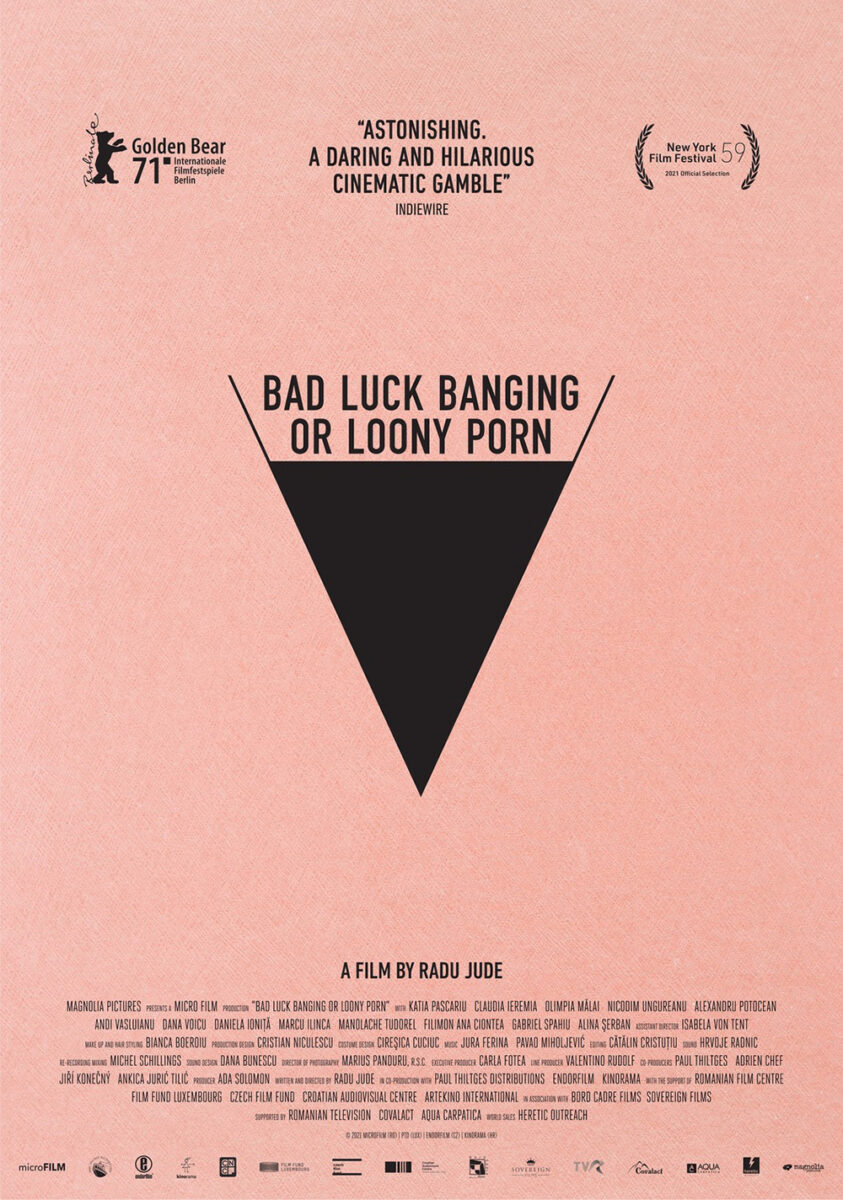
Vasilis Marmatakis’ Kinds of Kindness (limited, June 21), with photography by Atsushi “Jima” Nishijima, is more literal in its partitions if not its subject matter. Here we have three triangles (representing the three chapters of the film), each with its own identifiable motif: broken tennis racket, water droplet, and severed thumb. And in the middle is a collection of disembodied hands––three holding onto one to stop its bleeding. Let Arnold Estefan’s poster for Bad Luck Banging drift into your head and this layout might even become sexualized as a pair of spread legs too.
It’s the type of imagery that begs you to watch the film. Not as much because it sells what said film will deliver, but because you want to know what it all means and hope that watching might provide the answer. That’s the beauty of director Yorgos Lanthimos and designer Marmatakis’ continued partnership. They are creating complementary work in two separate mediums that speak to each other rather than for each other. The latter’s posters seek to evoke the feeling the former’s films incite. They pique interest through abstraction rather than representation––a lesson others should copy.
Some examples work better than others. I’m sure people dislike the above and love the second’s collage of faces, but I’m the opposite. Maybe it’s too simple? Too literal despite its desire to confuse and excite? The previous motifs get lost in the chaos and the faces that aren’t a large Emma Stone, Jesse Plemons, and Willem Dafoe at top become lost in the abyss. The only part I do find transfixing is that one man at middle right who doesn’t seem to be repeated anywhere else. It’s not Yorgos (despite a bearded resemblance). And he isn’t any of the top-billed actors either. Identifying him becomes the pitch.
Brushed


There’s big “book cover” energy with the poster for Chronicles of a Wandering Saint (limited, June 28). The credit block text is so tiny that it almost disappears in order to let the painted image and title stand alone. And it’s a cutely funny painting too: a look inside a cathedral as three women gaze upon a fourth rising into the air while we bear witness to the man and pully system making it happen. The “saint” aspect is therefore introduced as fake, but we can assume the film will somehow render its intent real by the end.
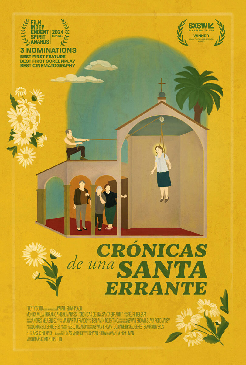
It’s fun to compare this English-language sheet against its Spanish counterpart to see all the differences. I like the former best in how it removes the clutter so the illustration can breathe, but I also like the brightness of the latter even if the faded quality of the other lends to its aged jacket appeal. And it’s interesting to see the carryover of the decision to lift the “of the” higher than the rest of the title’s x-height. It’s an odd choice in both (especially since the text has been switched from bold to italics already), but at least it’s justified in the English version due to the descender of the “f” needing room to exist.
So, which was actually created first? I assumed the Spanish poster due to this being an Argentinian film, but so many of the details make it seem as though the English one was the base instead. It’s the one that needs those two words raised. It’s the one with fewer laurels. What an interesting conversation placing them side-by-side creates.
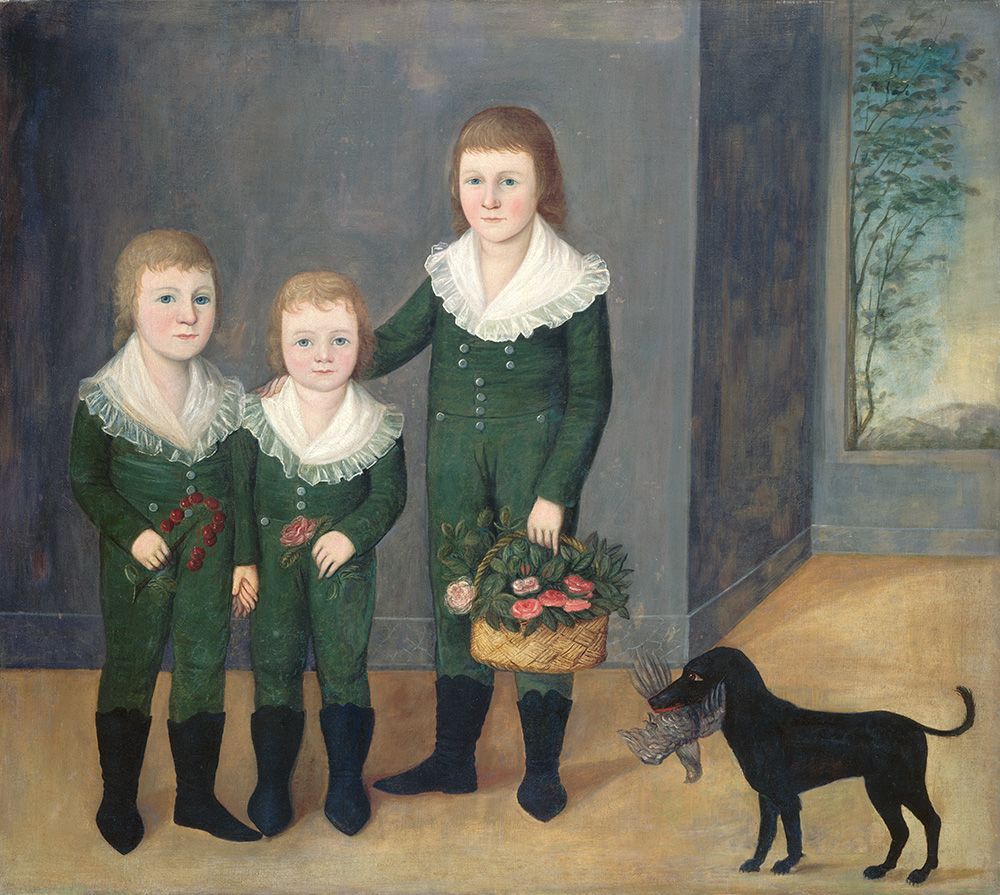
(version_industries) and Caspar Newbolt also go the painted route for Family Portrait (limited, June 28), but from a wholly different angle. Rather than create something from scratch, they have gone back in time to reappropriate an old master painting: Joshua Johnson’s The Westwood Children. That canvas becomes the source of these three sets of eyes, cutout and repositioned for the shift from landscape to portrait as their bodies become lost within the void of a highly textured field of muddied color.
It’s a memorable piece that alludes to the film’s disappearance of a character while trying to take a photo of the group. There’s mystery in that absence of form and horror in the fact that these eyes stare at us unperturbed, as though they know what happened and might in fact be the cause. And there’s a symbolic read of Shakespeare’s quote that “the eyes are a window to our soul” included as well. What more do we need to immortalize ourselves than them?
And from just eyes to everything but, we move to Tony Stella’s gorgeous posters for Music (limited, June 28). Both are seemingly quick studies that seek to leave the hand-made touch in each brushstroke and color wash as they create scenes of motion amidst an ever-changing title broken up by letter to gradually lead our eyes down the page.
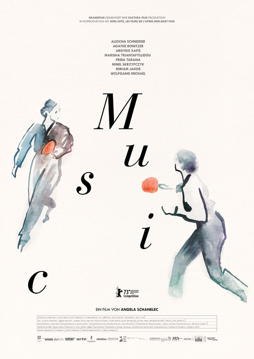
The German version has two people engaged in what appears to be a game of ping-pong. The French version shows a couple in embrace. The title fills the expanding gap between figures in the former, each letter a potential ping-pong ball. And it compresses and escapes the closing gap between figures in the latter so as not to get crushed and lost within their impending kiss.
There’s a lightness to both compositions that enhances the sketchy sense of kinetic energy imbued by the minimalist aesthetic. It’s that energy that also transforms the letters of the title into notes on a scale for those who wish to read it literally. We move from one to the other, left to right, each providing a chime that creates a song for moments that are at once coming into focus and fading away.