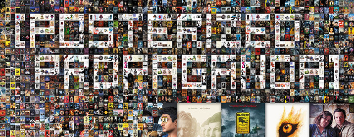
“Don’t Judge a Book by Its Cover” is a proverb whose simple existence proves the fact impressionable souls will do so without fail. This monthly column focuses on the film industry’s willingness to capitalize on this truth, releasing one-sheets to serve as not representations of what audiences are to expect, but as propaganda to fill seats. Oftentimes they fail miserably.
Disney (again) and Tarantino takeover this month and it’s not the best thing for creative diversity when theaters only have four Fridays at their disposal. Add the re-release of Avengers: Endgame to try and squeeze past Avatar for box office supremacy and real estate will be hard to come by. So it’s crucial that the little guys get the word out to steal some attention their way. And a few of the campaigns below do exactly that—if your market is brave enough to bring them to town. Sadly fewer and fewer places outside of the big metropolises have that ability anymore.
Face-to-face
Nothing turns a head faster than a white man’s face covered in Nazi tattoos, so InSync Plus (who I do believe designed every A24 poster this month to set themselves apart as the studio’s go-to firm) does exactly that with Skin (limited July 26). Despite being directed by the same man who won an Oscar for Best Live Action Short Film in February, this is not a feature expansion on that piece. Instead it concerns the true-life reversal of Bryon Widner from violent skinhead to activist in search of redemption—a journey set to the painful sessions he underwent to remove those “patches” covering his body.
It’s therefore a no-brainer to put Jamie Bell (a dark horse in the Best Actor conversation) front and center with full regalia intact. The first critics quote becomes crucial towards understanding “redemption” is coming for this man, but the imagery is provocative enough to pique interest regardless. That sense of hope definitely helps to sell a ticket when audience members may not want to just watch a brutal drama of racism, but the latter’s power is what grabs you first.
F Ron Miller delivers a different face for David Crosby: Remember My Name (limited July 19). This one has a comedic flavor with the singer shirtless and smoking while precariously holding an American flag wrapped gun to his temple. It’s an absurd bit of imagery that promises to go beyond the music into his personality and politics. So why not have some fun and use a photo less interested in regal portraiture than candid freedom?
And where it lets the frame breathe with white space, B O N D refuses to follow suit with their tease of Spider-Man: Far From Home (July 2). This thing is a strange-hold of oppression with the superhero pressed against the lens so we can see every single tourist sticker affixed to his mask. Will he actually end up hitting all these places during the course of the film (Prague, London, Venice, Swiss Alps, and Berlin? Who knows? It depends on what Nick Fury orders.
It’s not the best poster, but it does standout if only because it doesn’t look like BLT Communications, LLC’s Photoshop project with floating torsos on a metallic spider logo that looks like a design of tuning forks. The tease may be generic, but at least it’s not boring. Thankfully BLT increases the fun quotient with their IMAX sheet by adding some illustrative flair, but the cardboard cutout adults remain stiffly stood-up at the bottom.
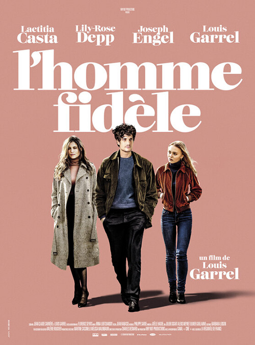
Leave it to Akiko Stehrenberger to therefore bring some electricity to this section with A Faithful Man (limited July 19). It’s not her best work in that it’s really just portraiture squeezed into a frame, but it’s playful and colorful with a vintage look. Putting the title in cursive lipstick is a perfect touch too to complement the bright pink smooches left atop Louis Garrel’s cheeks.
Put it against RYSK’s French version of masked-out actors walking with artificial shadows and it’s even better. I do love the font choice here, though. The lowercase thick to thin from verticals to horizontals is attractive and almost distracts us enough to ignore how the actors are just slapped on and left to fend for themselves.
The gang’s all here
Is it still a floating head collage? Yes. But there’s personality to the poster for Sword of Trust (limited July 12) anyway due to its slapdash, off-the-edge composition. The whole thing is a little wonky with director Lynn Shelton’s credit tilted one way and the title tilted in about five different contrasting directions. Those heads therefore become an enclosure that points us inwards to read the vertical construction of text—an arrow pointing upwards so we can read down. And you can’t tell me Marc Maron starring straight into your soul isn’t off-putting since the rest look off-screen. Unsettling is still memorable.
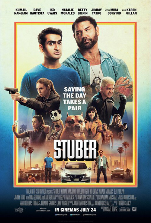
So too is funny, the thing that Concept Arts puts front and center with their tease for Stuber (July 12). From Kumail Nanjiani’s look of wide-eyed discomfort to Dave Bautista’s tough guy squint to a dog that neither seems phased by between them, it’s a wild scene of claustrophobic proportions. The comedy of the scenario is there even if you don’t get the full details until watching the trailer.
BLT’s final poster loses that spontaneity with a busy mash-up of every single actor in weird positions that say nothing. By making Bautista unnaturally 50% larger than Kumail so that he can look down upon him with a disparaging teacher to student gaze, you lose the situational rapport. The line-up of supporting players melds together since none are given the room to standout; the tagline just shoe-horned in at center makes it difficult to read let alone spot; and the doubling of the stars at bottom is more “We have to put something here” then “This is where they go.” The old school 70s drop shadow flair on the title is nice, though.
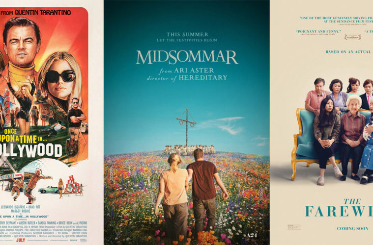
If you have to Photoshop a bunch of people in a line, at least make it purposeful like with InSync Plus’ The Farewell (limited July 12). Why they had to when they could have theoretically gotten the actors to pose together is the problem here. My eyes see more shadows than people because the hope of faking a common light source to remove its fabrication failed.
As a composition it is serviceable, though. The quotes and tag aren’t too big to distract from the characters and the image is allowed room to exist without fighting against the title. If they got them all in the same room to snap a photo, it would have been great. And if you tell that’s what this is? I say it’s time to hire a new re-toucher.
This is why the only way to really succeed with composite imagery is to stick to illustration like BLT did by having Steven Chorney draw their Once Upon a Time in… Hollywood (July 26) key-art. There’s a line of folks at middle, but they form a triangle to mimic the one created by the trio of large heads at top—driving our vision instead of stagnating it. The title is in the middle now and it’s on a background that allows it to pop without getting bogged down by its surroundings unlike Stuber. Add some scenes at the bottom to break the frame early and not keep things enclosed and you create visual excitement.
WORKS ADV’s teasers did nothing of the sort with their cutout actors on blurred backdrops of Hollywood. These things were so poorly received that they became memes on social media and inspired Alphaville Design (Midnight Marauder & Studio Stella) to draw up a concept that should have been completed from the start. Looks pretty close to what BLT did, doesn’t it? Coincidence? Probably. But also evidence that there’s a correct way to do this stuff.
Off-kilter sensibility
It’s simple yet effective: Gravillis Inc.’s Mike Wallace is Here (limited July 26) going with a lined halftone to mimic old tube televisions and provide context as well as content. This could have easily been a full-color photo a la David Crosby above, so the decision to hew closer to how he’d look to America during his heyday rather than portraiture is worth mentioning. I’m not so hot on the title treatment (the “is here” isn’t a subtitle and thus isn’t in need of being smaller), but its bright yellow coloring works nicely against the grays to earn attention from across the room.
B O N D goes a bit off-the-beaten path with this Real D 3D sheet for The Lion King (July 19) too. Rather than showcase the computer animation (yes, this is an animated film regardless of what Jon Favreau would like us to think), they take a painterly approach with ample white space to create a quarter of “life’s circle” in the jungle. They throw out the main plot to deal directly with Simba’s formative years in exile. There’s his best friends Timon and Pumbaa, their food of choice (grubs), and their “Hakuna Matata” strut.
It’s a cool departure since most theaters are going to just plaster their walls with the full-frame character sheets anyway (see Simba putting paw into paw-print). Place it alongside LA’s lion eye with a comparable style for Dolby Cinema and you receive true artistry removed from what’s on-screen. It’s like Rafiki’s drawing: hand-made rather than computerized for that sense of love the hyper-real aesthetic risks losing.
Like Mike Wallace, HBO’s poster for Share (limited July 26) eschews convention for intrigue as their glimpse of Rhianne Barreto is put under a motion blur that can’t help but create a tense feeling of uncertainty. It’s very well composed with the fuzzy edges countered by a sharp sans serif font and the stillness of an eyeball remaining in focus to the right of center. Your own eye becomes drawn to hers to know her fear and worry about her safety. It reminds me of the sheet for Margaret, but with a more visceral sense of foreboding energy.
And while it doesn’t possess as much weight, Canyon Design Group’s The Art of Self-Defense (limited July 12) takes off-kilter to another level by rendering the whole just as effective in portrait as in landscape. All it takes is one quote block and one scene of characters at a ninety-degree angle to ensure a counter-clockwise turn won’t ruin the style. Someone will still be upside-down in both directions, the text stays legible, and the comedic nature of such stoic faces continues to shine.
This latter aspect is a key factor to the poster’s success because the simple act of having Jesse Eisenberg look constipated in karate effort conjures laughter despite its dramatic trappings. That line dark comedies toe is on full display to turn what should be a generic marketing idea of characters on flat color backgrounds into an unforgettable one.
Bold banners
There’s a rough draft quality to Rojo (limited July 12) that really works for me. Just look at the central image of Dario Grandinetti and how the designer applied a “multiply” filter on him so the red circles beneath come through his pants despite retaining opacity on his head and hands. His clothes therefore become penetrated while his body does not—his part in the death of the man at his feet unavoidable no matter how hard he tries to distance himself from it.
As for the design itself: what’s up with those circles? Are they the middle of the “Os” enlarged and placed above or merely an artistic element to give the actors something to complement besides a plain cream background? They could also construct a Venn diagram in that their overlap creates a new color. We’re filtering one version of what happens through another to attempt a stab at finding the truth.
Along the same line of design for design sake is I Do Not Care If We Go Down in History as Barbarians (limited July 19) and its stark black text on white imagery. It’s not enough to simply put a title on the page without photography or graphics, though. How the cast and crew is segmented at bottom is meticulously done with an interesting breakdown that highlights cinematography and editing away from jobs such as costume design and sound. In the end it’s just a block of white above a block of black (housing logos) to ground things and let the title float alone, but it could have been much messier with no one batting an eye. Its purpose intrigues.
If you want something that really stands out, however, look no further than Sam Smith’s The Mountain (limited July 26). This is a gorgeously minimalistic piece with two chairs facing each other in a beautifully colored room above an eccentrically composed high-style stencil font. Your initial desire is to give the photo meaning via the title—to create mountaintops with icecaps out of the folding chairs’ deliberate wire-framed cushioning. But maybe that’s not what’s happening at all. Maybe it truly is just two chairs actors will eventually sit upon. This mystery of the unknown that lets us conjure meaning out of nothing therefore becomes its greatest strength.
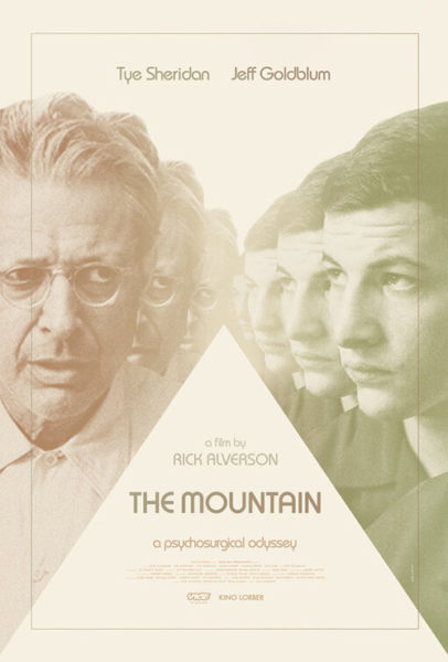
His second poster doesn’t work nearly enough with its repetitive faces fading away. There’s a triangle giving “the mountain” literal form as the characters simultaneously move closer and farther from us. It’s going for an almost psychedelic aesthetic devoid of color to get at the surgical precision of the tagline and yet proves too sterile in its emptiness of motive when compared to how its predecessor creates tense anticipation in its physical emptiness for whoever is about to arrive.
The unbalanced intrigue that second sheet tries to build is exactly what Midnight Marauder accomplishes with this tease for Midsommar (July 3). It’s a disturbing image masked by beauty much like the film itself. Why? Because the child is covering its face with the flower—hiding potential ugliness (physical, emotional, or psychological) with an objective form of rebirth, joy, and promise. Truth is thus contained until the last possible moment with us as viewers left uncertain of whether we’re coming or going considering this could be the child’s back or front with each arm facing the opposite direction for a fifty-fifty chance of life or death.
That sense of dread is absent from InSync Plus’ more polished photo-based work. The one of Florence Pugh and Jack Reynor walking towards an odd looking May pole is only weird because of the (demonic?) symbol we believe it’s doubling as. And the other with Pugh in tears is more laughable than suspenseful (my thoughts on the film itself) because it comes across as a Greek pledge distraught about a bad grade more than someone in mortal danger.
What is your favorite July release poster? What could have used a rework?

