The new year is in full swing with its January doldrums making way for another February chock full of Oscar-qualifying films receiving their limited and/or platform releases nationwide. Sure, there are some wide releases too like another Scream sequel (February 27) and another The Strangers prequel sequel (February 6), but they are merely the counterprogramming against Oscar nominee re-releases and international runners-up since horror sells big year-round.
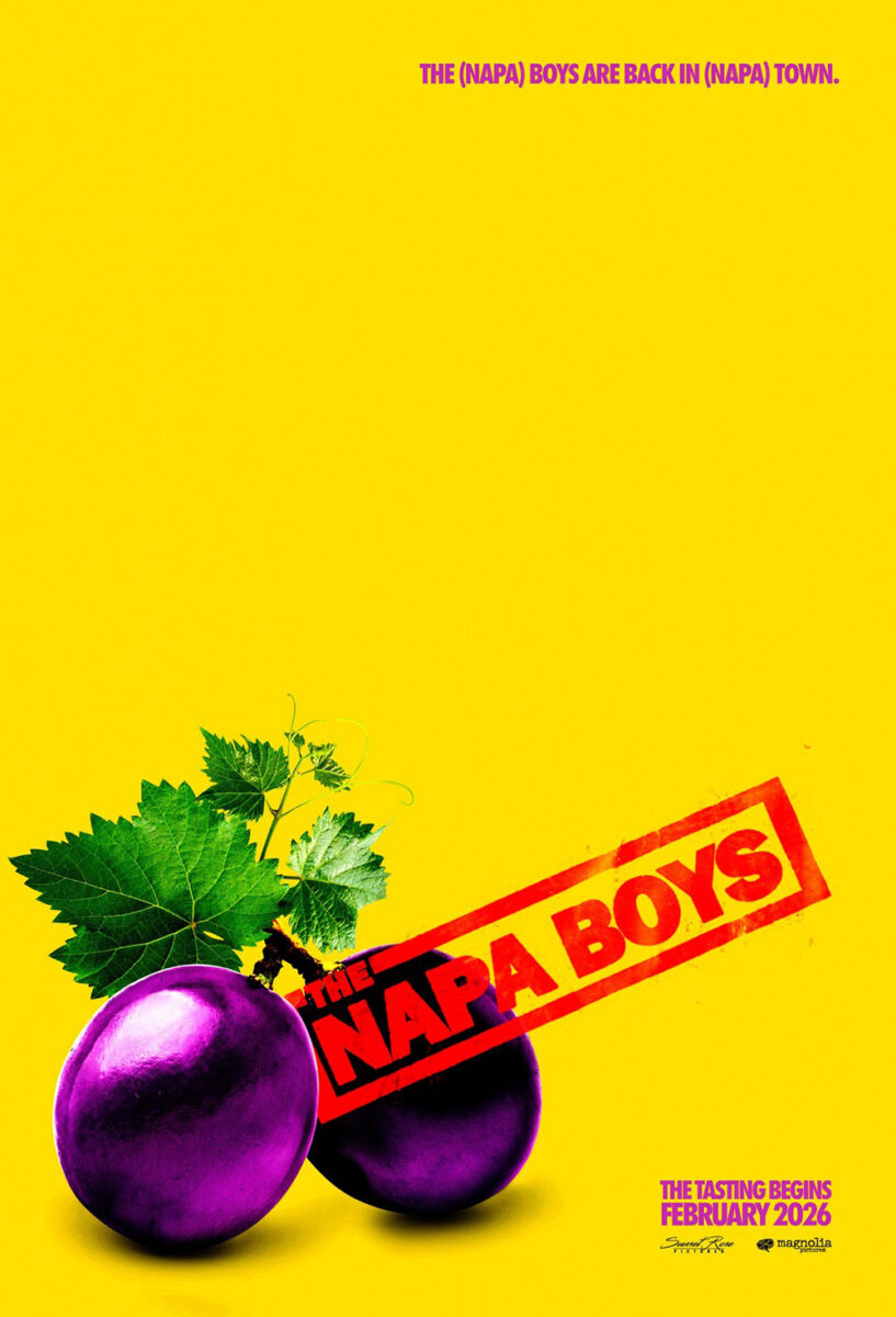
So, look past the glossy images of scary masks and animated basketball-playing anthropomorphic animals to seek out films with producers willing to commission art befitting of their own to sell them. Sometimes that’s a high-brow piece of singular creativity like the final trio highlighted below. Sometimes it’s an expertly crafted yet lewd gag like Mark McGillivray’s The Napa Boys (February 27).
Whatever works.
What a character


One mode used for blanket exposure is the character sheet. Create a template and substitute the actors amidst a generally bland scene of flying embers. Or, as evidenced here, a legitimately appealing sense of composition and ingenuity.
Are Derek Gabryszak’s Crime 101 (February 13) posters doing anything particularly unique in their concept? No. The text is static with the actor’s name and image switching between cast members. But while the only visual elements carrying through are the fold creases on the left side (top and bottom corners), the cropping technique also holds true conceptually.
The actors are pushed to the top half of the frame so that everything above the bridge of their noses is cut-off. It provides a sense of drama and urgency. There’s motion too with Chris Hemsworth exiting his car and Mark Ruffalo barking orders into an intercom. It’s gritty. Impulsive. It sets a scene.


You simply don’t get that in the full cast versions by Empire Design. The box collage never feels like anything more than cut and paste. The other two try to build a vibe with a masked silhouette making way for a skyline and a bridge for floating heads (although I do love the motion created by the latter’s swooping curve courtesy of Gary Dalton). Dealing with one actor at a time sometimes just gives you more freedom.
(On a side note, isn’t it wild that none of these have the Amazon MGM logo? They’ve all been built as teasers without a full credit block, but to leave off your studio seems more like a mistake than a conscious choice.)
The same can be said about Hunting Jessica Brok (limited, February 13). The Robot Eye’s full sheets do well to mask out the characters and combine them into the usual totem of importance (and/or billing), but they lack the malleability necessary to stand out from the crowd like their individual counterparts.


This is where the designer can spread their wings. Go edge-to-edge title text. Remove the counters from the letters to supply a larger space when converting them into windows. Bring each actor’s face through the openings to ensure their expressions aren’t covered. It’s a bold, staccato scream as each word is punctuated by our eye’s need to read them one at a time before seeing the person within.
The device also works for films that don’t have a sprawling cast. Pillion (limited, February 6; expanding, February 20) only wants to highlight two main leads? Why not give each a character sheet anyway to earn extra real estate on the theater wall?
One might posit that it’s not worth the trouble, but what if the duo works in tandem? What if Eddie Loughran and Empire Design specifically chooses images that provide context to the other via their collaboration? Because it’s not just the sexualized, drenched close-ups of these men and the wonderful lowercase title treatment in play. There’s also the fact that one wears a lock and the other a key.
More than that is the way the Desiree Nasim builds off these two to deliver a third with the exact same typography (albeit merged into one) and a brand-new reference point for the men as big dog and little dog. This is an intentional visual conversation that carries through the entire campaign.


And, if you don’t have the space to post all three? There’s always Eileen Steinbach’s German-language sheet to get the same point across with one minimalist depiction of chain locked into a heart.
What a tease


There are some great examples of teaser posters this month too. Look no further than GrandSon’s How to Make a Killing (February 20) and its spin on the Polo Ralph Lauren logo courtesy of a Grim Reaper on horseback with sickle. It’s the perfect representation of Glen Powell doing Patrick Bateman. Ivy League douchebag smiling as he slits your throat. Simple. Clean. They even threw in a pun via the tagline.


Is that what the movie is about? I honestly don’t know. To gaze upon the film’s other one-sheets, however, would lead me to believe it is. Whether GrandSon’s family tree or Empire Design’s jail cell front gate (both with photography by Gavin Bond), the Bateman allusions are obvious. The only question is whether you think the thicker font of the former or the sleeker example on the latter will impress your brunch friends more.
When it comes to Nirvanna the Band the Show the Movie (limited, February 13), I don’t know if the tease is actually effective or simply effective for me considering I am very familiar with Orbitz since my uncle was a convenience store chain general manager back in the 90s. He would bring back a ton of product samples from tradeshows for my sister and me to try when we went over to visit. I wouldn’t know what bubble tea or boba was until two decades later, but I knew this specific drink was disgusting.
Have I thought about Orbitz since? No. Did this poster send me right back to 1996? You bet. And that was the point. Regardless of my familiarity with any iterations of this Kurt Cobain-less Nirvanna (which is zero), I found myself desperate to know what Neon was advertising here. Sometimes that’s all it takes to sell a ticket.


Good on them for continuing the thread on Empire Design’s reveal of Matt Johnson and Jay McCarrol riding that bottle through the sky like Marty Supreme rides his ping pong balls (courtesy of BLT Communications, LLC). It’s goofy, makes no sense, and delivers the exact tone you should expect upon sitting down in the theater.
A successful tease doesn’t always have to be funny, though. Yes, we can expect Emerald Fennell’s “Wuthering Heights” (February 13) to possess some comedy considering all her scripts from Killing Eve to Saltburn, but WORKS ADV’s composition is anything but. This is lustful. Dramatic. Ornate. The lace treatment on the title is magnificent.
Sure, the tagline is tongue-in-cheek considering one can imagine the fabric of those letters coming undone via rips and frays, but I don’t think that’s its purpose. It’s about sex and falling victim to temptation. It’s about the voyeurism of peering through that sheer curtain at their kiss.


You don’t really get that with the checkout aisle romance novel cover that followed. It’s still a kiss and still the same title treatment, but you lose the sensuality for Hay’s Code purity. There’s no electricity here. The tease makes it feel the actors don’t want Fennell to yell, “Cut!” This one makes it seem like they can’t wait for her to do exactly that.
BLT Communications, LLC’s character sheets are similarly staid, but it makes more sense as profile portraits separate from the emotion of proximity and action. I love the shift in wall texture and color to better align with character personality … but I wish the frames changed too.
What a sheet


AV Print went wild with their illustrated posters for Good Luck, Have Fun, Don’t Die (February 13). While we don’t get to see long stretches of the many iterations of Sam Rockwell going back in time to try and find the right combination of people to join his crusade to save the world, his manic performance makes us feel as though we have. So, it makes sense to just extend the wires around his head into a hurricane of memories, objects, and overlaps for his brain to process and spit out verbally sans filter.
This is a case where the energy of the poster matches the energy of the film. The plot is too convoluted to try and distill it down into one image, so represent the vibe instead. Food. Robots. Rats. Cast names. Swirl it around so that our main takeaways are the title, the star, and the experience.


It’s the perfect payoff from the text-based teaser showing only Rockwell’s thumb on his dead man’s switch—itself a great juxtaposition with the title asking him not to die despite the image seemingly telling us that survival is fully in his control. And while I don’t hate the eventual full cast poster that gives faces to the names, it does lose a lot of that chaos by pushing the collages to the sides and presenting Rockwell as Moses parting this technological sea.
Just wait until you see the body attached to that giant cat head in the top left corner.
From busy to simple, we move to Midnight Marauder’s The President’s Cake (limited, February 6) and its gorgeously ornate design that’s feasibly been ripped straight off a mosque’s wall. Its beauty is just a façade, though. A glimpse of opulence and wealth with Saddam Hussein’s waving visage at its center signifying strength and leadership.
What the film quickly reveals, however, is that reality is actually destitution and depravity. Peasants who cannot afford to feed their families due to trade embargoes and rations are still forced to celebrate their president’s birthday with a cake that literally takes food out of their mouths to bake. I’m almost surprised there isn’t a tear asking us to pull and see the truth hidden beneath the lie. That’s for the film to reveal itself.
And that brings me to MUBI’s My Father’s Shadow (limited, February 13) and D.A. Jasper’s amazing painting of Ṣọpẹ́ Dìrísù’s titular father carrying his son on his back. I love the style with its seemingly photo realistic detail smudging into an expressionistic dream-like aura. Then there’s the color shift (Or is it a metaphorically relevant transparency shift?) that turns Dìrísù’s bottom half into the same warm red of the sunrise behind him and the use of the sky’s blue for the text to peel the whole into separate layers of perception and reality.
It’s also a perfect example of the benefit to MUBI’s consistent credit block layout pushing the requisite information to the bottom with very small text. Adhering to that template means the design team has the entire top four-fifths to work with and play in without a need to sacrifice emotion for utility. The title treatment can go dead center. The critic quotes can stack down the middle to create a waterfall of words for our eyes to follow. It’s about finding ways for the text to work with the image rather than compromising the image to facilitate the text.