“Don’t Judge a Book by Its Cover” is a proverb whose simple existence proves the fact impressionable souls will do so without fail. This monthly column focuses on the film industry’s willingness to capitalize on this truth, releasing one-sheets to serve as not representations of what audiences are to expect, but as propaganda to fill seats. Oftentimes they fail miserably.
—
Summer is coming to a close with a five-Friday August jam-packing all the leftover big budget actioners that have been biding their time to distance themselves from the likes of Iron Man 3 and Man of Steel. The last couple family-friendly flicks like Planes (open August 9) drop to close the season and the descent into Halloween begins with some indie thrillers.
A few festival favorites finally see the light of day too, but they’re overshadowed by train wreck rubbernecking for the now infamous The Canyons’ (limited August 2) debut as well as boy band One Direction’s concert diary courtesy of Morgan Spurlock (open August 30). So it’s popular names and critical successes, two categories that I guess don’t need much creativity when a hive mind consensus on design tropes will suffice.
Gimmickery 101
 |
 |
 |
 |
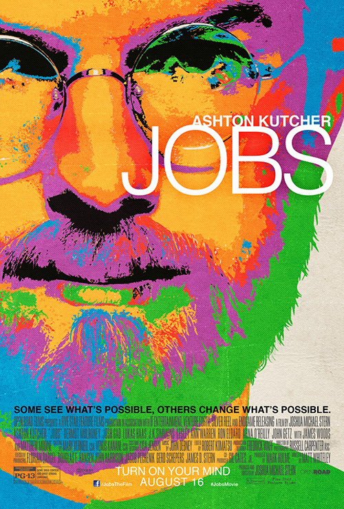
I think it’s time for The Cimarron Group to actually dig deeper into the hive and pull something else out because their sheet for Jobs (open August 16) is pretty god-awful. I honestly don’t know what is happening because Ashton Kutcher does bear a resemblance to the titular Steve Jobs, so why not let him be seen devoid of the vomit-inducing color filter? It seriously looks like the artist accidentally hit a color inverse before saving and never checked the file when sending it to print.
I love that some are comparing it to old iPod ads too. Now that’s a stretch at best. (Where’s the silhouette?) And if the imagery itself didn’t look cheap enough, the weird overlapping of its all caps, thin sans serif star’s name and film title picks up the slack. One more ‘flourish’ that looks like a mistake.
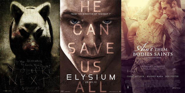
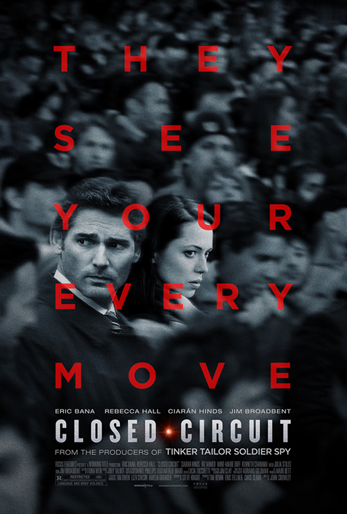
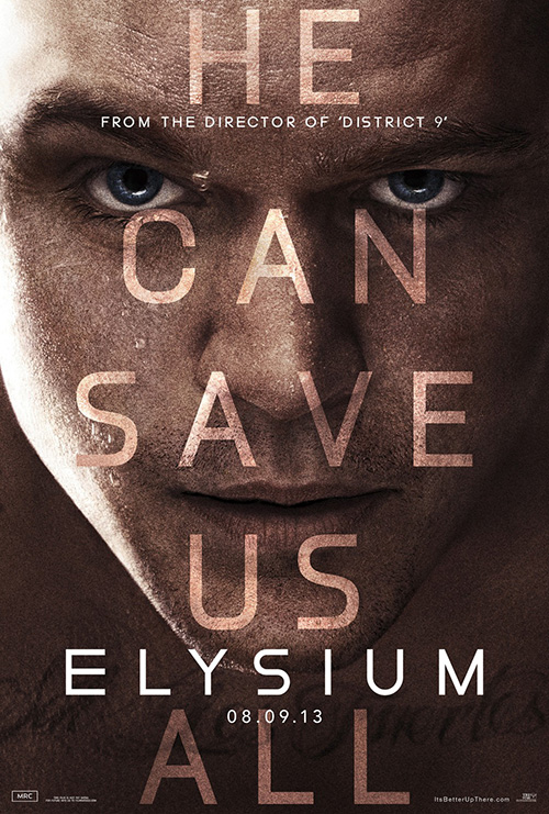
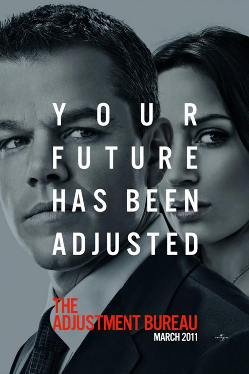
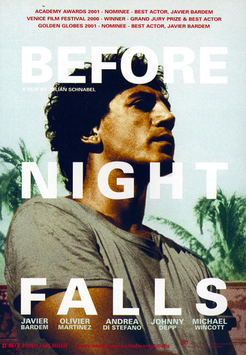
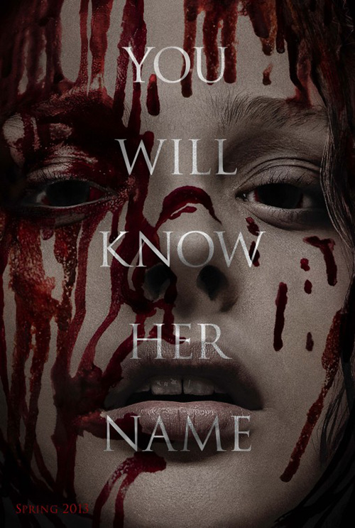
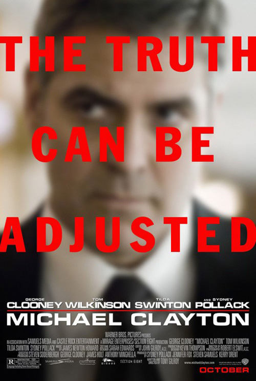
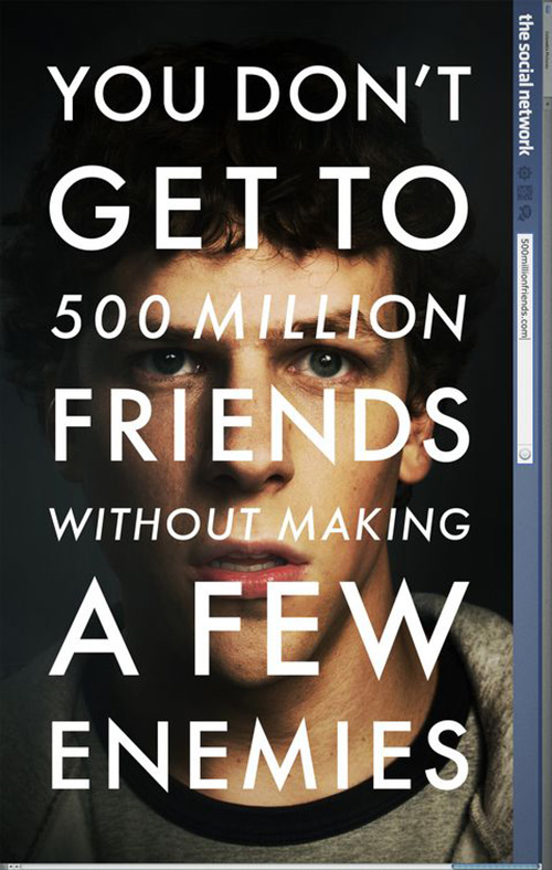
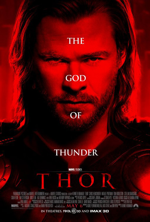
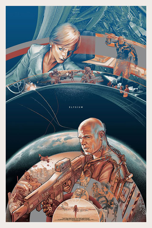
Should I at least give them credit for trying something new, though? I definitely can’t give it to my usual favorite firm Gravillis Inc. or cold open for their respective attempts on Closed Circuit (open August 28) and Elysium (open August 9). Talk about going back to the well—we need to retire this design trope once and for all.
Seriously though, look at all these:
 |
 |
 |
 |
 |
 |
 |
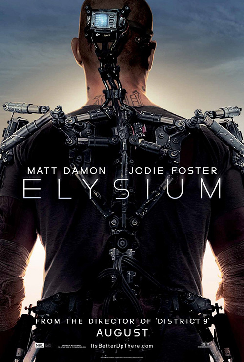 |
Its day has come and gone. If your tagline is that important, use it by itself. Or maybe these actors are simply too sexy to be seen in full force? Perhaps Matt Damon’s face will just enamor moviegoers so much that no one will remember to buy a ticket.
At least Elysium got a Mondo limited edition from Martin Ansin to class things up a bit. It may not be the artist’s best, but it’s better than Erector set and sweaty faced Damon. Or maybe that’s just me.
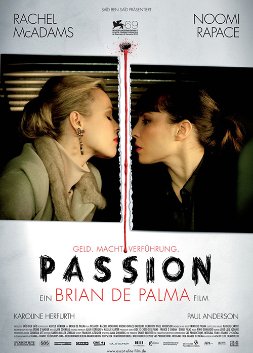 |
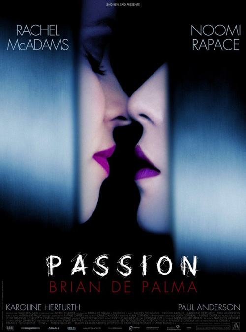
Thankfully, however, Passion (limited August 30) found someone to give it some allure in its sex appeal. I’m far from a fan of the film itself, but there’s no denying this shot of Rachel McAdams and Noomi Rapace won’t get butts in seats.
The steely blue is a perfect contrast to the usual warm reds of lust; the ultra thin font is attractively stark and cold; and it’s fun to know exactly whose lips and noses those are without full faces or cheesy graphics. Just compare it to its German counterpart and see how the same idea can be disastrously neutered if handled wrong.
Characters galore
 |
 |
 |
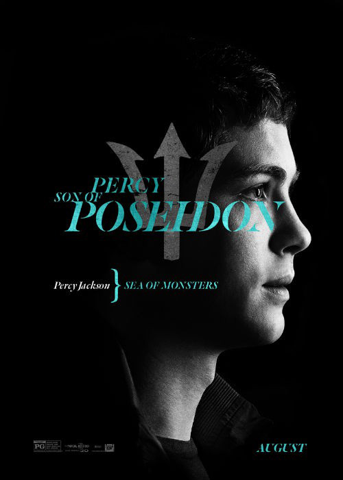 |
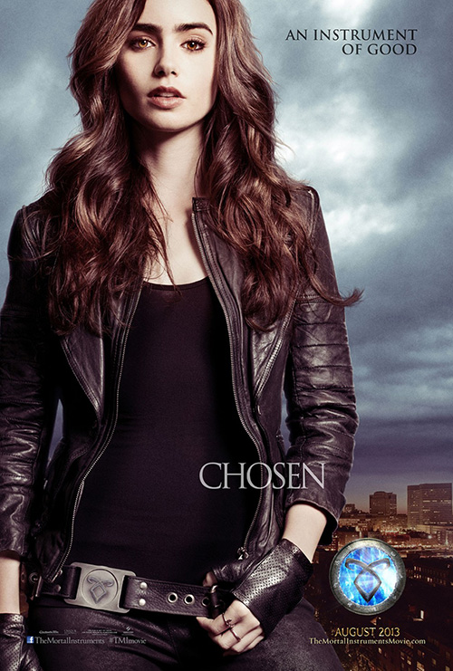
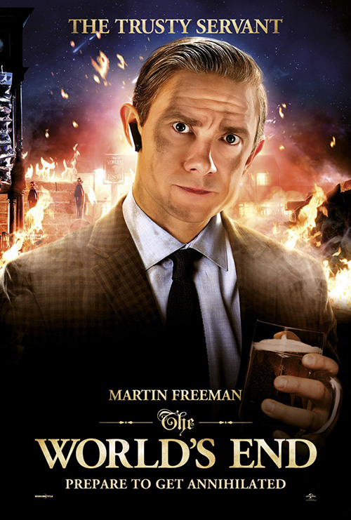
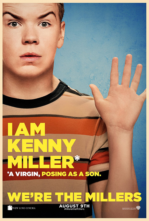
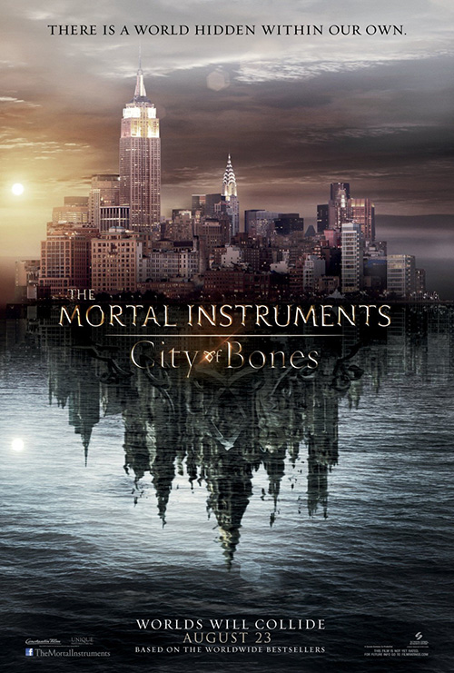
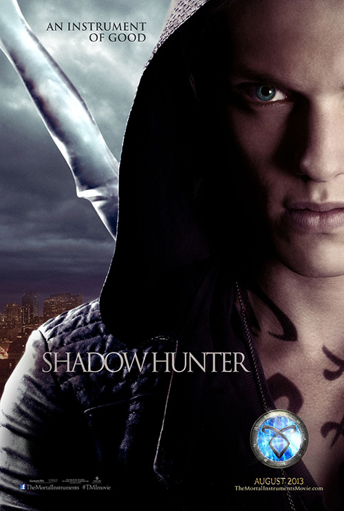
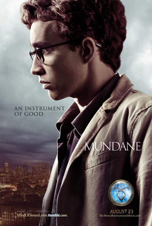
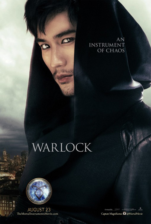
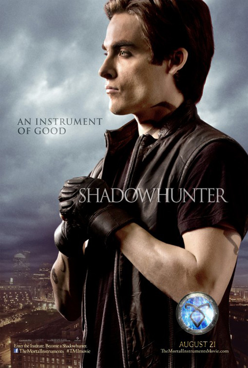
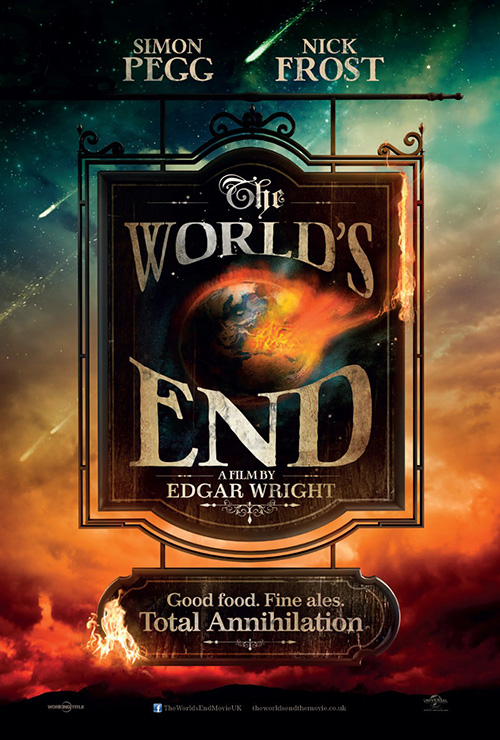
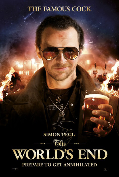
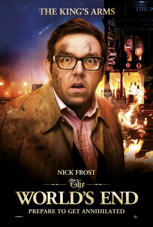
And what do you do when trusty design tropes are too much effort? That’s right—fall back to the more is more philosophy of character posters to mass-produce in large stand-up cardboard rectangles. We see it with The Mortal Instruments: City of Bones (open August 21), The World’s End (open August 23), We’re the Millers (open August 7), and Percy Jackson: Sea of Monsters (open August 7).
 |
 |
 |
 |
 |
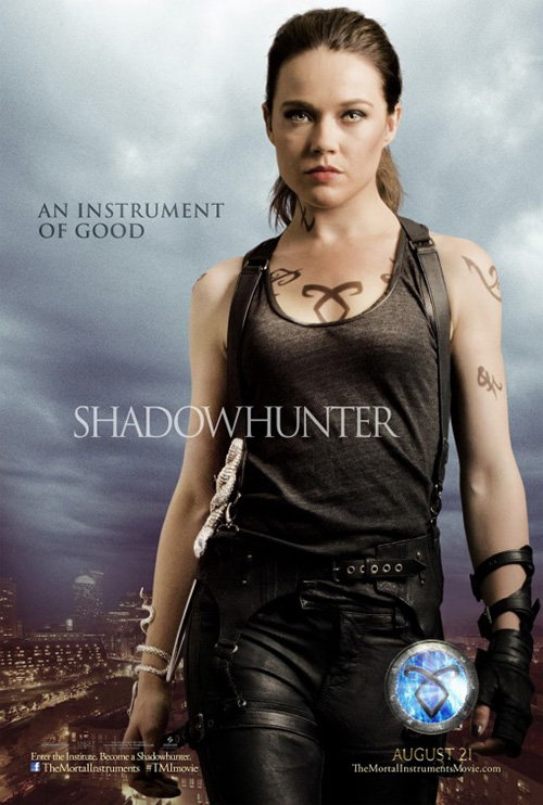 |
For City of Bones it’s a real shame because of the supernatural, fantastical elements involved. You could do something really cool with this stuff. Art Machine, A Trailer Park Company does good work on the generic sheet with its reflective pool of water showcasing the underworld of darkness hiding amongst us, but BLT Communications, LLC’s puts a wrench in the creativity when introducing the actors.
We get a glowing orb, a lot of leather, and sparse words with only Jonathan Rhys Meyers getting an interesting crop worth mentioning. Have them fighting. Have them in motion. Have them do anything but pose for the camera. Please, we beg you.
 |
 |
 |
 |
 |
 |
 |
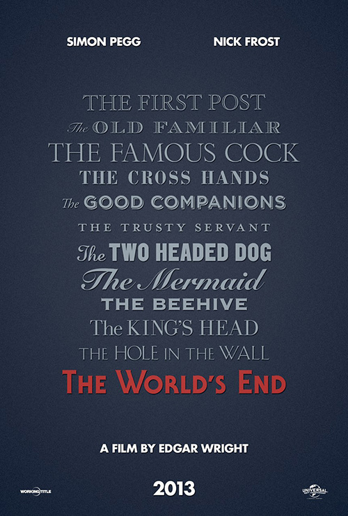 |
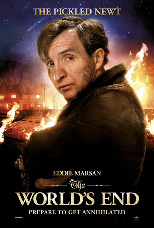
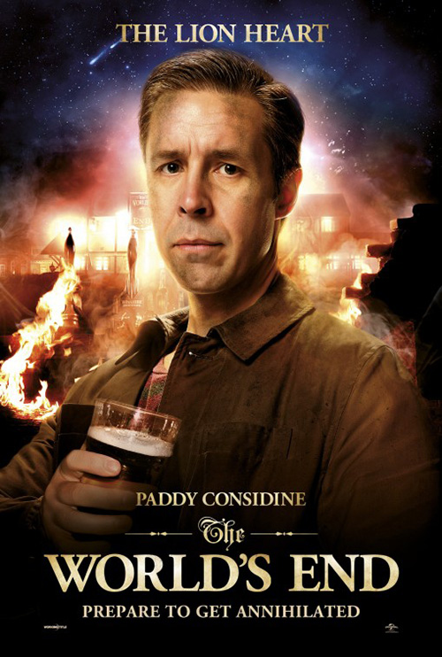
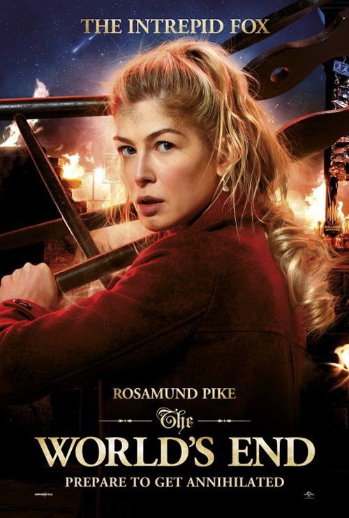
Creative Partnership unfortunately does no better for The World’s End. This is even sadder, however, because they made a pretty cool teaser with a bar sign engulfing in flames. I love the font, the wood texture, the starry sky, and the meteorites—all of which lose every ounce of interest when put behind blatantly touched up faces with painted dirt.
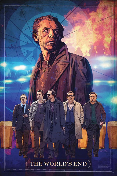
Each bust looks like a wax figure with a ton of gloss and artifice. Tommy Lee Edwards subverts this aesthetic in his hand-drawn sketch that perhaps isn’t as good as it could be either, but ultimately the film’s best representation comes from the original tease with nothing besides the names of each bar on the crawl. It’s a lot of fonts, yes, but there is something to be said about its simplicity of content.
 |
 |
 |
 |
 |
 |
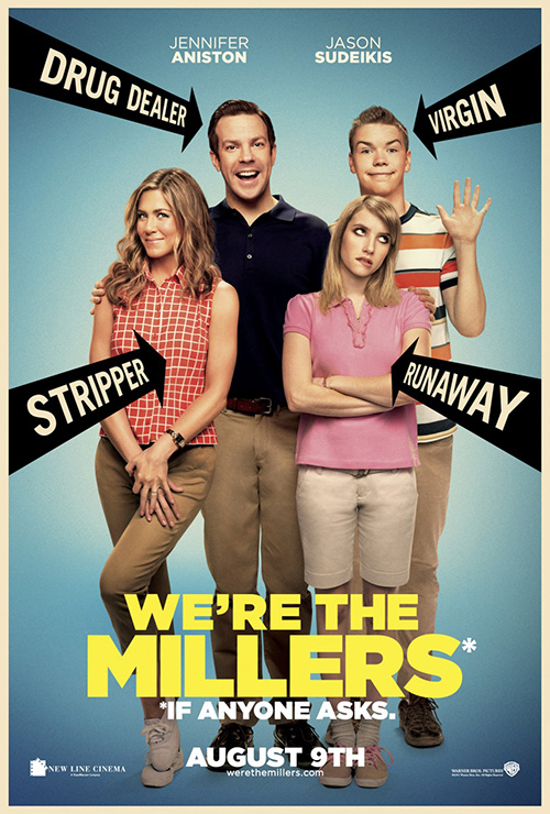
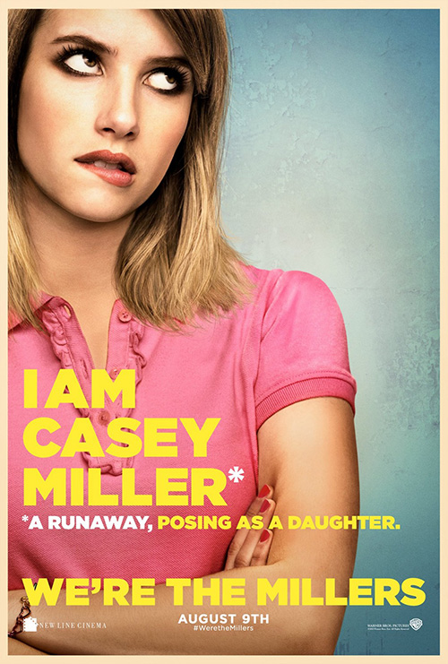
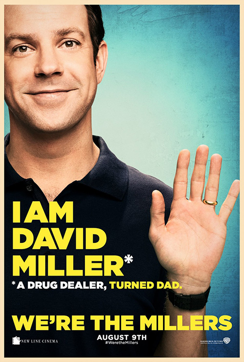
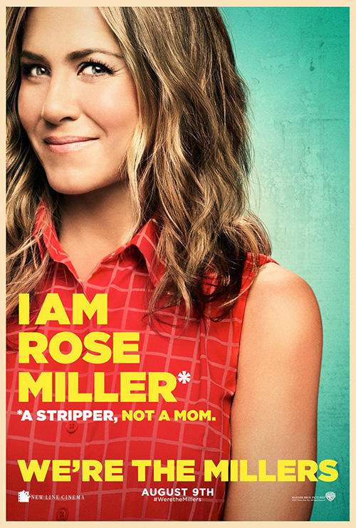
On the flipside, cold open somehow found a way to make their character sheets for We’re the Millers better than the montaged full look. It may not be too surprising once you notice that the imagery is identical—funny by itself, cheesy together.
I like the color border, the goofy asterisk subtitles to their names, and the faded textured wall behind them. And the expressions are priceless, each one perfectly embodying their roles. I’m not saying the resulting poster its Photoshop combination creates is bad, it just loses the impact each actor had without the competition.
 |
 |
 |
 |
 |
 |
 |
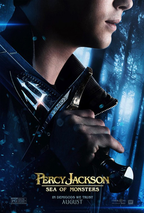
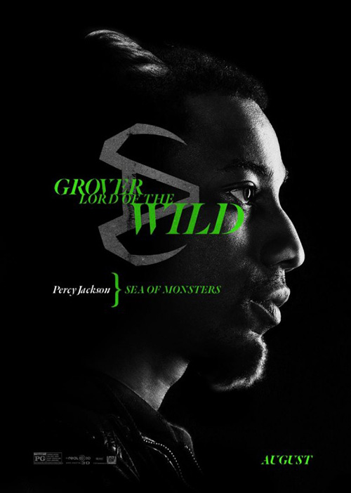
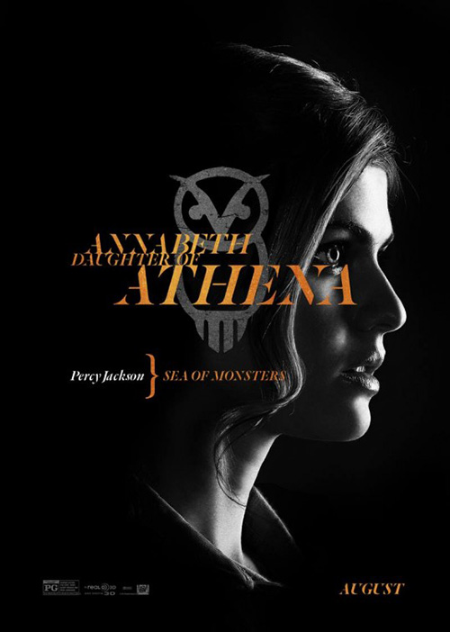
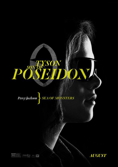
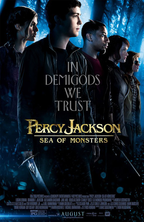
In the end, though, it’s Percy Jackson who wins this round of breathing new life into an old format. Designed by Midnight Oil Creative with photography from Frank Ockenfels, these chiaroscuro profiles possess fantastic atmosphere. The fonts are fun, the juxtaposed Greek symbols tasteful, and the bracketed title small enough to take a backseat but bright enough to be noticed.
Even Midnight’s one-sheet of the titular hero is a winner with its moody forest, extreme crop and prominent tridented sword. The combo is a little weak with the profiles now in color, but the stance of solidarity helps bolster the tagline so that we know this is our last line of defense.
What’s in a face?
 |
 |
 |
 |
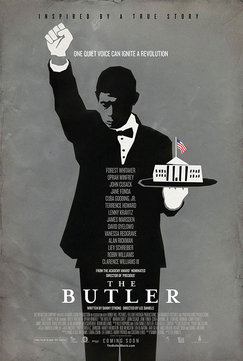 |
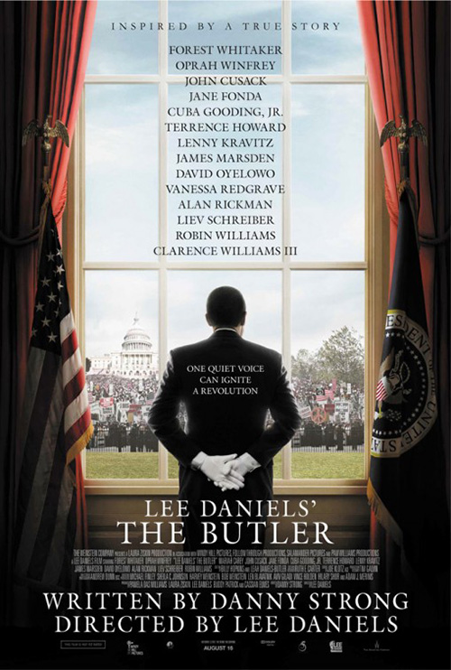
With an eccentric cast—see Robin Williams as Eisenhower, Alan Rickman as Reagan, and John Cusack as Nixon—it’s not too much of a shock to see Bemis Balkind design a poster for Lee Daniels’ The Butler (open August 16) that leaves things subtle and faceless. We know the man standing with his back towards us is Forest Whitaker, but he isn’t whom this film depicts. It’s about Eugene Allen and this is a tasteful way to approach such a distinction.
The cast is a big selling point—thus the laundry list over the window; Daniels is a draw after his Oscar run for Precious (the public probably wants to forget or doesn’t even know about The Paperboy in between). Does he deserve the type of placement given to him inside the film’s actual title, however? No. But thanks to Warner Bros. asinine lawsuit, that’s just the way it is.
I also don’t mind the jagged illustration of Whitaker with a White House on a platter, but I feel it might be too abstract for unnecessary reasons.
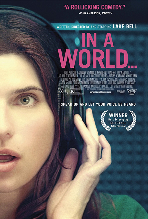
Bemis Belkind’s sheet for Lake Bell’s In a World… (limited August 9) may not exactly fit this category due to us getting half the artist’s face, but I think it’s a relevant inclusion in that it isn’t using her visage to sell the film more than her name itself. That coupled with the action depicted and the mystery as to what she is listening to earn our attention instead.
The discolored skin tone is a nice complement to the very cool colors behind her and the hot pink text pops just enough without being overly obnoxious. By no means the most original poster, it gets the job done with its odd crop and prominent Sundance laurels.
 |
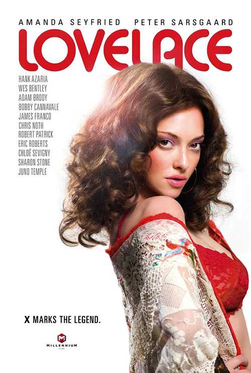 |
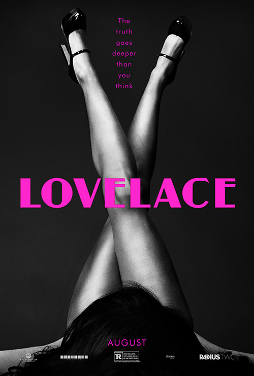
Going back to no faces, one doesn’t get a more captivating pose than the one on cold open’s Lovelace (August 9). The ‘x’ of the legs alludes to the subject’s pornographic background as the appendages arouse through their light to dark gradients and complete absence of fabric.
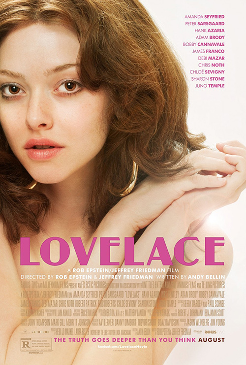
The firm’s other entry uses the same idea but with our actress’ face in full view. Yes, Amanda Seyfried is still without clothes, but the allure isn’t close to being as palpable as it was with just her legs. The soft colors add an aged look to match the hairstyle and earrings, but the true flourish is the uniquely cut title font. Its angular nature is light years better than bpg’s rounded loops for sure.
 |
 |
 |
 |
 |
 |
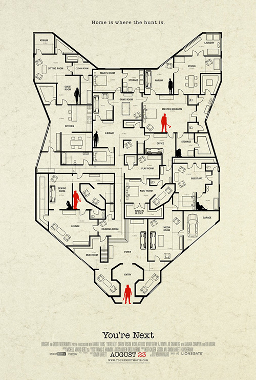
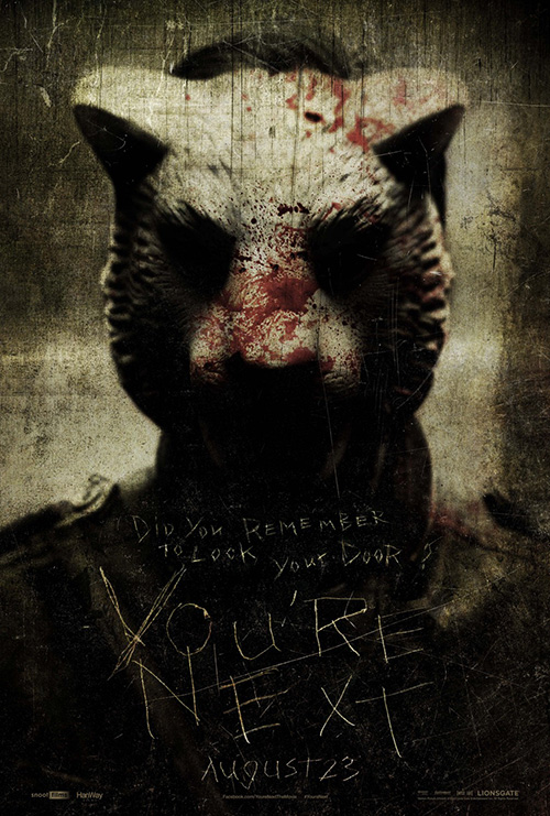
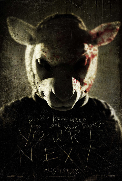
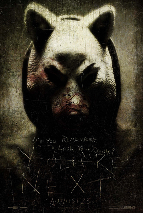
With all that said, nothing this month compares to Ignition Print where removing identity is concerned, though. Their hand-scrawled text over animalistic masks is creepy and definitely sets a mood for bloody horror, but the true winner for You’re Next (August 23) is its floor plan of death.
Drawn in the shape of the main predator’s mask, we see the black-silhouetted victims hiding for their lives as the red knife-wielding maniacs close in. Where they’re located and what the rooms are named may make more sense once I see the movie—or maybe they won’t—I just like the inventiveness, symmetry, and feel of Clue it instills.
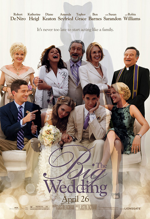
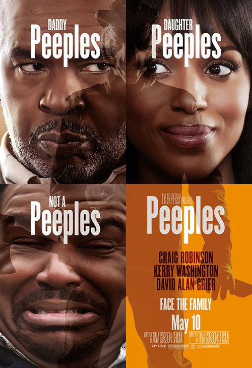
Not finished there, however, Ignition also went an interesting route in superimposing these murderers atop a couple other Lionsgate productions. This would be cool if The Big Wedding and Peeples were still in theaters so they could simply be taken over by the horror flick, but for all I know these were part of a viral campaign that went up in April and May respectively to spark intrigue. And that’s even cooler.
Washed out white spaces
 |
 |
 |
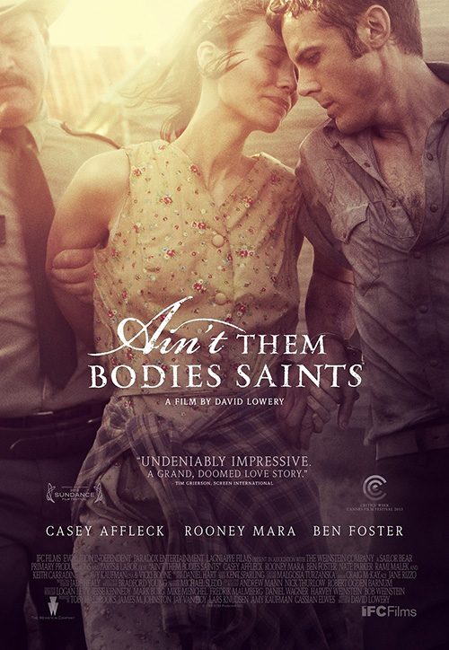 |
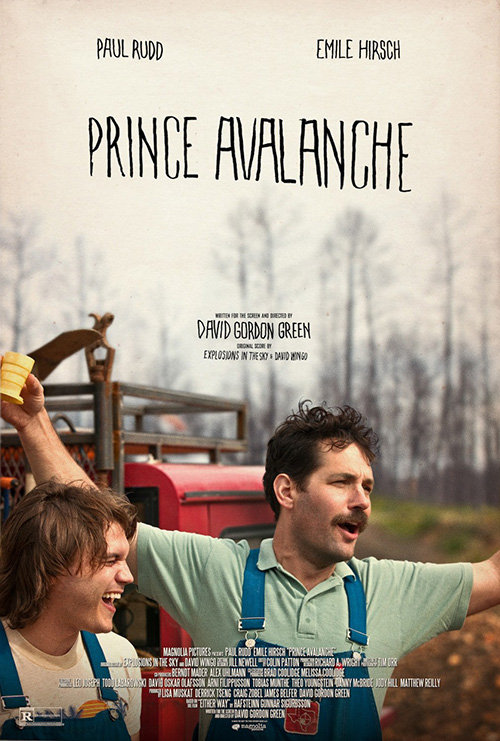
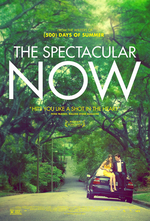
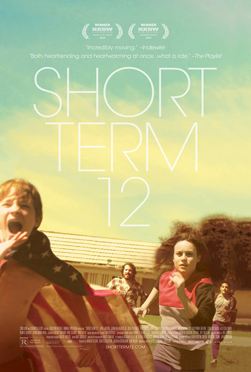
But if this month says anything about current movie poster design it’s that indie darlings need burned and/or dodged photos with ample white space to house either giant or unique text. Maybe there was some secret meeting or perhaps firm P+A simply enjoys the aesthetic and did them all (I know they did at least two), but whatever the reason doesn’t deny present attractiveness. Give it another year or two and I’ll probably hate it as much as the text on faces trope above.
The sheet for Prince Avalanche (limited August 9) is the least touched-up of the grouping but included just the same due to its wide expanse of blurred sky above its horizon. The grayish haze allows the jagged typefaced title to standout while also ensuring our eyes descend further to check out the colorful overalls of its cast engaged in a humorous interaction below.
This sort of meticulous cropping seems a commonality for independents these days merely because they understand the appeal of good art as opposed to celebrity sales. It’s less about having Emile Hirsch and Paul Rudd than it is catching the breadth of Rudd’s arm span and the visual representation of whatever jovial voiced singsong he’s uttering.
P+A’s The Spectacular Now (limited August 2) starts to let the sun-bleached glare of photo burn in at the top, but even without it we can notice the hyper-yellow tinge to the whole in Miles Teller’s shirt. And rather than an extreme crop, this firm instead goes with extreme scale to make sure the entire car is in frame and ultimately the one thing of substance besides the massive Century Gothic title above it.
It’s a pretty piece with an intentional softness to the greenery as we rise up to the white text, unafraid to practically put yellow on yellow in order for the title to pop that much more without competition. It may render the accolades hard to decipher, but from a design standpoint it’s the only possible move. If the imagery hooks its audience correctly, they’ll either peer closer or research it more at home.
For Short Term 12 (limited August 23), the designers go full bore into the tinted splendor of brightly muted pastels in a sky barely dark enough to allow white text legibility. The sheet is almost radiating warmth as we absorb the glee of its actors’ spirit running towards us.
There is a mood emitted that instills a hopeful feeling and yearning to delve into the lives of these characters. It’s unafraid to play with depth, composition, or text with a beautifully slim sans serif as subtle when peering at the photo as it is visible when adjusting to the sky.
But if any poster this month embodies an emotional resonance of pure aesthetics its P+A’s Ain’t Them Bodies Saints (limited August 16). Most of this feeling comes from the pained sorrow in Rooney Mara and Casey Affleck’s faces, but you also can’t diminish the muted palette or heavy dark to light gradient for adding to its effect.
And when an image can be that powerful and still take a backseat to the wonderfully rendered text—a gorgeous joining of ornate cursive and thick serif—you know you have a winner. The white of it seems impossibly strong on its not-so dark backdrop as its distressed flecking adds to the weathered/aged feel of the whole. Despite whatever erosion or forces falling upon it, a remnant remains. One could say the same about the obvious love shared by the actors at its center.
What is your favorite August release poster? What could have used a rework?

