“Don’t Judge a Book by Its Cover” is a proverb whose simple existence proves the fact impressionable souls will do so without fail. This monthly column focuses on the film industry’s willingness to capitalize on this truth, releasing one-sheets to serve as not representations of what audiences are to expect, but as propaganda to fill seats. Oftentimes they fail miserably.
Despite only having four Fridays, April is packed with new releases. It seems like all the studios are trying to get some traction for their smaller films before the summer months arrive and take over (even though Disney is continuing its early tracks for blockbusters with Avengers: Infinity War bowing April 27).
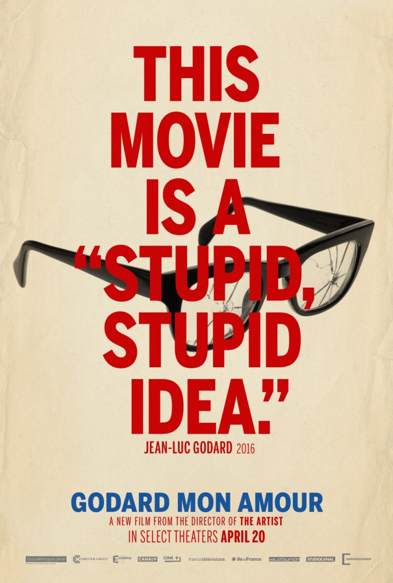
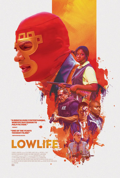
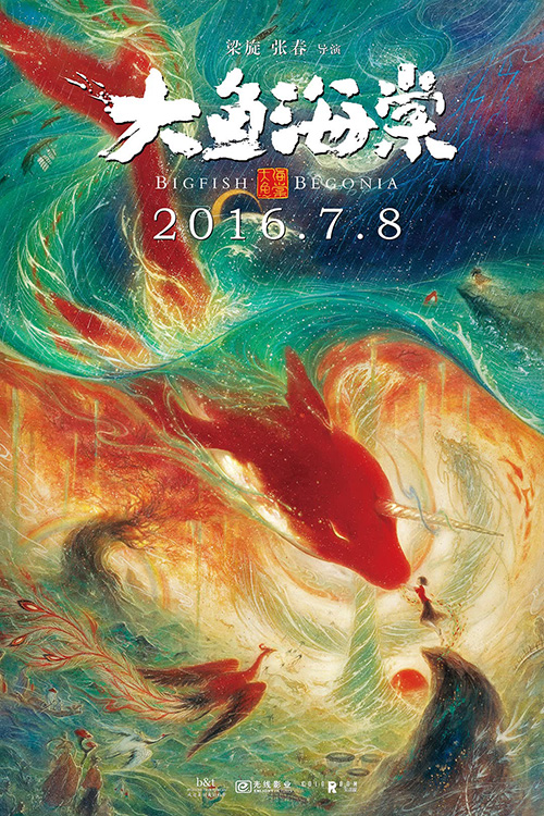
As such there are a few posters I couldn’t fit into any sections below including the fun self-own quote-centric sheet for Godard Mon Amour (limited April 20), the attractively illustrative collage for Lowlife (limited April 6), and the breathtaking artwork used to advertise the Chinese animation Big Fish & Begonia (limited April 6). These are stunning works in their own right and shouldn’t be forgotten amongst the rest.
Quick turnaround


The film is named Spinning Man (limited April 6). The designers think, “How do we show spinning in two-dimensional print media?” The answer is duplication. Use blurring, multiple vantage points, and cropping to make it appear as though your subject is moving despite it obviously not being able to do so. But this works when you have one subject. It works if you have some view of it from the backside as well since spinning means 360-degrees. Kustom Creative decided a weird shimmer would be enough.
There’s so much wrong with this thing. Why couldn’t they have used an image of Minnie Driver facing the same direction as her co-stars? Why are the actors cropped with straight lines and masked to their contours simultaneously as though they are being folded in front of backdrops of themselves? This is less spinning than disappearing. And why are only two of the four “Ns” in the title “moving”?
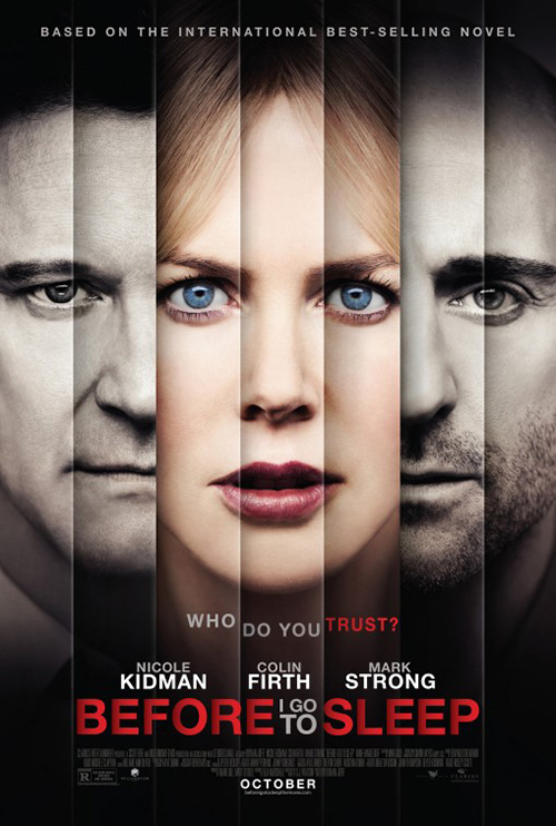
What’s worse is that the poster is pretty much exactly what Blood & Chocolate did with Before I Go to Sleep. But that one worked because the effect looked like shutters. It was about trust and façades and the fact that we could peer behind those surfaces to see the person’s true intent. Spinning Man‘s design is the low budget, cardboard cutout, “sweded” version without any recognition as to what the other was doing.
B O N D created a nice graphic teaser for Chappaquiddick (April 6). There was satire (American Flag symbolism juxtaposed with murder) and minimalism (not one floating head to be seen). The title is synonymous with Ted Kennedy’s infamous evening and so one look at that overturned car drowning in water is all we need to know what’s up. Short, sweet, and effective.


So why did they go to the John Curran well when creating the final sheet? The similarity to Curran’s previous film Stone (designed by The Refinery) is too close for coincidence. It’s as though the firm thought putting the title beneath the actors instead of around the actors would be enough to render it unique. They were wrong.
Not only that, though, it’s utterly boring. Those overlapping Photoshop faces are way too distracting to let the scene of the car below possess any drama. The “image” seen through the letters of the text makes it seem less like added texture than empty ink cartridge losing paper coverage. And the line-up of tilted glasses lend a comedic bent that even the film’s surprisingly comedic bent can’t quite survive.
Borg Vs. McEnroe (April 13) and The Posterhouse’s Submergence (limited April 13) see their studios deciding to go cliché with the always-unchallenging two-hander back-to-back ad. Have two leads that earn equal billing? Put both faces on the poster, but have them looking away from each other because “Drama!” No one can complain except those forced to gaze upon the uninspiring portraiture.
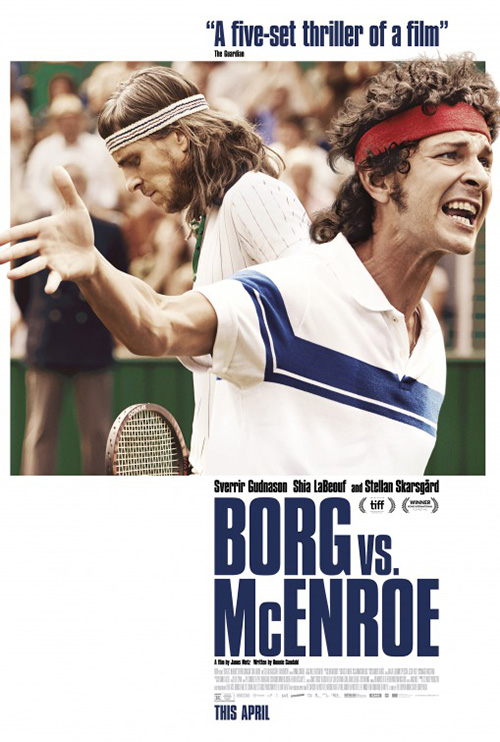
Let’s be honest: the former is laughable. The way Sverrir Gudnason and Shia LaBeouf are positioned makes them look like the stars of a Stuck On You sequel. Either that or McEnroe is literally a monkey on Borg’s back. Or maybe this monstrosity is trying out for the role of Zaphod Beeblebrox in a new Hitchhiker’s Guide to the Galaxy film.
I don’t love the second poster for the film either, but at least it creates a scene with its actors. It shows the way they display their anger (stoic frustration against animated verbal abuse) with an interesting composition. It also adds the “Vs.” that wasn’t there at the beginning nor wanted now.
As for Submergence, I don’t necessarily hate what Posterhouse did with the layout. It very directly bisects the page with the title to create two distinct windows so the former film’s two-headed monster issue is avoided. And it has them looking in opposite diagonal directions. This creates a sense of movement that them looking right and left wouldn’t. We can read the title down while also witnessing their respective emotional woes.


It’s much better than the badly faked torn page diptych and The Robot Eye’s floating translucent heads in the sky. The latter removes Alicia Vikander’s emotion for an empty, vacant expression as though she is an angel rather than person. What a weird aesthetic choice in extreme contrast to the others.
Depth of field


Shallow focus doesn’t have to be handled “artistically” to be effective. Just look at Krystal (limited April 13). This could have been Rosario Dawson in the middle of the frame, but then we wouldn’t get the context that leaving Nick Robinson at left delivers. Rather than portrait, this is conversation. We don’t need to know who he is, only that he is one of the “boys” alluded to in the tagline. Is this poster winning any awards? No. But it isn’t ignoring its own conventions either. It has a plan and it succeeds.
Aardvark (limited April 13) takes this idea further. It pretends to be more “artistic” even though it is just as straightforward as the last one. In fact, it may be even more boring because it is less about a scene and action than providing a sense of hierarchy in relationship. Without knowing anything about this film I can sense that Jenny Slate is the object, Jon Hamm is her supposed “protector,” and Zachary Quinto is the predator/stalker always in the background. What’s interesting is that the latter is in focus. She may be his object, but he is ours. This is his story.
Again, though, just because we can read the poster doesn’t mean it is attractive or unique. It too had a plan and enforced it with success. Its one flourish is the typography: a nice sharp serif italicized for movement yet contained within a box. You could say it is a metaphor for either Quinto or Slate’s character. It’s a person trying to escape the world that has refused to give him/her true freedom.
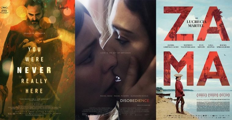
Disobedience (limited April 27) by InSync Plus isn’t as overt as these other two and therefore is much more artistic. The whole is soft to the point of its sole crisp imagery being the wisps of hair washed out to white between Rachel Weisz and Rachel McAdams. The softness is a nod to the grainy texture of film as opposed to digital, the warmth of the colors more about mood than reality. And the way the vantage augments the contrast between light and shadows ensures our eyes move to Weisz’s open mouth.
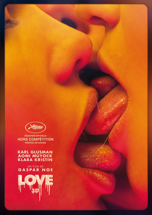
The image is provocative and effective—a real world application of a similar layout with Love from a few years back. Sadly the text does it no favors. Why is the tagline where it is? Why have it distract from the sightline of their eyes by refusing to let us see their loving gaze unfettered? Why is the cast list perfectly aligned with the left edge of the tag to create an invisible line between them that more or less tries to erase the kiss altogether by skipping over it? This is a perfect example of how great photography can be ruined by bad design.
And by combining the strengths of these three posters, Indika Entertainment Advertising achieves the best of the bunch with Where is Kyra? (limited April 6). That’s not to say it doesn’t have its own problems (giant title, giant actor names, distracting quotes boxing in Michele Pfeiffer’s face), only that it utilizes its focus to direct our eyes while also embracing composition to create memorable artistry.
The whole might have worked without Kiefer Sutherland’s face—perhaps just a shadow instead. Like with Krystal, though, it allows for conversation. He gives us a reason for her expression. He makes us pause and wonder about the sadness in her eyes whereas only malice might have existed without him there. It’s this mix of feelings that capitalizes on the title’s question. It’s her performance that draws us in to discover its answer.
Remove the quotes, shrink the text below, and watch how she steals every bit of attention you have with only half a face in view. If this is any indication of the film itself, the universal praise Pfeiffer has earned thus far might actually be selling her short.
The standouts


There is deceptively a lot going on in the poster for Zama (limited April 13). Not only is it an image from the film with a ton of white space at top to place the title, but that title also has its own painted imagery to enhance the period detail and atmosphere rather than compete with the main scene. I love how the typography uses the title’s four letters as a way to create a box that fills the frame without sacrificing legibility. It’s as much a design element window as it is a focal point. And allowing the trees at top to leave the letter is a subtle stroke of genius marrying these two worlds together.
Even better is how everything else is effectively positioned around it. The main scene is cropped so the middle point of the “M” meets Daniel Giménez Cacho’s hat. Director Lucrecia Martel’s name is centered without a worry that it is above both light sky and dark red. The actors’ names are in a dead space that doesn’t distract from anything else. And the credit box is justified with the edges of the “A” to become a linear extension of that side of the page with no spill over. The whole is expertly measured for an unparalleled visual beauty.
To look at Brandon Schaefer’s The Endless (limited April 6) is to initially think it’s the exact opposite of Zama. The truth, however, proves that they are very similar in their symmetry. The difference is that this one has an image that seemingly breaks with the rigid grid of the other. That doesn’t mean we ignore how the characters are centered beneath the circular void, which is in turn centered above the title. The way this hole is manipulated with the world around it bending to its spiral reveals that the sheet may have used a grid after all. It simply spun it around to warp its edges.
The result is an attractive representation of the film itself—the phenomena within, the repetitive nature of its cycle of time, and the eeriness of its juxtaposition of religion with the supernatural. We the viewers are sucked into its frame, the imagery consuming our imaginations and ensuring we don’t forget how much we want to see what’s on the other side.
You wouldn’t be blamed for thinking Gravillis Inc.’s The Devil and Father Amorth (limited April 20) was a book cover rather than a movie poster. That’s exactly what it looks like—the giant title assaulting us in a captivating yet unorthodox font, author name at top. To me this is why it’s so effective.
I’d love for more posters to follow suit, but also know it’s impossible due to contractual obligations where billing is concerned. The reason it works here is the fact that this is a documentary. There are no egos to assuage, just the content to advertise. And it does that to perfection.
It’s great because the title can be broken into two distinct halves: “The Devil” and “Father Amorth.” It can then divide the page to accommodate this separation and portray each independent from the other. We receive the priest at the right, almost cropped off the page. This is because both he and “The Devil” are forces interacting with the woman writhing in pain. He’s the force we see and accept. “The Devil” is the force unseen and abstract. This poster screams at us about a war, presents its opposing generals, and dares us to find out who wins.
The design for Grace Jones: Bloodlight and Bami (limited April 13) also decides to divide the page into parts. Rather than provide different images in each of its quadrants, however, this one creates a stationary strobe effect to highlight the presence and electricity of its subject. I look at the finished piece and think of a screen skip like Max Headroom glitching out, but in pristine high definition. (The neon tube font only helps this aesthetic.)
What makes it simultaneously entrancing and disorienting is the choice to shift each vertical slide uniquely from the others. None of the four match. It’s not an A/C, B/D scenario. They all move lower in sequence so our eyes are constantly moving with them before heading back up to the beginning via her second hand as bridge. This is a kinetic portrait sliding forever to the music we hear in our head.
Indies are allowed marketing budgets too


I’m always excited when a film like You Were Never Really Here (limited April 6) earns the kind of multi-poster series that blockbusters regularly deliver. Empire Design doesn’t phone this one in either as their foursome is nothing if not eye-catching, moody, and diverse.

The first is the most straightforward. It recalls Travis Bickle looking down as he walks towards us on the Taxi Driver poster—a cinematic comparison the studio has loved putting on its marketing materials. But even if it’s not wholly unique, the one-sheet is a success. Its font and coloring brings to mind pulpy checkout aisle paperbacks, something I’m sure source novelist Jonathan Ames would appreciate considering the aesthetic of his old HBO show Bored to Death. It exudes a mood to get viewers in the correct headspace for its content.
The second is a stunning graphical representation of the film with an illustrated Joaquin Phoenix trailing blood from his hammer behind him. It’s an arm/hand and also an illuminated pathway. It’s both a man exiting violence and born from its depths. It’s an iconic image not easily shook.
Number three seemed to get a lot of play online, but I easily rank it as the weakest of the four. I like the idea of Phoenix falling through the surface of a pool, drowning under the weight of his life. I don’t like the title being used as that surface. It doesn’t come across as natural or even attractive for that matter. It’s more about not having anywhere else to put it where it wouldn’t distract. It feels like a last-second decision without alternatives.
The fourth is my favorite of the bunch. It merges the minimalistic approach of the second with the photography and typography of the first. The way the girl’s arms come from the darkness to hang on his shoulders is mesmerizing—a chiaroscuro noose as much as embrace. The title floats yet pops, the positioning next to the triangle of her wrists perfectly balancing out the faces above.


This quartet is a far cry from what came before and after whether P+A’s domestic sheet with a clutter of glares and fuzzy letters creating a busy frame with way too much to process or Silenzio Communication’s French sheet from Cannes (titled A Beautiful Day) that feels very Coen Brothers in comedic murder rather than viciously brutal like everything else. They both do the job, but it’s hard to praise either when Empire Design knocked at least three others out of the park.
What is your favorite April release poster? What could have used a rework?