“Don’t Judge a Book by Its Cover” is a proverb whose simple existence proves the fact impressionable souls will do so without fail. This monthly column focuses on the film industry’s willingness to capitalize on this truth, releasing one-sheets to serve as not representations of what audiences are to expect, but as propaganda to fill seats. Oftentimes they fail miserably.
There are only four weeks in April, but a ton of films are scheduled for release. A common thread between them, however, is a distinct lack of mammoth bugdgets—something the latest installment in the Fast and Furious franchise probably didn’t expect (or maybe it did considering a return to April after Part 7 bowed in May). Instead we’re looking at wide releases of festival favorites from A24 and WWE Studios with productions from Fox Searchlight, Bleecker Street/Amazon, and STX.
Talk about a change of the guard. Maybe spring is slowly becoming autumn-lite to bookend the popcorn, throwaway excitement of summer tent-poles. Here’s to hoping this trend continues.
They all need to fit


That volume means there will be a wealth of good posters and a wealth of bad. The latter is never helped by a studio desire (or contractual imperative) to throw as many characters into one sheet as possible, but that’s still what happens only too often.

Just look at The Refinery’s Going in Style (April 7). Could no one get its three stars together for a publicity photo that didn’t look more airbrushed than authentic? Could they not be positioned in front of a wall, brick or otherwise, so that real lighting could create shadows that weren’t just blurred ovals on fake ground? A jaded person would look at this poster and assume it was an animated film utilizing the technology that brought Peter Cushing back to life last December.
It’s made even worse when compared to the artwork that advertised the film it is remaking. This thing had character with some nice illustrative work and an infectious bit of comedic appeal. Here were three names so big that you could cover their faces without studio brass batting an eye. Why then is the newest trio—Academy Award winners all—unable to be seen beyond manufactured plasticity? We know how old they are. We know how good they are. This depiction feels like a metaphor for the film itself: something talented people now regret.
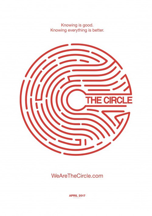
What Gravillis Inc. does with The Circle (April 28) isn’t much better. They’re allowed to utilize the medium’s two-dimensionality and not worry about shadows to provide depth, so that’s a plus. But throwing in part of your film’s motif to cut through the rectangular canvas doesn’t make it any different than if they simply bisected the page with two stills. Despite being a “circle,” having your actors both look in one direction reads very “straight line” to me too.
They get no assistance from the circle maze design tease by mOcean either as it comes across as a child’s drawing rather than anything of dramatic weight (more so when enlarged with the actors). It’s so smoothly curved right down to the line ends and yet the title is in san serif and squeezed to the point of illegibility. They’re so desperate to keep the space between lines consistent, but the gap between title and lines is less than half. It’s being crushed in a vice and it’s the last thing I look at—so it’s perhaps never seen by those walking right by.
WORKS ADV does things correctly with Their Finest (limited April 7) by contrast. They embrace the idea of collage but don’t pretend to be doing anything to subvert it. They aren’t cutting characters out to fabricate a scene and they aren’t boringly keeping things apart in their own separate boxes either.
Is it Photoshopped? Yes. But the lack of a desire to “create a scene” renders that choice acceptable. These actors are Photoshopped into a symmetrical hierarchy to guide our focus and compliment the Union Jack design behind them. It’s clean, informative, and never talks down to our ability to parse visual stimuli. It won’t win any awards, but it nevertheless accomplishes its job by impressively cobbling together a lot in a way that makes it seem like much less.
And while I usually rail against the totem collage, I can’t lie and say I don’t find BLT Communications, LLC’s—with photography by Jose Haro—sheet for The Promise (limited April 21) attractive. The characters are just barely positioned for billing hierarchy but artistically joined in a Mount Rushmore pose rather than a bumbling “moment” that doesn’t exist. The colors are vibrant and rich, popping the dark portraiture off the page. And the morphing from flag-like fabric to character wardrobe is seamless in its transitions and hard layering from background to foreground.
It also nicely balances out the heavy photography at the top against the stark white at bottom. The slight lowering from Oscar Isaac to Charlotte Le Bon moves our eyes with the angle of the fabric down to the corner only to flow back on its curves to the title at left. You want to stay and move through its ebbs and flows rather than stare at one piece before moving on.
Sullen faces in the crowd


The previous section shows the importance of the concept of “less is more.” Just look at Concept Arts’ The Fate of the Furious (April 14). That’s right. The Fate of the Furious.


It isn’t necessarily some stunning work of art, but it is successful. And in the marketing game, successful is what truly matters. We arguably receive the series’ two biggest stars in Vin Diesel and Dwayne Johnson as their friendship has fallen—nothing else. Whether one is literally a “candy-ass” or not, the characters of Dom and Hobbs are at odds. “Family no more” explains what the image shares: anger in the background and guilt in the fore. With perfect use of depth of field, a blurred The Rock tells us that the latter is the imperative.
This stuff pushes the series into overt melodramatic, but it’s also why I keep watching. Many audiences, however, do so for the cars, stunts, and action. So while this tease speaks to me, the others talk to the public. Characters are replaced by automobiles doing their best to symbolize each actor in America while chaos and insanity takes their spots internationally. Whichever brings you out to the theaters, though, there’s no question Furious will hit pay dirt.
Blood & Chocolate’s Sleight (limited April 7) utilizes emotions too as Jacob Latimore arrives in profile to set a scene more than shine a spotlight. It also isn’t flashy, but it uses design effectively to grab our attention and retain it enough to read through what it’s selling. The grain on the photo and lens flare put the image in line with the comparison at top (Chronicle meets Iron Man) and the red words steal our gaze while also bookending the title so it jumps off the dark hoodie below (thanks to a heavy font and pristine white color) as well as the wealth of text surrounding it.
Match the title with the playing card and ideas about magic, con games, and twists are conjured to add a level of mystery and excitement. It looks gritty and intrigues with how little it says. Don’t discount the miniscule size of the WWE logo either to not completely turn off potential ticket buyers via prejudice as far as wrestling quality might be concerned. They didn’t produce it. They merely acquired distribution after it debuted at Sundance. So rest assured.
When it comes to Arnold Schwarzennegger’s pained expression on Aftermath (limited April 7), we get a great example of how two posters can deliver two very different tones despite using the same image.

LA’s somber look of wheels turning is enhanced by the stripped down color. We aren’t just seeing a photo of a man grieving—this is an expressionistic view of his sorrow mixed with his drive to get even. Things are colliding like the two airplanes about to crash into the title, itself small yet impactful due to the square block font and thick characters. Past, present, and future are coming together and we can’t wait to see how it plays out.
Now look at the other version. The color filter is gone. The expert typography is replaced by in-your-face size over substance. And Schwarzennegger’s soft squint is altered into a harsh grimace. This isn’t a man thinking. It’s a man uncoiling to pounce. This is direct-to-DVD action whereas the first was introspective drama. So why not just show the crashed plane instead of implying it too? Nuance has already left the station so they might as well leave nothing to interpretation.
Put all the above together and you get something like Buster’s Mal Heart (limited April 28). We have the expressive face—albeit a blank one that’s not as easy to read as Dwayne, Vin, and Arnold; the carefully cropped imagery supplying ample white space to position text; and a carefully placed detail to either crack the whole wide open or make us scratch our head.
The title font’s mix of capital letters and lower case makes me think “free font search,” but it gets the job done. Its size makes it disquieting with the lowercase letters feeling even bigger than they already are—a sense of oddity to match the crop of Rami Malek at his chin and the inverted clock behind him. On quick glance you’re simply seeing a man at a desk. But if your brain realizes something is off, you move closer to inspect. Things start to sink in, curiosity increases, and you find yourself hard-pressed to forget its name.
Scale goes a long way


The idea of a new Smurfs movie generally prompts eye rolling and I wouldn’t be surprised to find Smurfs: The Lost Village (April 7) earns them. With that said, however, you have to credit Proof for delivering a really nice teaser sheet to usher the property back into animation.
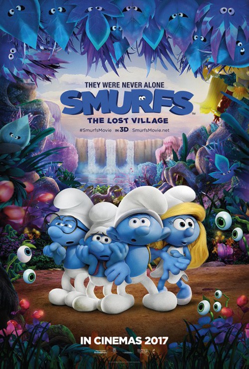
There’s a ton to like from the large space of solid blue doubling as a curtain separating us from their world to the playful logotype with eyes in the “R” to a colorful landscape of surreal wonders that reaches far out to gaze upon alongside the little blue guys themselves. The poster is a visual embodiment of the tagline and it even has me wanting to walk forward and discover what’s in store.
I don’t get that feeling with the version at right, though. This is less about mystery or wonder and more about over-the-top expressions to please the youngsters. It’s all googly eyes and overt emotions spanning intrigue to fear to cautious awe to full-blown excitement. And it does nothing but tell kids that the Smurfs are back and you should proceed to annoying your parents. Rather than lead the adults in, it shows everything to replace anticipation with indifference.
MOTTO’s advert for Mine (limited April 7) plays with scale not through depth, but size. Here’s a human faced with the horrors of nature—a grain of sand about to be scooped up by a wave of those grains that have previously fallen. There’s nothing like that moment when awe-inspiring beauty is simultaneously nightmare. It’s one man against God’s wrath.


Even better are the international sheets from BIG JELLYFISH® that don’t rely so heavily on contrast and saturation. The first is very similar, but better for a few reasons. One: Armie Hammer is facing the storm, ready for it rather than resigned to it. Two: the uniform color makes it less angry, but more formidable as the storm is consuming rather than merely threatening to destroy. Three: the title has some subtle flourishes of blowing away, it’s faded thick font proving more relevant than the thin, sharp sans being used in America.
I like the second Spanish sheet too, but it is a bit much as far as Hammer’s face merging into the dunes. It’s rendered effectively, though, that lighter coloring working to compliment the fade. And I hope we can all agree the final domestic poster pales in comparison to the rest. A confused soldier partially blocked by a ripped flag? This isn’t drama, just a Hail Mary in hopes Hammer’s star is bright enough to sell tickets.
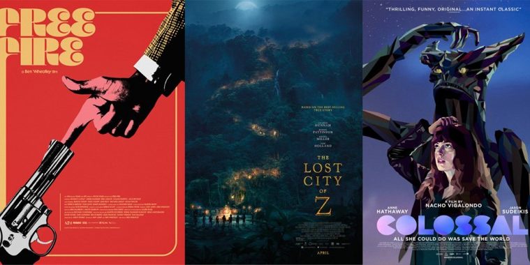
These two films bring us to B O N D’s The Lost City of Z (limited April 14, wide April 21). Not only do they bring that sense of nature’s wonder, they also deliver it within a scene that makes us want to journey inside. It’s a breath-taking view that our eyes move through with light cutting a path in the darkness. We focus on the bonfire (and circle of people around it) at bottom left, but only briefly before traveling up. Where it goes becomes the mystery we seek to solve.


I also have to applaud the title layout because it isn’t your usual span words across the page. The designers have created a shape with purpose, one where the articles are readable but clearly less important that the rest. Having two words of four letters each is the perfect result for a compact box, the articles serving as borders separating them from the large “Z”. The font is old fashioned in shape but modernized with its thin bevel work to provide three-dimensionality. And while I haven’t seen the film yet, I do hope the title’s composition into a cross is intentional.
The second sheet by Creative Partnership is nice too because it retains its mystery with a sharp contrast between bright forest and dark cave. Charlie Hunnam is shrouded in shadow and we can feel the beginnings of an adventure. The others sadly lose this effect. Whether three windows of actor faces (Creative Partnership) or Hunnam removed from the environment that got us interested in the first place (B O N D), their lack of atmosphere hurts their appeal.
Closing out the section is Palaceworks’ fantastic Colossal (limited April 7). They’ve gone the reverse of the previous three, deciding to scale down rather than up. This film isn’t about the giant monster towering above humanity, but the humans willing to do monstrous things to each other. It’s about becoming the thing we fear and allowing ourselves to destroy everything in our path.
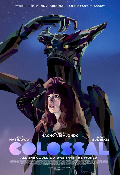
The firm goes back to childhood and our youthful enjoyment of pretend to represent this notion. Think kids putting those little squishy gumball machine toys on their fingers going all “Rawr!” in adults’ faces. Now replace the child with a thirty-something lost in a quarter-life crisis. They put it on their middle finger and flip off anyone who gets in their way. They may not be colossal in size, but they’re surely a colossal *******.
Its simplicity is what shines, although it may admittedly work better for those who’ve seen the film already. Regardless, it’s captivating enough to make people give it a second glance, something that can’t quite be said about The Boland Design Company’s version with illustration by Tim Biskup. The image is uniquely position to turn heads, but there’s no room for interpretation where content is concerned. I do love the logo font, though—Pacman “C” and all.
A bottle of bullets


This original teaser for Free Fire (April 21) by B O N D is a legitimate candidate for end of year glory. It’s attractive in its design whether we’re talking colors, font (love the slant add-on to its sans serif), or composition. The mass of arms flowering out with guns drawn gives an idea of the all-out chaos the film delivers while also depicting the period specific wardrobe worn by its characters. My favorite part: the shotgun is held by two different men to make the final count five guns and six people.
Jay Shaw’s alt poster with a Pop Art Xerox aesthetic is a great compliment to the minimalist character sheet campaigns I’ll be mentioning shortly. The colors are muted just enough to not overpower with unnecessary vibrancy, the font is fun and of the era, and the gun finger is a perfect encapsulation of the tone. B O N D’s expansion on their tease isn’t quite as good now that actors are shown in full, but the circle format gets at the conundrum of dissolving sides and self-preservation motivating everyone. And who doesn’t love a pulpy Japanese sheet assaulting you with color, actors, and bullets galore?
The firm I really want to highlight with this film, however, is Empire Design and their two stunning series.


The first depicts each character as target practice cards, the scoring ovals intact with a grid at the top to keep track. At theatrical poster size you could literally take one to the range and set it up to shoot. So it’s both pretty visually and real world-ready to engage as those onscreen do. I liked these when they were released and thought how they supplied a nice textured portrayal of old school print methods to place them within the film’s setting. Who could have guessed the design team would outdo themselves with their follow-up.


That second set is nothing short of gorgeous. Black and white photography (which could have gone dirtier through halftones for added effect), simple yet stylish typography, and a single polygon used as a one-size-fits-all prop. The blue quadrilateral is a wall to come out from behind. The red is a wall to rest against. You can hide, support yourself, or steady your gun. Whatever the photo angle provides, the color field can be adjusted to work with seamless precision. And each is singularly unique yet also very much a piece of one cohesive whole.
Hell on Earth


Can we talk about The Void (limited April 7) now? Here’s a film with a marketing team that knows its audience. A throwback to practical effect horrors of the 80s, it targets the type of fanbase that follows MondoTees’ Twitter feed to get the latest poster or vinyl release of whatever cult favorite is due a rebirth. So why not treat this 2017 release in much the same way? Act as though it’s a revival by providing the deliverables your audience wants to see.
The result is a series of three pre-release sheets by Phantom City Creative, Gary Pullin, and Graham Humphreys with a teaser sheet from Gravillis Inc. and a pull-quote heavy final.
To me PCC’s is the best. The symmetry, the unsettling mass of tentacles escaping the now iconic triangle, and the heavy title font drawing us in like a black hole. How great is the decision to go off-white too? It ages it a bit and softens things ever so slightly in order for us to glide into the center as though through a hazy nightmare.
Gravillis seems to have liked it too as their teaser is a riff with human figure and blue aura. Their logotype is on point with the “THE” carved into the “V” in a way that isn’t afraid to crop off as much of the letters as needed without reducing legibility. The symmetry is retained, the content a bit flashier and “bigger budget.”
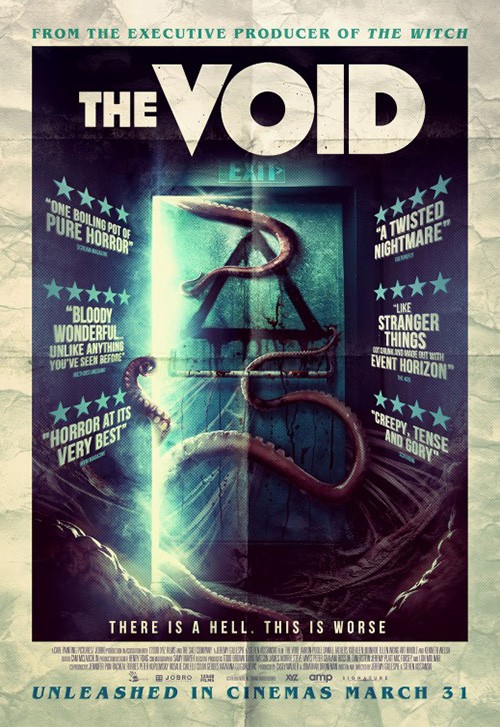
Pullin and Humphreys leave the triangle portal motif behind to focus on the monster/human hybrid image of parasite and host in mid-transition, in monochrome and full color respectively. They use their own particular illustrative styles to set each apart from the other and will appeal to those seeking a little less of an exacting composition as me. There’s definitely something for everyone and it’s not just for show either—the film deserves the attention.
What is your favorite April release poster? What could have used a rework?