“Don’t Judge a Book by Its Cover” is a proverb whose simple existence proves the fact impressionable souls will do so without fail. This monthly column focuses on the film industry’s willingness to capitalize on this truth, releasing one-sheets to serve as not representations of what audiences are to expect, but as propaganda to fill seats. Oftentimes they fail miserably.
With four big festivals happening this month (Venice, Telluride, Toronto, and New York), it’s no surprise that the only true blockbusters hitting screens are the highly anticipated sequel to a Stephen King property and the inexplicable return of Downton Abbey (September 20). We could probably throw Rambo: Last Blood (September 20) into the mix too for the boomer crowd.
That’s not to say movies like Hustlers (September 13) and Abominable (September 27) won’t make money. They will. The distinction comes from those two titles making their debuts on that same festival circuit. Just because the former opens wide mere days after its TIFF bow doesn’t mean a little added press won’t augment exposure. An event like that wants stars like Jennifer Lopez posing for photos and studios want audiences to think they aren’t missing out on the “festival experience.”
Posters therefore become a huge part of ensuring the public knows what’s available as fall turnover in theaters happens quickly. The glitz and glamour of festival season puts a lot of titles in their heads courtesy of red carpet news coverage and a nice piece of artwork can help them wade through the noise.
Portraiture


When a documentarian has films like Senna and Amy on his/her résumé, their inclusion on the director’s latest work shouldn’t be a surprise. What’s interesting about Diego Maradona (limited September 20), however, is that Empire Design has risked competing with the logotype they created for this film by listing those previous works in their own. That yellow “Senna” grabs my eye every time I look at this sheet and holds my sight from peering down at what’s being sold. It’s not necessarily bad thing, though, since seeing that name is what got me intrigued in the first place.
Without it the poster is pretty forgettable. The blue “Maradona” mirrors the blue of the subject’s shirt and the halo glow around his head helps to align with the “Hero” and “God” of the tagline while his scowl depicts “Rebel” and “Hustler.” While bland is okay for fans of the athlete since his name and photo is enough to get them excited, I personally needed that aforementioned reminder that Asif Kapadia was the one who put this story together.
Depraved (limited September 13) could have fallen prey to blandness too considering it’s nothing more than a face at the center of the page, but Brandon Schaefer and Jump Cut know how to do a lot with a little via color, texture, and aesthetic.
This isn’t merely a photo of Alex Breaux in make-up. It’s an isolated head bathed in red and shadows against a grungy backdrop and d-movie title font. There’s a throwback nature to the construction of the sheet that’s been brought into the twenty-first century so it’s not too much different than the other posters on the wall. It’s an extremely polished riff on lo-fi trash—something I wouldn’t be shocked to learn the film is too.
Gravillis Inc.’s Linda Ronstadt: The Sound of My Voice (limited September 6) takes a similar route albeit one that proves more conventional. Rather than create something new in the style of something old, they’ve taken an old photograph and manipulated it to add drama while still retaining the soft grain of its origins. By making the color saturation super dark, the colors become more vibrant than they’ve been since the day the photo was snapped. The yellow title doesn’t therefore pop as much as fall in line with the bandana around her neck to guide our eyes down from her face, through the fabric and her hands, and straight to the text.
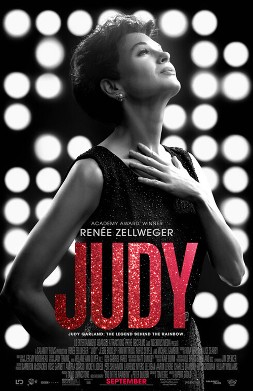
The opposite is done with Empire Design’s Judy (September 27) as they push Renée Zellweger to the side so she can literally point to the title with her arm. Rather than let her dress melt into a black background like Ronstadt, the contrast from white to dark transforms her chiaroscuro to a virtual silhouette that allows the glittery “Judy” to sparkle all on its own.
It may not seem like much, but comparing it to LA’s poster (with photography by Jason Bell) shows exactly how good it is. Here the black and white Zellweger becomes lost within the black and white lights behind her—the low contrast muddying everything into a consistent gray that the red title cannot compete against. Instead of being a bright beacon in an otherwise drab whole, the glitter here undercuts the color’s power to break free. It grounds it to the blacks and whites so that the only true outlier becomes “September” at the very bottom.
Similarities abound


It’s weird that the American posters for Rambo: Last Blood (September 20) didn’t do what the Italian teaser did: copy the spray painted black/white/red stencil look of Rambo. The choice is an easy one to make considering it’s been a while since Sylvester Stallone tied up that headband and some aesthetic connection might have done it good. Better than a badly blurred agro-Robin Hood trapped in flames at least.


I’m not sure what LA was doing with the latter because it’s pretty silly when all is said and done. I do wonder, though, if the studio nixed bringing that kneeling Rambo to the States because it bore too much resemblance to Colin Kaepernick’s anthem protest and thus would turn off the film’s main demographic: an American flag wearing public too dumb to realize their jingoistic clothing is what’s actually disrespectful.
The English language First Love (limited September 27) design is less about recalling something else than being something else. I know it’s not exact, but I thought this was an ad for the new HBO Watchmen series the first time it crossed my path. Between the closely kerned, bold yellow font and the pink splatter—how could I not? Someone had to have thought the same during those design meetings, so I must assume it was intentional.


Thankfully the festival sheet from Cannes has a bit more personality with its hand-drawn collection of carnage and unraveling skin. It too brings to mind something else due to the latter (Kevin Tong’s Mondo release of Mulholland Drive), but not enough to stop it from existing on its own merits. I would like to know whether a nude woman being the owner of that skin has contextual purpose to the whole, though. Otherwise it’s just another product using sex to sell tickets and that’s hardly creative.
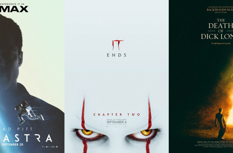
Ad Astra (September 20) becomes an intriguing case study since almost every one of its posters bears resemblance to another. A big part of this is the fact that space carries with it a specific set of visual tools with which to wield. While an astronaut alone against the black void is one such motif we’re seen countless times before, WORKS ADV does its best to at least stand apart.


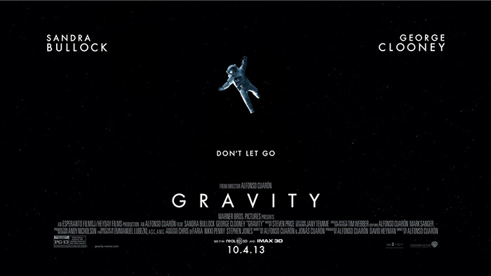
Where The Refinery’s Gravity depicts a person in crisis who’s desperate to swim to safety or reach out towards something she cannot grasp, Ad Astra shifts perspective and tone to deliver something else despite the pieces being the same. By shifting the angle lower, it’s as though its figure is walking on air without distress. And by morphing our sight with wavy static, his disappearance isn’t going to be slow and futile. He might blip out in an instant. The drama is therefore the same, but the mystery is its own beast.


Sadly, that’s the only copycat that adds something new to the equation. Brad Pitt the astronaut practically uses the same template as MOT’s Solis (albeit with a ton more polish) and BLT Communications, LLC’s French sheet proves a less effective riff on Creative Partnership’s First Man. Only BLT’s IMAX layout delivers something fresh by inverting space so it’s inside the actor with the white of possibility flooding the frame around him. It’s a beautiful visual metaphor.
I include Coffee & Cigarettes’ Extra Ordinary (limited September 27) here not because it appropriates a successful campaign from the past, but because it uses a concept that in turn makes it appear as though it does. The previous work I speak of is Being John Malkovich and its crowd of Popsicle stick masks that show how we’re all John Malkovich. It’s this idea that what makes us different can be neutralized if everyone around us adopts that same quality that’s being used here—not a visual repetition scheme on its own. Where one sheeted ghost is scary, a ton of them becomes comical.


It’s a wonderful representation of the tagline “Putting the normal in paranormal” because it shows how the unfamiliarity of an aberration is what stops us in our tracks. Once we normalize it, we can acknowledge that it’s not in our space. It’s sharing our space.
The final sheet loses this conceptual edge by simply plastering actors on the page underneath Will Forte’s goofy face. If anything, this poster shows us that the film itself might be what’s ordinary.
How low can you go


Despite the interesting angle of a painting covered in ash, eclipse’s The Goldfinch (September 13) is very much a tease. Content is thrown out the window (it’s based on a Pulitzer Prize-winning book so fans won’t need more than the title) as the cast list takes the spotlight instead. Director? Nope. Author? Nope. Ansel Elgort is king.
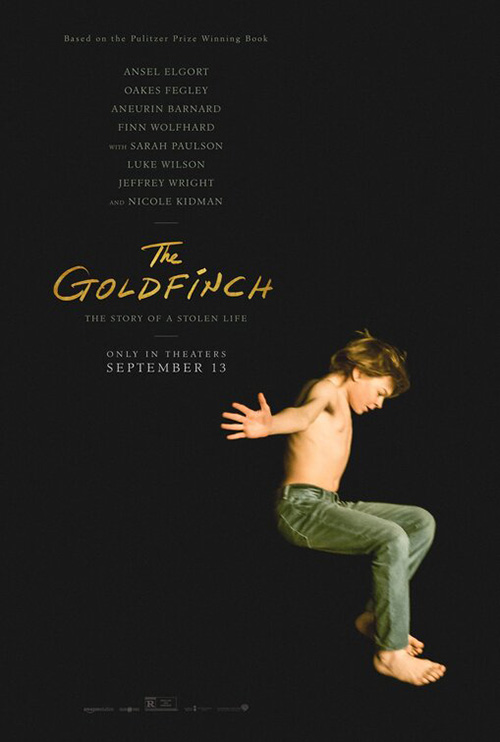
I think sometimes we get excited for a teaser because it has the potential to do something wild when really it doesn’t need to do more than its job. Will this sheet stay with us? Probably not. But it will put the title in our consciousness so subsequent designs can.
Is that the case here, though? It’s a no from me as Oakes Fegley jumping does little more than replace the painting as a mildly more captivating visual. The title is still the sole source of color besides that image and the cast list is still a focal point above any other behind the camera artists. It does tell us that the release date got moved up, however—so that’s good.
F Ron Miller’s Midnight Traveler (limited September 18) does a bit better as it creates something with its unique vantage point. It’s as though the person at bottom is standing on tiptoes to peer into a camera as the nighttime scene of a refugee camp (prison?) continues moving behind them. There’s a simultaneous sense of danger and fun, freedom and imprisonment. It’s a world of contradictions pushed down by the hopeful blue sky of the title.

For pure dread, look no further than Concept Arts’ teaser for It: Chapter 2 (September 6). You don’t need more than Bill Skarsgård’s creepy eyes to feel the chill of sinister malice run down your spine. That the white space at top can double as an aesthetic choice and Pennywise’s giant forehead only gives the poster greater appeal as an ingenious crop utilizing what’s available to create its optimal mood.
I like cold open’s theatrical sheet with its pair of balloons signifying the chapter number, but the lack of those eyes forces it to lose something in the translation. This is more Santa Claus than Pennywise thanks to that oversized sleeve. I’m a big proponent for less is more, but removing the hand and adding a reflected face instead might have been the better choice.
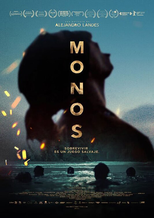
Nothing beats Legion Creative Group’s Monos (limited September 13) where mood and texture are concerned, though. It’s like a painting with swirling brushstrokes photographed on old stock with weathered scratches added to the surface. That there’s an actual scene beneath of a horse walking down a mountaintop is almost an after thought since it seamlessly merges its silhouette with the disintegrating edge of a page in flames. This thing operates on multiple levels at once to challenge our perspective and linger much longer than the bubbling title succumbing to that fire will.
It’s a huge step up from the Spanish language poster and its desire to combine two scenes together with shallow focus and sparks acting as filters for intrigue. What was implied is now literal and the distress we felt gazing upon the former is all but erased.
Cream of the crop


BLT Communications, LLC supplies what might be the most entertaining poster of the month courtesy of their tan-lined piggy bank for The Laundromat (limited September 27). It really doesn’t matter if this imagery alludes to the plot or not as its existence piques interest all on its own. That this added level does succeed is merely a bonus—laundering the money of the rich through a Panama City law firm as sun and sand risks burning you. I just hope the smile on my face now remains while watching.
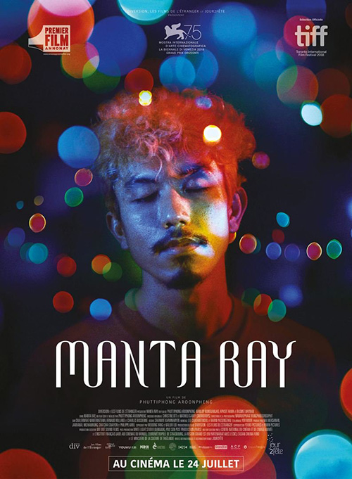
The English language sheet for Manta Ray (MUBI September 26) might be the month’s most beautiful as the black and white animals swim amongst amorphous orbs of color, their shadows providing a double exposure effect that renders the textured foreground even more delicately complex. I don’t even care that the title font is nearly illegible since its proximity to the object it describes is enough to parse the letters together.
It’s a testament to the designer too that it works so well when the French language iteration is almost as gorgeous with a completely different visual direction. Here we get an actor swimming amongst the evening light glares blurred in the distance that have also inched forward to surround him as though caught in a dream. The title removes its experimental font of using just two types of vertical shapes for greater readability and a smoother transition with its curved slopes being devoid of sharp edges. And the color palette is absolutely magical.
For Daniel Fumero’s Chained for Life (limited September 11), the magic comes from his ability to use refraction and fragmentation to create a metaphoric overlap of beauty and “beast.” What at first seems like a shattered mirror putting Jess Weixler and Adam Pearson in frame together is soon revealed as the product of glare. Or is it? The edges from one part of a face to the next are nonexistent, the fuzz almost alluding to the fact that no division exists.
It’s truly a stunning piece of art done in by a stray line of text at the top. I’m sure there was a reason to jut Aaron Schimberg’s credit out to the right (differences and all), but it’s the sole piece not on its center axis. Rather than be tastefully offset, it becomes a sore thumb sticking out like someone screaming, “Look at me!”
And speaking of such a declaration, P+A’s entire layout for The Death of Dick Long (limited September 27) is exactly that. Why? Because the name makes it so we cannot think the figure at the bottom released a firework with his hands. No. It’s definitely coming from his genitals and the thought is about as head-scratching a concept as you could expect from one half of the Swiss Army Man directing duo.
Despite that flight of fancy, however, the poster itself is elegantly composed. Everything lines up at center, the title is a regal serif with purposeful leading, and the coloring is as in-your-face with its brightness as it is precise with its detailed smoke trails. This traditional beauty is intentional too since it legitimizes the insane act it has immortalized for all to see. Handling this scene with such care ensures we take it seriously. That’s part of the joke.
What is your favorite September release poster? What could have used a rework?