“Don’t Judge a Book by Its Cover” is a proverb whose simple existence proves the fact impressionable souls will do so without fail. This monthly column focuses on the film industry’s willingness to capitalize on this truth, releasing one-sheets to serve as not representations of what audiences are to expect, but as propaganda to fill seats. Oftentimes they fail miserably.
You have to love a summer month where there are just five tent-poles and a bunch of little things surrounding them. Here’s a time where you have Wonder Woman refusing to even advertise until after Guardians of the Galaxy Vol. 2 bows a month in advance. Competition is fierce and box office glory comes but once. So you need to pick your date wisely and hope one of the small budgeted flicks that exude quality rather than gimmicks don’t rain on your parade.
There are two big questions arriving out of this situation. One: will you have the constitution to avoid those blockbusters and support the auteurs instead? (Not that James Gunn, Ridley Scott, and Guy Ritchie don’t have the track record to say they deserve the paydays.) Two: who wins Memorial Day weekend? Baywatch comes in on the 25th, Pirates 5 the 26th, and a slew of holdovers remain on screens. The war of studio attrition begins wherein theater owners are forced to decide which will grace their coveted screens.
Disney (and Disney adjacent) rules May


Out of those aforementioned five behemoths, three come from Disney or have a link to Disney in their past. If all goes to plan this trio could combine for almost a billion dollars worldwide in one month. That’s insane.
I’ll start with the “adjacent” title in Warner Bros.’s King Arthur: Legend of the Sword (opens May 12). It could just be my youthful adoration for The Sword in the Stone, but I had to stare long and hard at the distributor name to realize it wasn’t Mickey Mouse and pals. And who knows? Maybe WB gets lucky and a few million people go simply because they believe the same.
The ad campaign by B O N D isn’t anything to write home about, but it gets the job done in a concise manner. Whether they put Charlie Hunnam against white or gray, they keep him in an almost black and white high contrast monotone so the splash of color in the Old English-y font pops. The blue works best against the stark shades, but the gold proves more relevant and gritty in its textured sheen. Neither sells me on the product as much as the star since Ritchie’s name (one that admittedly gets me excited still to this day as a fan) is non-existent.


P+A is responsible for sheet number three and it’s very similar if less effective. A bit more color is added, motion blurs completely remove the pop art feel of the first that the second already distanced itself from, and the glow of the sword is silly—although that’s on the film and not necessarily the designer. We’ve gone from stylishly generic to simply forgettable in a matter of one, two, three. And don’t get me started on the character sheets’ text over portrait lameness. Art Machine is lucky that gold is nice.
I’d like to say the fourth advert above saves the day, but it too isn’t perfect despite there being plenty to like. Finally we get more than one actor at the same time, the playing card vibe an inspired choice what with “kings” and everything. The “KA” logotype is attractive if also a clunky read, the coloring really embraces a Warhol aesthetic, and the repetition of its “coming soon” text is a welcome example of dedication to the card structure. If any would turn my head, this is it.
Where mouthful Pirates of the Caribbean: Dead Men Tell No Tales (opens May 26) is concerned, the head-turner is number one: BLT Communications, LLC’s teaser. I love the detail of the skulls’ ornate artistry, the gorgeous line work beneath it making up a map, and the fact that we need nothing else to see this as the newest Jack Sparrow chapter. Disney has been feeding us this motif for almost fifteen years cinematically and more through their amusement parks. The Pirates brand is strong.
Depp’s face is a part of that too so it’s no surprise B O N D, with help from photographer Frank Ockenfels, ensures we get a tease of his mug too. In lieu of the Pirates name we get the subtitle—again enough when coupled with the visuals. The character is iconic, the make-up and hair on point, and the tattoo a reinforcement of Jack … except not. Does his hand say Jake? Or even worse: Jakc? I feel like we’ve stumbled into Garry Gergich territory now.


As for the final posters: meh. Here are some characters—familiar and new; some artistic, painterly flourishes; and the latest CGI-fueled baddie in Javier Bardem’s cracked face of death. The way that hair flows I can only think of Ursula from The Little Mermaid, a comparison that admittedly cuts some of his potential bite (something the comical change in dialogue tone during the teaser trailer does too).
Oh. Don’t pay enough attention to the gold leaf names on the character sheets to wonder who copied who between Pirates and King Arthur either. B O N D had a hand in both. They copied themselves either way.
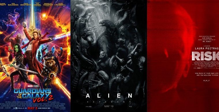
All is not lost on originality as far as the biggies go, though. Guardians of the Galaxy Vol. 2 (opens May 5) saves the day somewhat. No one is breaking any molds, but at least every poster isn’t merely some rendition of the same thing. B O N D (boy are they busy) is actually allowed a little fun with mix tape spines and hand-drawn names. It’s on brand, informative, and memorable in its distinct lack of photography.


LA comes in with a full sheet that riffs on every big budget collage, adding a “groovy” element that does little to combat its lack of ingenuity. It’s chock full of details whether enemies, monsters, or spacecraft, but I’m not sure many will stick around long enough to get close and discern each one. That’s why I’m all-in with the black and white “cool kids” Calvin Klein space ad from BLT. Sure it’s heavily Photoshopped, but it looks real via proportion and place. You get to even have fun searching for Baby Groot.
The IMAX sheet is memorable too with its dark silhouettes and seemingly vector based animation. It puts a “comic book” spin on the whole that becomes a good change of pace considering the source medium is just that. I’m not a fan of the straight-line title, though, especially if the “of the” remains stacked. The two-liner version is compact, easier to read, and perfect for the “Vol. 2” overlay.
Sadly, I could do without the character sheets completely. LA’s English versions are excruciatingly boring in their wanted-posters-but-not tone. B O N D’s Japanese versions are better in that they’re stripped down (black and white photocopy faces against a color gradient, no lame frames or marble backdrops), but no less interesting. Rather than attitude (see BLT’s work above), I can only discern constipation.
Tale of two directions


InSync Plus’ poster for Chuck (limited May 5) is okay. There’s a bit of the fun that the trailer hints at with the fighting stance in huge coat—pugilism meets style. The black on red gives your eye a break from the chaos of the blockbuster photos and it’s graphic enough to be just left of obvious. It’s also a good example of a marketing rebrand both in title and tone.


What it’s not, however, is better than the original sheet from when the title was The Bleeder. This one is more serious with Liev Schreiber in the ring, bloodied and perhaps defeated—something his supposed counterpart in Rocky Balboa never was (despite the result). The coloring is reminiscent of Sylvester Stallone’s franchise as well, the layout similar to that of Rocky III. It’s old school in sensibilities, gives a glimpse of content, and intrigues regardless of it. The comedy is missing, but its addition in the above doesn’t outweigh this one’s captivation.
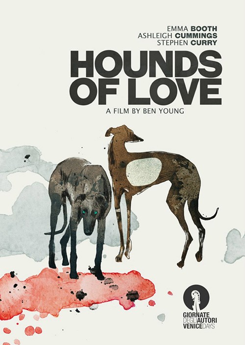
While the poster for Hounds of Love (limited May 12) isn’t anything special with its color, torn bisection, and juxtaposition of sexuality and perhaps torture, I really like the title font. It gives it a sense of era, the mood set as one perhaps not of today (it takes place in the 1980s). There’s a horror vibe coming off of it too, the bold letters blinding us as the additional curves at its points look like daggers.
Is it better than the festival sheet, though? I’m not sure. There’s something really nice about the watercolor aesthetic and metaphor of actual hounds instead of people even if it may give you the wrong idea of what the film is about. The color fields could connote blood, the look of the dog in the foreground perhaps a stare of malice as the one looking away sees it has nowhere to go. One maybe I’m only reading that because I’ve seen the other. Both ultimately have pluses and negatives, their success hinging on your affinity for literal depictions or expressive ones.
The Dinner‘s (limited May 5) shift is interesting not because it proves either super dark or super light, but because of each version’s origins. Stereotypically it’s the foreign markets that embrace edgy material with domestic tastes skewing more palatably mainstream.
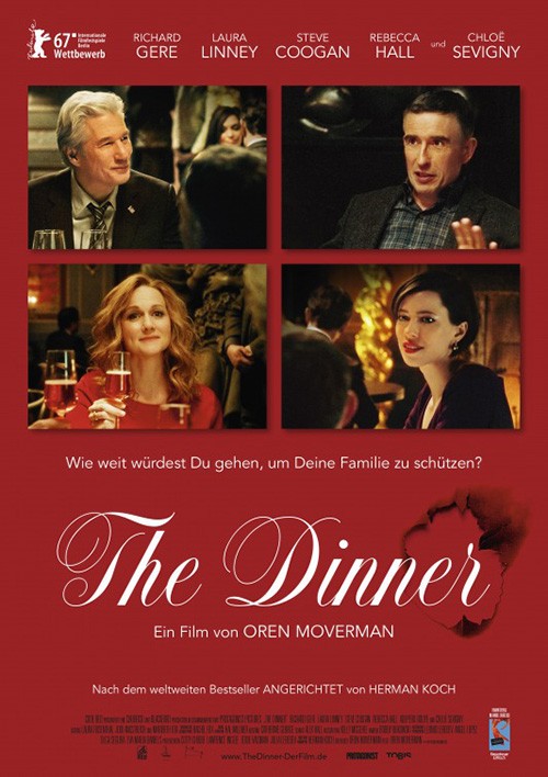
When you see the dramatic sheet from The Refinery you think it’s going to be a doozy on the emotional scale. These actors look ready to kill one another or at least suspicious that another wants to kill them. The word “thriller” is present with a tagline “How far would you go to protect your children.” I’m thinking Prisoners level suspense here—actions and thoughts that make you as protector just as cruel and unyielding as the predator waiting to pounce.
And then you spy the German poster. It possesses many of the same elements as the first: prominent title, a solid color background, and four boxes housing one character each. But look at how these attributes have changed. The title goes from thin, stoic sans to a playfully decorative script. The deep black moves to a brighter red, the actors from stern looks to enjoyable small talk with a smile. So is the film a comedy now? Are the supposed lengths these parents will go barely mischievous let alone criminal and Americans simply believe things are worse than they are?
If nothing else I want to buy a ticket to find out which poster got it correct.
For Berlin Syndrome (limited May 26) the difference between version A and B is aesthetic. The tone is rather consistent in its dramatic mystery even if the first is darker than the second’s gaze of romance, but the color, text, and imagery are night and day.
As a whole my favorite is the “In Production” ad because of its complexion. It goes from black to dark blue with a bright name devoid of flourish. We see two actors either fearful or pensively unsure, the crop as captivating as the scale is suffocating. There’s a sense of intent, consistency, and emotion.
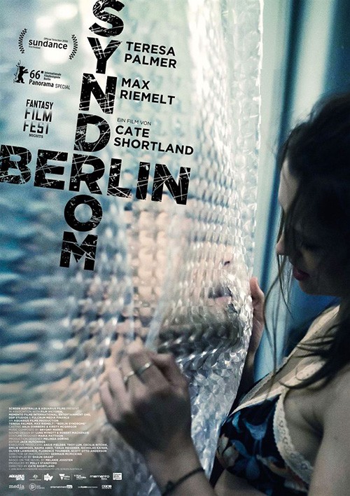
I do really like the image in the second better, though. How could I not? It’s this weird scene of woman and man separated by translucent shower curtain, his mouth coming in for a kiss as she watches with the thought of reciprocation. The angle is interesting, the coloring a strange green tint, and the power of its freeze-frame palpable.
But it’s ruined by typography that completely subverts its image’s success. The angle calls attention to the off-kilter slant, rendering it moot. The cross of the “R” doesn’t appear to have purpose, the scratches a product of a free download rather than a conscious texture. This font unavoidably augments the film’s budget and makes you question whether it will be worth your time.
Illustrative typography


I enjoy a good handwritten font, especially when the letters aren’t perfectly molded from template. The two “Hs” in Hermia & Helena (limited May 26) aren’t identical in shape or fill with one being solid and the other not. This isn’t therefore a font at all, but an actual person’s cursive. It therefore lends individuality, a personal touch assumedly mimicking the actress depicted in the photo. We are brought into the story, the text here a piece of it rather than a machine-made embodiment of style over substance.
As for the rest, I think it mostly works. I haven’t seen the film, but from this imagery my guess is that this woman plays both roles. Perhaps a split personality? Maybe twins? Kudos to the designers for finding a way to fade out her body so that it looks like she’s two heads connected by the neck a la a playing card (again). If you look close enough you can see the coats disappearing, but only if that’s your goal. The lens flare and over-exposure help mask it while also adding some flavor to what would usually be a studio shot portrait under controlled conditions.
What I love about Abacus: Small Enough to Jail (limited May 19) is the design work constructed around the text. The font itself is a common sans, the symmetry of its letters proving imperative to the design. Suddenly they become additional beads to the titular device, lined up to deliver an answer. The title is therefore illustrated in a minimalist way that enhances both its meaning and the poster’s aesthetic.
The image is perfectly cropped to serve as a balance to it: the subject scooted to the right so that we’re given ample space at left to house the graphic. Its straight lines vertically (and horizontally as formed by the beads and letters) also add a layer of depth against the vanishing point built by the rooms walls (“Abacus” serving as the horizon). We can believe that it’s closer to us than the man, our eyes allowed to enter the frame and move freely as a result.
There’s a logical reason why Everything Everything‘s (opens May 19) poster is just text with illustrative doodles: it’s almost identical to the original book cover. Not only does the poster evoke a youthful exuberance much like the one for Me and Earl and the Dying Girl, it possesses brand recognition for fans of the source material. Dare I say it even improves upon the book’s graphic by turning the first “Everything” into one line? This switch makes the whole less unwieldy, especially since the top word didn’t have illumination anyway. This way we even put emphasis on the second word for an “Everything, EVERYTHING” read.


While it works nicely on its own as a tease, though, it can become a bit much when used alongside images. Brian Bowen Smith’s final sheet distracts us by wanting its photo to resonate despite our eyes having a hard time ignoring the title at bottom. It’s smaller now so we stare longer and more intently to make out the myriad details in it, all but forgetting the sweet depiction of love behind glass above. What wasn’t busy now becomes so, its surroundings turning an attractive logo gaudy.
As for the ultimate display of typography this month, that award goes to Afterimage (limited May 19). There’s a mix between constructivist design sensibilities and Polish illustration in lieu of photos. Do we know what it represents? I sure don’t. But it grabs us in that mystery, appealing to our sense of beauty rather than literal description.


And it gorgeously plays with depth, translucency, and color. Some of the biomorphic shapes seem flattened together, some cover the thick black text, and others—like the red—reveal what’s beneath through it. I don’t love the elongated text at bottom with the “A Film By” credit considering the rest is conversely proportional and this shift sticks out, but besides that the sheet’s use of art and abstraction is a winner.
Pairing image with type


Beyond cool typography are those designs with the ability to compliment their imagery rather than war against it. May 2017 delivers a few that do this very nicely. Sometimes it’s a marriage made in heaven and others simply knowing that either the type or image is good enough to ensure the other takes a backseat to let it shine.
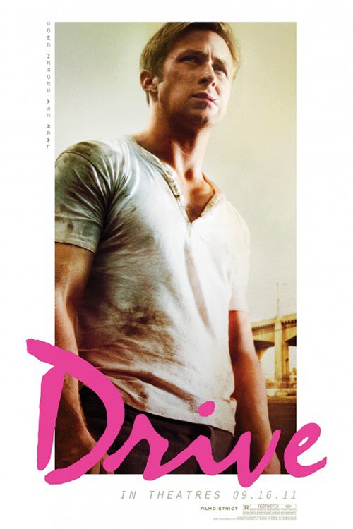
P+A’s The Lovers (limited May 5) is an example of the former. Not only does its neon script reminding me of Drive pop enough to draw attention, the image does the same. This isn’t about showing a grand gesture of love or the lack thereof. It’s a display of complacency—a rut wherein you may not even realize something is wrong. It’s about body language, the distance between husband and wife with no inclination towards erasing it through an embrace.
The juxtaposition of this flashy title against stagnant photo is wonderful, the symmetry of names, actors, and title box perfectly formulated to augment the gap at the center straight down to the name. So much is said with so little prompting as the designer effortlessly gives us everything we need in a glance.
The Boland Design Company’s Risk (limited May 5) provides a captivating harmony of aesthetic by masking everything in a white noise. This filter makes the image barely discernible and the text unmistakable due to the heavily saturated red being stripped away to white.

They’ve placed the title at the center even if it’s pushed right, our eyes targeting it before moving out to catch a glimpse of Julian Assange’s highlighted silhouette. It’s face and title—nothing else is truly needed besides the director’s name. Even the date is shrunk as though an afterthought, the content enough to force us into searching to find it.
Personally I can’t look at this image without thinking about Andres Serrano’s Immersion (Piss Christ) from 1987. I wonder if it’s intentional since the artist has said the work “alludes to a perceived commercializing or cheapening of Christian icons in contemporary culture.” One could say Assange has done this with the media, making his celebrity a product above the information he shares. His desire always seems to be the one that releases it being more important than the implications of it being released.
For Violet (limited May 12), these two parts are impactful on their own and the designer acknowledges it by keeping them separate. We’re given this powerful image of a bruised woman caught under a haze of grain, the shallow depth of focus highlighting her face as body and hair blurs into a framing device. It literally fills 80% of the frame so that we have nowhere else to look and nothing else to distract us.
It’s then up to us to look for the title because we’re intrigued and when we find it we’re drawn back in by the subtle flourish of removing the “V’s” right side. Our eyes fill it in, the line from the “V’s” bottom point to top of “I” there in its emptiness. The credit box arrives at its right to balance out its bright white and the logos get relegated to the bottom as an afterthought (because that’s what they are to everyone who doesn’t work for those companies).
And then there’s BLT’s teaser for Alien: Covenant (opens May 19), a success in its mood, horror, and complete ignorance of anything not imperative. The text isn’t meant to oppress, intrigue, or do anything but deliver the franchise’s trademark lettering. Even “Covenant” becomes a secondary inclusion, its presence to set the film apart from its siblings but not declare it as better than them.


Its white pops because the rest is shrouded in shadows, an unforgettable mural done as though in marble of a transition in power from creators to creation. That which is formed by the hybridization of Prometheus man and Alien face-hugger is born in its vile, evil Xenomorph form. This is a Renaissance statuary of nightmare.
InSync Plus comes in with a series of teasers that enhance the whole with specific details—many of which weren’t in Prometheus and in my opinion prevented people from seeing how great a film it was. There is “HIDE” with an egg and “RUN” with a monster exiting the darkness. And while their final with Katherine Waterston doing her best Sigourney Weaver from Alien3 gets the look right, it doesn’t quite captivate like BLT’s besides on that level of nostalgia.
What is your favorite May release poster? What could have used a rework?