“Don’t Judge a Book by Its Cover” is a proverb whose simple existence proves the fact impressionable souls will do so without fail. This monthly column focuses on the film industry’s willingness to capitalize on this truth, releasing one-sheets to serve as not representations of what audiences are to expect, but as propaganda to fill seats. Oftentimes they fail miserably.
For being a summer month, July only having two sequels (yes, An Inconvenient Sequel in limited release on the 28th counts) and one reboot is kind of an astonishing realization.
It’s a tough market for originality out there, but maybe we’re turning a corner. A24 is bringing its niche auteurs to wide release, big studios like Warner Bros. are affording A-listers the room for passion projects, and no matter how misguided The Emoji Movie (July 28) seems, the reality of it not having a number after its name in a year of umpteenth franchise rehashes is comforting.
Now the hope is that you—the ticket-buying public—will support these artistic endeavors and help buck the trend of empty mega-million budgeted nonsense. Because you cannot argue against tent-pole blockbusters’ lack of ingenuity story-wise if you aren’t willing to practice what you preach by making the “fresh” alternatives hits.
Tent-pole central


Back to emojis: I’m skeptical yet intrigued by The Emoji Movie. It is “original” if also an insane choice to jump to cinema. And it seems like it might have its heart in the right place after finally releasing a trailer to give us an idea of what to expect. There’s a Wreck-It Ralph-lite feel happening that could fail miserably as quickly as it could succeed. Either way it will probably make a ton of money for no reason other than hearing Patrick Stewart’s voice escape an animated pile of feces.


The marketing is built-in as any child with a smartphone is fully aware of what these successors to emoticons are. So it’s no surprise that Proof goes for the simple grid display providing a few of the more common examples. Are you feeling “devilish,” “happy,” or “ice cream”? It’s like a vending machine with every option illuminated and ready for its chance to shine. Throw a couple generic faces in the title’s “O’s” and voila!
Ignition is then tasked with the job to make jokes and introduce older, tech-unsavvy people to what is happening here. So S*** “Happens”. Bug-eyed fake smile woman is deemed to be “Crazy Happy”. And we’re told which of our favorite actors decided to take this lucrative paycheck. And no that it’s all out there, the question becomes whether you will buy it?
The same can be said about Valerian and the City of a Thousand Planets (July 21). Here’s a movie that director Luc Besson literally staked the future of his production company on to the point of having to sell off distribution to STX. It’s the sort of work that will need that very reputation to be successful because more people surely know The Fifth Element and Lucy above Pierre Christin and Jean-Claude Mézières (the original comic’s creators).


This is why BLT Communications, LLC puts “From the legendary director of” at the top of a poster that doesn’t even possess Besson’s name. The idea is to bank on past achievements and current celebrity with Cara Delevingne and Rihanna on full display amongst a collage of space-like creatures. Switch does the same with their simpler “V” holding the two leads (Cara and Dane Dehaan) alone. In fact, it’s only when BLT sheds the white for deep, dark colors popping out the blues of space and reds of fire that the director’s name is allowed a place next to his accomplishments.
Will the colorful chaos be enough to get people interested? I hope so because this marketing campaign does little to entice on any level beyond surface star-power. BLT’s teaser tries to add a welcome sense of scale with its behemoth spaceship, but it remains polish over substance. We shall see whether audiences believe the finished film is too.
Sometimes it’s just easier when you’re building off of an existing base of recognition like the third part of a trilogy such as War for the Planet of the Apes (July 14). Granted, it also helps when the first two parts of said series were critical and financial successes. We are anticipating this installment. We know Caesar the chimpanzee and what he stands for. We’re ready to see his fate.


This means BLT can go the large-scale face-off route with humans opposite apes (in glorious Full Metal Jacket mode with helmet text) or small-scale with focus on Caesar himself (and his incomparable computer-animated construction with snow covered fur). We know what he’s advertising without a title. We know this war can be the end of everything.
So it follows suit that a glimmer of hope would be introduced in the form of a little girl. You see her (and a winter coat wearing chimp of blue against the drab grays) in the face-off poster (small on the horse). You see her being protected by Caesar in close-up on Gravillis Inc.’s tease. And she even gets her own showcase (by 20th Century Fox Domestic Theatrical Creative Advertising), flower in hair. This is a calculated move to project the possibility of coexistence. It’s to show Caesar’s anger isn’t towards humans, but those few that oppose him as an inferior threat to their lives.
And just as subtle and effective that campaign is, the opposite is true for Spider-Man Homecoming (July 7). Don’t get me wrong: BOND did a nice tease with Spidey on the Avengers tower and BLT too with him lying in front of the building. Their simplicity is their selling point because these are more about the character’s integration into the MCU than anything else.


But once we move into collage territory, the wheels fall off. If you were on the internet when BLT’s above one-sheet was released, you know the spoofs it spawned. I could have trolled you by using one of the mock versions with random stuff Photoshopped in and you might not have known the difference.
What is honestly happening there? Do we need Spidey and Peter? Iron Man and Robert Downey Jr.? Vulture and Michael Keaton? Is Jon Favreau’s role big enough to warrant a visual presence next to Zendaya and Marisa Tomei let alone have his name above the title? Where is the fire coming from? And who’s the dude with the blue spark? This is what happens when a studio puts its marketing images online for a fan-made poster contest and someone wrongly reads the rules as “use everything together.”


At least the yearbook version of this unbridled insanity makes thematic sense. Each image is rendered as a cutout piece of paper to be glued into a scrapbook. There’s fun had with hand-drawn aspects and poorly cut outlines. A little charm goes a long way.
Thankfully Matt Ferguson comes in as a palate cleanser with the latitude to make a piece of art through graphic illustration. Here’s that sense of composition the two “official” sheets lack.
I’m going despite the poster


It’s one of those things where you have to hope Universal had explicit instructions for LA in regards to their Girls Trip (July 21) sheet: “Do that poster trope thing with everyone framed between someone’s legs. But, like, ironically. You know, that thing but funny.” Sorry to all involved, but there is no way to make it funny anymore—not even by adding children a la The Sitter.


What they were able to do, however, was make it even worse. Just look at this thing. Regina Hall and Queen Latifah are at a table on which the stripper is standing. We can all agree on that. But what is happening behind them? You can almost let your brain ignore that Jada Pinkett Smith is torso up only. Maybe she’s a head taller than the others or maybe she’s standing on something or maybe the two women in front of her are leaning. Whatever. I’ll think about letting it slide.
We cannot excuse Tiffany Haddish on the top left, though. Is her left arm crossing in front of her body? Is her body contorted into a “Z” so you can only see that tiny portion of something above Hall’s right shoulder? If anything Haddish’s head is positioned like she’s lying on the floor, stomach down. That would explain the absence of her body, but not her ability to float in the air.
The tragic reality here is that the teaser poster is hardly better. It looks as though the film has a scene where all four actors are shown praying to God at the edge of their beds alone and the designer decided to splice them together to pretend it was one giant bed. They have failed. And making the tag/quote/prayer almost as big as the title only makes the whole worse. Suddenly “Girls” is the only thing not popping despite its color presumably attempting to do the opposite.
The studio behind Blind (limited July 14) must have instructed Stockholm Design to complete a very specific design homage too as this thing is identical to BLT’s Something’s Gotta Give. Man with sunglasses on top, woman peering back at bottom, and serif title in between. It’s the rom/com template of boring faces atop blurry, nondescript backgrounds to remind us that nothing matters besides the actors’ charm.


As an alternative the poster at right is hardly an improvement. It confuses if anything. Why the tonal shift to thriller with the dark night scene, Demi Moore’s depression, and the italicized “I” in the title to connote something as not being completely honest? Is she going to kill him? Gasp! Is he not truly blind? Double gasp! Is she a ghost? Gas—yeah, that’s my guess. So much for thoughts of just another happy-go-lucky Nancy Meyers retread.
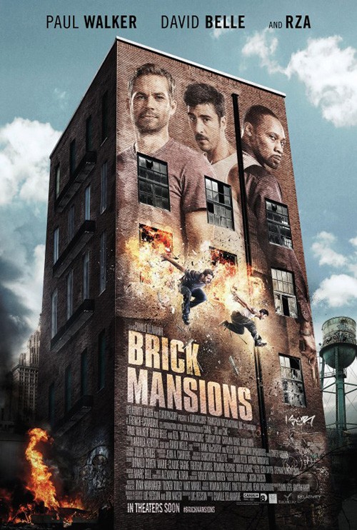
Even worse, however, is Wheelhouse Creative’s Person to Person (limited July 28). Here’s an example where an unrealistic collage would actually be preferred to what’s delivered. You know, like Brick Mansions. Yes, that mess is better than this.
Six static close-ups that cannot even be called portraits with actors facing off-camera in a tidy little grid plastered on the side of a building? This is the work of someone fresh out of ideas whose deadline was an hour away. Throw a stock photo of a building up there, toss a couple blurry stills in like they’re windows even though they’re placed on what might be a billboard (But that craquelure filter wants to fake it as paint on brick?) that’s actually covering up the windows, and toss a few names in to fill white space. I feel bad saying it, but this is a poster that makes it tough to not want to skip the film altogether.
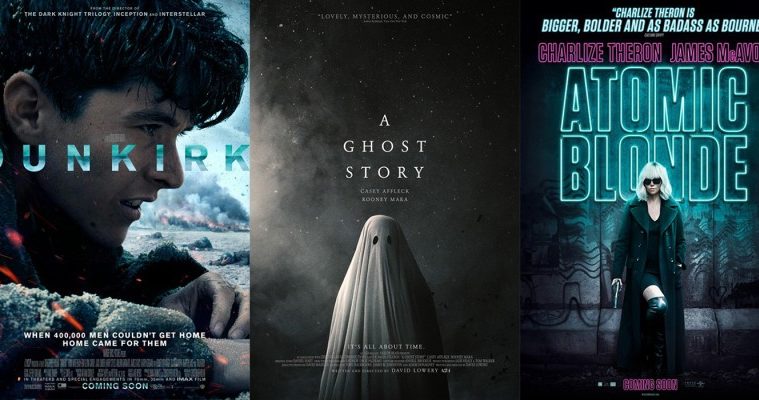
And that leaves us with Dunkirk‘s (July 21) campaign of glossy images beneath horrible typography. This is a war film from Christopher Nolan full of gravitas (if the trailers are to be believed) that’s relegated to uninteresting stills and misguided text. These things make what should be a beautiful work shot on film look like made-for-tv soap opera.


The IMAX sheet from Concept Arts wants us to care more about the technology than the movie, its use of the ocean’s horizon line as a color fill forcing us to lose sight of the massive letters (which are bigger than the title that’s also saddled by the same fill to render it overkill rather than effective distraction) thanks to a sky with similar blues. Give us scale. Play with the boat angled on choppy waters. My eye can’t even look at the scene because those letters are monopolizing my vision.
WORKS ADV’s close-up character view isn’t better as there’s still no drama (sorry you random flickers of flames). I don’t mind the title spanning the width of the whole to drive our attention its way, but the placement atop the actor’s face is weird. I look at the title and then his eyes. But since they peer off-screen, I’m drawn to the tag in white at bottom and finally away from the poster completely. I never see the smoke or the soldiers and I surely never see the credit text so thin and condensed that it’s practically illegible.
Not all is lost thanks to Concept Arts’ teaser, but most theaters have probably removed it for the new ones due to a lack of a solid release date. Finally we’re given a moment of time. There’s weighty drama, a sense of scale with foreground battling background, and effective typography to let the title pop on the black while remaining small enough to be manageable and remembered as a word rather than letters with too much kerning. This is the movie I want to see.
Critics are saying …


Critic blurbs have been a tried and true way to drum up excitement for films that may not have the type of exposure a big Hollywood blockbuster would. In recent years some “critic-proof” work has even resorted to placing social media reactions on their marketing material—the decision to do whatever is necessary to create positive buzz winning out over letting the title and/or stars sell it alone.
A movie like The Untamed (limited July 21) is a perfect candidate for using earned acclaim. It’s a Spanish-language, Mexican production that hasn’t really received a massive push (and most likely won’t hit many cities outside of big cinematic hubs). So we need to hear something about what it could be from a source other than the PR-team.
The image used of a woman on a mattress inside a darkened, non-descript room is captivating enough to give us pause, but coupling it with the words “Sci-fi sexual drama” provides context to really dig in and take note. I may have shrunk the title a bit and pushed the image down to utilize a more expansive white space at top for added claustrophobic atmosphere, but that’s just me.
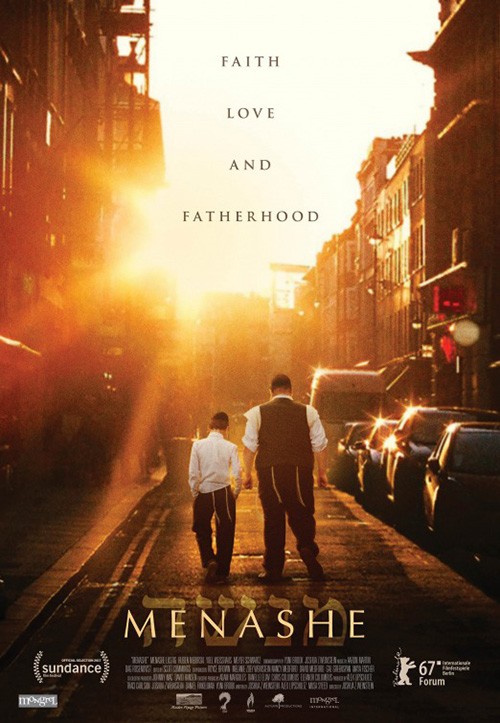
Menashe (limited July 28) looks to create its buzz with more subtlety. Rather than highlight the quotes at the top center, the design firm decides to integrate them into the rest of the design. It bisects the frame to be image on left, text on right. The font is smaller so as not to overshadow the title, but its bright and legible enough to pop above the credit box at bottom. There’s nothing exciting about this sheet, but it does supply the information we need to have an idea of what to expect.
For my money Outer Arc’s poster before the film was bought by A24 does a much better job at cultivating intrigue, though. It uses a tag to punch up qualities that the over-saturated image delivers from the heavens. The simple inclusion of a boy to give the man purpose instead of giving him a static portrait adds a lot too. Here’s a story whereas the previous example was literal advertisement.
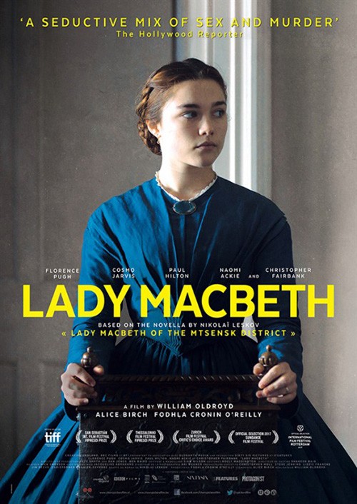
Leroy and Rose looks to avoid this notion of two posters with individual strengths the other doesn’t possess on Lady Macbeth (limited July 14). Yes they give the critic quotes half of the page with bold white to scream out at us, but they don’t sacrifice the overall visual aesthetic to do so. This sheet may be a portrait of sorts like Menashe, but it also gives its subject character, setting, and depth (the latter thanks to some effective typography integrating words with image). And it adds drama by creating that extra white space I wanted with The Untamed above and bright color dictating focus below.
This was a major step forward beyond the selection at right even though the latter contains half as much information. Don’t get me wrong, I do like the look its grain provides better than the glossy sheen above, it’s just less dynamic on the whole. The font used for the sole critic quote is very out-of-place, the title seems awkwardly squished together, and the previous sense of power through scale is replaced by unearned mystery. While pretty, it’s nowhere near as impactful.
Nobody would say the same about LA’s Atomic Blonde (July 28), though. Here’s a wide release (albeit from a smaller studio in Focus Features) that might not need critic validation, but why not use it if it’s there? I feel like I should hate this poster because it’s so busy, but the designers did a wonderful job retaining a level of coherence despite that chaos. They punched up certain words so we can read them without the rest, used color to highlight exactly what’s paramount to absorb, and let the action speak for itself visually with an untouched still. The image describes the text and vice versa.


There’s something comforting about this down and dirty, stripped down informational vehicle devoid of bells or whistles. That’s how confident the studio is in the content—they don’t need to show us anything that we wouldn’t also see in the theater. This truth doesn’t mean BOND and The Posterhouse’s more stylish examples are unsuccessful, though. They just want to focus on the attitude of the film’s character rather than the excitement of its action. They’re selling sex and celebrity instead of choreography and expertise. Hey, whatever works.
Headturners


Ok, so the Landline (limited July 21) poster isn’t a head-turner. I will concede that point. What it is, however, is fun. The sans serif font of the title is both sharp and smooth, bold and playful. The cord exiting out of the first “L” proves to be a goofy visual pun that helps move our eye down the page. And I love the tag: “1995. When people were harder to reach.”
Better than the tag itself is its marriage with the image and the image’s familiarity to today. Just look at this cast of funny people staring blindly out into space, ignoring all others for the paper, or trying real hard to see something that may not be there. This idea of the 90s having “difficult” communication comes from its world being without cellphones. But when I look at this poster I think about the last time I had dinner at my parents: TV on, fork in one hand, and smartphone in the other. In some respects we were much easier to reach back then.
I’m honestly not so sure P+A’s A Ghost Story (limited July 7) is a head-turner either, but it is effective. If anything it’s a head-retainer because the low contrast black sucks you in after you look its way. I really like how it isn’t the usual deep saturation photography used in pieces like this because the gray lets the detail of the stars lend an unforeseen texture to the piece. It provides an otherworldly feel steeped in adventure and infinite possibilities, something that renders the ghost a welcoming presence rather than a specter of horror.
It’s a simple design with carefully positioned title block bright against the muted whole, the ghost tactile and believable despite just being a sheet, and the use of critic quote and credit box as non-imperative augmentation—reading them adds something, but ignoring them loses nothing. It sticks with you without wowing you and frankly that’s the better outcome of the two.
The same can be said about Brigsby Bear (limited July 28), although with a very different effect. This is a head-turner because it’s impossible to catch a glimpse of it with the corner of your eye and simply walk away. It demands to be seen with its play on a school photo entertaining on multiple levels—the aesthetic alone and the fact that its orchestration would have us believe the man and bear are one and the same.

Its comedic tone is off-kilter eccentric, the bear itself more akin to an animatronic Show Biz Pizza Place character than the animal itself. And that’s all we have to go on. There is no director name or actors. There’s nothing but the inherent weirdness of its content. You either want to find out what it’s about or hope to forget you ever saw it. Unfortunately success at the latter will probably prove impossible.
By contrast you probably could scrub the final sheet from your mind. It is no less odd; it just uses more conventional movie poster techniques. The Méliès-esque homage is interesting, but it being blurry prevents me from focusing on it as intently as I probably should. And the decision to cover the man and bear in shadow loses the WTF appeal of the previous teaser unleashing them upon us. It makes you scratch your head, but perhaps not hard enough to keep scratching upon walking away.
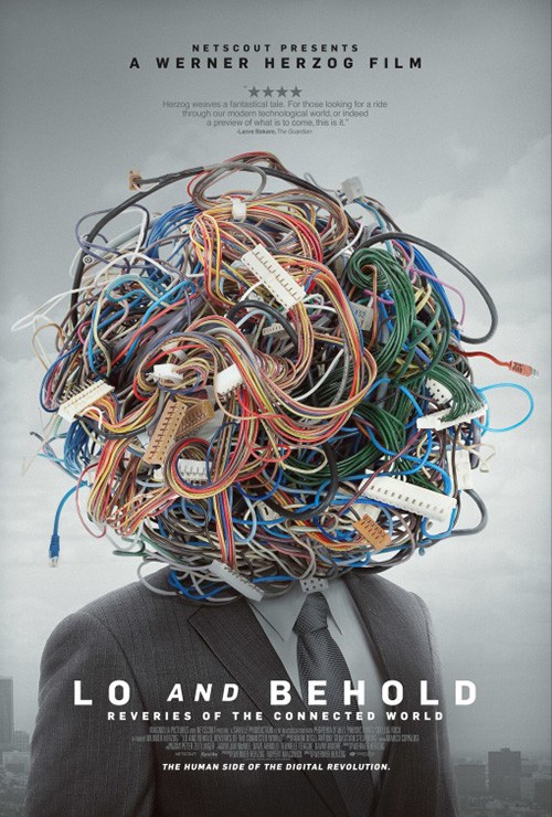
Out of all the posters this month, though, none are better artistically than Brandon Schaefer’s Escapes (limited July 26). From the unforgettable imagery (Medusa curls are apparently big in the industry with Lo an Behold last year possessing a similar look), non-mainstream font selection, and conformity-rejected composition (credit box at top and right justified, title off-center, image unencumbered by text or collage), this piece is everything the one-sheets above are not.
We get low contrast black to highlight the grainy texture. We get the documentary’s subject, recognizable and yet hidden so the abstract can infer upon his identity as well as \ literal representation. And we aren’t distracted by rampant superfluity—the red title glows but feels as though it’s on even footing with the imagery below. There’s no visual warfare, our eyes effortlessly flowing through the snaking filmstrip and out from the center to see what’s beyond.
It’s easy to forget that art within commercialization. Thankfully examples like this exist to remind us.
What is your favorite July release poster? What could have used a rework?