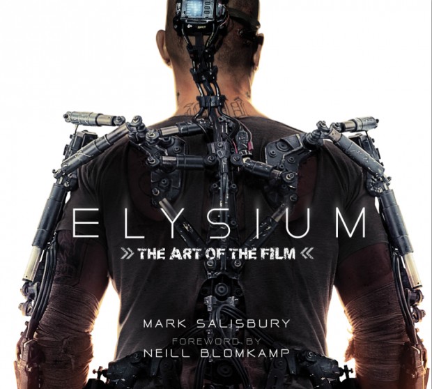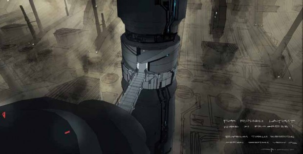
Editor’s note: Below, one will find our review of Mark Salisbury’s Elysium: The Art of the Film (now available for purchase), along with exclusive concept art. For those that have yet to see the film, one piece of art — as well as some of the review — may prove to be spoiler-y for those that haven’t seen Neill Blomkamp‘s latest, so proceed at your own risk.
Part of the charm of Neill Blomkamp’s District 9 was its grimy, unwashed, lived-in aesthetic, probably a smart choice for a debut feature. It’s easy to convincingly pull off onscreen poverty — even onscreen alien poverty — when you are shooting at a location that is actually impoverished. But the scale of Blomkamp’s second film is huge: Sony-, $130 million-, Matt Damon-huge. And as Mark Salisbury’s Elysium: The Art of the Film demonstrates, that increased size demanded more planning, more people, and faux-poverty, as opposed to real poverty. It is also a project that actually warrants a lavish coffee table book from Titan Books, the publishing company that has released similar weighty, photo- and drawing-heavy tomes on the Dark Knight trilogy, as well as other franchises liable to cause messy geek-gasms.
For starters, there is the film itself, which, as we all know by now, is a story of class warfare taking place in the year 2159. As Salisbury puts it, “the super rich, super powerful elite live in luxury and perfect health” on Elysium, a space colony orbiting the Earth. Meanwhile, everyone else is still stuck on a decaying Earth — including Max, a factory worker played by Matt Damon. Max must escape Los Angeles — now a Third World city — and make it to that mighty colony. This, then, is a sizable production, one that busts free of District 9’s admittedly appropriate setting and offers the audience a vision of another world — “something magnificent.”
To achieve this dystopian vision of the 22nd Century, Blomkamp enlisted some of the finest names in cinema, starting with the wizards of Weta Workshop, the special effects house that memorably worked on District 9 and the Lord of the Rings saga. Talented production director Philip Ivey, a District 9 vet, returned. But the key newbie on the Elysium team was “concept artist, industrial designer and world renowned ‘visual futurist,’” Syd Mead, whose designs for movies like Blade Runner, Aliens, and Tron still rank among the most-beloved and -influential in cinema history. “Those films helped form our film education,” Ivey says, and, adds Blomkamp, “his stuff is fucking awesome.” Mead’s influence is all over the film and dominates this book, with some elements of his work on Aliens and Blade Runner being especially evident.
It’s the kind of book that goes into details that might only arouse obsessive-compulsives. Consider: “‘My first question to Neill was how many people live there?” recalls [production director Philip] Ivey of the space colony. “He said 10 million people. From there I worked out how many square metres you need for each person, what the surface area would be and that gave us a dimension in terms of width, which gave me its circumference.” Err, cool.

It’s all very cool: the designs, the drawings, the measurements, the level of detail in Max’s Exo-suit, the elaborate fake logos adorning objects throughout the film, the safety tips on the side of the shoulder-mounted missile launcher used by Sharlto Copley’s Kruger, etc. The concept art is stunning, the film stills gorgeous, the text insightful.
There are fascinating tidbits throughout:
– Blomkamp had planned to set the Earth story in Rio. However, he realized that “the impact on a First World audience is decreased if you use Brazil as the setting on Earth, because Brazil is already like that. But if you make the setting on Earth American, hopefully is has more of an impact on the First World audience watching it.”
– The wheel-shaped design of Elysium is based on a real NASA concept, Salisbury explains, “During discussions at the 1975 NASA Summer Study seminar at Stanford University, scientists came up with the idea for what is now known as the Stanford Torus.” The illustration of the Torus that most struck Blomkamp ran in National Geographic in the ’70s… as drawn by one Syd Mead.
– Blomkamp calls himself “the last person to push any kind of sociological issues on people or any sort of bullshit about social awareness or anything like that.” We assume he hasn’t seen his two features.
– Ending the film leaving “audiences asking what happens next?” was vital. “Will Elysium become overrun and overpopulated, like Earth?” Salisbury asks. “That’s the debate,” Blomkamp answers. “That’s the reason the film exists.”
Salisbury is the author of Titan’s similar Prometheus companion (can Resident Evil 6: The Art of the Film be far behind?), but, unlike the book accompanying Ridley Scott’s controversial sorta-Alien-origin-but-what? epic, it’s hard to argue that the Elysium tome adds a great deal to one’s enjoyment of the film. The Prometheus book helped fill in some of the many gaps and mysteries left unexplained by Scott and Damon Lindelof. Elysium is a much different, far less vague science fiction film.
This time, Salisbury does not need to answer any questions, but merely let the film’s designs speak for themselves. It makes for an inessential text, but certainly an interesting one at that. What Elysium: The Art of the Film demonstrates with the clarity of an in-ground pool at an Elysium mansion is that there are few other films in 2013 that can attest to this level of thought, planning, and creative verve. Look no further than Salisbury’s book to see the care Blomkamp and company took on this late-summer blockbuster. In other words, respect those circumference measurements.

Elysium: The Art of the Film is out now, and one can read our review & listen to our discussion of the film.


