“Don’t Judge a Book by Its Cover” is a proverb whose simple existence proves the fact impressionable souls will do so without fail. This monthly column focuses on the film industry’s willingness to capitalize on this truth, releasing one-sheets to serve as not representations of what audiences are to expect, but as propaganda to fill seats. Oftentimes they fail miserably.
August spells the end of summer and start of awards season with a couple “prestige” openings from the likes of Kathryn Bigelow and Destin Daniel Cretton in wide release (from Annapurna Pictures and Lionsgate respectively). It’s nice to see big-ish studios showing independent voices some love in 2017 (although Bigelow is obviously no stranger to Hollywood budgets) alongside bigger sibling Sony’s partnership with Edgar Wright and Baby Driver.
It’s not all highbrow, though. Fans of Annabelle have a prequel to its prequel (Annabelle: Creation hits August 11); animation lovers have a couple off-the-beaten-path selections in The Nut Job 2: Nutty by Nature (August 11) and Leap! (August 25); and Steven Soderbergh makes his auspicious return to the big-screen with Logan Lucky (August 18) — a film I can’t stop myself from calling low-brow Ocean’s 11.
So whether you want to bask in the sun and not let go of your popcorn fun or prepare yourself for the austere dramas yet to come, the cinematic transition to fall begins early.
Blast from the past


If you’re going to do a Bruce Lee bio-pic where homage is king, why not follow suit with the marketing roll-out? It would have been inexcusable if Blood & Chocolate didn’t do at least one poster in the aesthetic of a classic Lee actioner — especially when the title of this film bears such a striking resemblance to one of them.
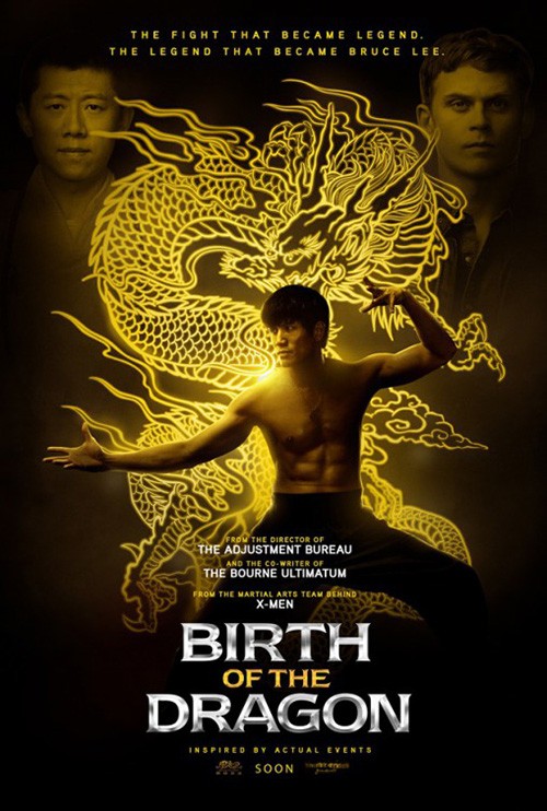
So their Birth of the Dragon (limited August 25) channels Bob Peak’s Enter the Dragon with its adorned frame, shadowboxed lettering, and nunchaku pose. The absence of the elder’s illustrative qualities definitely takes a bit of the charm away, but you can’t blame the studio for not wanting to fork over the extra cash to commission something when photography could do the job adequately instead.
I don’t like the film’s other poster all that much, but I do enjoy the glowing golden dragon of the background. It’s a cool flourish ruined by the type of shiny beveled text and emotionless portraiture that graces most HBO fight posters. A little personality goes a long way if you’re willing to give it a shot.
Two actors who exude personality are Ryan Reynolds and Samuel L. Jackson so you had to know their new film The Hitman’s Bodyguard (August 18) would bring the funny in its print campaign. I’m not certain, however, that you’d have guessed LA would go straight carbon copy of the Kevin Costner/Whitney Houston starrer The Bodyguard. The detail in this appropriation is stunning: typography, pose, line spacing, everything. It’s glorious.


Is it objectively good? No, but it conjures a smile and presents a hilarious juxtaposition with its actors. LA’s other one-sheets aren’t quite as effective on these two criteria or even objectively good for that matter. Using the photography of Perry Curties, they’d decided to go gritty 70s corrupt cop chic. They bring to mind Magnum Force and others of its ilk with the newsprint moiré patterns and monochrome coloring for better or worse. Unfortunately they don’t strip away the 21st century computer art sheen to embrace that look fully.
As for the oppressive red/black versions: I feel like I may go blind if I look at them long enough to comment further.
True or false


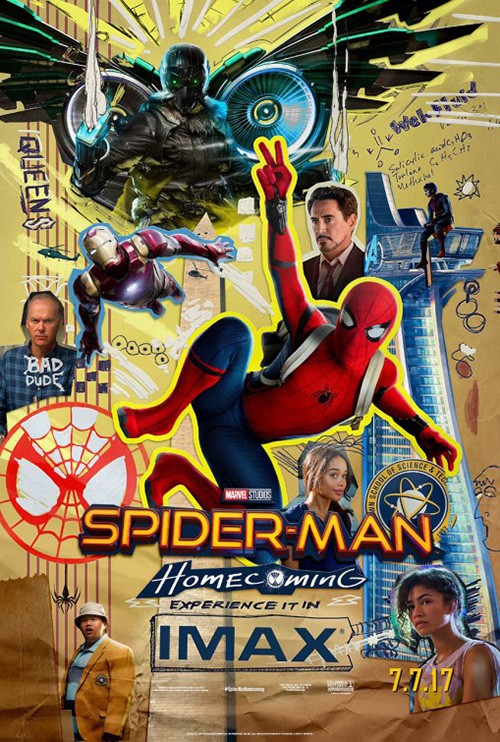
In a bit of synergistic design, new documentary Step (limited August 4) sees their poster utilizing a similar technique as that yearbook Spider-Man: Homecoming advert. The notion of letting the strings be seen is growing on me — that do-it-yourself as intentional charm showing just how boring smoothly perfect gloss can become.
This isn’t the product of expert masking techniques to feather hair and integrate multiple images without seams. No, these photos were cut with scissors close to their edges but not quite close enough to hide a glimpse of the background that is now missing. Doing this adds slivers of color everywhere to serve as impromptu borders separating girls from one another while also letting the scrapbook locker art aesthetic shine.
My favorite part, though: the black box holding the title is just as imperfect as the rest.
From documentary to memoir-turned-film, we head over to The Glass Castle (August 11) next. LA takes a scene of hope and beauty in nature between a father and his daughter — one that may seem a bit misleading if you’ve seen the trailer and understand the underlying struggles of this life where “Home goes wherever we go.” But whether the image highlights one part of the film or the film as a whole, you can’t help finding the use of scale and composition appealing. The sky is literally the limit here. The future is boundless.


The German iteration uses this message too while adding a few more characters to the mix in fun and happy demeanors. We get a sense of conflict from the beat-up car and tarped over possessions, but the saturated coloring and smiling faces force us to believe love means more than comfort or money. Family means more than material desire.
This is why the final one-sheet excels in its melancholy through a juxtaposition of that youthful pleasure against the sorrow of present-day struggles. But while the tone is pure and closer to the film itself, the execution is clunky. How the past and present merge with a fade is awkward as Brie Larson’s right eye gets caught in a purgatorial no-man’s land between the two. Is the family a memory? A dream? Characters in a story Larson’s author wrote? It makes sense as an evolution from the teaser, but it confounds contextually and artistically on its own.
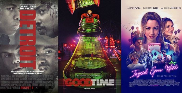
Now we move from memoir to a fictionalized depiction of “real life events” with Detroit (August 4). Canyon Design Group goes minimal with their teaser to let the title do the talking as imagery serves as complement. The whole turning a photo 90-degrees in order to retain a landscape feel in a portrait frame is hardly new (heck, I used the same mechanics on my own poster for a local screening of I Am Belfast). Sometimes you need to go this route no matter how clichéd because it’s the only way to ensure the emotion and scale is presented unedited.


There’s no way you could turn this image of police blocking citizens and then crop it down by two-thirds while still keeping its message. You can’t push into this image because its impact lies in how “big” it is with tens to hundreds of people rather than just three or four. If the name is proving broad enough to embody an entire city, the visuals need to do the same.
And that’s why the second sheet is so disappointing. It’s nice to focus on the four actors we see, but there’s too much separation and confusion. They aren’t looking in the same direction, the title is covering parts of their faces, and the emotional impact of chaos is replaced by the quiet severity of characters devoid of context. You only know the two on the left are cops if you’ve seen the trailer. This sheet is all about celebrity.
The Nile Hilton Incident (limited August 11) doesn’t have this problem in America because it’s a foreign film with actors we wouldn’t recognize. Mood and aesthetic take the place of recognition as this Egyptian revolution-set fiction lets intrigue reign supreme.
It’s a nice contrast opposite posters with heavy saturation that theaters generally display — its green hue permeates the entire image so that it seems just off from reality. I like that the title gets lost in places too because it forces us to really concentrate. We do so since its disorienting quality grabs our attention rather than fly under it. We see the actor’s face, follow his white cigarette down, and read the unaligned title with Arabic translation serving as a light to brighten the yellowish green. The film may be set in 2011, but this poster exudes 70s cool.
Artful imagery


The marketing campaign for The Dark Tower (August 4) has been highly criticized on the internet — both about how long it took for anything to drop and the quality of what has — but I really like the initial tease from WORKS ADV. I love how it presents the idea of two worlds, two armies, and good versus evil. It makes us look closely to see what’s there to see.


Is it upside down or right side up? Should our heroes be at the bottom or at the top? You could theoretically flip this poster 180-degrees and still have it make sense. Do you like the bright sky forming the titular tower of life with its protectors ready to fight? Or would you rather highlight the reality of Earth slowly being corrupted by greed at the hands or our destroyer? The choice is yours.
And that’s where the rest go awry. B O N D gives us character sheets that lose the dynamic at the core of Stephen King’s epic saga. We receive vanity shots rather than context. Yes they are dripping with mood and brooding, but where’s the conflict? The same goes for the pair of illustrations created. They intrigue — while also calling to mind the fact that there has been a graphic novel counterpart to the novels — but they do so in a vacuum.
Crown Heights (limited August 18) only has one actor on its poster, but that decision is one that helps explain plot instead of showcasing a star. This is a man in a jail cell, isolated in the dark of solitude with only the light from a high window to remind him of the world outside. Making the title into bars is an unwieldy choice, but it works enough to understand its goal.
What’s really nice, though, is the way in which the sun’s rays appear to be drawn by hand. Lakeith Stanfield is represented via photograph — albeit with the contrast amped up for a gorgeous chiaroscuro silhouette — and yet the light looks scratched on with charcoal. There’s an otherworldly quality to this, as though God is looking down metaphorically. What may seem simple on first blush ultimately has a lot happening within.
Comparing it to Beach Rats (limited August 25) may seem odd, but I’d argue these two posters are practically identical in content. Just look at the expression on their male focal points — that lost look of contemplation. You could say this young man is in a prison himself despite having the sky above him instead of total darkness. He’s trapped as the others look beyond, the shallow depth of focus isolating him as “other”.
It’s also just an aesthetically nice design by The Boland Design Company. It takes a film still and crops it to form a composition with heavy emotion while providing an equal bisection between actors and text. The effect being used on the title is somewhat distracting, but otherwise this piece is attractive, subdued, and memorable.
Two of those three adjectives could be used to describe the graphic tease(s) for Bushwick (limited August 25) too. The one that doesn’t: subdued. This thing may be minimalistic, but it is loud in the process. It doesn’t matter what color is used or what positioning of the actors at bottom — these scream their title at us with an eccentric jolt of electricity.


And they work even with the idiosyncratic way of breaking up their name. This totem must be simultaneously read left to right and up to down, each two-letter duo leading to the next. Somehow I’ve never been confused reading it, though. It effectively lets our brains do the job while its faux symmetry and real monochromatic palette ensure we can focus on reading without distractions.
The final sheet isn’t quite as effective, but it’s also not a complete loss. Had it just been the actors walking towards us with a fake scene of destruction behind them, I’d be singing a different tune. But the translucent American flag curtain that separates foreground from background does add something. The graphic quality contrasts the photography and provides purpose to two unknowns holding guns.
More with less


Gravillis Inc.’s Wind River (limited August 4) is the kind of poster that gets easily dismissed. A quick glance shows actor at top, title at bottom, and little else. While this would be true if the design firm simply used a photo wherein Jeremy Renner’s coat and hat were white fabric with shadowy folds, that isn’t the case here. For all we know his clothing is red — there’s no way to be sure because it’s been erased. This poster takes camouflage to another level by literally merging everything into a single empty field.
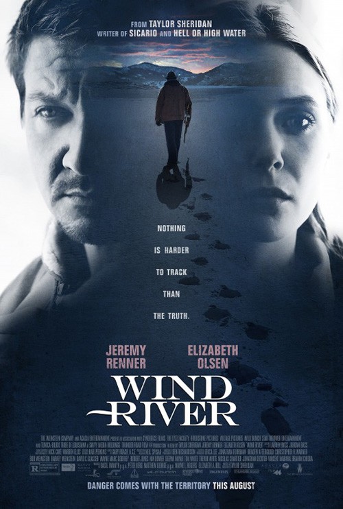
The effect is eye-catching in its impossibility. There’s no way you wouldn’t see some color difference to pick his body out from what we can assume is a snowy setting, so we have to look closer to make sure our eyes aren’t deceiving us. It’s such a simple alteration to the image and yet its impact is huge.
Compare it to Blood & Chocolate’s entry and you’ll see that a desire for “more” can destroy your message. There may be a scene on this poster, but it’s meaningless besides the way it unnaturally separates the actors for visibility. The sense of suspense is gone because we are no longer discerning a man ready to shoot from the void. We’ve moved from a wealth of potential energy to bland portraiture going nowhere.
The final sheet for Good Time (limited August 11) by B O N D gives a similar burst of energy by transforming its vertical frame into a scene moving horizontally. A poster’s orientation is inherently top to bottom and yet our vision keeps darting side to side here as the actors flee beneath a motion blur and every line of text is set against a stripe keeping our eyes moving off the page. It doesn’t want us to linger. It wants us to run to our seats and watch the action unfold.
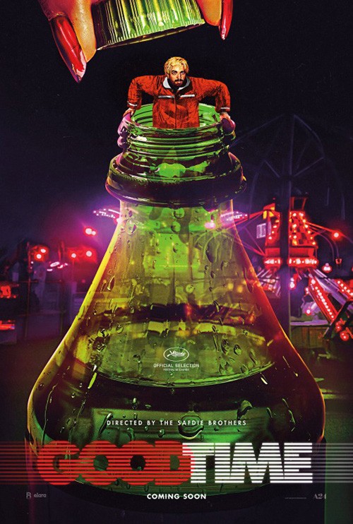
You don’t get that sense of immediacy with the teaser. In fact, this image of Robert Pattinson coming out of a plastic 20-ounce bottle provides nothing but an oddly comedic air. I initially thought this film was a stoner comedy because of it — the bottle turning into a bong in my head with a pothead “escaping” the hazy hold of the drug. Obviously that’s not what this film is, but what’s the artwork trying to convey if not? Maybe Pattinson is a genie about to grant us three wishes.
And what better way is there to supply energy than actual electricity? That’s what Canyon Design Group gives us with their teaser for Ingrid Goes West (limited August 11). If you’ve seen the trailer you know that you’re going to be in for a wild ride of unbridled chaos and this poster complements those thoughts by flashing its name in lights.
I love the font used — it’s beachside aesthetic a perfect embodiment of destination. The white of its coloring is blinding against the neon pink/purple duotone image beneath, almost as if it’s rapidly flickering like fluorescent lights do. And don’t dismiss the use of half-toning as a throwaway hipster-chic filter either. The juxtaposition of a print-specific texture to represent a movie that surrounds digital media/social media is just one more laugh earned by a photo of Aubrey Plaza eating her phone.


LA joins Canyon for the main sheet. While attractive in its painterly quality, it loses some of the other’s pizazz by forcing us to decipher its collage rather than experience its vibe. It might be objectively pretty, but there’s little going on to separate it from any other poster on the wall using the same put-everyone-in-frame trope.
Akiko Stehrenberger’s Mondo commission is the polar opposite. Rather than crisp photo-real representation, she’s gone Chuck Close on us by creating a portrait with smaller geometric pieces. The grid is reminiscent of an Instagram page (see the “Follow” button at top) and the not-quite pristine fit of each square (due to coloring, placement, and overlap) serves to infer on Ingrid’s descent into madness. It may not possess the same jolt of excitement as its predecessors, but it’s a stunner nonetheless.
If I had to pick one design to win the month, however, it would be Leroy and Rose’s The Only Living Boy in New York (limited August 11). This is the definition of using the whole page despite not “using” the whole page. It’s The Piano Teacher meets Match Point — the illicit act of a kiss pushed to the edge of secrecy.


It’s great because the image is barely a quarter of the page while the white space majority shoves it over as though a wall or curtain shielding its forbidden sexuality. The typography is right justified as a rule to augment this idea of force, each word “moving” left to right to keep that border in place so no unsuspecting voyeur can see what’s happening without physically turning around the corner. When your design and composition is this good, your scene creates itself.
What is your favorite August release poster? What could have used a rework?