“Don’t Judge a Book by Its Cover” is a proverb whose simple existence proves the fact impressionable souls will do so without fail. This monthly column focuses on the film industry’s willingness to capitalize on this truth, releasing one-sheets to serve as not representations of what audiences are to expect, but as propaganda to fill seats. Oftentimes they fail miserably.
—
When not distracted by the more offbeat, artistically inclined one-sheets for the amazing line-up gracing Toronto screens at TIFF this month, I was surprised to see a few good ones hit the September release schedule proper. Whether or not a couple of them find live on both lists is beside the point.
With enough to talk about that I don’t even need to bother with the umpteenth example of Milla Jovovich shooting a gun while skewed on the page in Resident Evil: Retribution (open September 14th) (poster) or Bachelorette (limited September 7th) (poster) losing the point of Bridesmaids‘ badass looks and The Hangover‘s irreparable shenanigans, I’m officially happy the summer season is over.
Why bother?
 |
 |
 |
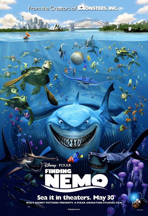 |
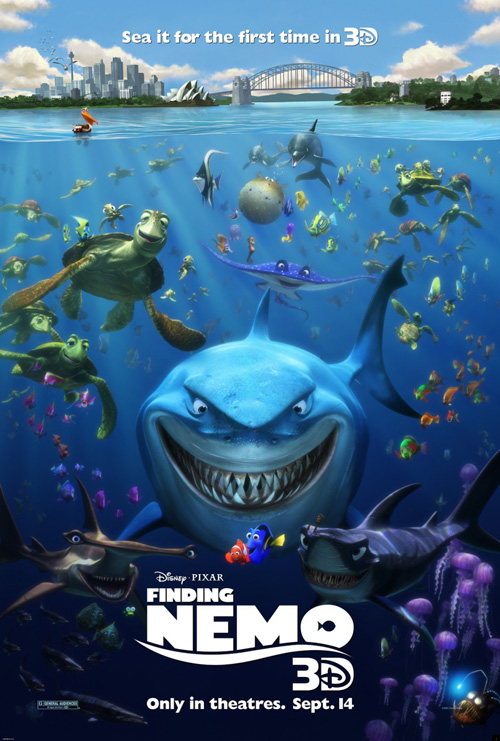
As uninspired as the rerelease itself, Disney/Pixar has decided to utilize the ol’ “if it ain’t broke, don’t fix it” mentality with Finding Nemo 3D (open September 14). An almost exact replica of the sheet from a decade ago, you can’t really fault its use of scale and ferocity by putting every character from the film together at once.
Points off for the horribly corny ‘”Sea” it for the first time in 3D’ pun but more points added for the inclusion of atmosphere in the water to cultivate a little authenticity. If the original poster had one knock it would be the stark, cartoon crispness of its imagery making everything appear more Colorform than realistic representation. A smidge of blur goes a long way in softening the edges and really making it pop.
But what happened to the whale?! What’s with the lack of love for our gentle giant of the sea? His exclusion is glaring only because there’s no real reason for it.
 |
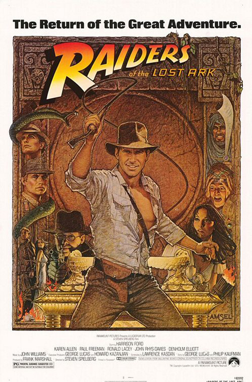 |
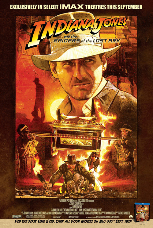
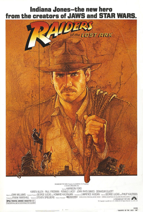
Instead of straight reusing the old advert, Raiders of the Lost Ark‘s IMAX transfer (open September 7th) enlists Mark Raats to create something new, but the same. More Photoshop painterly than the Richard Amsel drawings from 1981, the pallette, look, and content are almost identical. It probably would have cost less just to reprint, so kudos to Raats for milking some extra cash for his efforts.
The main difference, however, is the utilization of its not originally titular hero’s name on the marquee. What once was Raiders of the Lost Ark is now Indiana Jones and the Raiders of the Lost Ark. In keeping with the box set trilogy and our own easily mistaken masses, the studio has decided to cater to general preconception. It’s not necessarily a bad thing, just an interesting tidbit concerning public consciousness changing what should be unchangeable.
After those two, my title for this foursome may seem weird when it comes to Hotel Transylvania (open September 28th—after a surprising screening at TIFF). I grouped it here as an inversion of the rest because I’m glad BLT Communications, LLC did try.
I’m not saying the campaign is great with its ensemble poster and celebrity name list, but the original sheet with the back of the hotel’s newest tenants facing us is a refreshing artistic choice. Studios probably want the faces of their prospective merchandising assets in young kids’ mugs, so subverting that is pretty cool. At the very least it gives us something to appreciate opposite the redundant character posters from The Arterie—although the blank Invisible Man one is inspired.
 |
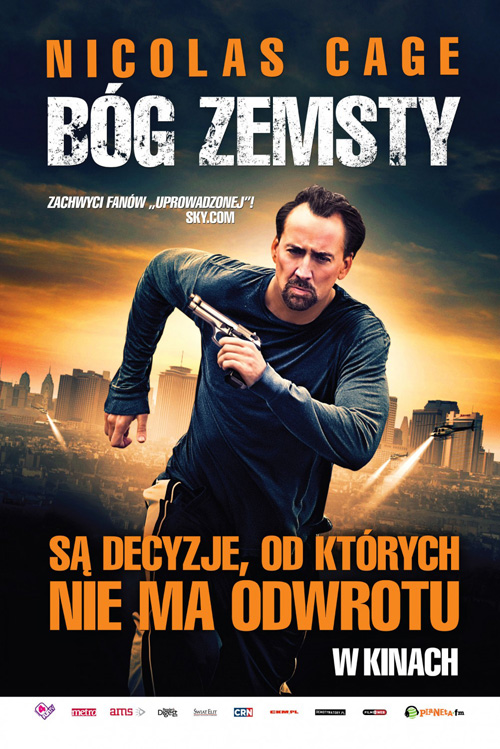 |
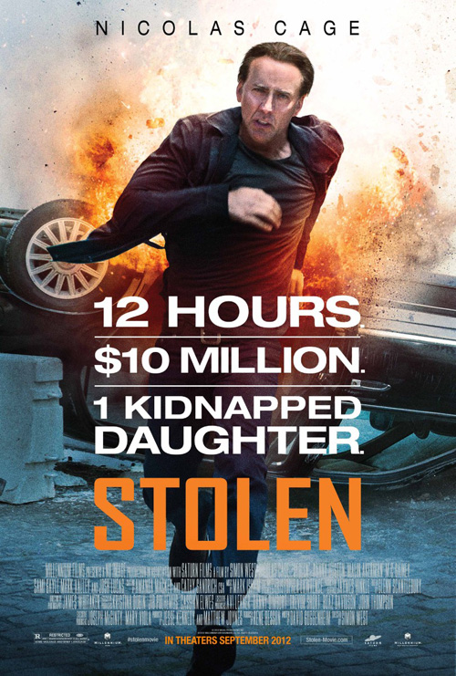
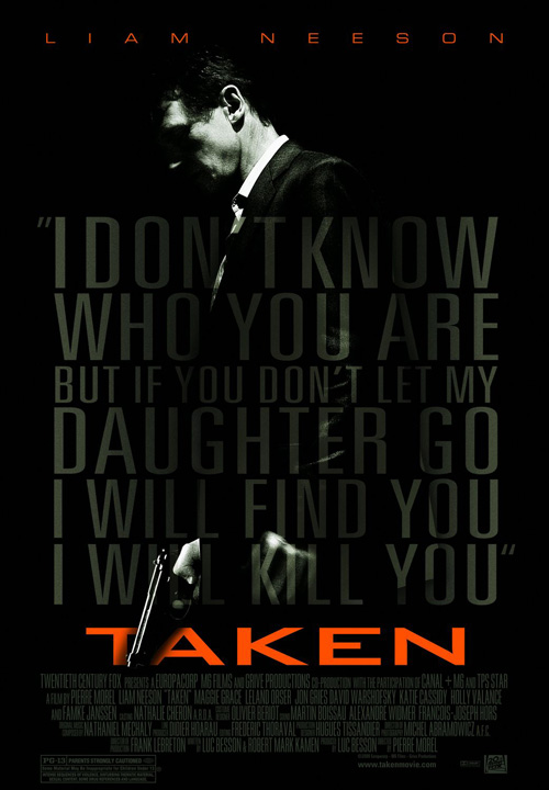
And if you thought two repeats at the start were fodder for “Why bother?”, you obviously haven’t seen Nic Cage‘s newest marketing hairdo for Stolen (limited September 14th).
Its laundry list of premise details with a colored title treatment below can’t stop from recalling the more effective Taken by Petrol. The Liam Neeson vehicle knew how to intrigue, though, with opacity changes and contrast while Cage simply shows his full, glorious run stride. At least he’s consistent with fare like Seeking Justice—the dude loves to pump those arms and move towards trouble.
What are you looking at?
 |
 |
 |
 |
 |
 |
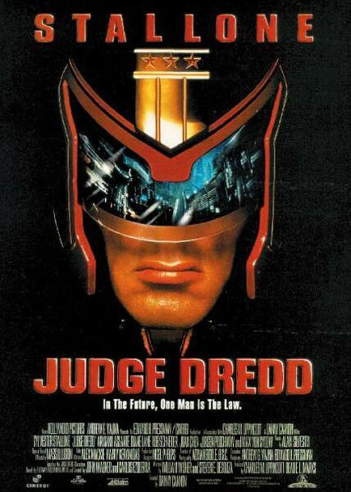 |
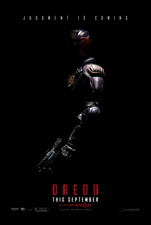
Our first look at firms loving on white space this month comes from Ignition Print‘s Dredd (open September 21st—also a TIFF release). I love when designers use starkly targeted light to literally bleed their subject into the background. The black here is so deep and menacing that Karl Urban‘s armored Judge is equal parts fearsome as he is our last defense against the villains of his The Raid: Redemption-esque plot.
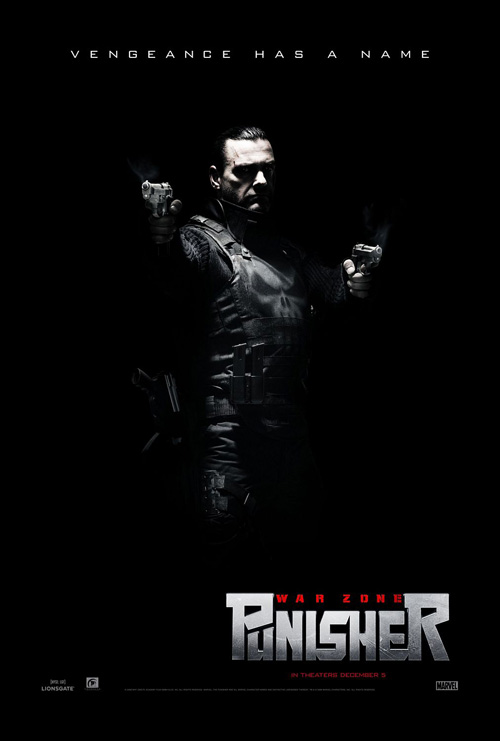
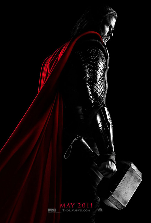
By no means unique—see Ignition’s own Punisher: War Zone and BLT’s Thor—but it does fit the science fiction/dystopic subject matter. It’s also great how the head is tilted just enough to know he’s peering our way. Stallone‘s scowl straight on in his Judge Dredd sheet is absolutely cartoonish in comparison.
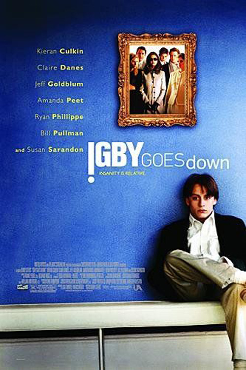 |
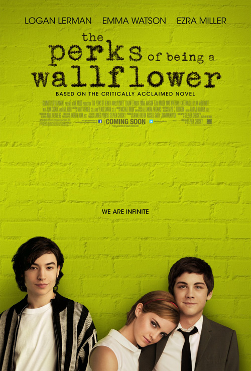
Utilizing empty space in the more generic sense of the term, BLT’s Perks of Being a Wallflower (limited September 21st—after TIFF again), lets its actors’ gazes toward garner our full attention. The green wall behind them serves as a light enough color to allow the black text above remain readable while also providing an interesting hue to counter the very pale trio at the bottom.
It’s similar in concept to Igby Goes Down, stripping away all the other superfluities for the cropped cast. The wall therefore plays into the title while the positioning of Emma Watson on Lorgan Lerman implies some sort of love triangle with the more isolated Ezra Miller at left. The drop shadow may make them appear woefully cut and paste, but it’s not enough to ruin the design itself.
 |
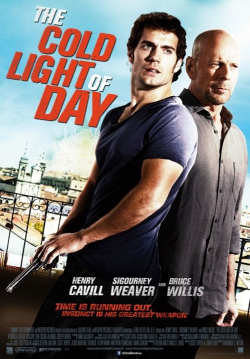 |
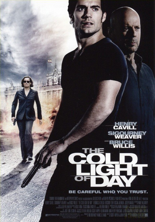
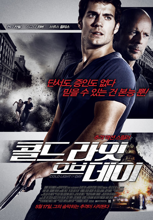
Getting back to contrast, how about those pensive faces on Henry Cavill and Bruce Willis in BLT’s The Cold Light of Day (open September 7th) cutting through the darkness? I like how our new Superman bisects the page with his stance, but the rest is way too uninspired. Sigourney Weaver looks like a forced badass in the background and Bruce is made into a growth on Cavill’s shoulder. We don’t need every bankable star’s likeness on the advert. Really, we don’t.
But don’t tell kjm as they pretty much rip it off with only a more metallic texture palette to separate their Asian release. Hell, Summit must have given everyone on Earth the same publicity image of their two stars because even a more photographic—and hopefully earlier copy—shows an identical pairing. If it does anything good, this one shows how darkening the background to make Willis merge into Cavill is better than seeing their buddy comedy selves standing next to that horribly red and bland title.
 |
 |
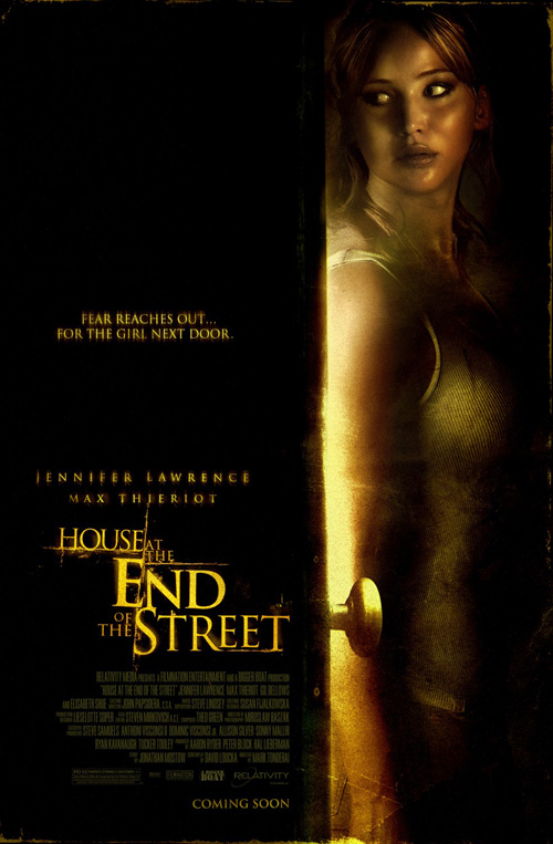
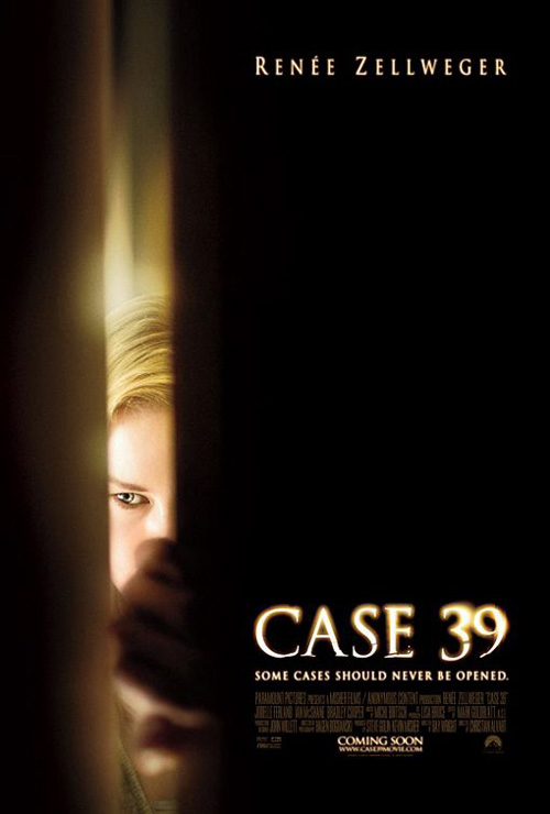
That leaves Jennifer Lawrence‘s horror House at the End of the Street (open September 21st) from The Cimarron Group. Keeping more than half the space shrouded in black, the tinted high contrast image of its lead is claustrophobically squeezed into the right edge. More just hiding from what we can’t see than anything else, the firm definitely missed out on the opportunity to instill real dread like cold open did on Case 39. Putting Renée Zellweger‘s face in the door crack is so much more effective than Lawrence leaning against one.
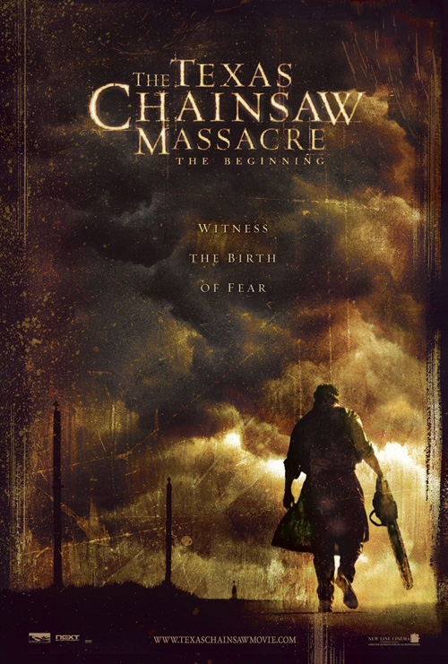
And what’s with the distressed serif font in differing sizes with creased lines running through the letters? Can the horror flicks just stop this already? Seen in The Texas Chainsaw Massacre: The Beginning, I can hear the overdone whir of a camera and the quiet freeze frame coinciding in the trailer. Sometimes I wonder if the genre is simply parodying itself at this point.
Ah, love …
 |
 |
 |
 |
 |
 |
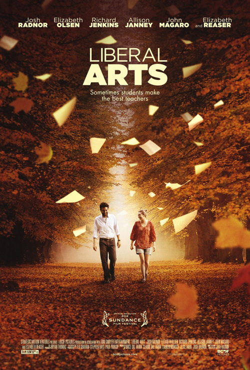
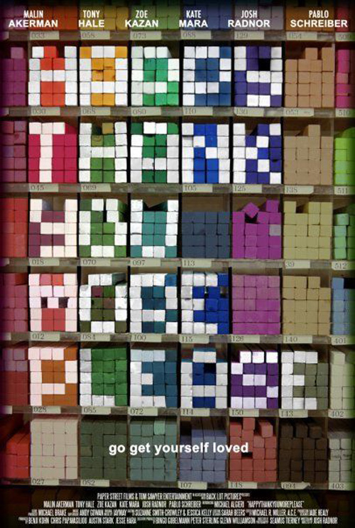
One of the best aspects of Josh Radnor‘s first feature Happythankyoumoreplease was its abstract, text-only poster. This was something especially original for a film I really enjoyed.
So, when the real good buzz for his follow-up Liberal Arts (limited September 14th) started coming a couple months ago, I was highly anticipating what kind of artwork would accompany its release. Let’s just say eclipse did not fulfill my expectations. Sugary love between the director and Elizabeth Olsen amongst fall trees as pieces of paper flitter down from the sky like leaves just doesn’t cut it.
There is probably a metaphor in there somewhere but the finished whole only screams run-of-the-mill romance. Don’t even get me started on the second one because the actors walking on a gigantic open book must be the epitome of “I can’t think of anything creative”.
 |
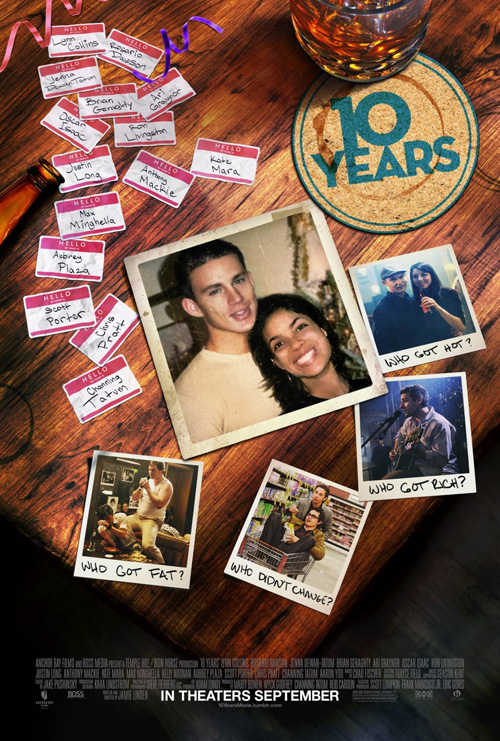
The Arterie’s reunion table trompe l’oeil for 10 Years (NY & LA September 14th) at least tries to infuse some nostalgia with its rudimentary representation of the film’s setting. Everything is just too neat, though. The nametags are crumpled sure, but what about a couple ripped ones or folded over ones? The Polaroid pictures just happened to fall in the perfect position to read each one?
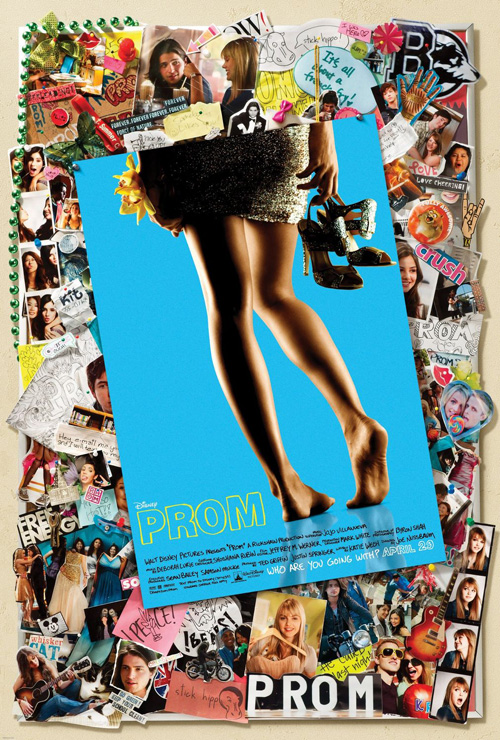
Here is a case where more is more because even the poppy shenanigans of Prom—which I now remember surprisingly not giving a horrible review to—come off more authentic through overload. Objects are completely covered and nothing looks especially computer generated as opposed to a legitimate collage. The key is that the more you put up the more you can hide—put more five or six of everything in and you’ll still be able to see what needs to be seen.
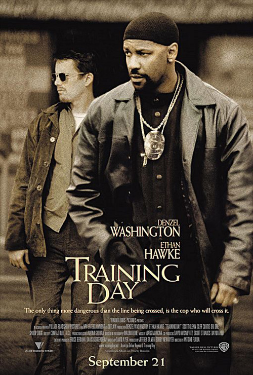 |
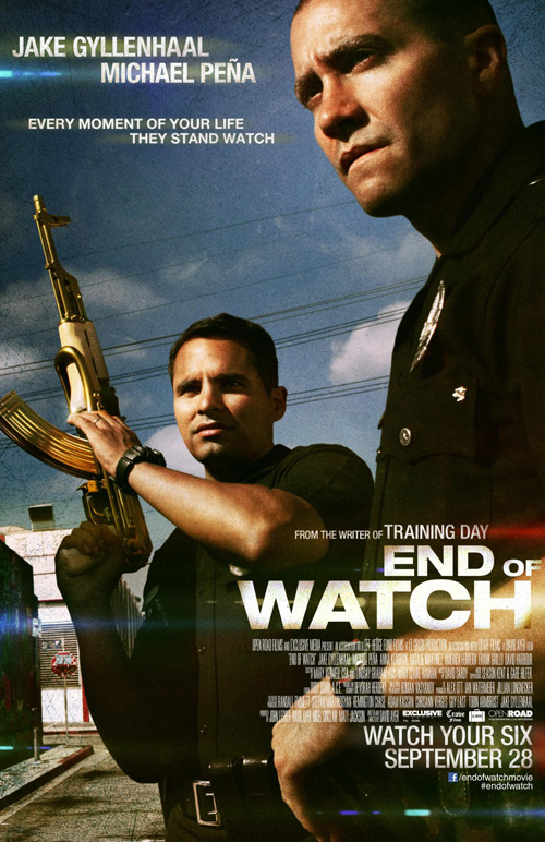
From actual love to sentimentality to bro-love, you have to like Ignition’s End of Watch (open September 21st—with a TIFF debut). Accomplishing the same as The Cold Light of Day above and writer/director David Ayer‘s screenplay splash Training Day by Indika Entertainment Advertising, the angle and use of depth and perspective is light years better. Even the glares that should annoy me for their perfect placement are working somehow.
The cool thing about this poster is that it doesn’t look staged and yet Jake Gyllenhaal and Michael Peña are placed so meticulously within the frame. What was most likely carefully planned out, the image appears as though a brilliant case of serendipity and a camera. The gun shows the stakes, the demeanors and attitudes show their fortitude to survive. It’s gritty and pretty all at once.
 |
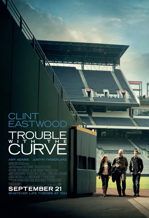 |
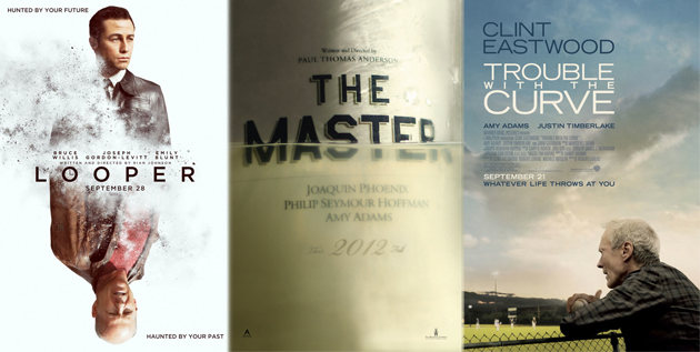
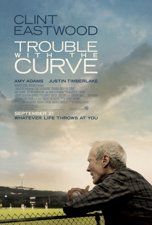
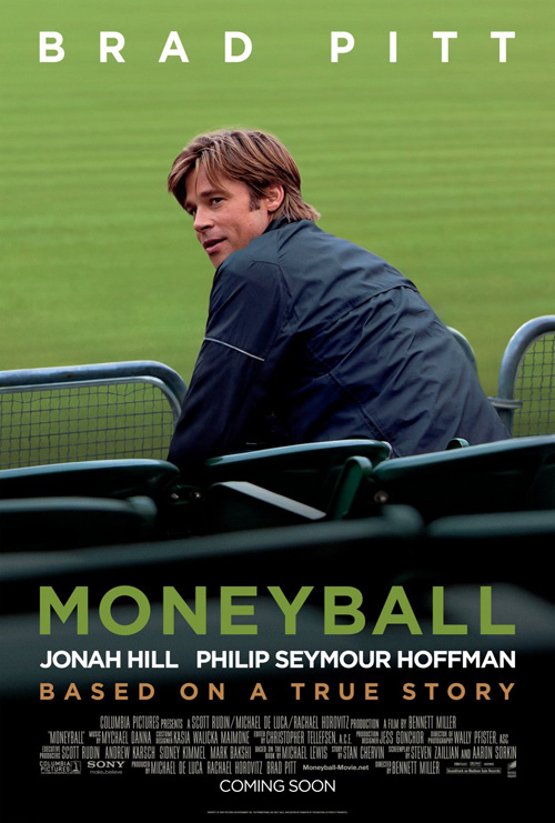
I wish I could say the same for cold open’s Trouble with the Curve (open September 21st), but it’s rather tame besides the liberal use of empty space at the top to hold Clint Eastwood‘s massive name above the title. I like the colors of the tumultuous sky and the subtle inclusion of the baseball in his hands, but I feel this aesthetic has been oversaturating the market of late. For some reason—even though they really look nothing alike—I couldn’t stop thinking Moneyball.
The second sheet isn’t a huge improvement, but I do like that there is more going on with the same amount of dead air. The text block is made smaller and the actors added as almost an afterthought in the bottom corner. It possesses a beautiful use of composition as the empty seats fill the sky while still allowing the top half to stay vacant of any real focal point—our eyes can’t help but shoot right down to the action.
Indie artsy
 |
 |
 |
 |
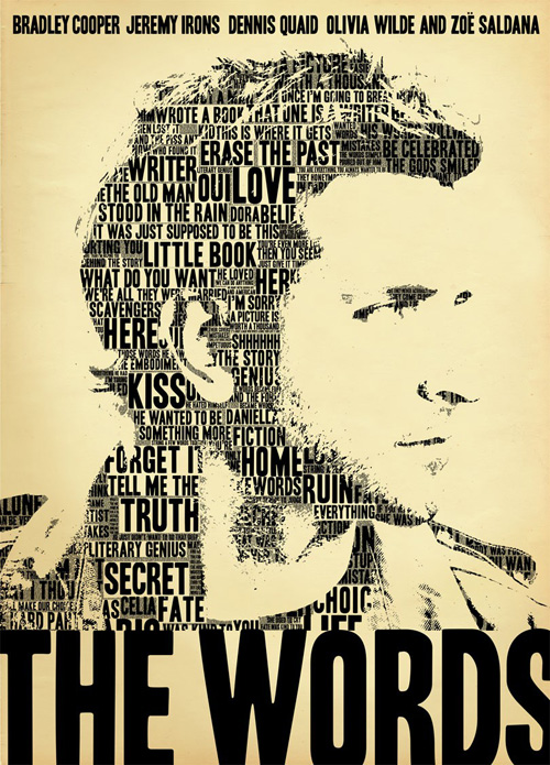 |
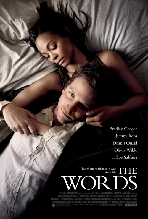
There is something serenely gorgeous about The Cimarron Group‘s advert for The Words (open September 7th). The way Zoë Saldana and Bradley Cooper are positioned exudes emotion, longing, and an intriguing gaze into the unknown. Angled perpendicularly against each other, the composition itself becomes so much fresher than two people lying on a bed should. I am only undecided on the title font’s chasm between ‘R’ and ‘D’. I cannot stop looking at it but that may be my design radar kicking in.
I do think the alternate poster of a textual illustration of Cooper could have been great, though. Just get rid of the actor—you don’t need him. People know The Hangover star by name now so why not go for broke and make the whole design words? A compressed, tightly kerned series of text spanning over fifty lines or so that makes us feel something when we read it. That’s powerful.
 |
 |
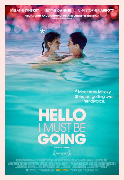
Back to white space, though, P+A‘s Hello I Must Be Going (limited September 7th) really gets it right. The actors portrayed aren’t purposefully cropped or floating against a solid background—they are literally floating within it.
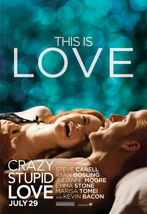
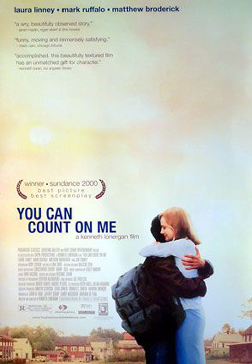
The sans serif font fires on all cylinders with thick and thin strokes forming into a solid block rather than leaving slanted corners from a ‘V’ or a ‘W’ on the edge; the asterisk is a cute flourish to give us the tagline; and the reflective water makes the generally annoying light orbs at the top work in conjunction. It’s a bit of WORKS ADV‘s Crazy, Stupid, Love. meets Indika’s You Can Count On Me and it succeeds in capturing the feel of both to make us want to learn more about Amy Minksy.
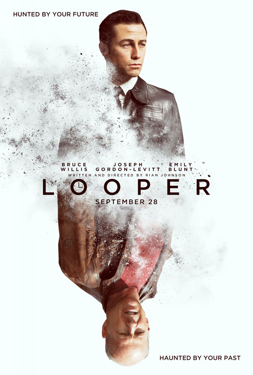
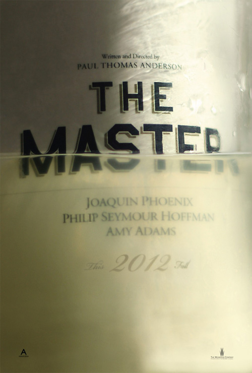
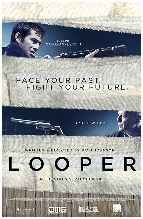
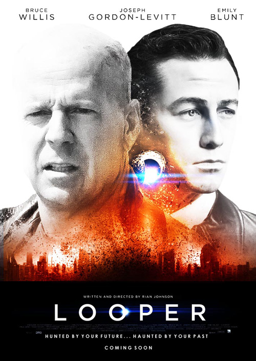
Finishing with two more TIFF films—Looper (open September 28th) and The Master (limited September 14th)—I give you a director willing to spotlight his fans and their work and an auteur who somehow gets some of the best designs every single time.
 |
 |
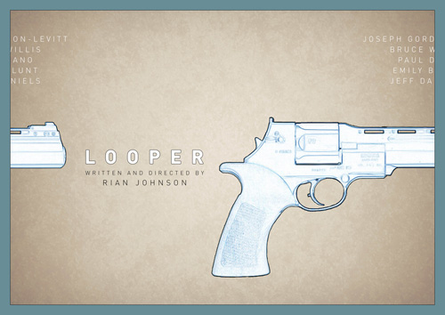 |
Looper‘s Rian Johnson nicely exposed the world to a brilliantly drawn piece by his brother Zachary at The Made Shop right when the lackluster ‘real’ poster had me thinking twice about his follow-up to Brick. In much the same fashion, Johnson has been turning to Tumblr as a forum to show fan-made art. It’s not even that Ignition’s is bad—although I’d like it better if the bottom text line was upside down like Willis so it could be turned—it’s just neat to see more.
Glen Matthews (cryingoncue) uses some gauze to break up the actors while uncoolguy creates an awesome title treatment that puts Ignition’s analog clock ‘O’ to shame. But it’s Daniel Keane‘s tile-able landscape sheet that wins first prize. The graphic nature of the gun, the sloping curves of the font, and the possibility of looping the design itself are amazing.
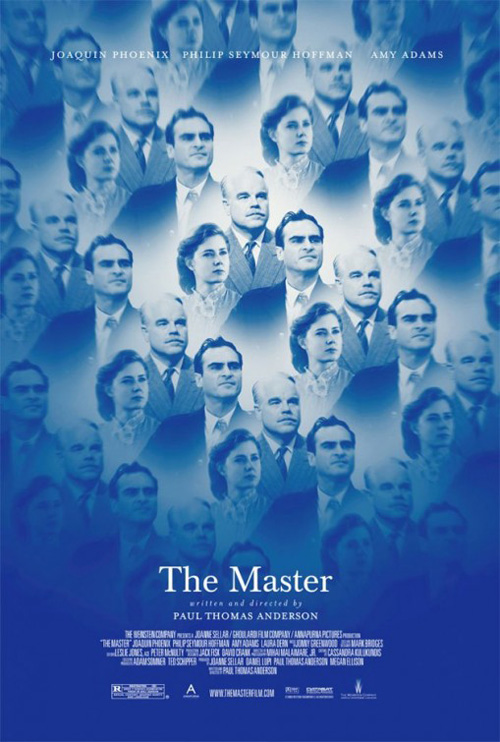 |
In fact, the only thing beating this amateur art is Dustin Stanton‘s alcohol drowning Master. I’m still a bit weirded out that the curve of the text makes it look like we’re seeing the outside of the bottle yet also the liquid inside of it, but I don’t even care. Love the carefully etched font, the cloudy haze almost making the year lost within, and the depth one line of moving fluid can create. Seriously—love it.
I like PLANETFAB‘s kaleidoscopic look at our Scientological family of characters—perhaps through beer googles of sorts—but its eccentric uniqueness still doesn’t trump the flawless art direction of Stanton. And how about PTA letting his name present less pronounced than his cast on both? A ‘master’ of the craft not putting ego on full display? Go figure.
What is your favorite September release poster? What could have used a rework?