
“Don’t Judge a Book by Its Cover” is a proverb whose simple existence proves the fact impressionable souls will do so without fail. This monthly column focuses on the film industry’s willingness to capitalize on this truth, releasing one-sheets to serve as not representations of what audiences are to expect, but as propaganda to fill seats. Oftentimes they fail miserably.
Are you ready to spend all your money this summer? Hollywood sure hopes you are because they’ve stocked piled a ton of big name franchises to be released the next 30 days. I’m talking the T-800, Mike, Marvel, Wally World, and Adam Sandler.
A couple of those look good, two have promise with checked expectations, and one looks so bad that the only laugh in the trailer came from Chris Hemsworth having absolutely no shame. While their posters will be littering multiplexes until Fall, however, don’t forget about the little guys too. Yes, I mean independent selections from the likes of Woody Allen, Tarsem Singh, and Asif Kapadia.
Those little yellow dudes appear to be worth your attention too …
What a tease
 |
 |
 |
 |
 |
 |
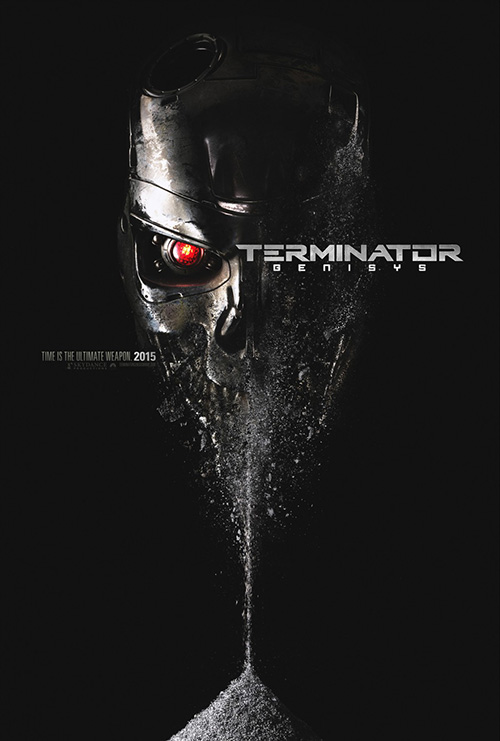
When you get to the fifth film of a franchise, no one expects much. It will probably be redundant, watered down, or so crazy you wonder how it even connects (my favorites are when a script with no relation to the series gets retrofitted to become one). Terminator Genisys (July 1) is none of these things—well it is pretty crazy and convoluted, but it works. Maybe Concept Arts hoped to drum up some interest out of those ready to dismiss it sight unseen because their teaser is a pretty effective visual pun.
There’s no more iconic image from the series than the T-800 skull, but we’ve never seen it like this. Made into an “hourglass” to align with the tag “Time is the Ultimate Weapon,” this face of horror is disintegrating into the sand counting us down to extinction. And if you’ve seen the film already, you could say it’s also possibly a spoiler for the construction of the latest Terminator model.
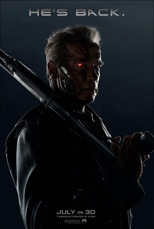
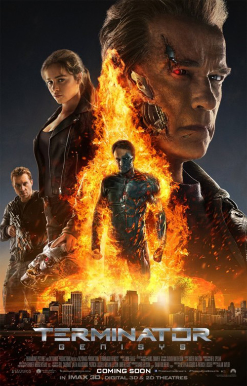
It definitely piques our intrigue more than old Arnold Schwarzenegger shrouded in shadow. Despite this, even that one is better than what BLT Communications, Inc. did with their twist spoiling series of fiery characters. John Connor is a machine now and the marketing team thought it would be cool to tell us weeks before opening day? Is someone getting fired over this?
Sadly BLT’s best with Emilia Clarke angled into the page’s corner is even forgettable. Maybe that’s just because the first thing I thought when looking at it was the firm’s own poster for Transformers: Age of Extinction.
 |
 |
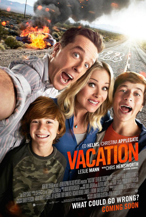 |
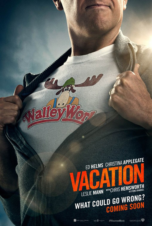
WORKS ADV joins Concept Arts with a great teaser for Vacation (July 29). It too utilizes the most iconic graphic from the franchise—a vintage logo for every family’s favorite theme park Wally World. The play on Superman is appropriate too since we can assume Ed Helms‘ Rusty is going to follow in his hapless father’s footsteps to “save the day”. I could do without the obviously fake lens flare though.
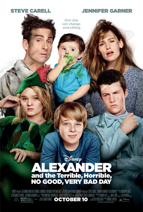
The firm’s zoom out to show the rest of the family battered and dirty a la Alexander and the Really Long Name is much less effective. Slanted text worked on the teaser because it was a block angled to rest in the bottom right corner. This one has the tag at bottom left angling down off the page as though we should continue following it to the floor and forget the poster altogether.
The second entry on Route 66 with a flaming car is better if only because it makes sense as a scene. The actors were probably placed atop the road in post, but it’s not like they have a JC Penny backdrop behind them like the other.
BLT does redeem itself for their boring Genisys sheets on Pixels (July 24). Conceptually they only had to watch the brilliant short film the feature is based upon to hatch these scenes, but they stick to the conceit and nicely keep Sandler and crew off-screen.
Pac-Man and Caterpillar are my faves with Donkey Kong coming up second. The scale of Space Invaders seems off and I’ll be honest in my not knowing what is above Sydney, Australia. Regardless, the glowing, not quite static pixel boxes making up each character is simply a cool effect. If only the property could have found its way to the big screen sans the buffoonery. Columbia Pictures would be smart to never put a real person on any of their advertisements for what I still hope will be an enjoyable movie.
 |
 |
 |
 |
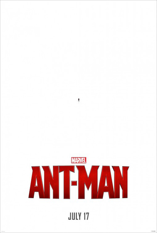
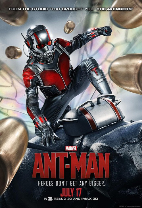
As for BLT’s Ant-Man (July 17) tease: it’s cute if also wholly on-the-nose. I wonder how it would have played if the title was absent and all we had was tiny Paul Rudd and the date. Make people work for their information. If you do it correctly they will.
This is Marvel, though, and there’s no way that would ever happen. Too much money is involved and it also appears Disney is VERY worried about this installment into their comic book universe. They’ve release a ton of footage from the film, they’re blanketing their coverage with Avengers references, and all their other posters are extremely cartoonish—a departure from every other franchise thus far introduced.
Just look at Art Machine, A Trailer Park Company‘s sheet with the titular hero riding an ant while bullets whizz by. It’s Honey I Shrunk the Kids caliber hokey and it looks faker despite a twenty-five year gap in photo manipulation technology. BLT’s full sheet is amateur hour with every actor in the movie fading into nothingness and the big blurry people flicking tiny adversaries off themselves is aimed at ten-year olds. Right? Half those foreground arms are nowhere near plausibly attached to the person showcased.
It’s disappointing when the best posters of this campaign are the ones riding Captain America, Thor, and Iron Man’s coattails.
In your face
 |
 |
 |
 |
 |
 |
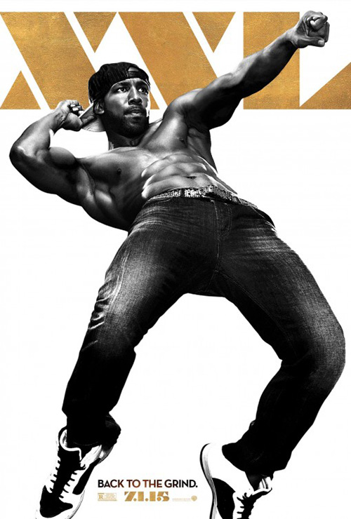 |
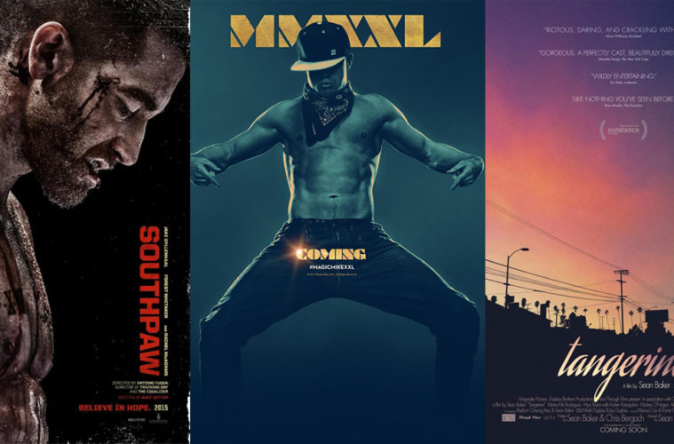
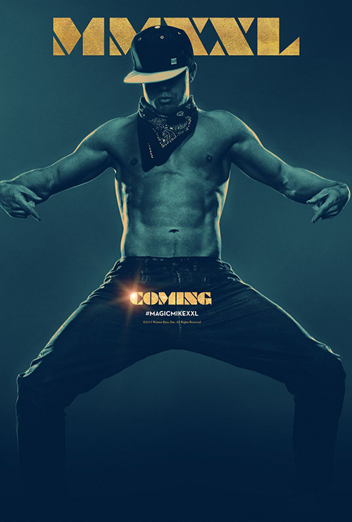
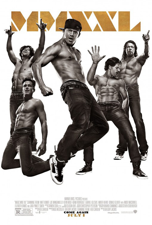
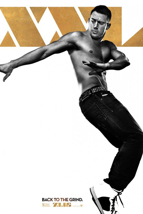
You have to give Concept Arts credit for their Magic Mike XXL (July 1) teaser. This sequel is supposed to be even more fun and comedic than the first so why not follow suit with puns while blatantly putting the requisite abs on display? Channing Tatum doesn’t mind in the slightest as proven by his many surprise appearances at screenings to bump and grind on “lucky” ladies in the audience. He and his movie are most assuredly coming.
I also like the font work with its stenciled, boldly angled lettering cutting into the page. Chiseled text against chiseled bods? Perhaps. The brushed gold is a nice touch too, especially juxtaposed with the monochrome actors living it up in the rest of the white void. The combo platter is lacking with so many plopped in at once, but the individual character sheets deliver some nice compositions. I like that they aren’t afraid to play with the canvas.
 |
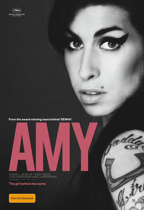 |
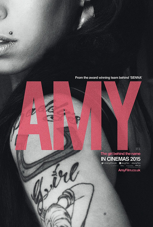
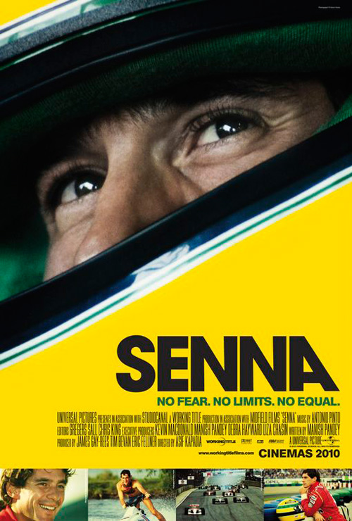
With Wonderland‘s Amy (limited July 3) it’s all about the name. This is a smart maneuver because it’s tough to know what to expect by something so widely used. Place it atop tattoos with that upper lip stud above, however, and it’s hard not to know who the owner of this “Amy” is. Take the bottom stills off of Creative Partnership‘s Senna (also directed by Kapadia) and you have a similar technique.
It’s just more intriguing than its counterpart with Amy Winehouse seen in full and the title pushed to the side. The effect is gone and in fact the word “Amy” almost disappears completely, taking on the role of caption rather than focal point. At this point you might as well take it off completely and let the image of Winehouse speak for itself. There’s your tease: her face and tattoos with nothing but a date at the bottom.
And while the tag is more on-the-nose than Ant-Man‘s cuteness—”The Girl Behind the Name” is a perfect description of what the poster projects. Here’s a gorgeously cropped image showcasing personal identity via artwork above looks that literally has a name placed on top of it. The translucency only enhances the device by telling us neither name or image is more important than the other.
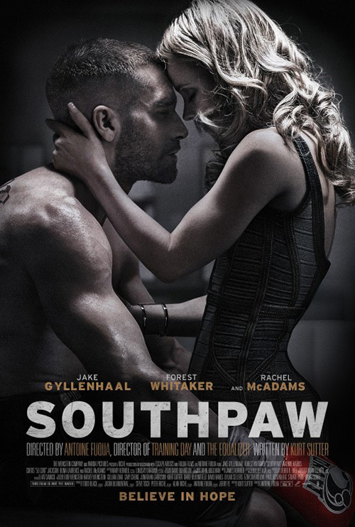 |
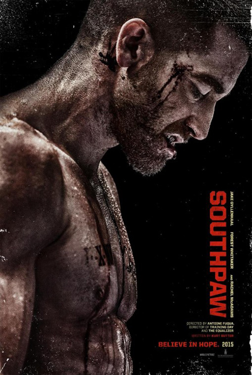
I’m torn on Gravillis Inc.‘s Southpaw (July 24). It’s definitely in your face and brutal with a jacked up Jake Gyllenhaal that has been making the rounds on the internet for months to show what he’s done to prepare for this role—a rough depiction with grit and guts that ultimately loses both. It’s surprising to see how polished and mainstream the firm went with a photo that could have easily impacted audiences without the gloss.
First mistake is the fake distress around the edges—I get you don’t want to cover your meal ticket with blemishes, but it’s hard to believe whatever “ruined” this image avoided the actor completely. Second is the coloring. I see this really popping in a high contrast black and white as opposed to the over-saturated richness of an HBO Boxing poster. Third—and this is a design no-no that was ingrained in my head during school—is the title being rotated 90-degrees the wrong way. It’s easier for American eyes to read sideways text from bottom to top as it retains our left to right conditioning. Top to bottom confuses our eyes and we have to rotate the page backwards for it to be correct. Maybe this disorientation was intentional to represent the impaired sight Jake must have.
I barely like the alternate sheet of Gyllenhaal and Rachel McAdams caught in a lovers’ embrace more. The coloring is subdued and the pockmarks are gone, but sadly most of the text is way too big and the whole too straightforward to earn my attention.
 |
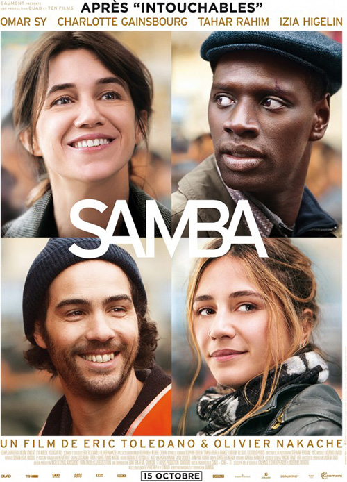 |
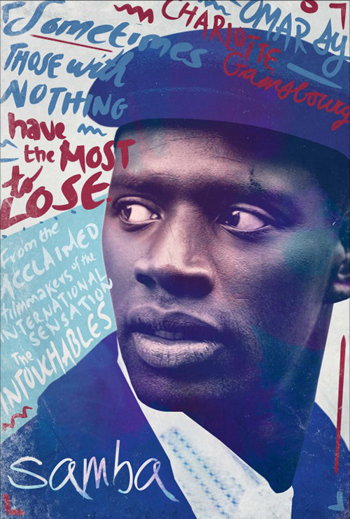
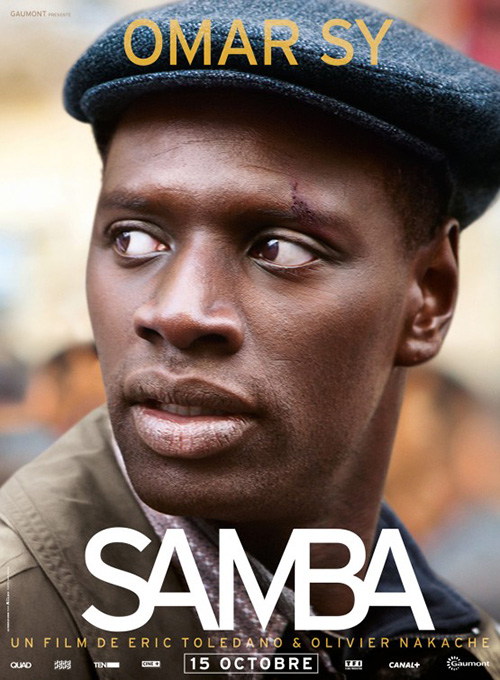
One poster I do love this month is Samba (NY/LA July 24). I was very bored with Le Cercle Noir‘s French faces adverts on display for its TIFF bow and it seems so was cold open. The latter firm takes what the international version did and makes it more international for lack of a better term. The color change, the hand-written scrawls, and the painterly aesthetic—it’s night and day. I see this sheet multiplied one hundred-fold on the side of an urban wall.
There’s a playfulness involved now that shine through the film. I adored it when I saw it and tonally it needs something looser like this to get people excited.
Sky’s the limit
 |
 |
 |
 |
When going through this month’s releases I found myself laughing after seeing two of the above series of posters. When the third popped up I was in tears wondering how great it would be to have four so I could place them next to each other for their own segment. And then it arrived.
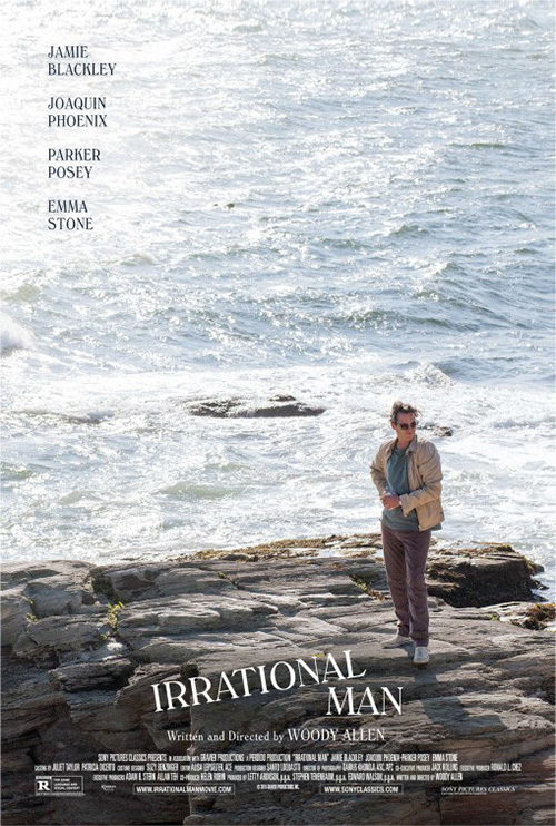
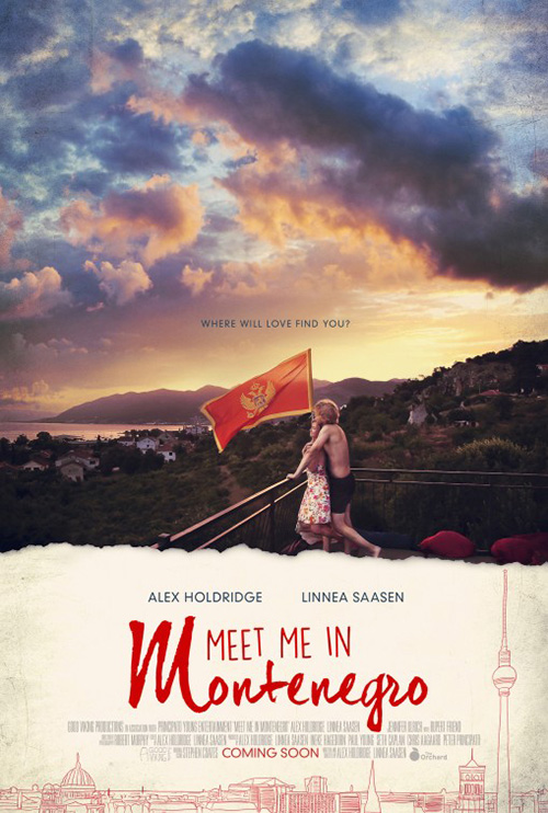
I know one of them doesn’t have the sky in its frame—Irrational Man (limited July 17)—but its water might as well be clouds. All four give a great expanse of uncluttered imagery for the top two-thirds of the page before showing us people and title below. The Refinery‘s Meet Me in Montenegro (limited July 10) tries to change things up a bit by adding a deckle edge to differentiate top from bottom, but the effect is unaltered.
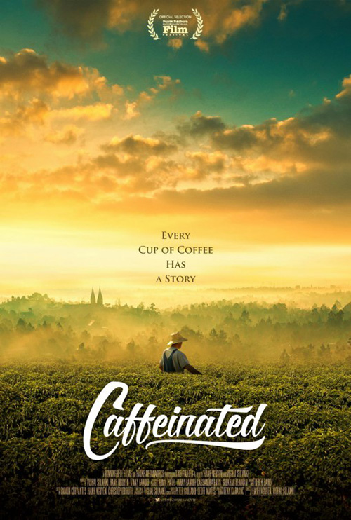
Take away the cartoonish font and Caffeinated (limited July 14) might be the prettiest of them all with its yellows and layers of atmospheric fog providing multiple striations of content. It’s better at the drama than Montenegro is attempting with its dark purples by being a totem rising upward—the circle of life all at once from clouds to crops to consumer.
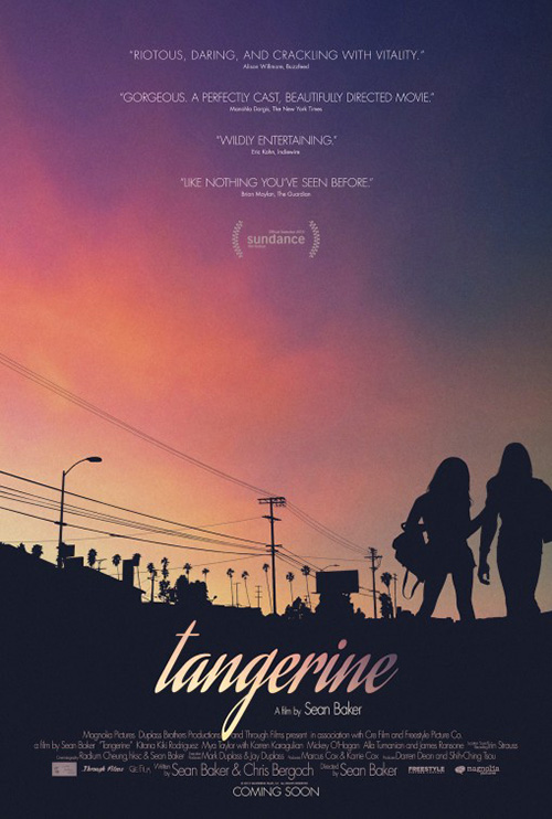
The best of the bunch, however, is P+A‘s Tangerine (limited July 10). Its silhouette against a smooth dusky palette sets it apart from the rest. Montenegro is too painterly despite not going all-in on the motif (Is that canvas roughness in the corners?) and Irrational Man‘s waves and rocks are so similar in form that its as though there’s no difference between them to prevent Joaquin Phoenix from disappearing completely. Tangerine‘s not quite black field of dark doesn’t overpower the pastel reds above while its sharp edges flatten the soft sky into a tactile texture. It’s a mesmerizingly beautiful alternative to the sleek sheen of Hollywood collage.
Against convention
 |
 |
 |
 |
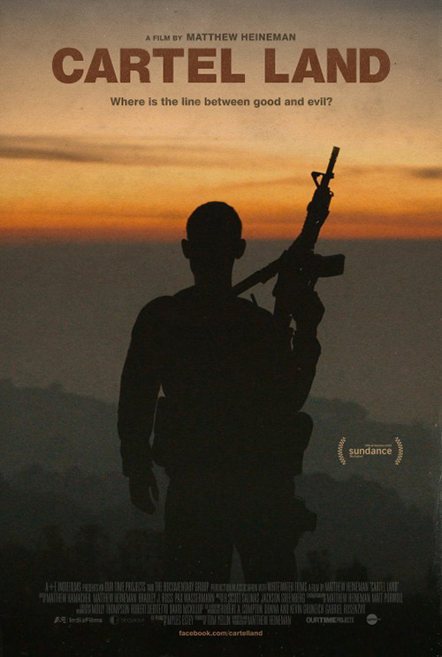 |
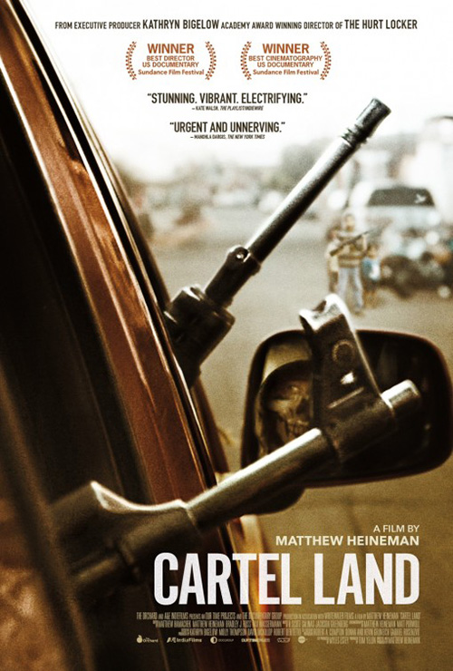
BOND‘s poster for Cartel Land (NY July 3) is the product of an expertly composed shot. The gun barrels sticking out of the vehicle at left leave perfect triangles of space with which to add text, showcase armed children in the background, and frame the masked man reflected in a side view mirror. Manohla Dargis‘ quote “Urgent and Unnerving” could be describing the advertisement itself and not the film. You can’t help wonder if bullets are about to fly.
Gravillis Inc.’s isn’t too shabby either with a similar design theme as Tangerine. The dark silhouette becomes an ominous figure against the hidden sun’s smoky orange rendering the background a slow gradation to black. Both examples have faith in the image above what any text might enhance. They each speak for themselves and the artists understood such.
 |
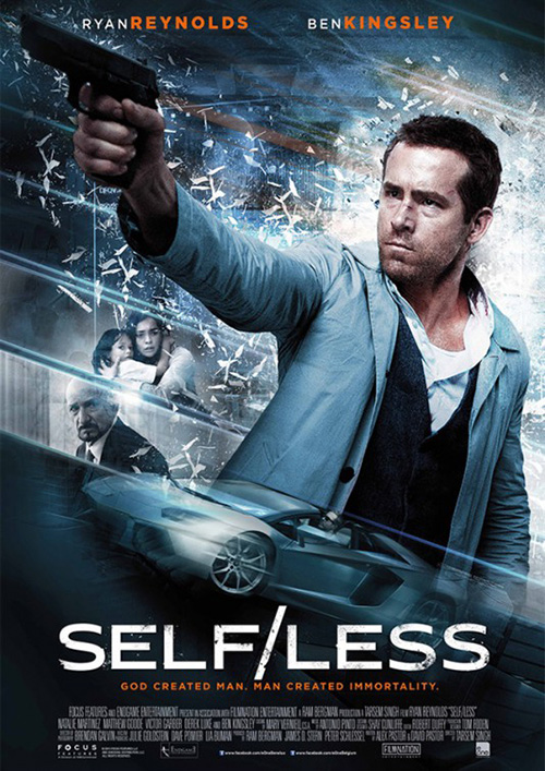 |
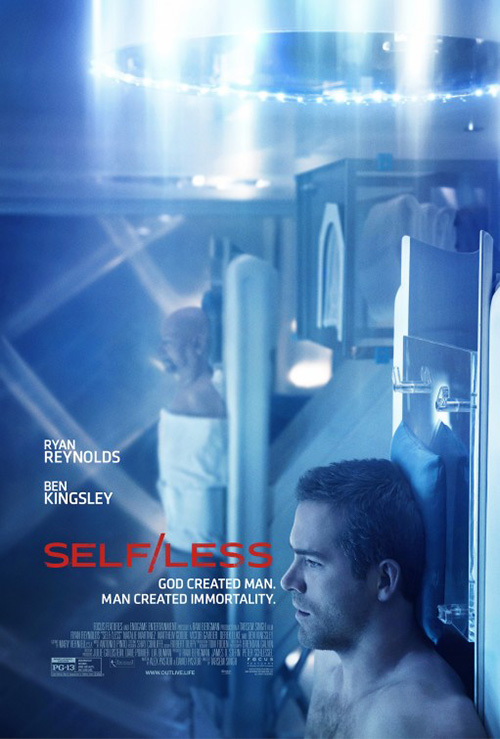
I really enjoy The Refinery’s work on Self/Less (July 10), a film I’m largely unsure about despite my unapologetic support for both Tarsem and Ryan Reynolds. The plot line seems a bit uninspired in its science fiction, but the potential visual splendor could render that assumption moot. The firm showcases the aesthetic possibilities with their 90-degree rotating of what’s probably a film still manipulated until its steely blue/green and new orientation resembles a transporter room readying to send the actors to a new world.
The depth of field and perspective are great with our eyes drawn up as we go into the frame. Its overexposed brightness creates motion where there is none—at least not physically since consciousness is in fact being transferred from one body to the next.
Gravillis’ tease is nice too with a human face wrapped in plastic. It supplies a very visceral concept matched by the tagline comparing man to God. You don’t need more than a hashtag and website at bottom to provide those piqued an avenue to learn more. The same cannot be said for the final generic one-sheet that’s pretty much like every other revenge-type shoot ’em up. The sci-fi plays, but the forced action does not.
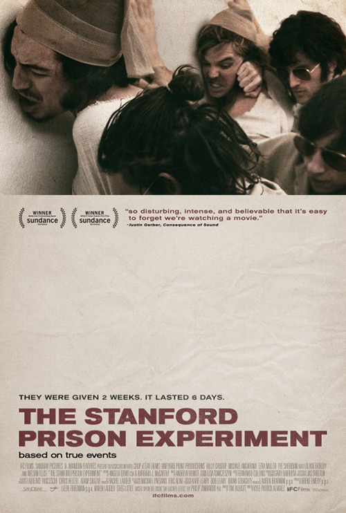
Also from Gravillis is a kind of reverse “sky’s the limit” design from above for The Stanford Prison Experiment (limited July 17). Rather than the extra space on top to offset information overload, we get the blank crinkled paper giving our eyes a rest at bottom. There’s something disturbing about the juxtaposition of so much anger and violence in the first third with the complete serenity of nothing at the middle. It reminds me of one of those optical illusions where you stare at an image for a full minute and then look at white to see something else.
What I love about the piece is the harsh separation from paper to photo. It’s a steep cliff censoring us from the full action, beckoning us closer to look behind the curtain and watch the insanity of its true story’s events.
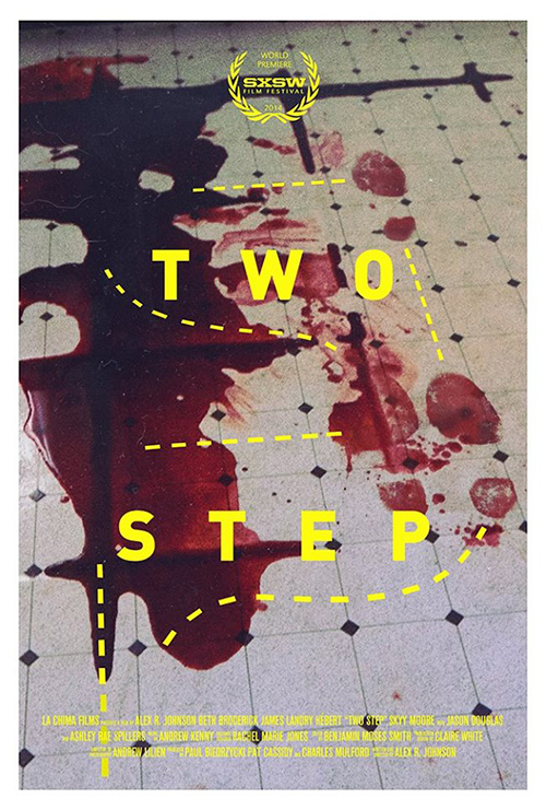
Possibly my favorite poster of the month, however, is Two Step (limited July 31). I can’t shake its simultaneous depiction of horror and frivolity. On a quick glance you do just see dance steps and the dotted “teaching” lines showing the motions someone needs to get the technique down pat. It’s amazing how conditioned that diagram aesthetic is to masking what lies beneath.
Only when you finally comprehend the sheer amount of blood involved below the yellow text do you begin to question what you’re experiencing. And the gritty 70s photo grain only makes me want to see it more.
Kanpai!
|
||||
|
||||
|
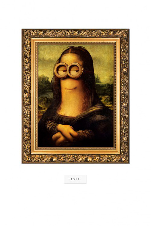
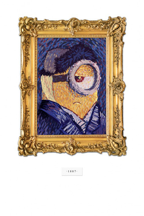
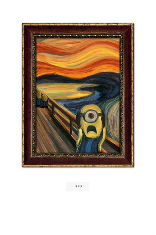
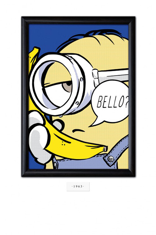
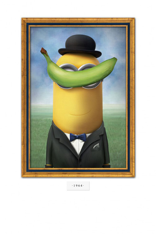
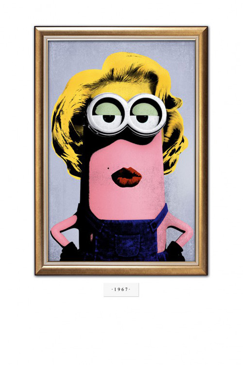
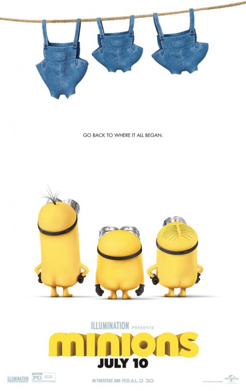
While Two Step is the poster that sticks with me, it’s LA‘s campaign for Minions (open July 10) that delights me to the core. It may be exactly what they did for The Age of Adaline earlier in the month, but I don’t care because it’s a ton of fun.
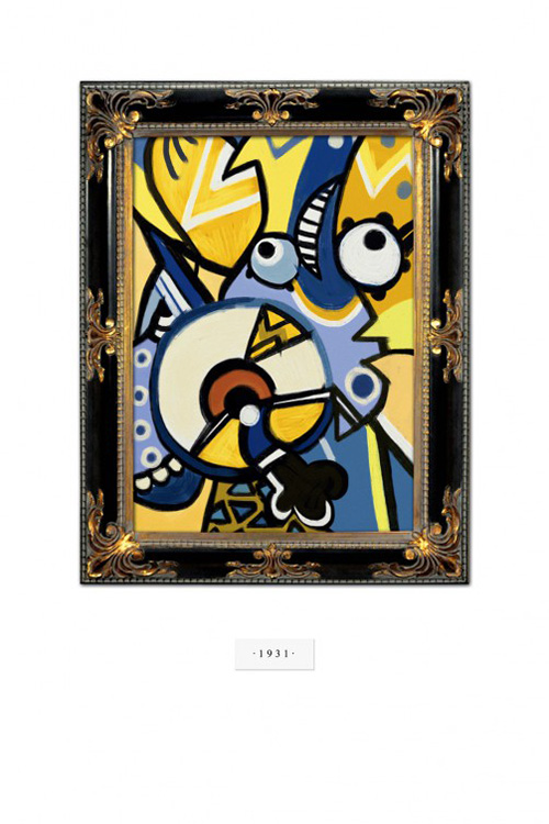
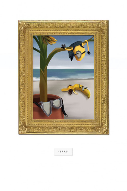
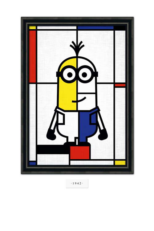
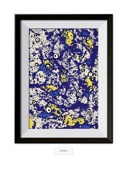
The firm lucked out by there being two centuries-spanning films to build a “Through the Years” concept around this year. Rather than photographic technology changing, they went with the evolving artistic climate traveling from Renaissance art (Leonardo Da Vinci‘s Mona Lisa) to the era of Post Modernism capped by Pop Art (Andy Warhol‘s Marilyn). In between are Vincent Van Gogh, Edvard Munch, Fernand Léger, Salvador Dalí, Piet Mondrian, Jackson Pollack, Roy Lichtenstein, and René Magritte.
 |
Will Regular Joe walking down the street or in a movie theater get every reference? Probably not. But they will take a second look to realize there’s a Minion hiding in each famous piece of work that lies dormant somewhere in the recesses of their minds.
It’s not like LA went highbrow only either. They’ve got a bare-bottomed sheet for the kids too.
What is your favorite July release poster? What could have used a rework?