While waiting for the Generative AI bubble to burst, it’s essential to highlight art from real people doing real work rather than “massaging” a text prompt to eventually look almost like what they wish they could create themselves. As movie-poster industry has recently pivoted hard into the realm of individual artists working on a case-by-case basis rather than big firms stamping their name on finished pieces from everyone on their payroll, one would hope there’s a legitimate desire to continue commissioning bespoke products.
I must think this way because the alternative would instead point towards a demoralizing trend wherein studios no longer wish to place institutions on expensive retainers when they can go directly to one person and inevitably drive down the price. That route would all but guarantee they’re champing at the bit and biding time before simply letting the C-Suite steal others’ creativity via an algorithm and never pay another dime again.
So pay attention to champions of the art form—among them Adrian Curry at MUBI, Brandon Schaefer at seekandspeak, Jahan Singh Bakshi at Posterphilia, and the folks at Posteritati. Take note of who and what they highlight—firms, designers, painters, collagists, etc.—because there’s a likely 100% chance the images they’re sharing were crafted by the hard work and talent of whomever is credited. Graphic design isn’t “a passion,” like the meme goes. It’s a specialized vocation with a storied and significant history.
There are rules to be followed, adapted, revised, and broken by those educated in, experienced with, and / or uniquely attuned to the medium’s use of composition, typography, and color theory. And there are different rules for the mode in which the finished result will be displayed (digitally online or physically hung on a theater wall). As someone whose day job forces him to explain what a bleed, gutter, and live area are to designers making big money at national agencies (thanks to universities no longer teaching the mechanics inherent to the print process), the below work’s success cannot be overstated. These artists are literally keeping a crucial cinematic tradition alive.
Honorable Mention:


#25 – Sinners (BOND, photography by Frank Ockenfels); #24 – You Burn Me (Pedro Bernstein, watercolor by Matias Piñeiro); #23 – Thunderbolts* (Akiko Stehrenberger); #22 – The History of Sound (MUBI Lab); #21 – Grand Tour (Irene Lee); #20 – Eephus (Erik Lund, photography by Kaila Reed); #19 – Sister Midnight (The Creative Partnership, painting by James Paterson); #18 – Bugonia (Vasilis Marmatakis); #17 – The Plague (Mark McGillivray); #16 – Peter Hujar’s Day (Brandon Schaefer for Jump Cut); #15 – Is This Thing On? (Eddie Loughran for Empire Design, part of a triptych); #14 – The Sparrow in the Chimney (Unknown); #13 – No Other Choice (Steady, design by Chang Zu, illustration by Yeon Yeoin, photography by Hong Jang Hyun); #12 – Eddington (GrandSon, inspired by David Wojnarowicz’s Untitled (1988–89)); #11 – The Heirloom (Caspar Newbolt for (version_industries), painting by Liza Evseeva)
Top Ten:
#10 – Next Sohee (Unknown)


I didn’t know if I’d ever be able to include the poster for Next Sohee in a Posterized round-up—it seemed as though it would never gain the US distribution necessary to qualify. I jumped at the chance when it was finally released stateside this May because its use of shallow focus and negative space is breathtaking. Si Eun Kim is the focal point—the mystery to be solved—and Doona Bae is the investigator tasked to uncover the answer behind her tragic fate. The image is thus a snapshot of two ships passing in the night. A ghost trapped in time and the woman trying to look beyond her shadow.
#09 – HAPPYEND (Studio RAN)


I adore the pixellated texture of Studio RAN’s HAPPYEND and how it mimics the lo-fi tracking scan of video upon a television screen. It adds to the voyeur nature of the film’s Big Brother technology that watches and judges the teenage students it seeks to reprimand via a series of demerits. We understand their drive for freedom—to run from an oppressive system and the pressure to become what you’re told rather than who you dream. It’s another great use of white space and even better typography with the addition of the above surveillance boxes trying to identify each letter.
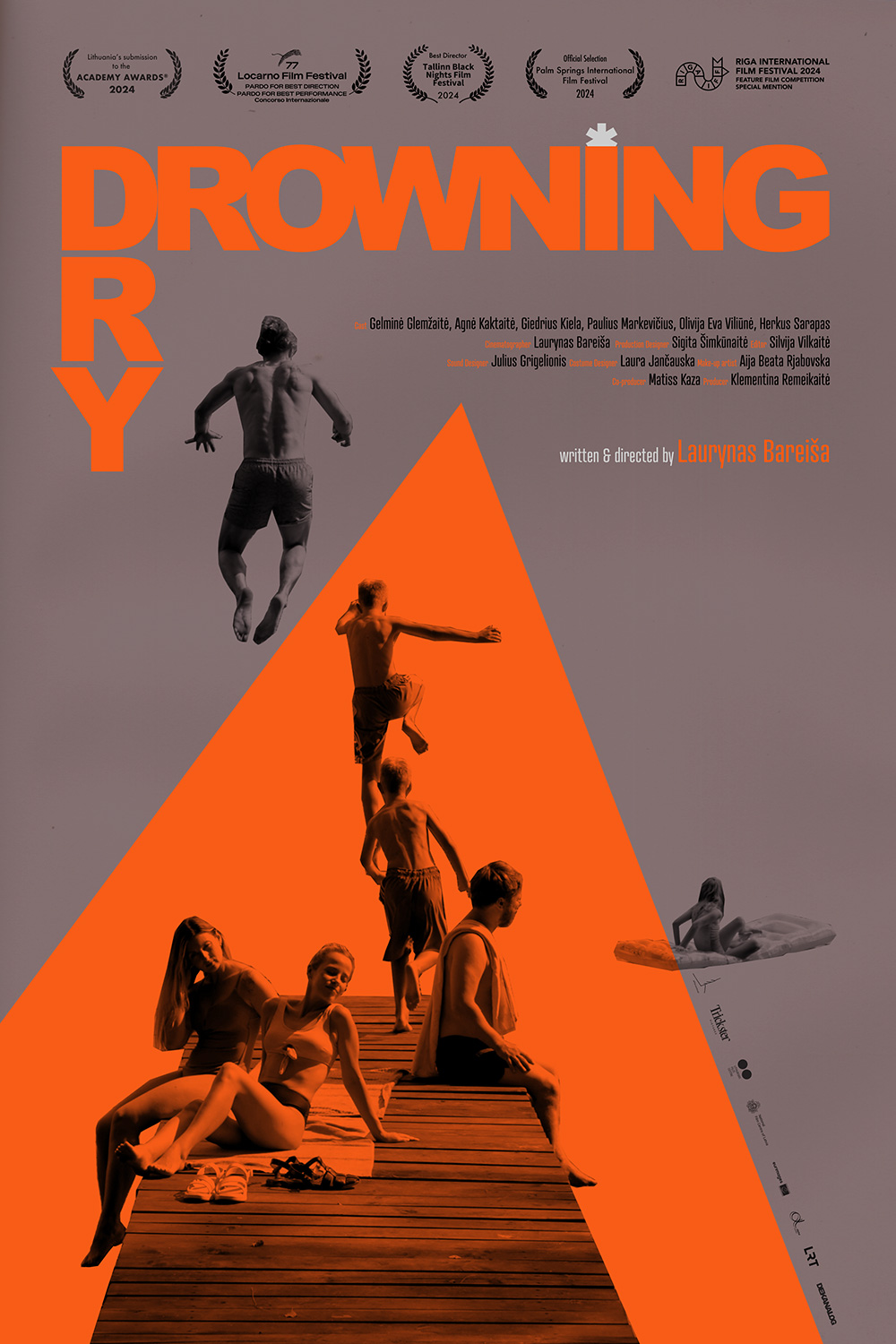
#08 – Drowning Dry (Unknown)


The original Drowning Dry poster’s (Lysa Le adapted it for US release) image economy brilliantly creates motion to compel our vision. We’re obviously drawn to the color—the whole is otherwise stripped down to monochrome black on stark white—so the large orange triangle lures us in before propelling us upward (with the logo procession) as a boy jumps into a nothingness marked by a similarly hued title. The blue asterisk then mirrors the young girl offset from the action with narrative purpose. So too does the triangle’s allusion to time—a clockwise spin to the jump, counterclockwise to the dock.
#07 – Resurrection (inbetween)


You could honestly put any of the Resurrection posters on this list—it was the most varied and consistent campaign of the year—but inbetween’s tease is my favorite for both its atmospheric mood and tactile aesthetic, each perfectly illustrating the awesome production design and technical achievement inherent to Bi Gan’s film. The eyeball pendulum. The timeline timepiece. The music notes. The playing card spade. The poppy flower in the “O”. The title treatment’s use of a repeating “I” to form each Chinese character. This thing is operating on a creative level all its own.
#06 – April (Caspar Newbolt for (version_industries))


The initial inscrutability of Caspar Newbolt’s (version_industries) design for April is a huge part of its appeal—abstractions ask the viewer to look beyond its formal success and find a path towards its visual interpretation of systemic violence. We aren’t witnessing an illegal abortion via characters and action so much as a representation of the procedure’s power within a repressive state. This serenely calm and cloudy sky destroyed by hastily covered blood portrays a tacit agreement. It shields the evidence of its horror while allowing the patriarchy to keep pretending everything is fine.
#05 – Harvest (Korina Gallika)


Despite watching the film, I still don’t know what the red shape on Korina Gallika’s Harvest poster represents. A horse blinder? Reservoir of blood? Dove? Or, albeit unlikely, a cartoon scream into the animal’s ear as it gallops through the frame? Regardless of any literal meaning, however, its presence is but one part of this ethereal image whose monochrome appearance calls to mind ghostly vapor trails or a smudged x-ray attempting to peer below the surface at Athina Rachel Tsangari’s metaphorical reaping. Add that gorgeous typeface (the “S” is so good) and its mystique proves impossible to ignore.
#04 – Universal Language (Derek Gabryszak & Hannah Christ)


Anyone who’s seen Universal Language will be very familiar with the specific patch of snow beneath a concrete arch that Derek Gabryszak and Hannah Christ so skillfully repeat to create this fun, brutalist and human, squared-off, and unfolded zoetrope. I love their decision to include the thieving turkey in the fourth window alongside director Matthew Rankin, Pirouz Nemati, and one of the two young sisters attempting to procure a bank note from ice. It speaks to the film’s eccentric absurdity as well as the notion that their isolated characters are all interconnected and just as important as the rest.
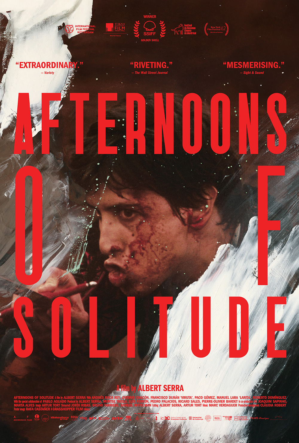
#03 – Afternoons of Solitude (Ana Domínguez)


Ana Domínguez’s Afternoons of Solitude is yet another original design too good for US distribution tweaks to avoid undercutting why it was reused in the first place. The Spanish title (having fewer letters than the English) allows the red to fill more frame and overpower the whole while a 90-degree turn of Andrés Roca Rey at its center invokes a sense of vertigo. Because our eyes keep turning clockwise after reading the text, spinning to reorient to his face and absorb the violent streaks of blood and paint. This conflict is crucial to its success and only made possible by its specific visual language.
#02 – Bogancloch (Sam Ashby, photo by Ben Rivers)


Ben Rivers’ grainy black-and-white image captivates by letting texture and contrast transform its subject into a stone-like sculpture. Sam Ashby’s disjointed placement of Bogancloch‘s letters above it then cascade our eyes down the frame, adding more intrigue to an already distinctive aesthetic built to stand out against glossy posters with straightforward type. What truly won me over, however, are the red pen markings that zigzag through the page and introduce a personal, code-like system yet to be revealed. Each shape becomes a geometric destination upon a lined travel map into this hermit’s soul.
#01 – Sunfish (& Other Stories on Green Lake) (Midnight Marauder)


The 2025 poster that won’t stop putting a smile on my face is Midnight Marauder’s Sunfish (& Other Stories on Green Lake). What a gorgeous, painterly shot selection supplying lush foliage with which to interact while also epitomizing the summer vibe instilled by Sierra Falconer’s lakeside setting. It wields atmospheric and transportive nostalgia above plot (the anthology structure provides too many to choose from) with an expressive shallow focus that puts us into the scene. Full marks for the tilt, too—its curved horizon through the page creates a wave of green that perfectly balances the right-justified text.