The fall festival season is upon us and that means awards season isn’t too far behind. And if you’re wondering just how crazy the last couple years have gone for cinema, look no further than the fact that I have posters of two TIFF films bowing in theaters this month below: one from the latest installment (beginning September 9) and one from the 2019 edition. Better late than never.
Hopefully that trend continues as more indie titles held for better days start making their entrance into the public sector, either via the big screen or VOD/streaming. But the latter is a very good thing, no matter what some try to tell you. Especially when Disney’s Shang-Chi and the Legend of the Ten Rings hits September 3 and inevitably monopolizes half of your hometown’s available screens. Sometimes getting “normalcy” back is overrated. And, frankly, the studios have nothing to blame but their own pre-pandemic greed.
Reflection


Move over, Amy Adams and Netflix—Amazon Prime is introducing a new snooper via MOCEAN’s poster for The Voyeurs (Prime, September 10). It’s funny how similar the posters are (BLT Communications, LLC handled The Woman in the Window), but also unsurprising since the best way to handle our ability to differentiate between reflections on glass and images seen through glass is rain. Let those drops tell us which is which.


What I really like about this version above the other is its coloring. Rather than go with warm colors and a washed-out aesthetic during the day, they went cool colors and a rich contrast at night. Then there’s the great compositional awareness to shift the rectangular windows in a way that allows Sydney Sweeney’s eye to be perfectly placed between them for full clarity, sans filter. That eye becomes our focal point, its position aligning with that which she’s spying: a couple undressing on their kitchen island.
I also like the font choice—even if it feels a bit out of place. Where a similar style plays into the look of Rhubarb’s Paradise Hills, it becomes almost confrontational here. What looks like a straightforward dramatic thriller suddenly takes on genre connotations of unexplainable nature. There’s a sinister playfulness where most would go for bold strength. It’s an interesting choice that makes me wonder about whether it was inspired by something within the film or simply “looked good.”
Now check out P+A’s The Card Counter (opens wide, September 10). Without the rain we really don’t know if this is a reflection at all. Maybe those card suits are a projection instead. The way the color at the top left diffuses over Oscar Isaac’s hair would say otherwise, but the lack of a source can’t help causing confusion.
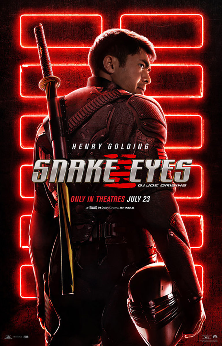
There’s a nice sense of mystery in that, though. Those suits become iconography for the character rather than just a representation of the subject matter. Proximity has me unable to not see BLT’s Snake Eyes as a comparison point—like an alter ego of sorts.
I could do without all the text… or maybe just the sheer number of sizes and formats therein. We have big, medium, and small. Sometimes it’s a regular thickness, sometimes bold. We’ve got red—was the intent to have Martin Scorsese’s name pop? because it just gets lost in the hazy red atmosphere—gray, and lighter gray. Despite being a bit of a mess, however, it also becomes rendered as noise against Isaac’s cold stare. Maybe he’ll pull out a katana after all.
And then you have ARSONAL’s Blue Bayou (opens wide, September 17). More than merely providing the cast (like Card Counter) or presenting the conceit (like Voyeurs), this one uses its reflection to tell a story. Here is a family sitting in a car and there is the entity ready to tear them apart outside of it. All we need is that shoulder and badge to understand the weight this scene carries as well as the situation of this man caught in the middle.
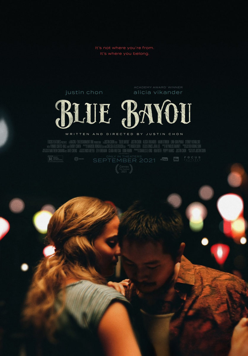
It’s concise, emotive, and attractive with its color scheme and grain. It’s also a far-cry from the firm’s other poster that leans more towards the joy this man shares with his wife when the world isn’t pressing down with all its might. The font change is also quite interesting: while similar in their stylishness, they possess very different symbolism. The first has a tattoo quality in its sharp serifs that, combined with the cop, can infer upon stereotypes like a criminal background. The second is curved and casual to embody the bayou of the title and the music therein instead. You must be careful with these things, for every little detail has the potential to impact our preconceptions.
Bottom-heavy


James Wan keeps his alternating schedule of horror and studio blockbusters going with Malignant (opens wide & HBO Max, September 10) and cold open delivers an effective one-sheet to mark the occasion. Pop that title in the middle, turn the “I” into a nail, and threaten Annabelle Wallis with an unplanned lobotomy all while stripping the palette down to blood red and pitch-black (with a splash of white).
What’s great is that the designers didn’t overthink the credit box. This sheet is a hybrid teaser/final with a pared-down list of top-line crew that must go somewhere. Do you sacrifice the layout by shifting Wallis over to fit it? Do you clutter the top and therefore render Wan’s filmography inert? Or do you find a nice little nook to place it where it’s both out of the way and easily forgotten?
The answer is almost always #3. The font choice’s serif rendering that “I” into its nail rather than the whole into an icepick you can grip helps matters—its danger doesn’t diminish our unconscious attempt and failure to wrap our knuckles around the title. Our eyes focus on the point and Wallis’ opened pupil readying to receive it anyway. The rest is merely in the contract.
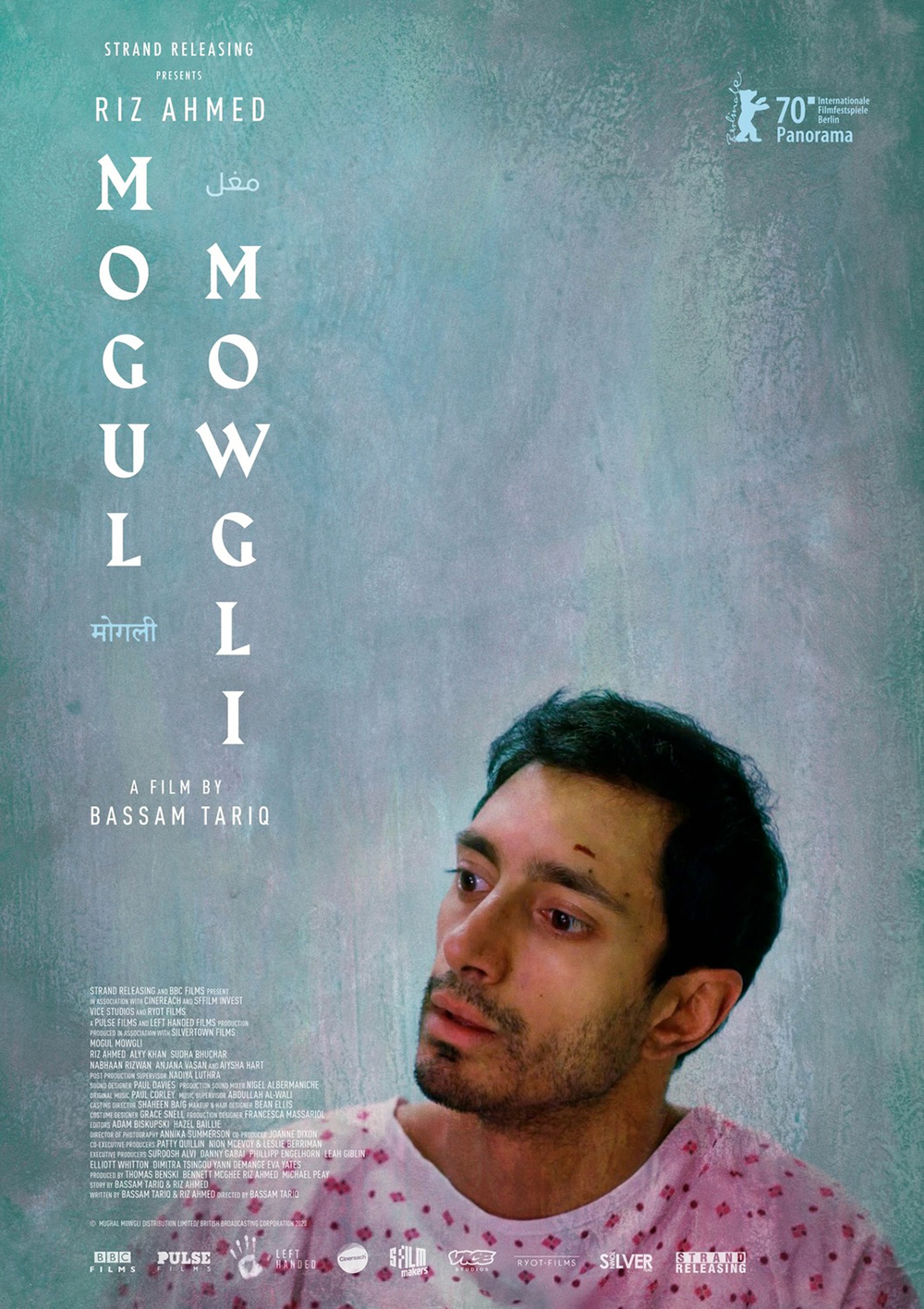
Mogul Mowgli (limited, September 3) utilizes similar vertical movement with the bonus of not having its star hogging the bottom edge. By keeping Riz Ahmed upright and off-center, designers can easily dump all the tiny text they want without worrying about messing with overall composition. He’s still our focal point being the sole bit of color on an otherwise washed-out gray. And his head tilt still creates an invisible diagonal bisecting the frame from bottom-left to top-right in order for us to slope downwards with it and back up straight through the title.
The typography on that works too despite going letter by letter rather than rotating the full words ninety degrees for legible ease. The addition of Urdu helps by providing a reason for the nice vertical shift between them. It becomes its own complementary diagonal to Ahmed’s head, creating a “X” right down the middle.
And then there’s Dylan Haley’s Anne at 13,000 Ft. (limited, September 3). He erases all the problems faced by the above by creating a frame right from the start. The image can now be completely untouched so Deragh Campbell’s cropped face at bottom feels as though it’s about to disappear completely as she falls through the sky.
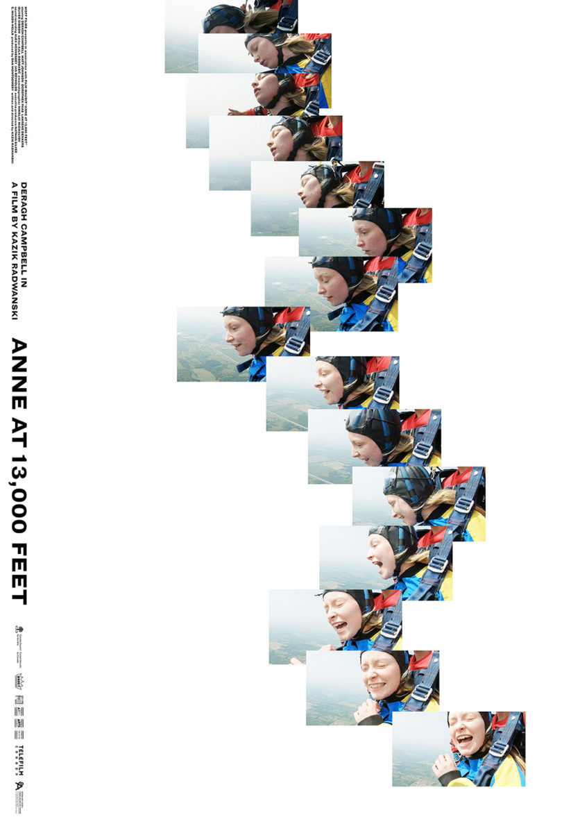
We need that emptiness at top for the motion to work. Stick a title and text up there and we lose the sense that everything has recently slid down to leave us looking through what will soon be an empty frame. The hair wisps only add to the effect as they trail behind her forward progress.
Caspar Newbolt / (version_industries) similarly focuses on that motion with his version at right. Instead of playing with one image to induce vertigo, however, he wields a series of them for what could be described as a deconstructed flip book. Down we go with Campbell, through her fear and shock and into her subsequent unbridled joy.
Turned Away


With three people riding horseback into an Argentinean forest, it would be hard not to create a scenic frame with the poster for Azor (limited, September 10). That the artists take the time to realize giving the environment more weight than the trio only helps in that pursuit, however, says volumes. This is a depiction of the adventure rather than the purpose. It’s about the unknown that awaits.
They also nicely shift the credit box to the top so as not to ruin the image’s scale. Logos stay at bottom because they both don’t take up too much space and can assist in building a window of white with which to use as a viewfinder onto the riders’ journey. And I love the Art Deco font’s stylish austerity as a contrast to nature’s mystery. It’s an inspired juxtaposition.
It’s all about atmosphere with Stockholm Design’s Prisoners of the Ghostland (limited & VOD, September 17) too. This time it’s with an eastern illustrative flair and a distressed western-type font complete with spurs. And when a quote from Nicolas Cage (“The wildest movie I’ve ever made”) proves a better pitch than showing his face, you know there’s room to deliver something unique.
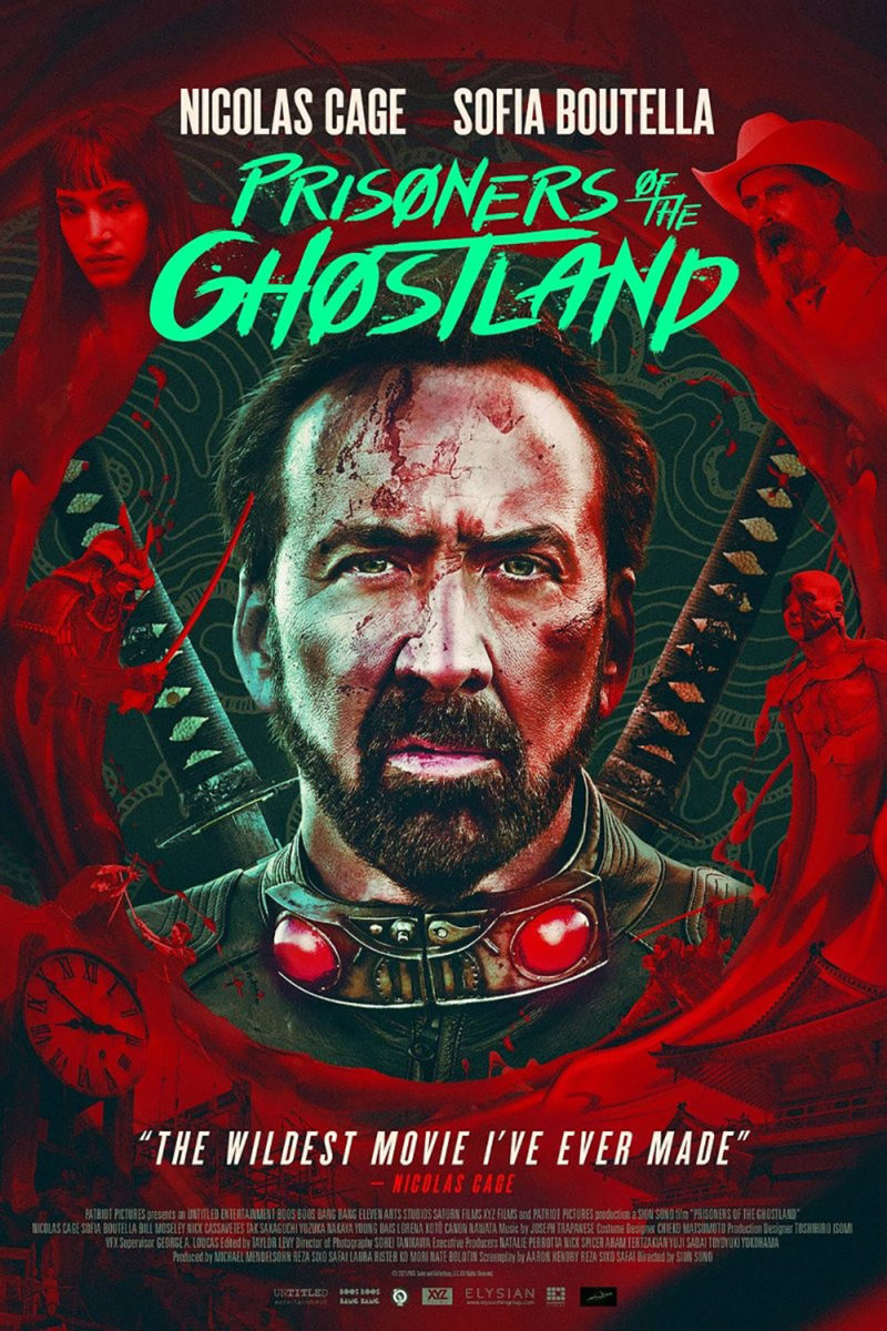
The junkheap Cage’s avatar stands upon becomes a treasure trove of Easter eggs and anticipation. We’ve got shogun, swords, and skulls. Graffiti, ornate drawings, and anachronisms galore. How you can then go from that to the subsequent portrait sheet with Photoshopped co-stars in red and a title font devoid of all personality is beyond me. Distributors want what they want, I guess. Thankfully those poor, money-driven decisions don’t also erase the better designs that came first.
As evidenced by the two titles above, one generally must choose between cast and setting. If you focus on the actors, you lose the scale of their environment. If you focus on the environment, you willingly push the cast to its fringes. There are exceptions, though. Sheryl Nields’ The Eyes of Tammy Faye (opens wide, September 17) is one.
This is a portrait, yet we cannot see the subject’s face. It’s a mood piece of period aesthetic with nothing but a closed eye and fashion sense despite only being able to spy tiny triangles of cloth and hair. We see a glint of light from the crucifix upon her ring, the shame in her manicured shield, and the drama inherent to her fall from grace. The result is more than Jessica Chastain and Tammy Faye combined. It’s about performance—capturing what it is that makes the former’s talents and the latter’s story captivating enough to put on the big screen.
Are the title and teaser text crammed too tightly into the bottom right corner? You bet they are. But it’s okay. Those who’ve seen the trailer don’t need any of that to know what this poster is for—and those old enough to have experienced her story in real-time don’t need, either. And that truth probably would have only made Tammy Faye want to retreat from our gaze even further.