“Don’t Judge a Book by Its Cover” is a proverb whose simple existence proves the fact that impressionable souls will do so without fail. This monthly column focuses on the film industry’s willingness to capitalize on this truth, releasing one-sheets to serve as not representations of what audiences are to expect, but as propaganda to fill seats. Oftentimes they fail miserably.
![]()
Photoshop: the Bad, the Really Bad, and Some Success
 |
 |
 |
 |
You see it a lot these days—the dreaded floating head Photoshop hack job. July 2011 is no stranger to the phenomenon and design equivalent to Frankenstein’s Monster, but the month also gives a couple examples of making the process work beneficially.
 |
 |
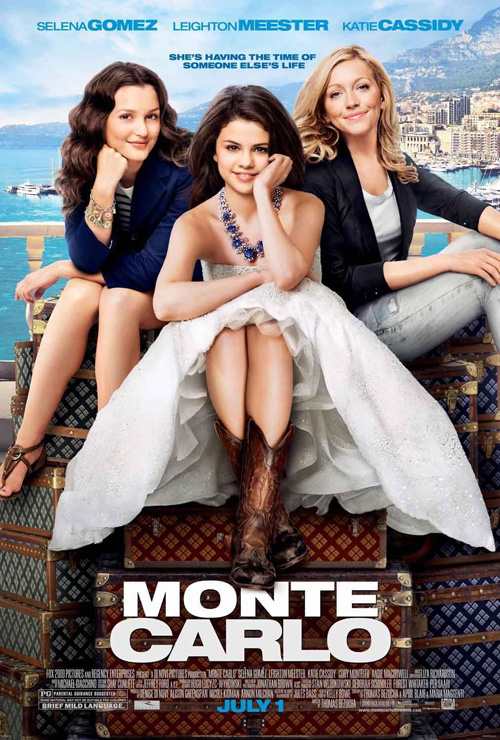
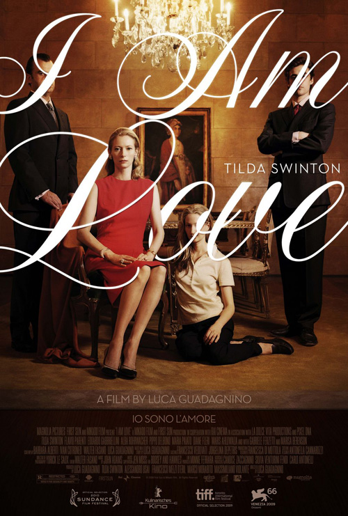
To think, design firm The Refinery was behind my favorite poster of 2010—I Am Love—and yet here they come out with the drab work for Monte Carlo (opening July 1). A trio of leading ladies superimposed on the backdrop of the titular city does nothing but reinstate the obvious. One could look towards the target audiences for the disparate tonal feel of the two, the gorgeous typography of a foreign film contrasted with the pristine, smoothed over faces of tween superstars, but that is no excuse. It only shows the industry knows their demographic is tied to the stars and the mediocrity of hamfisted, schmaltz. Why waste the money and talent when you can slap some words on faces?
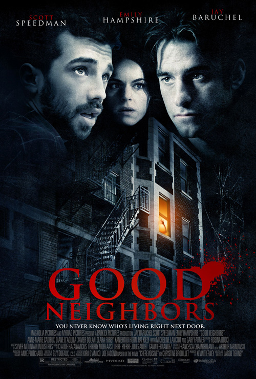
And this is what makes the poster for Good Neighbors (limited July 29) so frustrating. A thriller starring Scott Speedman and Jay Baruchel, the design team appears to have decided that the fake, ominous glow of an apartment window, a taut hand pushing against the pane in strife, is just the moody atmosphere needed to attract the tasteless hoping for a scare. Tense/aghast floating heads of the leads are thrown on top in hopes people recognize the B-list at best actors involved.
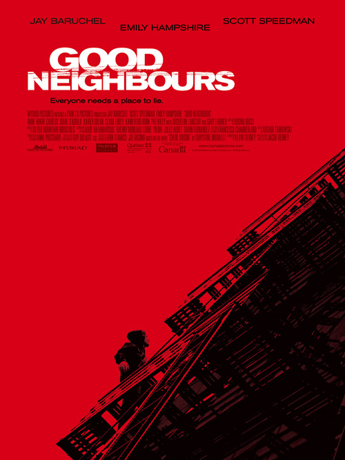
But it didn’t have to be that way; ARSONAL (admittedly the proponents of some of the worst one-sheets out there) crafted an original take—when still including the ‘u’ in Neighbours—full of intrigue and glorious white space. The contrast of black and red gives a stark bleakness to the imagery; the abstract angle is disconcerting enough to express the suspense sure to come without beating us over the head.
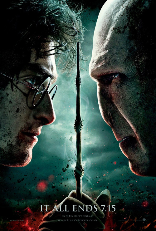
Just as these adverts show what’s wrong with the industry, WORKS ADV and BLT & Associates show how to use obvious imagery in a uniquely fascinating way. Tasked with the seventh Harry Potter film—The Deathly Hallows Part II (Opening July 15)—the former realized the scope of its characters’ recognition factor. There is no more need to explain this world to audiences, the pitting of Harry’s and Voldemort’s faces in profile, malice on each with a wand between, is all that’s needed … the film’s name completely absent.
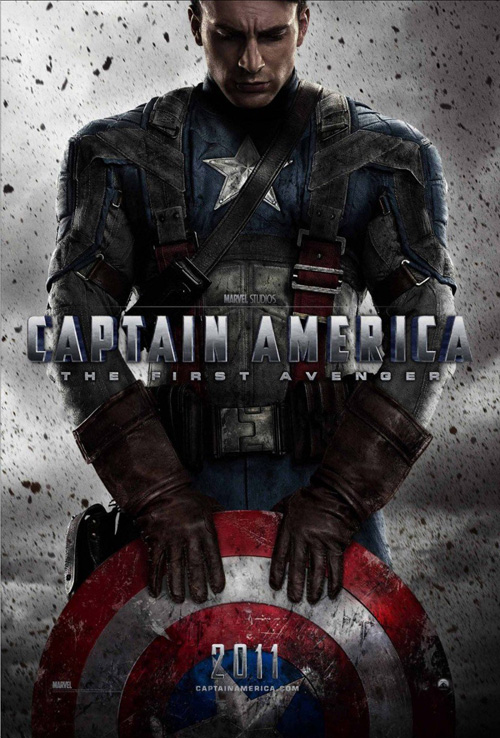
Much the same, BLT enjoys the enviable task of creating for one of the most iconic figures in the comic book universe. Captain America: The First Avenger (Opening July 22), needs only half of the hero’s shield to get the idea across. Chris Evans’ face is unnecessary compared to the red, white, and blue; the grungy dirt flying doing its best to represent the World War II setting and the explosive mines riddling its landscape.
![]()
Fun with Cut & Paste
 |
 |
 |
 |
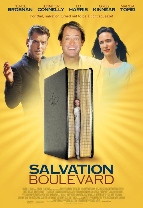
The sad part of this whole endeavor is that we haven’t even touched on the month’s worst entries yet. The makers of Salvation Boulevard’s poster (Limited July 15) should be happy I couldn’t find their names. This monster is a tragic state of affairs, not only merging three very different emotional states in the trio of upper body actors at the top, but also begging the question of why Greg Kinnear is being eaten by the Bible? Truth be told, I almost want to see this thing because the poster is so bad, but I doubt any agency would be shrewd enough to take the risk on a strategy of “Let’s make the worst poster ever and people will HAVE to see what’s up!”
 |
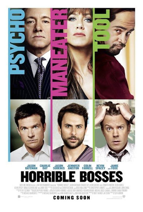
Horrible Bosses (Opening July 8)—which actually looks like it can be pretty darn hilarious—again shows how a firm’s success is not across the board. Coming from BLT, they’ve decided to forgo floating heads and instead compartmentalize six of the seven stars, gridding off the advert and rendering it completely impotent. Slapping text over the bosses has no bearing on the film as I don’t care what their transgressions are, I just want to watch the three buffoons on the bottom try and kill them.
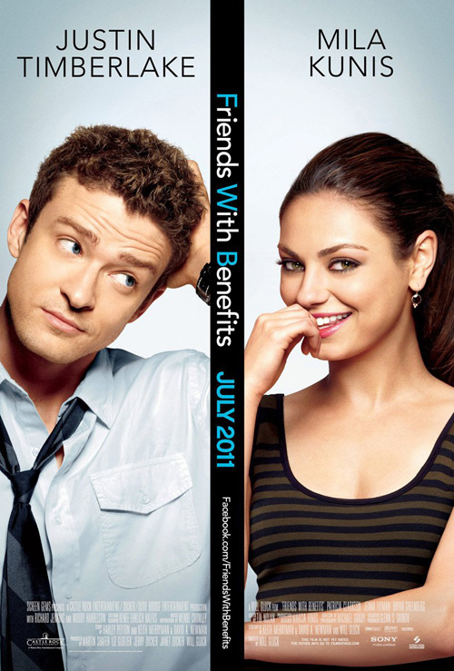
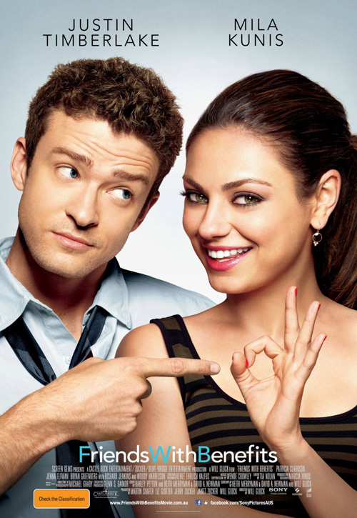
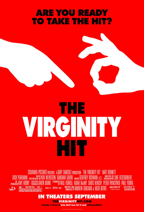
And to continue on the topic of agencies I praised mere paragraphs before, ARSONAL misses the mark with Friends With Benefits (Opening July 22)—twice. Hedging bets that the visage of Justin Timberlake and Mila Kunis will be enough to sell the film, they try to ratchet up the raunch by including lewd finger gestures, much like Ignition Print did with The Virginity Hit. I guess they—or the studio—decided it was perhaps too much and out comes an even more boring splitscreen, only interesting because it shows its lame process. Both posters use the exact same faces, the positioning of arms added later on, proving marketing firms feel no need to actually stage a worthwhile composition, instead deciding to cut and paste at will.
![]()
Intelligence Meets Art
 |
 |
 |
 |
 |
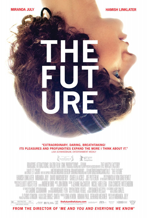
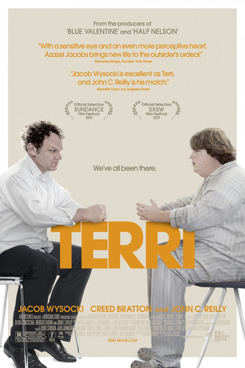
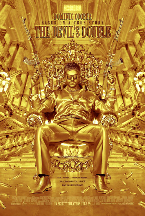
Our savior comes from the independent festival circuit, a vehicle for creativity, stellar typography, and as much quirk as the films they represent. One doesn’t have to look farther than Utah for a trio of Sundance entries opening this month in select cities. Two, XL’s The Future (Limited July 29) and an unknown firm’s Terri (Limited July 1), show brilliant use of type and composition while a third, Ignition Print’s The Devil’s Double (Opening July 29), creates a world of its own, captivating with its well-orchestrated implausibility—the Midas gold sheen palpable and exotic as Dominic Cooper literally becomes gold.
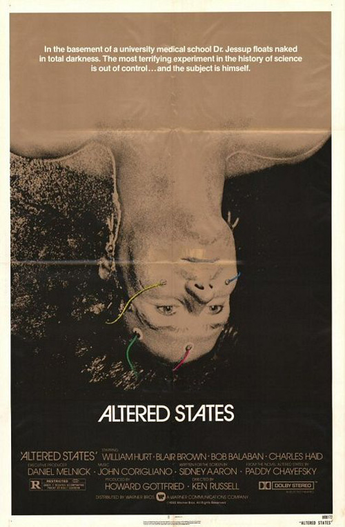
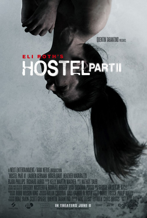
I absolutely love the first two, their use of text insanely appealing in their out-of-the-box nature. XL keeps us off-balance with the upside-down head of writer/director Miranda July—a motif used as far back as Altered States and as recently as Hostel Part II—and then surprises with a beautifully boxed set of letters, more interested in its own design than worrying about breaking a word in half. The sans serif font juxtaposes against the organic hair, the stark white focusing all our attention on the image, knowing fans of the director and fans of art don’t need more than this sort of simplicity.
And Terri does much the same. It’s a muted palette of the two leads sitting at a table, it’s rigid top on which their hands rest constructed by the film’s title. Utilizing text as object is nothing new, Zombieland filled its run-time with as many examples as it could and David Fincher’s opening credits to Panic Room an early adopter of infusing words into the frame rather than on top of it. The orange draws your eye and the mood sets the stage. Sometimes low-budget work means stripping it all down to its core, a trick Hollywood would do well to try.
![]()
Cowboys & Aliens & Pooh, Oh My
 |
 |
 |
 |
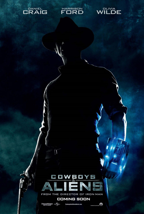
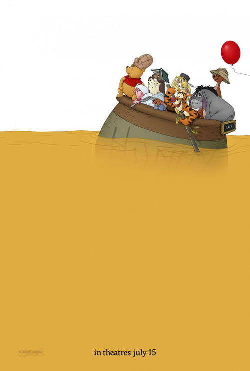
But July’s coup de grâce is a pair of films with as far apart a demographic as possible. One, Jon Favreau’s Cowboys & Aliens (Opening July 29), is a supernatural actioner set in desert landscapes; the other, Winnie the Pooh (Opening July 15), the newest in the beloved children’s animated series. Why they both are the best, however, has nothing to do with the subject matter or genre, it’s all about the designers knowing how to create a captivating image, fearlessly manufacturing their frame for full impact, refusing to cram in anything unnecessary to the visual message they sought to portray.
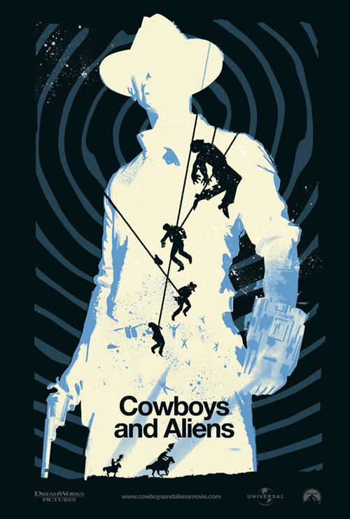
With the release of a fan-made piece, shared by the director himself on Twitter, one may believe—especially with the astronomical success of Mondo Tees and their commissioned poster sales—the silkscreen aesthetic would trump anything an agency could make. But, no matter how attractive Janée Meadows’ work is, the real impact it has hinges on the silhouette of Daniel Craig, his outline a direct rip-off from the one-sheet by BLT. Even Meadows saw the beauty in the shadowy figure at the ready for a fight, the blue glow of his alien weapon a gorgeous flourish to counter the wispy blue in the night’s sky. A striking image made by pseudo-photography, (I’m sure it was retouched)—who knew it possible?
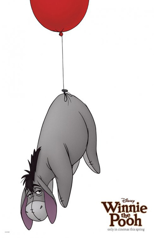
And last comes The Arterie’s amazing work on a honey river filled frame, the characters we know and love at top right, the only visual aide needed to draw in the hoards. The series of character posters created also uses white space to good effect, but it is the orange-tint of the honey that excels, its play on Washington Crossing the Delaware a fun set-up for adults, the kooky headwear of the merry band a hoot for the kids. Like Harry Potter previously, a name as recognizable as Pooh doesn’t need words—kudos to The Arterie for latching onto this fact and refusing to buckle against it.
What is your favorite July release poster? What could have used a rework?

