The poster selection this month is a bit uninspiring, but I guess that comes with the territory of awards season—name recognition is at an all-time high. When everyone is talking about The Fabelmans (limited, November 11; wide, November 23) and Glass Onion (limited, November 23; Netflix, December 23), they don’t need to wow us with exciting visuals. That’s not to say it wouldn’t be nice if they tried.
Thankfully, a few titles do stand out. Maybe they don’t all possess a strikingly original composition, but a little artistry goes a long way. Don’t blame the designers, though: they’re creating hundreds of comps and spending countless hours on each campaign only to sometimes have the studio pick the safest most boring sketch of the bunch. You do your best with what you’re given.
Grab a pen


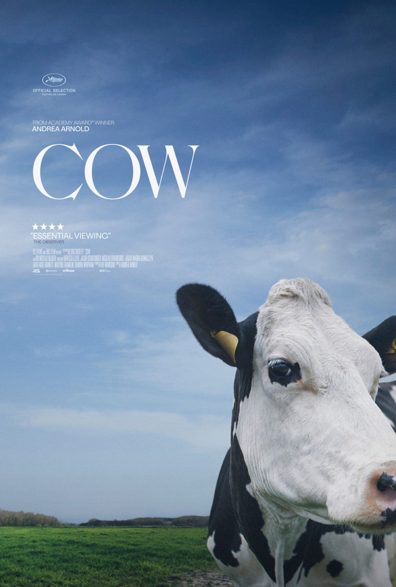
Case in point: EO (limited, November 18). They could have used a still from the film and went glossy donkey. They could have done something artsy, like Intermission Film’s Cow from earlier this year. Instead they deliver a wonderfully cute hand-drawn rendering that transforms the lead into a veritable Disney character. Soft eyes. Welcoming smile. Perky ears. He’s as excited to see us as he is to lead us on his adventure.
The red-and-white color scheme screams Poland (EO is the country’s official Oscar submission) while allowing the whole to pop with a bold brightness that the drawing couldn’t on its own. Add the scribbled title treatment that conjures potential of the donkey writing it himself with pen in mouth, and the informal playfulness gets you wanting to do nothing but spend a couple hours with him.
There’s also a playfulness to Miro Denck’s illustration for The Great Basin (limited, November 14). Being a documentary about rural Nevada and the so-called “loneliest road in America,” the decision to use line-drawing allows for a metaphorically surreal portrait with giant mailboxes and sheep creating new monuments on its multi-colored landscape.
Despite the oddities of its background, however, the main attraction here is a man struggling to empty a bowl of water. It’s depicted as a Sisyphean act of futility—the little water left doing nothing but absorbing into the ground. What was once “great” is now depleted. A ghost town of empty promises and unfulfilled dreams.
There There (limited, November 18) adds some volume and shading to its artwork, creating a scrapbook-like collage of characters holding debate and conversation over a mix of settings that conjure something in the scholastic realm. It contains an infectious energy with both its warm colors and DIY, cut-and-paste nature that’s exemplified by a fractured title shifting our eyes to the people below.
I like the odd construction of sightlines, too. These men and women are obviously all ripped from a scene of dialogue, each listening or speaking with intent that’s no longer contextually present due to their partners in that act being removed. They’re all looking at random spots as though we’re supposed to alter our angle and provide them their focus. We find ourselves wanting to catch their eyes and know what’s so interesting. We want to be the one that has them so devoted and alert.
Grab a brush


Moving from drawing to painting brings less of a need for precision than emotion. Rather than simply show an image of Taylor Russell and Timothée Chalamet like we’ll see later, Elizabeth Peyton’s canvas gives us a kiss through smudged colors if you’re willing to look close enough to find it. There’s an aggression to the texture and movement that counters the longing and romance of the act itself. And with a title like Bones and All (limited, November 18; expands, November 23), that juxtaposition makes sense.
Jules Estèves is the designer, and what they’ve done with the text reminds me of Mu Pan’s equally evocative work on Catch Me Daddy: letters and image flickering back and forth from windows to walls as both consume each other whole. The letters are absorbing into the canvas—the kiss a vacuum that threatens to take us with it.


ARSONAL’s US sheet can’t quite match that intensity. While I really like the way they’ve cut out the stars’ heads to form a heart (you can get a look at the full image with the Italian sheet), it removes the drama. It’s love, plain and simple. Maybe it’s a forbidden love, considering the sadness of their gaze, but there’s also this idea of relief in having a moment all their own. The energy of Peyton’s art is gone. It’s singular gut punch replaced by uninspired stillness.
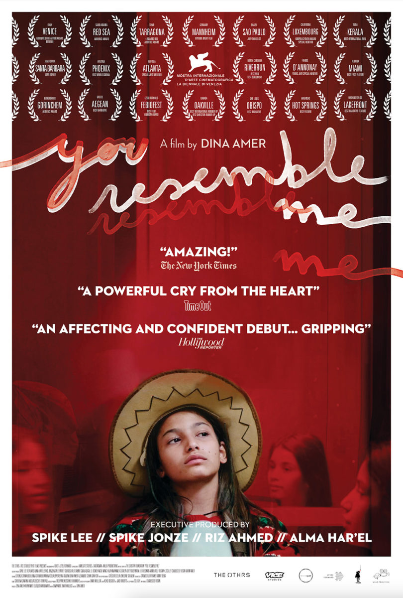
There’s a similar electricity in Phil Gribbon’s You Resemble Me (NYC, November 4; LA, November 11; expands, November 18). The shifting and overlap of four faces in hats—each as alike to the other as different—provides a strobing effect with translucency and opaqueness alternating in a rhythm matched by the smooth, white cursive of the title above.
I don’t generally like the repetition of festival laurels, but this grid fits the whole in much the same way. Our eyes are moving left to right with staccato beats throughout the page. Venice to Red Sea to Tarragona. “You” to “resemble” to “me.” Faded sister to visible sister and back again. It’s like a story in three parts, expertly separated yet combined for maximum clarity.

The second poster looks to mimic that same aesthetic with photography and ever so slightly falls apart as a result. It knows to shift perspective, though, and become its own thing removed from the first. This time it moves our gaze from front to back rather than side to side. The white laurels, title, and text become an overlay with the frame—a mid-ground between the image (one sister this time) and a duplicated title in red. It’s this detail that gives us the strobe with shifted color, size, and placement. White to red. Red to white.
And then comes Mike McQuade’s Meet Me In the Bathroom (limited, November 4). Its painterly brushstrokes are an enhancement—augmenting the fluid convergence of cutout black-and-white imagery into a collage of bodies and faces with surgical precision. That bright red gives us a guitar, shoes, and arch of a back. Its splotches highlight focal points and create a pathway through the mix of positive and negative space, turning arms into skylines and legs into doorways through space and time.
Keeping in those white chalk lines to show separation from image to image is a fantastic touch that both exposes the main guitarist as being pasted atop a black field and the flipbook-like motion of hair on the left. The main visual reminds us of the lo-fi nature of band zines and show posters Xeroxed over and over again before being plastered on the street. The clean-cut, white sans serif evokes the vintage style simplicity of cd jackets from the era (although the ones I think of most are Pete Yorn and BRMC rather than those listed).
It’s a strong piece merging bands, venues, and vibes into a rousing stage show we can almost hear just from a glance.
Grab a lens


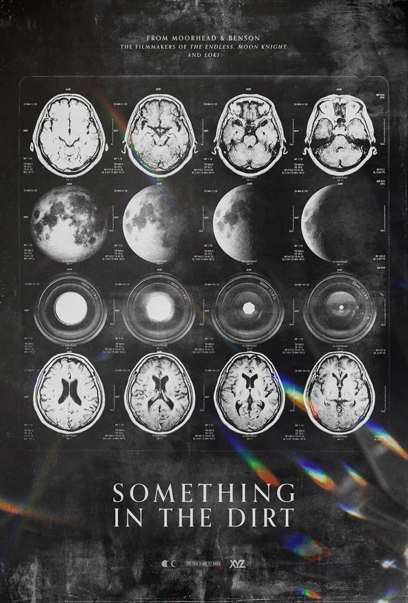
There’s double-meaning when moving to a “lens” for Something in the Dirt (limited, November 4). I say it both to show we’ve gone from painting to photography and to call focus towards the fact this poster is using an eyeball lens—as well as a camera lens—to tell its story. It’s a cool effect that turns a black hole in the sky into a pupil with the curve of a fisheye vantage combining cityscape and desert as lids. Moorhead and Benson love a good circle in their posters.
It’s evidence that you can have fun with a film still. You can warp an image of the directors standing and looking into the camera to become something completely different with a bit of imagination. Add a celestial iris and see what results while keeping the sci-fi conceit shrouded in mystery.

That cryptic nature is what made the tease so effective. It’s an MRI page held up to the light to show brains, planets, and camera lens in differing cross-sections and stages. Mind and matter are positioned on the same level. That which we capture is caught in-between hallucination and reality depending on whether the evidence seen is something we can believably handle as truth.
Utama (limited, November 4) exists only in the real world as an image from the film, devoid of any obvious signs of manipulation. Where it excels is thus not in the ingenuity of the designer but the beauty of the frame. It’s the grainy texture of the blue sky. The exquisitely unique font with backwards serifs that almost feels windswept. The perfectly centered text utilizing the y-axis to bring us down by separate animals from man. And the soaring eagle pushing through the “U” into the foreground to meet us halfway.
Everything about this poster is ordinary on paper, yet it sings when put together as a cohesive whole. The title is large but muted. The text is bright but thin. The creatures at bottom are dark yet balanced as just another horizontal stripe amongst many.
The Box (limited, November 4) by The Dream Factory is similar: it too is just an image, but the composition supplies a sense of drama the other’s stacked lines cannot. There’s impact in its scale—a giant man in the foreground and tinier teenager in the distance—as well as its crop, the former bleeding off the frame at waist and nose. His jacket is billowing in stark contrast to the stillness of the sand, building a gorgeous diagonal bisecting the page while also creating a shadow on which the title can sit.
The font is bold yet elegant, its pedestal serifs providing strength as the curves of its “B” and “O” allow a certain grace. Thus the whole isn’t menacing. It merely captivates in its central dynamic of father and son, purpose and innocence. Is the man a ghost? A friend? An enemy? It feels as though the teen is about to get one final lesson from the grave.
