“Don’t Judge a Book by Its Cover” is a proverb whose simple existence proves the fact impressionable souls will do so without fail. This monthly column focuses on the film industry’s willingness to capitalize on this truth, releasing one-sheets to serve as not representations of what audiences are to expect, but as propaganda to fill seats. Oftentimes they fail miserably.
Welcome to prestige central. All the spooky goblins and demons have disappeared to be replaced by November’s slate of Oscar-nominated artists (with some winners) swinging for the fences in hopes of another. There’s high drama for parents and fantasy flavor for kids with auteur visions from festival season filling in the blanks. While the studios save their super serious stuff for Christmastime, those more “fun” titles of counterprogramming with critical appeal hit theaters now to whet our collective appetite.
Such a tease


Leave it to the Harry Potter franchise’s producers to look at Thanksgiving and think, “Let’s use the holiday to make sure our second week matches our inevitable first.” It’s a shrewdly calculated and self-aware move. And the same description could be used when talking about the marketing campaign for Fantastic Beasts: The Crimes of Grindelwald (November 16) too.


WORKS ADV hit the streets with familiar iconography, a familiar lead, and the film’s main attraction: Jude Law as young Dumbledore. I’m half surprised they even bothered to include the title since Eddie Redmayne holding a wand is all you need to know what’s being sold. Kudos for the dramatic lighting and electric smoke aesthetic, though. Things are looking much darker than the first.
The conspicuous absentee is of course the rightfully maligned Johnny Depp despite his being the titular character. So it’s hardly surprising that the next card in WORKS ADV’s sleeve makes sure to have everyone’s face visible but his. Yes, there’s contextual reasoning for such a maneuver, but it’s kind of fun to think Warner Bros. was trying to distance themselves a bit from Depp’s current news cycle.
It’s only with the final sheet and its ornately stylish snake-like frame that we finally see his face with equal billing to Law. I’ll admit that this poster is well done considering how stale its content proves. While it’s perhaps not as moody as the tease, the dark palette works infinitely better than the blinding white and too graphically perfect line work of the previous example. In the end it really doesn’t matter, though. This franchise will either show how it remains king or reveal its decline regardless of how pretty the advertising is.
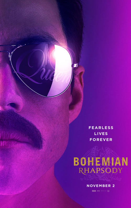
A film that should benefit from good marketing is Bohemian Rhapsody (November 2). Here’s a biopic that has a not so great history considering Sacha Baron Cohen’s public departure from the project after the surviving members of Queen stated they wanted a story that showed “their perseverance as a band despite Freddie Mercury’s death” and the firing of credited director Bryan Singer mid-way through production. So anything able to bring the focus back onto the music and Mercury is necessary.
Gravillis Inc. was up to the task with their UK tease of Rami Malek in silhouette against a gloriously grainy sunset. The coloring makes this sheet what it is, giving the whole an otherworldly feel. The crest under the title isn’t distracting and the dual font selection proves a perfect complement to one another.
Sadly, WORKS ADV’s US sheets aren’t as good. Their close-up of Malek’s jawline could work, but not as is. Putting the word “Queen” in his sunglasses doesn’t negate the fact that this looks like a rejected design for Super Troopers 2. You need to have a concert atmosphere—a microphone, stage, pose, or whatever. I’m not sure what this is trying to say.
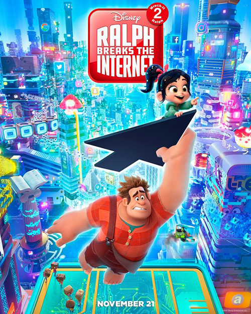
Concept Arts, on the other hand, do right by Ralph Breaks the Internet (November 21). The character is recognizable on its own and his sheepish look of “whoops” along with the context of a Google search bar and accusatory arrow provide the title as visual riddle rather than just by the hashtag below. It’s the sort of tease you need to place the brand back into our consciousness well before the release date.
That minimalism is rendered even better when measured next to Ten30 Studios’ sheet. I don’t mind how busy the environment is (the internet should be when compared with a vintage arcade network) and do enjoy the arrow taking Ralph and Vanellope to who knows where. What’s unwieldy is the title as app icon. Putting Disney inside the box is bad enough, but what they do with the notification circle is unforgiveable. Having the “2” there is ingenious, but only if you keep the name “Wreck-It Ralph 2.” Putting those words super tiny inside the circle conversely admits you know the gimmick doesn’t work and were too lazy to figure out a real fix or simply scrap the idea completely.
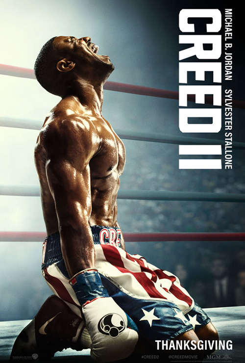
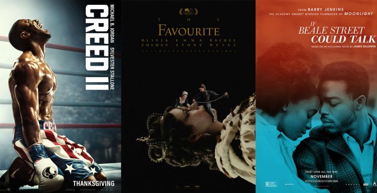
One poster that doesn’t need meddling is Concept Arts’ Creed II (November 21). Much like their Ralph teaser, they know the character is enough. The added bonus here, however, is that this character wears his name on his clothing. So despite the artwork being nothing but a Frank Ockenfels photo atop a giant Roman numeral “II,” those two pieces are intentionally combined to form the title.
The black and white also adds some welcome drama the second poster loses in its glossy, try-hard attempt to earn emotion through a scream. Is this a happy scream? Angry scream? We don’t know. Maybe he’s singing. And don’t get me started on the title/actor list top right because it needs to be rotated 180-degrees so my left-to-right English-based brain stops screaming as loud as Michael B. Jordan.
This has character


Characters in a film don’t always have to be actors, especially not when we’re talking about documentaries like The Last Race (limited November 16). Here’s the story of a small-town racetrack and the community that rallies around it. The poster could have gone the route of using some citizens that we don’t know to sell its product, but why not go for drama instead? Why not focus on the subject of racing and what this specific track has to offer?
The result is a captivating image of a beat-up stock car painted red, white, and blue with smoke ascending out the engine. It has a showcase feel similar to when dealerships put their latest edition on a revolving circular platform and have photos taken from a low-angle to portray its “muscle.” The condition itself is both a literal representation of what happens and a metaphorical parallel to the track’s struggles to survive. And this car is allowed to exist in alone that headspace, the title bold yet detached for a perfectly balanced composition moving us through the smoke from “character” to text.
For Jinn (limited November 15), Blood & Chocolate have taken an image of its star and cropped her in a way that allows them to mimic the contours of her face with their text. The right justified credits box follow the path of her mouth until the slight slope of the “j” outlines her nose. A river of negative space is therefore created so our eyes can travel down it, the stark white title grabbing our attention before releasing us onto the rest. And the coloring is superb with headscarf and background filling diagonal corners to highlight her smile. The film is about a young girl struggling with her identity and if nothing else this poster gives us hope she’ll come out of it okay.
InSync Plus’ If Beale Street Could Talk (limited November 30) uses similar imagery in a different way. Like the last sheet, both KiKi Layne and Stephan James have heads bowed. Unlike Zoe Renee’s sense of joy, however, these two are tilted with somber reverence and love in the midst of oppression. And rather than having text cradle their faces as it does above, they meet as though pieces of a puzzle matching forehead to forehead as no other soul could.
The coloring is intriguing in that the photo itself is black and white with green at bottom fading cloudily into red at top. There’s good motion in that transition so we can effortlessly shift our gaze along the vertical axis from title to date.
After characters portraying drama, joy, and love comes my fourth entry to this section: comedy. You cannot help but laugh at MIDNIGHT OIL’s The Favourite (limited November 23) simply because of Emma Stone sunk down on the floor with arms crossed while Olivia Colman and Rachel Weisz look on regally by comparison. The poster literally frames the latter pair as though they epitomize a pristine image that should be sold and yet it’s the odd woman out who steals our attention and the show.
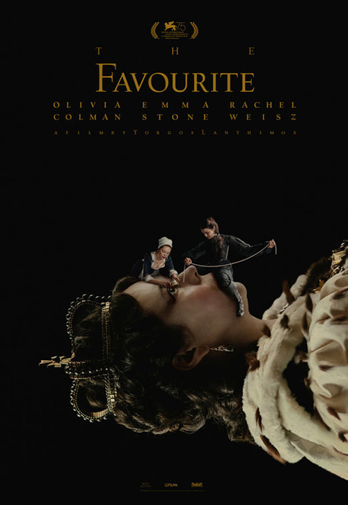
The rest is a mix of the surreal and idiosyncratic. The bunnies add a nice flourish (I haven’t seen the film to comment on their inclusion), the way Colman’s cape interacts with the false frame and then becomes a rug is delightful, and the decision to force all text into full justified columns proves as confounding as it does memorable. On the whole this poster is simultaneously abstract and matter-of-fact, playful and severe. Knowing Yorgos Lanthimos, the film itself should follow suit.
This design ultimately proves much more palatable than Vasilis Marmatakis’ teaser. That one is much darker and obtuse—perhaps relying too much on our having seen the film to understand it. Unforgettable in concept, I wonder if it’s simply too weird to leave an indelible mark.
Leave your name at the bottom


I’ve been waffling on BLT Communications, LLC’s poster for Overlord (November 9) because I love the concept if not the execution. Making it an optical illusion by being both a blood-spattered surface and parachuting soldiers in the sky is inspired, but the Hollywood gloss effect does no favors. The reason stems from it never feeling natural in either lane. Rather than play with a real liquid pattern that could be made into the parachutes, this appears more cartoonish animation. While that may align with the horror/comedy bent portrayed in the trailer, it keeps the design from being a success on its own.


For that reason I have to give BLT’s other sheet a leg up. The messy 30 Days of Night graphic novel feel mixes grunge and heavy metal (that font) to create an atmosphere of brutality without falling into cutesy ambitions for more. With all signs pointing to this being a down and dirty flick for midnight audiences, that transparency in print goes much further than high concept visual metaphor.
What The Refinery did with Green Book (November 21) is very much the opposite. Here we have an uninspired design executed to perfection. All they have is title, image, and actor names and yet each one comes together in a way that lets them shine.
Having both names be fourteen and thirteen letters respectively does wonders for symmetry and really lets the whole exist on that vertical axis. They’re placed at the top with an ample gutter between so our eyes can fall down—glossing over the small line of “inspired by” text—to their faces below. We see character in these men with stationary performances augmented by a motion-blurred car causing our brain to believe it is focusing on a single frame captured in an instant. Mahershala Ali is looking right at us to share in that momentary eye lock before he’s gone to leave nothing but the super thin title as reference for how to see more.
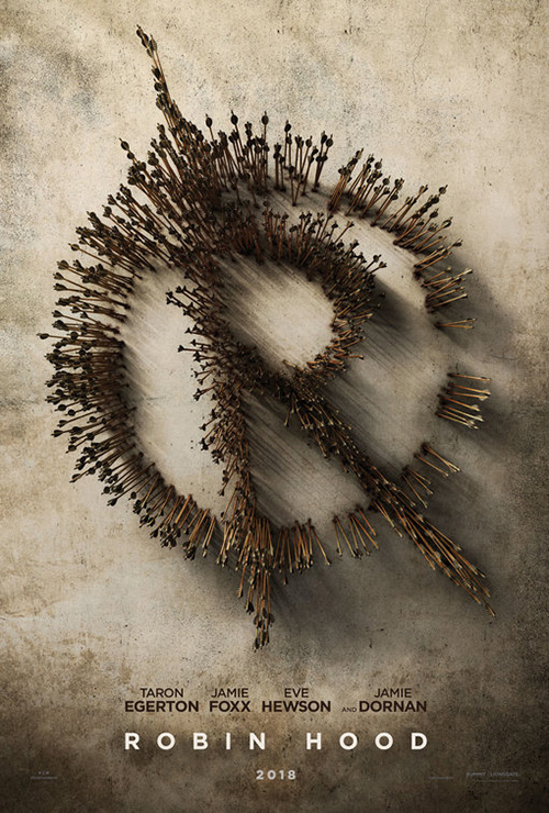
LA is a bit more overt with their poster for Robin Hood (November 21). An arrow is by definition something pointing to something else and so this mass of them takes us from feather to head with speed enough to mask the fact we’ve gone from weapon to trees—a Sherwood Forest composed of the titular hero’s lifeblood. It’s the type of visual flourish you can almost guarantee will be put in-motion at some point during the film, perhaps within a credits sequence placing us on those arrows and into this hideout as though we’ve join Hood on his adrenaline junkie ride.
The tease at right is similarly effective if less imaginative and moody. The formation of a logo conjures more thoughts of Dick Grayson than Robin of Loxley, but I get the appeal of wanting to provide a graphic representation of the hero without having to show any faces. When you’re dealing with an archer as proficient as he, you can imagine him creating patterns with expert precision. As far as having them penetrate what looks like stone? I guess this Hood has muscle too.
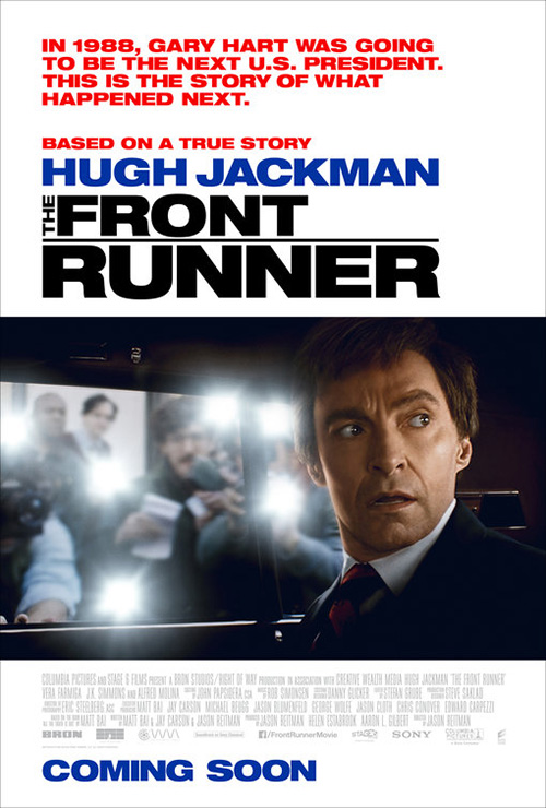
The poster in this section I’m most impressed with, however, is Manheim’s The Front Runner (limited November 6; expand November 21). They’ve really captured the tone of the film and the artistic look of a 1980s political campaign with a simple cartoon style and wit bringing to mind Doonesbury comics. Gary Hart found himself on a cliff of integrity, ethics, and fidelity and, as Jason Reitman portrays, he wasn’t the only one to drive straight off. I love the heavy font choice matching bus banner to title and the lack of visual excess where silhouette will do.
It only makes WORKS ADV’s sheet worse. Goofy face by Hugh Jackman aside, this thing is more akin to a 90s thriller with dramatic title breaking apart its words for a fast break right onto a mysterious shot of the lead looking off-screen at his unknown pursuer. The killer is already here.
Symmetrical serenity


I really enjoy this poster for The New Romantic (limited November 9) by The Refinery because it “looks” real. You can’t usually say that about sheets dealing with practical objects such as neon lighting or graffiti. Whereas most are close approximations, this seems as though the firm may have commissioned a fixture rather than used Photoshop. The black lines in the background connecting each portion of tubing sells it.
What’s even better, however, is how they let it be a source of the soft lighting behind rather than a blinding beacon overpowering everything around it. There’s an allusion to it being a halo above Jessica Barden’s head too, one that gives her power instead of taking it for itself as a signpost leading her astray. The whole is simple, attractive, and legible: three traits that should be imperative and yet most posters can barely call themselves one.
I’m very glad Netflix finally decided to give their films theatrical posters because there have been some good ones of late. (And now that it appears “big ticket titles” will be getting wider theatrical releases, they’ve become necessary.) BLT Communications, LLC provides one of these successes with The Ballad of Buster Scruggs (limited and Netflix on November 16).
This thing is objectively pretty with its western font manipulated through curves in order to become six separate roads on which its characters can escape. It feels like a board game of sorts with each dark silhouette a token to be moved according to the player’s roll. We get whimsy, mystery, drama, and period aesthetic all at once, our vision spiraling into and out of the image’s hexagon as though on an infinite loop in hopes of experiencing where they’re going and how they’ll inevitably come back together.
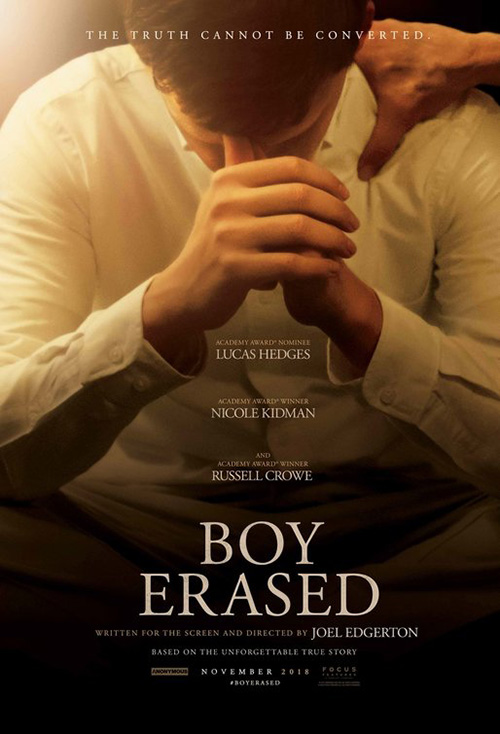
Where its symmetry radiates, B O N D’s creates a diptych in Boy Erased (limited November 2). After how little cold open’s first sheet at right did to create intrigue, I was absolutely blown away by this newest entry to the campaign because of how stunning it proves.
There’s the use of light as a beacon shining through a window onto Lucas Hedges, reinforcing the fact that he’s our central focal point. There’s the shallow depth of field augmenting this even further by rendering Nicole Kidman and Russell Crowe blurry to counteract how much larger they are in size by comparison. And there’s the text work that never distracts from the image while staying center justified to ensure we see the whole as a fractured division—light vs dark, mother vs father. The drama is palpable in every square inch.
And that leaves us with Shoplifters (limited November 23) and its gorgeous woodcut-style illustration by Chinese artist Huang Hai. Much like The Handmaiden, this type of eastern aesthetic does wonders to standout from the pack at local multiplexes while also hewing closer to a representative work of art removed from its advertising duties. It takes the still that The Refinery fashioned into its English sheet and reinvents it through a historical lens of graphic waves and surreal clouds. Where theirs is sterile and cold, this one possesses warmth via a personal touch.


I also like the more colorful and modern illustration with fireworks blasting to frame the family at center. It may confuse people into thinking the film is a cartoon since we see faces and an interaction with a scene rather than obviously abstract motifs, but the energy is enough to carry it beyond any misinterpretations.
What is your favorite November release poster? What could have used a rework?