“Don’t Judge a Book by Its Cover” is a proverb whose simple existence proves the fact impressionable souls will do so without fail. This monthly column focuses on the film industry’s willingness to capitalize on this truth, releasing one-sheets to serve as not representations of what audiences are to expect, but as propaganda to fill seats. Oftentimes they fail miserably.
Oof. There are a couple good posters this month. That’s it. And I don’t mean “a couple” hyperbolically, either. There are maybe two I’d consider looking at again at the end of the year. Maybe.
It’s July, though. No one is surprised.
Monkey Business
 |
 |
 |
 |
 |
 |
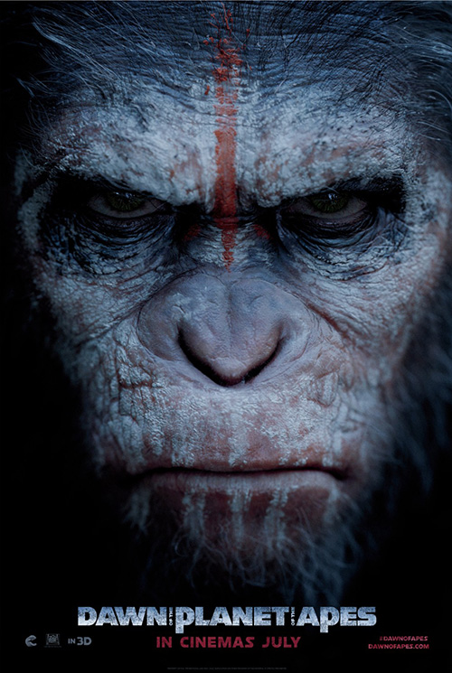
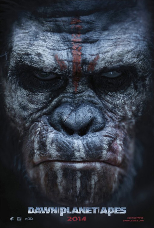
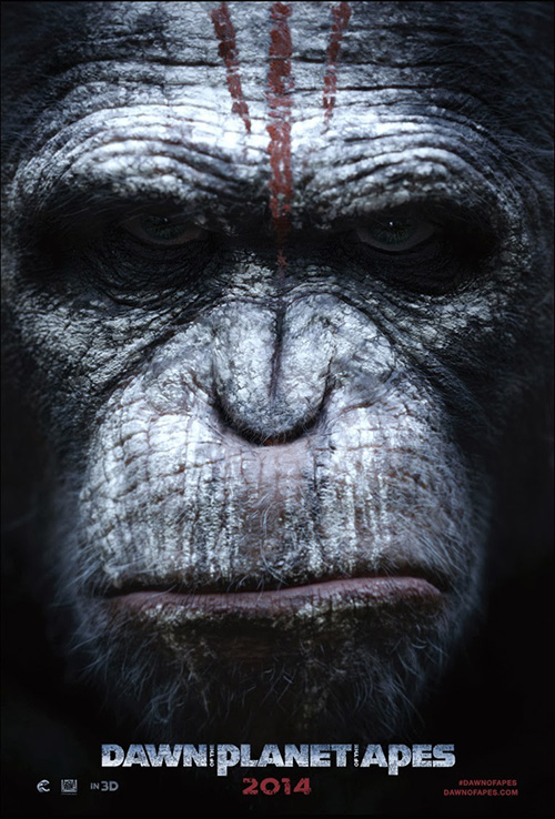
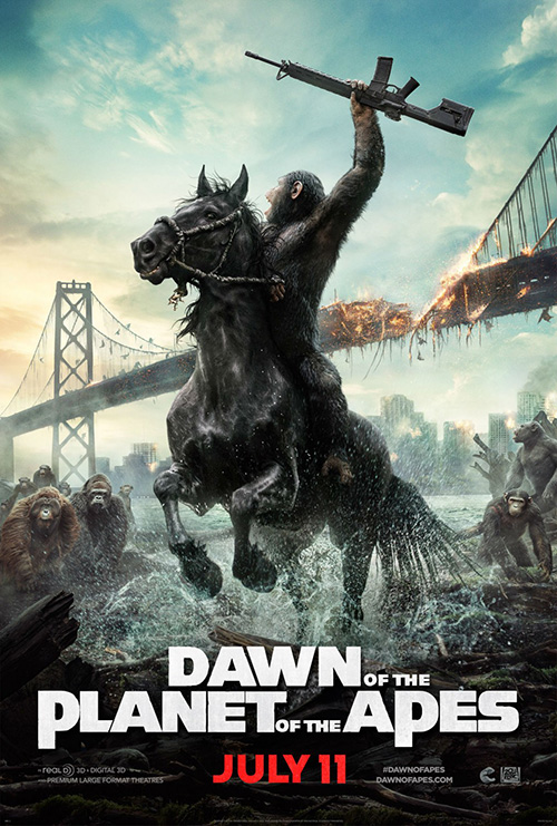
What is surprising is the fact that America has one-upped the world as far as providing a poster series devoid of humans for human sake. For a movie entitled Dawn of the Planet of the Apes (opening July 11), however, you’d automatically assume any actor not being motion-captured like Andy Serkis is moot to begin with. So don’t give American designers too much credit for doing what logic calls for.
A series of character sheets for the apes is an inspiring decision nonetheless, seeing as the layperson honestly has no clue what their names are. And that’s okay. I’ll assume the first is Caesar just because I remember him looking like that in the previews — I never saw its prequel, nor any of the original films — but it’s an unnecessary distinction regardless. These apes mean business as they ready for war and you get the emotion and attitude of that revelation in spades.
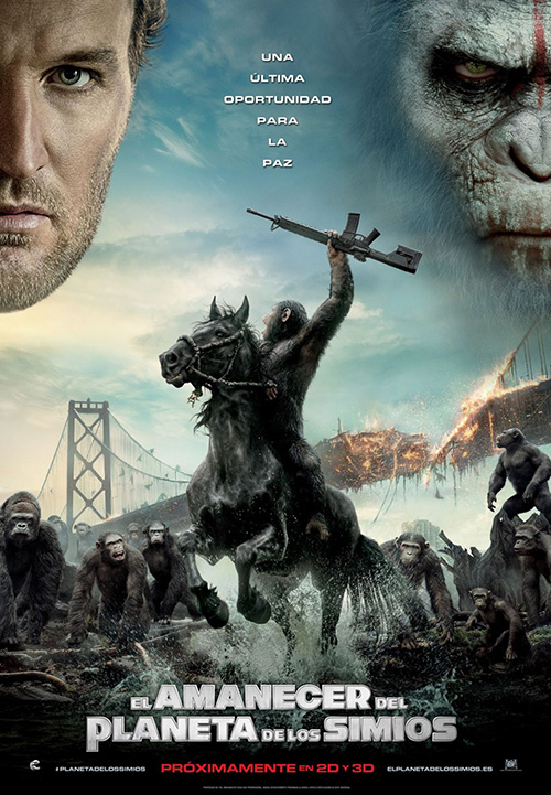
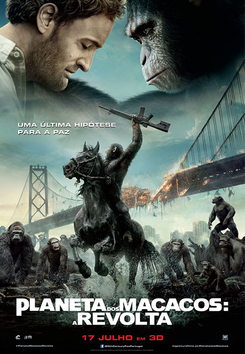
Here is where it gets funny, though — and by “funny” I do truly mean laughable, because how could you not laugh at BLT Communications, LLC‘s Caesar riding a horse into battle? I know fanboys all over the internet LOVE this poster, but I can’t help snickering each time I see it. Granted, it doesn’t help that my girlfriend whispered, “It thinks it’s people” when this scene came onscreen during the trailer while at the movie theater. The whole thing is a bit absurd, which I say knowing the films are supposed to be great. I just can’t muster any enthusiasm, and this “painting” of post-humanity isn’t helping.
The real joke is even funnier, though, thanks to the aforementioned foreign interpretations with floating human heads. Maybe they thought their citizens wouldn’t want to see a film all about angry monkeys? Or maybe Jason Clarke is huge in Europe.
Get the most for your money
 |
 |
 |
 |
 |
 |
 |
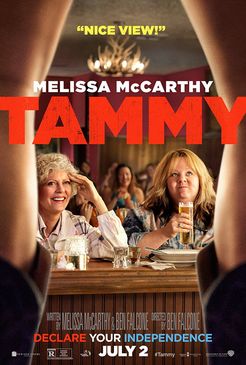 |
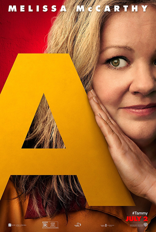
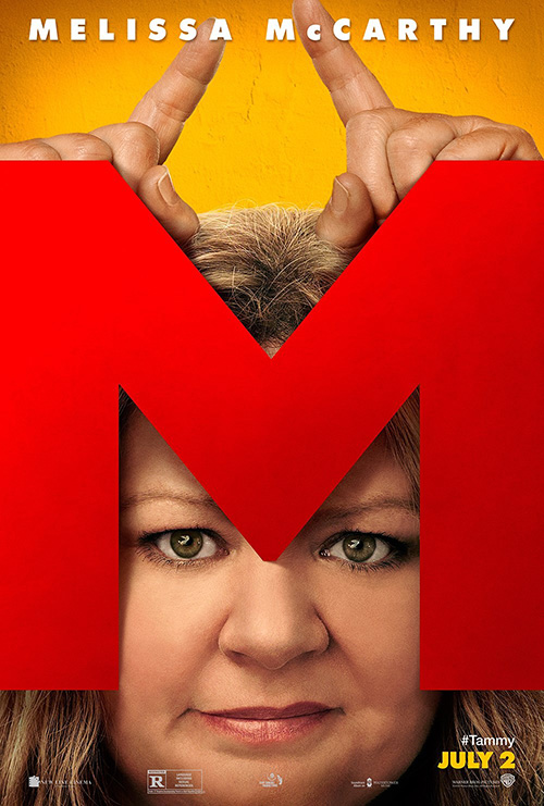
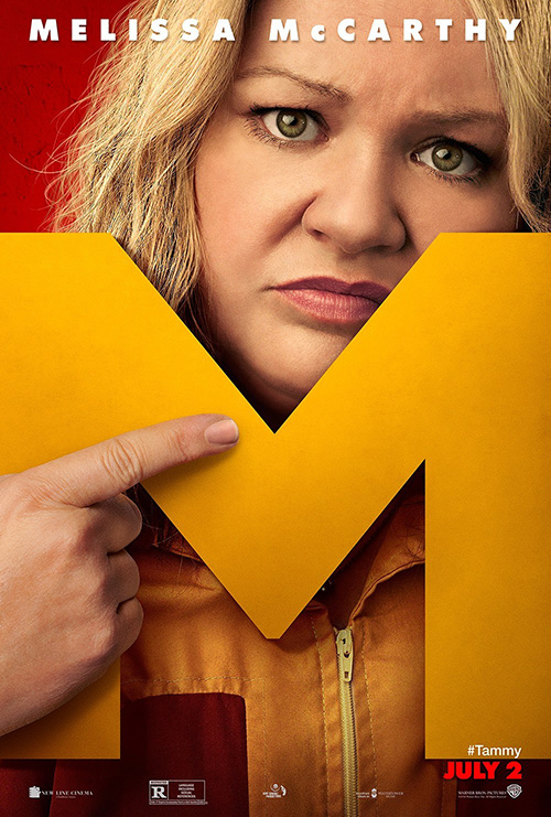
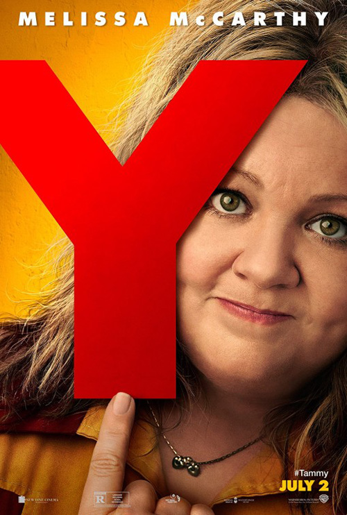
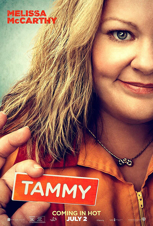
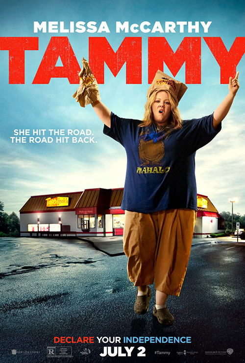
Tammy (opening July 2), on the other hand, is all about the humans — Melissa McCarthy, to be exact. It’s not without reason that WORKS ADV goes this route, though, because the film is her baby. She’s the star, co-writer, producer, and wife of the director. Her hands are all over this thing and, who knows, maybe she chose the marketing materials too.
Unfortunately for her, the posters spelling out the title one letter at a time do nothing to make you want to see the film. Instead it looks like the firm spent too much money on the photo shoot and thought this would be a great way to get more bang for their buck out of the pictures. Common sense would dictate giving each letter to a different actor — show some variety like so many children’s films utilizing this trick. But that probably means more money having to truck everyone into the studio to make faces that are half-angry, half-laughing, and fully uninterested.
The best detail is that the “main” teaser sheet appears to use the exact same Sam Jones-shot photo used alongside the “T”. Crop it differently, change the position of her hand, and voila! We have a brand-new, yet almost identical piece of artwork to slap up at the local multiplex.
At least the other “action” shots have a bit more intrigue thanks to not simply being McCarthy in a controlled environment of yellow light. They’re horribly Photoshopped and less-than-great examples of graphic design, but they do give us an idea of what to expect, plot-wise. The truth is that McCarthy’s name sells tickets with or without intrigue.
2D layers
 |
 |
 |
 |
 |
 |
If you really want to grab someone’s attention with a poster, one maneuver is to play with fabricated depth. It can often look cheesy when a drop shadow is too blatant, but when it’s done right, you sometimes create something very special.
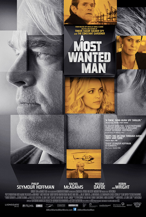
Canyon Design Group‘s sheet for A Most Wanted Man (limited July 25) is not one of these cases. I’m not sure what their goal was in creating a puzzle of boxes at differing distances from the viewer, but you can’t help getting confused trying to work everything out. Some instances make you think a square can slide in between two others and some seem like they’re popping forward. Do the tinted pieces denote importance? Who knows?
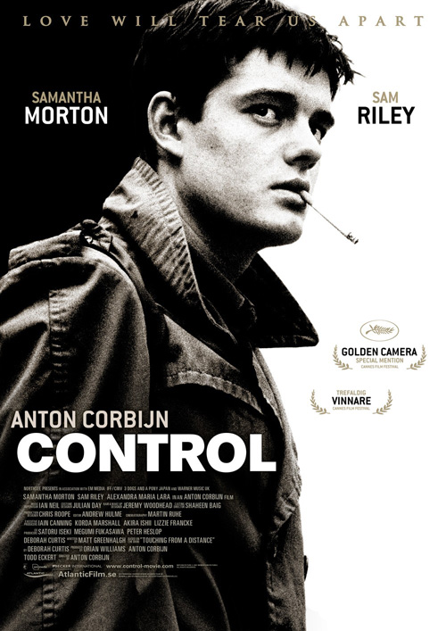
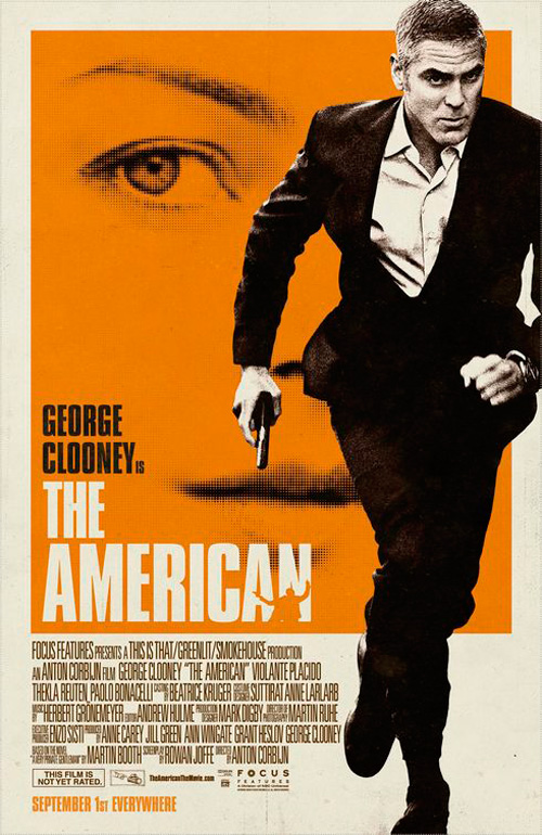
I guess, at a certain point, we knew Anton Corbijn would be saddled with a sub-par advert — one that didn’t quite match the stunning photography he usually captures onscreen. Canyon seems to want to follow tradition by keeping it graytone, but it simply can’t match Kellerman Design‘s Control or P+A / Mojo‘s The American. The gray doesn’t possess enough contrast for drama and the color seems an afterthought rather than a carefully planned eye-catcher.
I do like the modern, stencil-like typeface on the title, though. So not all is lost.
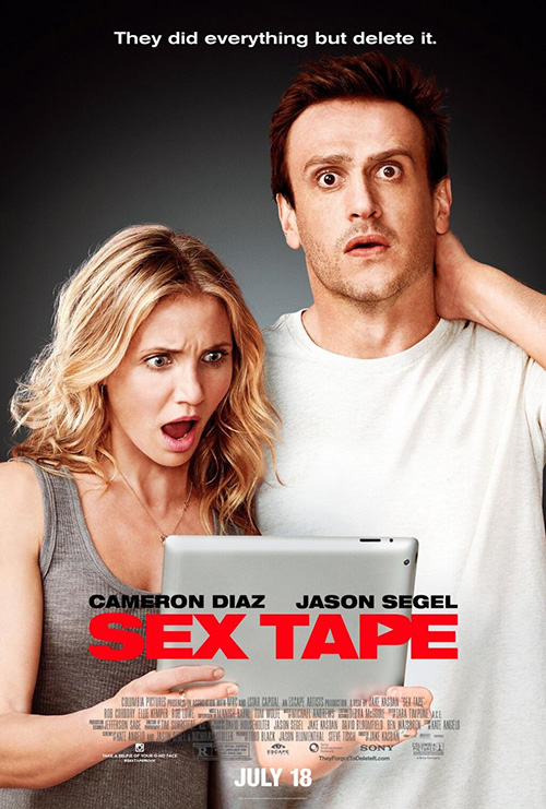 |
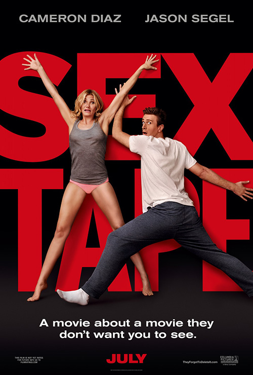
Unlike the film itself — which looks horrible — Sex Tape‘s (opening July 18) teaser is effective in its simplicity. ARSONAL sticks to the basics by putting its already-provocative title front, center, and big, with its stars desperately attempting to shield our eyes from what the words could mean. There’s some physical humor, Cameron Diaz‘s bare legs, and a genuine sense of the unknown to pique interest.
The obvious error is in how fake the depth is handled by a pretty bad example of the aforementioned drop shadow. Some points of contact look as though the actors are touching a wall, while others make them look like paper dolls. I know it’s probably more money, but why not construct those giant letters and have Diaz and Jason Segel play off of something real? As it is, we aren’t even sure those are their bodies and not simply stock art affixed with their heads.
At least its minimalism forgives such issues as realism, though, because you know it’s merely a gimmick. The movie’s second poster is not so lucky. I don’t know what is happening with Segel’s head here, but it’s messed up. Maybe the size is wrong or perhaps the complete removal of depth to the point where his chin is painted onto his skin is what’s weird. And why put them on the black background again? The least you can do is keep them in scene with a bedroom at their backs. This looks like your friend’s amateur Black Box Theater performance from college.
 |
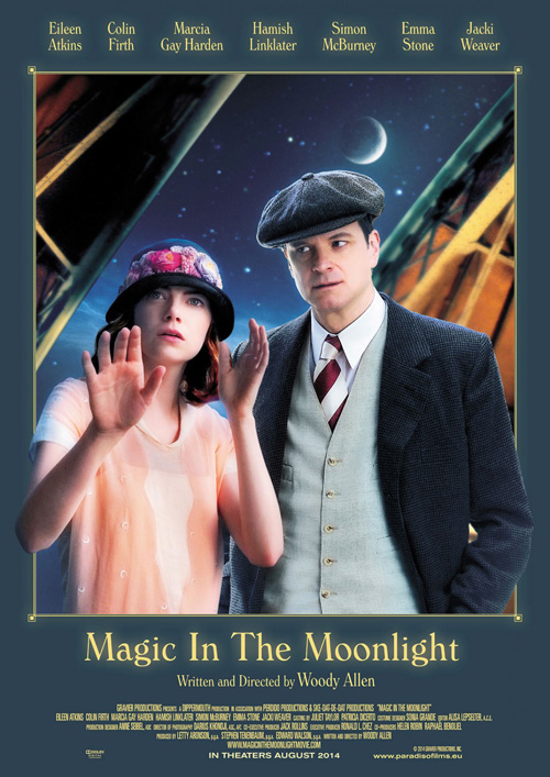 |
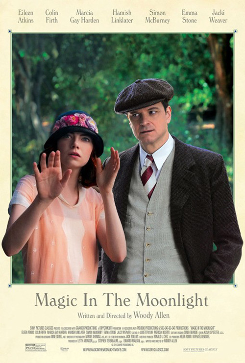
If something can save us, Woody Allen is it, right? Wrong. While I enjoy the idea of Magic in the Moonlight‘s (limited July 25) poster, execution leaves a bit to be desired.
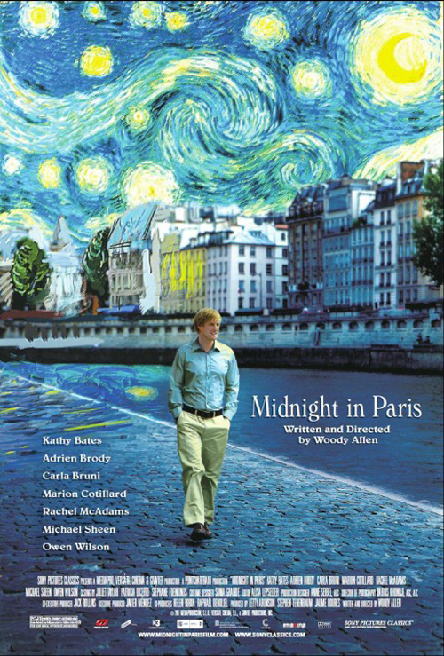
As per usual, all the text is in Allen’s trademarked font to ensure it doesn’t overpower any of the visuals or his own name and, much like Midnight in Paris, it has a painterly feel. Sadly the depth of focus creating such an aesthetic by blurring the trees into an Impressionistic haze is ill-fit for the starkly in-focus duo at the front. The glow on Colin Firth‘s face makes him appear to be a cardboard cut-out, while Emma Stone‘s proximity does just the same.
The one bright spot becomes her out-stretched arm. Here, in this piece of flatness, comes a miraculous example of space and motion. You can feel her hand extending towards you as she looks into the beyond with her psychic powers, and it strangely captivates your gaze. His shoulder going over the border ruins much of this sensation by grounding us back to the medium’s limitations, but, for a fleeting second, it is magical. It’s also better than the cartoony observation-room iteration with its oversaturated colors and unnatural plasticity.
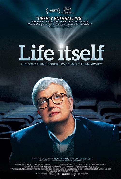 |
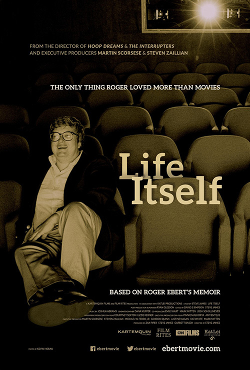
No, this category’s winner comes from the man who would have been critiquing the rest were he still with us today. It isn’t the final poster put out by Magnolia Films which looks more like a text book cover than anything else (despite the admittedly nice flourish of making the projector lens form the dot of the “I”), but the festival sheet of Life Itself (limited July 4) that uses depth best.
It’s not necessarily a great design but it does succeed at getting its job done when it comes to depicting Roger Ebert as its subject and the setting he was so familiar with. The decision to use an old photo of him tickled by what’s onscreen is inspired and the drop shadow on the nicely spaced text beside him in sequential seat rows a realistic rendering. Those words pop and in turn help the illusion that we’re actually looking into a theater from the screen, diving into the page itself in the hopes we could sit beside this icon of criticism and talk shop.
Two sides of the same coin
 |
 |
 |
 |
 |
 |
 |
 |
For my next trick I compare a stateside film’s campaign and one hailing from France. Both utilize a main sheet and character posters, but each sees different results due to conventions or lack thereof. I wonder which proves more inventive?
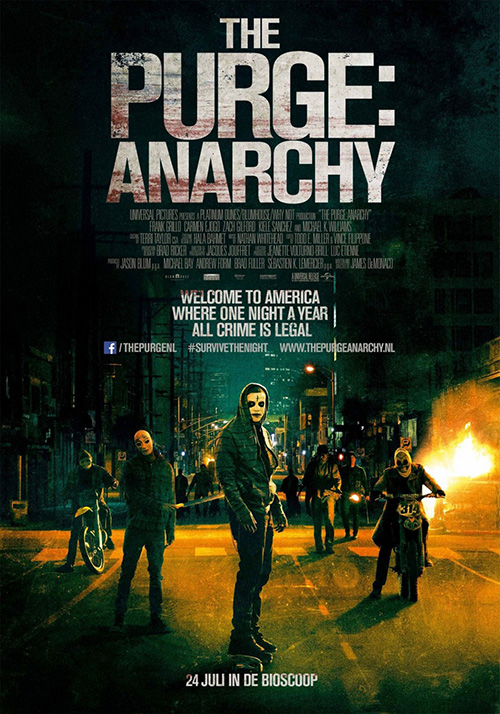
Let’s do America first with The Purge: Anarchy (opening July 18). I have a love/hate relationship with Ignition‘s teaser of Red, White & Blue built by graffiti assault weapons. I applaud the effort to do something different, but the end result is a bit stock photo/vector silhouettes run through Photoshop filters. It’s almost a little too clean of a grunge job if you know what I mean—it tries too hard.
Is it better or worse than the Netherlands’ version? That’s up to you. I like each for its own reasons, but neither comes close to matching the mood of the mask from the original film highlighted in chiaroscuro courtesy of cold open. The title is bulky, the weight off balance thanks to the pitch-black top doing nothing to resemble white space rather than a way to split the sheet in half. I do like the creepily painted Purgers straight out of a The Warriors revival, though. I’m digging that the sequel will take place outside in the chaos.
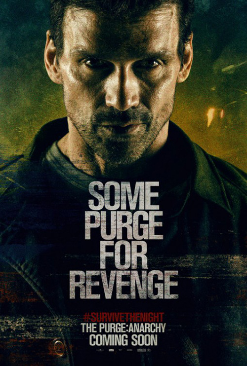
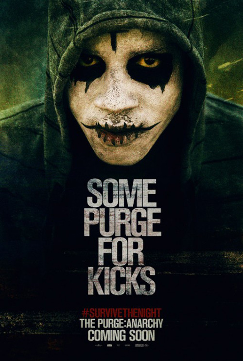
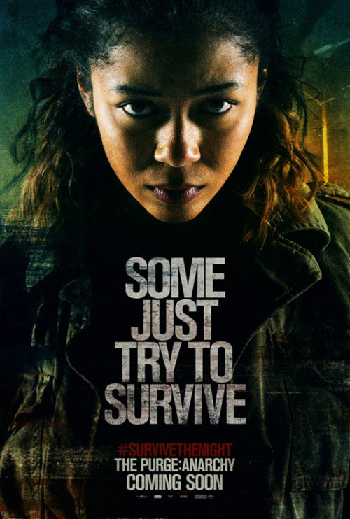
But the character posters are as boring as you’d expect with three actors on display behind slightly changing taglines specific to their roles. Wonderland hopes to mess their designs up with scratches and streaks, but the quality remains too crisp to really buy into the aesthetic. They probably work better as vehicles to disseminate the hashtag #SurvivetheNight than anything else.
 |
 |
 |
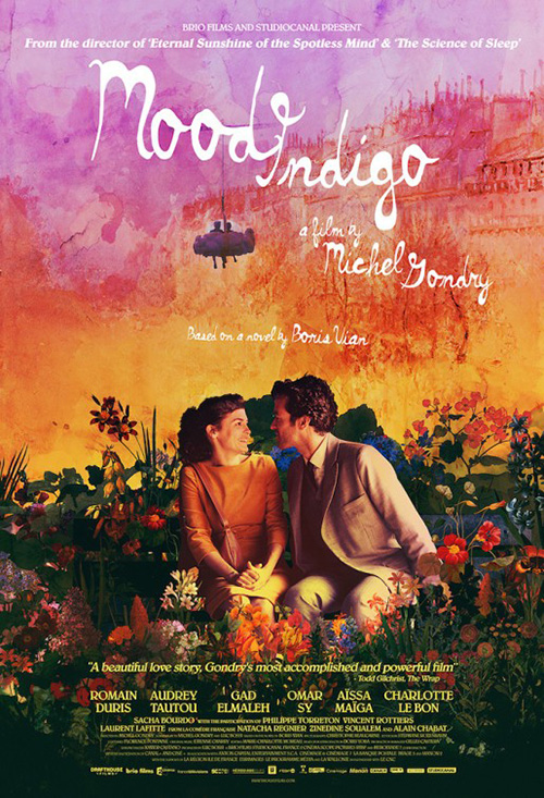
For Michel Gondry‘s latest Mood Indigo (limited July 18), Le Cercle Noir decides to have some fun with all its iterations. If you’re familiar with the director you’ll know it wouldn’t be too hard to believe that a part of the film takes place underwater, so this image is a perfect embodiment of what he brings to the table. Romain Duris and Audrey Tautou‘s smiles are infectious, they both radiate beauty despite their awkward surroundings, and the suspension of time the water provides is something that will stand out amongst the other posters on display.
Surprisingly, the American version lends itself to a similar sensibility—this time with a sort of watercolor quality in the background behind our two leads in love. There’s a hybridization of real world and fantasy like we’ve come to expect from Gondry and you get a sense of the fun, romance, and possibly adventure if not solely a means for the visual flair displayed along the way.
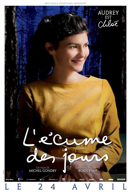
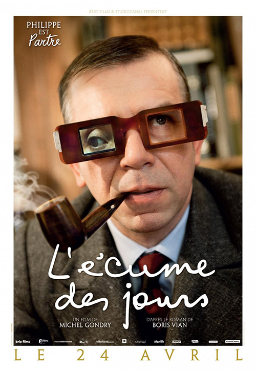
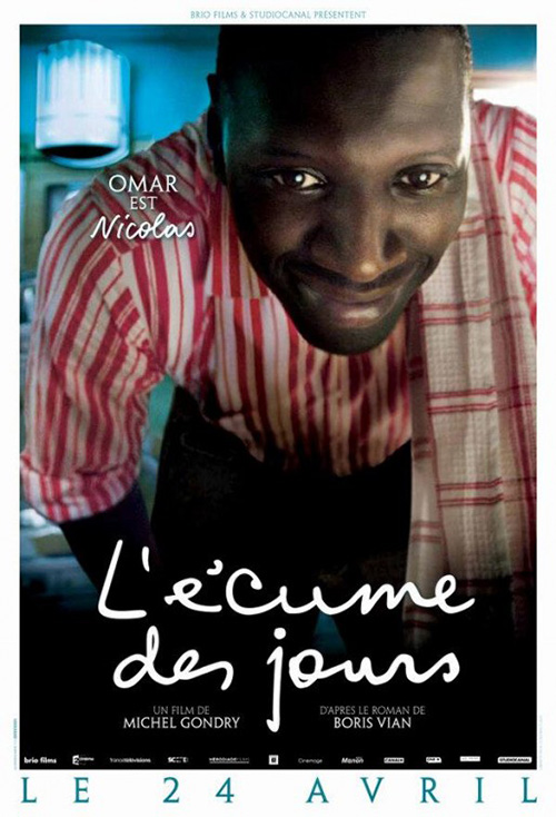
What really struck, though, is how Le Cercle Noir handled the French character sheets. Yes, they’re similarly boring in that they depict one person staring at the camera, but they also add excitement by placing them in different scenes. Their backgrounds aren’t some drably textured color; they’re the vibrant hues of Gondry’s palette. But the best part has to be the way they introduce the characters through a personal and informal system of supplying the actor’s first name before his/her role. Audrey is Chloé, Philippe is Partre, and Omar is Nicolas. There’s warmth to that familiarity that really sticks with me.
A visual flair
 |
 |
 |
 |
As I said in the introduction, it’s slim pickings this month as far as memorable designs. These four are the best. Would they be so any other month? Lucky for them we don’t need to find out.
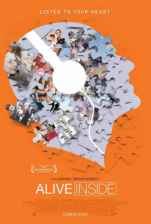
For Alive Inside (limited July 18), the idea to use a jigsaw gimmick adds an interesting aesthetic to what could have been a generic collage. The puzzle pieces did make me think Autism at first for obvious logo-specific reasons, but I guess it does work well for the actual subject of Alzheimer’s this documentary focuses on too. Memories are like bits of us that either remain in place or get lost in the shuffle. Healthcare providers as a result must put those pieces back together—ah, metaphor.
Even if you can’t quite tell the Alzheimer’s angle, though, it’s hard to miss the music component thanks to its iPod commercial homage of flat person and white headphones. Its inclusion stands out and helps make the poster look like an actual collage rather than a fake one with its two-dimensional layering. I only wish the puzzle pieces around the edge didn’t seem to dissolve into the background. That ruins any chance of believing this was created outside of a computer.
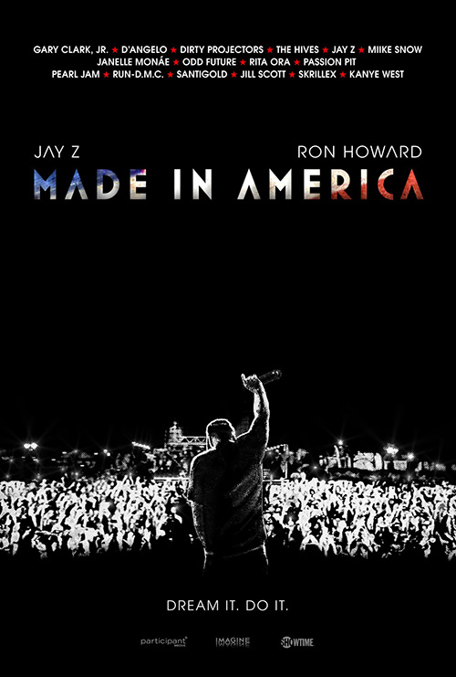
As anyone who regularly reads this column knows, I’m a huge fan of Gravillis Inc.‘s work. So it should be no surprise their sheet for Ron Howard‘s concert film Made in America (limited July 11) is a July favorite.
It’s simple, effective, and clean in its heavy black background and overexposed—almost Xeroxed—image of a stage at bottom. None of the text is obtrusive and in fact has a ton of buffer from itself and the photo throughout. I like that the American Flag motif showing through the title font is rough enough to lend a coolness rather than cartoony bright colors and I have to admit to loving how the crossbar of the many “As” around it are removed.
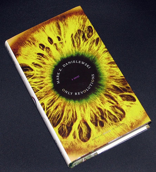 |
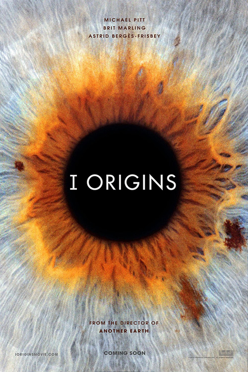
The poster for I Origins (limited July 18) is similarly pleasing in its simplicity (even though it’s pretty much the cover to Mark Danielewski‘s 2006 novel Only Revolutions). I don’t know much about the film because I’ve found that’s the best way to enter a Brit Marling creation, so I couldn’t say for certain what’s exactly going on. I’m enjoying the juxtaposition of an eyeball iris with the title’s “I” nonetheless. (It’s not even an eyeball is it? Probably a fertilized egg a la Heroes?)
Like Made in America, the text here never infringes on itself. There is some nice breathing room from actors’ names to title to footer information with a healthy leading between lines too. And you can’t prevent yourself from getting lost in the imperfect symmetry of the image behind those words nicely contrasted by the sharp (mostly) sans-serif font.
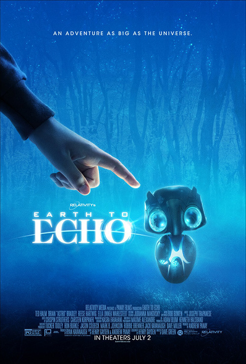 |
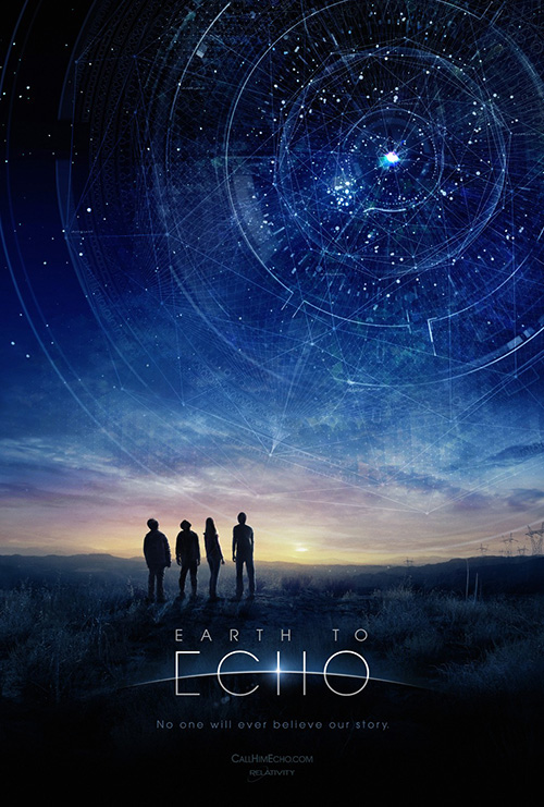
If I’m going to give kudos to any advert this month without strings attached, though, it has to be Art Machine, A Trailer Park Company‘s teaser for Earth to Echo (opening July 2). This is just a very well-designed image from its colorful clouds lighting up the middle of the page to the silhouetted children looking into the great beyond to the expertly stylized logotype. And that constellation map of geometric circles and triangles that reminds me of the detail work at the Taj Mahal is a splendidly patterned maze for our eyes to follow into its center.
BLT Communications, LLC’s main poster is cute if only because Echo itself is cute, but it loses something in the cartoonification. The logo is ruined with the font change from slickly thin sans to bulky serif, the blue is flattened and erased of all drama, and the hand coming in looks like it was animated rather than photographed. It probably appeals to the children the film is targeting, but as far as design goes it’s light years away from the brilliance of Art Machine’s meticulous composition.
What is your favorite July release poster? What could have used a rework?
