A couple of studios rightfully got nervous about the increased COVID numbers over the holidays and moved their marquee titles away from the wintry months. You do still get Moonfall (February 4), Uncharted (February 18), and the long-awaited release of a sequel embroiled in cannibalism controversy (see below), though. If you’re someone in dire need of a blockbuster escape from the snow.
That means more space for the continued presence of Oscar hopefuls and independent features to go along with a pretty robust crop of streamers from the likes of Steven Soderbergh (KIMI hits HBO Max on February 10) and Tyler Perry (A Madea Homecoming hits Netflix on February 25). The poster game is thus a crucial avenue towards steering eyes to smaller scale work you might otherwise miss.
Embrace


First up is Leroy and Rose with their sheet for Josephine Decker’s The Sky is Everywhere (limited & AppleTV+, February 11). The similarities to a couple of MOCEAN designs (young adult romances Words on Bathroom Walls and The Map of Tiny Pretty Things) are obvious and yet there’s something more joyful and sincere here. Rather than focus on a relationship, this layout ensures that Grace Kaufman shines brightest.


The reason is simple: this is her story. She’s grieving the death of her sister and attempting to come out the other side. Romance plays a role (pitting her late sister’s boyfriend against the new kid in town), but it seems the intent is less about who she ends up with and more if she is okay.
You don’t therefore need the kiss of Words or the teamwork of Map. Remove the melodrama and center pure unadulterated elation instead. That’s what we get with the 90-degree rotation leaving Kaufman as the x-axis to the center justified text’s y-axis. The chalky cursive title follows across, the negative space of the lowercase “e” framing her smile as her hair and the red shirt of her friend keep our eyes firmly planted on the middle.
Playground (limited, February 11) is conversely about the dynamic rather than its participants. This is a tale of connection and friendship. Of a young girl deciding how to traverse the worlds of children and adults when confronted with a choice to help a boy being bullied. Does she say something to make it stop? Or does she agree to remain silent (as he asks her to do)? By showing them in this embrace we see only the bond—one that can sever at the slightest misstep regardless of whether the offending action is justified.
It’s both a cute image and powerfully dramatic. The text is minimized as much as possible (the white at top and bottom getting lost so that the title becomes our main focal point atop the yellow hoodie) so that we see the arms as a pathway through. The one cuts across horizontally with the title as the other shoots upward with a diagonal to the closed eyes and heartfelt faces of kids willing to do anything for each other. It’s simple yet effective.
There’s a similar feel to the poster for A Banquet (limited & VOD, February 18) as far as protection goes (mother and daughter) and yet it is anything but simple. From the pieta positioning to the craquelure pattern, it’s as though we’re gazing upon a Renaissance painting. The dark shadows add to the horror nature of the material by flirting with chiaroscuro enough to create a foreboding atmosphere without shielding the actors’ expressions. Jessica Alexander is obviously afraid of something—something Sienna Guillory isn’t yet willing to fully accept beyond managing the teen’s reaction to it (and definitely not her complicity).
I love the deep, high contrast coloring and the decision to let the image speak for itself without copious critic blurbs or festival laurels (although the lack of a TIFF mention is surprising). My favorite part, however, is the typography. The sharp serif, the symmetrical construction with names and tagline, the uneven spacing to ensure the former doesn’t crowd the title—it’s a delicate balance, expertly achieved.
Centerstage


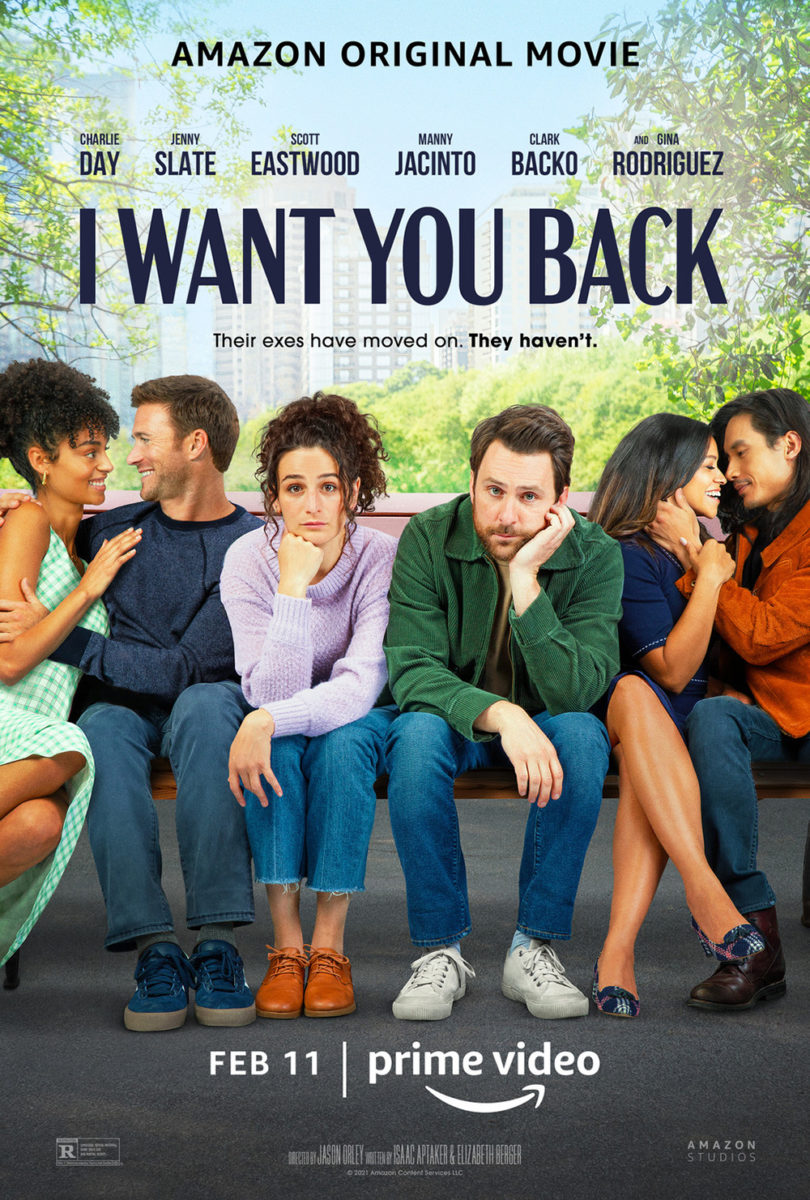
Despite The Refinery’s advertisement for I Want You Back (Prime, February 11) looking exactly like what it is—a cover for their digital platform rather than a theatrical one-sheet to be hung in movie theaters—you can’t deny its success. Look no further than the firm’s other version to see just how boring things could get with Photoshopped couples flanking the stars. To be allowed to go back and find a compelling way to express that same idea is a win in my book.

This is still about two people wanting their old flames back despite the latter having moved on. It doesn’t matter whether their exes are together or merely with other people—the point is that they aren’t with them. That’s the story being told here as Jenny Slate and Charlie Day look upon two blurred faces about to kiss. They want that too and they look unhappy enough to do something drastic in order to achieve it.
Making the window on which to gaze upon their ire a heart (more or less) just adds another hokey level that gets you in the mood for what you’re about to see: a goofy rom/com with an entertaining leading duo.
LA’s original tease for Death on the Nile (February 11) is much more polished by comparison with its moody atmosphere and neon glowing title. The look is of course meant to mimic that of Art Machine’s poster for Murder on the Orient Express (sans Academy Award text since only Kenneth Branagh, Sophie Okonedo, and Annette Bening would require it). They do a good job, although I rather like the train being off-center as opposed to dead-center like the boat, creating motion around the text rather than through it. And the giant “A” has grown on me.


It’s no surprise then that LA recruited Frank Ockenfels to do the same with Art Machine and Jordon Nuttall’s character collage too. This time I think I prefer the Nile version with its 45-degree tilt and more dense sense of space. Hierarchy is still followed as far as how big everyone’s head is based on billing, but it’s much less stagey and more uniform in that goal. The pyramids add some nice flair too.


The joke therefore arrives with the character sheets and the necessity to have something with the new date listed considering that October 23 on the above two is from 2020. The delay was of course due to COVID, but the length was exacerbated by Armie Hammer’s on-going news cycle—hence why he did not earn a new sheet all to himself. I assumed someone would have mocked one up with the title “The Cannibal” by now, but I can’t say I’ve seen anything yet.
Unlike him, no one has anything but praise to bestow upon Renate Reinsve. And what higher praise is there than making sure her face sells three different poster variations for The Worst Person in the World (limited, February 4) itself?
I prefer the original festival sheet mostly because of its ability to do something with the static photo beyond mere cropping. The addition of a sun glare adds a welcome brightness and the segmentation into twelve rectangles is a nice touch to honor the chapter structure of the film. There’s motion from her being captured in a sprint and from the uneven composition of those shapes—our eyes moving up and down from one to the other, beginning to end.


From there you have Midnight Marauder’s full-bleed iteration and one more with a crop. Both seek to also ensure nothing gets in the way of Reinsve’s hold on us and both succeed to that end. If I had to pick one over the other, however, I’d go with the former because of a subtle difference in its title treatment. Midnight Marauder makes “IN” as big as the rest of the text whereas the other makes it as small as “THE.” The latter ends up awkward as a result with its “IN THE” seemingly falling off the page. By making the “IN” big, it helps solidify the whole—especially with the actors’ names creating nice balance alongside the first left justified “THE” to offset the bottom line being right justified.
A graphic touch


MOCEAN comes through with a minimalist approach for the underrated Catch the Fair One (limited & VOD, February 11). They could have just thrown Spirit Award nominee Kali Reis onto the page with text floating all around her, but doing so wouldn’t have provided the same impact of seeing her face in the metal of that razorblade (a significant prop to the plot, firmly lodged inside her cheek).
Her expression is enough to show that she’s a badass ready to do what needs to be done, so creating that small window adds mystery to the equation. We don’t know where she is or what she’s looking at. All we need to know is that the situation is going to need an exacting and perhaps brutal touch to survive. The object is a weapon as much as it is a tool—violent yet unassuming and easy to be misjudged much like the character.
The blade is also an effective way to keep the whole composition symmetrical on its vertical axis. It fits right in with the stacked text from top to bottom, its dark field of color atop the light background only having one other block to compete with: the title.
The illustrative sheet for Friends and Strangers (limited, February 25) uses its white space in a completely different way by shoving its content to the top and bottom of the frame. Our gaze is easily manipulated to the latter thanks to the orange-red of those hands weighing down the whole, the penny supplying us a fixed point of shadow to contrast the solid fields of bright color and line drawings. That coin is like an eyeball looking back at us, hypnotizing our attention until we must look away to finally read the white text in the top left corner just out of view.
Putting the text kitty-corner like that adds some nice motion too by almost forcing our sight to move in a circle around the penny rather than straight up and down. The finger shows us where to start before we curl around the coin, through the cast list, upwards towards the title. It becomes a whirlwind spiral despite being two-thirds empty.
And that brings us to Sister Hyde’s Hellbender (Shudder, February 24). It goes back to the tried-and-true symmetrical orientation of Catch the Fair One with its own graphic representation of character and mood beyond mere photography. Utilizing her trademarked style of monochrome halftones, we receive a glimpse of Zelda Adams shrouded under a blood red filter—her crowned image becoming as much a symbol as the drawing above her head. Her likeness becomes a totem, warning us of evil to come.
What brings it all together for me, though, is the title and its heavy metal blackletter font. Rather than just putting white text above Adams’ eyes like a blindfold, Sister Hyde breaks down each letter into segments to then recreate them with a grungy, scratched-up aesthetic reminiscent of ripped tape. It doesn’t therefore only block her face on the page. It blocks her vision in the scene, as though someone affixed those strips to protect us. Tear it off and find out what awaits by pressing play.
