“Don’t Judge a Book by Its Cover” is a proverb whose simple existence proves the fact impressionable souls will do so without fail. This monthly column focuses on the film industry’s willingness to capitalize on this truth, releasing one-sheets to serve as not representations of what audiences are to expect, but as propaganda to fill seats. Oftentimes they fail miserably.
You’ve made it out of dump month, hopefully having caught up on all the Oscar nominees that rolled out wider nationwide. February even has a couple prizes for your trouble whether festival holdovers or hotly anticipated sequels. You may just have to tread carefully amongst a few more clunkers to find them.
Sadly, the poster selection is going to be no help on this front. Lackluster is the word that comes to mind: a few will catch your eye and a handful will draw you in, but most will escape your memory as soon as you walk by.
Replace toner


I don’t want to call BLT Communications, LLC’s poster for A Cure for Wellness (February 17) a facsimile of Slither, but it’s hard. My assumption is that Gore Verbinski’s latest also has a scene of snakes in a bathtub. Choosing it for the marketing campaign therefore points towards the image being a visceral one to grab attention more than an intentional decision to prey on James Gunn fans’ memory banks.


What cannot be excused, however, is the level of artifice at play. From the bathtub down is great. It’s a bit bright and absent of atmosphere, but it looks “real.” The same can’t be said about what’s it. The faucet looks giant, flat, and badly Photoshopped. The shadow glows around it at the same consistency whether the pipes supposedly against the wall or the handle and spout presumably jutting out. Depth becomes nonexistent, the pristine tiles look like wallpaper, and both prevent us from believing the tub is real anymore.
Gravillis Inc.’s entry isn’t perfect, but it gets your mind racing to decipher the choice of having a character float within a medicine bottle rather than pick apart its glaring flaws. There’s a fantastic sense of motion from bottle stopper down through the girl’s feet towards the title’s sharply angled, bold sans serif. The color pops off the white and the whole possesses that eerie sense of the unknown mirrored in the trailer.
The first thing I thought after seeing the poster for Bitter Harvest (limited February 24) was Pride and Prejudice and Zombies. The difference is that everything the latter did right, the former does wrong.


PPZ does a great job of coloring its sky to put a halo around its duo, their wardrobe fading into the cool-hued darkness yet standing out against the warm light. It also puts them in a stance that’s ready to uncoil, giving us the illusion of motion despite the impossibility of providing any.
By contrast, Bitter Harvest decides to muddy everything in the same brown: ground, clouds, and clothing. Even where there’s light, it’s just a tint of that tan. And maybe it’s just me, but the desire to put its duo in an embrace of potential romance is completely wasted. Rather than look like Samantha Barks and Max Irons are going to kiss, it seems like she’s moving in to suck out his soul and he’s stiff-backed and frozen in fear. I do believe the reason Stalin’s tyranny can’t destroy their love is because they don’t have any.
I hate to say it, but the generic collage one-sheet is light years better if only because of the color. Letting that same embrace from before show clearer and bigger also allows us to see the emotion on Irons’ face rather than blank pause. He does want her after all.
I’ll throw in some extra points for highlighting Barry Pepper’s hair too.
For my most anticipated film of the month — Jordan Peele’s Get Out (February 24) — LA goes another generic route with the shattered glass of scenes motif. This isn’t always a bad way to go, but it’s uninspired unless you’re putting a spin on it like Louder Than Bombs did (mirrors, broken family, torn emotions, etc.)


There’s no seeming rhyme or reason here because none of the shards engage us. These characters aren’t looking through the broken window. They aren’t looking into a broken mirror at themselves. Every section is a film still: the two at top showing happy times and the ones at bottom showing fear. I wonder what it would look like if the whole were just Daniel Kaluuya’s scared face staring at us, frozen in the glass with a silent scream.
I can’t even say the tease is better since it holds no impact. The darkness makes it hard to see anything, the text at top and bottom is way too big not to conflict with the title (considering half is outlined rather than bolded), and there’s nothing to focus on. This print campaign does the film no favors in cajoling passersby.
As far as Rings (February 3), BLT embraces the overused horror sheet with monochrome character underneath top to bottom text. Think the Carrie remake. Think The Evil Dead remake. Snore.


I will give the copywriter some credit, though, because the tagline is ballsy. “First you watch it. Then you die.” On one level it’s speaking about the video of Samara that permeates this franchise. On another it’s telling you that you’ll die after watching it. I like when a campaign puts the viewer into the movie. It gives you pause.
It’s also a lot better than “Evil is reborn.” Snore number two. I don’t mind this second poster’s imagery, though. The branded ring on her back is pretty gruesome and the font changes things up from the usual kid’s scrawl. Just don’t look at the release date. Like The Bye Bye Man before it, this Halloween-slotted work was dumped too.
Maybe things would have been different if BLT was able to talk the film’s American distributors into using the international graphic. I really like this view of Samara exiting the TV towards us. This could give you a fright with some 3D technology. More please.
Play on


It’s difficult not to come up with something fun where LEGO movies are concerned. The product built its reputation on creativity and imagination and has only expanded that success as the years advance. Going into the license business to create LEGO versions of characters was an inspired choice and the way in which they’ve fabricated helmets, hair, and faces to bring beloved pop culture icons to life inventively retains that LEGO feel.
So when Proof sought to give The LEGO Batman Movie (February 10) a teaser sheet, they went all-in. The yellow backdrop is a peg sheet, Batman’s helmet is beautifully rendered in its matte plastic, and the Bruce Wayne hair-do is impeccable. What I don’t love are the dueling proportions when affixing the logotype onto that pegboard. The pieces forming it are much smaller than the pegs presented for visual clarity. Maybe a flat yellow would have been better to avoid this? Maybe I’m just looking way too hard at it.


I’m not the only one, though. Just look at Ten30 Studios’ poster. By shifting the pegboard to become the ground on which characters can run, the world is cohesively brought together. The peg size matches the feet sizes now — everything fits. It’s a minute detail, I know. But it’s one that matters in the context of getting the reality right. Now the logotype can float above and be whatever size pieces it wants thanks to a changing depth of field.
This is the version that gets the LEGO feel down pat. That doesn’t mean I don’t also enjoy Art Machine’s graffiti character sheets seemingly melding the 2D faces from the original LEGO Movie and street art of The Dark Knight, but it’s not “LEGO world” specific. They’re cool (some drips go around pegs to give it three-dimensionality), but hardly unique. Although it’s not like the properties involved need mind-blowing advertising to battle for a box office victory.
You’ve distracted my attention


Stark white earns a head turn. There’s no getting around it when so many posters are bleeding off the edges with full-color photography. It’s a simple way of distracting walkers, the blinding light forcing a glimpse at least. But would you linger on The Comedian (limited February 3)? I wouldn’t.
The font is horrid—maybe not as the title, but definitely as every single word. The thick calligraphic brush moving into thin serifs makes the actor names at bottom hard to read, the choice of all lower-case gives it a juvenile/amateurish vibe, and the De Niro into microphone wires has no natural progression into the other. Is the hanging mic innuendo?
What irks me most, however, is the word “the”. Why is it a different font than everything else? You’re going to double-down on the stylish italics, but leave the title’s “the” normal? I hate that it might have just been an accident. I despise that it was probably intentional.
This KEDi (limited February 10) advert by Fred Davis grabs attention if only because it’s just a giant cat. You’ll probably laugh it off and keep walking without reading the title (the best part of the whole with its giant “k” and smooth lilt), but you still look.
The hope is that it’s just intriguing enough to Google because it definitely says little about the film. You think it’s a documentary (thanks critic blurb) about felines, or at least this specific feline. The reality is that KEDi actually profiles Istanbul, Turkey through the eyes of cats. Maybe put the Hagia Sophia mosque in the background to give it a sense of place? Mystery is one thing, but I’m not remembering the name of what in my mind is just a cat movie.
It might not be bright white, but AllCity’s UK sheets for A United Kingdom (limited February 10) pop enough against four-color work to catch your gaze. The vintage monochrome isn’t purely aesthetic either since this series of three posters seemingly mimics real photographs of the people depicted: Seretse Khama and Ruth Williams. Class, elegance, and dignity are all on display.
Where things go awry is with the title. A quick look and this film is “United Kingdom”. Those two words are inverted in color (cut into the white acting as a cover atop the photograph) to stand out, stretched left to right. The “A” ostensibly becomes a design flourish—a too-big, too-similar-to-a-letter bullet separating the lead actors’ names.


MIDNIGHT OIL solves this problem, but creates more with their very stuffy and conservative American iteration. The coloring and tree make me think of The Lion King—the African setting conjured out of stereotypical visual cues—and it’s just plain weird beyond that. The comfort of lying on that porch ledge appears anything but and putting all that text at the top into a nice, neat rectangle ensures it can’t integrate with the imagery. This sheet consists of two halves that stall your eyes. You must struggle to see the other half, but the energy to do so may not be worth the trouble.
B O N D does the exact opposite with their tease for Fifty Shades Darker (February 10). It helps that the property speaks for itself and no title or text is necessary, but the impact of the visuals could have been mishandled with lesser skill. There’s something powerful in the way that Dakota Johnson stares directly at us, in full control. It makes sense if you saw the first film, her awakening and refusal to be submissive introducing the idea of a superiority shift. This is her game now.
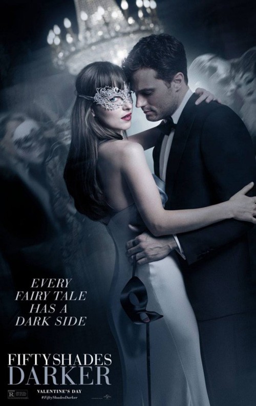
The photography is a huge reason for its success, the “steel” sheen and shadows making sure we see what needs to be seen explicitly and implicitly. The mask simmers and the simple reverse of black text for “Darker” prepares you for the sequel you already knew it advertised.
Iconisus L&Y – Visual Communication Systems’ full sheet loses some of this raw appeal by creating a scene that doesn’t necessarily elicit the same reaction. By placing the two in dance with other revelers in the background, you remove the hold Johnson had. She’s still staring at us, but the power is absent. Now she just seems coy. We’ve gone from Eyes Wide Shut thriller undertones to Labyrinth ballroom frivolity.
You’ve earned my attention


With a title like I Am Not Your Negro (limited February 3), you don’t need much else. That’s a strong statement in and of itself and Gravillis Inc. understands this by making sure it gets all the focus. They’ll throw James Baldwin’s eyes in at the top—the title in place of his mouth since every one spoken by Samuel L. Jackson is his—but the declaration is what screams at you. That’s read and you either dismiss it or take it as a call to arms. In today’s climate I implore you to take it as the latter.
The poster for Lovesong (limited February 17) doesn’t look like much, but its soft pinkish hue and thin white title are the perfect resting spot for your eyes on a theater wall bombarding you with blacks, reds, and yellows. It’s a reprieve from the harsh, in-your-face assault so many attempt, these genuine smiles from an in-the-moment exchange unlike usual posed portraiture. You feel something from its imperfections: the wisp of hair covering Riley Keough’s face or the just barely in-frame Jena Malone tilted perfectly to be recognizable and integral to the scene.
Rather than pop out from the other three in this category, it sinks below them and draws you in closer. Just look at this foursome above and watch as the others rise and blur in their dark high contrast to leave this one alone for more study.
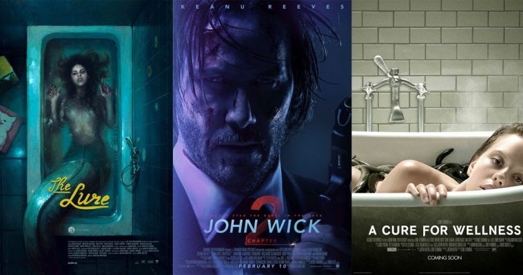
Just because The Lure (limited February 1) embraces those dark colors doesn’t mean it gets lost, though. On the contrary, its painterly aesthetic and subject matter dealing with a mermaid in a bathtub are difficult to ignore. It’s the title that grabs you first, its neon brightness grabbing attention even if it’s not necessarily “glowing” or an unblemished yellow. That muddiness actually helps it, the color popping just as much as it assimilates into the whole’s look.
This is the “mermaid movie,” so the fact that the original Polish poster doesn’t highlight this aspect is an interesting choice. Its cabaret of sequins and faux glamour emit a completely different vibe, one that’s equally compelling if not equally mysterious. This one looks like a fun romp. But the other describes an imaginative fantasy where anything is possible.
Despite what I said about portraiture earlier, it can sometimes work because it’s so staged. Case in point: John Wick 2 (February 10). The original was such a huge hit and so widely recognizable by simply putting Keanu Reeves in a suit that LA needs to do nothing else.
Black on black on black. His face is half in shadow, his gun barely visible at bottom left. The only true swath of light is a measuring tape, its inclusion juxtaposed with Reeves’ severity a wonderfully farcical joke that gets you excited for the high-octane fun you know this film will deliver. Throw the title out and just put “bulletproof”—pure gold.


I want to like the sheet with the extreme contour or light outlining Reeves’ face, but it doesn’t make sense. It’s stylish, sure, but you can’t pretend a three dimensional tie is a two-dimensional line that can then be a wick for ignition. Cool photography, misguided photo manipulation.
The red “relit” is bold, but overly comical. And the final sheet with Reeves in blue is oddly alien. The original film’s success hinged on its ability to feel authentic—we saw the stunt choreography without quick cuts. This sheet is so manufactured and steeped in artifice that it looks faked. It looks like a videogame, something that goes against what has made the John Wick brand so great.
What is your favorite February release poster? What could have used a rework?