“Don’t Judge a Book by Its Cover” is a proverb whose simple existence proves the fact impressionable souls will do so without fail. This monthly column focuses on the film industry’s willingness to capitalize on this truth, releasing one-sheets to serve as not representations of what audiences are to expect, but as propaganda to fill seats. Oftentimes they fail miserably.
February is here, January dump month is over, and 2014 is officially ready to take control with only a few more festival holdovers from last Fall. A couple summer-caliber flicks on paper find themselves getting release (doesn’t bode well) and Valentine’s Day is primed for the usual rom-com/rom-dram/vampire cliques we should expect (cringing ensues). Does that mean dump month part two? If the banal poster design is any indication: yes.
Uh, I think that’s been done before
 |
 |
 |
 |
I know that designs resembling other designs simply cannot be avoided, but you have to feel sorry for them. There are trends in the industry, artists get an aesthetic on their brains, and clients like repeating success unaware that it was only successful the first time because it was fresh. Way to water down the style Hollywood. This isn’t Interpol waiting twenty years to sound like Joy Division, though. These have mere months in between.
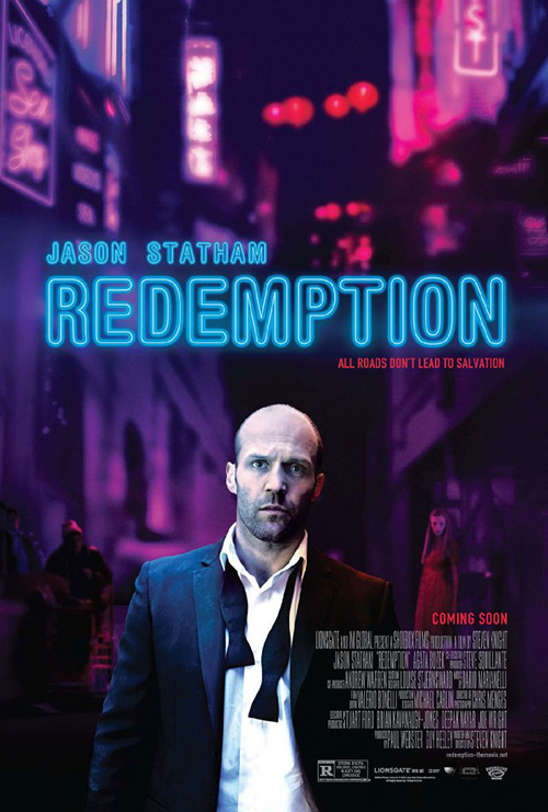 |
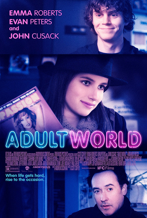
First up is P+A’s sheet for Adult World (limited February 14). From the color to the neon tube title, welcome to All City’s Redemption … or Hummingbird—I’m crediting them whether another firm handled changing the name or not. Sadly it isn’t as good.
There was atmosphere at the back of Jason Statham last year with the blurry marquee signs and the defeated face atop an undone bowtie. Adult World is just a triptych of smiling celebrities cobbled together and filtered. It truly is almost like the studio said, “Put all the actors on, but make it look like Redemption. Man, we loved that one.”
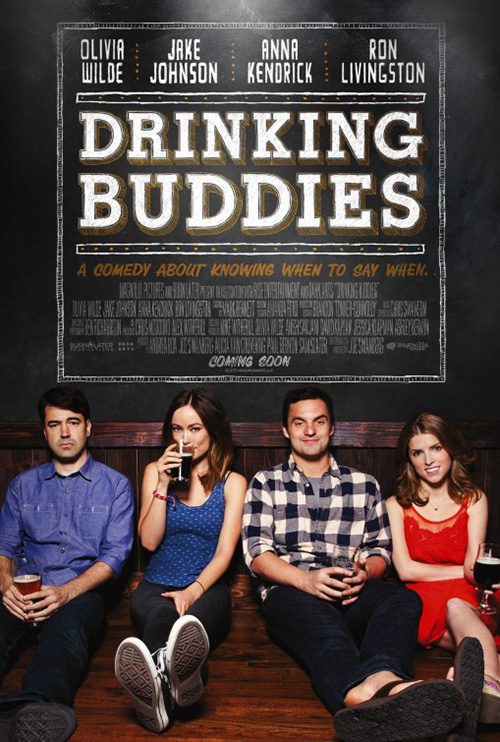 |
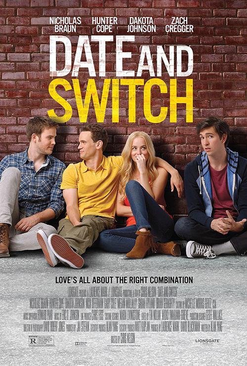
Next comes Date and Switch (limited February14). Thoughts of cold open’s Drinking Buddies anyone? Yep, that was last year too. I’m sure it was hard, though, having four stars in revolving door relationships and nookie swapping—why not just have them all sitting on the floor against a wall?
Unfortunately, it isn’t just that. This may be a stretch, but the title treatment wanting to be part of the scene is a rip-off too. Where Drinking Buddies gets the full-scale chalkboard treatment with fun 3D bevels and shakily drawn lines, however, Date and Switch only gets a Photoshop filter to make its sans serif appear to be painted on the brick. Ugh, I don’t even think there was a brick wall when the photo was taken. The actors’ edges are just too sharp.
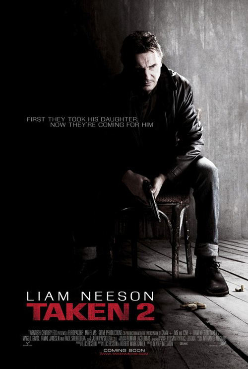 |
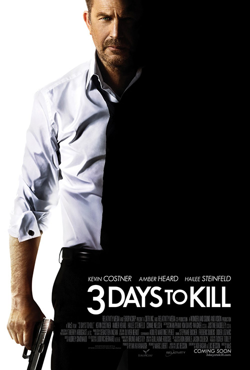
Concept Arts will save the day with Kevin Costner’s badass assassin in 3 Days to Kill (February 21), right? Wrong. They’re going to just make him look like another badass assassin we all know and love in Taken’s Liam Neeson. Poor cold open, that’s two quasi thefts … or homage if you want to spin it all shiny like.
It’s a cool motif—shrouding the actor in black to show the duality of good versus evil, family man against killer. I get it. But a standing Costner doesn’t compare to a sitting, brooding Neeson. That’s unfair, though, because little does. At least let him have a real shirt instead of what appears to be a painting. It could just be the contrast, but it wouldn’t surprise me if his half-a-face is the only photo-real element on the poster.
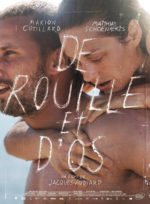 |
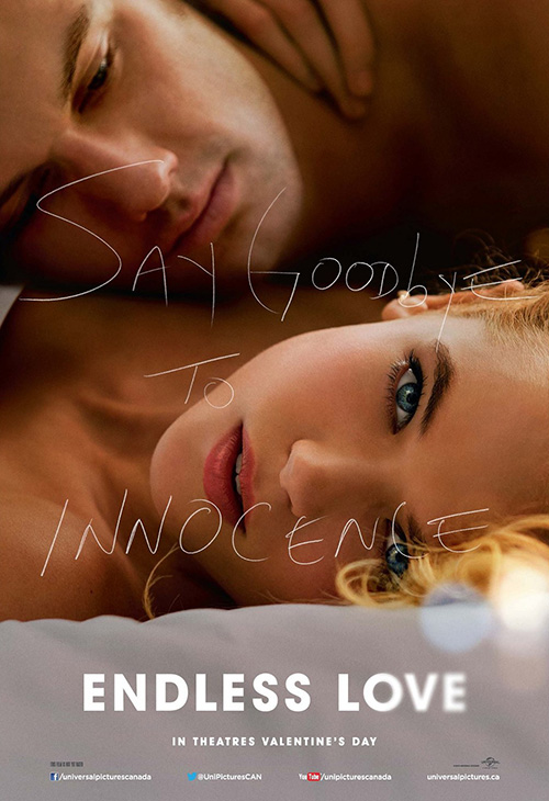
Concept Arts isn’t done either as they revive the scratched title of The Killer Inside Me and Rust and Bone’s French promo from The Rageman (at right) with Endless Love (February 14). But they do it wrong. You can’t make the tag scratchy/handwritten and then put the title at the bottom normal. They’re going to compete with each other in audience’s brains and confuse everyone. Honestly, at a quick glance it looks like the movie is called Say Goodbye to Innocence.
I do like having Gabriella Wilde looking straight at us, though. That’s definitely a nice touch. The whole just isn’t orchestrated well enough to disseminate its information efficiently.
Studio moolah
 |
 |
 |
 |
Now the question becomes, how bland can studios get on their bigger budgeted (marketed) films? The answer is very. It’s kind of the name of the game when you have recognizable, bankable stars to slap on the poster and get people’s attention. There doesn’t need to be an aesthetic draw when a goofy film still will suffice.
 |
 |
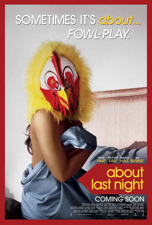 |
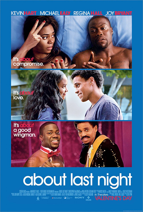
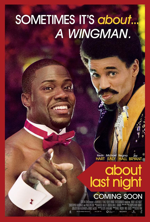
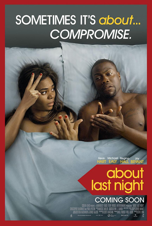
This is the common practice for comedies especially so it’s no surprise About Last Night (February 14) would follow suit. The main sheet is insanely static with three stills piled up on each other and designated by their own tagline to convolute things more. It’s a universal motif as anyone who’s stepped foot in a theater lately can agree considering Sony’s blanketed them all with their stacked cubes of images that beg to be spun yet are glued in place.
And of course each of these frames get their own “character poster” to try and make us laugh with Kevin Hart and Michael Ealy costumed up or one of the ladies wearing a chicken mask … I honestly have no clue what’s up with that one. It’s a conservative attempt at variety to increase exposure without actively seeking to hook anyone who wasn’t already going to buy a ticket.
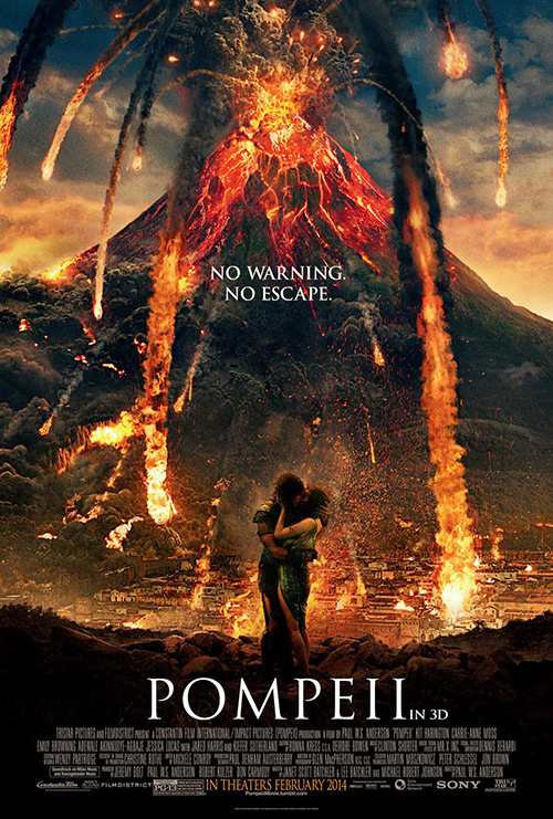
The same goes for BLT Communications, LLC’s Pompeii (February 21). There’s all that gorgeously macabre imagery from the petrified remains of this tragic event to play with and create a captivating image but you go with CGI volcano magma lighting up its leads’ kiss? Talk about mixed messages. Who knew genocide at the hands of Mother Nature could be so romantic? Paul W.S. Anderson just has a way of looking at the world that we cannot comprehend.
If you’re going to go the 3D route, you must own it. Don’t put a tiny “in 3D” at the side of the large fonted title to throw everything off center to the right, just call the damn thing Pompeii 3D. If you’re trying to trick viewers into hopefully missing that tidbit so they fork over the extra cash without knowing, you’ll just piss more people off. You need to at least pretend the 3D is an integral part of the whole and not sheepishly slap it on with the equivalent of a, “please don’t be mad”.
 |
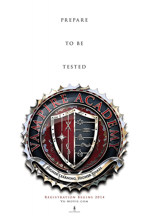 |
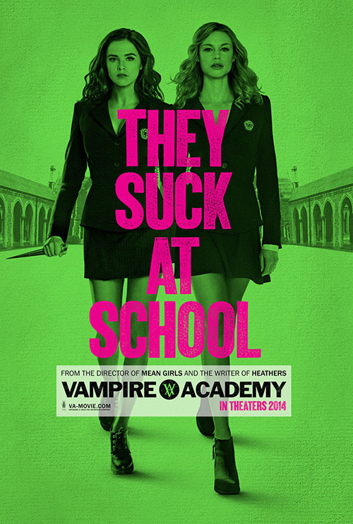
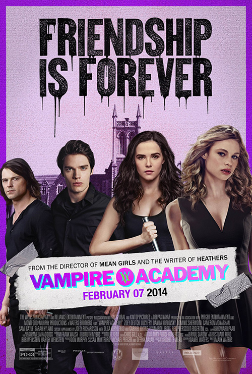
Thankfully the usually solid Gravillis Inc. knows how to have a little fun with that studio cash even if it is just oversaturating neon colors to grab attention. I personally think Vampire Academy (February 7) looks awful, but you have to give it credit for having style. I love the “VA” crest even if the heavy block title weirdly contrasts its upscale serifs as well as the simplicity of the power duo approaching us on a faux textured page.
Gravillis stumbles on their “Friendship is Forever” iteration by beefing up the Photoshop and adding duct tape, but we can’t all be perfect. I’m just glad they took over from cold open’s teaser since its ornate school crest is way too serious for what the movie actually appears to be. This ain’t Harry Potter, you can cut out the British severity please.
 |
 |
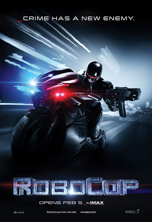 |
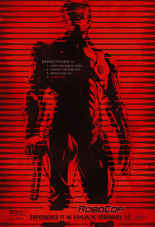
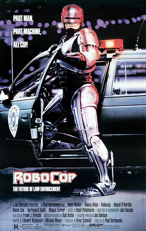
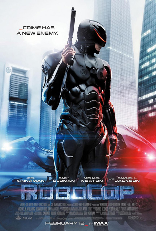
That said, cold open gets full marks on showing up BLT’s Robocop (February 12) designs with an eye-catchingly bright red IMAX sheet that plays with the idea of a robot rather than merely showing it. The high contrast black and red assaults you with feelings of alarm, caution, and danger—exactly those things a rogue government issued cop conjures.
I won’t blame BLT too much for going retro and copying the original poster by B.D. Fox Independent with more flash—you know, pretty much rebooting the design just like MGM/Columbia did the film. They were probably required to showcase Joel Kinnaman’s sleek new suit with as much lens flare as possible. And I know it’s cheesy, but I actually like the underscores and double slashes in the text lines to mimic computer code. They got that right at least.
Play on
 |
 |
 |
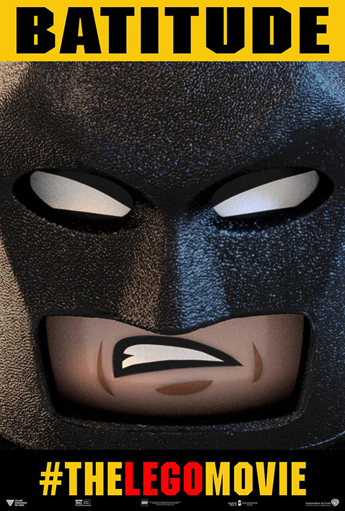 |
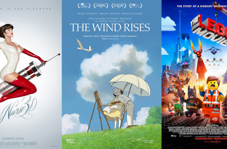
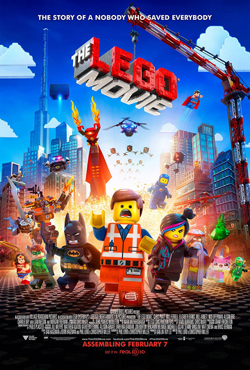
I know I’m probably looking forward to The LEGO Movie (February 7) way too much, but I was the kind of LEGO kid growing up who had card table cities set up in my basement. This was my childhood and the building blocks have only gained reputation with video games, licensed sets, and smaller scale movies. And with Phil Lord and Christopher Miller sitting in the director’s chair, you know it will be loads of fun if nothing else.
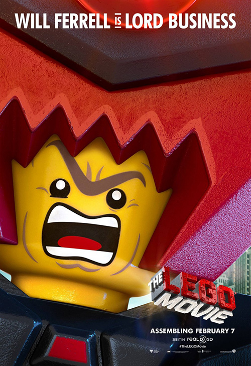
So how do you translate that fun to a poster? Well, Art Machine, A Trailer Park Company and Animal Logic simply put the world on full display with intricately constructed buildings “assembling” before our eyes. It’s an inspired teaser that eventually evolves into one that’s jam-packed with characters to get a flavor of just how expansive the intellectual property placement will be. Add two different sets of character sheets—one in extreme close-up and the other semi-extreme—and you have a blanketing campaign.
That original teaser, though, is the one that typifies what it means to be a LEGO collector. It showcases the process perfectly in a Doozer-esque way and translates the fact that someone could have theoretically animated this film with stop motion technology in his home. It’s fun, detail-oriented, and world building all at the same time.
The character sheets are blah in comparison, especially if you’ve played with the three-piece spinning figure boxes set-up at your local cinema to place Batman’s head on Wonder Woman’s body. Or to just spin randomly to see what juxtaposition gets made.
It’s not all bad
 |
 |
 |
 |
It isn’t all about the money, though, as three of the following four posters will show. There are still some holdovers from award season making their way to American cinemas this month with gorgeous designs to set them apart from the fare I’ve talked about above.
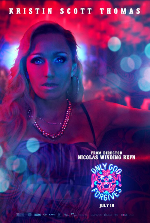 |
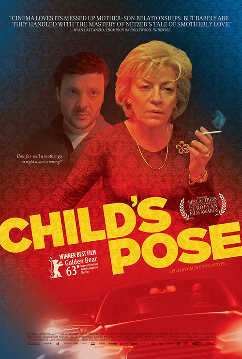
There’s Romania’s Golden Bear Award-winning Child’s Pose (limited February 19) created by Matt Frost to give us a warm glow against the cold metal of Robocop. I love the way the wallpaper design continues into the actress’ clothing as she disinterestedly looks at us with a cigarette in her hands. Something about the look reminds me of Ignition Print’s Only God Forgives sheet of Kristen Scott Thomas—that scary, dead glare unable to be anything but a little menacing.
The subtly of the tilted title in bright yellow with the fabric design poking through is fantastic too, cutting the top from bottom by popping out to grab our attention. There is mystery in their faces and the stark color fade from blue to red that truly captivates.
 |
 |
 |
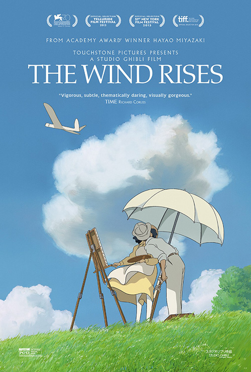
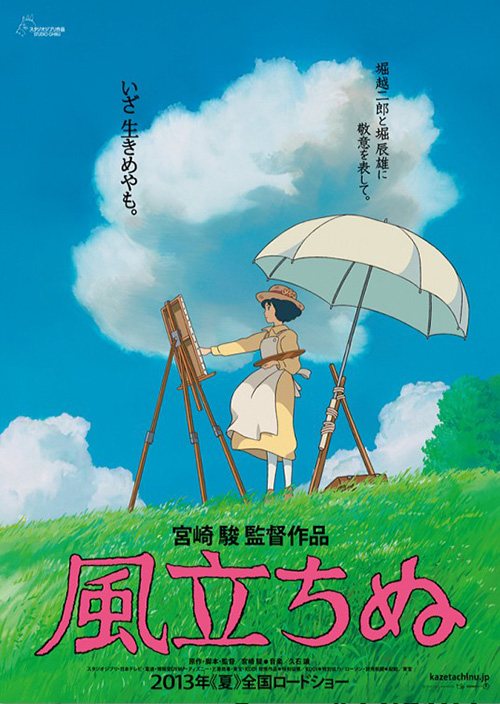
For The Wind Rises (limited February 21), I’m just glad the artist retained the look and feel of its Japanese counterparts for US consumption this time. In fact it improves upon it by not putting the title in an oppressive hot pink at the bottom. And there’s something about adding the male character to surprise the female as she paints with a kiss. It’s all the more intriguing as a result since both faces are obscured, forcing our eyes to see only form rather than context.
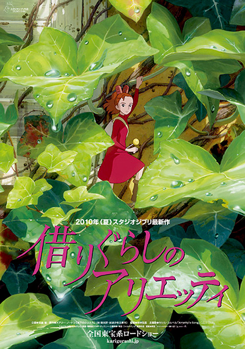
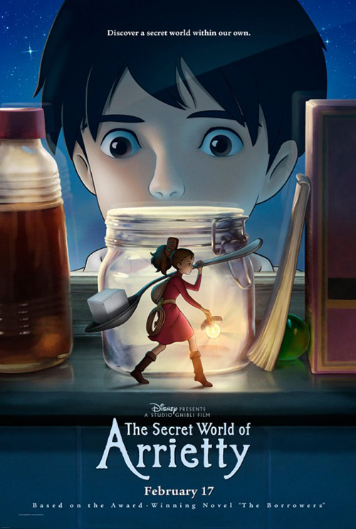
No one should ever bottle the expansive beauty of a Studio Ghibli film like was done with The Secret World of Arrietty. To go from the barely visible red dress amongst a sea of green leaves to the static composition of boy/girl clearly delineated was a travesty. If it ain’t broke, don’t fix it. And I’m not sure Hayao Miyazaki ever put his name on something that was broke.
 |
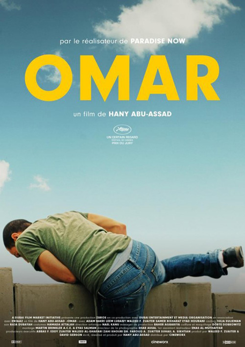
As far as Foreign Language Oscar nominee Omar (limited February 21) is concerned, its poster’s success lies in its simplicity. The yellow title has been over-used of late (I include Bemis Balkind’s Win Win as an example), but it is a color that stands out.
What I like most about the image is that it isn’t just the titular character standing to face us; there is motion in escape or fun as he jumps a fence instead. The crop gives us a ton of white space at the top to turn the actor and the name into our focal points as we find ourselves jumping with him to see what’s on the other side.
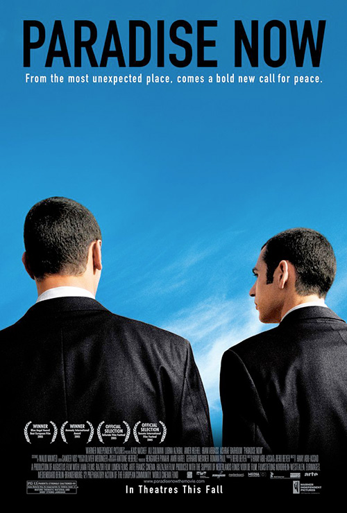
As an interesting tidbit: the resemblance to director Hany Abu-Assad’s Paradise Now poster from KO Creative is uncanny. From the blue sky, shooting the actors from behind, and the bold type at top, the style is two for two on earning him Oscar nominations.
 |
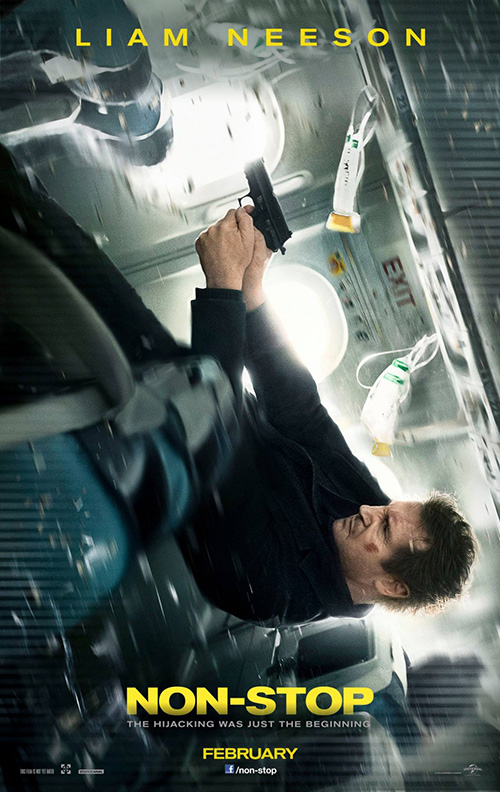
My favorite of this grouping, however, isn’t a foreign film held over from the festival circuit. No, it’s Concept Arts’ poster for Non-Stop (February 28). Here’s a film about a hijacked plane and the insanity occurring on-board as the trajectory gets out of whack to spin it into a nosedive. What better way to depict the adrenaline rush action than to put the print-ad into the same precarious position?
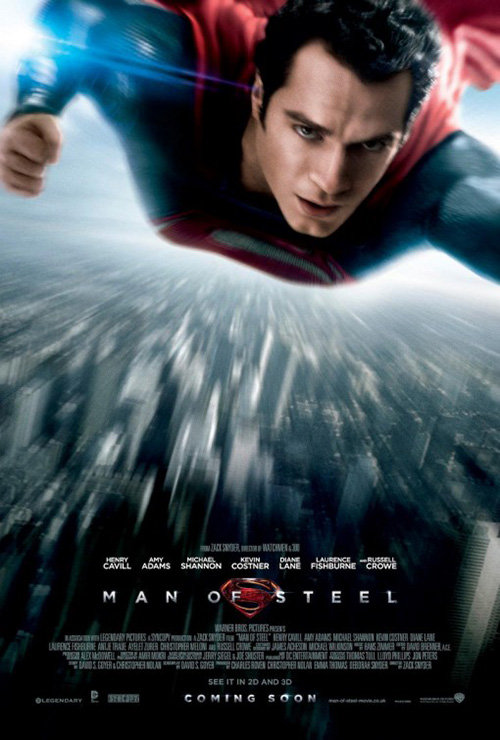
Other firms have attempted this aesthetic before (see WORKS ADV’s Man of Steel using motion blur to make him appear to fly out at us), but few get it undeniably right. I think this one is close to perfect in the chaotic, debris-filled chamber rushing past our eyes at high speeds while the camera focuses on Neeson in crisp clarity falling against the grain. And for a movie that looks as forgettable as can be, advertising this pretty actually makes me want to give it a chance.
Hellllll-ooo, NSFW
 |
 |
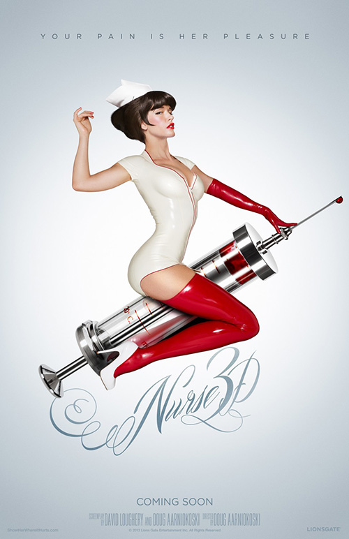 |
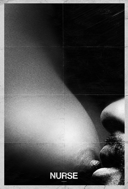
The unequivocal winner of February isn’t any of those, though. Nope, the victor is Ignition Print doing something very interesting. Well, Nurse 3D (limited February 7) itself is unlike many studio horrors as its inspired by the darkly sinister photos of Lionsgate’s chief marketing officer Tim Palen. His stunning work has been utilized on countless posters by the studio, but this time Ignition allows the sexuality to veer from mainstream consumption with a spot of nudity.
His shots are striking from the close-up breast suckled in black and white on a creased page reminiscent to old school David Lynch to Paz De La Huerta’s blood-soaked body in all its glory. This second one is definitely a play on Palen’s work with the Saw Blood Drives, but completely without censor.
Even the PG-13 version of a clothed Paz riding a syringe like a bucking bronco finds a way to sneak over the fine line of decency for a sexually charged image of pure, black desire. And I absolutely adore the glossy sheen of reflections on her skin-tight uniform to make it all appear as though she’s a plastic figure posed for the viewer’s satisfaction. It’s the type of design work that almost makes the film a must-see.
What is your favorite February release poster? What could have used a rework?

